Unknown –> Decode –> Understand –> Ally
A simple yet a very powerful path for all stages and dimensions of life.
Here Today, we will be making Seaborn (a super easy library for Data Visualization) our ally.
Seaborn is a python library for data visualization. It is a high-level interface based on matplotlib (another popular data visualization library). It can be used in all sorts of data analysis tasks that require you to visualize your data and infer information out of it.
Here is the official documentation of the Seaborn library. This Link is really helpful for referencing various use cases and ways to use seaborn along with very simple and detailed user guides and tutorials. I highly recommend you to check it out.
Seaborn plots create two different types of objects:
FacetGrid is a seaborn class whose objects have the capability to produce a Multi-plot grid for plotting conditional relationships. This means that you can easily create subplots using its object.
-> For More clarity, you can think that the dataset is mapped onto multiple axes aligned in a grid of rows and columns (the number of rows and columns corresponds to the levels of variables in the dataset) that outputs a subplot.
Example: seaborn.relplot(), seaborn.catplot() etc.
AxesSubplot is those plots whose objects belong to Matplotlib’s Axes class. It creates axes in a figure and returns that Axes object. It only creates a single plot.
Example: seaborn.scatterplot(), seaborn.boxplot(), seaborn.countplot() etc.
Well, Enough with the black and white text, Let’s make some beautiful, colorful plots with seaborn.
First, let us import a random dataset from the seaborn’s general_purpose data archive. Here is the link.
you can do that simply by the load_dataset function which the dataset name passed as an argument.
import seaborn as snsimport matplotlib.pyplot as plt
# Loading a Planet dataFrame
data = sns.load_dataset("planets")
data.head()

The First plot that we will see, is personally my most used plot whenever I first start analyzing the data. That is,
Count plots come under the category of categorical estimate plots (handle the estimated categorical values). It is a self-explanatory name for the plot. The plot shows the counts of the number of occurrences of different unique categories in the data.
I will be repeating few lines of code for each plot. Let’s quickly go through them.
# Initializing a figure object with the figure size in ratio of 14:8plt.figure(figsize=(14,8))
# After Initializing either a FacetGrid object or AxesSubplot object,#we can set the title of the plot using a different method. ##For AxesSubplot object, we useg.set_title("Title")
##For FacetGrid object, we useg.fig.suptitle("Title")
Here is how we can make a count plot using the seaborn library.
plt.figure(figsize=(14,8))
g = sns.countplot(x="year", data=data)
g.set_title("Counts entries in Particular Year")
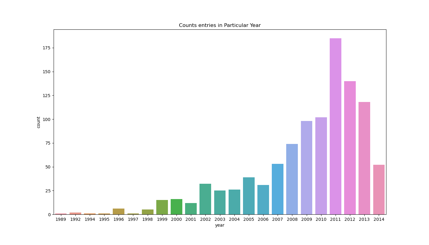
The above and below plots show how many data points in the data belong to unique year entries. The x-axis shows the years in sorted order and the y-axis shows their number of occurrence.
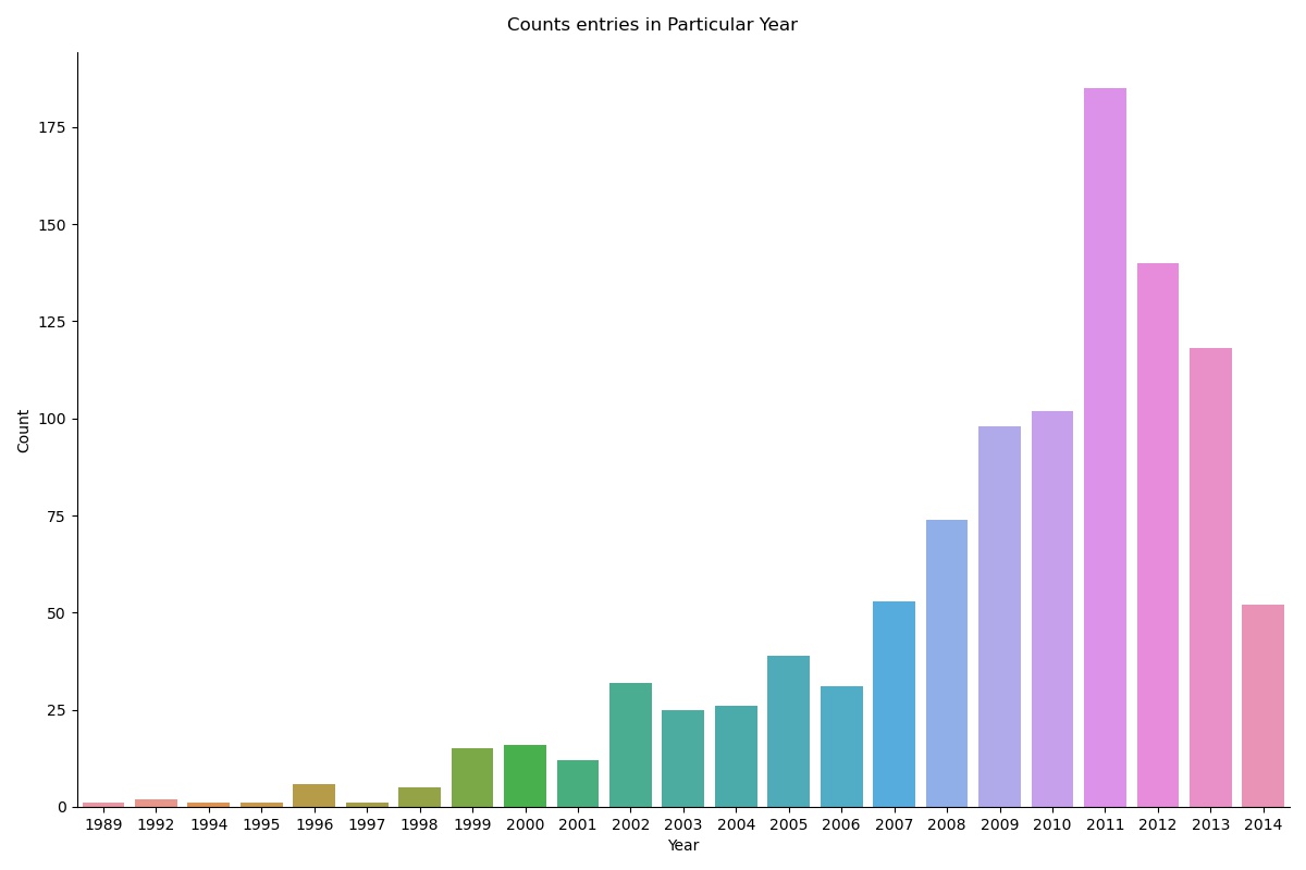
We can create the same count plot but as a FacetGrid object like this,
## Height in Inches for each Facet and aspect*height == width of each facet in inches.
g = sns.catplot(x="year", data=data, kind="count", height=8, aspect=1.3)
g.fig.suptitle("Counts entries in Particular Year")
Relational plots are those plots that signify the relationship between 2 (in terms of 2D plot) different features(columns of data) or Bivariate data. In seaborn If we want to plot them as FacetGrid object, we use seaborn.relplot(). Otherwise, if we want to create an AxesSubplot we can use seaborn.scatterplot() or seaborn.lineplot() {by the individual name of that plot}.
Scatter Plot is a relational plot because the data points that it creates on the plot are the function of 2 features (variable on the x-axis and variable on the y-axis). A single data point holds the relationship between both of those features. It’s called a scatter plot because each data point is plotted individually to each other, so it seems like data is scattered all over the plot. Here is how you can make one.
plt.figure(figsize=(14,8))
g = sns.scatterplot(x="distance", y="mass",data=data)
g.set_title("Relation Between Mass and Distance of the planets")
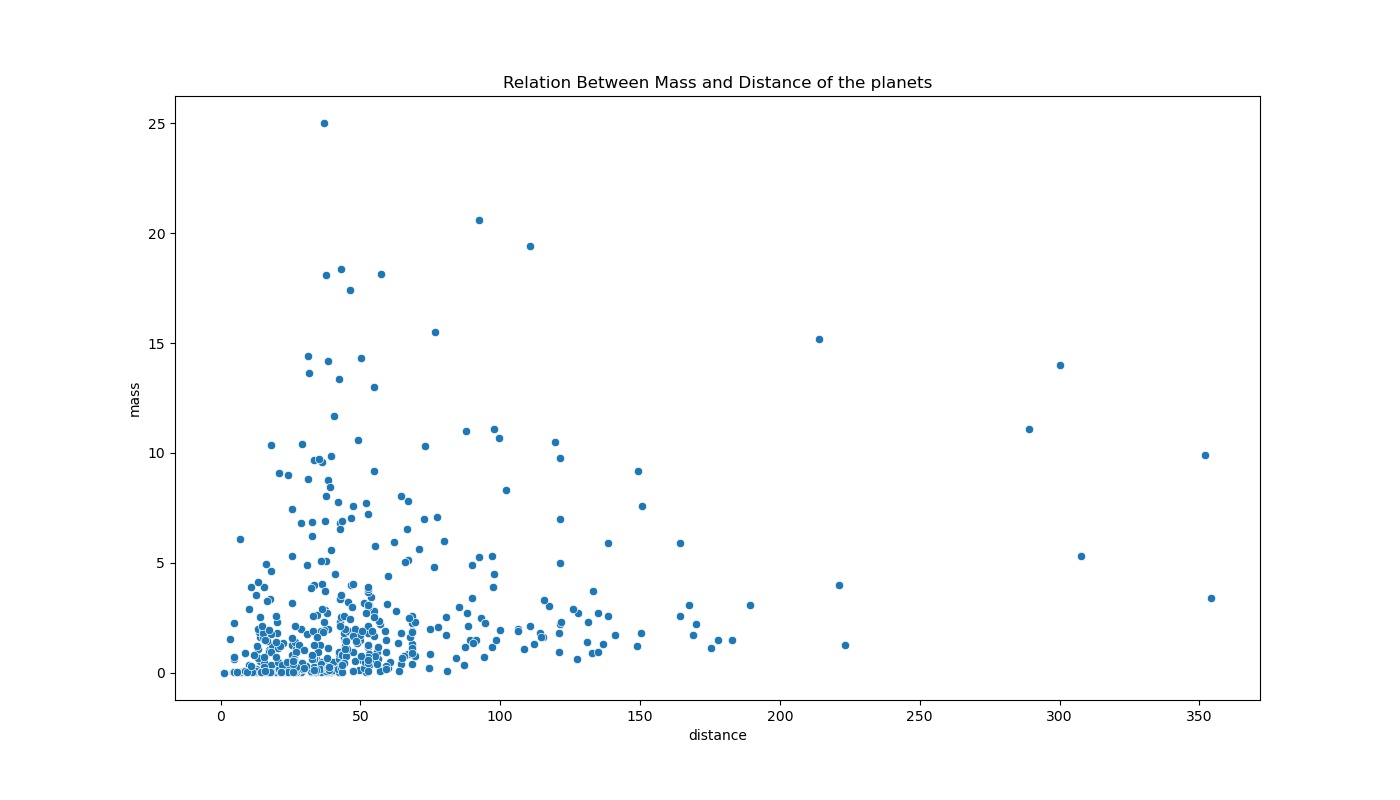
You can clearly see the scatter of data points on the plot. we can directly infer that most of the data in the dataset belong to smaller planets that are closer in the distance because there seems to be a dense cluster of data points in the lower-left part of the plot.
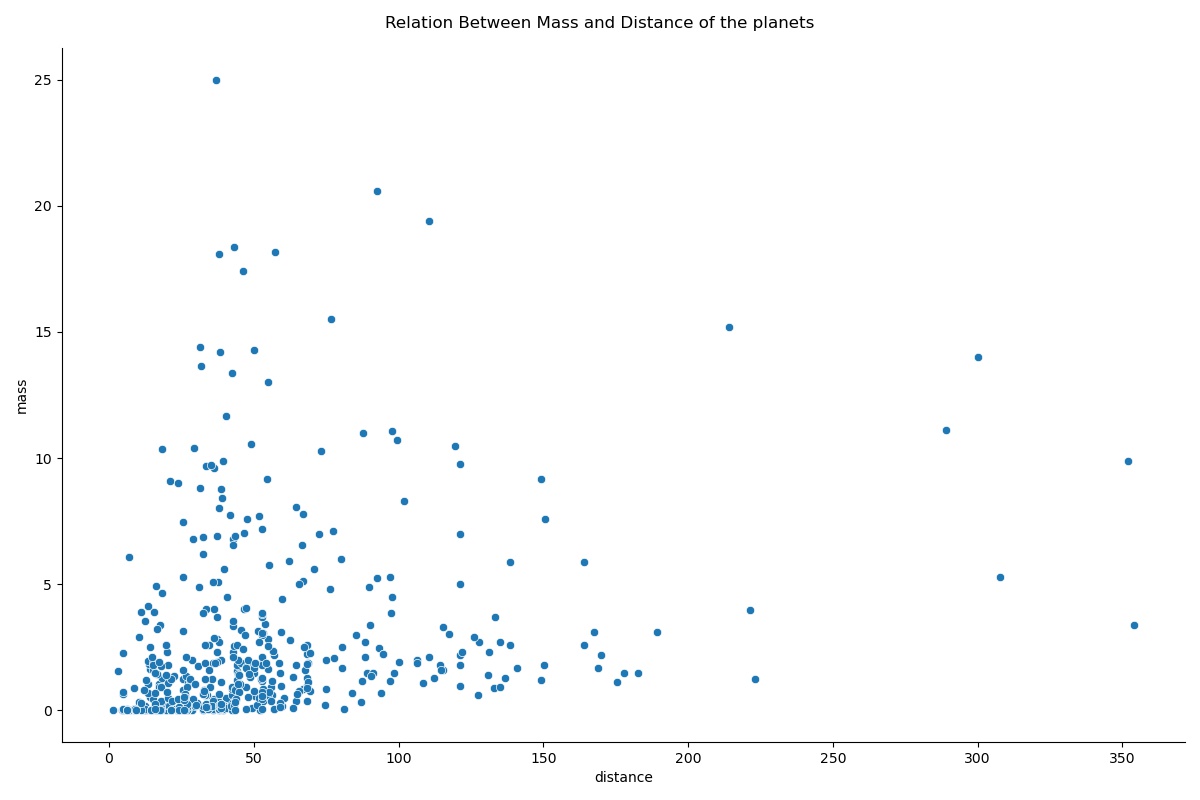
Let’s make the same plot again but as a FacetGrid Object.
g = sns.relplot(x="distance", y="mass",data=data, kind="scatter", height=8, aspect=1.5)
g.fig.suptitle("Relation Between Mass and Distance of the planets")
Line plots are very similar in nature to scatter plots but they both hold their significant value for a different use case. Connecting the data points in scatter plots by a line gives us a Line plot. Line plots are used to measure the trend (path between the data points) or any other direction-related nature of the data.
Let me show you why the line plot will not be the best choice for the features that we used earlier in the scatter plot and how each plot has its own strength and weakness.
g = sns.relplot(x="distance", y="mass",data=data, kind="line", height=8, aspect=1.5)
g.fig.suptitle("Relation Between Mass and Distance of the planets")
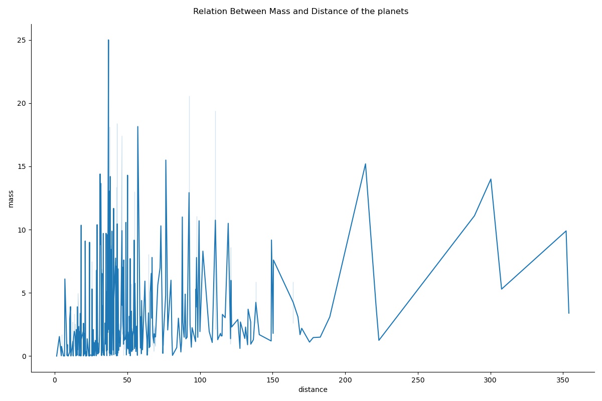
You can clearly see that there is a lot going on which is quite hard to interpret from this single plot. Probably this is not the best choice to show this particular relationship of these features.
Let me use the filtered data of only Planet number 4, and see what are the results.
g = sns.relplot(x="distance", y="mass",data=data[data["number"]==4], kind="line", height=8, aspect=1.5)
g.fig.suptitle("Relation Between Mass and Distance of the planets")
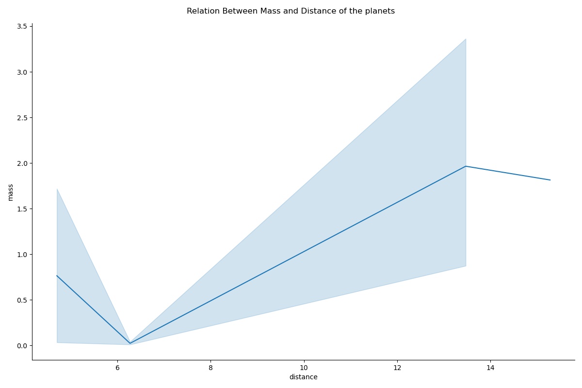
The shaded area around the line is the confidence interval. It assumes that the dataset is a random sample and it’s 95% confident that the mean is within this confidence interval region.
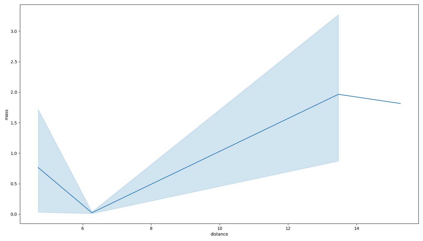
You can create the same line plot as an AxesSubplot object just by calling the function:
sns.lineplot(x="distance", y="mass",data=data[data["number"]==4])
Categorical Plots are those plots that deal with discrete categories in data. In seaborn if we want to plot them as FacetGrid Object we can use seaborn.catplot(). Otherwise, if we want to create AxesSubplot objects similar to relational plots, we can simply call the plots by their individual names. seaborn.countplot(), seaborn.barplot(), seaborn.boxplot() etc.
Box Plot comes under the category of `Categorical Distribution plots`. This plot had me confused for the longest period among all other plots. So, I will try to make you dodge that bullet. Box plots are categorical plots, which means they work with discrete categorical values(usually on the x-axis). They show the distribution of quantitative data (feature with continuous values) (usually on the y-axis) to facilitate the comparison between different unique categories on the x-axis.
A Box for a single category tells us 6 main things:
1. The “minimum” value (according to 99.3% data from the distribution) denoted by the lower whisker (inverted T below the lower boundary of the box).
2. The lower boundary shows us the 25th Percentile of the data distribution (First Interquartile range).
3. Median of the data distribution is denoted by the line between the boundaries of the box.
4. The upper boundary shows us the 75th Percentile of the data distribution (Third Interquartile range).
5. The “maximum” value (according to 99.3% data from the distribution) denoted by the upper whisker ( `T` shaped line above the upper boundary of the box).
6. Rest the single data points on the plot are 0.7% of the normal data distribution considered as outliers which are completely outside of the 99.3% normal data distribution.
Let us see how to plot one as a FacetGrid object,
g = sns.catplot(x="number", y="mass", data=data, kind="box", height=8, aspect=1.5)
g.fig.suptitle("Distribution of data for each planet")
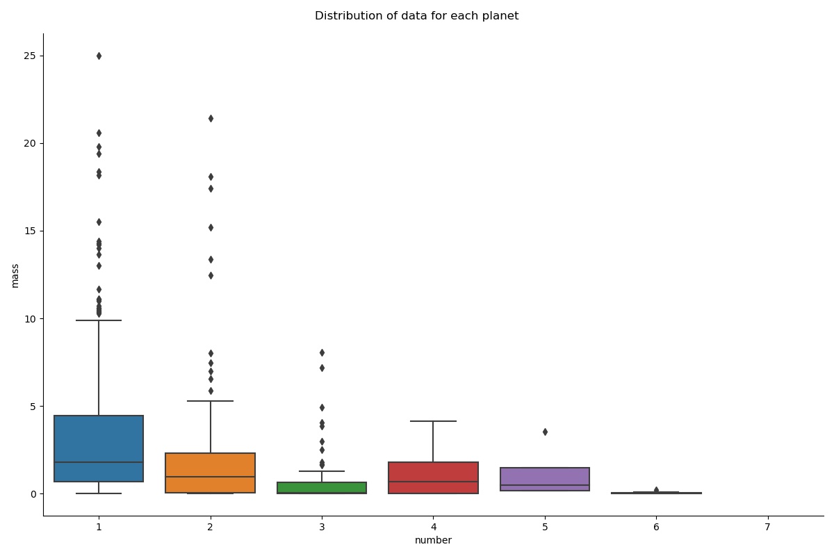
Refer to all the points mentioned above regarding the box plot and then everything seems to come together.
Bar plot is one of the simplest representations to show the relationship between categorical features and univariate quantitative data. Earlier when we looked at the count plot, it is nothing but a Bar plot that uses the count of occurrences of certain categories as univariate quantitative data (continuous value on the y-axis).
Let’s see how we can make one of our own using seaborn.
g = sns.catplot(x="number", y="mass", data=data, kind="bar", height=8, aspect=1.5)
g.fig.suptitle(" for each planet")
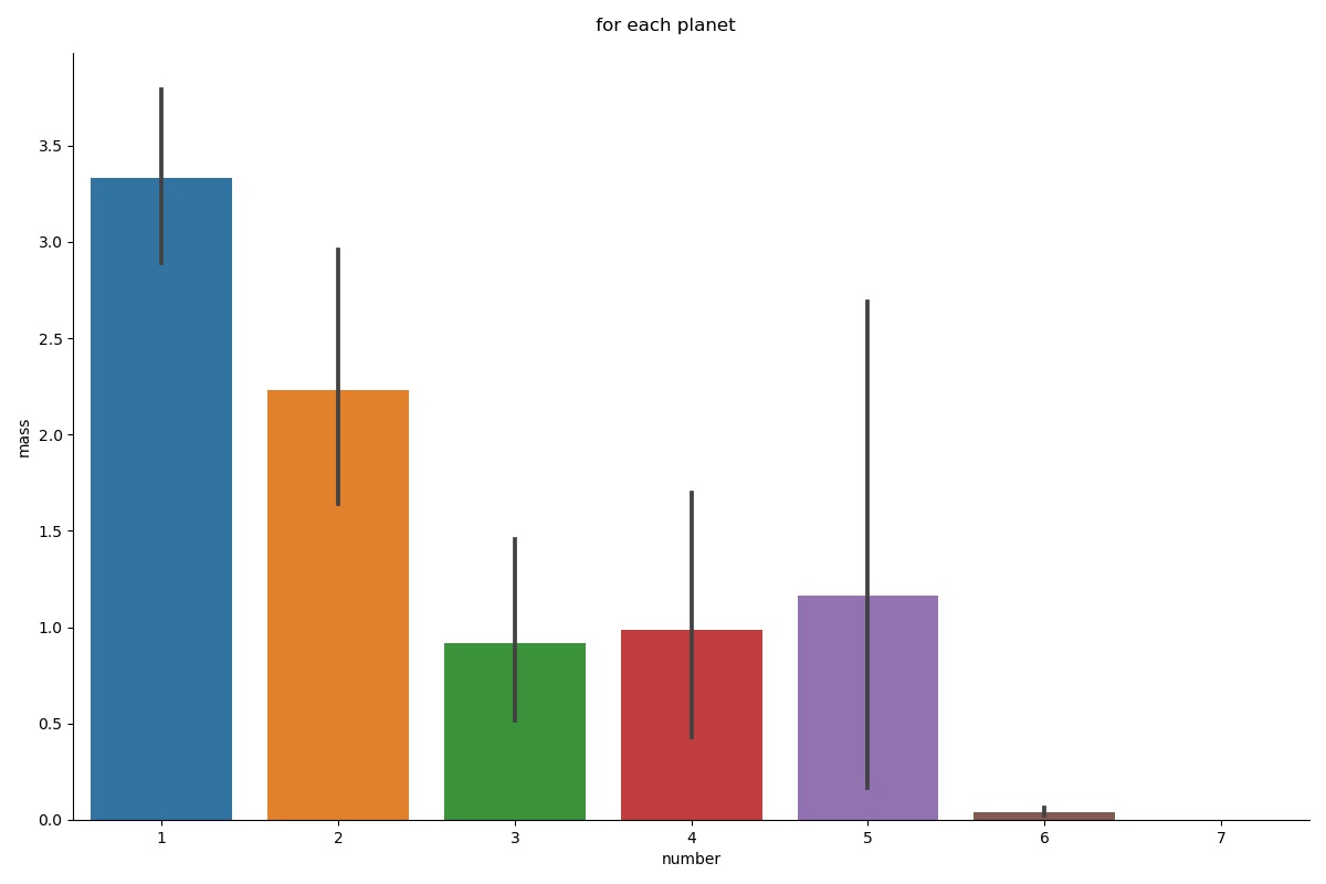
NOTE: The data didn’t contain a single occurrence for each category, there are a lot of ‘mass’ entries for a single category in the dataset. So, for such a case, our bar plot displays the mean of the quantitative variable per category and the black verticle line on the upper edge of the bar shows the 95% confidence intervals for the mean.
You have reached the End of this tutorial.
I could only cover a very limited number of plots that are available with seaborn. They are really easy to work with and highly intuitive plots as you clearly saw in the tutorial. So, do check out their official site for the user guides, exploration of various other plots, and tutorials on them.
I hope I was able to make start looking at seaborn as a very potential ally for your data science journey.
Gargeya Sharma
B.Tech Computer Science (3rd Year)Specialized in Data Science and Deep learningData Scientist Intern at Upswing Cognitive Hospitality SolutionsFor more information about me, check out my GitHub Home page.
Photo by Isaac Smith on Unsplash
The media shown in this article are not owned by Analytics Vidhya and is used at the Author’s discretion.
Lorem ipsum dolor sit amet, consectetur adipiscing elit,


