Analyze Covid Vaccination Progress Using Python
This article was published as a part of the Data Science Blogathon
Introduction
Check my latest articles here

Image Source
IMPORT LIBRARIES
For analyzing data, we need some libraries. In this section, we are importing all the required libraries like pandas, NumPy, matplotlib, plotly, seaborn, and word cloud that are required for data analysis. Check the below code to import all the required libraries.
import pandas as pd
import numpy as np
import matplotlib.pyplot as plt
import plotly.express as px
import plotly.graph_objects as go
import matplotlib.patches as mpatches
from plotly.subplots import make_subplots
from wordcloud import WordCloud
import seaborn as sns
sns.set(color_codes = True)
sns.set(style="whitegrid")
import plotly.figure_factory as ff
from plotly.colors import n_colors
READ DATA AND BASIC INFORMATION
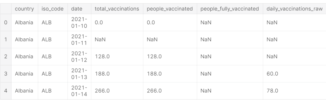
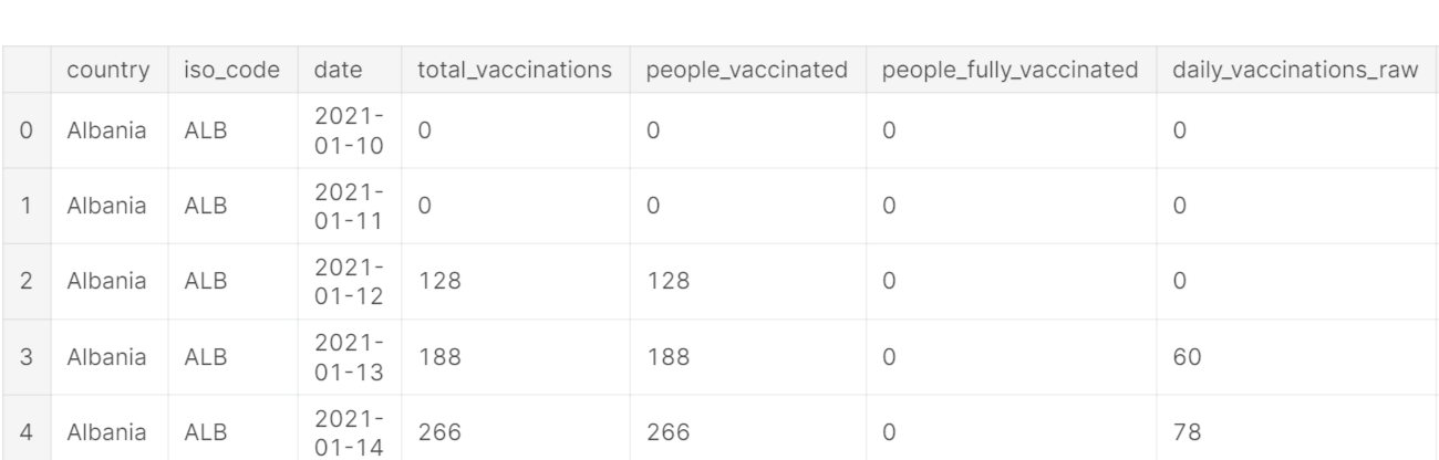
Read the CSV file using pandas read_csv() function and show the output using head() function.
info() function is used to get the overview of data like data type of feature, a number of null values in each column, and many more.
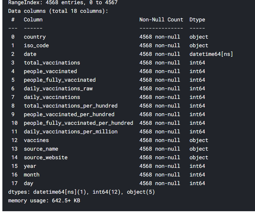
df.info()
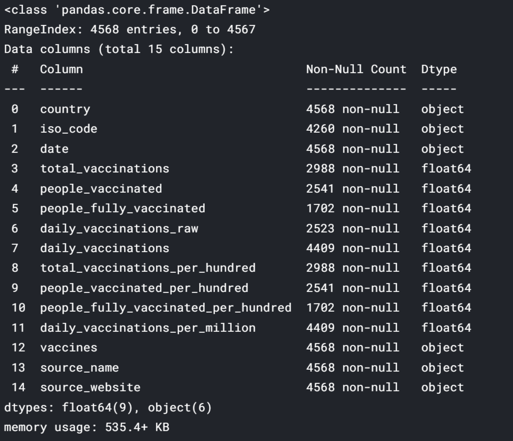
Observation:
The above picture shows that there are many null values in our dataset. We will deal with these null values later in this blog. There are two data types as seen from the table object means string and float.
The below function is used to get the total count of null values in each feature.
df.isnull().sum()
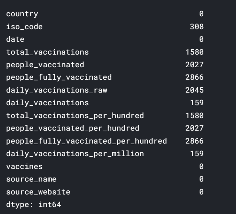
Observation:
The below picture shows tables like country, date, vaccines, source_name has 0 null values. Features like people_fully_vaccinated have a maximum of 2866 null values.
DATA CLEANING
Dataset has many null values as we have seen before. To get rid of it we need to clean the data first, After cleaning we will perform our further analysis. For cleaning the dataset we will perform many steps. Some of these steps are shown below
- Handling and Filling null values
- Change the data type of features
- Handling strings like splitting.
df.fillna(value = 0, inplace = True)
df.total_vaccinations = df.total_vaccinations.astype(int)
df.people_vaccinated = df.people_vaccinated.astype(int)
df.people_fully_vaccinated = df.people_fully_vaccinated.astype(int)
df.daily_vaccinations_raw = df.daily_vaccinations_raw.astype(int)
df.daily_vaccinations = df.daily_vaccinations.astype(int)
df.total_vaccinations_per_hundred = df.total_vaccinations_per_hundred.astype(int)
df.people_fully_vaccinated_per_hundred = df.people_fully_vaccinated_per_hundred.astype(int)
df.daily_vaccinations_per_million = df.daily_vaccinations_per_million.astype(int)
df.people_vaccinated_per_hundred = df.people_vaccinated_per_hundred.astype(int)
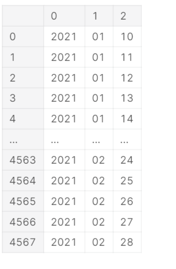
date = df.date.str.split('-', expand =True)
date
df['year'] = date[0]
df['month'] = date[1]
df['day'] = date[2]
df.year = pd.to_numeric(df.year)
df.month = pd.to_numeric(df.month)
df.day = pd.to_numeric(df.day)
df.date = pd.to_datetime(df.date)
df.head()
SOME FEATURES
Let’s get some details about our features using the below code
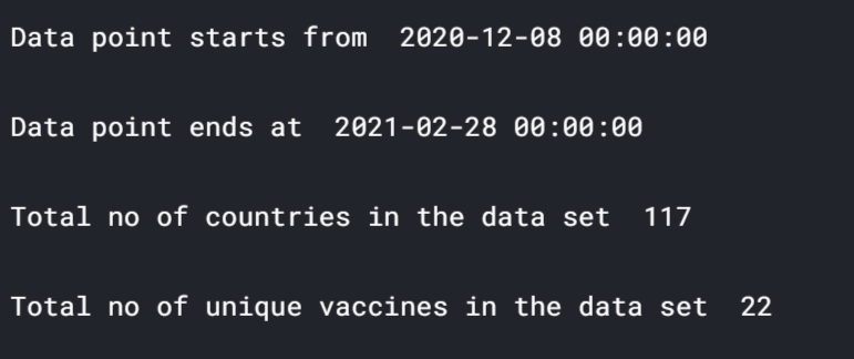
print('Data point starts from ',df.date.min(),'n')
print('Data point ends at ',df.date.max(),'n')
print('Total no of countries in the data set ',len(df.country.unique()),'n')
print('Total no of unique vaccines in the data set ',len(df.vaccines.unique()),'n')
df.info()
DATA VISUALIZATION
In this section, we are going to draw some visuals to get insights from our dataset. So let’s started.
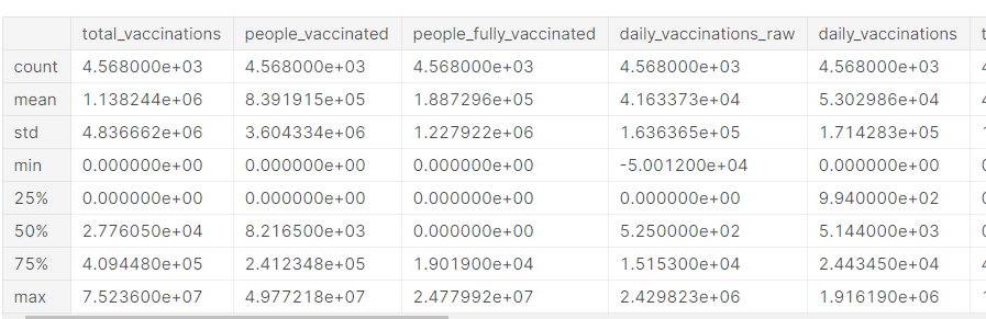
df.describe()
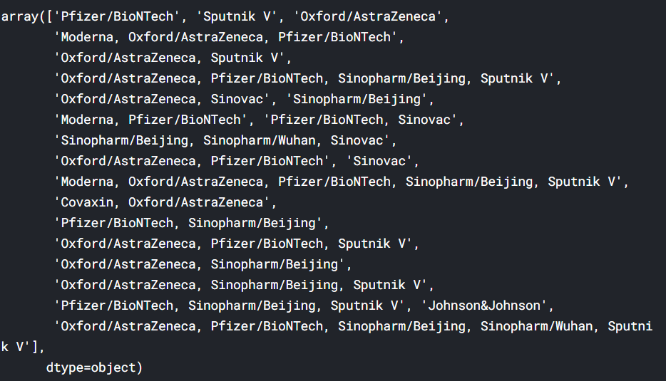
df.country.unique()
def size(m,n):
    fig = plt.gcf();
    fig.set_size_inches(m,n);
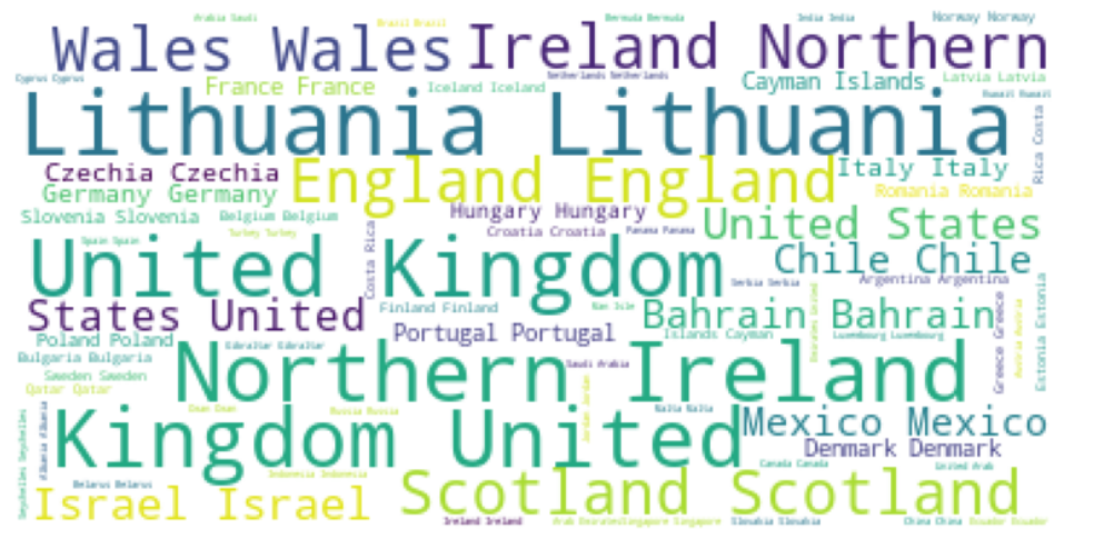
Word Art of Countries
wordCloud = WordCloud(
    background_color='white',
    max_font_size = 50).generate(' '.join(df.country))
plt.figure(figsize=(15,7))
plt.axis('off')
plt.imshow(wordCloud)
plt.show()
Total Vaccinated Till Date
In this section, we are going to see how many total vaccines have been used in each country. Check the below code for more information. The data shows the United States has administrated most vaccines in the world followed by China, United Kingdom, England, India and at the last some countries includes Saint Helena, San Marino has 0 vaccination.
country_wise_total_vaccinated = {}
for country in df.country.unique() :
    vaccinated = 0
    for i in range(len(df)) :
        if df.country[i] == country :
            vaccinated += df.daily_vaccinations[i]
    country_wise_total_vaccinated[country] = vaccinated
#     made a seperate dict from the df
    country_wise_total_vaccinated_df = pd.DataFrame.from_dict(country_wise_total_vaccinated,
                                                         orient='index',
                                                         columns = ['total_vaccinted_till_date'])
#     converted dict to df
country_wise_total_vaccinated_df.sort_values(by = 'total_vaccinted_till_date', ascending = False, inplace = True)
country_wise_total_vaccinated_df
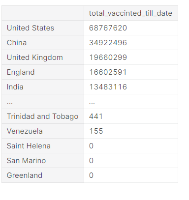
fig = px.bar(country_wise_total_vaccinated_df,
             y = 'total_vaccinted_till_date',
             x = country_wise_total_vaccinated_df.index,
             color = 'total_vaccinted_till_date',
             color_discrete_sequence= px.colors.sequential.Viridis_r
            )
fig.update_layout(
    title={
            'text' : "Vaccination till date in various countries",
            'y':0.95,
            'x':0.5
        },
    xaxis_title="Countries",
    yaxis_title="Total vaccinated",
    legend_title="Total vaccinated"
)
fig.show()
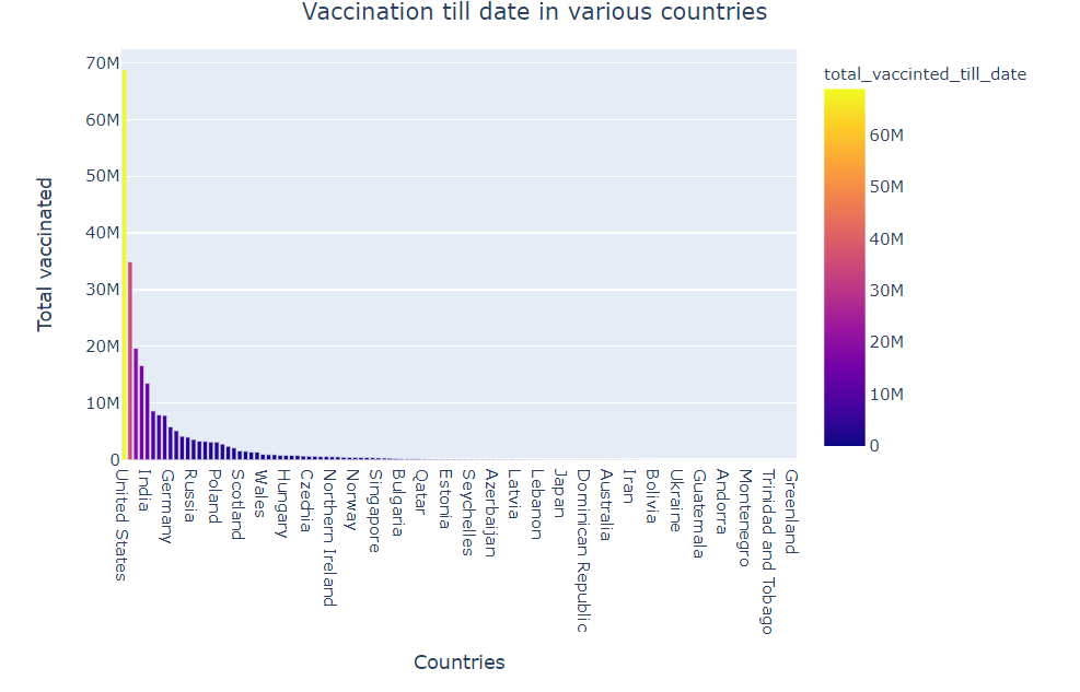
- The United States has administrated most vaccines in the world followed by China, United Kingdom, England, India
- Countries include Saint Helena, San Marino has 0 vaccination.
Country Wise Daily Vaccination
To check what is the vaccination trend in each country, check the below code. We are drawing the line plot where the x-axis is the date and the y-axis is the count of daily vaccination, Colours Is set to be the country.
fig = px.line(df, x = 'date', y ='daily_vaccinations', color = 'country')
fig.update_layout(
    title={
            'text' : "Daily vaccination trend",
            'y':0.95,
            'x':0.5
        },
    xaxis_title="Date",
    yaxis_title="Daily Vaccinations"
)
fig.show()
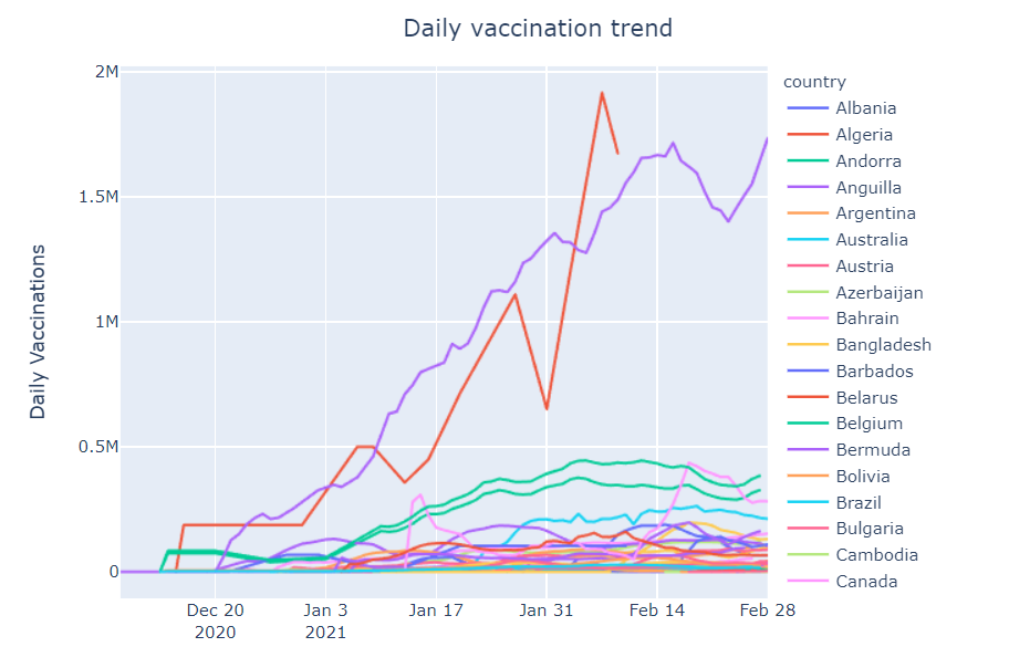
Observation:
There is a mixed kind of trend among each country. Sometimes a particular country shows a positive trend and sometimes it shows a negative trend.
Plot Till Date Function
# helper function
def plot_till_date(value1, value2, title, color1, color2) :
    so_far_dict = {}
    for dates in df.date.unique() :
        so_far_dict[dates], value1_count, value2_count = [], 0, 0
        for i in range(len(df)) :
            if df.date[i] == dates :
                value1_count += df[value1][i]
                value2_count += df[value2][i]
#         if dates not in so_far_dict.keys() :
        so_far_dict[dates].append(value1_count)
        so_far_dict[dates].append(value2_count)
    so_far_df = pd.DataFrame.from_dict(so_far_dict, orient = 'index', columns=[value1, value2])
    so_far_df.reset_index(inplace = True)
#     return so_far_df
    so_far_df.sort_values(by='index', inplace = True)
    plot = go.Figure(data=[go.Scatter(
            x = so_far_df['index'],
            y = so_far_df[value1],
            stackgroup='one',
            name = value1,
            marker_color= color1),
                           go.Scatter(
            x = so_far_df['index'],
            y = so_far_df[value2],
            stackgroup='one',
            name = value2,
            marker_color= color2)
        ])
    plot.update_layout(
    title={
            'text' : title,
            'y':0.95,
            'x':0.5
        },
        xaxis_title="Date"
    )
    return plot.show()
People vaccinated vs people fully vaccinated in the world :
In this section, let’s analyze how many people vaccinated vs the people which are fully vaccinated in the world. We are drawing a kind of curve where the x-axis is Date and the y-axis is the count of people that are fully vaccinated in the world
plot_till_date('people_fully_vaccinated', 'people_vaccinated','People vaccinated vs Fully vaccinated till date', '#c4eb28', '#35eb28')
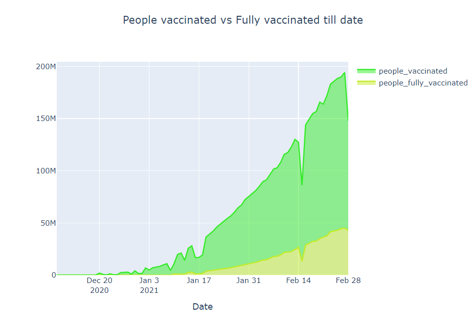
- People fully vaccinated in the world is around 50 million
- People that are vaccinated in the world is around 50 million
The People vaccinated vs people fully vaccinated per hundred in the world
In this section, let’s analyze how many people vaccinated vs the people which are fully vaccinated in the world per hundred. We are drawing a kind of curve where the x-axis is Date and the y-axis is the count of people that are fully vaccinated in the world per hundred
plot_till_date('people_fully_vaccinated_per_hundred', 'people_vaccinated_per_hundred', 'People vaccinated vs Fully vaccinated per hundred till date', '#0938e3','#7127cc')
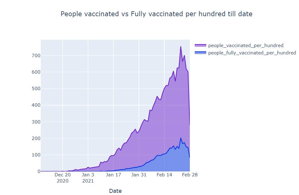
Observation
- People fully vaccinated in the world per hundred is around 2
- People that are vaccinated in the world is around 7
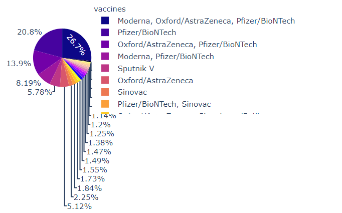
Pie-Plot
In this section, we are going to draw pip-plots. For more details check the below code:
def plot_pie(value, title, color) :
    new_dict = {}
    for v in df[value].unique() :
        value_count = 0
        for i in range(len(df)) :
            if df[value][i] == v :
                value_count += 1
        new_dict[v] = value_count
#     print(new_dict)
    new_df = pd.DataFrame.from_dict(new_dict, orient = 'index', columns = ['Total'])
    if color == 'plasma' :
        fig = px.pie(new_df, values= 'Total',
                     names = new_df.index,
                     title = title,
                     color_discrete_sequence=px.colors.sequential.Plasma)
    elif color == 'rainbow' :
        fig = px.pie(new_df, values= 'Total',
                     names = new_df.index,
                     title = title,
                     color_discrete_sequence=px.colors.sequential.Rainbow)
    else :
        fig = px.pie(new_df, values= 'Total',
                     names = new_df.index,
                     title = title)
    fig.update_layout(
        title={
            'y':0.95,
            'x':0.5
        },
        legend_title = value
    )
    return fig.show()
    plot_pie('vaccines', 'Various vaccines and their uses', 'plasma')
Most Used Vaccine
Let’s see what all vaccines are used in the different part of the world:
df.vaccines.unique()
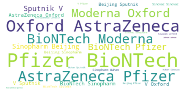
Word art of Vaccines
Word Cloud is a unique way to get information from our dataset. The words are shown in the form of art where the size proportional depends on how much the particular word repeated in the dataset. This is made by using the WordCloud library. Check the below code on how to draw word cloud
wordCloud = WordCloud(
    background_color='white',
    max_font_size = 50).generate(' '.join(df.vaccines))
plt.figure(figsize=(12,5))
plt.axis('off')
plt.imshow(wordCloud)
plt.show()
Daily vaccination trend per million
In this section, we will what is the trend of vaccination per million. We are going to draw a line plot where the x-axis is Date and the y-axis is daily vaccination per million. Check the below code for more information:
fig = px.line(df, x = 'date', y ='daily_vaccinations_per_million', color = 'country')
fig.update_layout(
    title=
            'text' : "Daily vaccination trend per million",
            'y':0.95,
            'x':0.5
        },
    xaxis_title="Date",
    yaxis_title="Daily Vaccinations per million"
)
fig.show()
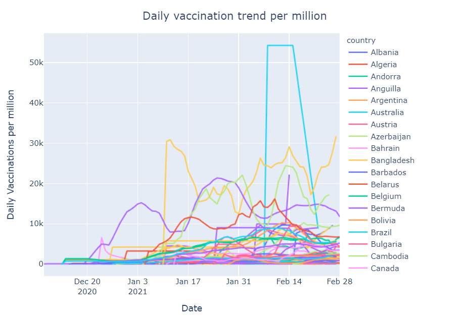
Observation
- Seychelles and Israel has the highest number of vaccinations per million
- On 10th Jan Gibraltar has the highest vaccination per million
Total vaccinated – India vs the USA
In this section, we will see what is the trend of vaccination among two great countries India and the USA. We are going to draw a line plot where the x-axis is Date and the y-axis is daily vaccination. Check the below code for more information:
india_usa = [df[df.country == 'United States'], df[df.country == 'India']]
result = pd.concat(india_usa)
fig = px.line(result, x = 'date', y ='total_vaccinations', color = 'country')
fig.update_layout(
    title={
            'text' : "Total vaccinated - India vs USA",
            'y':0.95,
            'x':0.5
        },
    xaxis_title="Date",
    yaxis_title="Total Vaccinations"
)
fig.show()
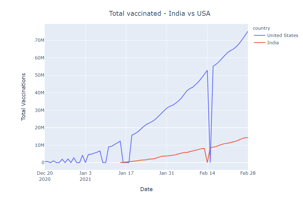
Observation
- The USA has started vaccination drive very early
- India is moving quite steadily despite it has started vaccination late.
MAPS
In this section, we are going to see how vaccinations are going in different countries using maps. The colour signifies how many people have been vaccinated. Check the below maps for more details.
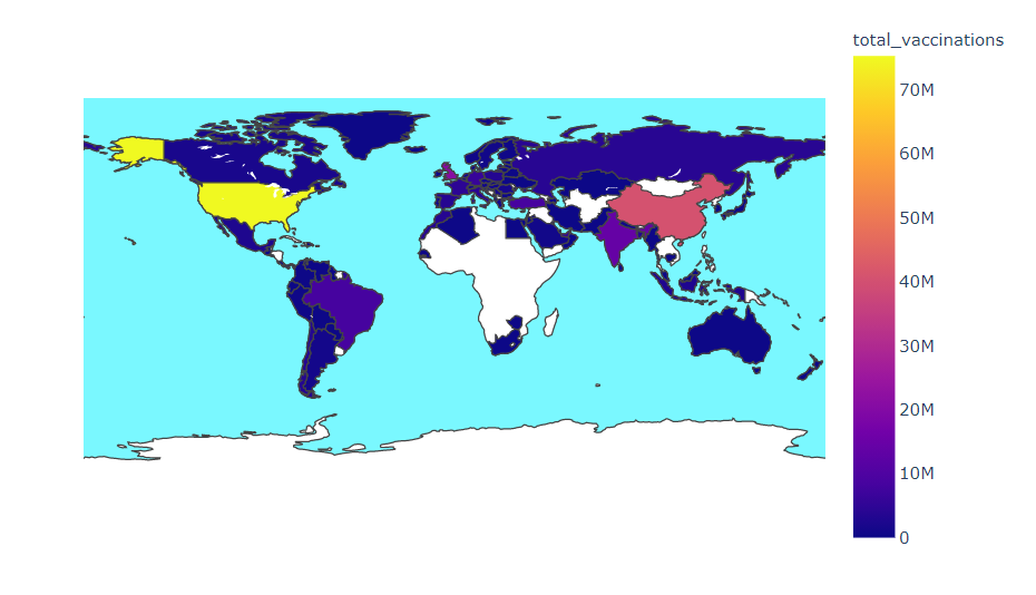
Most vaccinated country
plot_map('total_vaccinations','Most vaccinated country', None)
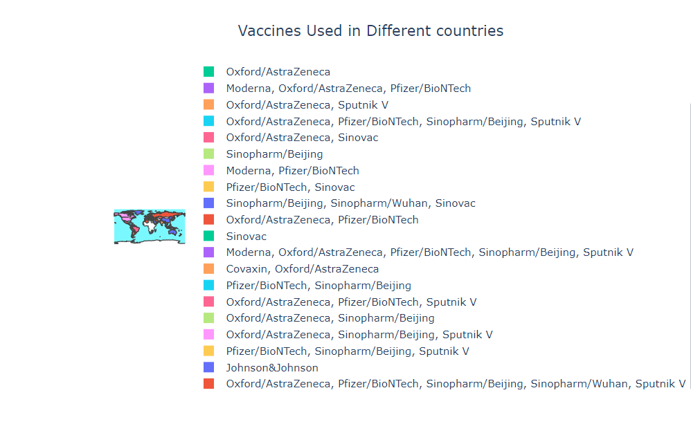
Vaccines Used in Different countries
plot_map('vaccines','Vaccines Used in Different countries', None)
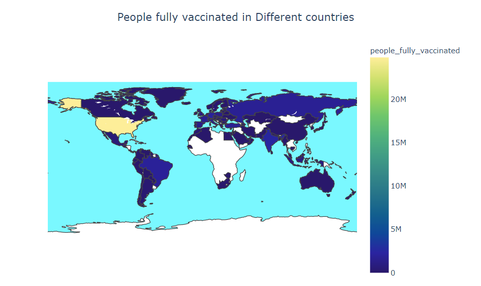
People fully vaccinated in Different countries
plot_map('people_fully_vaccinated','People fully vaccinated in Different countries', 'haline')
Key Observations:
- Sputnik V is mostly used In Asia, Africa, and South America
- Most of the countries are not fully vaccinated
- Modena and Pfizer are mostly used in North America and Europe
- Pfizer/BioNTech are mostly used in the world, its around 47.6%
- Covishield and Covaxin are in the 10th position
- China has started Mass Vaccination first
- Daily vaccination is highest in the USA thought the USA has started vaccination late as compared to China
End Notes
So in this article, we had a detailed discussion on Covid Vaccination Progress. Hope you learn something from this blog and it will help you in the future. Thanks for reading and your patience. Good luck!
You can check my articles here: Articles
Email id: [email protected]
Connect with me on LinkedIn: LinkedIn.
The media shown in this article are not owned by Analytics Vidhya and is used at the Author’s discretion.


