Everything is going to be connected to cloud and data… All of this will be mediated by software — Satya Nadella
Introduction:
One of the key facets of data science is visualization, whether you are exploring the raw data, analyzing the model results, or trying to tune the model, visuals make it easier to interpret the outcome.
Conventionally, the visuals are generated from either a plugin or a library and they are rendered on the web applications which let us end-user interact and interpret the results. These visuals can be static or partially interactive in silos.
So, is there a way to bring the best of data visualization and web technologies together in one place?. Yes, it is possible, and these apps are called Data Applications.

source: shiny.rstudio.com
Data applications facilitate subject matter experts, business decision-makers, or consumers – interact with data, big and small.
They differ from static BI reports as they offer ad hoc interaction through an intuitive interface tailored to the specific use case. They also differ from automated ML-driven analytics as they are designed for the “human in the loop” as opposed to automated decision-making.
This makes them perfect for analysis that requires a blend of data and intuition. These apps facilitate data investigation and data exploration. Data investigation occurs in reaction to a specific event or anomaly.
The user combines the event data with other data sources and historical data to identify the root cause and take action. This leads to hundreds to thousands of small insights that make a big difference in aggregate.
There are various libraries both in R (Shiny) and Python (Plotly Dash, Streamlit, Wave, etc.) to build data apps.
In this article, we will explore how R shiny can be used to build an application which lets user split the dataset into train/test, build multiple models, generate model metrics, visualize the result and make the decision on the fly.
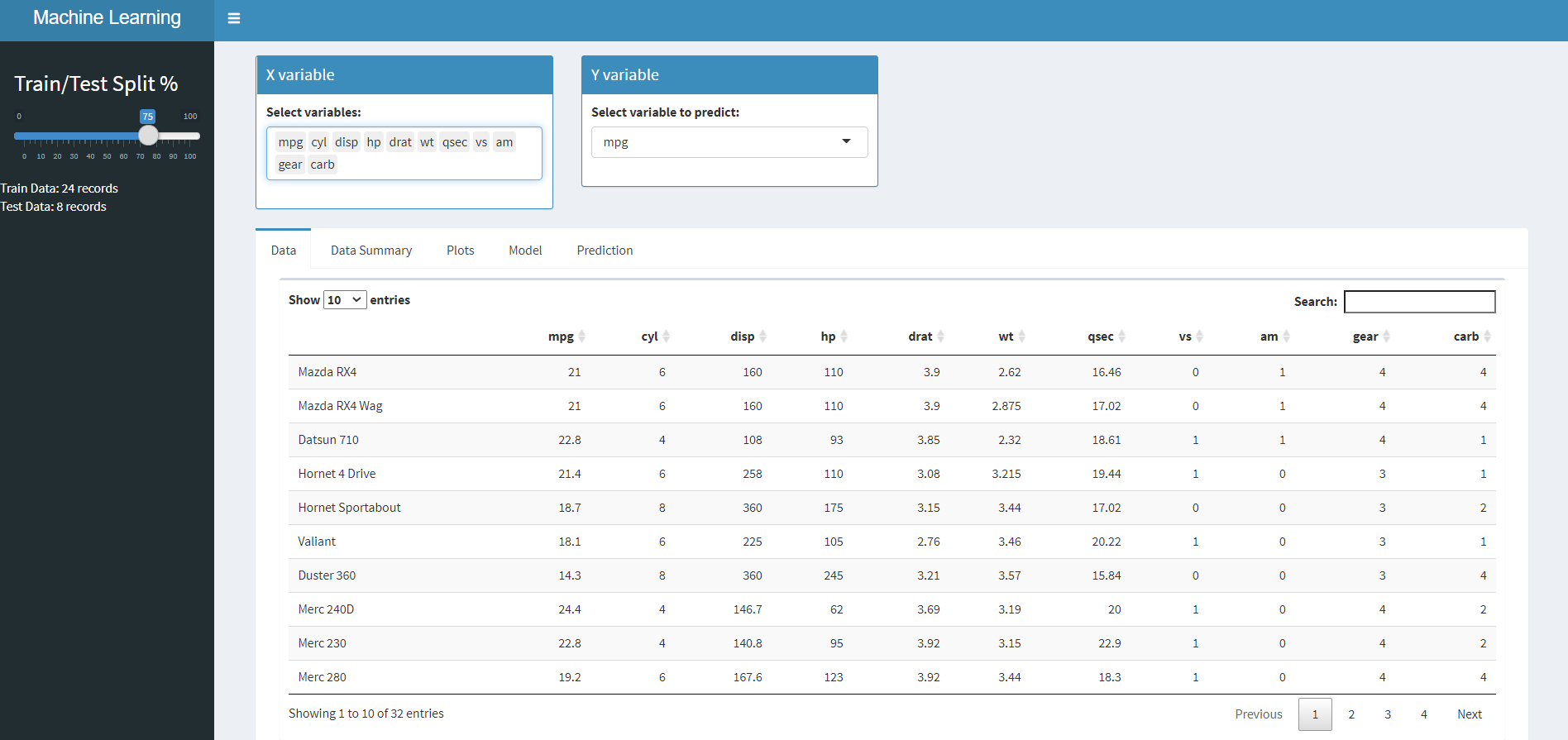
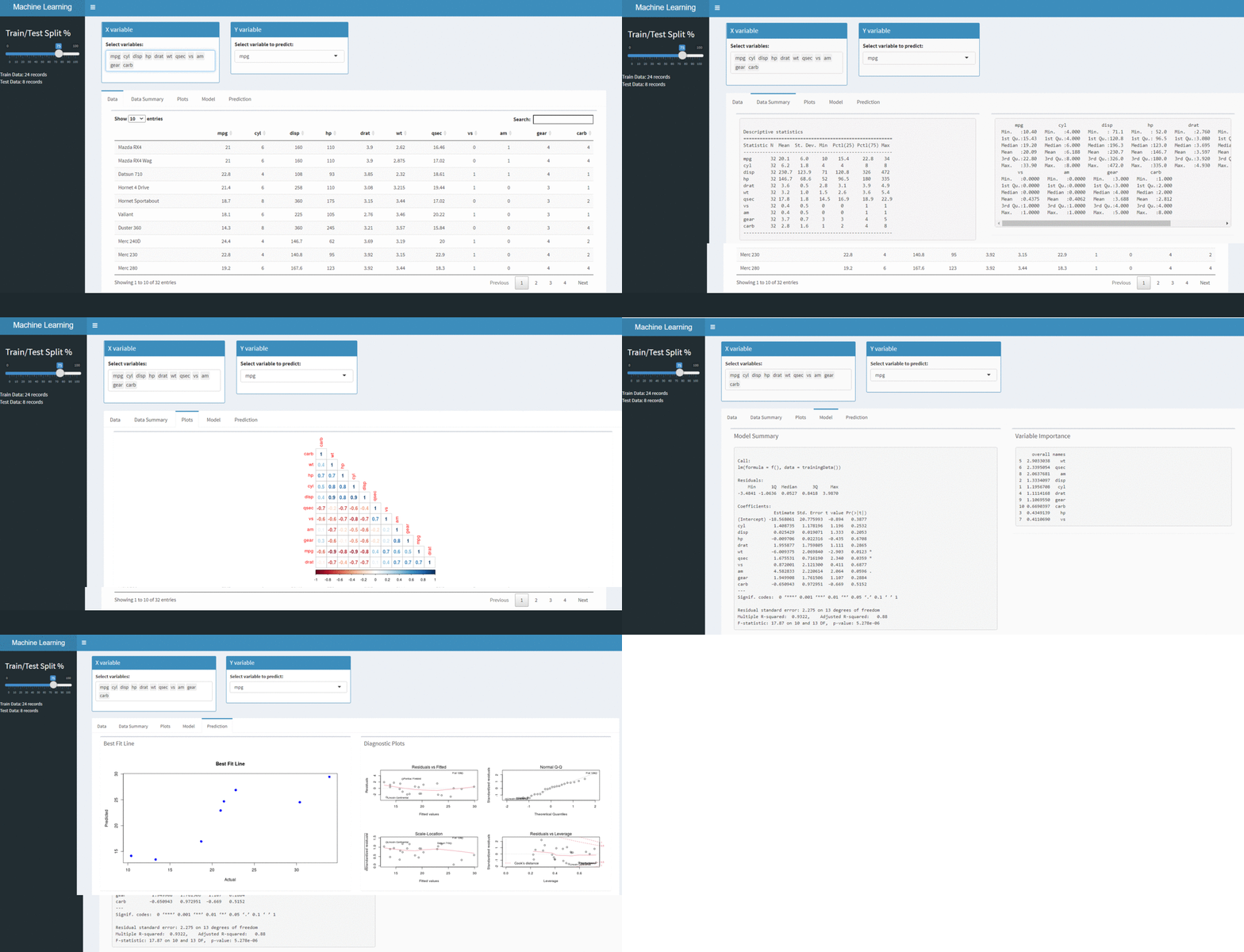
At the end of this article, we will build the below Application. Please note the various tabs on the home page.
Getting Started:
We will be using mtcars dataset for this application. Once we test and ensure the UI and server functionalities are working as expected, we can change the data set and the app should work just as fine with minimal data processing if required.
First, let’s install the shiny and load it. The Shiny app has mainly two files one each of UI and Server:
install.packages("shiny")
library("shiny")
User interface (UI):
This is where you define your layout — place holders which will be populated at the runtime from processed data/plot from the server.
Server:
This is where you write most of your logic, data wrangling, plotting, etc. Most heavy lifting is done here.
Let’s add the two dropdown fields one for independent variables and the other for selecting target
  dashboardBody(
    fluidPage(
    box(
      selectInput(
        "SelectX",
        label = "Select variables:",
        choices = names(mtcars),
        multiple = TRUE,
        selected = names(mtcars)
      ),
      solidHeader = TRUE,
      width = "3",
      status = "primary",
      title = "X variable"
    ),
    box(
      selectInput("SelectY", label = "Select variable to predict:", choices = names(mtcars)),
      solidHeader = TRUE,
      width = "3",
      status = "primary",
      title = "Y variable"
    )
Next, we will add a slider control on the side panel for splitting dataset in to train and test based on user selection
dashboardSidebar(
    sliderInput(
      "Slider1",
      label = h3("Train/Test Split %"),
      min = 0,
      max = 100,
      value = 75
    ),
    textOutput("cntTrain"),
    textOutput("cntTest"),
Now, we will create multiple tabs, each performing having specific functionality as detailed below:
Data – To view the raw data in the tabular form,
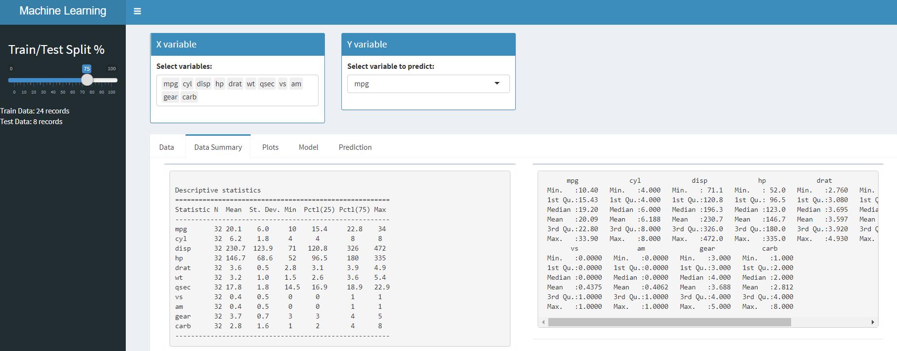
Data Summary – View the basic stats for our dataset.
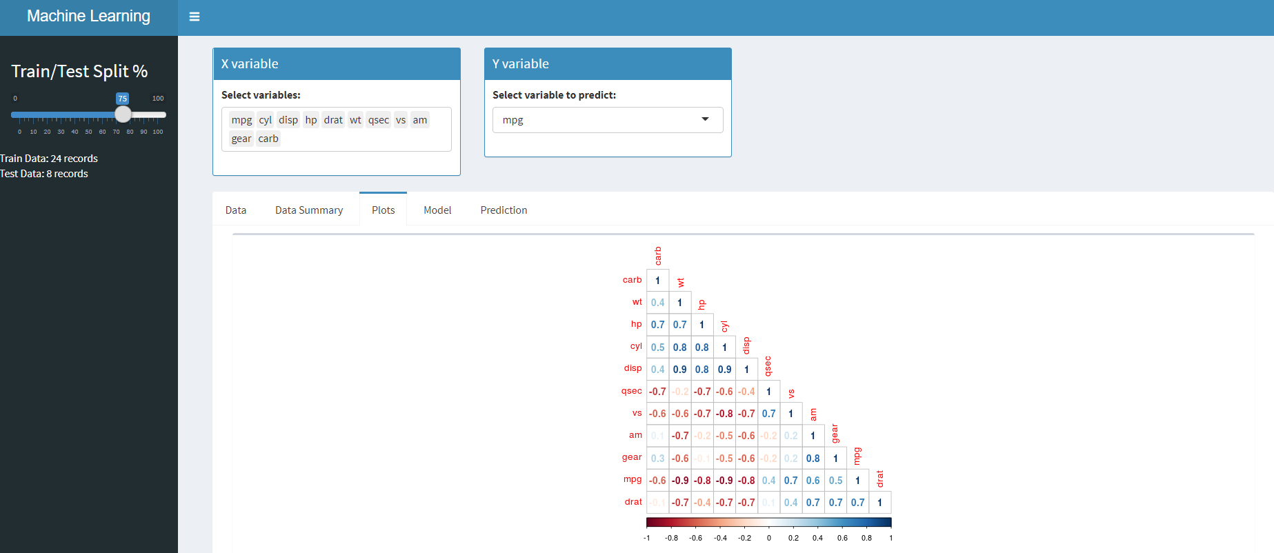
Plots – In this case, we will create only a correlation plot but more relevant plots can be added if required.
Model – Build Linear regression model based on user selection of X, Y variables and train/test splits
Prediction – Predict on the test set.
fluidPage(
      tabBox(
      id = "tabset1",
      height = "1000px",
      width = 12,
      tabPanel("Data",
               box(withSpinner(DTOutput(
                 "Data"
               )), width = 12)),
      tabPanel(
        "Data Summary",
        box(withSpinner(verbatimTextOutput("Summ")), width = 6),
        box(withSpinner(verbatimTextOutput("Summ_old")), width = 6)
      ),
      tabPanel("Plots",
               box(withSpinner(plotOutput(
                 "Corr"
               )), width = 12)),
      #box(withSpinner(verbatimTextOutput("CorrMatrix")), width = 12),
      tabPanel(
        "Model",
        box(
          withSpinner(verbatimTextOutput("Model")),
          width = 6,
          title = "Model Summary"
        ),
        box(
          withSpinner(verbatimTextOutput("ImpVar")),
          width = 5,
          title = "Variable Importance"
        )
      ),
      #textOutput("correlation_accuracy"),
      tabPanel(
        "Prediction",
        box(withSpinner(plotOutput("Prediction")), width = 6, title = "Best Fit Line"),
        box(withSpinner(plotOutput("residualPlots")), width = 6, title = "Diagnostic Plots")
      )
    )
Now that we have built our UI, we will proceed to implement the server logic to populate the UI based on user selection – interactivity.
Populating the Data tab: We use the mtcars dataframe and save it in an object by name InputDataset and then populate the UI using renderDT() function.
Please note the use of braces at the end of the object InputDataset(). This is done as it is a reactive object which means any changes to this object will have an impact on other places where it is referred to in the application.
 InputDataset <- reactive({
    mtcars
  })
 output$Data <- renderDT(InputDataset())
On similar lines, you can use summary() and correlation function to populate the data summary and correlation plot tab. You can access the server-side code from GitHub
Now that we have looked at how the data is populated, let’s build a linear regression model and also look at variable importance.
f <- reactive({
    as.formula(paste(input$SelectY, "~."))
})
Linear_Model <- reactive({
    lm(f(), data = trainingData())
  })
  output$Model <- renderPrint(summary(Linear_Model()))
  output$Model_new <-
    renderPrint(
      stargazer(
        Linear_Model(),
        type = "text",
        title = "Model Results",
        digits = 1,
        out = "table1.txt"
      )
    )
 tmpImp <- reactive({
    #varImp(Linear_Model())
    imp <- as.data.frame(varImp(Linear_Model()))
    imp <- data.frame(overall = imp$Overall,
                      names   = rownames(imp))
    imp[order(imp$overall, decreasing = T),]
  })
  output$ImpVar <- renderPrint(tmpImp())
Let’s implement the logic for the prediction tab where we will use our model from the previous section to predict on the test data set and also generate residual plots.
  actuals_preds <-
    reactive({
      data.frame(cbind(actuals = tmp(), predicted = price_predict()))
    })
  Fit <-
    reactive({
      (
        plot(
          actuals_preds()$actuals,
          actuals_preds()$predicted,
          pch = 16,
          cex = 1.3,
          col = "blue",
          main = "Best Fit Line",
          xlab = "Actual",
          ylab = "Predicted"
        )
      )
    })
  output$Prediction <- renderPlot(Fit())
  output$residualPlots <- renderPlot({
    par(mfrow = c(2, 2)) # Change the panel layout to 2 x 2
    plot(Linear_Model())
    par(mfrow = c(1, 1)) # Change back to 1 x 1
  })
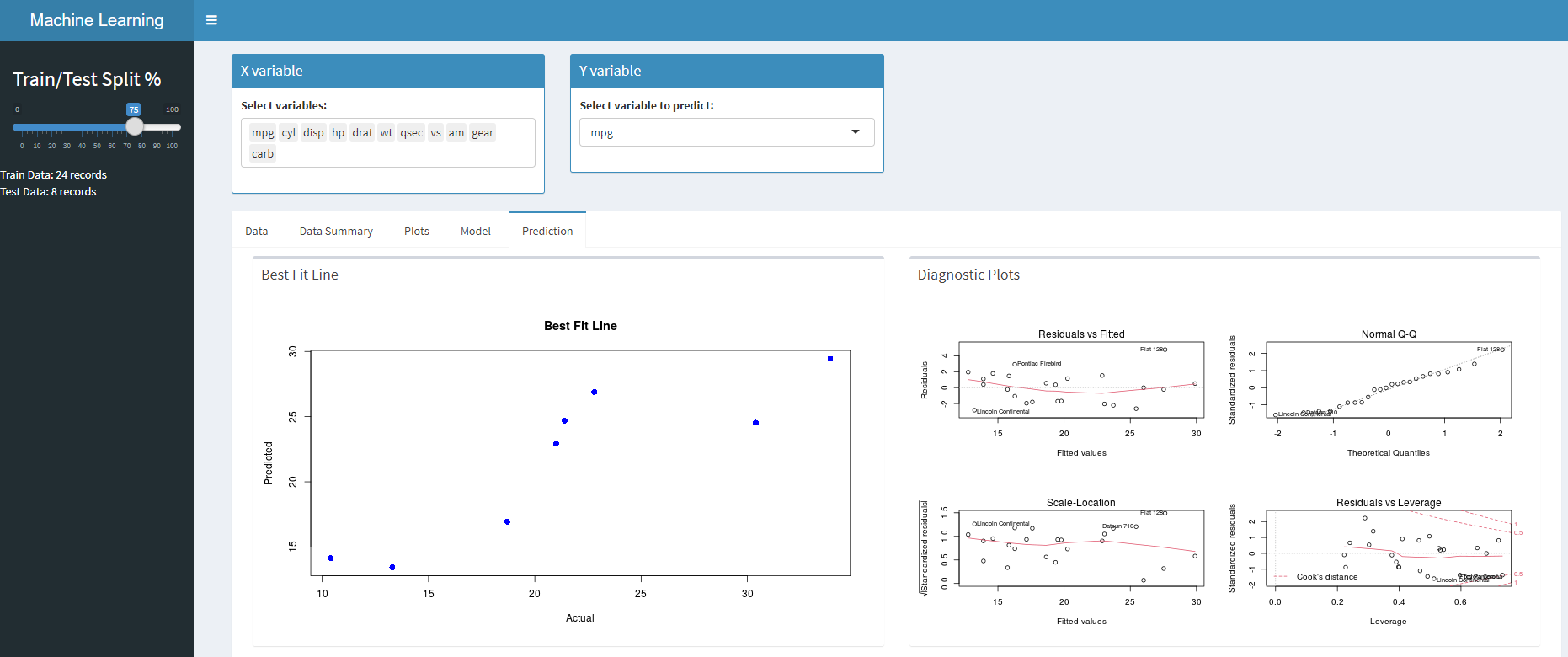
You can access the entire code from GitHub. Once you run your application, you will see the homepage loaded. You can navigate to various sections, make changes to variables, build models and also predict on test on the fly by following the below steps.

Step1:
Select the preferred train/test data split on the left panel.
Step2:
Select the X and Y variables from the dropdowns
Step3:
Navigate to respective tabs to view the result:
Conclusion:
The objective of the blog was to build a data application using R Shiny. This was a very basic implementation with all the built-in controls.
Just to make it a little more interesting, I chose to bring a model building aspect to the app to show how model-driven apps can be built in a short time.
Along with Shiny elements, you can use HTML elements to stylize your content in your application.
Happy learnings !!!!
You can connect with me – Linkedin
You can find the code for reference – Github
References
https://shiny.rstudio.com/tutorial/
https://unsplash.com/
The media shown in this article are not owned by Analytics Vidhya and is used at the Author’s discretion.


