Overview
- Introduction
- Dataprep introduction
- Installation
- Dataset for EDA
- Loading dataset
- Creating visualizations
- Endnote
Introduction
“Data are just summaries of thousands of stories – tell a few of those stories to help make the data meaningful.
Hello, we all know that because of new computing technologies, the data science community is developed as compared to the past or we can say that machine learning is the need of today’s world, and performing machine learning algorithms we needed a huge amount of data. The iterative aspect of machine learning is important because as models are exposed to new data, they can independently adapt. Like humans, machine learning algorithms also automatically learn from mistakes. It’s a science that’s not new – but one that has gained fresh momentum.

If you are belonging to the field of machine learning then you hear the word EDA which means Exploratory Data Analysis. Let us discuss a brief on exploratory data analysis then we move forward, EDA is a subset of machine learning, where it is an approach for the data analysis that employs a variety of techniques to maximize insight into a data set and graphically performing numerous amounts of operation.

In any machine learning project life cycle, you know that the first step is Exploratory Data Analysis. We perform EDA on our dataset then calculate the fundamental calculation from the data using graphs and plots. Mostly, we use python language for coding scripts of machine learning and there is a huge number of libraries available for performing exploratory data analysis, some of the most used libraries are matplotlib, pyplot, bokeh, seaborn, etc… but these libraries are having lots of fundamental functions which we can’t remember at the time of scriptwriting, and when we execute their codes then it will take lots of time to show output.
What we will do for reducing this time? It is such a big issue regarding this. Don’t worry! Python is updating day by day, A group of data scientist has developed a beautiful library which reduces the amount of time we investing in exploratory data analysis.
Today we are going to discuss this python library which is called DataPrep.

DataPrep Introduction
As the name suggests DataPrep, the preparation of data. The DataPrep is developed by a group of SFU data science researchers to speed up data science operations. it helps us to simplify the EDA operations in little bit lines of code it means that we don’t need to write lots of stuff code apart from that we only need to write one or two lines of code and EDA will perform.

This DataPrep library helps us to do two main important tasks one is it collects data from a common data source and second is we can able to perform exploratory data analysis easily. We need to use dataprep.eda module to perform EDA operations. if you don’t know what the dataprep.eda is? it is the fastest and easiest EDA performing library, it allows to understand dataframe in few lines of code.
Now, for performing Exploratory Data Analysis in any dataset first of all we have to install this library. let’s see below:
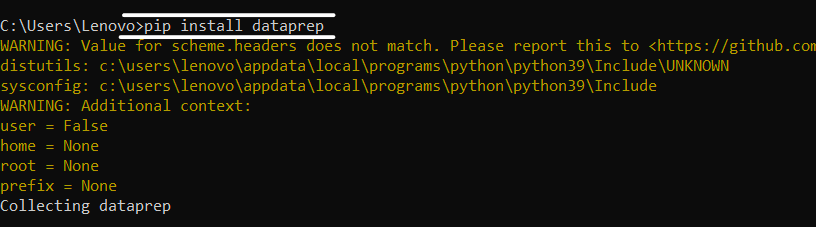
Installation
For installation of this library we need to open a command prompt or windows power shell then execute the following code:
pip install dataprep
After installation of this library now we start our EDA operations using DataPrep
Dataset For EDA
Now, we take a wine quality dataset to perform exploratory data analysis, you can download the dataset from here. If you want to use another dataset for EDA then you will.
Now after downloading the dataset we have to import a library for loading this dataset.
Loading dataset
# for loading dataset
from dataprep.datasets import load_dataset
# importing function from DataPrep.eda
from dataprep.eda import create_report
# loading dataset
df = load_dataset("")
df
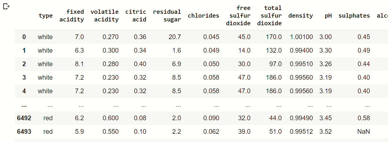
Here we use dataprep. datasets function load_dataset for loading our dataset, then we load our iris flower dataset as you can see in the output image.
Creating Visualizations
For creating visualization using DataPrep, above ve import one important function from dataprep.eda module which is create_report. This function helps us to create the whole visualization using one single line of code.
create_report(df)
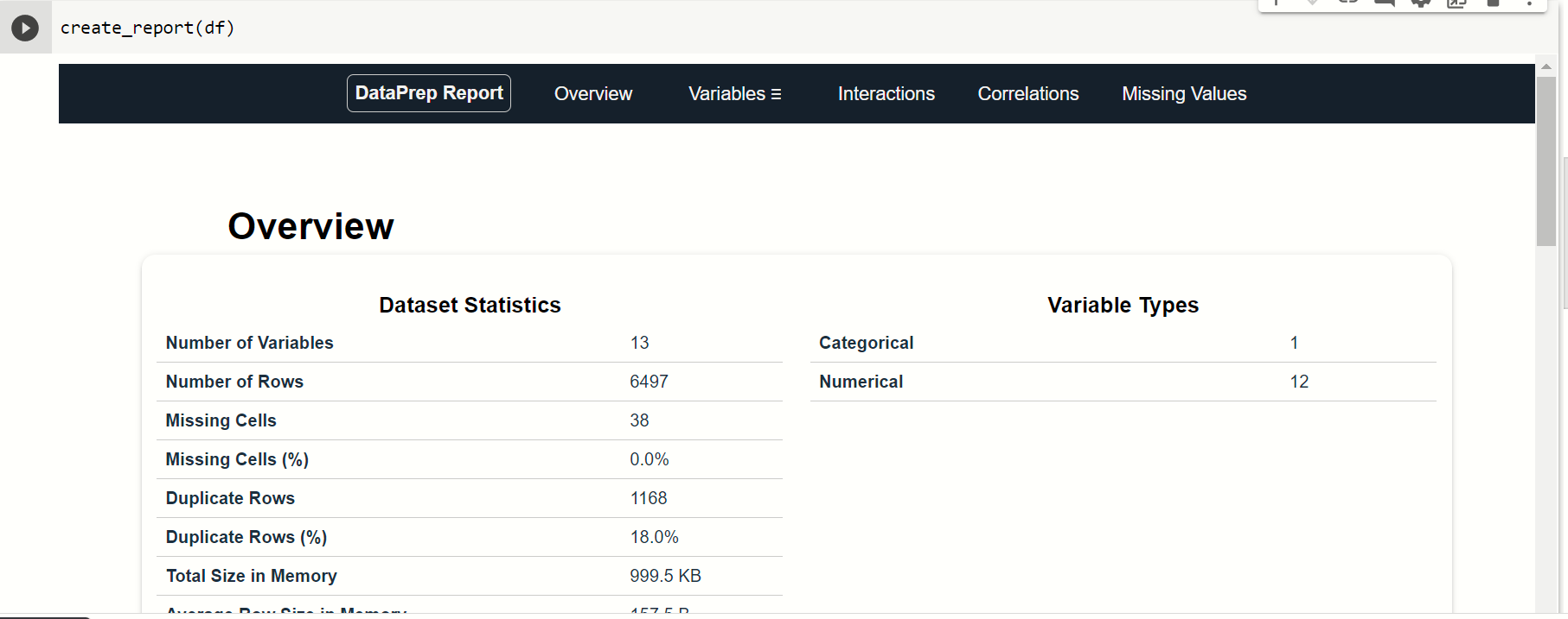
When you execute this command, then you find that this page is displayed in the output. In this output, there are many options on the top you can see that by these options you can take observation of various types of features.
Let us check all of them:
1. Overview
In this option you see the overview of our dataset:
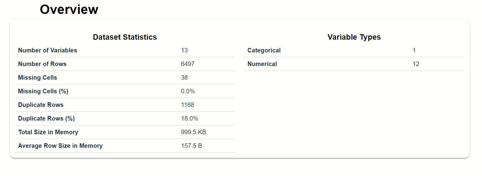
As you can see that there is a full overview of our wine quality dataset is displayed. Right-hand side there is something brief introduction of our dataset.
2. Variables
If you click over the variable option then, you find that there is the full information on every feature is displayed with the bar graph. Here you can get detailed info about what the specific features are and what does it impact the model accuracy. Let’s take an example of any feature and observe the different plots and graphs into this:
We take the observation from the total sulfur dioxide which is a numerical feature,
total sulfur dioxide:-
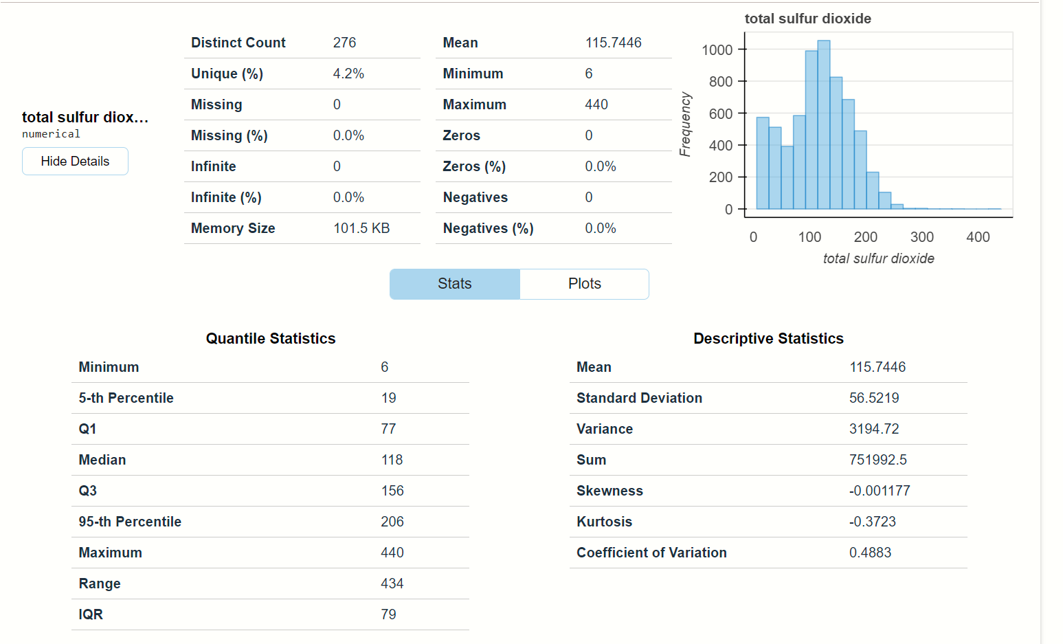
This is the full observation of the feature total sulfur dioxide. Here you will find that
- at the top there are some numerical calculations along with one histogram plot and
- at the bottom, there is two statistics description of the data points, you will find mean, median, variance and other statistical calculation.
When you click on the Plots option beside Stats, then you find the various plots that are based on total sulfur dioxide.
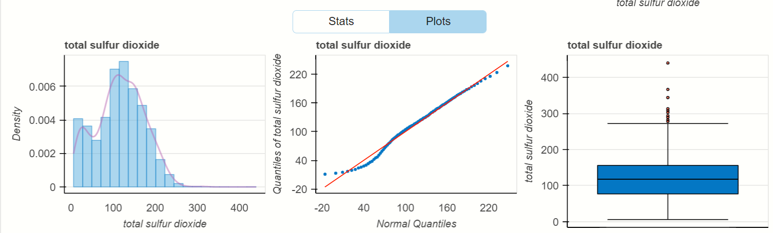
See there is density distribution of the total sulfur dioxide and the visualization of quantity that is present in wine. In last, there is a box plot that finds the outlier that is present inside the feature’s data points.
Let’s take any categorical variable from the dataset:
type feature:-
‘type’ is the categorical column present in the dataset, it defines the types of wine (Red or White).
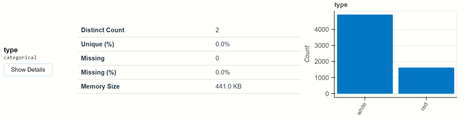
You can see that how the bar plot is beautifully plotted the categorical values. and when you click on show detail below type, then you find Stats and Plots see below:
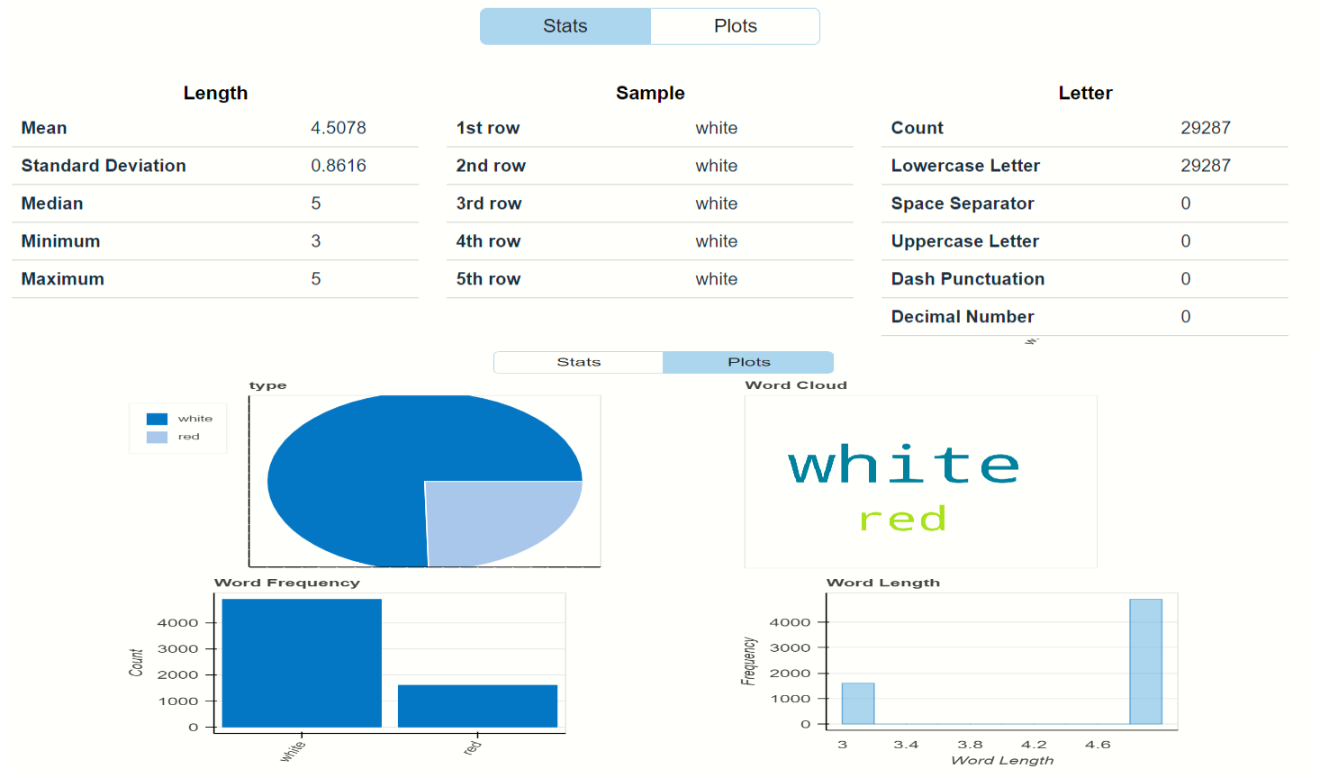
In states observe that there are observations of length, sample, and letter and in plots, you observe the visualization using pie charts, histograms, etc…
Interactions
In this option, you can find that the relationship between any two features where the x-axis is belonging to one feature and the y-axis belonging to another.
let’s see the interactions between the fixed acidity and other features:
fixed acidity and citric acid:-
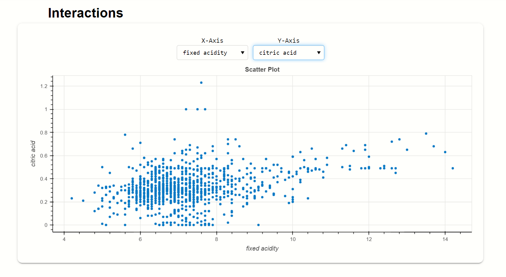
Here, this scatters plot shows the relationship between fixed acidity and citric acid, where citric acid is on the y-axis and the fixed acidity is on the x-axis.
fixed acidity and volatile acidity:-
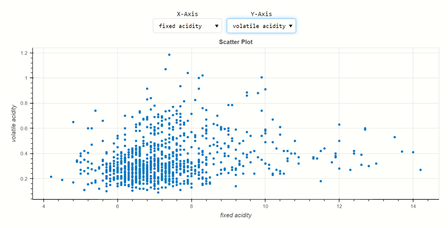
x-axis belongs to fixed acidity and y-axis belongs to volatile acidity, here the distribution of volatile acidity is quite over fixed acidity.
Correlations
Generally, there are correlated features that are present inside the dataset, one correlated feature impact the same on the accuracy that correlated other feature impacts. So, we have to find observe that correlation using EDA.
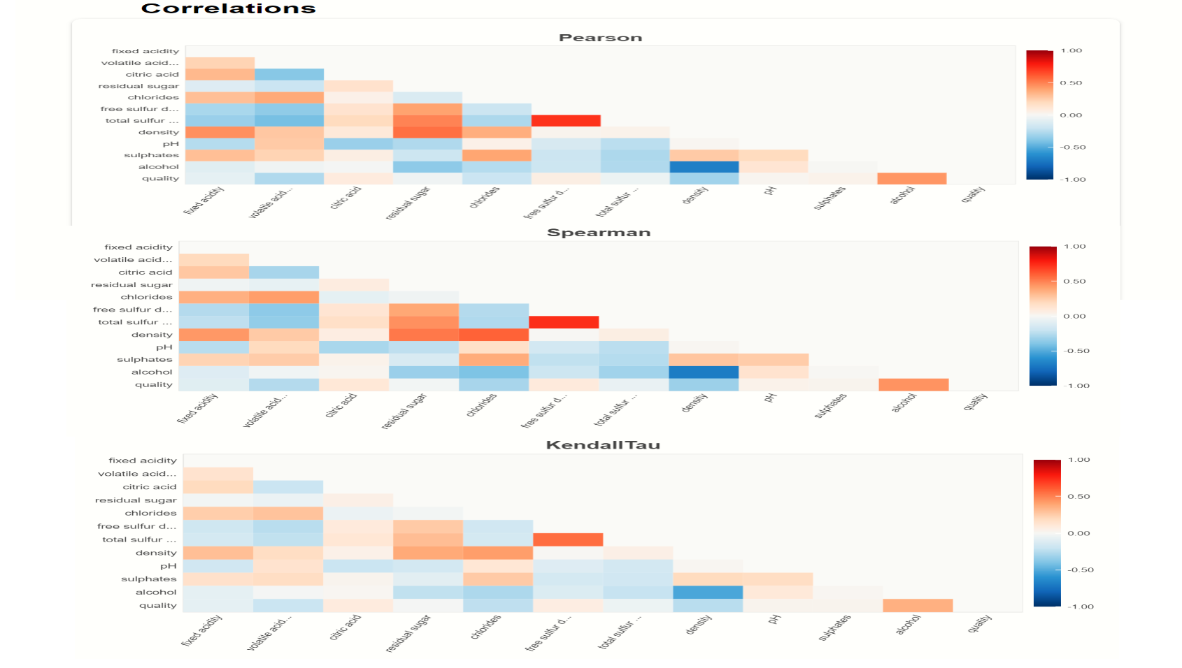
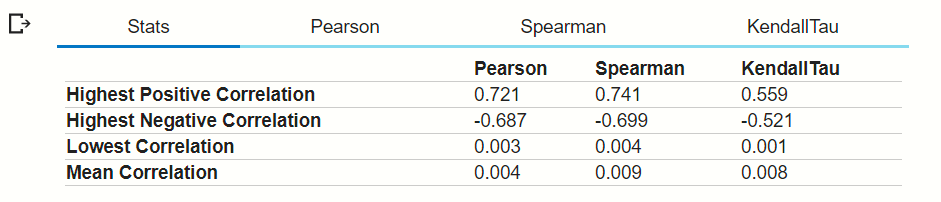
As you can see in the above output image that there are many types of correlation graphs present in this option like Pearson, Spearman, KendallTau, and others when you scroll down.
Another method to plot correlation is,
# importing module
from dataprep.eda import plot_correlation
# Correlation
plot_correlation(df)
then this type of output is displayed:
Here you can see that the types of correlation options present at the top. let’s see the Pearson correlation of dataframe-
Pearson correlation:-
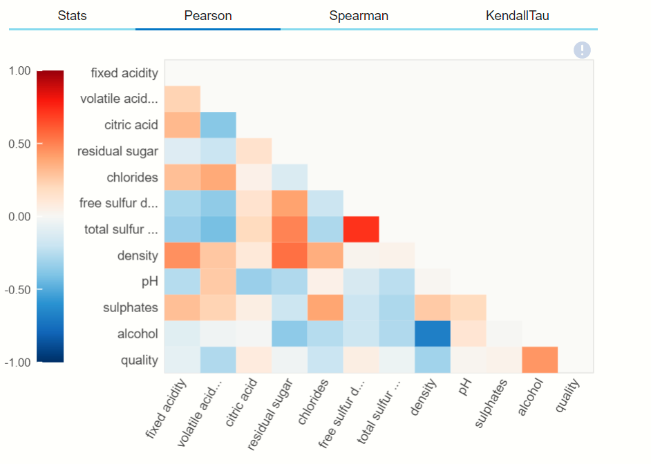
As you can also see the remaining two types of correlation graphically by clicking on their options.
Missing values
Finding the missing values from the dataset is quite difficult for any data scientist, so for that, we use EDA let’s see:
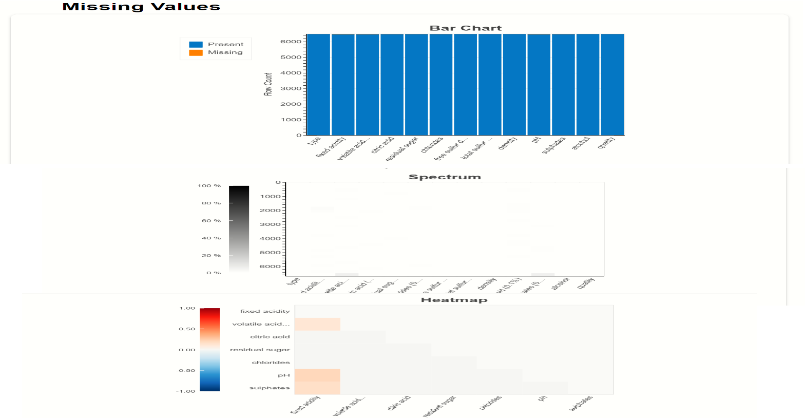
Here missing values are plot using BAR chart, using Spectrum graph, and using Heatmap on the top right-hand side you can see that there is a scale of missing values and present values. So, in this dataset, there are no null values or missing values so it will not show orange colour in the graphs.
There is another method inside the dataprep.eda module to find the missing values by using the above graphs and plots,
# importing module
from dataprep.eda import plot_missing
# Correlation
plot_missing(df)
when you execute this program then this will be displayed,
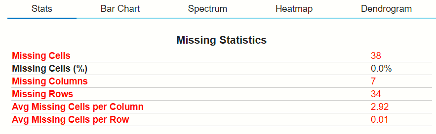
Here you can see the numbers of plotting options at the top, which will help in finding the count of missing data points by visualization. let’s choose the Spectrum option: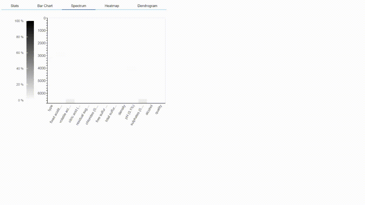
You can see that when the cursor pointing to the grey boxes in the plot it will show the missing value of 6%, which means the volatile acidity feature contains the 6% null values.
So, this is a detailed discussion on the Dataprep library.
Endnote
😎Would you enjoy it? I hope yes, this is the amazing python library that is helping a lot during performing exploratory data analysis in any machine learning project. This library is suggested by one of my connections on LinkedIn. My experience is amazing by using this library, So go and just EDA.
You can read my other articles:analyticsvidhya.com/blog/author/mayurbadole2407/
Connect with me on Linkedin: https://www.linkedin.com/in/mayur-badole-189221199
Thank You😉


