This article was published as a part of the Data Science Blogathon
In this blog, we will
Regression is a ‘Supervised machine learning’ algorithm used to predict continuous features.
Linear regression is the simplest regression algorithm that attempts to model the relationship between dependent variable and one or more independent variables by fitting a linear equation/best fit line to observed data.
Based on the number of input features, Linear regression could be of two types:
In Simple Linear Regression (SLR), we will have a single input variable based on which we predict the output variable. Where in Multiple Linear Regression (MLR), we predict the output based on multiple inputs.
Input variables can also be termed as Independent/predictor variables, and the output variable is called the dependent variable.
The equation for SLR is y=βo,+β1x+ϵ, where, Y is the dependent variable, X is the predictor, βo, β1 are coefficients/parameters of the model, and Epsilon(ϵ) is a random variable called Error Term.
OLS(Ordinary Least Squares), Gradient Descent are the two common algorithms to find the right coefficients for the minimum sum of squared errors.
Problem statement: Build a simple linear regression model to predict the Salary Hike using Years of Experience.
Start by Importing necessary libraries
necessary libraries are pandas, NumPy to work with data frames, matplotlib, seaborn for visualizations, and sklearn, statsmodels to build regression models.
import pandas as pd
import numpy as np
import matplotlib.pyplot as plt
%matplotlib inline
import seaborn as sns
from scipy import stats
from scipy.stats import probplot
import statsmodels.api as sm
import statsmodels.formula.api as smf
from sklearn import preprocessing
from sklearn.linear_model import LinearRegression
from sklearn.model_selection import train_test_split
from sklearn.metrics import mean_squared_error, r2_score
Once, we are done with importing libraries, we create a pandas dataframe from CSV file
df = pd.read_csv(“Salary_Data.csv”)
The basic steps of EDA are:
Our dataset has two columns: YearsExperience, Salary. And both are of float datatype. We have 30 records and no null-values or outliers in our dataset.
Graphical Univariate analysis
For univariate analysis, we have Histogram, density plot, boxplot or violinplot, and Normal Q-Q plot. They help us understand the distribution of the data points and the presence of outliers.
A violin plot is a method of plotting numeric data. It is similar to a box plot, with the addition of a rotated kernel density plot on each side.
Python Code:
# Histogram
# We can use either plt.hist or sns.histplot
plt.figure(figsize=(20,10))
plt.subplot(2,4,1)
plt.hist(df['YearsExperience'], density=False)
plt.title("Histogram of 'YearsExperience'")
plt.subplot(2,4,5)
plt.hist(df['Salary'], density=False)
plt.title("Histogram of 'Salary'")

# Density plot
plt.subplot(2,4,2)
sns.distplot(df['YearsExperience'], kde=True)
plt.title("Density distribution of 'YearsExperience'")
plt.subplot(2,4,6)
sns.distplot(df['Salary'], kde=True)
plt.title("Density distribution of 'Salary'")

# boxplot or violin plot
# A violin plot is a method of plotting numeric data. It is similar to a box plot,
# with the addition of a rotated kernel density plot on each side
plt.subplot(2,4,3)
# plt.boxplot(df['YearsExperience'])
sns.violinplot(df['YearsExperience'])
# plt.title("Boxlpot of 'YearsExperience'")
plt.title("Violin plot of 'YearsExperience'")
plt.subplot(2,4,7)
# plt.boxplot(df['Salary'])
sns.violinplot(df['Salary'])
# plt.title("Boxlpot of 'Salary'")
plt.title("Violin plot of 'Salary'")

# Normal Q-Q plot
plt.subplot(2,4,4)
probplot(df['YearsExperience'], plot=plt)
plt.title("Q-Q plot of 'YearsExperience'")
plt.subplot(2,4,8)
probplot(df['Salary'], plot=plt)
plt.title("Q-Q plot of 'Salary'")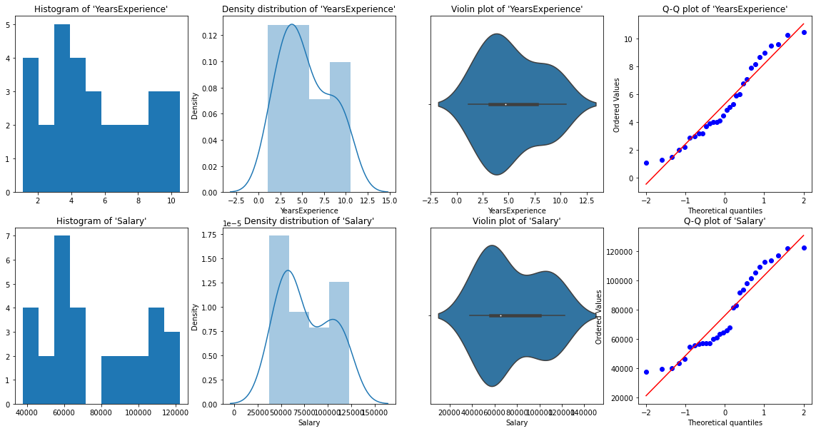
From the above graphical representations, we can say there are no outliers in our data, and YearsExperience looks like normally distributed, and Salary doesn't look normal. We can verify this using Shapiro Test.
Python Code:
# Def a function to run Shapiro test

# Defining our Null, Alternate Hypothesis
Ho = 'Data is Normal'
Ha = 'Data is not Normal'

# Defining a significance value
alpha = 0.05
def normality_check(df):
    for columnName, columnData in df.iteritems():
        print("Shapiro test for {columnName}".format(columnName=columnName))
        res = stats.shapiro(columnData)
#         print(res)
        pValue = round(res[1], 2)

        # Writing condition
        if pValue > alpha:
            print("pvalue = {pValue} > {alpha}. We fail to reject Null Hypothesis. {Ho}".format(pValue=pValue, alpha=alpha, Ho=Ho))
        else:
            print("pvalue = {pValue} <= {alpha}. We reject Null Hypothesis. {Ha}".format(pValue=pValue, alpha=alpha, Ha=Ha))


# Drive code
normality_check(df)
Our instinct from the graphs was correct. YearsExperience is normally distributed, and Salary isn’t normally distributed.
Bivariate visualization
for Numerical vs. Numerical data, we can plot the below graphs
# Scatterplot & Line plots
plt.figure(figsize=(20,10))
plt.subplot(1,3,1)
sns.scatterplot(data=df, x="YearsExperience", y="Salary", hue="YearsExperience", alpha=0.6)
plt.title("Scatter plot")
plt.subplot(1,3,2)
sns.lineplot(data=df, x="YearsExperience", y="Salary")
plt.title("Line plot of YearsExperience, Salary")
plt.subplot(1,3,3)
sns.lineplot(data=df)
plt.title('Line Plot')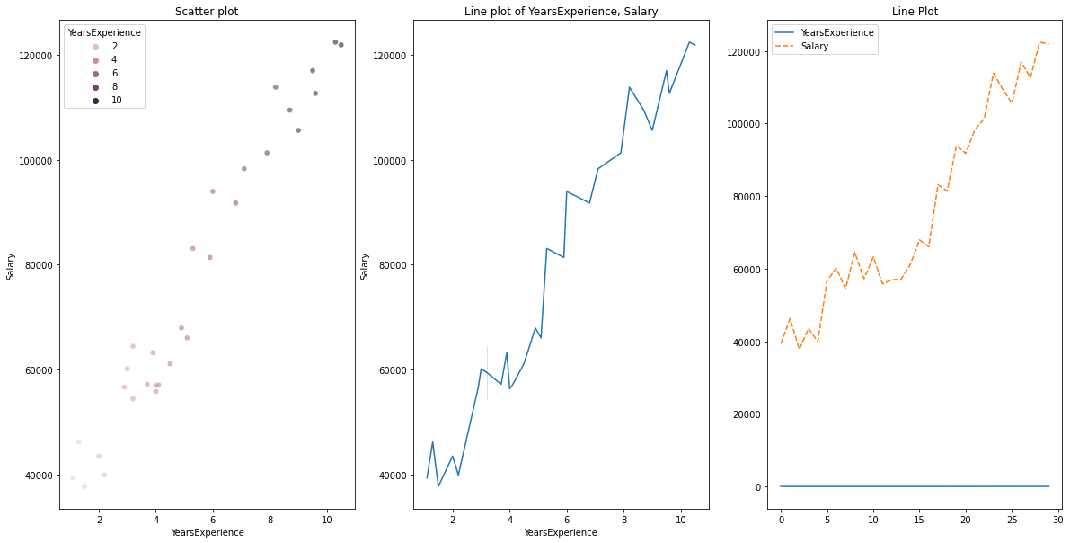
# heatmap
plt.figure(figsize=(10, 10))
plt.subplot(1, 2, 1)
sns.heatmap(data=df, cmap="YlGnBu", annot = True)
plt.title("Heatmap using seaborn")
plt.subplot(1, 2, 2)
plt.imshow(df, cmap ="YlGnBu")
plt.title("Heatmap using matplotlib")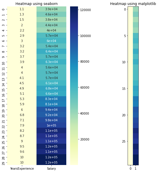
# Joint plot
sns.jointplot(x = "YearsExperience", y = "Salary", kind = "reg", data = df)
plt.title("Joint plot using sns")
# kind can be hex, kde, scatter, reg, hist. When kind='reg' it shows the best fit line.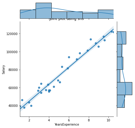
Check if there is any correlation between the variables using df.corr()
print("Correlation: "+ 'n', df.corr()) # 0.978 which is high positive correlation
# Draw a heatmap for correlation matrix
plt.subplot(1,1,1)
sns.heatmap(df.corr(), annot=True)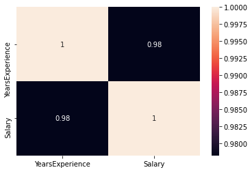
correlation =0.98, which is a high positive correlation. This means the dependent variable increases as the independent variable increases.
As we can see, there is a huge difference between the values of YearsExperience, Salary columns. We can use Normalization to change the values of numeric columns in the dataset to use a common scale, without distorting differences in the ranges of values or losing information.
We use sklearn.preprocessing.Normalize to normalize our data. It returns values between 0 and 1.
# Create new columns for the normalized values
df['Norm_YearsExp'] = preprocessing.normalize(df[['YearsExperience']], axis=0)
df['Norm_Salary'] = preprocessing.normalize(df[['Salary']], axis=0)
df.head()LinearRegression(): LinearRegression fits a linear model with coefficients β = (β1, …, βp) to minimize the residual sum of squares between the observed targets in the dataset, and the targets predicted by the linear approximation.
def regression(df):
# defining the independent and dependent features
x = df.iloc[:, 1:2]
y = df.iloc[:, 0:1]
# print(x,y)
# Instantiating the LinearRegression object
regressor = LinearRegression()
# Training the model
regressor.fit(x,y)
# Checking the coefficients for the prediction of each of the predictor
print('n'+"Coeff of the predictor: ",regressor.coef_)
# Checking the intercept
print("Intercept: ",regressor.intercept_)
# Predicting the output
y_pred = regressor.predict(x)
# print(y_pred)
# Checking the MSE
print("Mean squared error(MSE): %.2f" % mean_squared_error(y, y_pred))
# Checking the R2 value
print("Coefficient of determination: %.3f" % r2_score(y, y_pred)) # Evaluates the performance of the model # says much percentage of data points are falling on the best fit line
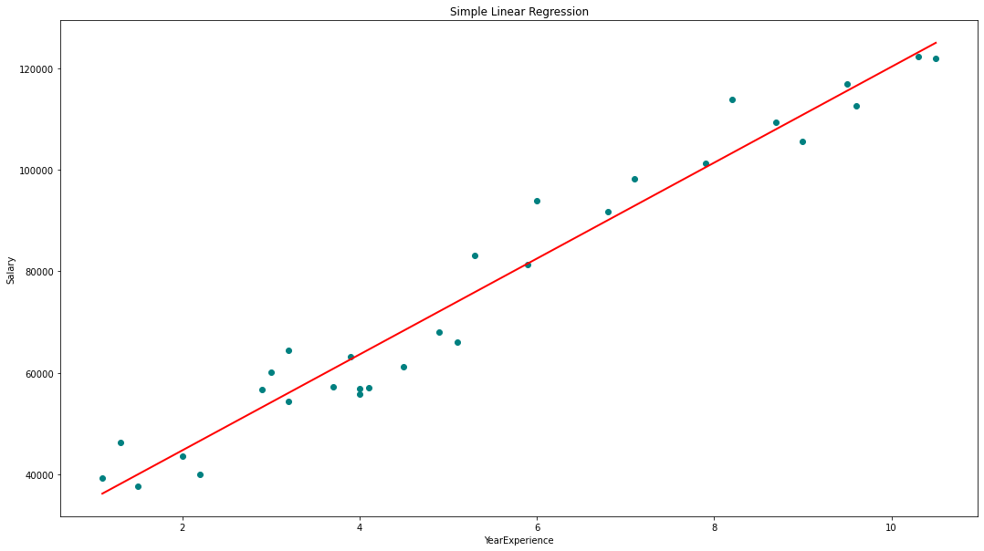
# visualizing the results.
plt.figure(figsize=(18, 10))
# Scatter plot of input and output values
plt.scatter(x, y, color='teal')
# plot of the input and predicted output values
plt.plot(x, regressor.predict(x), color='Red', linewidth=2 )
plt.title('Simple Linear Regression')
plt.xlabel('YearExperience')
plt.ylabel('Salary')
# Driver code
regression(df[['Salary', 'YearsExperience']]) # 0.957 accuracy
regression(df[['Norm_Salary', 'Norm_YearsExp']]) # 0.957 accuracyWe achieved 95.7% accuracy using scikit-learn but there is not much scope to understand the in-depth insights about the relevance of features from this model. So let’s build a model using statsmodels.api, statsmodels.formula.api
The predictors in the statsmodels.formula.api must be enumerated individually. And in this method, a constant is automatically added to the data.
def smf_ols(df):
    # defining the independent and dependent features
    x = df.iloc[:, 1:2]
    y = df.iloc[:, 0:1]
#     print(x)
    # train the model
    model = smf.ols('y~x', data=df).fit()
    # print model summary
    print(model.summary())

    # Predict y
    y_pred = model.predict(x)
#     print(type(y), type(y_pred))
#     print(y, y_pred)

    y_lst = y.Salary.values.tolist()
#     y_lst = y.iloc[:, -1:].values.tolist()
    y_pred_lst = y_pred.tolist()

#     print(y_lst)

    data = [y_lst, y_pred_lst]
#     print(data)
    res = pd.DataFrame({'Actuals':data[0], 'Predicted':data[1]})
#     print(res)

    plt.scatter(x=res['Actuals'], y=res['Predicted'])
    plt.ylabel('Predicted')
    plt.xlabel('Actuals')

    res.plot(kind='bar',figsize=(10,6))

# Driver code
smf_ols(df[['Salary', 'YearsExperience']]) # 0.957 accuracy
# smf_ols(df[['Norm_Salary', 'Norm_YearsExp']]) # 0.957 accuracy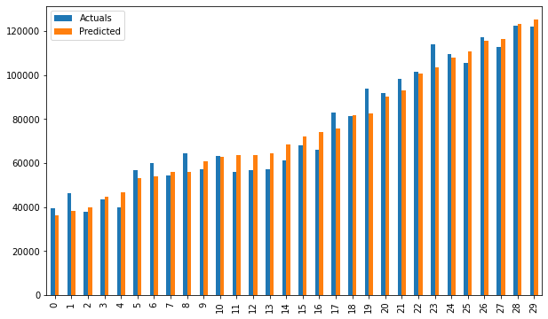
Bar plot of Actuals vs predicted values
The predictors are no longer have to be enumerated individually.
statsmodels.regression.linear_model.OLS(endog, exog)
endog is the dependent variableexog is the independent variable. An intercept is not included by default and should be added by the user(using add_constant).# Create a helper function
def OLS_model(df):
# defining the independent and dependent features
x = df.iloc[:, 1:2]
y = df.iloc[:, 0:1]
# Add a constant term to the predictor
x = sm.add_constant(x)
# print(x)
model = sm.OLS(y, x)
# Train the model
results = model.fit()
# print('n'+"Confidence interval:"+'n', results.conf_int(alpha=0.05, cols=None)) #Returns the confidence interval of the fitted parameters. The default alpha=0.05 returns a 95% confidence interval.
print('n'"Model parameters:"+'n',results.params)
# print the overall summary of the model result
print(results.summary())
# Driver code
OLS_model(df[['Salary', 'YearsExperience']]) # 0.957 accuracy
OLS_model(df[['Norm_Salary', 'Norm_YearsExp']]) # 0.957 accuracyWe achieved 95.7% accuracy which is pretty good 🙂
It’s always important to understand certain terms from the regression model summary table so that we get to know the performance of our model and the relevance of the input variables.
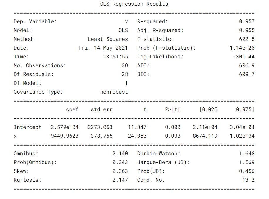
Some important parameters that should be considered are the R-squared value, Adj. R-squared value, F-statistic, prob(F-statistic), coef of intercept and input variables, p>|t|.
Well, now we know how to draw important inferences from the model summary table, so now let’s look at our model parameters and evaluate our model.
In our case, the R-squared value (0.957) is close to Adj. R-squared value (0.955) is a good sign that the input features are contributing to the predictor model.
F-statistic is a high number and p(F-statistic) is almost 0, which means our model is better than the only intercept model.
pvalue of t-test for input variable is less than 0.05, so there is a good relationship between the input and the output variable.
Hence, we conclude by saying our model is performing well ✔😊
In this blog, we learned the basics of Simple Linear Regression (SLR), building a linear model using different python libraries, and drawing inferences from the summary table of OLS statsmodels.
Interpreting the summary table from OLS statsmodel
Visualizations: Histogram, Density plot, violin plot, boxplot, Normal Q-Q plot, Scatterplot, lineplot, heatmap, jointplot
Check out the complete notebook from my GitHub repository.
Hoping this is an informative blog for beginners. Please upvote if you find this helpful 🙌 Feedback is highly appreciated. Happy Learning !! 😎
The media shown in this article are not owned by Analytics Vidhya and is used at the Author’s discretion.
Lorem ipsum dolor sit amet, consectetur adipiscing elit,


