This article was published as a part of the Data Science Blogathon
Like the evolution of humans, data visualization techniques have also been evolved with time. In recent times, better visualization techniques have been introduced than ever. Every day, people come up with their own invention of visualization with one ultimate GOAL: To improve the story behind the data. Advanced-Data Visualization techniques undoubtedly require more skills and effort, but the charts are always worth the effort. But thanks to the human brain, earlier what it used to take several lines of codes is now possible with the one-liner function call. This best explains our statement that data visualization techniques have been evolved with time.
This article will discuss one of the popular and powerful Data Visualization techniques widely used by organizations to describe the data and how to plot it in Python. As I said, plotting these plots is not a challenging task anymore. One must be aware of the library, functions, and arguments involved in the technique.

Lollipop Charts consist of a bar and the stick resembling the stick and sugar candy on its top respectively. The filled circles are placed at the top of bars which gives the resemblance of the sugary Lollipop. Lollipop Chart, like the Bar Chart, is used to compare the different classes of a category. Thus, this makes a great tool to visualize the comparison between the classes. But what makes it different from Bar Chart? First, it makes it easier to identify the values when we have a filled circle at the top. Second, when we have more classes, say more than 10, Bar Charts become cluttery and become difficult to read by end-users. While on the other hand, Lollipop Charts uses the Bars of slim width thus making a larger space for more classes. Again, like the Bar Charts, we can plot the Lollipops horizontally when the number of classes is high.
Lollipop Charts are also sued to display the rankings among the classes. For example, if we want to compare 20 different car models based on their fuel mileage. In similar scenarios, Lollipop Charts come in handy to do the task efficiently and provide minimal charts.

Image by fauxels from Pexels
Lollipop Charts can be plotted in Python efficiently using the Matplotlib library. Matplotlib library comes with a handy function .stem() which is meant to build Lollipop Charts. Let’s see how it works.
1. Importing the Libraries
import matplotlib.pyplot as plt
import numpy as np
2. Creating Random Data
x = ['A', 'B', 'C', 'D', 'E', 'F', 'G', 'H', 'I', 'J']
y = np.linspace(1, (np.log(0.2 * np.pi)), 10)
3. Plotting the Lollipop Chart
plt.stem(x, y, use_line_collection = True)
plt.show()
In plt.stem(), we have set argument use_line_collection to be True. This will add individual lines in the plot as LineCollection. If we don’t specify this argument, it will give an UserWarning and remind us to set the argument to True. This increases the performance of the Stem Plot.
4. Putting it all together
Python Code:
Basic Lollipop Chart (Source – PC)
Lollipop Charts can be improved by adding arguments to .stem() which increases the readability and data describing capabilities. Few improvisations that can be done are:
A. Adding Additional Arguments:
import matplotlib.pyplot as plt
import numpy as np
x = ['A', 'B', 'C', 'D', 'E', 'F', 'G', 'H', 'I', 'J']
y = np.linspace(1, (np.log(0.2 * np.pi)), 10)
plt.stem(x, y, markerfmt = 's', linefmt='--', basefmt = ':', use_line_collection=True)
plt.show()
On executing this code, we get:
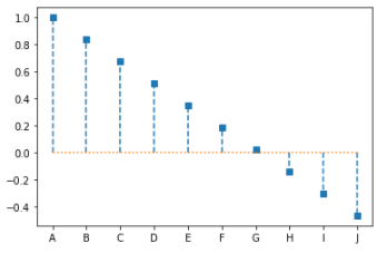
Lollipop Chart with Additional Arguments (Source – Personal Computer)
Here, we made three modifications:
A. Maker Format – We specified markerfmt = ‘s’, this replaced the filled circle of our Lollipop Chart to Square (s is referring to square)
B. Line Format – We specified linefmat = ‘–‘, this replaced the stem of our Lollipop Chart with a double-dashed line. (– is referring to double-dash)
C. Base Line Format – We specified basefmt = ‘:’, this replaced the baseline of our Lollipop Chart to the colon.
2. Sorting the Lollipop Chart
import matplotlib.pyplot as plt
import numpy as np
x = ['A', 'B', 'C', 'D', 'E', 'F', 'G', 'H', 'I', 'J']
y = list(np.linspace(1, (np.log(0.2 * np.pi)), 10))
y.sort()
plt.stem(x, y, markerfmt = 's', linefmt='--', basefmt = ':', use_line_collection=True)
plt.show()
On executing this code, we get:
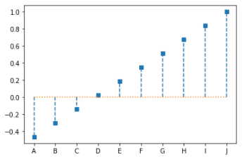
Sorted Lollipop Chart with Additional Arguments (Source – Personal Computer)
Remember, that here we have hardcoded the X Labels. Thus the X labels are not associated with any values. And that is why on sorting values, the labels remain at the same place.
3. Plotting Horizontal Lollipop Chart
import matplotlib.pyplot as plt
import numpy as np
x = ['A', 'B', 'C', 'D', 'E', 'F', 'G', 'H', 'I', 'J']
y = list(np.linspace(1, (np.log(0.2 * np.pi)), 10))
y.sort()
my_range=range(1,len(x)+1)
plt.hlines(y=x, xmin = 0 , xmax = y, color='skyblue')
plt.plot(y, x, "o")
plt.show()
On executing this code, we get:
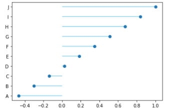
Horizontal Lollipop Chart (Source – Personal Computer)
Here, we used the .hlines() method to plot the horizontal sticks of the Lollipop Chart, and the sugar candy is plotted using the .plot() method specifying the marker as “o”.
Let’s compare the Bar Chart and Lollipop with an example to determine which fits well for our example. Here, we will plot the Subplots for Horizontal Bar Chart and Horizontal Lollipop Chart for comparing the figures side by side. We have generated random data using the NumPy library. On the Y-axis, we have used the range() function and converted each label to a string.
import matplotlib.pyplot as plt
import numpy as np
x = list(map(str, range(1, 35)))
y = list(np.random.random(34))
f, axs = plt.subplots(1,2,figsize=(12,6))
axs[0].barh(x,y)
axs[1].hlines(y=x, xmin = 0 , xmax = y, color='skyblue')
axs[1].plot(y, x, marker = "o", linewidth = 0)
plt.show()
On executing this code, we get:
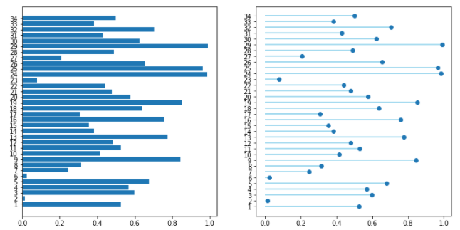
Comparing Horizontal Bar Chart and Horizontal Lollipop Chart (Source – Personal Computer)
Thus, reading the data is quite easier in Horizontal Lollipop Chart than in the Horizontal Bar Chart. One can easily rank the Values and compare the classes within. Also, more number of classes of a category can clutter the Axis of classes. Thus, one must not rely on one kind of plot for a problem. Plotting different Charts for a problem and selecting the best one is a wiser decision.
Note: Here we are using the .random() method of NumPy random. Every time we run the code, it will produce a different set of values. Thus, you will get different Plots every time we run the code.
In this article, we learned how to build a basic Lollipop Chart in Python. But the topic doesn’t end here. There is a huge number of modifications one can do to their lollipop charts. The one we learned above is the most basic modifications that can be done with fewer efforts. A lot of BI tools and programming languages today are capable of building Advanced Visualizations like Lollipop Charts. In fact, the .stem() method of matplotlib is inspired by the stem method of MATLAB. We can call the Lollipop Charts the special case of the Bar Chart. We also discussed, what mistakes one must avoid while building a Lollipop Chart. One can try building their own version of Lollipop Charts because one always learns by trying.
About the Author
Connect with me on LinkedIn Here.
Check out my other Articles Here
You can provide your valuable feedback to me on LinkedIn.
Thanks for giving your time!
The media shown in this article on Lollipop charts are not owned by Analytics Vidhya and are used at the Author’s discretion.
IT Engineering Graduate currently pursuing Post Graduate Diploma in Data Science.
Lorem ipsum dolor sit amet, consectetur adipiscing elit,


