This article was published as a part of the Data Science Blogathon
The DIstribution of data plays an important role in model building. By visualizing the data, one can create an inference of what type of distribution the data is representing. Since a lot of statistical tests require the data to be normally distributed, it’s always beneficial to work towards normally distributing the data. Distribution plots also help to identify and treat outliers. One can get a rough estimate of the spread of the data based on the distribution.
Python has several libraries and function to visualize the distribution of data. One of the widely used plots for plotting the distribution is Histogram. What if we want to visualize the distribution of each class of a categorical variable. In this article, we will learn how to plot a Ridgeline Plot.

Image by Lukas from Pexels
Ridgeline Plot or Joy Plot is a kind of chart that is used to visualize distributions of several groups of a category. Each category or group of a category produces a density curve overlapping with each other creating a beautiful piece of the plot. Joyplot got its name from the album cover Unknown Pleasue by Joy Division in 1979. Joy Plots are widely used in cases when we have a large number of classes or groups in a category. Wvwnhtugh, it may become cluttery but the plot as a whole becomes beautiful and meaningful at the same time. These plots have classes or groups at the y-axis while the numerical feature at the x-axis.
One of the popular use cases of the Ridgeline Chart is measuring the numerical variable with time. For example, we can measure the temperature for the last ten years. Here, it will create 10 horizontal liens for 10 classes and each class will plot a distribution of temperature throughout that year. This will help us gain insights about that year as well as analyzing the trend for the last 10 years. Interestingly, one may find the distribution of temperature has increased in comparison to the temperature we had 10 years ago.
In this article, we will build a Ridgeline Plot in Python using Python library joypy.
A Ridgeline Plot in Python can be built using several libraries including the mainstream Matplotlib and Plotly libraries. But plotting a Ridgeline Plot using joypy is pretty straightforward. Thus, we will continue with joypy for this article.
Install the Required Libraries
!pip install joypy
Importing the Libraries
import pandas as pd
from joypy import joyplot
import matplotlib.pyplot as plt
Reading the Dataset
df = pd.read_csv("Admission_Predict.csv")
Here we are taking the Dataset built for the prediction of Admission to Graduate Courses from given parameters specifically for Indian students. The dataset has been downloaded from Kaggle.
For this article, we will try to plot the Ridgeline Plot for University Rating based on CGPA.
print(df.info())
On getting the info, we found that this dataset has not categorical column. We want the University Rating for the plot. Thus, we will concert the University Rating values into str type.
df_new['University Rating'] = df_new['University Rating'].astype(str)
.joyplot() requires just one mandatory argument. But here, we will specify the ‘by’ and ‘col’ parameter as well.
Python Code:
We can create a quick interpretation that as we move from University Ratings 1 to 5, the distribution of the CGPA is also shifting towards the right. Thus, a higher rating University requires a higher CGPA. Also, few outliers are present in the data as we see the density curve is stretching ahead of the 10 CGPA mark and CGPA never exceeds the value of 10.
In the previous section, we plotted a basic Ridgeline Plot. But a plot of beautification can be done to this chart as well, thanks to the number of arguments .joyplot() accepts. Let’s see a few of them:
We can add the fade option to the Ridgeline Plot to visualize overlapping density curves more clearly and aesthetically. We can give a mono colour to all the density curves using colour or can give a colour map to the curves sing cmap. Let’s visualize the plot using these changes:
joyplot(df, by = 'University Rating', column = 'CGPA', color = 'Orange', fade = True)
plt.show()
On executing this code, we get:

Image Source – Personal Computer
Or, we can specify the colormap instead of color We can import the cm function from the matplotlib library:
from matplotlib import cm

joyplot(df, by = 'University Rating', column = 'CGPA', colormap=cm.autumn, fade = True)

plt.show()
On executing this code, we get:
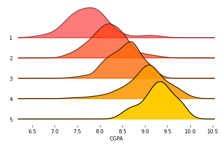
Image Source – Personal Computer
We can change the range_style to ‘own’ to make the y-axis visible for the width of the density curve only. Also, can set the figure size by passing a tuple of size values. Also, we can set the title to the Ridgeline Plot as an argument.
joyplot(df, by = 'University Rating', column = 'CGPA', colormap = cm.autumn, fade = True,

         range_style='own', figsize = (10,6))

plt.show()
On executing this code, we get:
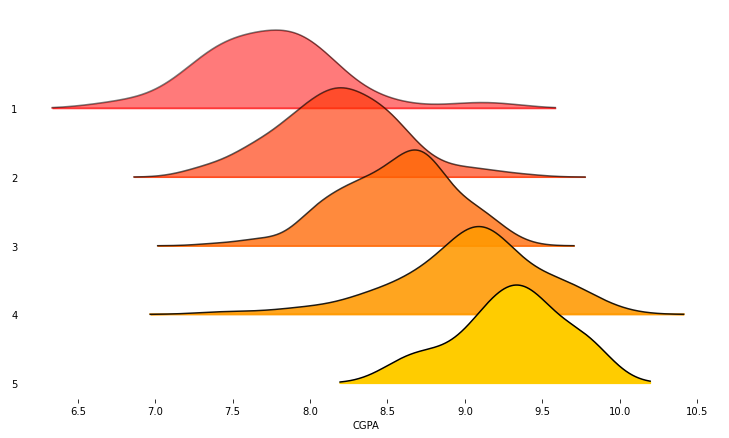
Image Source – Personal Computer
3. Adding title to Ridgeline Plot
joyplot(df, by = 'University Rating', column = 'CGPA', colormap = cm.autumn, fade = True,

         range_style='own', figsize = (10,6),

          title = 'Distribution of Student CGPA based on University Rating')

plt.show()
On executing this code, we get:
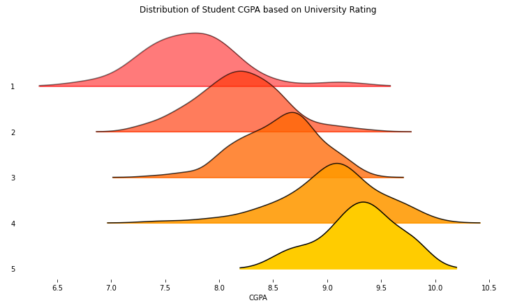
Image Source – Personal Computer
4. Plot Histogram instead of Density Curve
Instead of plotting a Density Curve on each axis of the Ridgeline Plot, we can plot a histogram.
joyplot(df, by = 'University Rating', column = 'CGPA', color = 'Orange', fade = True,
                range_style='own', figsize = (10,6), hist = True, overlap = 0,
                   title = 'Distribution of Student CGPA based on University Rating')
plt.show()
On executing this code, we get:
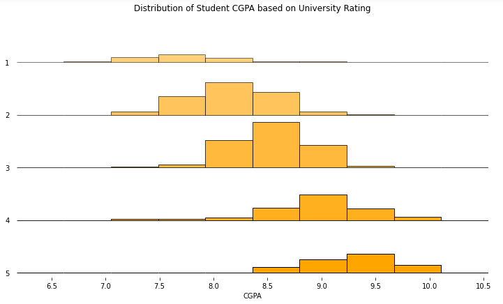
Image Source – Personal Computer
Here, we have plotted a histogram for each University Rating. Also, we have specified the overlap value to 0. This will keep the group axes separated from one another.
In this article, we learned about Ridgeline Plot, also known as Joy Plots, and how to plot them in Python. We also learnt how to beautify our plots to maximise the information gain. There several other variations of Ridgeline Plots that are possible with the use of parameters of .joyplot(). The data is not cleaned and one can identify outliers from the plot as few of the curves are crossing CGPA value 10 and CGPA cannot exceed 10. As mentioned, RIdgeline Plot can accommodate a huge number of groups of a categorical variable. Plotting a histogram instead of a density curve is not a popular option but it’s always good to know more. Ridgelines Plots are also possible to draw in other BI Tools such as Tableau or with other libraries such as Plotly. One can try plotting different Ridgelines on the same dataset using different Numerical Features or with different combinations of Categorical and numerical features.
Connect with me on LinkedIn Here.
Check out my other Articles Here
You can provide your valuable feedback to me on LinkedIn.
Thanks for giving your time!
IT Engineering Graduate currently pursuing Post Graduate Diploma in Data Science.
Lorem ipsum dolor sit amet, consectetur adipiscing elit,


