This article was published as a part of the Data Science Blogathon
Introduction
Sounds can become wrangled within the data science field through a traditional data table very often. This may become true in an educational setting or a professional research environment.
In this tutorial, well-known trigonometric concepts and codes blend to form a visualization to evaluate audio files. Librosa is one of several libraries dedicated to analyzing sounds. Many individuals have used this library for machine learning purposes. Here, different methods to visualize sounds can become seen through advanced algorithmic codes.
Goals
Step out of the ordinary methods of analyzing sounds by taking the audio file in its original form. Use trigonometric functions and Python libraries to analyze sounds instead of the transcribed tabularized version.
Prerequisites:
- Python 3.3+
(the tutorial uses 3.9). - Python operating inside Jupyter Notebook (this
will become helpful as graphics are more appealing and presentable with
this platform than a Python Shell). - Linux container – if Anaconda is not instead (the tutorial uses Kali Linux).
- Prior knowledge and skills on how-to-use Python computer language, and Jupyter Notebook can become beneficial to understand this tutorial.
- Prior knowledge and skills about Python data visualization libraries.
- Some math knowledge (especially trigonometry and how to read graphs).
- Some music knowledge (music notes and general music or sound units of measurement).
Visually sensitive readers please note that some contrasting ambiance factors could become visually strain.
Implementation
Let’s get started by selecting audio files. As a side note, DRM files are useable in this tutorial as well. Some associated libraries may become unsupported as time progresses, however, there are alternate libraries that Librosa can use instead in codes. Warning messages are usual when unsupported primary libraries become deprecated and cause a chain reaction to using alternate substitute libraries. Sin and cosine are the specific trigonometric functions mentioned in this tutorial.
Finding a song from a library can become simple for music fanatics of any genre. For this tutorial, an attempt at selecting a neutral song considering readers’ opinions and views. With that in mind, Seal’s “Kiss From a Rose” labeled “kissfromarose.m4a” and Justin Timberlake’s “Can’t Stop the Feeling (Original Song From DreamWorks Animation’s “Trolls”)” labeled “cantstopthefeeling.m4a” were both chosen and uploaded into Jupyter Notebook to exclude explicit lyrics from the analysis.
Once Librosa, matplotlib, NumPy, math libraries can become successfully installed into the platform, codes as shown below can become useable.
For readers to test if a trigonometric function is workable on Python Jupyter Notebook. Please see the basic code shown below.
What is happening in this image above can become understandable by referring to a specific trigonometric function called Sin or Sine. Most
of the public population may have learned this concept. If not, readers can find an understanding of this concept from the following link. As
shown in the code above the image, the NumPy version of Pi or otherwise known
as ~3.14 is a choice linked to the line spacing function. The reason for selecting Sin or Sine is to shape the curved sound wave. Based on the graph shown above, all associated labels shown with the graph are according
to graph requirements.
Readers can find this initial code from Librosa documentation.
import librosa
import numpy as np
y, sr = librosa.load("cantstopthefeeling.m4a")
D = librosa.stft(y)
What does “stft” mean in the code?
Stft is a short form for Short-Time Fourier Transform. As mentioned in Librosa official documentation, “The STFT represents a signal in the time-frequency domain by computing discrete Fourier transforms (DFT) over short overlapping windows” (Librosa Development Team, 2021)
This warning message is to inform readers that a substitute library can become the primary alternative may appear in this way:

The reader should understand that this warning message is a usual encounter, and it is acceptable to continue to code afterward.
s = np.abs(librosa.stft(y)**2) # Get magnitude of stft
chroma = librosa.feature.chroma_stft(S=s, sr=sr)
What does “Chroma” mean?
Chroma is a type of transformation of sounds into numerical values. The majority of the time, Chroma can become a vector data type. A synopsis of Chroma history includes the process of feature extraction and can
become a vital part of data engineering. According to documentation, Chroma is a 12-element vector that measures energy from the sound pitch.
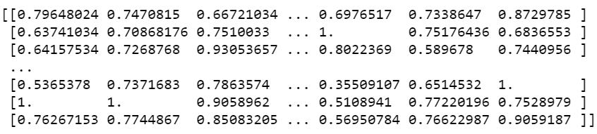
Displaying chroma values can appear with:
print(chroma)
Output:
Next, chroma may need to transform into another data format using np.cumsum. If readers do not prefer to visit the link along with the text, a vague definition of the cumulative sum function involves adding values of a specific axis.
chroma = np.cumsum(chroma)
The following code can visualize Justin Timberlake – “Can’t stop the feeling.”
import matplotlib.pylab as plt
x = np.linspace(-chroma, chroma)
plt.plot(x, np.sin(x))
plt.xlabel('Angle [rad]')
plt.ylabel('sin(x)')
plt.axis('tight')
plt.show()
The output appears in this manner.
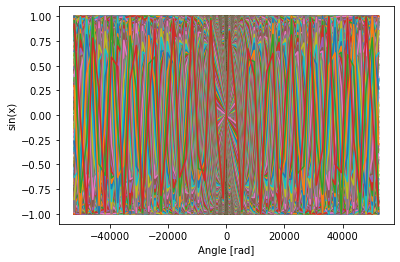
The reader can follow what exactly is happening above with the following overview. If the audio file inside this code were to become replaced with another file, shapes, and movements inside the graph would be different and vary as features of each element of sound can change. Readers may have noticed this observation by scrolling down to the next sine wave graph.
This time, Librosa is used to show enhanced Chroma and Chroma variants. Readers can learn more about specific Chroma element visualization with the link provided previously.
import matplotlib.pyplot as plt
from librosa import *
y, sr = librosa.load("cantstopthefeeling.m4a")
chroma_orig = librosa.feature.chroma_cqt(y=y, sr=sr)
# For display purposes, let's zoom in on a 15-second chunk from the middle of the song
idx = tuple([slice(None), slice(*list(librosa.time_to_frames([45, 60])))])
# And for comparison, we'll show the CQT matrix as well.
C = np.abs(librosa.cqt(y=y, sr=sr, bins_per_octave=12*3, n_bins=7*12*3))
fig, ax = plt.subplots(nrows=2, sharex=True)
img1 = librosa.display.specshow(librosa.amplitude_to_db(C, ref=np.max)[idx],
                                y_axis='cqt_note', x_axis='time', bins_per_octave=12*3,
                                ax=ax[0])
fig.colorbar(img1, ax=[ax[0]], format="%+2.f dB")
ax[0].label_outer()
img2 = librosa.display.specshow(chroma_orig[idx], y_axis='chroma', x_axis='time', ax=ax[1])
fig.colorbar(img2, ax=[ax[1]])
ax[1].set(ylabel='Default chroma')
What does each function do in the code above?
| Code | Purpose |
| Matplotlib | View visual. |
| Librosa.load | Read-in audio file. |
| idx | Time measurements. |
| c | Remove negative numerical values. |
| img1 | Setting up to display top graph. |
| img2 | Setting up to display the bottom graph. |
| Librosa.feature.chroma.cqt | After transforming audio into a vector data type, cqt is a type of visual-based on chroma data. CQT is short for Constant-Q which is a type of graph to visualize chroma measurements. CQT visualization uses a logarithmically spaced frequency axis to display sound in deciBels. |
Output:
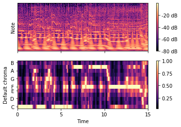
How can readers understand a Chroma and Chroma Variants graph?
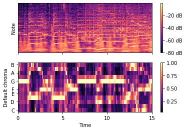
As readers know, chroma is a vector data type used to measure energy from sound usually in deciBels (dB). The graph above is a Chroma version of measuring dBs. The graph below shows how deciBels in this form can also translate into music notes.
Another method to interpret both graphs is to become familiar with heat maps as they both share a common display. This common display comes with a legend measuring DBS with color gradients and associated labels. Interpreting the bottom graph includes some knowledge of correlation and the simple fact that numbers between 0.00 and 1.00 can only become applicable when measuring correlation.
General Overview of Justin Timberlake Graphs:
Top graph: Amplitude transformed into dB unit of measure within 15 seconds of the song. Since this song includes many instrumental and vocal sounds, many layers can become visualized per pixel. For example, the C music note appears to measure at 40dB and lower while the B music note appears to measure at 60dB and higher.
Bottom graph: Music notes and time display one relationship type of 15 seconds within this song. Correlating strongly or weakly with specific notes. For example, within the first 10 milliseconds, the C music note appears to correlate strongly in this song and A and D appear to correlate weakly.
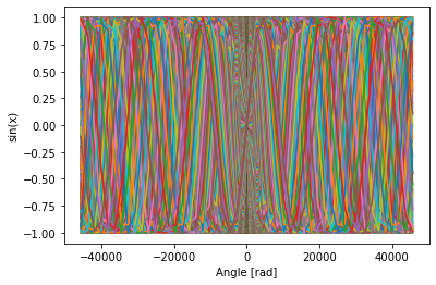
Seal’s “Kiss from a Rose” visualizations.
Now that readers are aware of which codes to choose from to visualize certain graphs, replacing the song file with another can become second nature. The readers can see this concept below.
Chroma:

Sin (x):
Enhanced Chroma:
General Overview of Seal Graphs:
Top graph: Amplitude transformed into dB unit of measure within 15 seconds of the song. Since this song includes many instrumental and vocal sounds, many layers can become visualized per pixel. For example, the C music note appears to measure at 40dB and lower while the B music note appears to measure at 60dB and higher.
Bottom graph: Music notes and time display one relationship type of 15 seconds within this song. Correlating strongly or weakly with specific notes. For example, within the first 10 milliseconds, the G and B music note appears to correlate strongly in this song while C and F appear to correlate weakly.
A generalized method is to match. For example, reading each graph relies on matching color with a numerical value according to graph labels.
As noted previously, graphs and visuals can reflect audio files with their unique features and sound measurements. When comparing the provided graphs as their original state in this tutorial, it is important to consider how each aspect of sound can contribute to listeners who may intentionally or unintentionally become willing to hear sounds from audio files. Each aspect can become a differential attribute to each individual. Whether any reader would prefer to specify an audio file that could play for any purpose is mostly under a mixture of demographical contexts. Demographics can include age, personal values, lifestyle, freedoms within cultural norms of geography, and more. Sound measurements can become one of several aspects, whereas demographics can affect the decision of overall audio preferences.
Conclusion:
Visualizing audio files can become possible. It is not an exact replacement for traditional methods to analyze audio, however, it can provide an advanced version of interpreting audio files without a visible data table. More options are available in the Librosa library as shown in the documentation. Other libraries can provide some insight into audio files as well. Readers can explore and discover libraries as time progresses forward.
Takeaways:
- Audio files can translate to visuals without the creation of data tables.
- Librosa can generate many views of audio files and become interpreted accordingly.
- Trigonometry and general math are appropriate for sound analytics.
- Depending on the demographics of listeners who intentionally or unintentionally listen to audio files of this nature, opinions, and interpretations can vary from each individual.
Reference:
Analytics Vidhya – Audio Visualizations
The media shown in this article are not owned by Analytics Vidhya and are used at the Author’s discretion.
Priya Kalyanakrishnan
23 Aug, 2022


