Effective Data Visualization Techniques in Data Science Using Python
This article was published as a part of the Data Science Blogathon
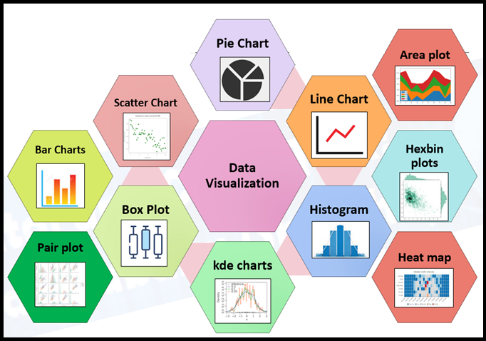
Data Visualization
Data Visualization techniques involve the generation of graphical or pictorial representation of DATA, form which leads you to understand the insight of a given data set. This visualisation technique aims to identify the Patterns, Trends, Correlations, and Outliers of data sets.
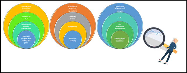
Benefits of Data Visualization
- Patterns in business operations: Data visualization techniques help us to determine the patterns of business operations. By understanding the problem statement and identifying the solutions in terms of pattering and applied to eliminate one or more of the inherent problems.
- Identify business trends and relate to data: These techniques help us identify market trends by collecting the data on Day-To-Day business activities and preparing trend reports, which helps track the business how influences the market. So that we could understand the competitors and customers. Certainly, this helps to long-term perspective.
- Storytelling and Decision making: Knowledge of storytelling from available data is one of the niche skills for business communication, specifically for the Data Science domain which is playing a vital role. Using best visualization this role can be enhanced much better way and reaching the objectives of business problems.
- Understand the current business insights and setting the goals: Businesses can understand the insight of the business KPIs, finding tangible goals and business strategy plannings, therefore they could optimize the data for business strategy plans for ongoing activities.
- Operational and Performance analysis:
- Increase the productivity of the manufacturing unit: With the help of visualization techniques the clarity of KPIs depicting the trends of the productivity of the manufacturing unit, and guiding were to improve the productivity of the plant.
Data Visualization in Data Science
Data visualization techniques most important part of Data Science, There won’t be any doubt about it. And even in the Data Analytics space as well the Data visualization doing a major role. We will discuss this in detail with help of Python packages and how it helps during the Data Science process flow. This is a very interesting topic for every Data Scientist and Data Analyst.
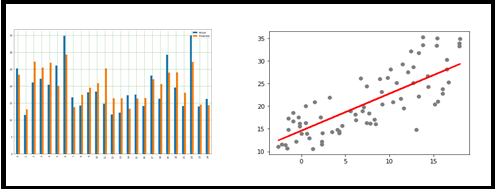
I. Line Chart
Line Chart is a simple data visualization in Python, which is available under Matplotlib.
Line charts are used to represent the relation between two data X and Y on the respective axis. Let’s see a few samples
Line Chart always a linear relationship between X and Y axis, we observe that in the above picture.
II.Histogram
The histogram is the graphical representation of a set of numerical data distribution across. It is a kind of bar plot with X-axis and Y-axis represents the bin ranges and frequency respectively. How to read or represent this chart.
Let say the example, set of students marks in the ranges and frequency as below. Here we could understand the range and frequency cut off exactly.
from matplotlib import pyplot as plt

import numpy as np

fig,ax = plt.subplots(1,1)

a = np.array([25,42,48,55,60,62,67,70,30,38,44,50,54,58,75,78,85,88,89,28,35,90,95])

ax.hist(a, bins = [20,40,60,80,100])

ax.set_title("Student's Score")

ax.set_xticks([0,20,40,60,80,100])

ax.set_xlabel('Marks Scored')

ax.set_ylabel('No. of Students')

plt.show()
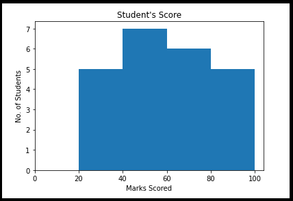
Characteristics Of Histogram
- The Histogram is used to get any unusual observations in the give en dataset.
- Measured on an interval scale of given numerical values with several data bins.
- The Y-axis represents the number of % of occurrences in the data
- The X-axis represents data distributions.
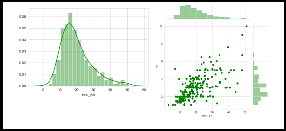
Displot – This is similar to the histogram in the graphical, but with additional features. And bringing Kernel Density Estimation (KDE).
Jointplot – A combination of scattering and histogram.
import seaborn as sns
import matplotlib.pyplot as plt
from warnings import filterwarnings
df = sns.load_dataset('tips')
sns.distplot(df['total_bill'], kde = True, color ='green', bins = 20)
sns.jointplot(x ='total_bill',color ='green', y ='tip', data = df)
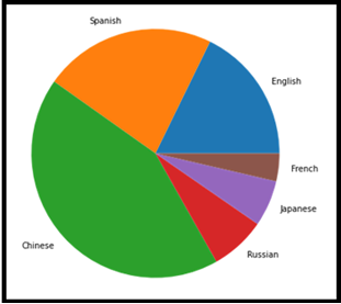
III.Pie Chart
This is a very familiar chart and representation statistical plot in the form of circular from series of data. This is commonly used in business presentations to represent Order, Sales, Profit, Loss, etc., It consists of slices of data part in the collection of the same set and character-wise differentiation. Each of the slices of pie is called a wedge with values of different sizes.
This chart is widely used to represent the composition collection. Perfect for the categorical data type.
from matplotlib import pyplot as plt
import numpy as np
Language = ['English', 'Spanish', 'Chinese',
        'Russian', 'Japanese', 'French']
data = [379, 480, 918, 154, 128, 77.2]
# Creating plot
fig = plt.figure(figsize =(10, 7))
plt.pie(data, labels = Language)
# show plot
plt.show()
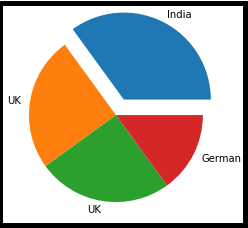
import matplotlib.pyplot as plt
import numpy as np
y = np.array([35, 25, 25, 15])
mylabels = ["India", "UK", "UK", "German"]
myexplode = [0.2, 0, 0, 0]
plt.pie(y, labels = mylabels, explode = myexplode)
plt.show()
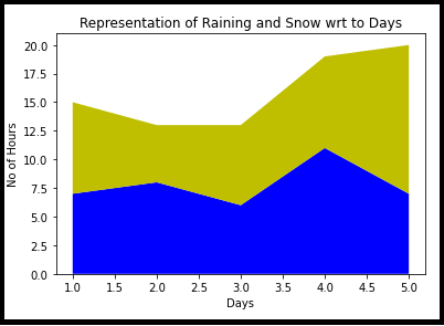
IV. Area plot
This is very similar to a line chart with fencing surrounded by a boundary line of different colours. Simple representation of the evolution of a numeric variable.
import matplotlib.pyplot as plt

days = [1, 2, 3, 4, 5]

raining = [7, 8, 6, 11, 7]

snow =  [8, 5, 7, 8, 13]

plt.stackplot(days, raining, snow,colors =['b', 'y'])

plt.xlabel('Days')

plt.ylabel('No of Hours')

plt.title('Representation of Raining and Snow wrt to Days')

plt.show()
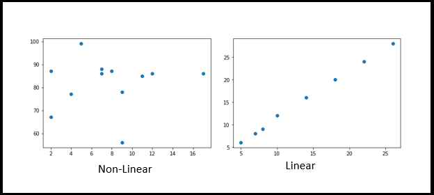
V. Scatter plots
Scatter plots are used to plot data points across both axes (Horizontal and Vertical) and represent how each axis correlated with each other. Mostly in Data Science/Machine Learning implementation and before the EDA process, generally we should analyse how dependent and independent aligned. It could positive or Negative or sometimes be scattered across the graph.
import matplotlib.pyplot as plt
x = [5,7,8,7,2,17,2,9,4,11,12,9]
y = [99,86,87,88,67,86,87,78,77,85,86,56]
plt.scatter(x, y)
plt.show()
import matplotlib.pyplot as plt

x = [5,7,8,10,14,18,22,26]

y = [6,8,9,12,16,20,24,28]

plt.scatter(x, y)

plt.show()
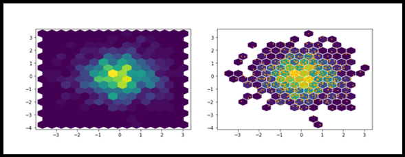
VI. Hexbins plots
The objective of Hexbins is used to group the two sets of numeric values. Hexbins helps to improve the visualization of the scatter plots. Because for a larger dataset, a scatter plot makes a confused smattering of points. We can improve this with Hexbins. It provides two modes of representations 1.List of Coordinates 2.Geospatial Object.
import numpy as np
import matplotlib.pyplot as plt
x = np.random.normal(size=(1, 1000))
y = np.random.normal(size=(1, 1000))
plt.hexbin(x, y, gridsize=15)
plt.hexbin(x,y,gridsize=15, mincnt=1, edgecolors="white")

plt.scatter(x,y, s=2, c="orange")

plt.show()
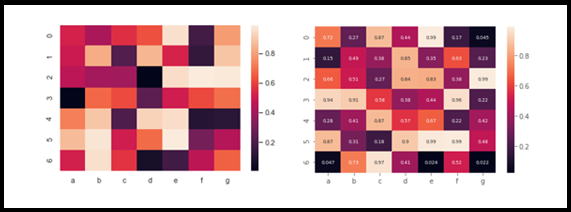
VII. Heatmap
A heatmap is one of my favorite visualization techniques among the other charts. basically, a set of variable correlations is represented by various shades of the same color. Usually, the darker shades of the chart represent the higher correlations values than the lighter shade. this map would help Data Scientists to figure out how to target variable is correlated with other dependent variables in the given data set. Less correlated variables can be removed for further analysis, we could say this helps us during the feature selection process. Later grouping them under X, Y as our target and followed by test and train split.
import seaborn as sn
import numpy as np
import pandas as pd
df=pd.DataFrame(np.random.random((7,7)),columns=['a','b','c','d','e','f','g'])
sn.heatmap(df)
sn.heatmap(df,annot=True,annot_kws={'size':7})
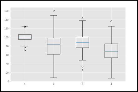
VIII. Boxplot
A Boxplot is a type of chart often used in the Data Science life cycle, especially during Explanatory Data Analysis (EDA). Which represents the distribution of data in the form of quartiles or percentiles. Q1 represents the first quartile (25th percentile), Q2 is the second quartile (50th percentile/median), Q3 represents the third quartile (Q3) and Q4 represents the fourth quartile or the largest value.
Using this plot we could identify the outliers very quickly and easily. This is a very effective plot all among the plots. So after the removal of outliers, the data set needs to undergo some sort of statistical test and fine-tune for further analysis.
#import matplotlib.pyplot as plt
np.random.seed(10)
one=np.random.normal(100,10,200)
two=np.random.normal(80, 30, 200)
three=np.random.normal(90, 20, 200)
four=np.random.normal(70, 25, 200)
to_plot=[one,two,three,four]
fig=plt.figure(1,figsize=(9,6))
ax=fig.add_subplot()
bp=ax.boxplot(to_plot)
fig.savefig('boxplot.png',bbox_inches='tight')
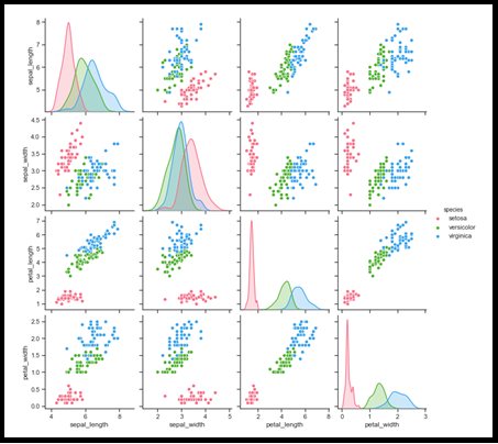
IX. Pairplot
A pairplot is another important plot in the Data Science life cycle during the EDA process, to analyse how features are related to each other, in the form of grid-based miniature graphical representation along the X and Y axis, either positive correlated or negatively correlated. So obviously we could eliminate the negatively correlated, by considering positively corrected pairs and move for further analysis. This is very similar to Heat Map, but here we could see the relationship with our naked eyes. That is special over here. Hope you could fee this. Again this is best for doing the feature selection process.
import pandas as pd
import seaborn as sb
from matplotlib import pyplot as plt
df = sb.load_dataset('iris')
sb.set_style("ticks")
sb.pairplot(df,hue = 'species',diag_kind = "kde",kind = "scatter",palette = "husl")
plt.show()
Line Chart is always linear relation between X and Y axis, we observe that above picture
X. Bar Chart
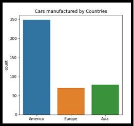
A bar chart or bar graph is generally a very familiar chart to presents categorical data with rectangular bars. It can be plotted either way horizontally or vertically. this chart would represent the impact of the individual’s category on the given dataset. First of first look. In the below chart “America” is much more impact than “Europe” and “Asia”. This would derive some observation on the dataset and focus on the problem statement.
fig, ax = plt.subplots(figsize = (5, 5))


sns.countplot(x = df_cars.origin.values, data=df_cars)

labels = [item.get_text() for item in ax.get_xticklabels()]

labels[0] = 'America'

labels[1] = 'Europe'

labels[2] = 'Asia'

ax.set_xticklabels(labels)

ax.set_title("Cars manufactured by Countries")

plt.show()
Univariate – Bi-variate and Multivariate Analysis
Analysis of variants in Data Science process, it could be Univariate (or) Bi-variate (or) Multivariate.
- Univariate: only one variable at a time.
- Bi-variate: compare two variables.
- Multivariate: compare more than two variables
You can very well refer to the above models with the Charts/Visualization that we have discussed from the beginning of the article. Just go through it again. Certainly, you could understand the importance of these Data visualization techniques.
Thanks for reading this article and I believe it is useful to you. and you could realise this when you go for Data Science solution implementation before model selection. Even after all model evaluation and predictions result from comparisons. As below reference charts.
Thanks! Once again. Will get back to you with another interesting topic. Until then Bye! Bye! – Shanthababu


Very interesting and also informative article. Thanks for your sharing....
This is awesome website/platform for me to learn more as Statistician.
Hello Shanthababu, You have provided marvelous information on data science and data visualization techniques. Your explanation makes this material accessible for a wide audience. Keep up the great contributions. Thank you.