Data Visualization: Techniques To Make Your Plots Stand Out
Introduction
Visualization plays an important role in gaining quality insights from the data. Our traditional data visualization techniques are already playing a significant role in obtaining insights. But it’s always useful to bring and adapt new visualization techniques to create more appealing plots. Creating appealing plots is a way to increase the retention period of the audience. There are plenty of visualization techniques that are yet to be discovered and adopted.

In this article, we will look at three unique data visualization techniques which are not regularly used and can be widely useful in the case of plotting theme-based plots. One can use these techniques to make their plots stand out amongst the crowd.
This article was published as a part of the Data Science Blogathon
Table of contents
Andrews Curves for Data Visualization
Andrews Curve is a useful plot for visualizing patterns in multidimensional data. The concept Andrews Curves was developed by statistician David F. Andrews in 1972. Andrews Curves are created by defining a finite Fourier Series which is an equation of sine curves. This allows us to visualize the difference in data. The equation is given by:
.png)
where x refers to each of the dimensions in the data and the value of t ranges from -π to π. Learn more about Andrews Curves in Python Here and Wikipedia.
Let’s create the Andrews Curves in Python using Pandas.
Importing the Librariesimport pandas as pd
Importing the Datadf = pd.read_csv(“iris.csv”)
The dataset has been downloaded from Kaggle.
Plotting the Andrews Curvesplt.figure(figsize=(12,6)) pd.plotting.andrews_curves(df, ‘Species’, colormap=’YlOrRd’)
Here, we passed our dataframe df into the .andrews_curves() method of pandas.plotting. We also passed our categorical variable and the colormap for the Andrews Curves.
Putting it All Together Python Code:
On executing this, we get:
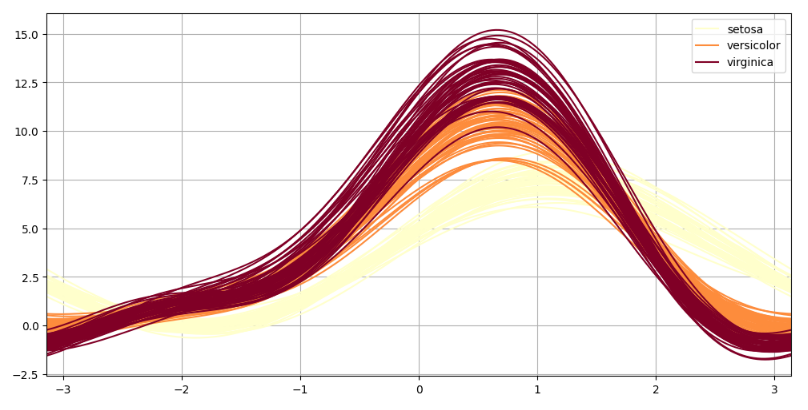
Source – Personal Computer
Raincloud Plot for Data Visualization
Raincloud Plot is a unique Data Visualization technique introduced in 2019. It is a robust visualization technique that combines a violin plot, a box plot and a scatter plot. Thus, one can see a detailed view of raw data in the single plot. This plotting style makes the Raincloud Plot better than any of the charts it is made of alone. Learn more about Raincloud Plots here.
To create a Raincloud plot in Python, we will use a library called ptitprince. A raincloud is made of: 1) “Cloud”, kernel density estimate, the half of a violinplot.
2) “Rain”, a stripplot below the cloud
3) “Umbrella”, a boxplot
4) “Thunder”, a pointplot connecting the mean of the different categories (if pointplot is True)
How to create a Raincloud Plot in Python.
Installing the Librariespip install ptitprince
Importing the Librariesimport pandas as pd import matplotlib.pyplot as plt import ptitprince
Importing the Datadf = pd.read_csv(“iris.csv”)
The dataset has been downloaded from Kaggle.
Plotting the Raincloud Plotplt.figure(figsize = (12,8)) ptitprince.RainCloud(data = df, x = ‘Species’, y = ‘Sepal.Length’, orient = ‘h’)
Here, we used the .RainCloud() method and passed the data, x and y attributes into it. Along with it, we also specified the orientation of our palette. Here ‘h’ means horizontal palette.
Putting it All Together
import pandas as pd import matplotlib.pyplot as plt import ptitprince df = pd.read_csv(“iris.csv”) plt.figure(figsize = (12,8)) ptitprince.RainCloud(data = df, x = ‘Species’, y = ‘Sepal.Length’, orient = ‘h’) plt.show()
On executing this, we get:
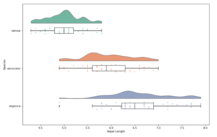
Source – Personal Computer
Calendar Heatmap for Data Visualization
Calendar Heatmap is a unique visualization technique to visualize the time series data. It creates a horizontal pallet of squares, each resembling a day of a year. One must have seen a similar palette in their GitHub profile for all the commits for a year. Since it’s a heatmap, each square has colors of different densities based on the values or weights for that day.
In Python, we can create a Calendar Heatmap using a library called calmap. Let’s build a Calendar Heatmap.
Installing the Librariespip install calmap
Importing the Librariesimport matplotlib as mpl import calmap
Importing the Datadf = pd.read_csv(“currency.csv”)
Here, we imported the data downloaded from Kaggle.
Getting Data Ready for Plotdf[‘Time’] = pd.to_datetime(df[‘Time’]) df.set_index(‘Time’, inplace = True)
Here, we converted our Time column to DateTime type. Next, we set the Time column as Index using the .set_index() method which will help plot the Calendar Plot.
Plotting Calendar Plotcalmap.calendarplot(df[‘2017’][‘GEMS_GEMS_SPENT’], cmap = ‘OrRd’, fig_kws={‘figsize’: (16,12)}, yearlabel_kws={‘color’:’black’})
Here, we used the .calendarplot() method of calmap. In the calenderplot(), we specified the arguments as dataframe for the year 2017 for column ‘GEMS_GEMS_SPENT‘, cmap as ‘OrRd’, figure keyword arguments fig_kws for specifying the figure size, and yearlabel keyword argument yearlabel_kws to specify the colour of the year label at the left side.
Putting it All Together
import matplotlib as mpl import calmap df = pd.read_csv("currency.csv") df['Time'] = pd.to_datetime(df['Time']) df.set_index('Time', inplace = True) calmap.calendarplot(df['2017']['GEMS_GEMS_SPENT'], cmap = 'OrRd', fig_kws={'figsize': (16,12)}, yearlabel_kws={'color':'black'}) plt.show()On executing this, we get:
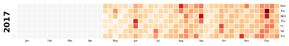
Source – Personal Computer
Conclusions
In this article, we learned and implemented three unique visualization techniques to take our data visualization game to a next level. Unique visualization techniques are eye-catchy and gain attention from the viewers. Learning new techniques also helps in developing our skillset. One can try playing with arguments of the methods discussed above to build more robust and beautiful plots. With time, a lot of new visualization techniques are being developed, one should keep trying to learn them to create more accurate plots based on the data.
The media shown in this article are not owned by Analytics Vidhya and are used at the Author’s discretion.
IT Engineering Graduate currently pursuing Post Graduate Diploma in Data Science.


