Introduction
In this article, we will cover everything from gathering data to preparing the steps for model training and evaluation. Deep learning algorithms can have huge functional uses when provided with quality data to sort through. Diverse fields such as sales forecasting and extrapolation use deep learning algorithms to perfect their process. Fields such as the evaluation of skin diseases from image data also use deep learning to deliver results.
Deep learning and TensorFlow can be your best friends while creating projects using deep learning concepts. To understand the process of building a classification model using tabular datasets, keep reading this article.
Prerequisites that you may need:
- TensorFlow 2+
- Numpy
- Matplotlib
- Scikit-Learn
- Pandas
Dataset for Classification Model with TensorFlow
The dataset that you use can make your life easy or give you endless headaches. Make sure that you have the right datasets for your projects. Kaggle contains clean, well-designed datasets that you can use to work on this project that we have covered in this article. Here, we have the wine quality dataset from Kaggle.
The dataset here is well designed. However, it doesn’t classify the wines as good or bad. Here, the wines are rated on a scale depending on their quality. To follow along, you may download it and take the CSV onto your machine. Next, you can open up JupyterLab. You may use any other IDE as well. However, we have worked on JupyterLab and will include screenshots from the same.
Phase One: Data Exploration and Preparation

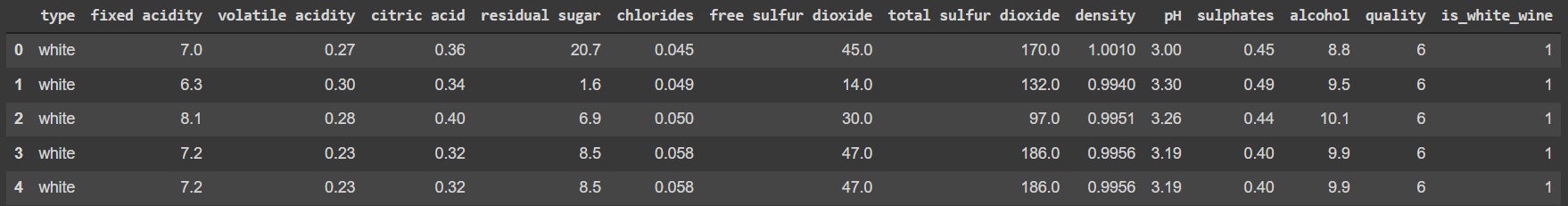
First, you need to import Numpy and Pandas and then import the dataset as well. The code snippet given below is an example that you can follow. The code snippet also prints a random sample containing 5 rows.
Code:
import numpy as np
import pandas as pd
import plotly.express as px
import plotly.graph_objects as go
df = pd.read_csv('winequalityN.csv')
df.sample(5)
Output:
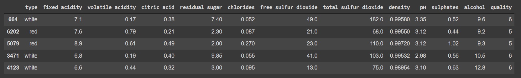
Here’s a look into what the dataset looks like right now:
To get to the results, we still have some more work to do.
Basic preparation
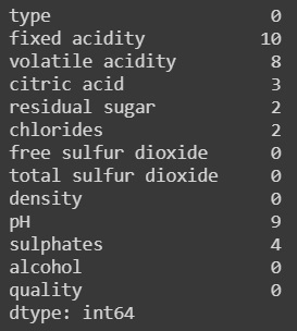
The dataset that we are working with has a few defects, but the problem is not so significant as there is a large sample of 4123 rows in total.
Code:
df.isna().sum()
Output:
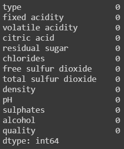
You can use a code similar to the one below to remove all the defects:
Code:
df = df.dropna()
df.isna().sum()
Output:
All the features are numerical except for the type of column which can be either white wine or red wine. The following part of the code will convert that into a binary column known as “is_white_wine” where if the value is 1 then it is white wine or 0 when red wine.
Code:
df['is_white_wine'] = [
    1 if typ == 'white' else 0 for typ in df['type']
]
df.head()
Output:
So after adding the feature we also need to make the target variable binary and convert it fully into a binary classification problem.
Changing it to a problem of binary classification
All the wines in the dataset are graded from a range of 9 to 3 where a higher value denotes a better wine. The following code divides the types and quality and displays that in a graphical manner
Code:
white = df[df['type']=='white']
red = df[df['type'] == 'red']
fig = make_subplots(rows=1, cols=2,
                    column_widths=[0.35, 0.35],
                    subplot_titles=['White Wine Quality', 'Red Wine Quality'])
fig.append_trace(go.Bar(x=white['quality'].value_counts().index,
                        y=white['quality'].value_counts(),
                        text = white['quality'].value_counts(),
                        marker=dict(
                        color='snow',
                        line=dict(color='black', width=1)
                ),
                        name=''
               ), 1,1
             )
fig.append_trace(go.Bar(x=red['quality'].value_counts().index,
                        y=red['quality'].value_counts(),
                        text=red['quality'].value_counts(),
                        marker=dict(
                        color='coral',
                        line=dict(color='red', width=1)
                ),
                        name=''
               ), 1,2
             )
fig.update_traces(textposition='outside')
fig.update_layout(margin={'b':0,'l':0,'r':0,'t':100},
    paper_bgcolor='rgb(248, 248, 255)',
    plot_bgcolor='rgb(248, 248, 255)',
    showlegend=False,
    title = {'font': {
                        'family':'monospace',
                        'size': 22,
                        'color':'grey'},
            'text':'Quality Distribution In Red & White Wine',
            'x':0.50,'y':1})
fig.show()
Output:
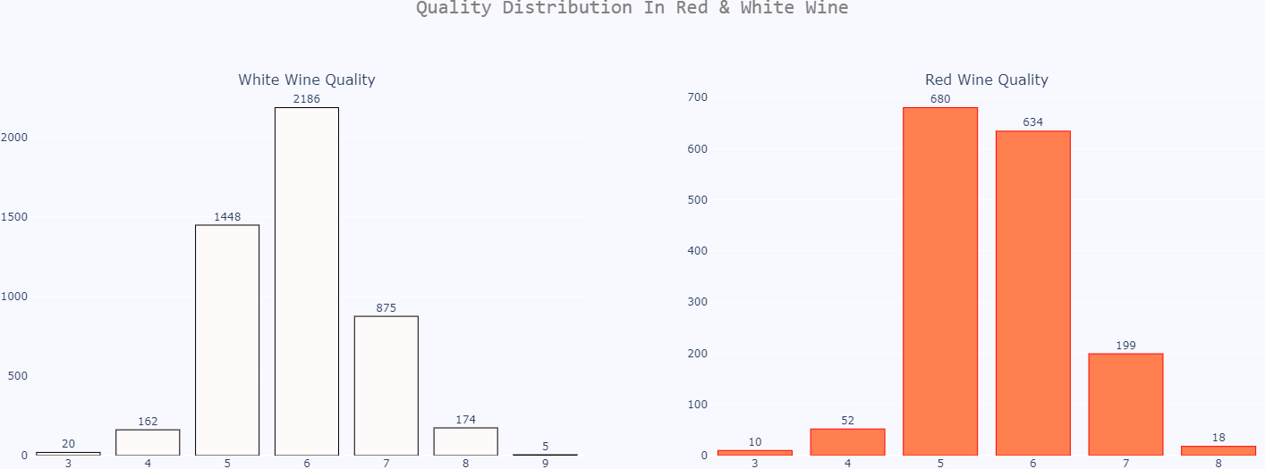
We will simplify this and make or give a value of good or 1 if any wine has a grade higher than 6 and all other wines will be termed as bad or 0. The following code does the task.
Code:
df['is_good_wine'] = [
    1 if quality >= 6 else 0 for quality in df['quality']
]
df.drop('quality', axis=1, inplace=True)
df.drop('type', axis=1, inplace=True)
df.head()
Output:
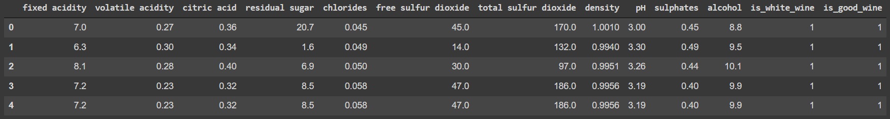
So now our dataset looks like this after all the transformation and changes and now we will move on to the next phase.
Phase Two: Training the classification model
We will stick to a general split rule of 80 and 20. The following code will do that task.
Code:
from sklearn.model_selection import train_test_split
X = df.drop('is_good_wine', axis=1)
y = df['is_good_wine']
X_train, X_test, y_train, y_test = train_test_split(
    X, y,
    test_size=0.2, random_state=42
)
X_train,y_train
Output:
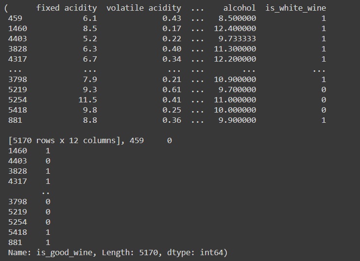
After this, you will now have rows: 5170 in the training set. You will also have rows: 1293 in the testing set. To train your neural network model, this should be a decent amount needed. Before we begin training the data, we must also scale the data. Let’s do that now. You can follow along if you have all the prerequisites.
Scale the Data
The dataset contains columns with values that are of different scales and hence not uniform or close enough. We may end up confusing the neural network that you’re trying to build if you leave the dataset like this. Here, we need to scale the data. We use StandardScaler from Scikit-Learn to fit and transform the data to make it ready for the model and as you can see that all the values have been scaled to a relative closer range which is now ready for our neural network.
Code:
from sklearn.preprocessing import StandardScaler
scaler = StandardScaler()
X_train_scaled = scaler.fit_transform(X_train)
X_test_scaled = scaler.transform(X_test)
X_train_scaled
Output:
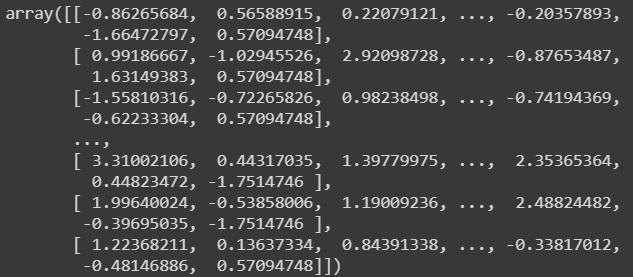
This is how the scaled data looks like.
The value range is much narrow and hence it is perfect for a neural network and now we move on to training it with Tensorflow
Using Tensorflow to train the classification model
You need to remember a few things before you begin to train your model which is as follows.
- The Layer structure of the output – You need to have one neuron which will be activated by a sigmoid function which will finally give you a probability and you can assign that to either being good or bad depending upon P>0.5 or P being <0.5 but here we will use the ROC_AUC score to calculate the optimal threshold to use to classify our data.
- Class Balance – If you do not have an equal amount of good and bad wines, then accuracy might not be the most accurate measure but precision and recall can be used to find the accuracy of the model
- Loss Function – You should go with a binary cross-entropy as that is the best one to go for and you should not confuse it with categorical cross-entropy.
Now we will move on to defining the neural architecture and remember the above key points.
The Neural Network
The following architecture was chosen at random and hence you can adjust it to whatever you want to. This model here goes from 12 different input features to the first hidden layer of 128 neurons and then 2 more hidden layers of 256 neurons. Then it ends with 1 neuron at the end and the hidden layers ReLU as the activation function and the output layer is got by using a Sigmoid function. The following code demonstrates it.
Code:
import tensorflow as tf
tf.random.set_seed(42)
model = tf.keras.Sequential([
    tf.keras.layers.Dense(128, activation='relu'),
    tf.keras.layers.Dense(256, activation='relu'),
    tf.keras.layers.Dense(256, activation='relu'),
    tf.keras.layers.Dense(1, activation='sigmoid')
])
model.compile(
    loss=tf.keras.losses.binary_crossentropy,
    optimizer=tf.keras.optimizers.Adam(lr=0.03),
    metrics=[
        tf.keras.metrics.BinaryAccuracy(name='accuracy'),
        tf.keras.metrics.Precision(name='precision'),
        tf.keras.metrics.Recall(name='recall')
    ]
)
history = model.fit(X_train_scaled, y_train, epochs=100)
Output:
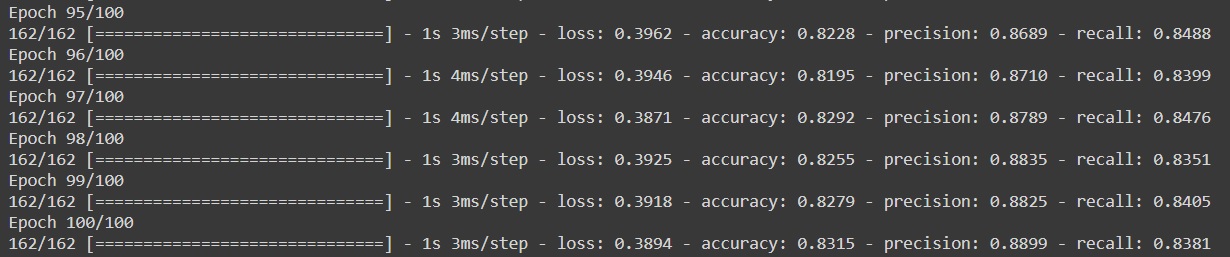
This image shows the final 5 epochs of the model. Each epoch on average takes around 1 second on google collab to get trained.
We also have kept track of the accuracy, loss, precision, and recall function during training and saved them to history. We can now visualize the various metrics so that we can get a sense of how the whole model is doing.
Phase Three: Visualisation and Evaluation of the classification model using TensorFlow
We will begin by first importing some important modules like Matplotlib and changing the settings a bit. The following code shows how to plot the results.
Code:
import matplotlib.pyplot as plt
from matplotlib import rcParams
rcParams['figure.figsize'] = (18, 8)
rcParams['axes.spines.top'] = False
rcParams['axes.spines.right'] = False
plt.plot(
    np.arange(1, 101),
    history.history['loss'], label='Loss'
)
plt.plot(
    np.arange(1, 101),
    history.history['accuracy'], label='Accuracy'
)
plt.plot(
    np.arange(1, 101),
    history.history['precision'], label='Precision'
)
plt.plot(
    np.arange(1, 101),
    history.history['recall'], label='Recall'
)
plt.title('Evaluation metrics', size=20)
plt.xlabel('Epoch', size=14)
plt.legend();
Output:
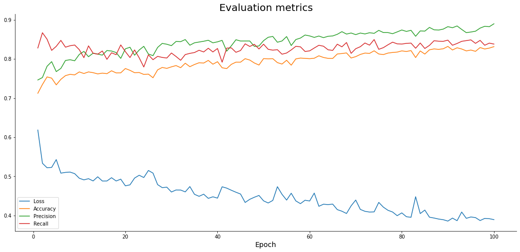
Note: Here we are plotting multiple lines together for the loss, accuracy, precision, and also recall. They all share the same X-Axis which is actually the corresponding epoch number. The normal behavior is that the loss should decrease and all the remaining parameters should increase.
Here in our model, we can see that it is following the trend and loss is decreasing as the other factors are increasing. There are some occasional spikes that would smoothen out if you were to train the model for more epochs. Since there is no formation of a plateau, you can still train the model for more epochs. The important question to solve next is whether if we are overfitting or not?
Predictions for Classification Model with TensorFlow
Now we move onto the prediction part where we will use the predict() function to predict the output on the scaled data of testing. The following code demonstrates it.
Code:
predictions = model.predict(X_test_scaled)
predictions
Output:
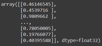
You need to convert them to the corresponding classes and the logic is simple as if the result is more than 0.5, then we assign a value of 1 or a good wine and 0 otherwise which denotes a bad wine as shown by the following code to find the optimal threshold. We will first find the ROC_AUC score manually and also via an inbuilt function.
Code:
from sklearn.metrics import roc_curve
from sklearn.metrics import auc
from sklearn.metrics import roc_auc_score
def plot_roc_curve(fpr, tpr):
    plt.plot(fpr, tpr, color='orange', label='ROC')
    plt.plot([0, 1], [0, 1], color='darkblue', linestyle='--')
    plt.xlabel('False Positive Rate')
    plt.ylabel('True Positive Rate')
    plt.title('Receiver Operating Characteristic (ROC) Curve')
    plt.legend()
    plt.show()
# Computing manually fpr, tpr, thresholds and roc auc
fpr, tpr, thresholds = roc_curve(y_test, predictions)
roc_auc = auc(fpr, tpr)
print("ROC_AUC Score : ",roc_auc)
print("Function for ROC_AUC Score : ",roc_auc_score(y_test, predictions)) # Function present
optimal_idx = np.argmax(tpr - fpr)
optimal_threshold = thresholds[optimal_idx]
print("Threshold value is:", optimal_threshold)
plot_roc_curve(fpr, tpr)
Output:
ROC_AUC Score :  0.8337780313224288
Function for ROC_AUC Score :  0.8337780313224288
Threshold value is: 0.5035058
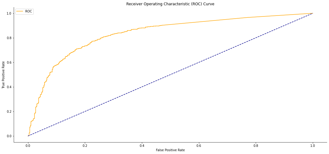
So now we have found the optimal threshold value, we will proceed to the next step.
Code:
prediction_classes = [
    1 if prob > optimal_threshold else 0 for prob in np.ravel(predictions)
]
prediction_classes[:20]
Output:

These are how the first 20 data values of the output look like. Now we need to move on to the evaluation of the model. We will begin with the confusion matrix which can be found by the following code.
Code:
from sklearn.metrics import confusion_matrix
print(confusion_matrix(y_test, prediction_classes))
Output:
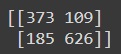
Since there are more False Negatives, 185, than there are false positives, 109, hence we can deduce that the recall value of the test set will be lower than the precision. The below code can be used to print all the details like precision, accuracy, and recall on any test_set.
Code:
from sklearn.metrics import accuracy_score, precision_score, recall_score
print(f'Accuracy: {accuracy_score(y_test, prediction_classes):.2f}')
print(f'Precision: {precision_score(y_test, prediction_classes):.2f}')
print(f'Recall: {recall_score(y_test, prediction_classes):.2f}')
Output:
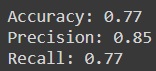
As we can see that the model is slightly leaning on the side of overfitting but it is a decent model for a quick build and test. WIth more epochs and better data exploration, you can further enhance the model. You can find all the above codes in the following link.
https://colab.research.google.com/drive/1vs2Zhm0WFjTDdvrgbHNaK6QCi6Sq2f9Q?usp=sharing
Conclusion
So that is all you need to know on how to train and test a neural network that can classify and can be used for binary classification. The dataset we have used here is almost ready to be used and has very little preparation and work needed to be done on it but real-world data is often messier. There are some rooms for improvement and more training or training for a long time can make the model even better. Even adding layers to the model will help along with increasing the number of neurons. I hope now you can build your first Tensorflow model and begin coding right away and if you run into any roadblock, feel free to hit me up or drop a mail.
That’s all for today, you can find more articles by me here.
Arnab Mondal (LinkedIn)
Python Developer & Data Engineer | Freelance Tech Writer
Links to external images used :
https://unsplash.com/photos/WrueFKpTlQs
https://unsplash.com/photos/udj2tD3WKsY
I love to code and create new software for any purpose. I also love to play MMO and RTG games. Other hobbies include Exploring new places and restaurants and making new friends. Feel free to ping me on LinkedIn for any new ideas or same and if you need any help with any code too.


