Types of Plots: Visualization from Concept to Code
Introduction
Data interpretation involves analyzing collected data to uncover patterns, trends, or relationships. It’s essential for drawing meaningful conclusions and answering research questions effectively. Data plots play a crucial role in data visualization, helping convey insights clearly. This article explores various data plot types for visualization and their subtypes, aiding in selecting the right one for specific problems. Popular packages like plotly and seaborn/matplotlib are used to create these plots. Visual representations and corresponding code can be found on GitHub. These visualizations are also referred to as graphs or charts depending on the context.
This article was published as a part of the Data Science Blogathon
Table of contents
12 Types of Data Plot Types for Visualization
These plot types serve various purposes and are chosen based on the data and the insights you want to convey.
- Bar Graph
- Line Graph
- Pie Chart
- Histogram
- Area Chart
- Dot Graph
- Bubble Chart
- Radar Chart
- Pictogram Graph
- Spline Chart
- Box Plot
- Scatter Plot
Bar Graph
A bar graph is a graph that presents categorical data with rectangle-shaped bars. The heights or lengths of these bars are proportional to the values that they represent. The bars can be vertical or horizontal. A vertical bar graph is sometimes called a column graph.
Following is an illustration of a bar graph indicating the population in Canada by years.
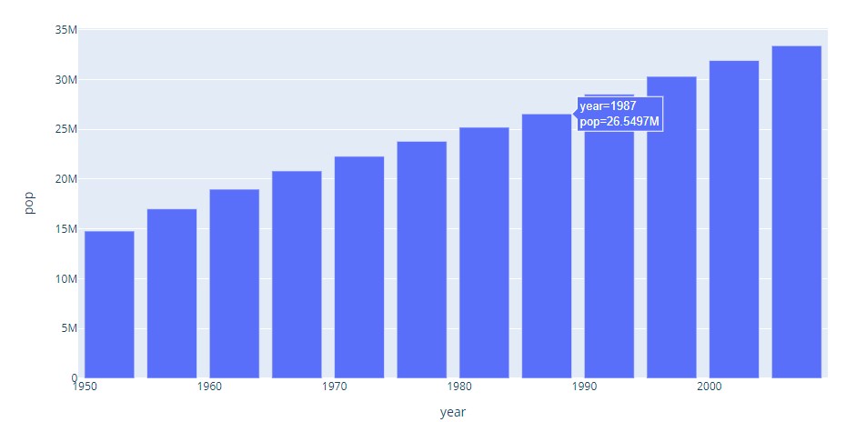
Code indicating how to do it in plotly.
import plotly.express as px
data_canada = px.data.gapminder().query("country == 'Canada'")
fig = px.bar(data_canada, x='year', y='pop')
fig.show()
Following is the representational code of doing it in seaborn.
import seaborn as sns
import pandas as pd
import matplotlib.pyplot as plt
import plotly.express as px

sns.set_theme(style="whitegrid")
data_canada = px.data.gapminder().query("country == 'Canada'")
ax = sns.barplot(x="year", y="pop", data=data_canada)
plt.show()
The following are types of bar graphs:
Grouped Bar Graph
Grouped bar graphs are used when the datasets have subgroups that need to be visualized on the graph. The subgroups are differentiated by distinct colours. Here is an illustration of such a graph:
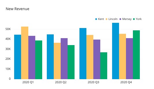
Code snippet on how to do it in plotly:
import plotly.express as px
df = px.data.tips()
fig = px.bar(df, x="sex", y="total_bill", color="time")
fig.show()
Here is a code snippet on how to do it in seaborn:
import seaborn as sb
df = sb.load_dataset('tips')
df = df.groupby(['size', 'sex']).agg(mean_total_bill=("total_bill", 'mean'))
df = df.reset_index()
sb.barplot(x="size", y="mean_total_bill", hue="sex", data=df)
Stacked Bar Graph
The stacked bar graphs are used to show dataset subgroups. However, the bars are stacked on top of each other. Here is an illustration:
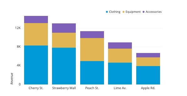
Here is a code snippet on how to do it in plotly:
import plotly.express as px
df = px.data.tips()
fig = px.bar(df, x="sex", y="total_bill", color='time')
fig.show()
Seaborn code snippet:
import pandas
import matplotlib.pylab as plt
import seaborn as sns
plt.rcParams["figure.figsize"] = [7.00, 3.50]
plt.rcParams["figure.autolayout"] = True
df = pandas.DataFrame(dict(
number=[2, 5, 1, 6, 3],
count=[56, 21, 34, 36, 12],
select=[29, 13, 17, 21, 8]
))
bar_plot1 = sns.barplot(x='number', y='count', data=df, label="count", color="red")
bar_plot2 = sns.barplot(x='number', y='select', data=df, label="select", color="green")
plt.legend(ncol=2, loc="upper right", frameon=True)
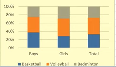
plt.show()Segmented Bar Graph
This is the type of stacked bar graph where each stacked bar shows the percentage of its discrete value from the total value. The total percentage is 100%. Here is an illustration:
Line Graph
It displays a sequence of data points as markers. The points are ordered typically by their x-axis value. These points are joined with straight line segments. A line graph is used to visualize a trend in data over intervals of time.
The following is an illustration of Canadian life expectancy by years in Line Graph.
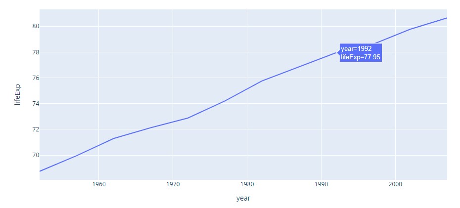
Plotly Code
import plotly.express as px
df = px.data.gapminder().query("country=='Canada'")
fig = px.line(df, x="year", y="lifeExp", title='Life expectancy in Canada')
fig.show()
Seabron Code
import seaborn as sns
sns.lineplot(data=df, x="year", y="lifeExp")
Here are types of line graphs:
Simple Line Graph
A simple line graph plots only one line on the graph. One of the axes defines the independent variable. The other axis contains a variable that depends on it.
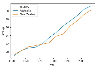
Multiple Line Graph
Multiple line graphs contain more than one line. They represent multiple variables in a dataset. This type of graph can be used to study more than one variable over the same period.
It can be drawn in plotly as:
import plotly.express as px
df = px.data.gapminder().query("continent == 'Oceania'")
fig = px.line(df, x='year', y='lifeExp', color='country', symbol="country")
fig.show()
Here is the illustration:
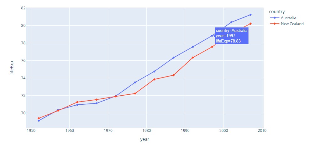
In seaborn as:
import seaborn as sns
sns.lineplot(data=df, x='year', y='lifeExp', hue='country')
Here is the illustration:
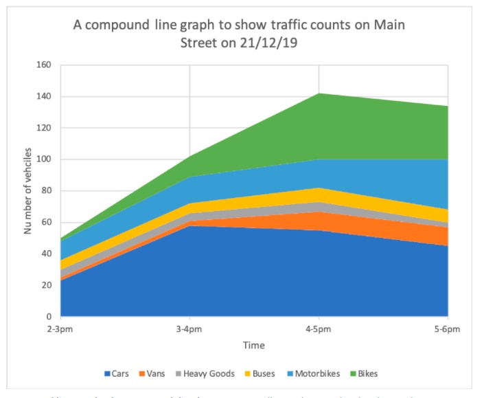
Compound Line Graph
It is an extension of a simple line graph. It is used when dealing with different groups of data from a larger dataset. Its every line graph is shaded downwards to the x-axis. It has each group stacked upon one another.
Here is an illustration:
Pie Chart
A pie chart is a circular statistical graphic. To illustrate numerical proportion, it is divided into slices. In a pie chart, for every slice, each of its arc lengths is proportional to the amount it represents. The central angles, and area are also proportional. It is named after a sliced pie.
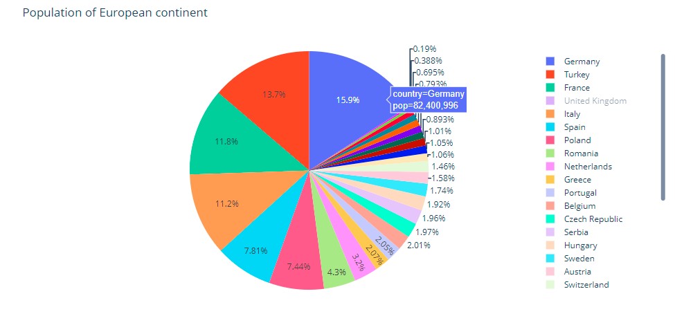
Here is how to do it in plotly:
import plotly.express as px
df = px.data.gapminder().query("year == 2007").query("continent == 'Europe'")
df.loc[df['pop'] < 2.e6, 'country'] = 'Other countries' # Represent only large countries
fig = px.pie(df, values='pop', names='country', title='Population of European continent')
fig.show()
And here is how it looks:
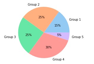
Seaborn doesn’t have a default function to create pie charts, but the following syntax in matplotlib can be used to create a pie chart and add a seaborn color palette:
import matplotlib.pyplot as plt
import seaborn as sns

data = [15, 25, 25, 30, 5]
labels = ['Group 1', 'Group 2', 'Group 3', 'Group 4', 'Group 5']

colors = sns.color_palette('pastel')[0:5]

plt.pie(data, labels = labels, colors = colors, autopct='%.0f%%')
plt.show()
This is how it looks:
These are types of pie charts:
Simple Pie Chart
This is the basic type of pie chart. It is often called just a pie chart.
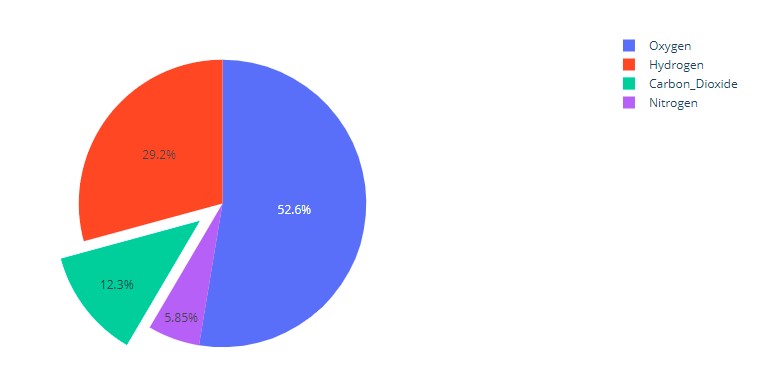
Exploded Pie Chart
One or more sectors of the chart are separated (termed as exploded) from the chart in an exploded pie chart. It is used to emphasize a particular element in the data set.
This is a way to do it in plotly:
import plotly.graph_objects as go

labels = ['Oxygen','Hydrogen','Carbon_Dioxide','Nitrogen']
values = [4500, 2500, 1053, 500]

# pull is given as a fraction of the pie radius
fig = go.Figure(data=[go.Pie(labels=labels, values=values, pull=[0, 0, 0.2, 0])])
fig.show()
And this is how it looks:
In seaborn the explode attribute of the pie method in matplotlib can be used as:
import matplotlib.pyplot as plt
import seaborn as sns
data = [15, 25, 25, 30, 5]
labels = ['Group 1', 'Group 2', 'Group 3', 'Group 4', 'Group 5']
colors = sns.color_palette('pastel')[0:5]
plt.pie(data, labels = labels, colors = colors, autopct='%.0f%%', explode = [0, 0, 0, 0.2, 0])
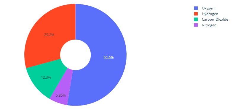
plt.show()Donut Chart
In this pie chart, there is a hole in the centre. The hole makes it look like a donut from which it derives its name.
The way to do it in plotly is:
import plotly.graph_objects as go

labels = ['Oxygen','Hydrogen','Carbon_Dioxide','Nitrogen']
values = [4500, 2500, 1053, 500]

# Use `hole` to create a donut-like pie chart
fig = go.Figure(data=[go.Pie(labels=labels, values=values, hole=.3)])
fig.show()
And this is how it looks:
This is how it is done in seaborn:
import numpy as np
import matplotlib.pyplot as plt
data = np.random.randint(20, 100, 6)
plt.pie(data)
circle = plt.Circle( (0,0), 0.7, color='white')
p=plt.gcf()
p.gca().add_artist(circle)
plt.show()
Pie of Pie
A pie of pie is a chart that generates an entirely new pie chart detailing a small sector of the existing pie chart. It can be used to reduce the clutter and emphasize a particular group of elements.
Here is an illustration:
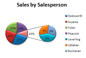
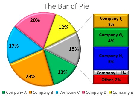
Bar of Pie
This is similar to the pie of pie, except that a bar chart is what is generated.
Here is an illustration:
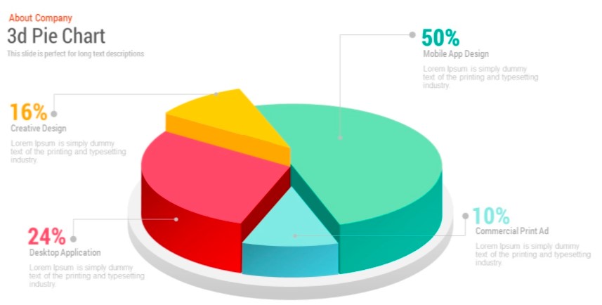
3D Pie Chart
This is a pie chart that is represented in a 3-dimensional space. Here is an illustration:
The shadow attribute can be set to True for doing it in seaborn / matplotlib.
import matplotlib.pyplot as plt
labels = ['Python', 'C++', 'Ruby', 'Java']
sizes = [215, 130, 245, 210]
# Plot
plt.pie(sizes, labels=labels,
autopct='%1.1f%%', shadow=True, startangle=140)
plt.axis('equal')
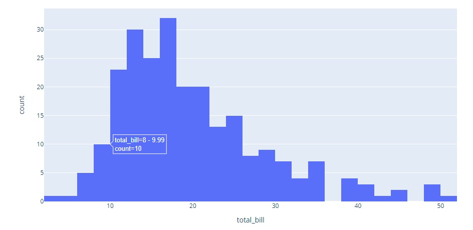
plt.show()Histogram
A histogram is an approximate representation of the distribution of numerical data. The data is divided into non-overlapping intervals called bins and buckets. A rectangle is erected over a bin whose height is proportional to the number of data points in the bin. Histograms give a feel of the density of the distribution of the underlying data.
Here is a visual:
Plotly code:
import plotly.express as px
df = px.data.tips()
fig = px.histogram(df, x="total_bill")
fig.show()
Seaborn code:
import seaborn as sns
penguins = sns.load_dataset("penguins")
sns.histplot(data=penguins, x="flipper_length_mm")
It is classified into different parts depending on its distribution as below:
Normal Distribution
This chart is usually bell-shaped.
Bimodal Distribution
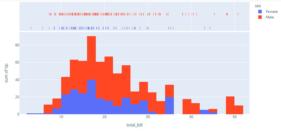
In this histogram, there are two groups of histogram charts that are of normal distribution. It is a result of combining two variables in a dataset.
Visualization:
Plotly code:
import plotly.express as px
df = px.data.tips()
fig = px.histogram(df, x="total_bill", y="tip", color="sex", marginal="rug",
                   hover_data=df.columns)
fig.show()
Seaborn:
import seaborn as sns
iris = sns.load_dataset("iris")
sns.kdeplot(data=iris)
Skewed Distribution
This is an asymmetric graph with an off-centre peak. The peak tends towards the beginning or end of the graph. A histogram can be said to be right or left-skewed depending on the direction where the peak tends towards.
Random Distribution
This histogram does not have a regular pattern. It produces multiple peaks. It can be called a multimodal distribution.
Edge Peak Distribution
Comb Distribution
The comb distribution is like a comb. The height of rectangle-shaped bars is alternately tall and short.
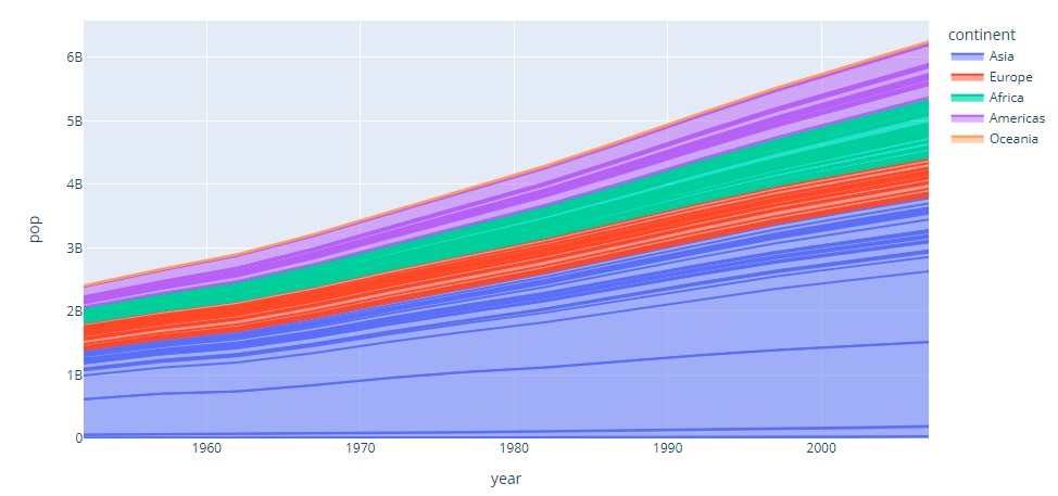
Area Chart
It is represented by the area between the lines and the axis. The area is proportional to the amount it represents.
These are types of area charts:
Simple area Chart
IIn this chart, the coloured segments overlap each other. They are placed above each other.
Stacked Area Chart
In this chart, the coloured segments are stacked on top of one another. Thus they do not intersect.
100% Stacked area Chart
In this chart, the area occupied by each group of data is measured as a percentage of its amount from the total data. Usually, the vertical axis totals a hundred per cent.
3-D Area Chart
This chart is measured on a 3-dimensional space.
We will look at visual representation and code for the most common type below.
Visual:
Plotly:
import plotly.express as px
df = px.data.gapminder()
fig = px.area(df, x="year", y="pop", color="continent",
	      line_group="country")
fig.show()
Seaborn:
import pandas as pd
import matplotlib.pyplot as plt
import seaborn as sns

sns.set_theme()

df = pd.DataFrame({'period': [1, 2, 3, 4, 5, 6, 7, 8],
                   'team_A': [20, 12, 15, 14, 19, 23, 25, 29],
                   'team_B': [5, 7, 7, 9, 12, 9, 9, 4],
                   'team_C': [11, 8, 10, 6, 6, 5, 9, 12]})

plt.stackplot(df.period, df.team_A, df.team_B, df.team_C)
Dot Graph
A dot graph consists of data points plotted as dots on a graph.
There are two types of these:
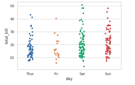
The Wilkinson Dot Graph
In this dot graph, the local displacement is used to prevent the dots on the plot from overlapping.
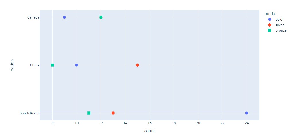
Cleaveland Dot Graph
This is a scatterplot-like chart that displays data vertically in a single dimension.
Plotly code:
import plotly.express as px
df = px.data.medals_long()

fig = px.scatter(df, y="nation", x="count", color="medal", symbol="medal")
fig.update_traces(marker_size=10)
fig.show()
Visual:
Seaborn:
import seaborn as sns
sns.set_theme(style="whitegrid")
tips = sns.load_dataset("tips")
ax = sns.stripplot(x="day", y="total_bill", data=tips)
Visual:
Scatter Plot
It is a type of plot using Cartesian coordinates to display values for two variables for a set of data. It is displayed as a collection of points. Their position on the horizontal axis determines the value of one variable. The position on the vertical axis determines the value of the other variable. A scatter plot can be used when one variable can be controlled and the other variable depends on it. It can also be used when both continuous variables are independent.
Visual:
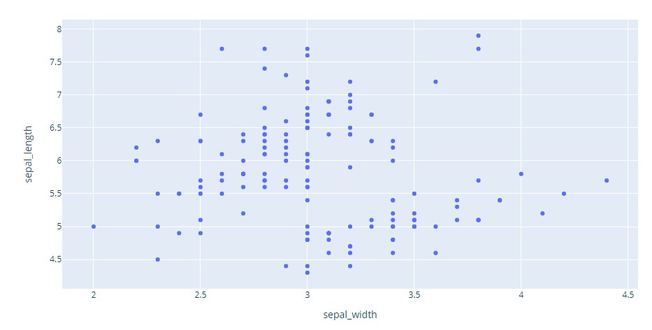
Plotly code:
import plotly.express as px
df = px.data.iris() # iris is a pandas DataFrame
fig = px.scatter(df, x="sepal_width", y="sepal_length")
fig.show()
Seaborn code:
import seaborn as sns
tips = sns.load_dataset("tips")
sns.scatterplot(data=tips, x="total_bill", y="tip")
According to the correlation of the data points, scatter plots are grouped into different types. These correlation types are listed below
Positive Correlation
In these types of plots, an increase in the independent variable indicates an increase in the variable that depends on it. A scatter plot can have a high or low positive correlation.
Negative Correlation
In these types of plots, an increase in the independent variable indicates a decrease in the variable that depends on it. A scatter plot can have a high or low negative correlation.
No Correlation
Two groups of data visualized on a scatter plot are said to not correlate if there is no clear correlation between them.
Bubble Chart
Visualization:
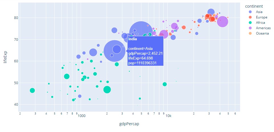
Plotly code:
import plotly.express as px
df = px.data.gapminder()

fig = px.scatter(df.query("year==2007"), x="gdpPercap", y="lifeExp",
         size="pop", color="continent",
                 hover_name="country", log_x=True, size_max=60)
fig.show()
Seaborn code:
import matplotlib.pyplot as plt
import seaborn as sns
from gapminder import gapminder # import data set

data = gapminder.loc[gapminder.year == 2007]

b = sns.scatterplot(data=data, x="gdpPercap", y="lifeExp", size="pop", legend=False, sizes=(20, 2000))

b.set(xscale="log")

plt.show()
Their categories into different types are based on the number of variables in the dataset, the type of visualized data, and the number of dimensions in them.
Simple Bubble Chart
It is the basic type of bubble chart and is equivalent to the normal bubble chart.
Labelled Bubble Chart
The bubbles on this bubble chart are labelled for easy identification. This is to deal with different groups of data.
The multivariable Bubble Chart
This chart has four dataset variables. The fourth variable is distinguished with a different colour.
Map Bubble Chart
It is used to illustrate data on a map.
3D Bubble Chart
This is a bubble chart designed in a 3-dimensional space. The bubbles here are spherical.
Radar Chart
It is a graphic displaying data that consists of many independent variables. It is shown as a two-dimensional chart of three or more quantitative variables. These variables are shown on axes starting from the same point.
Visualization:
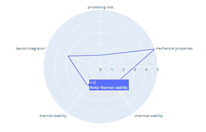
Plotly code:
import plotly.express as px
import pandas as pd
df = pd.DataFrame(dict(
    r=[1, 5, 2, 2, 3],
    theta=['processing cost','mechanical properties','chemical stability',
           'thermal stability', 'device integration']))
fig = px.line_polar(df, r='r', theta='theta', line_close=True)
fig.show()
Seaborn code:
import pandas as pd
import seaborn as sns
import numpy as np
import matplotlib.pyplot as plt
stats=np.array([1, 5, 2, 2, 3])
labels=['processing cost','mechanical properties','chemical stability',
           'thermal stability', 'device integration']
angles=np.linspace(0, 2*np.pi, len(labels), endpoint=False)
fig=plt.figure()
ax = fig.add_subplot(111, polar=True)
ax.plot(angles, stats, 'o-', linewidth=2)
ax.fill(angles, stats, alpha=0.25)
ax.set_thetagrids(angles * 180/np.pi, labels)
ax.set_title("Radar Chart")
ax.grid(True)
These are types of radar charts:
Simple Radar Chart
This is the basic type of radar chart. It consists of several radii drawn from the centre point.
Radar Chart with Markers
In these, each data point on the spider graph is marked.
Filled Radar Chart
In the filled radar charts, the space between the lines and the centre of the spider web is coloured.
Pictogram Graph
It uses icons to provide a more engaging overall view of small sets of discrete data. Additionally, the icons represent the subject or category of the underlying data. For example, population data would utilize icons of people. Furthermore, each icon can represent one or many units, such as a million. Moreover, side-by-side comparison of data is facilitated through columns or rows of icons. This enables a clear comparison of each category to one another.
Here is an illustration:
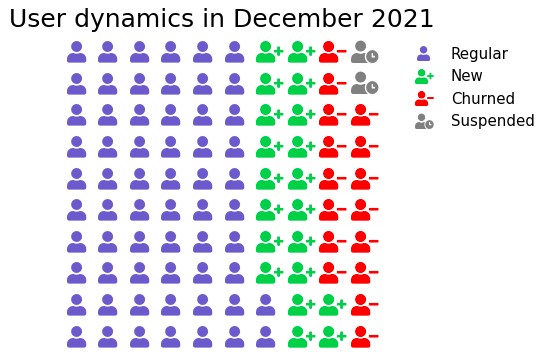
In plotly, marker symbol can be used with graph_objs Scatter. Icons attribute can be used in the figure method of matplotlib. The complete code listing is provided in GitHub.
Spline Chart
A spline chart is a line chart. It connects each data point from the series with a fitted curve that represents a rough approximation of the missing data points.
Visual illustration:
In plotly, it is achieved in line plot by specifying line_shape to be spline. Scipy interpolation and NumPy linspace can be used to achieve this in matplotlib. Again the complete code listing is provided in GitHub.
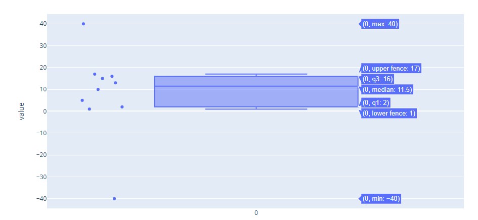
Box Plot
Box Plot is a good way of looking at how data is distributed. It has a box as the name suggests. One end of the box is at the 25th percentile of the data. 25th percentile is the line drawn where 25% of the data points lie below it. The other end of the box is at the 75th percentile (which is defined similarly to the 25th percentile as above).
The median of the data is marked by a line. There are two additional lines which are called whiskers. The 25th percentile mark is termed ‘Q1’ (representing the first quarter of the data). 75th percentile is Q3. The difference between Q3 and Q1 (Q3 – Q1) is IQR (Inter Quartile Range). Whiskers are marked at last data points on either side within the extreme range of Q1 – 1.5 * IQR and Q3 + 1.5 * IQR. The data points outside these whiskers are called ‘outliers’ as they deviate significantly from the rest of the data points.
Plotly code:
import numpy as np
import plotly.express as px
data = np.array([-40,1,2,5,10,13,15,16,17,40])
fig = px.box(data, points="all")
fig.show()
Visualization:
Seaborn code:
import seaborn as sns
sns.set_style( 'darkgrid' )
fig = sns.boxplot(y=data)
Visualization:
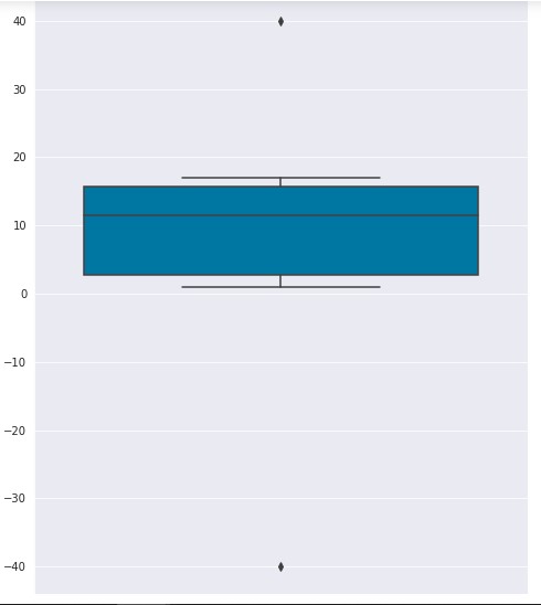
Box Plot is useful in understanding the overall distribution of data even with large datasets.
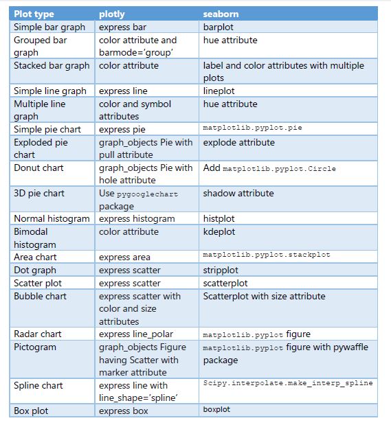
Cheat Sheet
Here is a cheat sheet of methods and attributes in plotly and seaborn for generating these plots.
Conclusion
We looked at a variety of plots and saw when to use each one of them. Also, we looked at code in plotly and seaborn for generating these plots. We went over visualizations of these plots for better understanding. A reference cheat sheet is provided on which methods and attributes to be used in plotly and seaborn for generating these plots.
Now that you are equipped with these tools, techniques, and tips. Hope you’re now well equipped with Data Plot Types for the Visualisation concept. Try this out and have fun!
Want to read another article on data visualization? Click here.
Frequently Asked Questions
A. The choice of the best graph for data visualization depends on the nature of your data and the insights you want to convey. Common types include bar charts for comparisons, line plots for trends, and scatter plots for relationships.
A. Data types in data visualization include categorical data (e.g., labels or categories), numerical data (e.g., quantities or measurements), ordinal data (e.g., rankings), and time-series data (e.g., chronological data points).
A. In the report view, the four main types of visualizations are tables (tabular data), charts and graphs (visual representations of data), maps (geospatial data), and text (narrative descriptions or explanations).
A. The four main types of graphs used to display scientific data are line graphs (for showing trends over time), bar graphs (for comparing categories), scatter plots (for displaying relationships between variables), and pie charts (for illustrating parts of a whole).
The media shown in this article is not owned by Analytics Vidhya and are used at the Author’s discretion.


[…] post 12 Data Plot Types for Visualisation from Concept to Code appeared first on Analytics […]