This article was published as a part of the Data Science Blogathon.
Cryptocurrencies are digital tokens that can easily replace traditional currency in the future. Easy access is the reason they are becoming so popular so fast. Almost anyone can own these coins and are accepted as payment just like traditional currency.
The blockchain technology on which most of these tokens are based, and their decentralized systems can have many more implementations in creating more safe and secure organizational environments in the future. In theory, it can change how economies and industries work and can almost effectively eliminate inefficiency and human error.
Like I said we are on the verge of something new and exciting, and getting on the ground floor of this change can benefit us and our successors in ways unimaginable. But how about we start this exciting crypto stuff with some good old data science analysis?
Dataset
You can find the dataset we will use here: Kaggle: Cryptocurrency
Let’s start with some EDA.
Exploratory Data Analysis
Python Code:
import pandas as pd
import numpy as np
import matplotlib.pyplot as plt
import seaborn as sns
from datetime import datetime, timedelta
import warnings
warnings.filterwarnings('ignore')
import matplotlib.dates as mdates
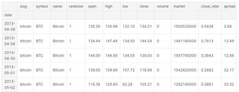
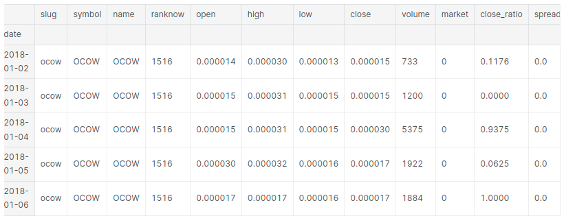
df = pd.read_csv('crypto-markets.csv')
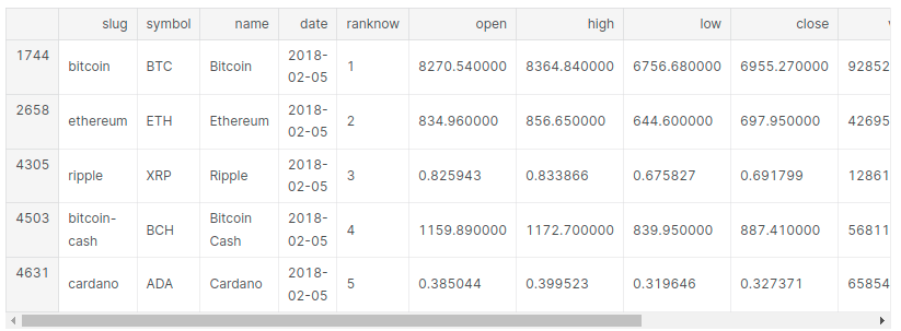
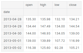
print(df.head())Open The price of the coin at the beginning of the trading day.
High: The highest price of the coin on a trading day.
Low: The lowest price of the coin on a trading day.
Close: The last price of the coin before the trading day ends.
# Transforming date to date object
df['date'] = pd.to_datetime(df['date'], format='%Y-%m-%d')
# Getting a dataframe containing only the latest date's data for each currency
print("Latest crypto data")
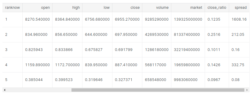
latest_df = df[df['date'] == max(df['date'])]
latest_df.head()
print("Number of cryptocurrencies listed: ")
latest_df['symbol'].nunique()
> Number of cryptocurrencies listed: 1461
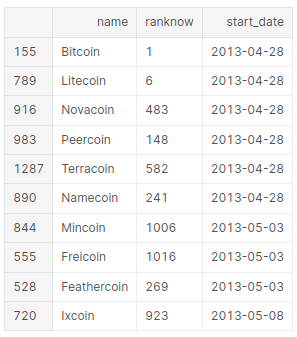
Old and new tokens
# starting dates for all currencies
start_df = pd.DataFrame({'start_date' : df.groupby( [ "name", "ranknow"] )['date'].min()}).reset_index()

# List the oldest ones
print("Oldest Cryptocurrencies")
start_df.sort_values(['start_date']).head(x)
Oldest Cryptocurrencies
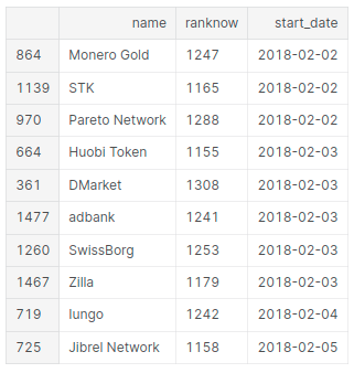
# List of the new ones
print("New Cryptocurrencies")
start_df.sort_values(['start_date']).tail(x)
New Cryptocurrencies
Rank
latest_df[latest_df['ranknow'] <= x].groupby('ranknow').name.unique()
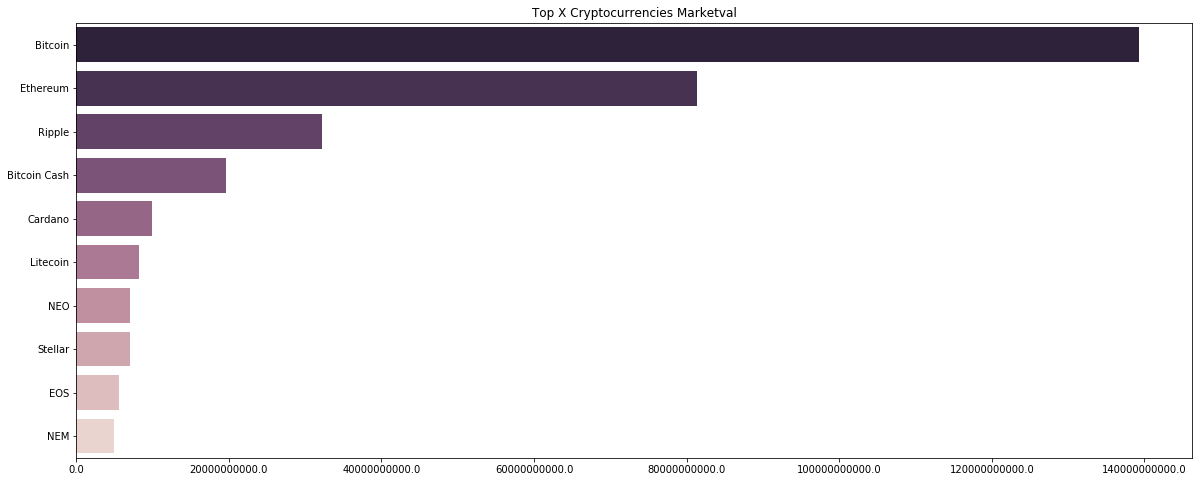
Market capitalization
We can calculate this value by multiplying the current price of the token with the total amount circulating in the market.
# Plotting the top X currencies according to market valuation
name = latest_df['name'].unique()
currency  = []
marketval = []
x_currencies = name[:x]
for i, cn in enumerate(x_currencies):
     filtered = latest_df[(latest_df['name']==str(cn))]
     currency.append(str(cn))
     marketval.append(filtered['market'].values[0])

f, ax = plt.subplots(figsize=(20, 8))
g = sns.barplot( y = currency, x = marketval, palette=sns.cubehelix_palette(x, reverse=True))
plt.title("Top X Cryptocurrencies Marketval")
ax.set_xticklabels(ax.get_xticks())
fig=plt.gcf()
plt.show()
Volume
In simple words, Volume is the amount of a token traded in a specific time interval.
# Plotting the top X currencies by volume
latest_df
currency  = []
volume = []
x_currencies = name[:x]
for i, cn in enumerate(x_currencies):
     filtered = latest_df[(latest_df['name']==str(cn))]
     currency.append(str(cn))
     volume.append(filtered['volume'].values[0])

f, ax = plt.subplots(figsize=(20, 8))
g = sns.barplot( y = currency, x = volume, palette=sns.cubehelix_palette(x, reverse=True))
plt.title("Top X Cryptocurrencies Volume")
ax.set_xticklabels(ax.get_xticks())
fig=plt.gcf()
plt.show()
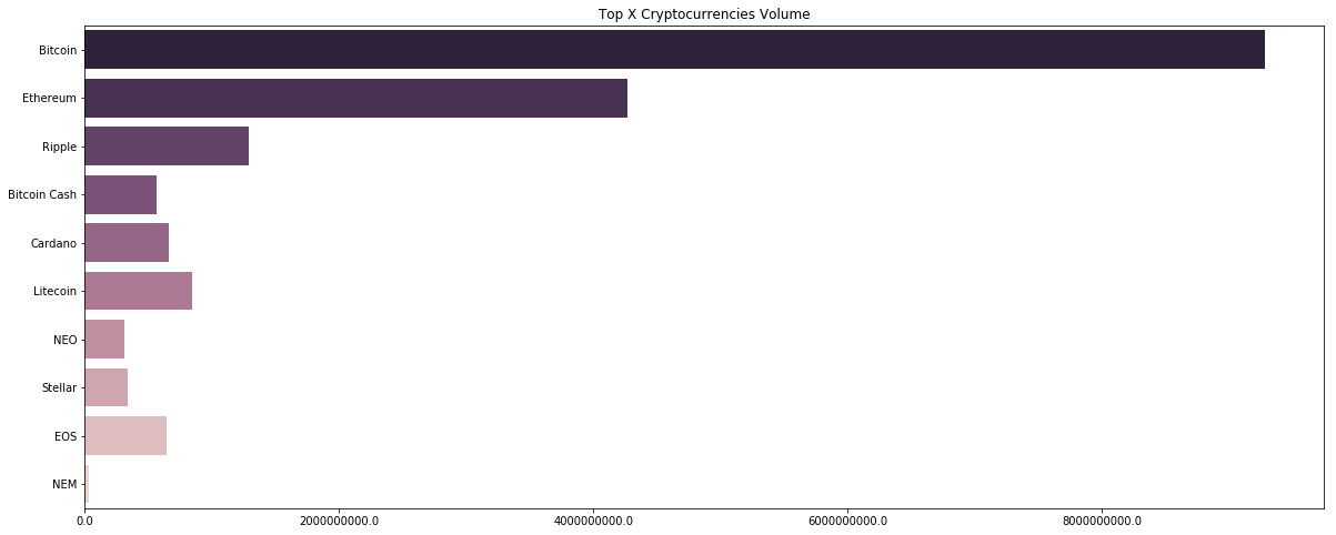
The crypto market much like the stock market depends a lot on the trader’s sentiments. The buyers are the ones who increase the price and the sellers are the ones who drive the price low. An increase in price but a decrease in volume traded shows a lack of interest, and thus can end up in a potential reversal. I know it’s counterintuitive, but that’s how financial markets all over the world works.
In this next section, we will use candlestick charts, which is the most popular chart-type used by traders, along with indicators like moving average to see if we can track some changes in volumes and uptrends and downtrends in the crypto market.
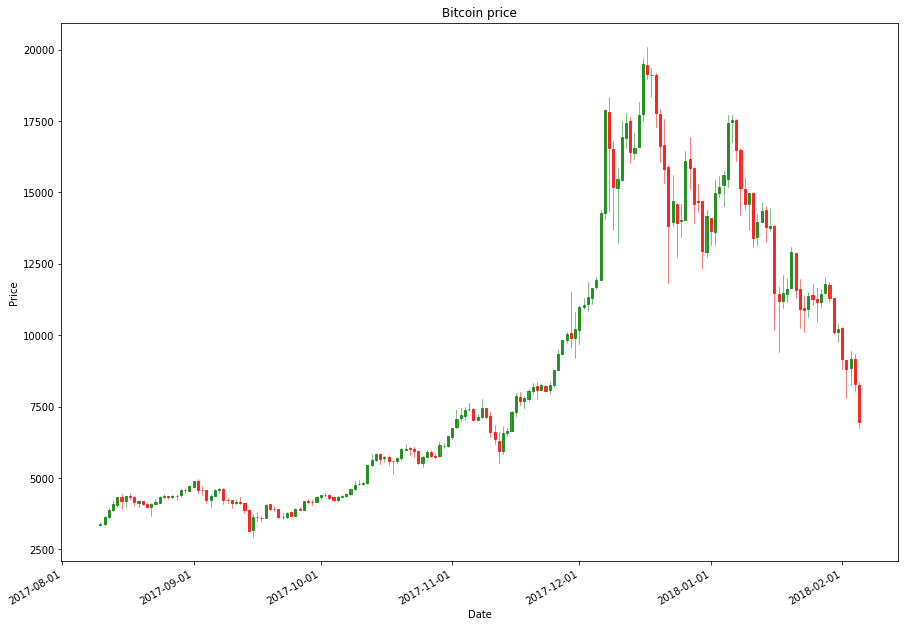
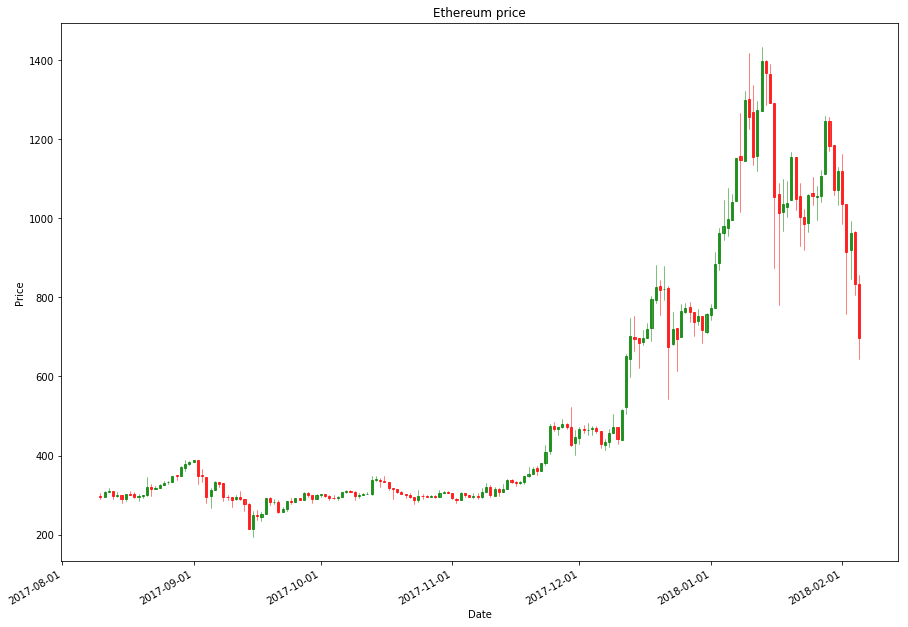
Japanese Candlestick
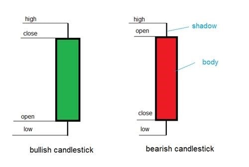
Image Source: Japanese Candlesticks: Find reliable signals
There are 2 types of candles in a Japanese candlestick pattern, a green and a red. The green one signifies the price increased in the given time interval and the red one vice versa. The rectangular part of a candlestick is its body. In a green candle, the bottom end is the opening price and the upper one is the closing price. The 2 wicks out of the rectangle from both sides are called shadows, which signify the high and low price for that timeframe.
# Candlestick chart for Bitcoin
rank = 1
months = 6

name = df[df.ranknow == rank].iloc[-1]['name']
filtered_df = df[(df['ranknow'] == rank) & (df['date'] > (max(df['date']) - timedelta(days=30*months)))]
OHLCfiltered_df = filtered_df[['date','open','high','low','close']]
OHLCfiltered_df['date'] = mdates.date2num(OHLCfiltered_df['date'].dt.date)

f,ax=plt.subplots(figsize=(15,11))
ax.xaxis_date()
candlestick_ohlc(ax, OHLCfiltered_df.values, width=0.5, colorup='g', colordown='r',alpha=0.75)

plt.xlabel("Date")
ax.xaxis.set_major_formatter(mdates.DateFormatter('%Y-%m-%d'))
plt.gcf().autofmt_xdate()
plt.title(name + " price")
plt.ylabel("Price")
plt.show()
# Candlestick chart for Etherium
rank = 2
months = 6

name = df[df.ranknow == rank].iloc[-1]['name']
filtered_df = df[(df['ranknow'] == rank) & (df['date'] > (max(df['date']) - timedelta(days=30*months)))]
OHLCfiltered_df = filtered_df[['date','open','high','low','close']]
OHLCfiltered_df['date'] = mdates.date2num(OHLCfiltered_df['date'].dt.date)

f,ax=plt.subplots(figsize=(15,11))
ax.xaxis_date()
candlestick_ohlc(ax, OHLCfiltered_df.values, width=0.5, colorup='g', colordown='r',alpha=0.75)

plt.xlabel("Date")
ax.xaxis.set_major_formatter(mdates.DateFormatter('%Y-%m-%d'))
plt.gcf().autofmt_xdate()
plt.title(name + " price")
plt.ylabel("Price")
plt.show()
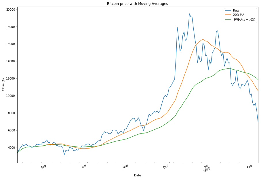
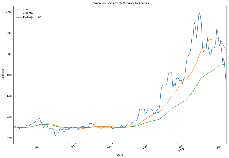
Moving average
We can use SMA(simple moving average) which is a very popular indicator in stock trading, to analyze the trends in the market.
# Moving average chart for Bitcoin
rank = 1
months = 6
name = df[df.ranknow == rank].iloc[-1]['name']
filtered_df = df[(df['ranknow'] == rank) & (df['date'] > (max(df['date']) - timedelta(days=30*months)))]

filtered_df.set_index('date', inplace=True)

f, ax = plt.subplots(figsize=(15,11))
filtered_df.close.plot(label='Raw', ax=ax)
filtered_df.close.rolling(20).mean().plot(label='20D MA', ax=ax)
filtered_df.close.ewm(alpha=0.03).mean().plot(label='EWMA($\alpha=.03$)', ax=ax)

plt.title(name + " price with Moving Averages")
plt.legend()
plt.xlabel("Date")
plt.gcf().autofmt_xdate()
plt.ylabel("Close ($)")
plt.show()
# Moving average chart for Etherium
rank = 2
months = 6
name = df[df.ranknow == rank].iloc[-1]['name']
filtered_df = df[(df['ranknow'] == rank) & (df['date'] > (max(df['date']) - timedelta(days=30*months)))]

filtered_df.set_index('date', inplace=True)

f, ax = plt.subplots(figsize=(15,11))
filtered_df.close.plot(label='Raw', ax=ax)
filtered_df.close.rolling(20).mean().plot(label='20D MA', ax=ax)
filtered_df.close.ewm(alpha=0.03).mean().plot(label='EWMA($\alpha=.03$)', ax=ax)

plt.title(name + " price with Moving Averages")
plt.legend()
plt.xlabel("Date")
plt.gcf().autofmt_xdate()
plt.ylabel("Close ($)")
plt.show()
Here are a few well-known facts about using the SMA in the stock market:
- The 20 moving average (20MA) is used for the short-term analysis.
- The 50 moving average (50MA) is used for medium-term analysis.
- The 200 moving average (200MA) is used to determine the trend.
In a bullish run (uptrend) the price of the stock should be above 20 MA, and the 50 MA in between 20 MA and 200 MA. And in a bear run (downtrend), the vice versa.
Let’s see if that is the case with our top 2 cryptocurrencies: Bitcoin and Etherium.
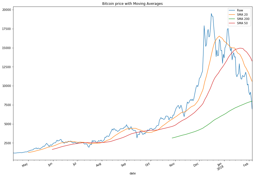
# Moving average chart for BTC
rank = 1
months = 10
name = df[df.ranknow == rank].iloc[-1]['name']
filtered_df = df[(df['ranknow'] == rank) & (df['date'] > (max(df['date']) - timedelta(days=30*months)))]
filtered_df.set_index('date', inplace=True)
sma20 = filtered_df.close.rolling(20).mean()
sma50 = filtered_df.close.rolling(50).mean()
sma200 = filtered_df.close.rolling(200).mean()
smaplot =pd.DataFrame({'Raw': filtered_df.close, 'SMA 20': sma20, 'SMA 50': sma50, 'SMA 200': sma200})
smaplot.plot(figsize=(9,5), legend=True, title="Bitcoin price with Moving Averages")
plt.gcf().autofmt_xdate()
plt.show()
As you can see a classic uptrend in mid-November 2017. After a few crosses between the coin price and the 20 SMA, we see a clear uptrend in 2017 end. But before not so long, we see a clear trend reversal in early January, indicating the beginning of a bear run.
# Moving average chart for ETH
rank = 2
months = 10
name = df[df.ranknow == rank].iloc[-1]['name']
filtered_df = df[(df['ranknow'] == rank) & (df['date'] > (max(df['date']) - timedelta(days=30*months)))]

filtered_df.set_index('date', inplace=True)

# simple moving averages
sma20 = filtered_df.close.rolling(20).mean()
sma50 = filtered_df.close.rolling(50).mean()
sma200 = filtered_df.close.rolling(200).mean()

smaplot = pd.DataFrame({'Raw': filtered_df.close, 'SMA 20': sma20, 'SMA 50': sma50, 'SMA 200': sma200})
smaplot.plot(figsize=(9,5), legend=True, title="Etherium price with Moving Averages")

plt.gcf().autofmt_xdate()
plt.show()
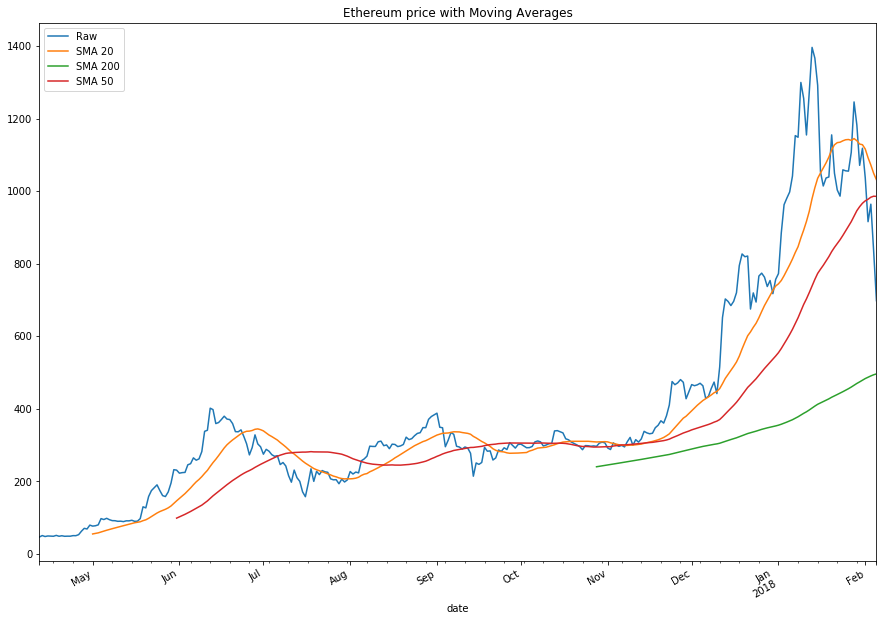
Etherium had a similar uptrend in late 2017 but mostly had a sideways market in most of 2017. In early 2108 we can see the 20 MA starting to change directions, which can possibly result in a bear run, but as of now, there’s no clear indication.
Price Prediction using ARIMA
In this section, we will use ARIMA(AutoRegressive Integrated Moving Average) to predict the price of Bitcoin using past data and the above analysis.
Importing libraries
import pandas as pd
from pandas import DataFrame
import numpy as np

import matplotlib.pyplot as plt
plt.rcParams["figure.figsize"] = (15,7)

import seaborn as sns
from datetime import datetime, timedelta

from statsmodels.tsa.arima_model import ARIMA
from statsmodels.tsa.statespace.sarimax import SARIMAX
from statsmodels.graphics.tsaplots import plot_acf, plot_pacf
from statsmodels.tsa.stattools import adfuller
from statsmodels.tsa.seasonal import seasonal_decompose

from scipy import stats
import statsmodels.api as sm
from itertools import product

import warnings
warnings.filterwarnings('ignore')
Importing data
dateparse = lambda dates: pd.datetime.strptime(dates, '%Y-%m-%d')
df = pd.read_csv('../input/crypto-markets.csv', parse_dates=['date'], index_col='date', date_parser=dateparse)
df.head()
df.tail()
# Extracting bitcoin data
btc=df[df['symbol']=='BTC']
btc.drop(['slug', 'volume','symbol','name','ranknow','market', 'close_ratio', 'spread'],axis=1,inplace=True)
btc.head()
ARIMA Model
AutoRegressive Integrated Moving Average
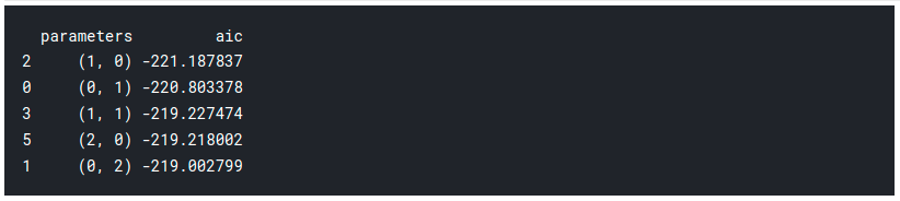
The model has 3 parameters p, d, and q accounting for seasonality, trend, and noise in the dataset. We will fit the ARIMA model using a stats model which will return something called an AIC value (Akaike Information Criterion). The AIC scales how compatible the model fits the data and the complexity of the model. A model with a lot of features that fit the data will be given a larger AIC score, than a model with the same accuracy but a lesser number of features. Thus we are looking for a model which yields a low AIC score. Let’s get started :
# Initial approximation of parameters
qs = range(0, 3)
ps = range(0, 3)
d=1
parameters = product(ps, qs)
parameters_list = list(parameters)
len(parameters_list)
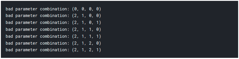
# Model Selection
results = []
best_aic = float("inf")
warnings.filterwarnings('ignore')
for param in parameters_list:
try:
model = SARIMAX(btc_month.close_box, order=(param[0], d, param[1])).fit(disp=-1)
except ValueError:
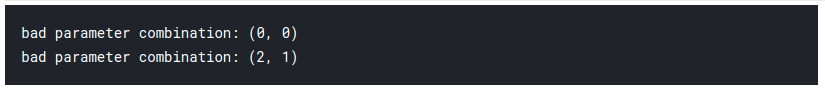
print('bad parameter combination:', param)
continue
aic = model.aic
if aic < best_aic:
best_model = model
best_aic = aic
best_param = param
results.append([param, model.aic])
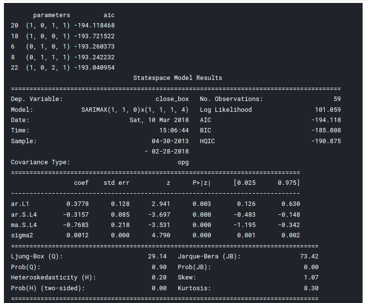
# Best Models
result_table = pd.DataFrame(results)
result_table.columns = ['parameters', 'aic']
print(result_table.sort_values(by = 'aic', ascending=True).head())
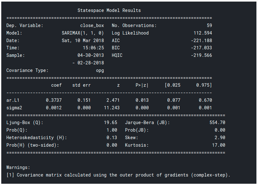
print(best_model.summary())
Results
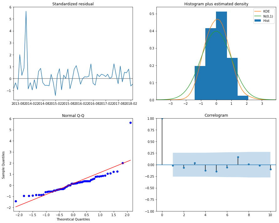
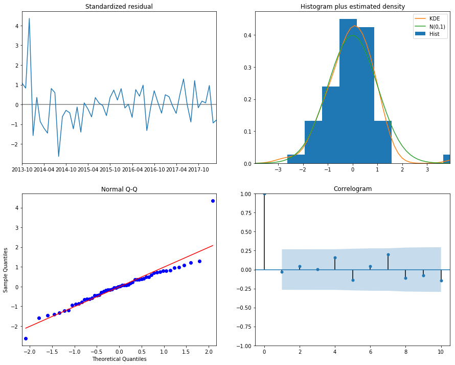
print("Dickey–Fuller test:: p=%f" % adfuller(best_model.resid[13:])[1])

best_model.plot_diagnostics(figsize=(15, 12))
plt.show()
Now it’s time for some prediction!
Prediction
btc_pred = btc_month[['close']]
date_list = [datetime(2018,6,31), datetime(2018,5,30), datetime(2018,3,31), datetime(2018,4,30)]
future = pd.DataFrame(index=date_list, columns= btc_month.columns)
btc_pred = pd.concat([btc_month_pred, future])
btc_pred['forecast'] = invboxcox(best_model.predict(start=datetime(2014,1,31),end=datetime(2018,6,30)),lmbda)
plt.figure(figsize=(15,7))
btc_month_pred.close.plot()
btc_month_pred.forecast.plot(color='r', ls='--', label='Predicted Close')
plt.legend()
plt.title('Bitcoin monthly forecast')
plt.ylabel('USD')
plt.show()
SARIMAX Model
It stands for Seasonal ARIMA with eXogenous regressors model.
The bitcoin data above showed some seasonality which was unexpected. Therefore we can improve our model using SARIMA.
# Initial approximation of parameters
Qs = range(0, 2)
qs = range(0, 3)
Ps = range(0, 3)
ps = range(0, 3)
D=1
d=1
parameters = product(ps, qs, Ps, Qs)
parameters_list = list(parameters)
len(parameters_list)

# Model Selection
results = []
best_aic = float("inf")
warnings.filterwarnings('ignore')
for param in parameters_list:
    try:
        model = SARIMAX(btc_month.close_box, order=(param[0], d, param[1]), seasonal_order=(param[2], D, param[3], 4)).fit(disp=-1)
    except ValueError:
        print('bad parameter combination:', param)
        continue
    aic = model.aic
    if aic < best_aic:
        best_model = model
        best_aic = aic
        best_param = param
    results.append([param, model.aic])
# Best Models
result_table = pd.DataFrame(results)
result_table.columns = ['parameters', 'aic']
print(result_table.sort_values(by = 'aic', ascending=True).head())
print(best_model.summary())
Results
print("Dickey–Fuller test:: p=%f" % adfuller(best_model.resid[13:])[1])

best_model.plot_diagnostics(figsize=(15, 12))
plt.show()
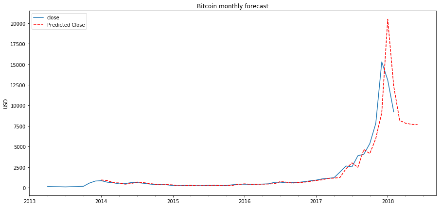
Prediction of the ARIMA Model
btc_month2 = btc_month[['close']]
date_list = [datetime(2018,6,31),datetime(2018,5,30),datetime(2018,3,31),datetime(2018,4,30)]
future = pd.DataFrame(index=date_list, columns= btc_month.columns)
btc_month2 = pd.concat([btc_month2, future])

btc_month2['forecast'] = invboxcox(best_model.predict(start=0, end=75), lmbda)

plt.figure(figsize=(15,7))
btc_month2.close.plot()
btc_month2.forecast.plot(color='r', ls='--', label='forecast')
plt.legend()
plt.title('Bitcoin Monthly Close Forecast')
plt.ylabel('USD')
plt.savefig('bitcoin_monthly_forecast.png')
plt.show()
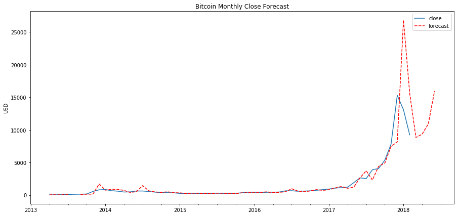
Validation
Now we will calculate how accurate our prediction is using RMSE (root mean square error). Let’s calculate the RMSE for 2015 through 2017:
y_forecasted = btc_month2.forecast
y_truth = btc_month2['2015-01-01':'2017-01-01'].close

# Compute the root mean square error
rmse = np.sqrt(((y_forecasted - y_truth) ** 2).mean())
print('Mean Squared Error: {}'.format(round(rmse, 2)))

End Notes
Thank you for taking out the time to read this article. If you liked my work and want to read more of it here’s the link to my Analytics Vidhya profile, be sure to check it out:
Sion | Author at Analytics Vidhya
Thanks and cheers!


I am doing my PDP in Data Science and this post is really useful in that context. ARIMA works well in a time series.
This ARIMA model looks pretty good. It might give proper Cryptocurrency Price Prediction.
Nice post, im happy about the recent rise of the crypto market and i wish it continues. By the way i enjoy the detailed post