This article was published as a part of the Data Science Blogathon.
Overview
In this article, we will be going through the Chronic kidney disease dataset and doing the complete analysis on the same our main goal will be to predict whether an individual will have chronic kidney disease or not based on the data provided.

Topics that will be covered are:
- Data preprocessing
- Exploratory data analysis
- Model building
- Saving the model
Let’s get started!
Importing necessary libraries
import pandas as pd
import numpy as np
import matplotlib.pyplot as plt
from sklearn.model_selection import GridSearchCV, train_test_split, cross_val_score
from sklearn.preprocessing import StandardScaler
from sklearn.metrics import r2_score
import scipy.stats as stats
import seaborn as sns

%matplotlib inline
Now, let’s read our dataset
df = pd.read_csv('kidney.csv')
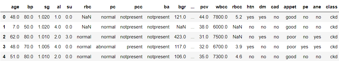
data = df
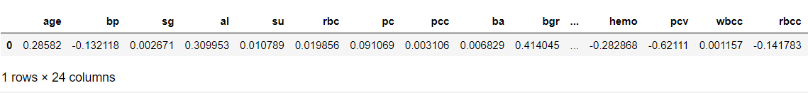
data.head()
Output:
Now, let’s see the shape of our dataset
data.shape
Output:
(400, 25)
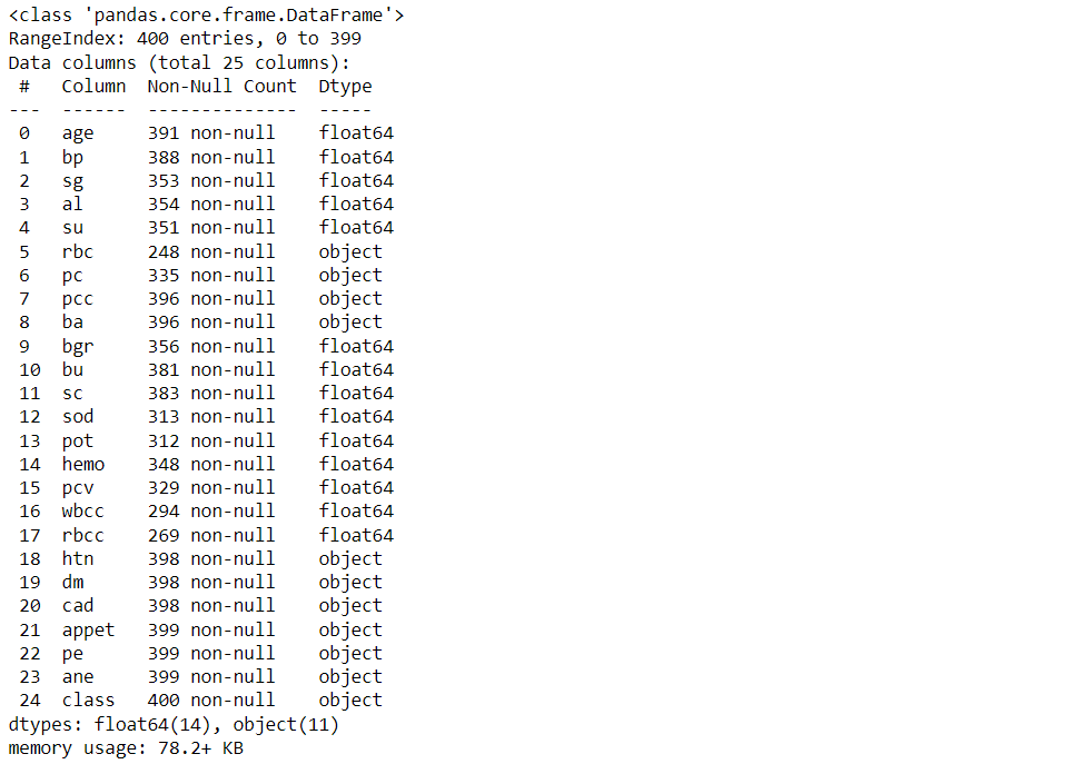
Data Preprocessing
df.info()
Output:
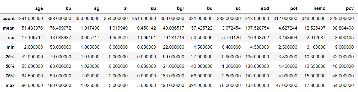
Now, let’s see our data statistically
df.describe()
Output:
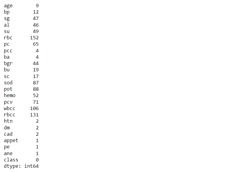
Now, let’s see the total count of null values that every feature holds
df.isna().sum()
Output:
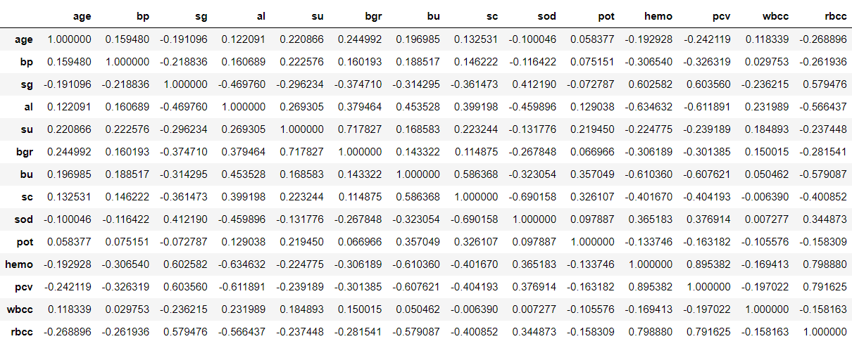
Correlation matrix & Matrix Visualisation
df.corr()
Output:
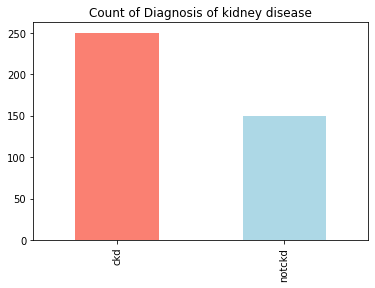
Let’s find out how many of each class are:
df['class'].value_counts()
Output:
ckd       250
notckd    150
Name: class, dtype: int64
Inference: From the below output we can draw our inference that this is close to an “imbalanced dataset”.
Representation of Target variable in Percentage
countNoDisease = len(df[df['class'] == 0])
countHaveDisease = len(df[df['class'] == 1])
print("Percentage of Patients Haven't Heart Disease: {:.2f}%".format((countNoDisease / (len(df['class']))*100)))
print("Percentage of Patients Have Heart Disease: {:.2f}%".format((countHaveDisease / (len(df['class']))*100)))
Output:
Percentage of Patients Haven't Heart Disease: 0.00%
Percentage of Patients Have Heart Disease: 0.00%
Understanding the balancing of the data visually
df['class'].value_counts().plot(kind='bar',color=['salmon','lightblue'],title="Count of Diagnosis of kidney disease")
Output:
Here we will be checking the distribution of the age column
df['age'].plot(kind='hist')
Output:
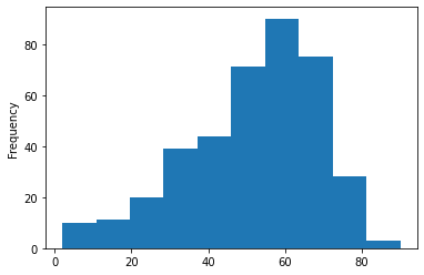
Inference: Herewith the help of histogram we can see that 50-60 age group people are widely spread in this dataset.
Here we are plotting the graph to see the null values in the dataset.
p = msno.bar(data)
Output:
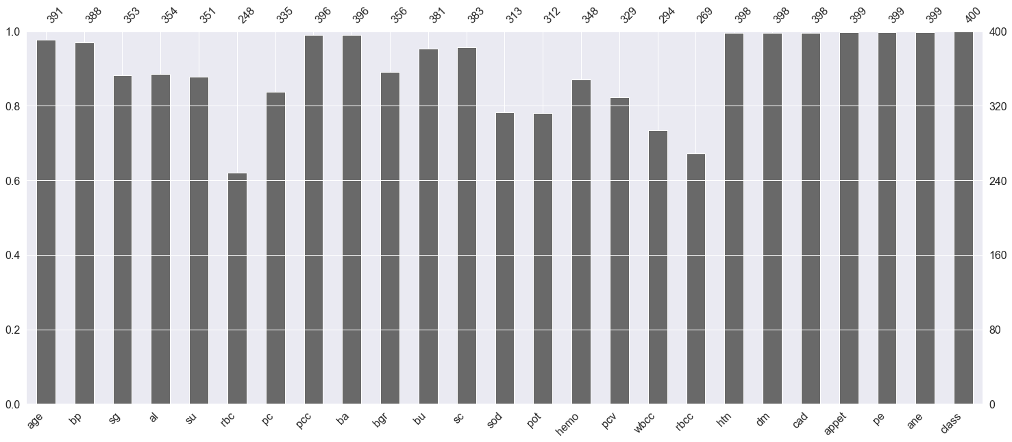
Inference: Here any features which have not touched the 400 mark at the top are having null values.
plt.subplot(121), sns.distplot(data['bp'])
plt.subplot(122), data['bp'].plot.box(figsize=(16,5))
plt.show()
Output:
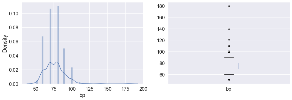
Inference: Here in the above graph we can see the distribution of blood pressure and also in the subplot it is visible that the bp column has some outliers in it.
Now we will convert the categorical values(object) to categorical values(int)
data['class'] = data['class'].map({'ckd':1,'notckd':0})
data['htn'] = data['htn'].map({'yes':1,'no':0})
data['dm'] = data['dm'].map({'yes':1,'no':0})
data['cad'] = data['cad'].map({'yes':1,'no':0})
data['appet'] = data['appet'].map({'good':1,'poor':0})
data['ane'] = data['ane'].map({'yes':1,'no':0})
data['pe'] = data['pe'].map({'yes':1,'no':0})
data['ba'] = data['ba'].map({'present':1,'notpresent':0})
data['pcc'] = data['pcc'].map({'present':1,'notpresent':0})
data['pc'] = data['pc'].map({'abnormal':1,'normal':0})
data['rbc'] = data['rbc'].map({'abnormal':1,'normal':0})
data['class'].value_counts()
Output:
1    250
0    150
Name: class, dtype: int64
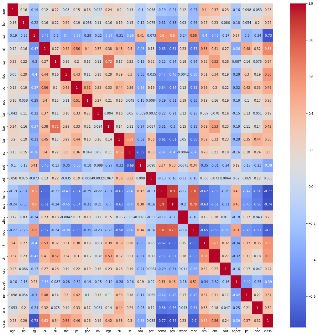
Finding the Correlation between the plots
plt.figure(figsize = (19,19))
sns.heatmap(data.corr(), annot = True, cmap = 'coolwarm') # looking for strong correlations with "class" row
Output:
Exploratory data analysis (EDA)
Let’s see the shape of the dataset again after analysis
data.shape
Output:
(400, 25)
Now let’s see the final columns present in our dataset.
data.columns
Output:
Index(['age', 'bp', 'sg', 'al', 'su', 'rbc', 'pc', 'pcc', 'ba', 'bgr', 'bu',
       'sc', 'sod', 'pot', 'hemo', 'pcv', 'wbcc', 'rbcc', 'htn', 'dm', 'cad',
       'appet', 'pe', 'ane', 'class'],
      dtype='object')
Now dropping the null values.
data.shape[0], data.dropna().shape[0]
Output:
(400, 158)
Here from the above output, we can see that there are 158 null values in the dataset. Now here we are left with two choices that we could either drop all the null values or keep them when we will drop that NA values so we should understand that our dataset is not that large and if we drop those null values then it would be even smaller in that case if we provide very fewer data to our machine learning model then the performance would be very less also we yet don’t know that these null values are related to some other features in the dataset.
So for this time I’ll keep these values and see how the model will perform in this dataset.
Also when we are working on some healthcare project where we will be predicting whether the person is suffering from that disease or not then one thing we should keep in my mind is that the model evaluation should have the least false positive errors.
data.dropna(inplace=True)
data.shape
Output:
(158, 25)
Model Building
- Logistic regression
from sklearn.linear_model import LogisticRegression

logreg = LogisticRegression()

X = data.iloc[:,:-1]
y = data['class']

X_train, X_test, y_train, y_test = train_test_split(X,y, stratify = y, shuffle = True)

logreg.fit(X_train,y_train)
Output:
LogisticRegression()
Training score
logreg.score(X_train,y_train)
Output:
1.0
Testing accuracy
logreg.score(X_test,y_test)
Output:
0.975
Printing the training and testing accuracy
from sklearn.metrics import accuracy_score, confusion_matrix

print('Train Accuracy: ', accuracy_score(y_train, train_pred))
print('Test Accuracy: ', accuracy_score(y_test, test_pred))
Output:
Train Accuracy:  1.0
Test Accuracy:  0.975
The cell below shows the coefficients for each variable.
(example on reading the coefficients from a Logistic Regression: a one-unit increase in age makes an individual about e^0.14 time as likely to have CKD, while a one-unit increase in blood pressure makes an individual about e^-0.07 times as likely to have CKD.
pd.DataFrame(logreg.coef_, columns=X.columns)
Output:
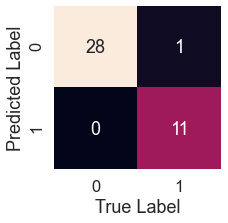
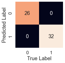
Confusion Matrix
sns.set(font_scale=1.5)
def plot_conf_mat(y_test,y_preds):
    """
    This function will be heloing in plotting the confusion matrix by using seaborn
    """

    fig,ax=plt.subplots(figsize=(3,3))
    ax=sns.heatmap(confusion_matrix(y_test,y_preds),annot=True,cbar=False)
    plt.xlabel("True Label")
    plt.ylabel("Predicted Label")
log_pred = logreg.predict(X_test)
plot_conf_mat(y_test, log_pred)
Output:
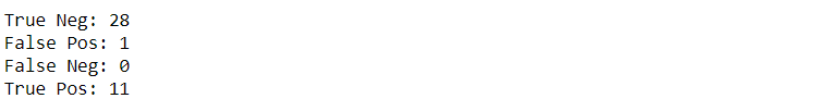
tn, fp, fn, tp = confusion_matrix(y_test, test_pred).ravel()

print(f'True Neg: {tn}')
print(f'False Pos: {fp}')
print(f'False Neg: {fn}')
print(f'True Pos: {tp}')
Output:
K-Nearest Neighbors Classifier
It is a good practice to first balance the class well before using the KNN, as we know that in the case of unbalanced classes KNN doesn’t perform well.
df["class"].value_counts()
Output:
0    115
1     43
Name: class, dtype: int64
Now let’s CONCATENATE our class variables together.
balanced_df = pd.concat([df[df["class"] == 0], df[df["class"] == 1].sample(n = 115, replace = True)], axis = 0)
balanced_df.reset_index(drop=True, inplace=True)
balanced_df["class"].value_counts()
Output:
1    115
0    115
Name: class, dtype: int64
Now let’s scale down the data
ss = StandardScaler()
ss.fit(X_train)
X_train = ss.transform(X_train)
X_test = ss.transform(X_test)
Now we will tune the KNN model for better accuracy
from sklearn.neighbors import KNeighborsClassifier
knn = KNeighborsClassifier()

params = {
    "n_neighbors":[3,5,7,9],
    "weights":["uniform","distance"],
    "algorithm":["ball_tree","kd_tree","brute"],
    "leaf_size":[25,30,35],
    "p":[1,2]
}

gs = GridSearchCV(knn, param_grid=params)
model = gs.fit(X_train,y_train)
preds = model.predict(X_test)
accuracy_score(y_test, preds)
Output:
1.0
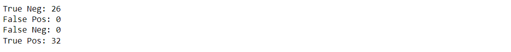
Confusion matrix for KNN model
knn_pred = model.predict(X_test)
plot_conf_mat(y_test, knn_pred)
Output:
tn, fp, fn, tp = confusion_matrix(y_test, preds).ravel()

print(f'True Neg: {tn}')
print(f'False Pos: {fp}')
print(f'False Neg: {fn}')
print(f'True Pos: {tp}')
Output:
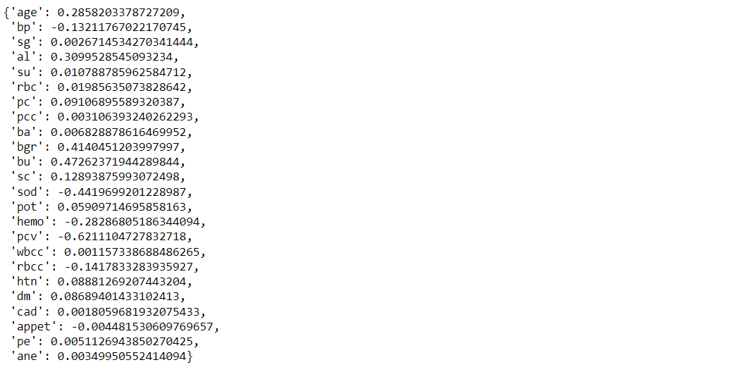
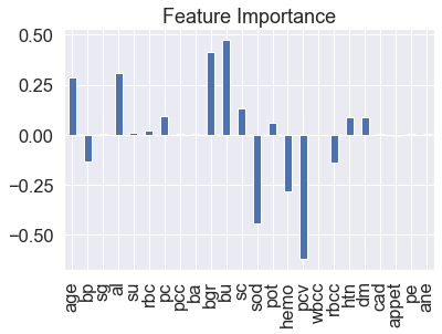
Feature Importance
feature_dict=dict(zip(df.columns,list(logreg.coef_[0])))
feature_dict
Here we will get the coefficient from the features which will tell the weightage of each feature.
Output:
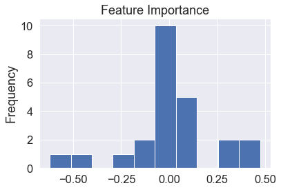
Visualize feature importance
feature_df=pd.DataFrame(feature_dict,index=[0])
feature_df.T.plot(kind="hist",legend=False,title="Feature Importance")
Output:
Visualize feature importance – Transpose
feature_df=pd.DataFrame(feature_dict,index=[0])
feature_df.T.plot(kind="bar",legend=False,title="Feature Importance")
Output:
Saving the model
import pickle

# Now with the help of pickle model we will be saving the trained model
saved_model = pickle.dumps(logreg)

# Load the pickled model
logreg_from_pickle = pickle.loads(saved_model)

# Now here we will load the model
logreg_from_pickle.predict(X_test)
Output:

Endnotes
Here’s the repo link to this article. Hope you liked my article on Chronic Kidney Disease ML. If you have any opinions or questions, then comment below.
Read on AV Blog about various predictions using Machine Learning.
About Me
Greeting to everyone, I’m currently working in TCS and previously, I worked as a Data Science Analyst in Zorba Consulting India. Along with full-time work, I’ve got an immense interest in the same field, i.e. Data Science, along with its other subsets of Artificial Intelligence such as Computer Vision, Machine Learning, and Deep learning; feel free to collaborate with me on any project on the domains mentioned above (LinkedIn).
Here you can access my other articles, which are published on Analytics Vidhya as a part of the Blogathon (link).
The media shown in this article is not owned by Analytics Vidhya and are used at the Author’s discretion.


You need to have a medical background to realize that this dataset has a lot of multicollinearities. The variables rbcc, pc, rbc, pcc. pvc and hemo are all related to hemoglobin so many could be deleted, and the model would not suffer
good day sir, i need your article, i'm working something similar to your own. this article will help me a lot if i get it. thank you.