Introduction
Asides from dedication to discovery and exploration, to succeed in a Data Science project, Data Science Workflow you must understand the process and optimize it to ensure that the results are reliable and the project is easy to follow, maintain and modify where necessary. And the best and fastest way to go about this is to structure your project using a template.
This article covers steps to guide you to successfully develop a structure for your Data Science project.
This article was published as a part of the Data Science Blogathon.
Table of contents
What is a Data Science Workflow?

Source: istockphoto
A Data Science Workflow defines the phases (or steps) in a data science project. Using a well-defined Data Science workflow provides a simple way to remind Data Science team members of what has been accomplished and what needs to be done to complete a Data Science project.
Also Read: Top 25 Machine Learning Projects for Beginners in 2024
Steps in a Data Science Workflow
There are no fixed frameworks or defined templates for approaching Data Science projects. Each new dataset and each new problem will lead to a different roadmap. But, there are similar high-level steps applied when approaching many Data Science different problems, irrespective of the dataset.
So let’s look at a clean workflow that can be used as a basis for data science projects.
However, you should note that the steps outlined below are in no way linear. Instead, most Data Science projects are largely iterative, requiring multiple steps to be repeated and revisited.
- Acquisition
- Inspection
- Preparation
- Modeling
- Evaluation
- Deployment
Step 1: Acquisition

The process of training machine learning algorithms is a little like teaching a toddler an object’s name for the first time, then allowing them to identify it alone when next they see it. But human beings only need a few examples to recognize a new object. That is not so for a machine, as it needs hundreds or thousands of similar examples to become familiar with an object. And these examples or training objects need to come in the form of data.
To train a machine learning algorithm, you need to get adequate data. Now, here comes the question, where do you collect data for any project you want to embark on?
And the answer is: data can come from any number of sources; you can collect pre-existing datasets from official sources, you can import data from a database, you can scrape data directly from a web page, and you can collect data via social media outlets like Facebook, LinkedIn, Instagram, and Twitter, and you can also leverage online forms for data collection. There are many other sources, and your data collection method depends on your Data Science project.
Step 2: Inspection

Source: istockphoto
After you have acquired the data to be used, the next step is to get a first impression of the data quality by inspecting it. The primary goal at this stage is to sanity-check the data, and the best way to accomplish this is to look for things that are either impossible or highly unlikely. Check for outliers and missing values, check the data types to see if they are correct, and check the most extreme cases. Do they make sense? A good practice is to run some simple statistical tests on the data and visualize it to get a quick overview of the statistical properties of the data and to detect possible outliers.
Step 3: Preparation

When you are confident you have your data in order, next you will need to prepare it by placing it in a format that is amenable to modelling. This stage encompasses several processes, such as filtering, aggregating, imputing, and transforming. The type of actions you need to take will be highly dependent on the type of data you’re working with, as well as the libraries and algorithms you will be utilizing.
Step 4: Modeling

Once the data preparation is complete, the next phase is modeling. Selecting an appropriate algorithm will depend on the type of data. For example, if the data is continuous you will apply regression modeling, if the data is categorical you will apply classification or logistics regression modeling. As a data scientist, you will try lots of models to get the best-fitted model.
Step 5: Evaluation

The evaluation stage seeks to answer the question – how good is this model?
After building the model you need to measure its performance. The good news is there are several ways to do that, and again this step is largely dependent on the type of data you are working with and the type of model used, but on the whole, this step seeks to answer the question of how close the model’s predictions are to the actual value.
Step 6: Deployment

Working with data is one thing, but deploying a machine learning model to production is another. Once you are comfortable with the performance of your model, you’ll want to deploy it so it can reach the intended audience. This can take several forms depending on the use case, but a common scenario is utilization as a feature within another larger application.
Also Read: 10 Best Data Analytics Projects with Source Codes
Case Study
I will be using the famous flower dataset which was introduced in 1936 to build a Multi-Class Classifier Model using Support Vector Machine with Python and deploying the model using Streamlit (an open-source framework used by Machine Learning and Data Science teams to create beautiful Web Apps in minutes).
Acquisition
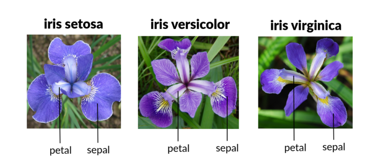
The first step is to import the data to the platform you want to use to do your analysis or build your model. And as stated above, I will be using the Iris dataset taken from Sir R.A. Fisher Paper for pattern recognition literature. It is also known as Anderson’s Iris data set as Edge Anderson originally collected the data to quantify the variation of Iris flowers in their different class.
These classes are class Iris-Setosa, Iris-Versicolour, and Iris-Virginica with attributes as Sepal Length, Sepal Width, Petal Length and Petal Width in centimeters. We will be importing the data from the UC Irvine Machine Learning Repository in CSV format and storing it in a data frame.
import pandas as pd

# laod the data in a dataset

url = 'https://archive.ics.uci.edu/ml/machine-learning-databases/iris/iris.data'

iris = pd.read_csv(url, header = None)

col_names = ['Sepal_Length','Sepal_Width','Petal_Length','Petal_Width','Species']

iris_df = pd.read_csv(url, names = col_names)Inspection
The next step is to inspect the data. Let’s start by printing the first 5 rows of the dataset.
iris_df.head()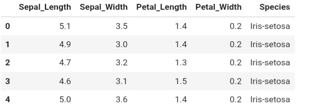
Next, let’s print the shape of the dataset.
print(iris_df.shape)(150, 5)The dataset has 150 rows and 5 columns. Next, let’s use the pandas .info() to print basic information about the dataset.
iris_df.info()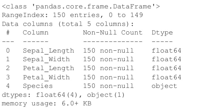
There are 2 formats of data types in the dataset (float 64 and object), and there are no null values.
The task is to predict the species of an iris flower, so let’s check the number of samples of each Iris flower species in our dataset.
iris_df["Species"].value_counts()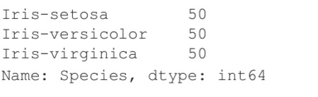
As we can the dataset contains 3 classes of 50 instances each, where each class refers to a type of iris plant.
Next, let’s plot the features in the dataset to extract trends, and get summary-level insights into what we are looking at.
import matplotlib.pyplot as plt

# plot the distribution of the data

iris_df.hist(edgecolor = 'red', linewidth = 1.2)

fig = plt.gcf()

fig.set_size_inches(12, 8)

plt.show().png)
We can see from our plot that apart from the Sepal Width feature, other features are not normally distributed.
Next, let’s create a scatter plot of the features to understand the relationship, especially the differences between the species.
# Plot the relationship between the features

colors = ['red', 'orange', 'blue']

species = ['Iris-virginica', 'Iris-versicolor', 'Iris-setosa']

plt.figure(figsize = (14, 15))

plt.subplot(221)

for i in range(3):

    x = iris_df[iris_df['Species'] == species[i]]

    plt.scatter(x['Sepal_Length'], x['Sepal_Width'], c = colors[i], label = species[i])

plt.xlabel("Sepal Length")

plt.ylabel("Sepal Width")

plt.legend()

plt.subplot(222)

for i in range(3):

    x = iris_df[iris_df['Species'] == species[i]]

    plt.scatter(x['Petal_Length'], x['Petal_Width'], c = colors[i], label = species[i])

plt.xlabel("Petal Length")

plt.ylabel("Petal Width")

plt.legend()

plt.subplot(223)

for i in range(3):

    x = iris_df[iris_df['Species'] == species[i]]

    plt.scatter(x['Sepal_Length'], x['Petal_Length'], c = colors[i], label = species[i])

plt.xlabel("Sepal Length")

plt.ylabel("Petal Length")

plt.legend()

plt.subplot(224)

for i in range(3):

    x = iris_df[iris_df['Species'] == species[i]]

    plt.scatter(x['Sepal_Width'], x['Petal_Width'], c = colors[i], label = species[i])

plt.xlabel("Sepal Width")

plt.ylabel("Petal Width")

plt.legend().png)
Scatter Plot of Features
Let’s pick a feature to understand – Sepal_Length. We can see that the Sepal_Length of Iris-Setosa (indicated by blue dots) starts at about 4.2 and ends at about 5.9. For Iris-Versicolour (indicated by orange dots), starts at about 4.9 and ends at about 7.0, and in Iris-Virginica (indicated by red dots), the Sepal_Length starts at about 4.9 and ends at about 7.9.
Also, we can observe, that the class – Iris-Setosa is linearly separable from the other 2; while the other 2 classes – Iris Virginica and Iris-Versicolor are not linearly separable from each other.
Finally, let’s display a Correlation heatmap to visualize the strength of relationships between the features in our dataset.
import seaborn as sns

corr = iris_df.corr()

# plot correlation heatmap

fig, ax = plt.subplots(figsize = (15, 6))

sns.heatmap(corr, annot = True, cmap = "coolwarm").png)
Correlation heatmap
As we can see, the most correlated features are Petal_Length and Petal_Width, followed by Sepal_Length and Sepal_Width.
Now that we have an idea of what the task is about, let’s go to the next step.
Preparation
The preparation step involves making the data ready for modeling. In many cases, the data collected will be a lot messier than this dataset.
To prepare our dataset for modeling, let’s first label encode the Species feature to convert it into numeric form i.e. machine-readable form.
from sklearn.preprocessing import LabelEncoder
le = LabelEncoder()

Species = le.fit_transform(iris_df['Species'])
We will be using a Support Vector Machine Classifier, and SVMs assume that the data it works with is in a standard range, usually either 0 t0 1, or -1. So next we will be scaling our features before feeding them to the model for training.
from sklearn.preprocessing import StandardScaler

# drop the Specie feature and scale the data

iris_df = iris_df.drop(columns = ["Species"])

scaler = StandardScaler()

scaled = scaler.fit_transform(iris_df)

iris_df_1 = pd.DataFrame(scaled, index = iris_df.index, columns = iris_df.columns)

iris_df_1.head(2)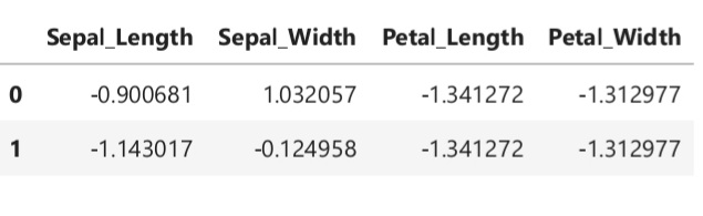
Modeling
We have explored the data to get a much better sense of the type of challenge we’re facing and prepared it for modeling. So it is time to train our model.
For training purpose we’ll store Sepal_Length, Sepal_Width, Petal_Length and Petal_Width in X and our target column – Species in y.
# Prepare the data for training

# X = feature values - all the columns except the target column

X = iris_df_1.copy()

# y = target values

y = Species
Next, we will use train_test_split to create our train and test groups. The reason for creating a validation set is so we can test the trained model against a set of data that is different from the training data.
30% of the data will be assigned to the test group and will be held out from the training data. We will then configure an SVM Classifier model and train it on the X_train and y_train data.
from sklearn.model_selection import train_test_split

# Split the data into 70% training and 30% testing

X_train, X_val, y_train, y_val = train_test_split(X, y, test_size = 0.30)
We have split the data, it’s time to import the (SVM) classification model, and train the algorithm with our X and y
from sklearn import svm

# Train the model

model = svm.SVC(C = 1, kernel = "linear", probability = True )

model.fit(X_train, y_train)

SVC(C=1, kernel='linear', probability=True)
Now, let’s pass the validation data to the stored algorithm to predict the outcome.
y_pred = model.predict(X_val)
y_pred[:5]
array([1, 1, 0, 1, 0])Evaluation
The next step in our workflow is to evaluate our model’s performance. To do this, we will use the test set held out from the data during Modelling to check the accuracy, precision, recall, and f1-score.
from sklearn.metrics import accuracy_score

# Print the model's accuracy on the testing set

print("Accuracy: ", accuracy_score(y_pred, y_val) * 100)
Accuracy: 97.77777777777777
from sklearn.metrics import classification_report
#Check precision, recall, f1-score
print(classification_report(y_pred, y_val))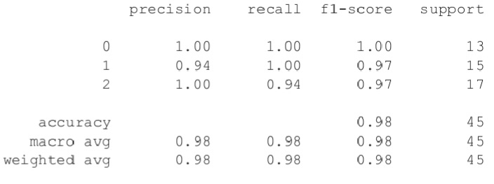
Our model’s accuracy is 97.7%, which is great.
This may not be the case in real-time as our dataset is very clean and precise, therefore it gives such results.
Deployment
We are in the final step of our Data Science workflow – deploying the model. We will be using Streamlit – an open-source python framework for creating and sharing web apps and interactive dashboards for data science and machine learning projects to deploy our model.
First, we need to save the model, the label encoder, and the standard scaler. And to do this all we need to do is pass these objects into the dump() function of Pickle. This will serialize the object and convert it into a “byte stream” that we can save as a file called a model.pkl.
import pickle
# store model, label encoder, and standard scaler in a pickle file
dict_filename = 'model.pkl'
data = {'le': le, 'model': model, 'scaler': scaler}
with open('model.pkl', 'wb') as file:
    pickle.dump(data, file)
Now that we have saved the model, the next thing to do is to deploy the model into a web app using Streamlit.
To do this, we will open a folder containing the dataset, the notebook you have been using, and the pickle file we just created (model.pkl) in an editor (e.g. Spyder), and create 2 files named web_app.py and predict_page.py.
Before we proceed, if you don’t have Streamlit installed, run the following command to set it up.
pip install streamlit
Next, in the predict_page.py script, we will load the saved model. To do this, we will pass the “pickled” model into the Pickle load() function and it will be deserialized.
import pickle
def load_model():
    with open('model.pkl', "rb") as file:
        data = pickle.load(file)
    return data
Now we have our model, label encoder, and standard scaler stored in data, and we can easily extract it with the code below.
# extract model, label encoder, and standard scaler
data = load_model()
model = data['model']
le = data['le']
scaler = data['scaler']
Start Building the Web App.
To do this, we will create a function containing Streamlit widgets.
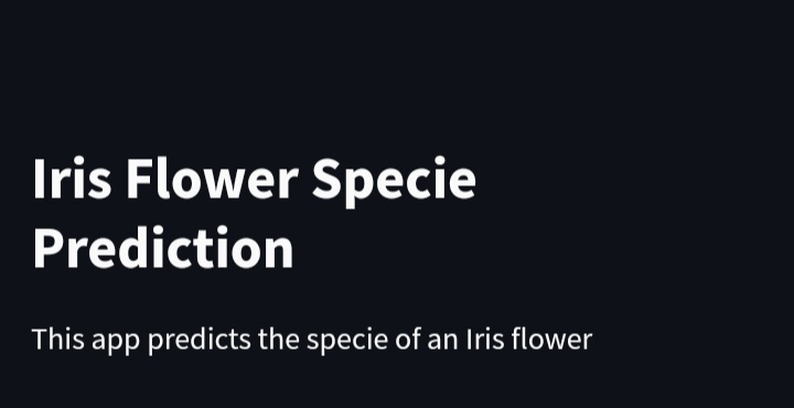
def prediction_page():
    st.title("Iris Flower Specie Prediction")
    st.write("""This app predicts the specie of an Iris flower""")
To view the web app, we will go to our web_app.py file to import Streamlit and the function we created.
import streamlit as st
from predict import prediction_page
prediction_page()
Then we will open Command Prompt and change our home directory to the folder containing the files then input “streamlit run web_app.py” in the terminal.
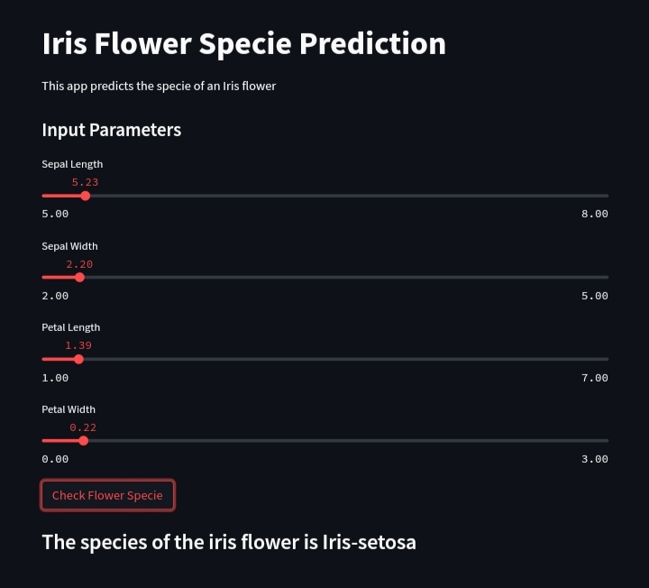
If you followed these steps correctly, the output below will show in your browser.
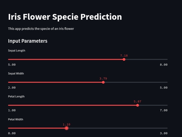
Next, we will add sliders for the user to input parameters for the Sepal Length, Sepal Width, Petal Length, and Petal Width by calling the slider method and giving it a minimum and maximum value, and a text to prompt the user the input values.
    st.write("""#### Input Parameters""")
    Sepal_Length = st.slider('Sepal Length', 8.0, 5.0)
    Sepal_Width = st.slider('Sepal Width', 5.0, 2.0)
    Petal_Length = st.slider('Petal Length', 7.0, 1.0)
    Petal_Width = st.slider('Petal Width', 3.0, 0.0)
Click Save and go Back to the Browser to Rerun
Finally, let’s add a button to predict the Iris flower specie We will do this by calling the button method and assigning it to a variable with the code below.
ok = st.button('Check Flower Specie')

if ok:

Features = np.array([[Sepal_Length, Sepal_Width, Petal_Length, Petal_Width]])

Features = scaler.transform(Features)

Prediction = model.predict(Features)

st.subheader('The species of the iris flower is' + ' ' + le.classes_[Prediction[0]])
Let’s click save again, and go back to our browser to rerun. The app should look like the image below.
You can play around with the web app and try different input parameters. We are now done building the app, and it’s time to deploy it.
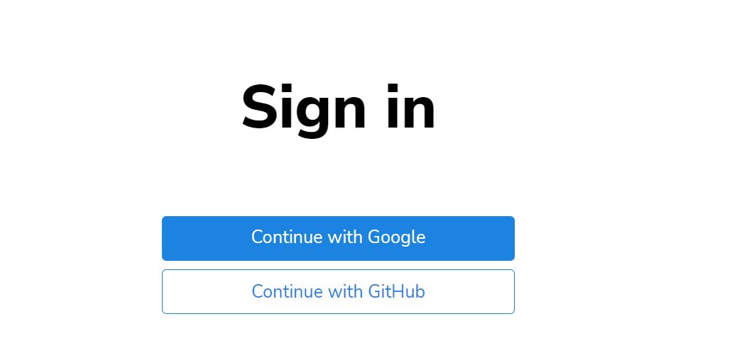
To deploy the app on Streamlit Sharing we first need to upload all the files we have used to a repository on GitHub. Once that is done, we will go to https://share.streamlit.io/ and click on Continue with Github.
Before we click on the New App button, we need to add a requirements.txt to our GitHub repository for the app to build properly.
Fortunately, there is a package called PIGAR that can generate a requirements.txt file automatically without any environments. To install it run the following:
pip install pigarThen, change the home directory to the projects folder, and run the following to generate the requirements.txt file:
pigarNow that the requirements.txt file is generated, we will upload the requirements.txt file to the Github repository we created, and go back to click on the New App button.
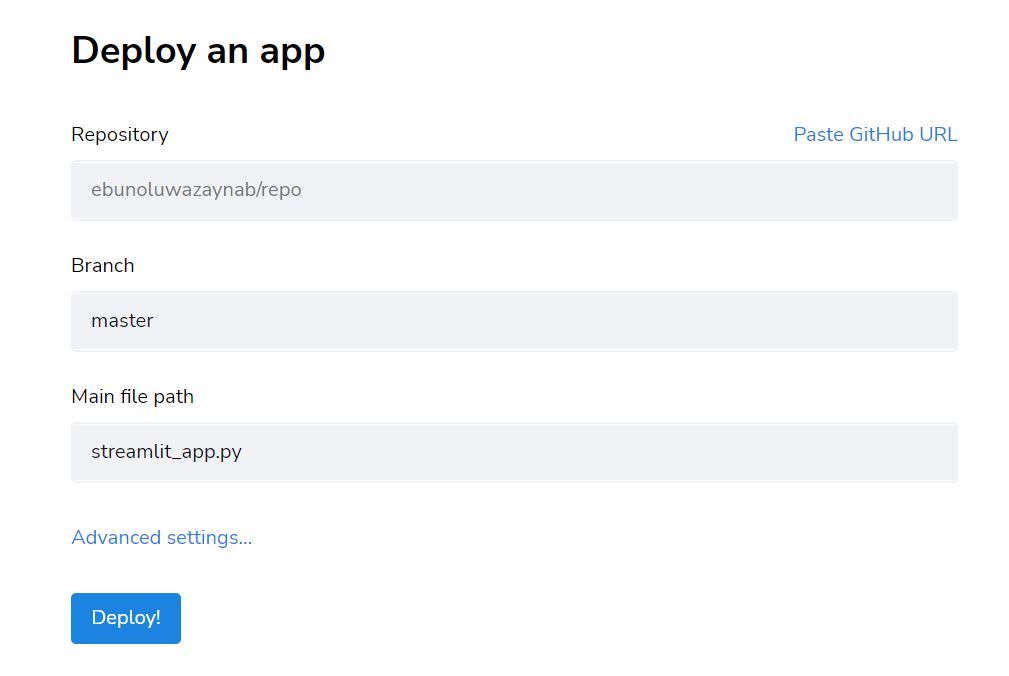
Then we will select the repo that we want to deploy from the dropdown. Choose the respective branch. Then select the file that runs the code and Click Deploy.
Conclusion
In summary, following a structured Data Science Workflow is crucial for the success of any data science project. The key steps include data acquisition, inspection, preparation, modeling, evaluation, and deployment. By methodically working through each phase, data scientists can ensure their results are reliable, the project is well-documented, and the insights are effectively communicated. While the specifics may vary based on the data and problem, adhering to this general workflow provides a roadmap for tackling data science challenges systematically. Ultimately, a defined process like this allows data teams to extract maximum value from data and deliver impactful solutions across industries and domains.
Frequently Asked Questions?
Q1. What is the data science workflow?
A. The data science workflow typically involves steps like data collection, data preprocessing, exploratory data analysis, model building, model evaluation, and deployment.
Q2. What are the 7 steps of data science cycle?
A. The 7 steps of the data science cycle are:
1. Frame the problem
2. Collect the data
3. Explore the data
4. Model the data
5. Evaluate the model
6. Deploy the model
7. Monitor and maintain the model
Q3.What are the 5 steps in data science lifecycle?
A. The 5 steps in the data science lifecycle include:
1. Data collection
2. Data preprocessing
3. Exploratory data analysis
4. Model building
5. Model deployment and maintenance
Q4. What is a data workflow?
A. A data workflow refers to the sequence of steps involved in processing and analyzing data, from its collection to its final output or deployment. This may involve tasks like data acquisition, cleaning, transformation, analysis, and visualization.
The media shown in this article is not owned by Analytics Vidhya and is used at the Author’s discretion.
Zaynab Awofeso
02 Apr, 2024


