Introduction
Excel is a global powerhouse, serving many functions, from data analysis and mathematical calculations to business report management and data organization. It excels at data visualization, allowing users to craft charts and graphs like pivot charts, 2-D line graphs, histograms, pie charts, and more. Among these, the waterfall chart in excel stands out as a particularly impactful tool. Let’s explore how excel can elevate your capabilities, create a waterfall chart and enhance efficiency.
Table of contents
What is a Waterfall Chart?
The waterfall chart in Excel is used to visually demonstrate the continuously increasing positive (addition) or negative (subtraction) values. The waterfall chart, otherwise known as a waterfall diagram or bridge chart, simply shows how the first value transitions to the final and last value with a string of positive and negative quantities throughout the chart.
The middle columns floating in the air are somewhat color-coded to distinguish between the positive and negative values. These middle values increase or decrease with the timeline. Hence, a waterfall chart is also known as a flying bricks chart, bridge chart or Mario chart.
Also Read: 8 Charts You Must Know To Excel In The Art of Data Visualization!
Getting Started with Waterfall Charts
To build a waterfall chart in Excel, you do not need to be a master at using Excel. Anyone can create a bridge chart for personal or professional use accordingly. Due to the accurate results and linear approach of waterfall charts in Excel, the financial and accounting sector, business management, and manufacturing sectors create waterfall charts in Excel to obtain the desired results. A waterfall chart in Excel requires some steps that can make the process a lot smoother.
Required Data Format
To create the waterfall diagram, the first thing you will need is some sort of data to build a chart on. After you have the desired data, you need to format the data in first value, last value, intermediate positive value and negative value. By labeling data in these categories, you can easily identify the data without any confusion.
Preparing Data for Waterfall Chart
Preparing the data for the waterfall chart in Excel is a simple yet crucial step that can ease your workload later. There can be many anomalies if the data is not prepared beforehand. For example, you might have the initial and final row of data sorted, but to generate an accurate result, you need to rearrange the data in base, addition/ rise or subtraction/ fall columns to create the bridge of different values.
How to Create a Waterfall Chart in Excel?
The way we look at the data or communicate with it is one of the most important factors when it comes to gaining insights and understanding the numbers inside the data for further analysis. Creating a visually appealing waterfall chart with thoughtful color choices and metrics helps us create a relationship between the user and the columns in Excel for better extraction of information. Now, below, we will learn to create a waterfall chart in Microsoft Excel step by step.
Creating or Loading the Data
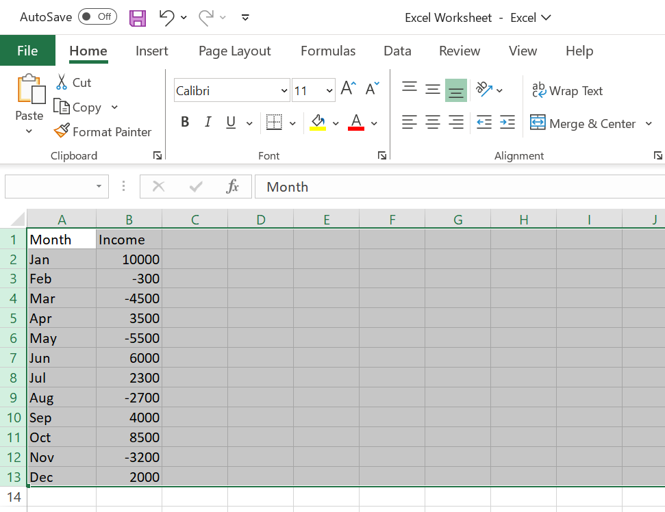
To build the waterfall chart in Excel, Let’s create two new columns, label them Month and Income and fill the rows by adding the details. Here, positive values show the profit and negative values show the loss.

Building the Waterfall Chart
The next step after the data is added is to create the waterfall chart in an Excel file. The chart will show the change in values as well as the fluctuations and ups and downs in income over the months.
- Select all the rows by pressing Ctrl + Shift + Arrow down or by manually selecting rows with the mouse.
- Navigate to the ‘Insert‘ panel and click on it. A ‘Recommended Charts‘ section with chart icons will appear. Select the third icon in the top row, which is “waterfall chart.”

- Select the first icon underneath the waterfall text, and the waterfall chart will appear, displaying the changes in monthly income values in the waterfall chart.

- Adding More Bars to the Chart
- Insert a new row above ‘base‘ income and below ‘final‘ income by right-clicking on the table and selecting the insert option.
- Sum all the numbers for final income using the formula (=SUM(B2:B14, B14)) in the ‘final‘ income column.

- You can also add extra rows for the quarterly sum to plot in our waterfall chart and calculate the sum using the formula and right cell numbers.

Improving the Waterfall Chart
We can customize the waterfall chart to meet the needs, aesthetics, and scenario of our project or specifications. Numerous things can be done using charts, and we will go over a few of them below.
- To change the colors of the chart, click on ‘Chart Design,’ which will show up on the toolbar.

- Choose the ‘Chart Design’ panel>> ‘Change colors’ icon; select it, and a drop-down menu with several colors will open. Choose the colors of your choice from it.

- You can change the chart name by clicking on ‘Chart Title’ on it and renaming it.

Cleaning the Waterfall Chart
Sometimes, unnecessary information remains on our chart, affecting its design. So, in order to clean up the chart, take the following actions:
- To remove the connecting lines behind the ‘Chart Design’ panel>> ‘Add chart element’ >> ‘Gridlines’>>‘Primary Major Horizontal’ tab to remove the horizontal gridlines to clean the chart.

- On the left side, select the ‘Series Options’ from the ‘Format Data Series‘ options to edit the gap between bars in the plot.

How to Create a Waterfall Chart in Excel?
To create a waterfall chart in Excel 2013, you need data in stacked columns. Then:
- Select all the columns except the Cash one. Now, ‘Insert’>‘Column Chart’>’2-D Column’>Stacked Column.’

- In the following series, click the bar on the chart, and in ‘Format Data Series’ on the left, make the following changes:
- Base: no fill, no line
- Down: solid fill, red color
- Up: solid fill, green color


- Select ‘Begin’ and ‘Final’ bars and color them gray. Reduce the gap size to 50%, and here is your desired waterfall chart in Excel.

Analyzing and Interpreting Data with Waterfall Charts
Creating a waterfall chart in Excel is one thing, and analyzing data with proper interpretation with waterfall charts is another thing. Let’s see how you can read, identify and analyze the data with a bridge chart:
Reading a Waterfall Chart
Waterfall charts are easy to read and understand. To read the plot, always go from left to right. Always read the chart from the initial value, looking at the intermediate of best/ worst values and then finally coming to the last cumulative value.
- Example: To read this waterfall chart in Excel, Let’s assume that the initial value of a small business is Rs. 5000, monthly revenue is Rs. 10000 (addition), electricity and utility bill costs are Rs. 2500 (subtraction), and last-minute additional profit is Rs. 1000 (addition). It gives you the result of Rs. 13500, which is your profit for the month.
Identifying Key Insights
Identifying key insights in a waterfall chart means identifying the crucial key value that is impacting the final value of the entire chart. This focal value could be the best or worst value in the chart. The main benefit of this feature is that you can recognize the positive and negative values that are affecting the waterfall chart in Excel.
Comparing Actual Vs. Target Data
The use of a waterfall chart is not limited to just creating a visual display of consecutive values. It can also be used to compare the target or expected result with the actual result generated.
- Example: In the above example, suppose the target was Rs. 13000, but the actual result was Rs. 13500. This comparison shows that the actual result exceeds the target data.
Trends and Pattern Detection
You can increase the productivity of any project or task by creating a waterfall chart in Excel. You can track the productivity of the project or delays in any task by setting these values in a waterfall chart. It can help in spotting the patterns of factors that positively or negatively affect the trajectory of your project.
Also Read: 3 Advanced Excel Charts Every Analytics Professional Should Try
Advanced Waterfall Techniques
- Handling Multiple Series: To handle multiple series, construct a base column of a 2-D stacked chart, then format the stacked chart as a waterfall chart.
- Stacked waterfall charts: These are used to demonstrate how numerous factors changed in values between two values over time in a single chart. In Excel 2016, they can be generated with a single click in the waterfall chart in Excel.
- Waterfall Diagrams Using Excel Templates: Using Excel templates to make a waterfall chart is the most efficient method. Before you can use templates, you must first clean and create your data.
- Dynamic Waterfall Chart with Formulas: A chart can be made dynamic to display more information by using data validation, drop-down lists, and input cells.
Tips and Best Practices
Use the following tips to effectively enhance your skills in creating waterfall charts in Excel:
- Always use color-coded intermediate values transitioning from positive to negative values, as it clearly shows the contrast between the mid-air or bridge values of the chart.
- If you have a large dataset, try to break it into smaller data groups to avoid the cluttering of data into your visual chart.
- To avoid any anomalies, categorize and label the dataset properly. It helps in creating a clean waterfall diagram for your data visualization.
Troubleshooting Common Issues
Despite following all the steps correctly, you can still face some of the common issues users face while creating waterfall charts in Excel:
- The issue in data formation creates inconsistency. Always use the correct data types where numeric values and character labels should not be mixed.
- One common issue while creating a bridge chart is using the wrong formulas. Double-check the formulas before applying them to the values.
- Data labeling is a crucial step to avoid any confusion. Always categorize the desired data from the first, positive, and negative values to the last and final values.
Excel Full Course – in 2 hours | Beginner Level
Conclusion
Creating a waterfall chart in Excel can be simplified if you follow this extensive guide. Anyone willing to learn the wonders of Excel can build a waterfall chart quickly. Excel is widely used for data analytics and visualization. The waterfall chart is among the many useful features that Excel provides.
If you want to master all the Excel techniques, signup for our FREE Microsoft Excel formulas
Frequently Asked Questions
Q1. How do you insert a waterfall chart in Excel?
A. Click on the “Insert” tab in Excel>> “Charts”>> “Waterfall” icon>> select “Waterfall.”
Q2. What is a waterfall chart, and how do you use it?
A. The waterfall chart in Excel is a visual and graphical representation of positive/ negative values in a consecutive series that goes from initial to final value. It is used to analyze the profit and loss of any financial entity, project progression pattern, business sector etc.
Q3. How do I create a waterfall chart in Excel with stacked columns?
A. Stack multiple waterfall charts on top of one another, where each category and label is distinct from the other.
Click on ‘Insert’>Chart’>>‘Waterfall’>>‘Chart editor’>> Confirm that the chart type is ‘Waterfall’>> Stacking option is ‘Stacked’>> Now click on ‘Customize’>>Tick “Use first value as subtotal”>> Now click ‘Legend’ in “chart editor”>> move the ‘Position’ to ‘Top’
Q4. How to make a Waterfall chart from Excel to Powerpoint?
A. You can copy the waterfall chart in Excel by ctrl+c and paste it into the PowerPoint slide by ctrl+v.
Hello, I am Nitika, a tech-savvy Content Creator and Marketer. Creativity and learning new things come naturally to me. I have expertise in creating result-driven content strategies. I am well versed in SEO Management, Keyword Operations, Web Content Writing, Communication, Content Strategy, Editing, and Writing.


