There are 3 fundamental changes driving penetration of data science industry:
These forces have also changed the process flow for an analyst. Effective data visualization is more critical component of data science process flow than ever before. The impact can be felt in following areas clearly:
Hopefully, this provides enough context to the importance of data visualization. In this article, we’ll understand the importance of data visualization and how it can be used to derive useful insights in diverse situations. We’ll also look at the various forms of data visualization, beginning from basic to advanced level of visualizations.
A good visualization could be the difference between hard to digest piles of data and useful business information. Let’s look at the some amazing examples of data visualization below:
Let’s look at some common methods of visualization which help us to understand distribution, trend, relationship, comparison and composition about the data values. One of the important question, every data scientist faces is to decide, ‘Which visualization method is more effective?‘
While discussing the same problem with my community, I got significant upvotes on the method of first focusing on the “Type of message or information” you want to convey and then select the appropriate visualization method.
Here is a really cool cheat sheet on selecting right visualization methods. I found this in Harvard CS-109 extension program (online resource).
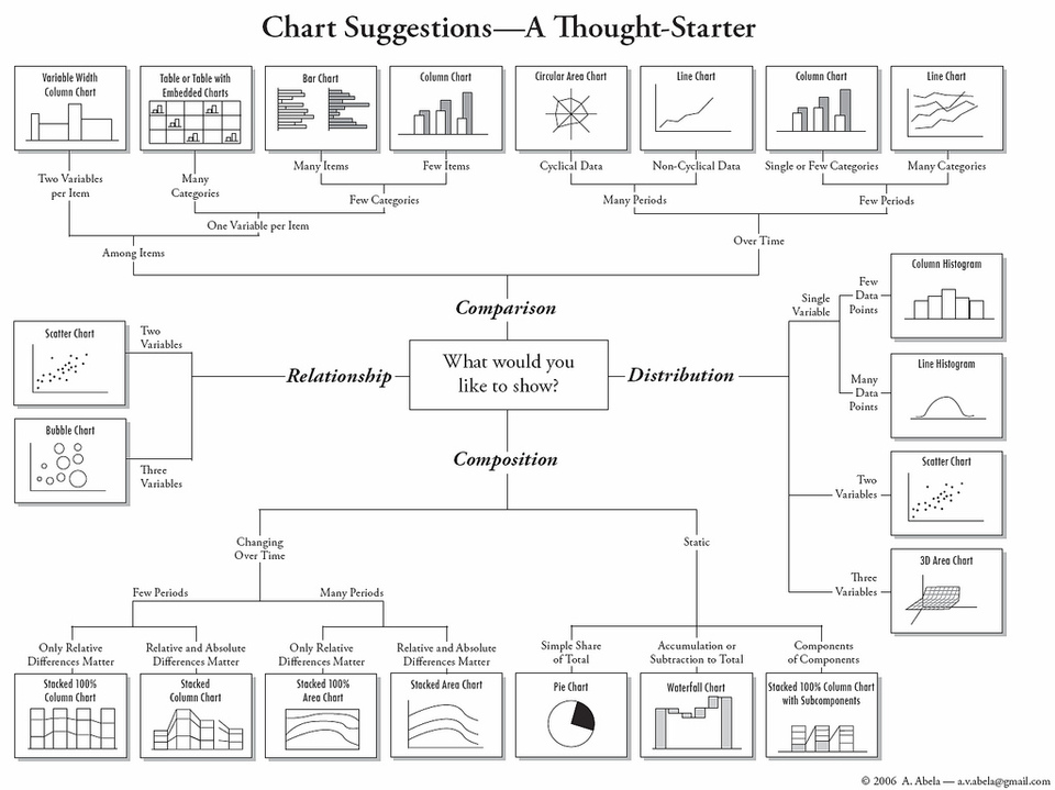
Here you can notice, how flawlessly they have divided the chart messages in four categories namely Distribution, Comparison, Relationship and Composition. Then, they have classified various visualization methods in these 4 categories.
Let’s look at these categories individually and discuss the most common and effective methods in detail.
It is commonly used at the initial stage of data exploration i.e. when we get started with understanding the variable. Variables are of two types: Continuous and Categorical. For continuous variable, we look at the centre, spread, outlier. For categorical variable we look at frequency table. Visualization types used to represent these are:-
a) Histogram: It is used for showing the distribution of continuous variables. One of the catch with histogram is ‘number of bins’. Let’s understand it in detail using example below:-
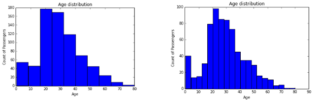
Both histograms are showing different distribution of a given set of data which represents age distribution using Count of Passengers vs Age. Look at the histogram at right .We can infer that there are more infants in age group of 0-4 years compared to age group of 4-16 years. However, if you try to make this inference from left graph, I’m sure you would fail to do so. Hence, we should be very careful while selecting number of bins.
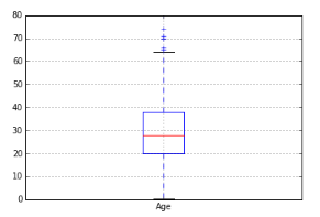
b) Box-Plot: It is used to display full range of variation from min to max and useful to identify outlier values. It shows Min, Q1, Median, Q3 and Max. Any value outside the lower and upper inferences is considered as an Outlier. Formula for calculating lower and Upper inferences are:-
Upper Inference = Q3 + 1.5 * (Q3-Q1), (Q3-Q1) (also known as IQR)
Lower Inference = Q1 – 1.5 * (Q3-Q1)
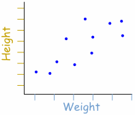
We can also visualize distribution between two continuous variables or one categorical and one continuous variable using scatter plot or multiple box plots by different categories of categorical variables respectively.
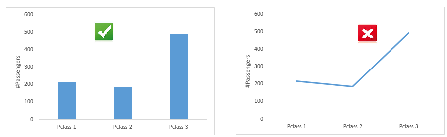
It is used to compare values across different categories and over time (trend). Common charts to represent these information are Bar and Line chart. Please note: When we compare values across different categories we should go with Bar chart. If it is over quantitative variable, we should go with line chart.
Comparison across various categories
Comparison across quantitative variable

We can also compare multiple metrics using bar chart across different categories using stacked bar charts.
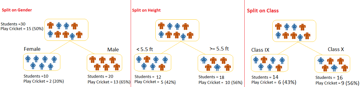
If there are multiple categories, it is a good practice to segregate categories in different groups and then compare accordingly. Decision Tree is one of the useful visualization technique to explore data values as shown below.
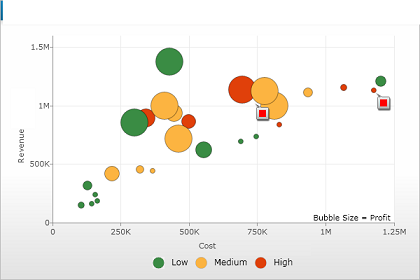
It is widely used to understand the correlation between two or more continuous variables. Most common method to visualize this information is Scatter Plot. It clearly shows the relationship between two variables. It usually draws a line of fit that best represent the relationship between data points. The line necessarily need not connect with data points.
We can also add third variable in scatter plot by using size of the points (known as Bubble Chart) or colors(as shown below).
One of the problem with scatter plot is that it may get crowded if we have thousands or millions of data points. In this case,we can perform alpha blending, which makes each point slightly transparent. So regions appear darker that have more point plotted on them.
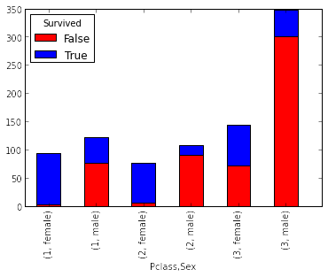
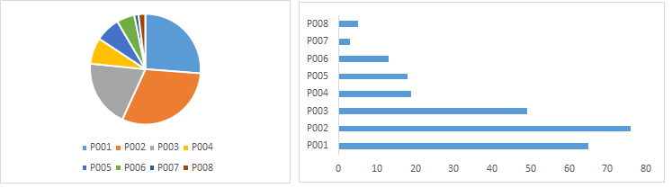
It is used to show distribution of a variable across categories of another variable. Well known method to represent this is Pie chart. Though, I am not a big fan of pie chart as it is difficult to show distribution across multiple categories and angular comparison is difficult to understand. Hence, I prefer to work with Bar Chart.
Stacked Bar(image at right) chart is a type of Bar chart. It can compare distribution across different categories of two variables.
Till here, we looked at most common methods used to visualize information. Let’s look at some advance methods of visualization. These methods extend the power of storytelling using visualization methods.
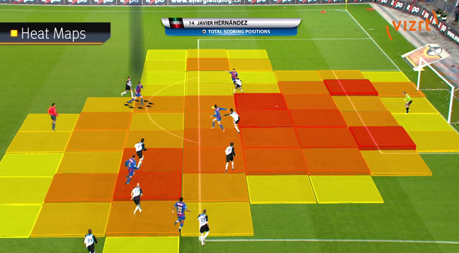
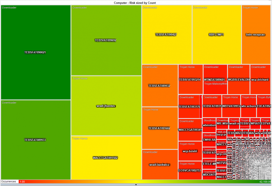
a) Heat Map: It uses colors to represent numbers in a spreadsheet or in any other visualization methods like Scatter, Geo-spatial, Area Chart. You can set different color gradient for the lowest, highest and mid-range values, with a corresponding transition (or gradient) between these extremes.
It represents one more variable to existing visualization method and adds additional information about data values.
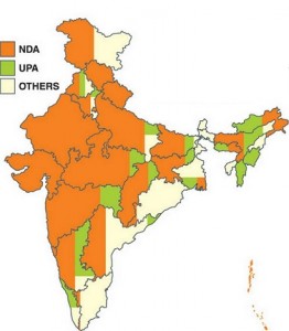
b) GeoSpatial charts: Data scientists started plotting variables on geographical address to help organisations in making their strategies differently for different cluster based on the spread of data. Here we can also use color index or size as a metric to represent more variables. It is similar to scatter plot. The only difference here is we are plotting data points on map.
Advantages of using Geo-Spatial Visualization are:
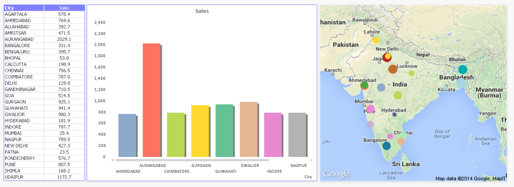
Above, you can see that how easily we are able to present information on map compare to tabular and Bar Charts.
c) Grid: It is used in 2D tabular format. In this method, we use two metrics horizontally and vertically. Then, plot a grid against each category of both metrics. After that, use colors to represent the data.
Let’s understand it using an example:
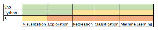
In above grid, you can represent the skill of a professional across various tools and techniques. In here, Green color represents the expert, Amber to intermediate and Red as beginner. Here we have efficiently represent this information without much hassle.
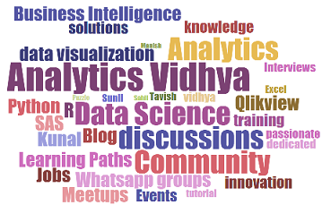
d) WordCloud: A word cloud is a method to represent text data. It is also known as text or tag cloud. It is a graphical representation of frequently used words in a collection of text files. The height and font style of each word in this picture is an indication of frequency of occurrence of the word in the entire text data. Such diagrams are very useful in working on text analytics.
It is just like any infographic. It makes an impact, easy to understand and can be shared easily. Make a note, before using word cloud, only focus on frequency of word and not on importance of variable.
There is more advance visualization techniques like Venn-diagram, Network Map, Radar Chart and other custom visualization methods to represent data and generate more meaningful insight from them.
In this article, we first understood the role of data visualization in data science process flow. We also looked at diverse applications and usage of data visualization using charts and graphs. Next, we discussed various methods used for representing complex data in a simplified manner. We also covered advanced visualization techniques which features Heatmap, Geospatial, WordCloud and Grid.
Do you have questions on visualization methods / techniques / selection? Feel free to discuss it with us and our community here.
Sunil Ray is Chief Content Officer at Analytics Vidhya, India's largest Analytics community. I am deeply passionate about understanding and explaining concepts from first principles. In my current role, I am responsible for creating top notch content for Analytics Vidhya including its courses, conferences, blogs and Competitions. I thrive in fast paced environment and love building and scaling products which unleash huge value for customers using data and technology. Over the last 6 years, I have built the content team and created multiple data products at Analytics Vidhya. Prior to Analytics Vidhya, I have 7+ years of experience working with several insurance companies like Max Life, Max Bupa, Birla Sun Life & Aviva Life Insurance in different data roles. Industry exposure: Insurance, and EdTech Major capabilities: Content Development, Product Management, Analytics, Growth Strategy.
Lorem ipsum dolor sit amet, consectetur adipiscing elit,


Brilliant article ... will use as a reference every time I need to convey information.
Excellent Article Sunil. All the time in business presentations, we use very few charts - Line graph , Bar charts and pie charts - to visualize all sorts of information. Your article showcase other charts that could be more appropriate, like a geo spatial chart to better depict sales across regions than the usual bar chart. Definitely a useful article for both analytics and non-analytics ( read business ) people