Overview
- A look at 11 mind-blowing and innovative data visualizations in Python, R, Tableau and D3.js
- These data visualizations span a variety of real-world topics
- I have provided the open-source code (or worksheet) for each visualization
Introduction
“Visualization gives you answers to questions you didn’t know you had.” – Ben Shneiderman
I have been involved in the data science field for a few years but I come from a non-technical background (learning and development). It took me a while to truly transition to data science. I say “truly” because the initial few weeks were a whirlwind of change (as I mention in detail in the structured thinking for data science course).
One of the biggest changes in my mindset revolved around how I looked at data. Initially, when I was asked by my manager to analyze certain data, I used to come up with run-of-the-mill data visualizations (scatter plots, bar charts, etc.). Little did I imagine the endless possibilities in store for me!
I cannot relate more to Ben Shneiderman’s quote above. Truly mastering data visualization techniques opens doors and opportunities you hadn’t dreamed of before. A well thought out visualization peels back the layers surrounding a raw dataset.
And that can often be the difference between a successful and a mundane data science project.
So in this article, my aim is to show you the incredible power of data visualization. I have put together 11 mind-blowing visualizations that cover a variety of topics. And to show that you can do this in any tool of your choice, we will cover these visualizations in Python, R, Tableau as well as D3.js.
The challenge for you? Pick up the visualization (code provided for all of them) and come up with your own version in your tool of choice.
Data Visualization in R
The creation of the ggplot2 library has made R the go-to tool for data visualization (for programmers at least!). I started my own data science journey using R and was instantly enthralled by the beauty and power of ggplot.
Stylish visualizations, instant insights, unearthing patterns – all of this in just a few lines of code. It’s no surprise that even hardcore Python programmers import ggplot2 in their Jupyter notebooks (yes, that’s possible now).
If you’re using R and haven’t explored ggplot2 yet – make sure you do that TODAY:
- Comprehensive Guide to Data Visualization in R
- 10 Questions R Users Always Ask While Using the ggplot2 Package
Create BBC-Style Visualizations in R

This isn’t strictly one visualization, though that certainly isn’t a problem, right? The above dashboard is an amalgamation of visualizations released by the BBC data team. I’ve been following the BBC website for years so this was a welcome release.
The BBC data team has actually developed and released an R package and an R cookbook for generating visualizations like the one above. The R package is called bbplot. It provides functions for creating and exporting visualizations made in ggplot in the style used by the BBC data team.
Here are the key resources to get you on your way:
Interactive Plots in R

Who doesn’t enjoy interactive plots? They are one of the most engaging aspects of a presentation (if used correctly). This visualization shows us how life expectancy has changed over the years in different continents plotted against the GDP per capita.
So much information packed into such a small space. The package used to create the above visualization? gganimate! No surprise to see that the power of ggplot extends to yet another awesome visualization type.
You can check out our guide to building interactive plots in R:
Sankey Diagrams in R
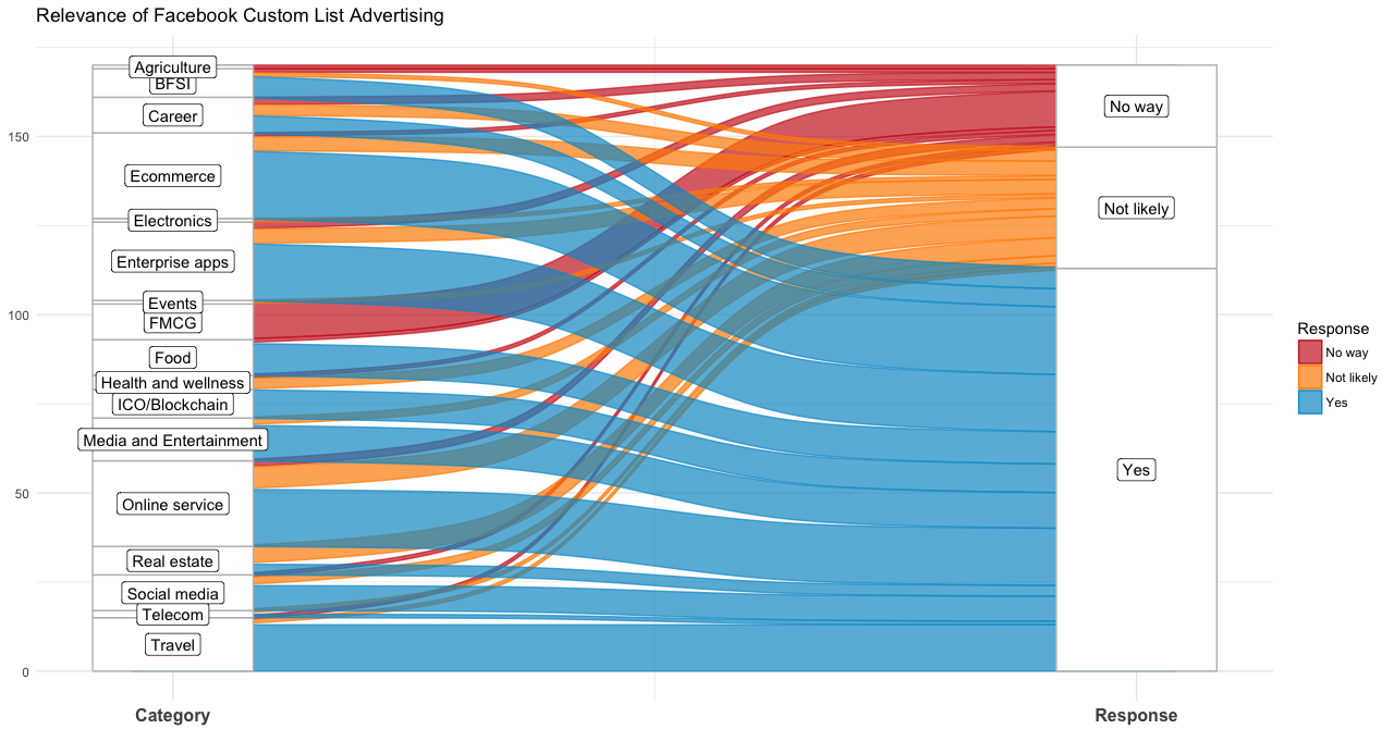
Intrigued? This is a classic example of a Sankey diagram. It essentially shows the flow of information, where the width of the arrows is proportional to the flow quantity. The above visualization shows the relevance of Facebook’s custom list advertising.
This visualization was created using the ggalluvial package in R. It combines the style and flexibility of the original alluvial package with the power of the tidyverse.
The full code, which is just a few lines, can be found here.
Data Visualization in Tableau
“In good information visualization, there are no rules, no guidelines, no templates, no standard technologies, no stylebooks. You must simply do what it takes.” – Edward Tufte
Edward Tufte is a pioneer in the field of data visualization. I feel this quote really applies to the visualizations we generate using Tableau. The plethora of features and customizations Tableau offers is almost unparalleled.
If you’re interested in getting started with Tableau, you’ve come to the right place! Here is a series of articles to help you transition from a Tableau beginner to an expert:
- Tableau for Beginners – Data Visualization Made Easy
- Intermediate Tableau Guide for Data Science and Business Intelligence Professionals
- A Step-by-Step Guide to learn Advanced Tableau
The World’s Largest Vote – India’s Elections Visualized

This is a truly stunning visualization. I have only taken one part of the full dashboard. The scope of this visualization and the amount of data covered is staggering and really useful for anyone interested in this kind of analysis.
Each data point represents details about each seat, including the winner’s name, state, party, and constituency). Look at how neat this visualization is, despite packing in a bucket load of information. This is something we can all aspire to in our daily/weekly/monthly report, right?
Here is the full Tableau dashboard which you can download.
Monitor Sales Performance using Tableau

I wanted to include a real-world business dashboard. If you’re struggling to visualize where you can use these visualizations in the real-world (use your imagination!), you should find this super useful.
This is an analysis of sales data to measure the distance from the original quota. I especially liked the first horizontal tab which neatly summarized the key figures a client or stakeholder needs to know.
The full Tableau workbook contains five comprehensive dashboards that look at these sales figures from different perspectives. I really feel you should use this as a reference if you work in the sales or marketing field.
Film Genre Popularity – 1910-2018

I’m a big movie buff so this visualization instantly drew my attention on the Tableau public gallery. Keep in mind that this is the popularity of film genres over time. Each genre has a different axis range hence look at them from that lens (rather than a one versus one comparison).
What stood out for me is that you can consider this as a dashboard with multiple data points presented. Can you think of a similar use case in your professional life where such a dashboard would come in handy?
You can download the entire worksheet and play around with it in Tableau.
Data Visualization in D3.js
If you want to create jaw-dropping animated visualizations, D3.js should be your go-to tool. It is a powerful library that enables you to build customized visualizations for any kind of storytelling you could imagine for the web.
This section is perhaps my favorite out of the four we have covered in this article. You should strongly consider adding D3.js to your skillset, especially if you want to work with data visualization regularly.
Here are two popular articles on how to get started with D3.js:
- Beginner’s guide to building data visualizations on the web with D3.js
- How to create jaw-dropping Data Visualizations on the web with D3.js?
Concept Map – Relationship Between Concepts
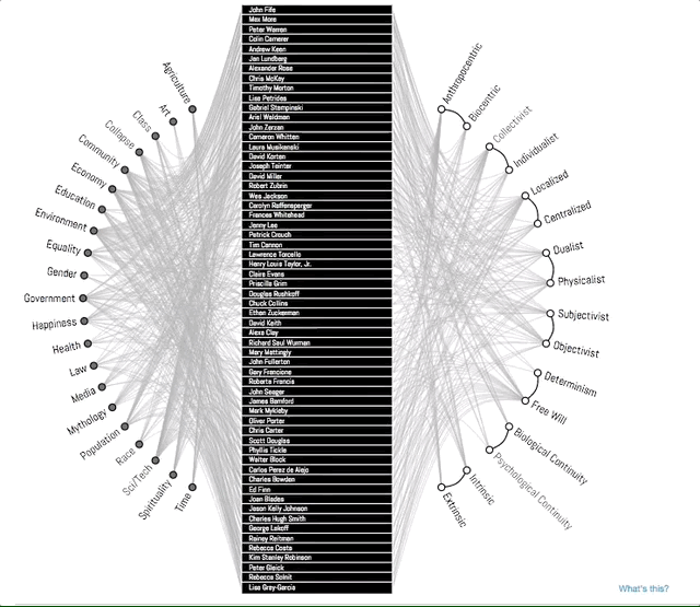
I use a concept map quite often. I can easily depict relationships between different concepts or knowledge points. As Wikipedia says, “A concept map typically represents ideas and information as boxes or circles, which it connects with labeled arrows in a downward-branching hierarchical structure”.
You’ll find it useful for mapping business decisions, process flow diagrams, information design, knowledge visualization, among other things. It’s an under-rated yet useful tool to have in your arsenal.
This concept map is very interactive and you can play around with the different nodes as well.
Sequences Sunburst Visualization in D3.js
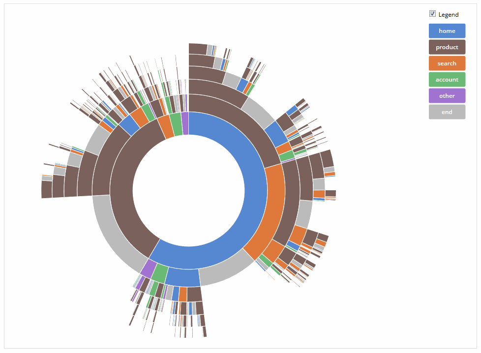
Ah, brilliant! This visualization shows how to use the sunburst concept with data that describes the sequence of events.
Think about it – you can visualize your customer’s journey using this. Instead of a static funnel, you can see all possible paths using this visualization. Your marketing team will love you for implementing this. 🙂
The full D3.js code to generate this sunburst of sequences is here.
Visualizing the Interaction Between Game of Thrones Characters
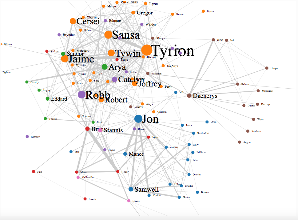
Are you a Game of Thrones fan? Then you’ll love this visualization. It represents the influence of each character based on the number of times his/her interaction has come up in the “A Storm of Swords” book.
Note that the nodes represent the characters and the links the interaction between them. The size of the node and name represents the influence of the character. No surprise to see Tyrion having the biggest influence, is there?
You can build your own Game of Thrones visualization using this tutorial.
Data Visualization in Python
We often think of Python as the ultimate programming language for data science. We associate it with cleaning data, building predictive models, and even certain data engineering tasks. But did you know that Python is actually pretty useful for generating data visualizations?
That’s right – Python comes with two exclusive libraries for visualization – matplotlib and seaborn. You can check out this article to know more about these libraries and see them in action.
A Geologic Map of Mars

This visualization is a thing of beauty. I came across this geologic map of Mars a few days back and I’m still astonished that this was created in Python (with a bit of help from Adobe Illustrator). Amazing!
The Python libraries used to create this wonderful visualization are:
- Matplotlib
- NumPy
- Pandas
- Cartopy
If the font is too small to read or you want to print this out as a poster – get the full high-resolution image here. And you can get the Python code for this visualization here. The GitHub repository has the complete tutorial to get you started.
Plotting Geostationary Satellites in Python
The PyEphem package was used to create this impressive plot in Python. PyEphem basically lets us implement astronomical algorithms in Python.
Quite a handful of data science enthusiasts tried their hand on plotting this visualization and you can find all the resources here.
End Notes
I had a lot of fun putting this list together. I work mostly with R and Tableau so it was eye-opening to see the kind of visualizations we can generate using D3.js. I’m definitely going to try my hand there.
Are there any visualizations you’ve come across that blew your mind? Go ahead and share them with us in the comments section below. This is the best place to get creative and learn from the community!
Senior Editor at Analytics Vidhya.Data visualization practitioner who loves reading and delving deeper into the data science and machine learning arts. Always looking for new ways to improve processes using ML and AI.


Hi pranav dar, this is Aditya here . The above article was really informative. Would like to.know whether analytics vidhya is offering any training on advanced chart types in tableau especially similar to the Indian parliament election winners visualization mentioned in the above list. Please let me know on this.
Hey Pranav, Very good article. Keep it up. One little advice. The Indian elections map you shown is not ok. The Indian map is incorrect. Please correct it and include full map of India. I think many tools do not support full India map. So way to show full map is to download a full shape file of India and merge it with the real data. I do have full elections 2019 visualizations on my github page showing full Indian map. Sharing half Indian map like this is illegal.
Hello Pranav, Thanks for sharing these flashy data viz options around. Did you really give a thought around who among the audience would actually read these? How these super complex visuals help back up any insights to the leadership? What business problem are you answering using any of the above visuals? With large volume of data, the real task is to answer the question with really small numbers. A complex sanky would lead nowhere. Concept map using D3.js does not add real value unless it allows you to filter on top 10 concepts. Less is more what works. Purpose of a data viz is to simplify the presentation layer of the information such that the decision making for the leadership becomes an easier task backed with relevant data. The above option is certainly trying to cover all the data available to be displayed - all is not actually relevant.