Overview
- matplotlib is a widely used Python library for performing data visualization and exploratory data analysis
- These 10 matplotlib tricks will enable you to become a better analyst and storyteller
Introduction
matplotlib is the first visualization library I ever worked with in Python. And that’s really no surprise – matplotlib is a core Python library that helps us explore our data with aesthetically pleasing visualization. Who doesn’t like that?
Whether you’re working as a data analyst, a business analyst, or a data scientist, you should be familiar with the power of matplotlib. matplotlib helps us tell stories in an effective and impactful manner, thus tying our analysis to business goals.

There’s no doubt that matplotlib is an easy and beginner-friendly library. But there can be times when things become complicated, especially if you’re a newcomer to this wonderful Python library.
So I decided to put together a list of 10 widely asked questions about matplotlib that I feel every analyst should know. Consider these as handy matplotlib tricks, or data visualization tips, to create impactful stories and charts.
I recommend taking a tour of the below article if you’re not familiar with the basics of matplotlib:
Table of Contents
- matplotlib Trick #1 – How to change the plot size?
- matplotlib Trick #2 – How to generate subplots?
- matplotlib Trick #3 – How to annotate plots?
- matplotlib Trick #4 – How to modify axes?
- matplotlib Trick #5 – How to make plots interactive?
- matplotlib Trick #6 – How to group bar plots?
- matplotlib Trick #7 – How to modify ticks?
- matplotlib Trick #8 – How to modify legends?
- matplotlib Trick #9 – How to add watermarks to a plot?
- matplotlib Trick #10 – How to save the plot as an image?
matplotlib Trick #1 – How to Change Plot Size?
The first is the easiest tricks in this article but it is the most searched question on Stackoverflow related to matplotlib. Changing the size of the plot is quite important at times given how it can vary based on various situations.
We can use the figure() class of matplotlib for creating a new figure. The same can be used for changing the size of the plot. You just need to pass the width and height of the desired plot in inches as the figsize argument:
Python Code:
import numpy as np
import matplotlib.pyplot as plt
import random

# plotting plot
fig=plt.figure(figsize=(5,8))

X=list(range(10))
Y=[x+(x*random.random()) for x in X]

plt.plot(X,Y)

plt.title('Line Plot')
plt.xlabel('x-axis')
plt.ylabel('y-axis')

plt.show()
Here you can see that the same line plot looks much better when presented with a different set of dimensions. I have used random functions here and I’ll be using them later too. Therefore, I recommend you to read this article:
matplotlib Trick #2 – How to generate subplots?
A subplot is a figure having multiple plots in it. This is the concept most analysts struggle with initially. Therefore, I thought it is best to discuss it here.
There are three ways of generating subplots in matplotlib:
- Using subplot()
- Using subplots()
- Using subplot2grid()
Let’s understand how you can use each of them.
Using subplot() is the easiest and most explicit way of creating subplots in matplotlib. It takes three things – the number of rows, number of columns, and index – as arguments and returns an axes object, which you can then use for plotting.

Here, you can see subplot() works flawlessly. But notice that for each plot in the figure, we have to write a similar statement again and again, which doesn’t make it a suitable choice when we have to create multiple subplots.
That’s where the subplots() function comes into the picture. Instead of returning one axes object at a time, it returns an array. You just need to pass the number of rows and columns as arguments to subplots(), and it will return an array of axes objects.


You might be thinking – all these plots are of the same size, what if I have to modify them? Let’s answer this question.
subplot2grid() allows you to treat the figure as a grid and modify your plots based on the rows and columns of the grid. It takes shape, location, rowspan, and columnspan as arguments and returns axes object for a specific location and of a particular size in a grid:

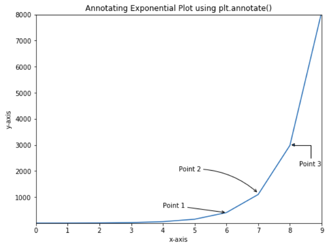
matplotlib Trick #3 – How to annotate plots?
Annotation is a comment added to a plot at a point for making it more understandable.
Annotations are of great help in marking different positions of a plot. There are two ways of doing this in matplotlib:
- Using the text() function
- Using the annotate() function of pyplot
Let’s start with the text() function.
Let’s say you have to mention values over each bar of a bar plot. text() function can be beneficial here because it takes x and y position as arguments and lets you write text there:

Now, let’s say you want to annotate a point on the plot with a marker and also write text. Here, the annotate() function can be used:

You can see above that the annotate() function also allows you to create arrows,. That’s what makes it superior to the text() function because text() function can only be used for text. You can read more about the annotate() function here:
matplotlib Trick #4 – How to modify axes?
Let’s go back to our previous plot. You will notice that there are some spaces left around the axes of the plot. We can correct this by modifying the axes of the plot. xlim() and ylim() are the two functions used for changing the limit of axes of a plot:
The empty spaces are removed from the plot but it still doesn’t look clean. Let’s do one thing – remove some of the axes of the plot. We can do this by manually setting the visibility of the spines of the axes to False:

Here, the plt.gca() is used for accessing the current axes object. Now our plot looks much cleaner but not quite aesthetically pleasing. We can try to make it more appealing by changing the color of the axes.
You can do this by setting the color of the spines manually using the set_color() function:

Looking good!
matplotlib Trick #5 – How to make plots interactive?
This is perhaps the most anticipated trick of the article. And it’s also the easiest thing you’ll ever do in matplotlib.
You can make any matplotlib plot interactive in a Jupyter notebook by just writing one line of code, i.e., %matplotlib notebook. Let’s try it on our previous plot:

You can see above that now we have the options to zoom, pan, and save our plot. Also, our axes are now dynamic and can change themselves based on the movement of the cursor.
Note: This works only in Jupyter Notebooks.
matplotlib Trick #6 – How to group bar plots?
Bar plots are great for visualizing and comparing data among categories. Grouped bar plots allow you to do the same with different groups. It is a very useful extension of a typical grouped bar plot, but I’ve seen beginners fail to create these in a proper way.
Two bar plots can be grouped by stacking them over one another. The things you need to pay attention to here are the width and position of bars on the vertical or horizontal axis (depending on the type of bar plot, i.e., vertical or horizontal).
Let’s create a grouped bar plot and try to visualize the temperature of various cities in summer and winter:

matplotlib Trick #7 – How to modify ticks?
Although our plot looks good, it doesn’t look clean and appealing, right? Let’s start making our plot beautiful by modifying ticks. xticks() and yticks() are the functions that we are looking for.
These functions take the position and labels as arguments and create ticks for a plot. You can use the same functions for changing the font, size, rotating ticks, and much more:

matplotlib Trick #8 – How to modify legends?
Our plot now looks a bit cleaner, but you can see that the legend on the top right corner sticks out weirdly from the rest of the plot. So, let’s modify it here.
The legend can be modified using the same legend() function used to place it on the axes. It takes various arguments that can be used to modify it. Here, I will be using only the loc, frameon, and ncol arguments.
The loc argument is used for defining the location of the legend, the frameon takes a boolean value and is used for setting the visibility of the frame around a legend and ncol is used for setting the number of columns in a legend:

matplotlib Trick #9 – How to add watermarks?
Watermarks are not something everyone uses in matplotlib, but it is a handy feature to know about. In matplotlib, you can have two types of watermarks: text-based and image-based. Let’s first understand how to create text-based watermarks.
The semi-transparent text can create a watermark effect. We can use the same text() function here which we used to annotate the plots. So let’s add text watermark to our plot:

Nice! But how often do you see a text watermark? Today, most organizations use an image as a watermark, and that’s what you’re about to learn next. An image can be used as a watermark using the figimage() function of matplotlib. This function is used for adding a non-resampled image to the figure:

Perfect!
matplotlib Trick #10 – How to save the plot as an image?
So far, we have created some really appealing plots, but we still don’t know how to preserve our work, i.e., how to save our visualizations.
It is effortless to save your plot; you just need to use the savefig() function, which is used for saving the current figure. There are many customizations that you can make while saving your plot. You can read more about them here.
Note: Just make sure never to call savefig() function after show() function because after the execution of show() function, a new figure is created, and the savefig() function saves a blank image.
End Notes
In this article, we discussed 10 awesome matplotlib tricks. But all this knowledge will go waste if you’ll not practice it. So, use these concepts, create something, and share with the community.
If you want me to cover more tricks related to matplotlib, then please comment below, and I’ll pick those up in a future article.
Here, I have listed some useful articles and courses related to data visualization to expand your knowledge:
- Tableau for Beginners
- Become a Data Visualization Whiz with this Comprehensive Guide to Seaborn in Python
- 11 Innovative Data Visualizations you Should Learn (in Python, R, Tableau and D3.js)
- 6 Essential Data Visualization Python Libraries – Matplotlib, Seaborn, Bokeh, Altair, Plotly, GGplot
- 10 Questions R Users always ask while using ggplot2 package
He is a data science aficionado, who loves diving into data and generating insights from it. He is always ready for making machines to learn through code and writing technical blogs. His areas of interest include Machine Learning and Natural Language Processing still open for something new and exciting.


Zooming and panning on X Y plots: Can you use a pair of sliders to control the plot dynamically? When plotting a set of data from a CSV file, there are ranges of junk data, and it would be useful to see a clipped range of the visualized data. I would have one slider (or could just be a field to enter a number) for the first xy position being plotted, and the second slider would control the span or number of data points following. Example: dataset with 100,000 rows, and nothing significant is happening until after ~7,000 points, and due to cyclic nature of the data, perhaps only 5-10,000 points would be sufficient to view at one time. Setting the range to ~10k, then sliding the starting position slider would basically be zooming and panning for an xy plot.
Hi, James. You can create sliders in matplotlib. For more information, you can take a look at this: https://matplotlib.org/3.1.1/gallery/widgets/slider_demo.html
Beautiful work and looking forward to more such articles. It helps aspirants to grasp the concept and take it forward with other plausible options to make it elegant.
Thank you, Akshar. I am glad you liked it.
Wonderful update
Regarding the Interaction of the Plot... I always faced a problem with Google Chrome browser while plotting interactive plots. Do you have any suggestions to eradicate the same?
Please explain it a bit more.