Introduction- Part 2
Now we have extracted, transformed, and loaded that data into our data warehouse system, we will put that data to use in our final product: an interactive dashboard having a custom layout designed by us with the aid of a relatively new dashboard and data visualization tool — Dash by Plotly.
Before we dive into the details of our space weather dashboard, let’s review quickly what Dash is exactly. Wikipedia describes Dash as an “open-source Python and R framework for building web-based analytic applications.” The Dash user guide gives a more detailed explanation of how Dash actually works:
“Written on top of Flask, Plotly.js, and React.js, Dash is ideal for building data visualization apps with highly custom user interfaces in pure Python. It’s particularly suited for anyone who works with data in Python.
Through a couple of simple patterns, Dash abstracts away all of the technologies and protocols that are required to build an interactive web-based application. Dash is simple enough that you can bind a user interface around your Python code in an afternoon.
Dash apps are rendered in the web browser. You can deploy your apps to servers and then share them through URLs. Since Dash apps are viewed in the web browser, Dash is inherently cross-platform and mobile ready.”
From my (admittedly limited) experience working with Dash, one of its main benefits is the ability to make highly elaborate and customizable web-based analytics interfaces in a straightforward and logical manner, using only Python and associated libraries (no need to learn how to code React.js!).
Setting up the Python Code for the Space Weather Dashboard
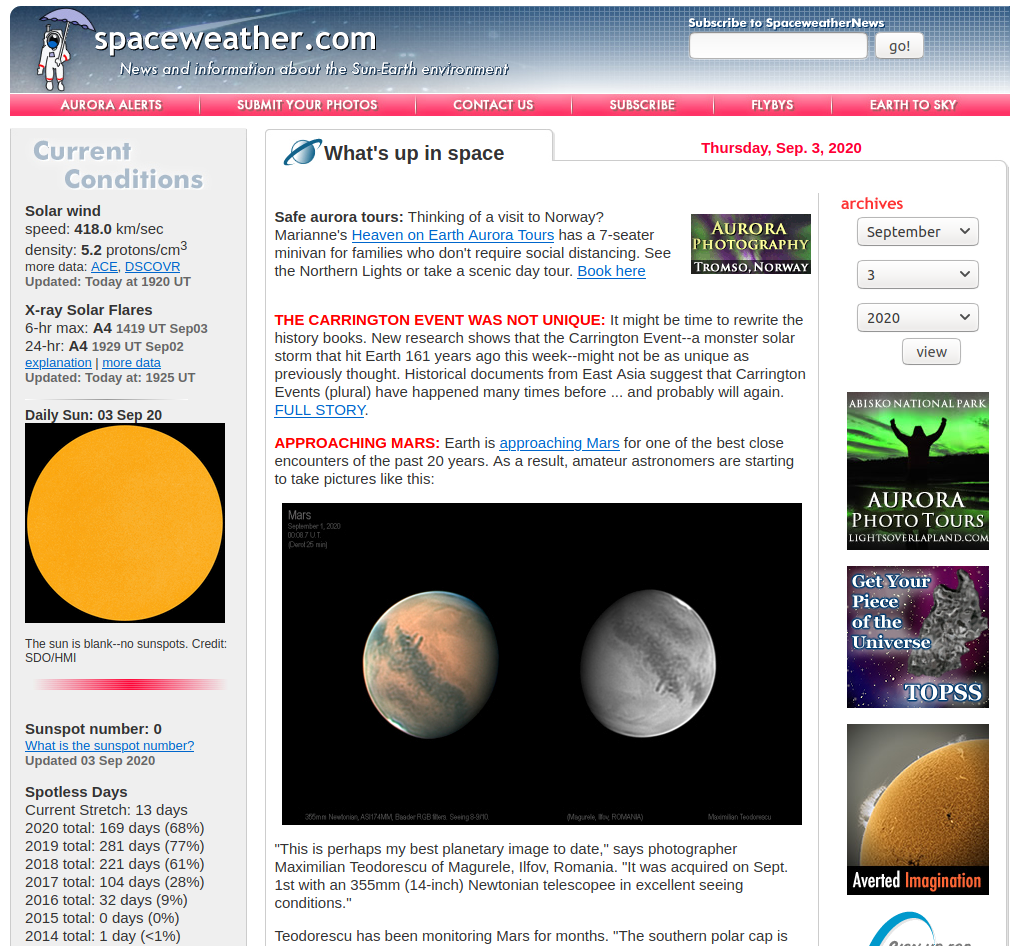
As mentioned in the above, our focus is on the weather factors that are most prevalent in space weather analysis and forecasting, which include:
- Number of sunspots (on any given calendar day, #/count),
- Earth’s magnetic field (in real-time, in units of Tesla), and
- Solar wind (in real-time, including plasma density, speed, and temperature)
We already have the data in our SQLite database, which is great. So let’s get started in our space weather dashboard Python script by importing the relevant Dash and Plotly libraries:
import dash
import dash_core_components as dcc
import dash_html_components as html
from dash.dependencies import Input, Output
import plotly.express as px
import plotly.graph_objs as go
Let’s also import some other libraries to help us with handling the data and connecting to our database:
import pandas as pd
import numpy as np
import sqlite3
import ipdb
from datetime import datetime as dt
Dash is built on the Flask library, which means we can define external stylesheets for dashboard CSS files. The Dash app is then initialized using external_stylesheets as an input argument:
external_stylesheets = ['https://codepen.io/chriddyp/pen/bWLwgP.css']

app = dash.Dash(__name__, external_stylesheets=external_stylesheets)
And connect to the database:
conn = sqlite3.connect("space.db")
cur = conn.cursor()
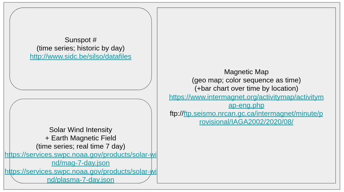
Sunspot Data/Visualization
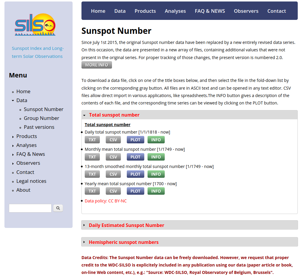
We’ll first start by pulling the data relating to sunspots (daily counts) and then loading that data into a Plotly figure. The sunspot data is contained in the sunspots table, so we can extract the sunspot counts since January 1, 1900, with an SQL query and insert the result into a dataframe as follows:
cur.execute("SELECT * FROM sunspots WHERE CAST(strftime('%Y', date) AS INTEGER) > 1900")sunspots = cur.fetchall()df_ss = pd.DataFrame(columns = ["Date", "Sunspot_count", "Sunspot_sd", "Observ_No"])

df_ss = df_ss.append([pd.Series(row[1:], index = df_ss.columns) for row in sunspots])
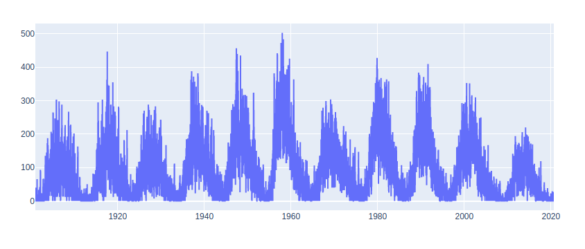
To generate our time-series graph, we will use the plotly.graph_objs (as go) library to instantiate a line chart with the x-axis being the sunspot date, and the y-axis being the sunspot count:
fig2 = go.Figure(data=[go.Scatter(x=df_ss.Date, y=df_ss.Sunspot_count)])
And using fig2.show() we can see what our sunspot graph looks like:
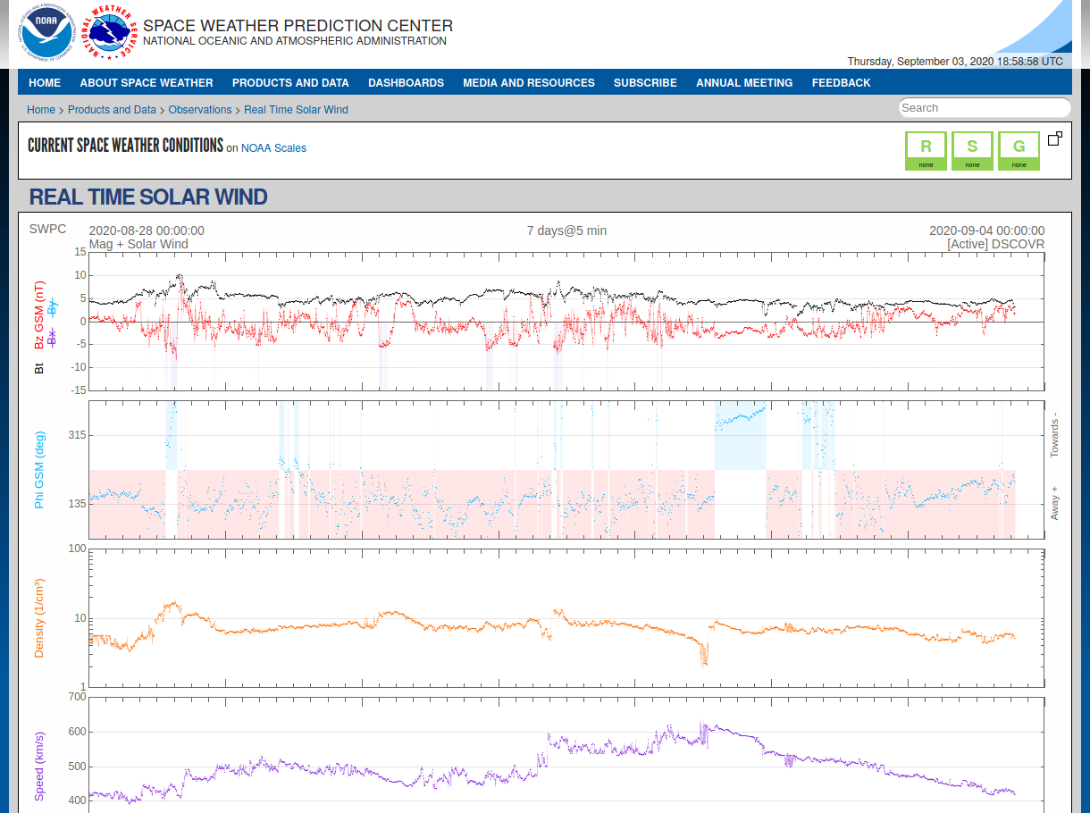
Solar Wind Data/Visualization
Now we repeat the above process for our solar wind data stored in our mag table.
First, we extract the data and then load into a dataframe:
cur.execute("SELECT * FROM mag")

mag = cur.fetchall()df_mg = pd.DataFrame(columns = ["Datetime", "Bx", "By", "Bz", "Bt"])df_mg = df_mg.append([pd.Series(row[1:], index = df_mg.columns) for row in mag])
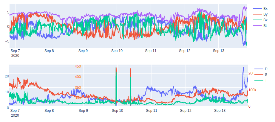
Next, we instantiate our Figure() object and add multiple traces corresponding to the solar wind Bx, By, Bz, and Bt vectors:
fig1.add_trace(
    go.Scatter(
        x=df_mg.Datetime,
        y=df_mg.Bx,
        name="Bx"
    ))

fig1.add_trace(
    go.Scatter(
        x=df_mg.Datetime,
        y=df_mg.By,
        name="By"
    ))

fig1.add_trace(
    go.Scatter(
        x=df_mg.Datetime,
        y=df_mg.Bz,
        name="Bz"
    ))

fig1.add_trace(
    go.Scatter(
        x=df_mg.Datetime,
        y=df_mg.Bt,
        name="Bt"
    ))
We also need to do the same thing for our solar wind density, speed, and temperature:
cur.execute("SELECT * FROM plasma")df_pl = pd.DataFrame(columns = ["Datetime", "density", "speed", "temp"])plasma = cur.fetchall()

df_pl = df_pl.append([pd.Series(row[1:], index = df_pl.columns) for row in plasma])

fig = go.Figure()

fig.add_trace(go.Scatter(
    x=df_pl.Datetime,
    y=df_pl.density,
    name="D"
))

fig.add_trace(go.Scatter(
    x=df_pl.Datetime,
    y=df_pl.speed,
    name="S",
    yaxis="y2"
))

fig.add_trace(go.Scatter(
    x=df_pl.Datetime,
    y=df_pl.temp,
    name="T",
    yaxis="y3"
))
Using the update_layout() method, we can update the layout of our graph to include tick marks for the 3 different y-axis scales we are using for the same graph:
fig.update_layout(
    yaxis=dict(
        tickfont=dict(
            color="#1f77b4"
        ),
        side="left"
    ),
    yaxis2=dict(
        tickfont=dict(
            color="#ff7f0e"
        ),
        anchor="free",
        overlaying="y",
        side="left",
        position=0.3
    ),
    yaxis3=dict(
        tickfont=dict(
            color="#d62728"
        ),
        anchor="x",
        overlaying="y",
        side="right"
    )
)
And the output product:
Geomagnetic Data/Visualization
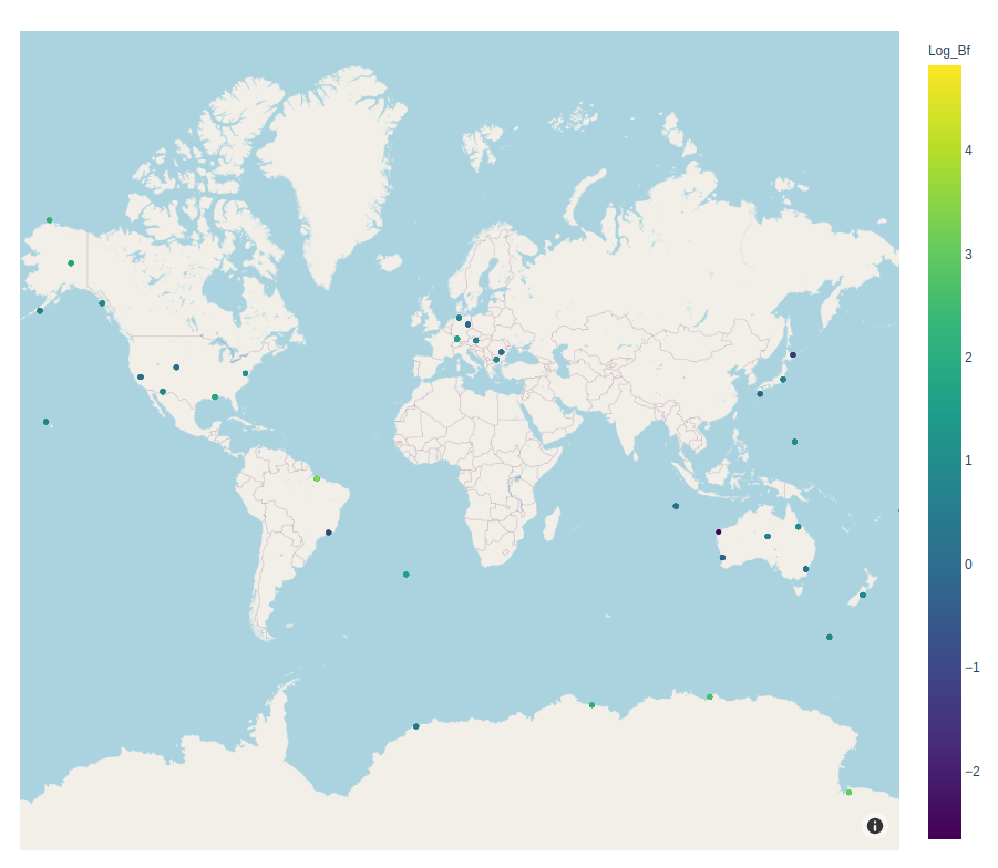
Our last graph to add to our dashboard is for a map displaying local magnetic field strengths for various recording stations scattered around the world (data provided by Intermagnet). Whereas our last two graphics were rather simple line charts, displaying this geomagnetic data will require the use of a different tool in the Dash/Plotly toolbox: scatter_mapbox().
Notably, scatter_mapbox() takes in several arguments including the dataframe object we are interested in plotting, the latitude and longitude columns of said dataframe, colors for scaling, etc.
Before we get to plotting our data, however, we need to do all the regular data pulls to prep the data for our Plotly figure:
cur.execute("SELECT station, strftime('%H',date_time) AS hour, avg(lat), avg(long), max(bf)-min(bf) AS bf_range FROM geo_mag WHERE bf != 99999 AND bf != 88888 GROUP BY station, hour")geo_mag = cur.fetchall()df_gm = pd.DataFrame(columns = ["Station","Time", "Lat", "Long", "Bf"])

df_gm = df_gm.append([pd.Series(row, index = df_gm.columns) for row in geo_mag])

df_gm['Log_Bf'] = np.log(df_gm['Bf'])
Our query is a bit more complicated than the above queries because we are interested in the hourly deviation in the magnetic field (see Intermagnet’s Table Data, which mentions “Hourly Ranges”). That’s why we need to take the difference between the maximum and minimum values of the magnetic field, grouped by station and hour (outliers also removed for consistency).
We also calculated a derived column, the logarithm of the total magnetic field (Log_Bf) to for color scaling purposes in our map plot.
Now that our geomagnetic data is stored in a dataframe, we can instantiate our map object, using Log_Bf as our color scale parameter:
fig3 = px.scatter_mapbox(df_gm, lat="Lat", lon="Long", hover_name="Station", hover_data=["Time","Bf"], color="Log_Bf", color_continuous_scale=px.colors.sequential.Viridis, zoom = 0.65, center=dict(lat=17.41, lon=9.33), height=780)fig3.update_layout(mapbox_style="open-street-map")
With the following result:
Bringing it All Together: Dash Layouts
With our newly generated graphics, we can begin the process of building our layout. We will use app.layout to assign our layout, which will then be used in our app.run_server() line at the end of our code:
app.layout = html.Div([
    html.Div([html.H3(children='Space Weather Dashboard')], id="title"),

    html.Div([
        html.Div([
            html.H6('Sunspot Count'),
            dcc.Graph(id='sunspots', figure=fig2),
        ], className="row pretty_container"),

        html.Div([
            html.H6('Solar Wind Magnetic Field and Plasma'),
            dcc.Graph(id='mag', figure=fig1),
            dcc.Graph(id='plasma', figure=fig4)
        ], className="row pretty_container"),
    ], className="six columns"),

    html.Div([
        html.H6('Earth Magnetic Field Map'),
        dcc.Graph(id='geo_mag_map', figure=fig3)
    ], className="six columns pretty_container")
])
One nice thing about configuring layouts in Dash is the ability to use the dash_core_components and dash_html_components, which act as modular building blocks with which a final Dash app can be constructed. For example, the Dash html library can be used to generate header (H1, H2…) or div tags in HTML, or render plots and graphs by simply passing a figure object into dcc.Graph(). The aesthetics of the layout can then be configured in CSS (inline, local, or external).
Configuring Dash Callbacks
Before we put the finishing touches on our dashboard, let’s first add a bit of interactivity to our Dash app. The Dash callback documentation describes callback functions as “Python functions that are automatically called by Dash whenever an input component’s property changes.”
In our case, we will add a time slider to our mapbox plot to visualize a time dimension (e.g., geomagnetic field over time). The time slider can be added to our layout by adding a dcc.Slider() object right after html.H6(‘Earth Magnetic Field Map’),:
dcc.Slider(
            id='time-slider',
            min=0,
            max=len(df_gm.Time.unique())-1,
            value=0,
            marks={int(i):(str(j)+":00") for i,j in zip(range(len(df_gm.Time.unique())), df_gm.Time.unique())}
        ),
Note that we are displaying the ticks of the time slider in units of hours.
For the actual interactive aspect, we need to create a Dash callback function. In our case, we want the functionality of the app to be such that when the slider is adjusted by a user, that the map update/refreshes all its data for display. That can be accomplished using the following custom callback function:
@app.callback(
    Output('geo_mag_map', 'figure'),
    [Input('time-slider', 'value')])
def update_figure(selected_time):

    actual_selected_time={int(i):str(j) for i,j in zip(range(len(df_gm.Time.unique())), df_gm.Time.unique())}[selected_time]

    filtered_df = df_gm[df_gm.Time == actual_selected_time]

    fig_new = px.scatter_mapbox(filtered_df, lat="Lat", lon="Long", hover_name="Station", hover_data=["Time","Bf"], color="Log_Bf",
                      color_continuous_scale=px.colors.sequential.Viridis, zoom = 0.65, center=dict(lat=17.41, lon=9.33), height=780)    fig_new.update_layout(mapbox_style="open-street-map")
    fig_new.update_layout(margin={"r":0,"t":0,"l":0,"b":0})

    return fig_new
Note that a lot of the above code is just copied from the original creation of fig3 (earlier in our code), with the minor addition that we are using our filtered dataframe, filtered_df (filtered by our selection made in the slider), as the dataframe input into our mapbox object.
Last, let’s add a range selector (6 months, 1/5/10/20/50 year, all) for our sunspot time-series graph:
fig2.update_layout(
    xaxis=dict(
        rangeselector=dict(
            buttons=list([
                dict(count=6,
                     label="6m",
                     step="month",
                     stepmode="backward"),
                dict(count=1,
                     label="1y",
                     step="year",
                     stepmode="backward"),
                dict(count=5,
                     label="5y",
                     step="year",
                     stepmode="backward"),
                dict(count=10,
                     label="10y",
                     step="year",
                     stepmode="backward"),
                dict(count=20,
                     label="20y",
                     step="year",
                     stepmode="backward"),
                dict(count=50,
                     label="50y",
                     step="year",
                     stepmode="backward"),
                dict(step="all")
            ])
        ),
        rangeslider=dict(
            visible=True
        ),
        type="date"
    )
)
Final Dashboard Layout
After performing a few minor updates to our figures’ layouts to adjust for margins, height/width, etc. (with the following code):
fig1.update_layout(
    height=200,
    margin=dict(t=10, b=10, l=20, r=20)
)fig2.update_layout(
    height=380,
    margin=dict(t=20, b=20, l=20, r=20)
)

fig2.update_layout(
    yaxis=dict(
        title="# of Sunspots (raw count)",
        side="right"
    )
)fig3.update_layout(margin=dict(t=20, b=20, l=20, r=20))fig4.update_layout(
#     title_text="multiple y-axes example",
    height=200,
    margin=dict(t=10, b=10, l=20, r=20)
)
And adding the style.css file from another Dash app into our /assets directory, we get the final product:
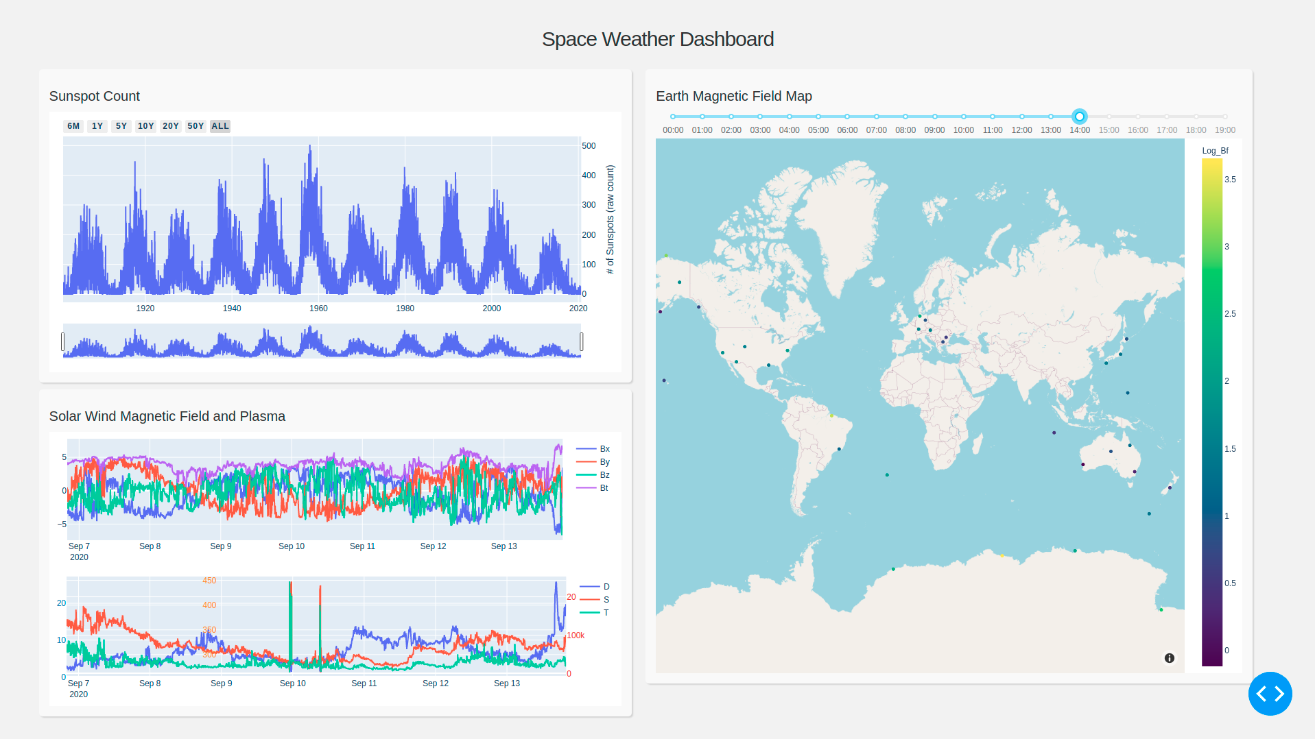
Looks pretty slick! Doesn’t it? One thing I find very interesting is that according to the top-left graph, we are at a lull in the 11-year sunspot cycle. In fact, according to scientists, solar cycle 24 ended and solar cycle 25 began in December 2019. And while it may have taken a bit to get our dashboard set up, once the basic scaffolding (like above) is assembled, it can be relatively easy to make some neat additions/customizations to your basic space weather dashboard layout.
A few possible ideas for improving our space weather dashboard:
- Add bar chart to the bottom of the map (right side) to filter by click; add callback functions to link map to the bottom bar chart (similar to the Intermagnet map plot here).
- Alter the slider to include a “play” button for visualizing map changes over time.
- Perform predictive modeling of sunspots data (e.g., w/ overlaid fitted curve)
- Include x-ray data overlaid with x-ray flare data (from NOAA) to see the correlation between the two.
The customization options for Dash are almost endless. So whenever you get a little time to learn a new and useful Python-based tool, check out Dash for your reporting, business intelligence, and data visualization needs!
Code on Github: https://github.com/vincent86-git/Space_Weather_Dash
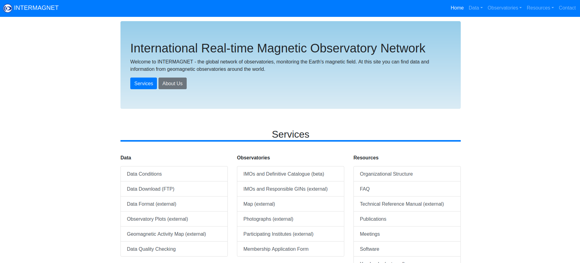
The results presented in this paper rely on data collected at magnetic observatories. We thank the national institutes that support them and INTERMAGNET for promoting high standards of magnetic observatory practice (www.intermagnet.org).
About the Author