This article was published as a part of the Data Science Blogathon.
Introduction
Let us walk through the Exploratory Data Analysis on NYC Taxi Trip Duration Dataset.
What is Exploratory Data Analysis?
Exploratory Data Analysis is investigating data and drawing out insights from it to study its main characteristics. EDA can be done using statistical and visualization techniques.
Why is EDA important?
We simply can’t make sense of such huge datasets if we don’t explore the data.
Exploring and analyzing the data is important to see how features are contributing to the target variable, identifying anomalies and outliers to treat them lest they affect our model, to study the nature of the features, and be able to perform data cleaning so that our model building process is as efficient as possible.
If we don’t perform exploratory data analysis, we won’t be able to find inconsistent or incomplete data that may pose trends incorrectly to our model.
From a business point of view, business stakeholders often have certain assumptions about data. Exploratory Data Analysis helps us look deeper and see if our intuition matches with the data. It helps us see if we are asking the right questions.
This step also serves as the basis for answering our business questions.
Importing necessary libraries
import pandas as pd       #data processing
import numpy as np        #linear algebra
#data visualisation
import seaborn as sns
sns.set()
import matplotlib.pyplot as plt
%matplotlib inline
import datetime as dt
import warnings; warnings.simplefilter('ignore')
Importing the Dataset
Let us now import the dataset. (You can download the dataset from here.)
data=pd.read_csv("nyc_taxi_trip_duration.csv")
Now, we have our dataset which was of the type ‘csv’ in a pandas dataframe which we have named ‘data’.
Exploring the Dataset
data.shape
We see the shape of the dataset is (729322, 11) which essentially means that there are 729322 rows and 11 columns in the dataset.
Now let’s see what are those 11 columns.
data.columns

Let us now look at the datatypes of all these columns.
data.dtypes
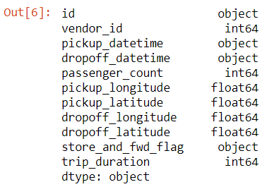
- We have id, pickup_datetime, dropoff_datetime, and store_and_fwd_flag of the type ‘object’.
- vendor_id, passenger_count, and trip_duration are of type int.
- pickup_longitude, pickup_latitude, dropoff_longitude, and dropoff_latitude are of type float.
Now, let us look at how does the data in these columns look like.
data.head()
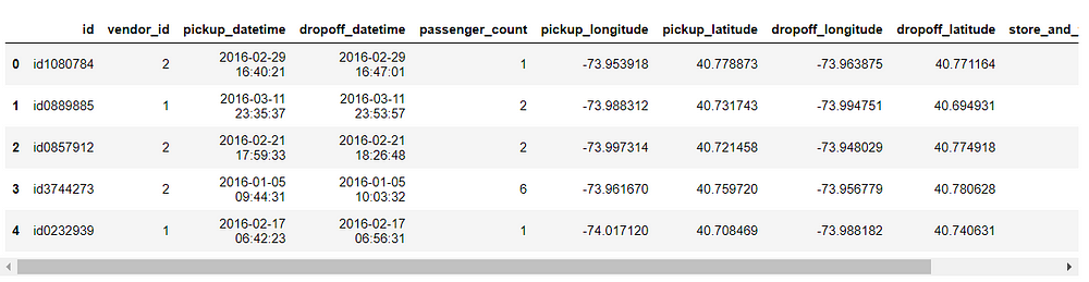
Independent Variables
- id — a unique identifier for each trip
- vendor_id — a code indicating the provider associated with the trip record
- pickup_datetime — date and time when the meter was engaged
- dropoff_datetime — date and time when the meter was disengaged
- passenger_count — the number of passengers in the vehicle (driver entered value)
- pickup_longitude — the longitude where the meter was engaged
- pickup_latitude — the latitude where the meter was engaged
- dropoff_longitude — the longitude where the meter was disengaged
- dropoff_latitude — the latitude where the meter was disengaged
- store_and_fwd_flag — This flag indicates whether the trip record was held in vehicle memory before sending to the vendor because the vehicle did not have a connection to the server — Y=store and forward; N=not a store and forward trip.
Target Variable
- trip_duration — duration of the trip in seconds
Let us see if there are any null values in our dataset.
data.isnull().sum()
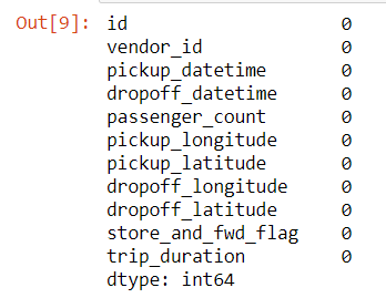
There are no null values in this dataset which saves us a step of imputing.
Let us check for unique values of all columns.
data.nunique()
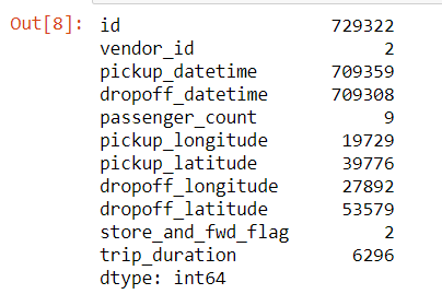
- We see that id has 729322 unique values which are equal to the number of rows in our dataset.
- There are 2 unique vendor ids.
- There are 9 unique passenger counts.
- There are 2 unique values for store_and_fwd_flag, that we also saw in the description of the variables, which are Y and N.
Let us finally check for a statistical summary of our dataset.
Note that this function can provide statistics for numerical features only.
data.describe()
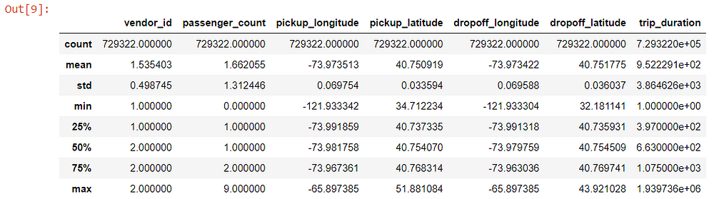
Some insights from the above summary:
- Vendor id has a minimum value of 1 and a maximum value of 2 which makes sense as we saw there are two vendor ids 1 and 2.
- Passenger count has a minimum of 0 which means either it is an error entered or the drivers deliberately entered 0 to complete a target number of rides.
- The minimum trip duration is also quite low. We will come back to this later during Univariate Analysis.
Feature Creation
Let us create some new features from the existing variables so that we can gain more insights from the data.
Remember pickup_datetime and dropoff_datetime were both of type object.
If we want to make use of this data, we can convert it to datetime object which contains numerous functions with which we can create new features that we will see soon.
We can convert it to datetime using the following code.
data['pickup_datetime']=pd.to_datetime(data['pickup_datetime'])
data['dropoff_datetime']=pd.to_datetime(data['dropoff_datetime'])
Now if you will run the dtypes function again, you will be able to see the type as datetime64[ns].
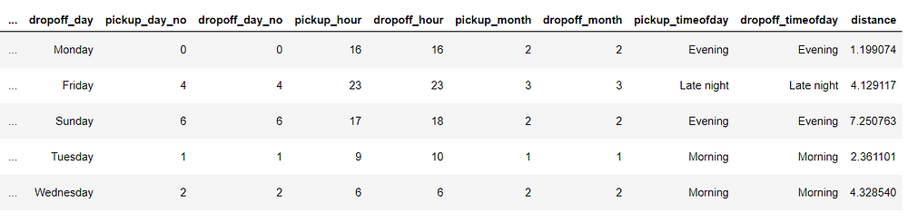
Now, let us extract and create new features from this datetime features we just created.
data['pickup_day']=data['pickup_datetime'].dt.day_name()
data['dropoff_day']=data['dropoff_datetime'].dt.day_name()
data['pickup_day_no']=data['pickup_datetime'].dt.weekday
data['dropoff_day_no']=data['dropoff_datetime'].dt.weekday
data['pickup_hour']=data['pickup_datetime'].dt.hour
data['dropoff_hour']=data['dropoff_datetime'].dt.hour
data['pickup_month']=data['pickup_datetime'].dt.month
data['dropoff_month']=data['dropoff_datetime'].dt.month
We have created the following features:
- pickup_day and dropoff_day which will contain the name of the day on which the ride was taken.
- pickup_day_no and dropoff_day_no which will contain the day number instead of characters with Monday=0 and Sunday=6.
- pickup_hour and dropoff_hour with an hour of the day in the 24-hour format.
- pickup_month and dropoff_month with month number with January=1 and December=12.
Next, I have defined a function that lets us determine what time of the day the ride was taken. I have created 4 time zones ‘Morning’ (from 6:00 am to 11:59 pm), ‘Afternoon’ (from 12 noon to 3:59 pm), ‘Evening’ (from 4:00 pm to 9:59 pm), and ‘Late Night’ (from 10:00 pm to 5:59 am)
def time_of_day(x):
    if x in range(6,12):
        return 'Morning'
    elif x in range(12,16):
        return 'Afternoon'
    elif x in range(16,22):
        return 'Evening'
    else:
        return 'Late night'
Now let us apply this function and create new columns in the dataset.
data[‘pickup_timeofday’]=data[‘pickup_hour’].apply(time_of_day)
data[‘dropoff_timeofday’]=data[‘dropoff_hour’].apply(time_of_day)
We also saw during dataset exploration that we have coordinates in the form of longitude and latitude for pickup and dropoff. But, we can’t really gather any insights or draw conclusions from that.
So, the most obvious feature that we can extract from this is distance. Let us do that.
Importing the library which lets us calculate distance from geographical coordinates.
from geopy.distance import great_circle
Defining a function to take coordinates as inputs and return us distance.
def cal_distance(pickup_lat,pickup_long,dropoff_lat,dropoff_long):

 start_coordinates=(pickup_lat,pickup_long)
 stop_coordinates=(dropoff_lat,dropoff_long)

 return great_circle(start_coordinates,stop_coordinates).km
Finally, applying the function to our dataset and creating the feature ‘distance’.
data[‘distance’] = data.apply(lambda x: cal_distance(x[‘pickup_latitude’],x[‘pickup_longitude’],x[‘dropoff_latitude’],x[‘dropoff_longitude’] ), axis=1)
Now let us re-run and see what the head looks like now with these new features.
Thus, we successfully created some new features which we will analyze in univariate and bivariate analysis.
Univariate Analysis
The univariate analysis involves studying patterns of all variables individually.
Target Variable
Let us start by analyzing the target variable.
sns.histplot(data['trip_duration'],kde=False,bins=20)
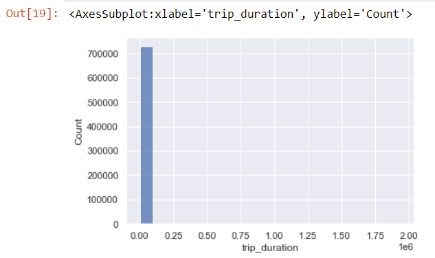
The histogram is really skewed as we can see.
Let us also look at the boxplot.
sns.boxplot(data[‘trip_duration’])
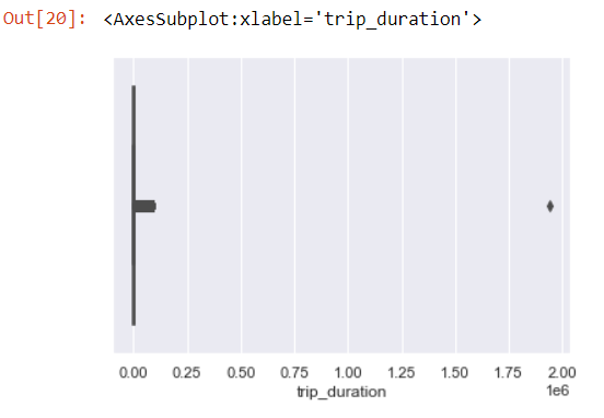
We can clearly see an outlier.
data['trip_duration'].sort_values(ascending=False)
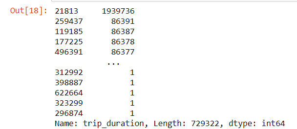
We can see that there is an entry which is significantly different from others.
As there is a single row only, let us drop this row.
data.drop(data[data['trip_duration'] == 1939736].index, inplace = True)
Vendor id
sns.countplot(x='vendor_id',data=data)
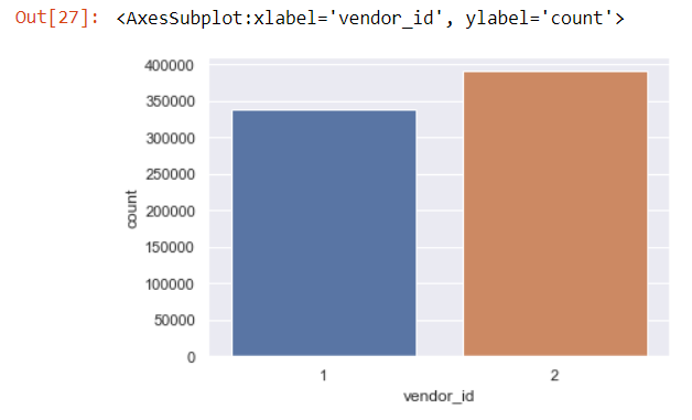
We see that there is not much difference between the trips taken by both vendors.
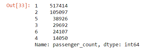
Passenger Count
data.passenger_count.value_counts()
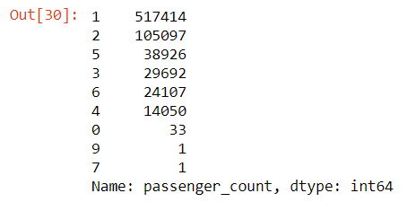
- There are some trips with even 0 passenger count.
- There is only 1 trip each for 7 and 9 passengers.
sns.countplot(x='passenger_count',data=data)
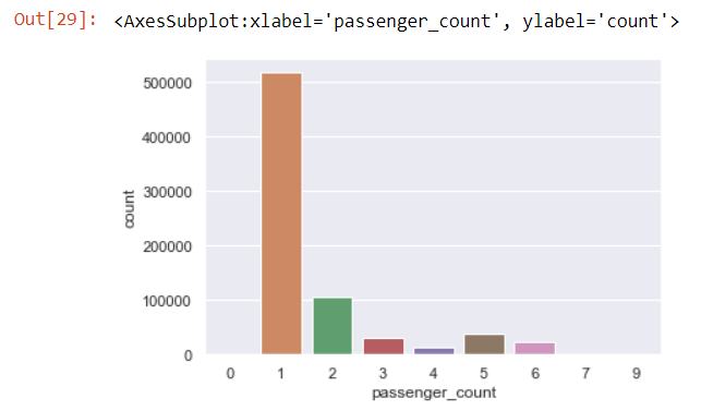
We see the highest amount of trips are with 1 passenger.
Let us remove the rows which have 0 or 7 or 9 passenger count.
data=data[data['passenger_count']!=0]
data=data[data['passenger_count']<=6]
Now, let’s see our value counts again.
Now, that seems like a fair distribution.
Store and Forward Flag
data['store_and_fwd_flag'].value_counts(normalize=True)

We see there are less than 1% of trips that were stored before forwarding.
Distance
data['distance'].value_counts()
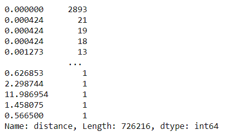
We see there are 2893 trips with 0 km distance.
The reasons for 0 km distance can be:
- The dropoff location couldn’t be tracked.
- The driver deliberately took this ride to complete a target ride number.
- The passengers canceled the trip.
We will analyze these trips further in bivariate analysis.
Trips per Day
figure,(ax1,ax2)=plt.subplots(ncols=2,figsize=(20,5))
ax1.set_title('Pickup Days')
ax=sns.countplot(x="pickup_day",data=data,ax=ax1)
ax2.set_title('Dropoff Days')
ax=sns.countplot(x="dropoff_day",data=data,ax=ax2)
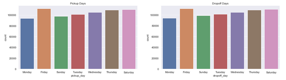
We see Fridays are the busiest days followed by Saturdays. That is probably because it’s weekend.
Trips per Hour
figure,(ax9,ax10)=plt.subplots(ncols=2,figsize=(20,5))
ax9.set_title('Pickup Days')
ax=sns.countplot(x="pickup_hour",data=data,ax=ax9)
ax10.set_title('Dropoff Days')
ax=sns.countplot(x="dropoff_hour",data=data,ax=ax10)
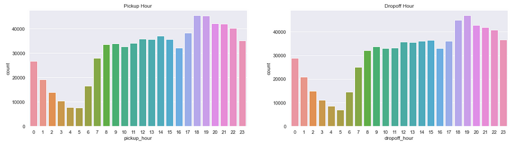
We see the busiest hours are 6:00 pm to 7:00 pm and that makes sense as this is the time when people return from their offices.
Trips per Time of Day
figure,(ax3,ax4)=plt.subplots(ncols=2,figsize=(20,5))
ax3.set_title('Pickup Time of Day')
ax=sns.countplot(x="pickup_timeofday",data=data,ax=ax3)
ax4.set_title('Dropoff Time of Day')
ax=sns.countplot(x="dropoff_timeofday",data=data,ax=ax4)
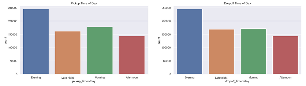
As we saw above, evenings are the busiest.
Trips per month
figure,(ax11,ax12)=plt.subplots(ncols=2,figsize=(20,5))
ax11.set_title('Pickup Month')
ax=sns.countplot(x="pickup_month",data=data,ax=ax11)
ax12.set_title('Dropoff Month')
ax=sns.countplot(x="dropoff_month",data=data,ax=ax12)
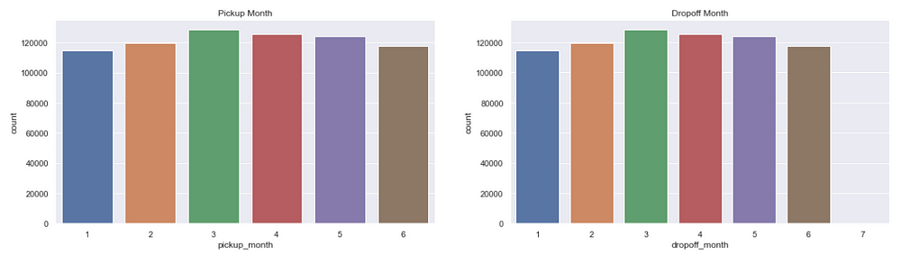
There is not much difference in the number of trips across months.
Now, we will analyze all these variables further in bivariate analysis.
Bivariate Analysis
Bivariate Analysis involves finding relationships, patterns, and correlations between two variables.
Trip Duration per Vendor
sns.barplot(y='trip_duration',x='vendor_id',data=data,estimator=np.mean)
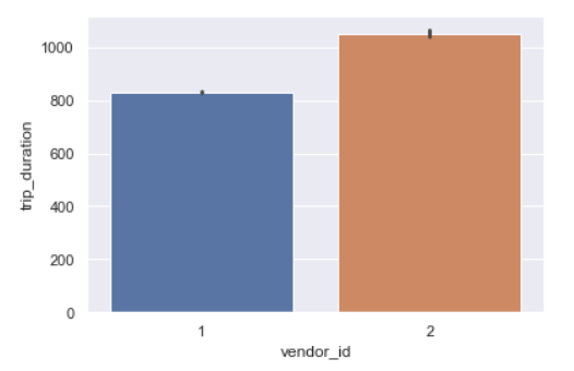
Vendor id 2 takes longer trips as compared to vendor 1.
Trip Duration per Store and Forward Flag
sns.catplot(y=’trip_duration’,x=’store_and_fwd_flag’,data=data,kind=”strip”)
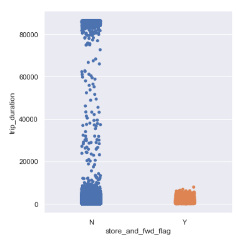
Trip duration is generally longer for trips whose flag was not stored.
Trip Duration per passenger count
sns.catplot(y=’trip_duration’,x=’passenger_count’,data=data,kind=”strip”)
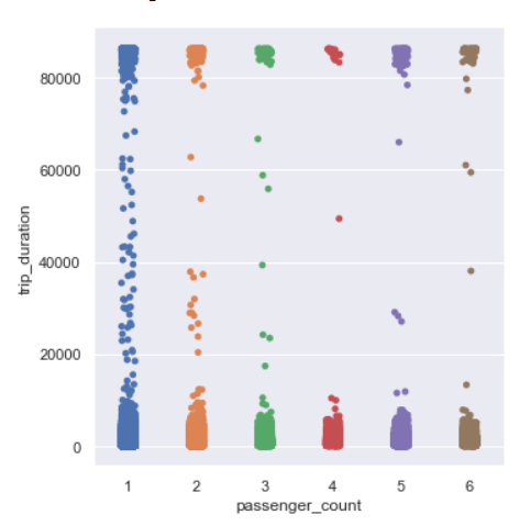
There is no visible relation between trip duration and passenger count.
Trip Duration per hour
sns.lineplot(x=’pickup_hour’,y=’trip_duration’,data=data)
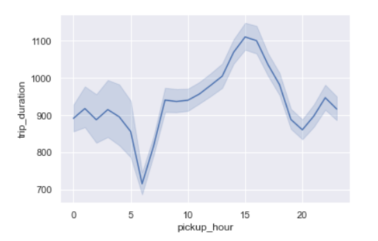
We see the trip duration is the maximum around 3 pm which may be because of traffic on the roads.
Trip duration is the lowest around 6 am as streets may not be busy.
Trip Duration per time of day
sns.lineplot(x=’pickup_timeofday’,y=’trip_duration’,data=data)
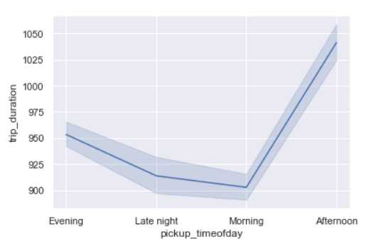
As we saw above, trip duration is the maximum in the afternoon and lowest between late night and morning.
Trip Duration per Day of Week
sns.lineplot(x=’pickup_day_no’,y=’trip_duration’,data=data)
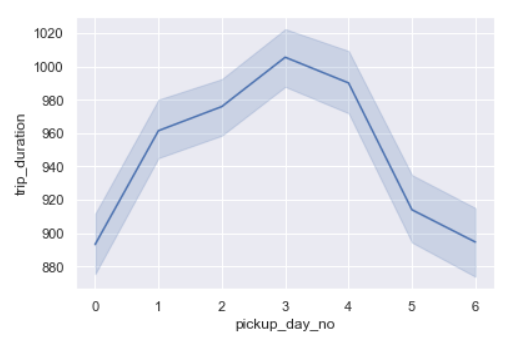
Trip duration is the longest on Thursdays closely followed by Fridays.
Trip Duration per month
sns.lineplot(x=’pickup_month’,y=’trip_duration’,data=data)
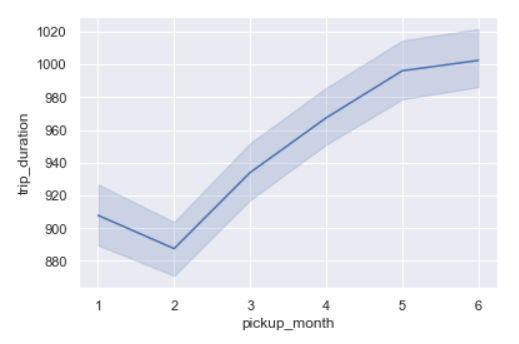
From February, we can see trip duration rising every month.
Distance and Vendor
sns.barplot(y='distance',x='vendor_id',data=data,estimator=np.mean)
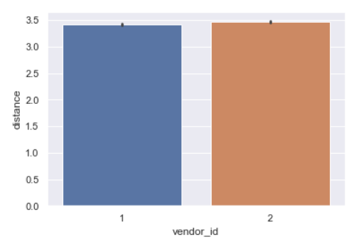
The distribution for both vendors is very similar.
Distance and Store and Forward Flag
sns.catplot(y=’distance’,x=’store_and_fwd_flag’,data=data,kind=”strip”)
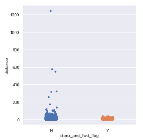
We see for longer distances the trip is not stored.
Distance per passenger count
sns.catplot(y=’distance’,x=’passenger_count’,data=data,kind=”strip”)
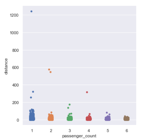
We see some of the longer distances are covered by either 1 or 2 or 4 passenger rides.
Distance per day of week
sns.lineplot(x='pickup_day_no',y='distance',data=data)
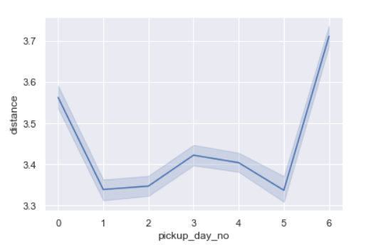
- Distances are longer on Sundays probably because it’s weekend.
- Monday trip distances are also quite high.
- This probably means that there can be outstation trips on these days and/or the streets are busier.
Distance per hour of day
sns.lineplot(x='pickup_hour',y='distance',data=data)
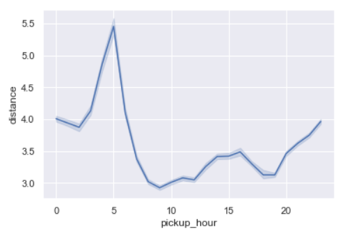
Distances are the longest around 5 am.
Distance per time of day
sns.lineplot(x='pickup_timeofday',y='distance',data=data)
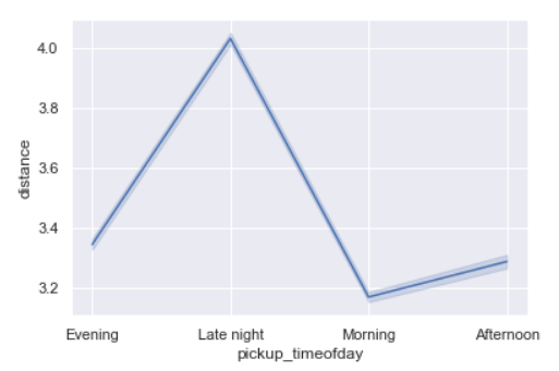
As seen above also, distances being the longest during late night or it maybe called as early morning too.
This can probably point to outstation trips where people start early for the day.
Distance per month
sns.lineplot(x='pickup_month',y='distance',data=data)
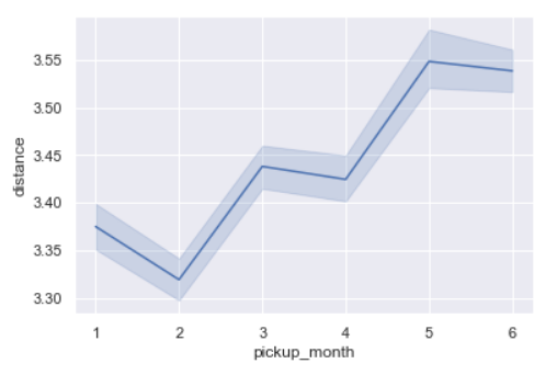
As we also saw during trip duration per month, similarly trip distance is the lowest in February and the maximum in June.
Passenger Count and Vendor id
sns.barplot(y='passenger_count',x='vendor_id',data=data)
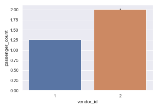
This shows that vendor 2 generally carries 2 passengers while vendor 1 carries 1 passenger rides.
Trip Duration and Distance
sns.relplot(y=data.distance,x='trip_duration',data=data)
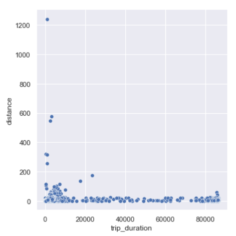
We can see there are trips which trip duration as short as 0 seconds and yet covering a large distance. And, trips with 0 km distance and long trip durations.
Let us see few rows whose distances are 0.
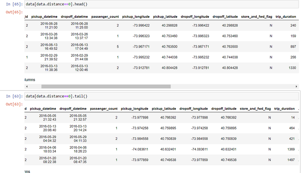
We can see even though distance is recorded as 0 but trip duration is definitely more.
- One reason can be that the dropoff coordinates weren’t recorded.
- Another reason one can think is that for short trip durations, maybe the passenger changed their mind and cancelled the ride after some time.
Frequently Asked Questions
Q1. How big is the NYC taxi data?
A. The NYC TLC dataset stands out as a prominent public dataset, renowned for being among the select few that are not only sizable (exceeding 100GBs) but also characterized by a relatively orderly structure and cleanliness.
Q2. Why are NYC taxis so expensive?
A. Several factors contribute to the perceived expense of NYC taxis. High operating costs, including fuel, maintenance, and insurance, are a key factor. Additionally, the dense urban traffic can lead to longer trip durations, raising fares. Regulatory fees, such as those imposed by the Taxi and Limousine Commission, also add to costs. Moreover, demand often outstrips supply, especially during peak hours, allowing taxis to charge premium prices. These factors, combined with the city’s high cost of living, contribute to the perception of NYC taxis as expensive transportation options.
So, we see how Exploratory Data Analysis helps us identify underlying patterns in the data, let us draw out conclusions and this even serves as the basis of feature engineering before we start building our model.
The media shown in this article are not owned by Analytics Vidhya and is used at the Author’s discretion.


Nice Visualization and Analytics.
By doing Data Visualization step, doesn't this result in Data Leakage & therefore Overfitting of the data I.e. Biased models? Shouldn't this be carried out only on Train dataset after Train- Test Split or k-fold split?
Not very sure what to write for I am not from ur field. But analysis is beyond par.