This article was published as a part of the Data Science Blogathon.
Introduction
Data visualization in python is perhaps one of the most utilized features for data science with python in today’s day and age. The libraries in python come with lots of different features that enable users to make highly customized, elegant, and interactive plots.
In this article, we will cover the usage of Matplotlib, Seaborn as well as an introduction to other alternative packages that can be used in python visualization.
Within Matplotlib and Seaborn, we will be covering a few of the most commonly used plots in the data science world for easy visualization.
Later in the article, we go over go another powerful feature in python visualizations, the subplot, and cover a basic walkthrough for creating subplots.
Useful packages for visualizations in python
Matplotlib
Matplotlib is a visualization library in Python for 2D plots of arrays. Matplotlib is written in Python and makes use of the NumPy library. It can be used in Python and IPython shells, Jupyter notebook, and web application servers. Matplotlib comes with a wide variety of plots like line, bar, scatter, histogram, etc. which can help us, deep-dive, into understanding trends, patterns, correlations. It was introduced by John Hunter in 2002.
Seaborn
Seaborn is a dataset-oriented library for making statistical representations in Python. It is developed atop matplotlib and to create different visualizations. It is integrated with pandas data structures. The library internally performs the required mapping and aggregation to create informative visuals It is recommended to use a Jupyter/IPython interface in matplotlib mode.
Bokeh
Bokeh is an interactive visualization library for modern web browsers. It is suitable for large or streaming data assets and can be used to develop interactive plots and dashboards. There is a wide array of intuitive graphs in the library which can be leveraged to develop solutions. It works closely with PyData tools. The library is well-suited for creating customized visuals according to required use-cases. The visuals can also be made interactive to serve a what-if scenario model. All the codes are open source and available on GitHub.
Altair
Altair is a declarative statistical visualization library for Python. Altair’s API is user-friendly and consistent and built atop Vega-Lite JSON specification. Declarative library indicates that while creating any visuals, we need to define the links between the data columns to the channels (x-axis, y-axis, size, color). With the help of Altair, it is possible to create informative visuals with minimal code. Altair holds a declarative grammar of both visualization and interaction.
plotly
plotly.py is an interactive, open-source, high-level, declarative, and browser-based visualization library for Python. It holds an array of useful visualization which includes scientific charts, 3D graphs, statistical charts, financial charts among others. Plotly graphs can be viewed in Jupyter notebooks, standalone HTML files, or hosted online. Plotly library provides options for interaction and editing. The robust API works perfectly in both local and web browser mode.
ggplot
ggplot is a Python implementation of the grammar of graphics. The Grammar of Graphics refers to the mapping of data to aesthetic attributes (colour, shape, size) and geometric objects (points, lines, bars). The basic building blocks according to the grammar of graphics are data, geom (geometric objects), stats (statistical transformations), scale, coordinate system, and facet.
Using ggplot in Python allows you to develop informative visualizations incrementally, understanding the nuances of the data first, and then tuning the components to improve the visual representations.
How to use the right visualization?
To extract the required information from the different visuals we create, it is quintessential that we use the correct representation based on the type of data and the questions that we are trying to understand. We will go through a set of most widely used representations below and how we can use them in the most effective manner.
Bar chart
A bar chart is used when we want to compare metric values across different subgroups of the data. If we have a greater number of groups, a bar chart is preferred over a column chart.
Bar chart using Matplotlib
# importing the libraries
import seaborn as sns
import matplotlib.pyplot as plt
#Creating the dataset
df = sns.load_dataset('titanic')
df=df.groupby('who')['fare'].sum().to_frame().reset_index()
#Creating the bar chart
plt.barh(df['who'],df['fare'],color = ['#F0F8FF','#E6E6FA','#B0E0E6'])
#Adding the aesthetics
plt.title('Chart title')
plt.xlabel('X axis title')
plt.ylabel('Y axis title')
#Show the plot
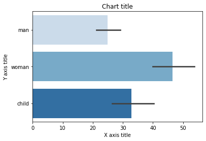
plt.show()Bar chart using Seaborn
#Creating bar plot
sns.barplot(x = 'fare',y = 'who',data = titanic_dataset,palette = "Blues")
#Adding the aesthetics
plt.title('Chart title')
plt.xlabel('X axis title')
plt.ylabel('Y axis title')
# Show the plot
plt.show()
Column chart
Column charts are mostly used when we need to compare a single category of data between individual sub-items, for example, when comparing revenue between regions
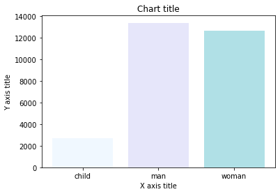
Column chart using Matplotlib
#Creating the dataset
df = sns.load_dataset('titanic')
df=df.groupby('who')['fare'].sum().to_frame().reset_index()
#Creating the column plot
plt.bar(df['who'],df['fare'],color = ['#F0F8FF','#E6E6FA','#B0E0E6'])
#Adding the aesthetics
plt.title('Chart title')
plt.xlabel('X axis title')
plt.ylabel('Y axis title')
#Show the plot
plt.show()
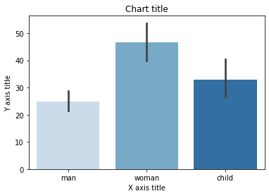
Column chart using Seaborn
#Reading the dataset
titanic_dataset = sns.load_dataset('titanic')
#Creating column chart
sns.barplot(x = 'who',y = 'fare',data = titanic_dataset,palette = "Blues")
#Adding the aesthetics
plt.title('Chart title')
plt.xlabel('X axis title')
plt.ylabel('Y axis title')
# Show the plot
plt.show()
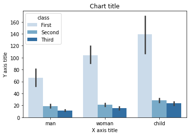
Grouped bar chart
A grouped bar chart is used when we want to compare the values in certain groups and sub-groups
Grouped bar chart using Matplotlib
#Creating the dataset
df = sns.load_dataset('titanic')
df_pivot = pd.pivot_table(df, values="fare",index="who",columns="class", aggfunc=np.mean)
#Creating a grouped bar chart
ax = df_pivot.plot(kind="bar",alpha=0.5)
#Adding the aesthetics
plt.title('Chart title')
plt.xlabel('X axis title')
plt.ylabel('Y axis title')
# Show the plot
plt.show()
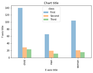
Grouped bar chart using Seaborn
#Reading the dataset
titanic_dataset = sns.load_dataset('titanic')
#Creating the bar plot grouped across classes
sns.barplot(x = 'who',y = 'fare',hue = 'class',data = titanic_dataset, palette = "Blues")
#Adding the aesthetics
plt.title('Chart title')
plt.xlabel('X axis title')
plt.ylabel('Y axis title')
# Show the plot
plt.show()
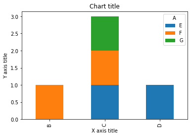
Stacked bar chart
A stacked bar chart is used when we want to compare the total sizes across the available groups and the composition of the different sub-groups
Stacked bar chart using Matplotlib
# Stacked bar chart
#Creating the dataset
df = pd.DataFrame(columns=["A","B", "C","D"],
                  data=[["E",0,1,1],
                        ["F",1,1,0],
                        ["G",0,1,0]])

df.plot.bar(x='A', y=["B", "C","D"],  stacked=True,  width = 0.4,alpha=0.5)

#Adding the aesthetics
plt.title('Chart title')
plt.xlabel('X axis title')
plt.ylabel('Y axis title')

#Show the plot
plt.show()
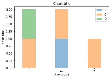
Stacked bar chart using Seaborn
dataframe = pd.DataFrame(columns=["A","B", "C","D"],
                  data=[["E",0,1,1],
                        ["F",1,1,0],
                        ["G",0,1,0]])
dataframe.set_index('A').T.plot(kind='bar', stacked=True)
#Adding the aesthetics
plt.title('Chart title')
plt.xlabel('X axis title')
plt.ylabel('Y axis title')
# Show the plot
plt.show()
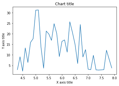
Line chart
A line chart is used for the representation of continuous data points. This visual can be effectively utilized when we want to understand the trend across time.
Line chart using Matplotlib
#Creating the dataset
df = sns.load_dataset("iris")
df=df.groupby('sepal_length')['sepal_width'].sum().to_frame().reset_index()
#Creating the line chart
plt.plot(df['sepal_length'], df['sepal_width'])
#Adding the aesthetics
plt.title('Chart title')
plt.xlabel('X axis title')
plt.ylabel('Y axis title')
#Show the plot
plt.show()
Line chart using Seaborn
#Creating the dataset
cars = ['AUDI', 'BMW', 'NISSAN',
        'TESLA', 'HYUNDAI', 'HONDA']
data = [20, 15, 15, 14, 16, 20]
#Creating the pie chart
plt.pie(data, labels = cars,colors = ['#F0F8FF','#E6E6FA','#B0E0E6','#7B68EE','#483D8B'])
#Adding the aesthetics
plt.title('Chart title')
#Show the plot
plt.show()
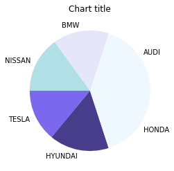
Pie chart
Pie charts can be used to identify proportions of the different components in a given whole.
Pie chart using Matplotlib
#Creating the dataset
cars = ['AUDI', 'BMW', 'NISSAN',
        'TESLA', 'HYUNDAI', 'HONDA']
data = [20, 15, 15, 14, 16, 20]
#Creating the pie chart
plt.pie(data, labels = cars,colors = ['#F0F8FF','#E6E6FA','#B0E0E6','#7B68EE','#483D8B'])
#Adding the aesthetics
plt.title('Chart title')
#Show the plot
plt.show()
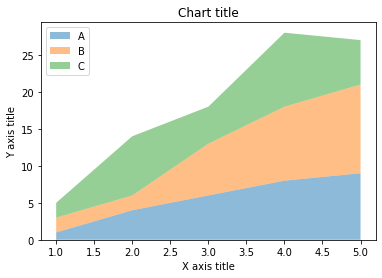
Area chart
Area charts are used to track changes over time for one or more groups. Area graphs are preferred over line charts when we want to capture the changes over time for more than 1 group.
Area chart using Matplotlib
#Reading the dataset
x=range(1,6)
y=[ [1,4,6,8,9], [2,2,7,10,12], [2,8,5,10,6] ]
#Creating the area chart
ax = plt.gca()
ax.stackplot(x, y, labels=['A','B','C'],alpha=0.5)
#Adding the aesthetics
plt.legend(loc='upper left')
plt.title('Chart title')
plt.xlabel('X axis title')
plt.ylabel('Y axis title')
#Show the plot
plt.show()
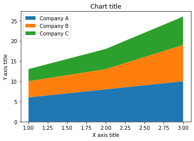
Area chart using Seaborn
# Data
years_of_experience =[1,2,3]
salary=[ [6,8,10], [4,5,9], [3,5,7] ]
# Plot
plt.stackplot(years_of_experience,salary, labels=['Company A','Company B','Company C'])
plt.legend(loc='upper left')
#Adding the aesthetics
plt.title('Chart title')
plt.xlabel('X axis title')
plt.ylabel('Y axis title')
# Show the plot
plt.show()
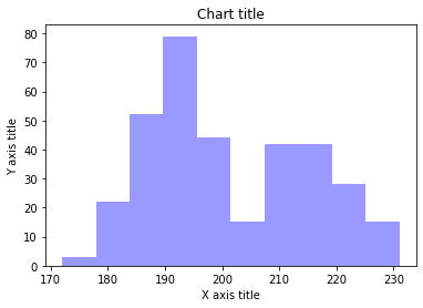
Column histogram
Column histograms are used to observe the distribution for a single variable with few data points.
Column chart using Matplotlib
#Creating the dataset
penguins = sns.load_dataset("penguins")
#Creating the column histogram
ax = plt.gca()
ax.hist(penguins['flipper_length_mm'], color='blue',alpha=0.5, bins=10)
#Adding the aesthetics
plt.title('Chart title')
plt.xlabel('X axis title')
plt.ylabel('Y axis title')
#Show the plot
plt.show()

Column chart using Seaborn
#Reading the dataset
penguins_dataframe = sns.load_dataset("penguins")
#Plotting bar histogram
sns.distplot(penguins_dataframe['flipper_length_mm'], kde=False, color='blue', bins=10)
#Adding the aesthetics
plt.title('Chart title')
plt.xlabel('X axis title')
plt.ylabel('Y axis title')
# Show the plot
plt.show()
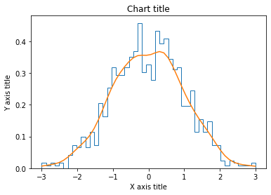
Line histogram
Line histograms are used to observe the distribution for a single variable with many data points.
Line histogram chart using Matplotlib
#Creating the dataset
df_1 = np.random.normal(0, 1, (1000, ))
density = stats.gaussian_kde(df_1)
#Creating the line histogram
n, x, _ = plt.hist(df_1, bins=np.linspace(-3, 3, 50), histtype=u'step', density=True)
plt.plot(x, density(x))
#Adding the aesthetics
plt.title('Chart title')
plt.xlabel('X axis title')
plt.ylabel('Y axis title')
#Show the plot
plt.show()
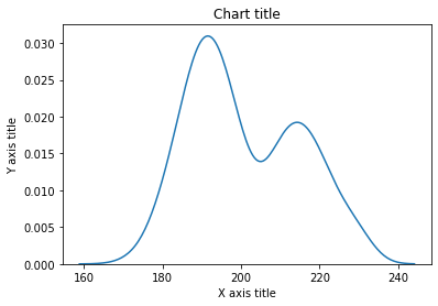
Line histogram chart using Seaborn
#Reading the dataset
penguins_dataframe = sns.load_dataset("penguins")
#Plotting line histogram
sns.distplot(penguins_dataframe['flipper_length_mm'], hist = False, kde = True, label='Africa')
#Adding the aesthetics
plt.title('Chart title')
plt.xlabel('X axis title')
plt.ylabel('Y axis title')
# Show the plot
plt.show()
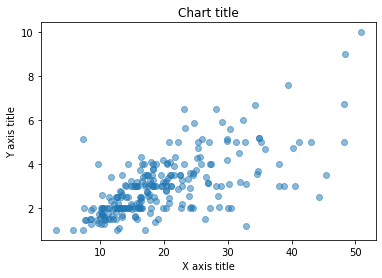
Scatter plot
Scatter plots can be leveraged to identify relationships between two variables. It can be effectively used in circumstances where the dependent variable can have multiple values for the independent variable.
Scatter plot using Matplotlib
#Creating the dataset
df = sns.load_dataset("tips")
#Creating the scatter plot
plt.scatter(df['total_bill'],df['tip'],alpha=0.5 )
#Adding the aesthetics
plt.title('Chart title')
plt.xlabel('X axis title')
plt.ylabel('Y axis title')
#Show the plot
plt.show()
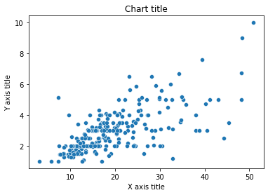
Scatter plot using Seaborn
#Reading the dataset
bill_dataframe = sns.load_dataset("tips")
#Creating scatter plot
sns.scatterplot(data=bill_dataframe, x="total_bill", y="tip")
#Adding the aesthetics
plt.title('Chart title')
plt.xlabel('X axis title')
plt.ylabel('Y axis title')
# Show the plot
plt.show()
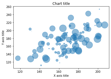
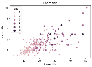
Bubble chart
Scatter plots can be leveraged to depict and show relationships among three variables.
Bubble chart using Matplotlib
#Creating the dataset
np.random.seed(42)
N = 100
x = np.random.normal(170, 20, N)
y = x + np.random.normal(5, 25, N)
colors = np.random.rand(N)
area = (25 * np.random.rand(N))**2
df = pd.DataFrame({
    'X': x,
    'Y': y,
    'Colors': colors,
    "bubble_size":area})
#Creating the bubble chart
plt.scatter('X', 'Y', s='bubble_size',alpha=0.5, data=df)
#Adding the aesthetics
plt.title('Chart title')
plt.xlabel('X axis title')
plt.ylabel('Y axis title')
#Show the plot
plt.show()
Bubble chart using Seaborn
#Reading the dataset
bill_dataframe = sns.load_dataset("tips")
#Creating bubble plot
sns.scatterplot(data=bill_dataframe, x="total_bill", y="tip", hue="size", size="size")
#Adding the aesthetics
plt.title('Chart title')
plt.xlabel('X axis title')
plt.ylabel('Y axis title')
# Show the plot
plt.show()
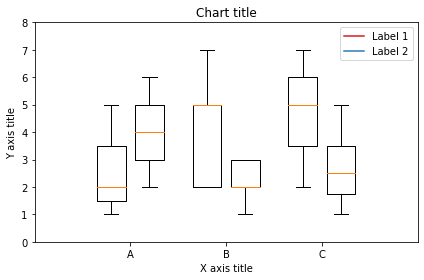
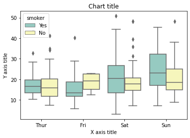
Box plot
A box plot is used to show the shape of the distribution, its central value, and its variability.
Box plot using Matplotlib
from past.builtins import xrange
#Creating the dataset
df_1 = [[1,2,5], [5,7,2,2,5], [7,2,5]]
df_2 = [[6,4,2], [1,2,5,3,2], [2,3,5,1]]
#Creating the box plot
ticks = ['A', 'B', 'C']
plt.figure()
bpl = plt.boxplot(df_1, positions=np.array(xrange(len(df_1)))*2.0-0.4, sym='', widths=0.6)
bpr = plt.boxplot(df_2, positions=np.array(xrange(len(df_2)))*2.0+0.4, sym='', widths=0.6)
plt.plot([], c='#D7191C', label='Label 1')
plt.plot([], c='#2C7BB6', label='Label 2')
#Adding the aesthetics
plt.title('Chart title')
plt.xlabel('X axis title')
plt.ylabel('Y axis title')
plt.legend()
plt.xticks(xrange(0, len(ticks) * 2, 2), ticks)
plt.xlim(-2, len(ticks)*2)
plt.ylim(0, 8)
plt.tight_layout()
#Show the plot
plt.show()
Box plot using Seaborn
#Reading the dataset
bill_dataframe = sns.load_dataset("tips")
#Creating boxplots
ax = sns.boxplot(x="day", y="total_bill", hue="smoker", data=bill_dataframe, palette="Set3")
#Adding the aesthetics
plt.title('Chart title')
plt.xlabel('X axis title')
plt.ylabel('Y axis title')
# Show the plot
plt.show()
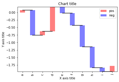
Waterfall chart
A waterfall chart can be used to explain the gradual transition in value of a variable that is subjected to increments or decrements
#Reading the dataset
test = pd.Series(-1 + 2 * np.random.rand(10), index=list('abcdefghij'))
#Function for makig a waterfall chart
def waterfall(series):
    df = pd.DataFrame({'pos':np.maximum(series,0),'neg':np.minimum(series,0)})
    blank = series.cumsum().shift(1).fillna(0)
    df.plot(kind='bar', stacked=True, bottom=blank, color=['r','b'], alpha=0.5)
    step = blank.reset_index(drop=True).repeat(3).shift(-1)
    step[1::3] = np.nan
    plt.plot(step.index, step.values,'k')
#Creating the waterfall chart
waterfall(test)
#Adding the aesthetics
plt.title('Chart title')
plt.xlabel('X axis title')
plt.ylabel('Y axis title')
#Show the plot
plt.show()
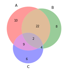
Venn diagram
Venn diagrams are used to see the relationships between two or three sets of items. It highlights the similarities and differences
from matplotlib_venn import venn3
#Making venn  diagram
venn3(subsets = (10, 8, 22, 6,9,4,2))
plt.show()
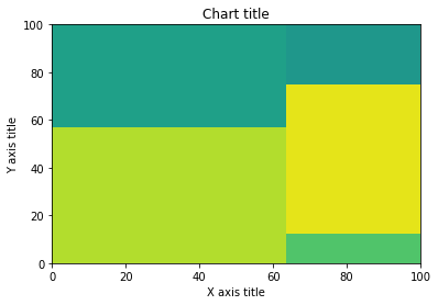
Tree map
Tree Maps are primarily used to display data that is grouped and nested in a hierarchical structure and observe the contribution of each component
import squarify
sizes = [40, 30, 5, 25, 10]
squarify.plot(sizes)
#Adding the aesthetics
plt.title('Chart title')
plt.xlabel('X axis title')
plt.ylabel('Y axis title')
# Show the plot
plt.show()
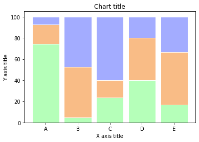
100% stacked bar chart
A 100% stacked bar chart can be leveraged when we want to show the relative differences within each group for the different sub-groups available
#Reading the dataset
r = [0,1,2,3,4]
raw_data = {'greenBars': [20, 1.5, 7, 10, 5], 'orangeBars': [5, 15, 5, 10, 15],'blueBars': [2, 15, 18, 5, 10]}
df = pd.DataFrame(raw_data)
# From raw value to percentage
totals = [i+j+k for i,j,k in zip(df['greenBars'], df['orangeBars'], df['blueBars'])]
greenBars = [i / j * 100 for i,j in zip(df['greenBars'], totals)]
orangeBars = [i / j * 100 for i,j in zip(df['orangeBars'], totals)]
blueBars = [i / j * 100 for i,j in zip(df['blueBars'], totals)]
# plot
barWidth = 0.85
names = ('A','B','C','D','E')
# Create green Bars
plt.bar(r, greenBars, color='#b5ffb9', edgecolor='white', width=barWidth)
# Create orange Bars
plt.bar(r, orangeBars, bottom=greenBars, color='#f9bc86', edgecolor='white', width=barWidth)
# Create blue Bars
plt.bar(r, blueBars, bottom=[i+j for i,j in zip(greenBars, orangeBars)], color='#a3acff', edgecolor='white', width=barWidth)
# Custom x axis
plt.xticks(r, names)
plt.xlabel("group")
#Adding the aesthetics
plt.title('Chart title')
plt.xlabel('X axis title')
plt.ylabel('Y axis title')
plt.show()
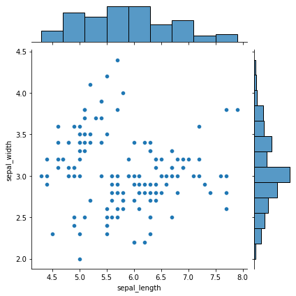
Marginal plots
Marginal plots are used to assess the relationship between two variables and examine their distributions. Such plots scatter plots that have histograms, box plots, or dot plots in the margins of respective x and y axes
#Reading the dataset
iris_dataframe = sns.load_dataset('iris')
#Creating marginal graphs
sns.jointplot(x=iris_dataframe["sepal_length"], y=iris_dataframe["sepal_width"], kind='scatter')
# Show the plot
plt.show()
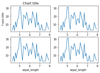
Subplots
Subplots are powerful visualizations that help easy comparisons between plots
#Creating the dataset
df = sns.load_dataset("iris")
df=df.groupby('sepal_length')['sepal_width'].sum().to_frame().reset_index()
#Creating the subplot
fig, axes = plt.subplots(nrows=2, ncols=2)
ax=df.plot('sepal_length', 'sepal_width',ax=axes[0,0])
ax.get_legend().remove()
#Adding the aesthetics
ax.set_title('Chart title')
ax.set_xlabel('X axis title')
ax.set_ylabel('Y axis title')
ax=df.plot('sepal_length', 'sepal_width',ax=axes[0,1])
ax.get_legend().remove()
ax=df.plot('sepal_length', 'sepal_width',ax=axes[1,0])
ax.get_legend().remove()
ax=df.plot('sepal_length', 'sepal_width',ax=axes[1,1])
ax.get_legend().remove()
#Show the plot
plt.show()
In conclusion, there is an array of different libraries which can be leveraged to their full potential by understanding the use-case and the requirement. The syntax and the semantics vary from package to package and it is essential to understand the challenges and advantages of the different libraries. Happy visualizing!
Data scientist and analytics enthusiast
The media shown in this article are not owned by Analytics Vidhya and is used at the Author’s discretion.


Thanks for sharing such valuable knowledge about data visualization.
It was eye opening. That was a great read. Hope to see more of that.
Eye opening. It was a great read. Hoping to see more of that