Data visualization is a powerful tool for transforming numerical and textual data into easily interpretable images. It serves various purposes, including communication, informing, and persuading. However, if the representation is wrong, data can also mislead people. This article will explore 5 examples of bad data visualization that you must avoid. Additionally, we will discuss tips and solutions to address these concerns and ensure that data visualizations maintain integrity and accurately convey information to the audience.
This article was published as a part of the Data Science Blogathon.
There are graphs/charts that seem good at first but provide a bad representation of data, and would only confuse your audience. In a telecasted news report of FOX on a 2012 Presidential Run, it was shown a pie chart that seems off as shown below:
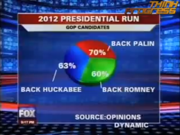
The use of a pie chart should represent data as part of a whole, which means the sum of all data in a pie chart should be equivalent to 100%. Contrary to a representation made by Fox News, the total percent of the pie chart shown is 193%. This could be very troublesome if shown without the label. It would look convincing.
In comparing data, the best way to represent them is through a bar graph as shown below:
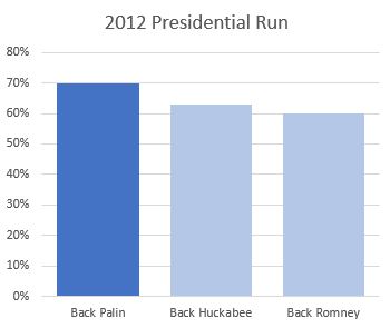
In this new graph that represents the Presidential Run of 2012, the category Back Palin has the highest percent. Proper usage of a graph to represent our data, will make it easier for the audience to know the message you are trying to convey.
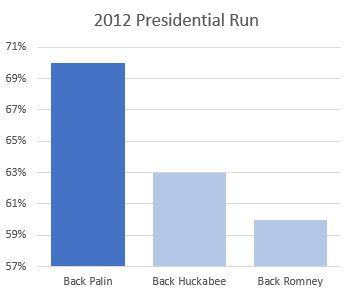
The above graph represents Back Palin has an overwhelming advantage against Back Huckabee and Back Romney when in reality, it is just around 7% to 10%. To fix this, always start your Y-Axis with a baseline and use proper scales.
When presenting your data, it is important to observe the norms. The graph above demonstrates the representation of larger data using a lighter color, whereas society generally accepts highlighting specific portions with a darker color. If we were to alter the conventional method of presenting heat/dense areas in complex graphs like geo-mapping or heat maps, it could cause misconceptions and confusion. To address this, it is crucial always to consider the social norms in the area or consult your audience when preparing data visuals.
A graph without labels is a bad data visualization example because it lacks the necessary context and information for the audience to understand and interpret the data accurately. Labels are crucial in providing clear descriptions of the variables, axis scales, units of measurement, and any other relevant details. Without labels, viewers are left guessing about the meaning and significance of the data, leading to confusion and potential misinterpretation. Including proper labels is essential to ensure that the graph effectively communicates the message.
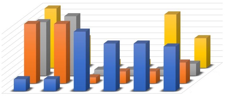
The above graph represents a bad data visualization example due to the lack of specific highlighted data. Additionally, the tall bars in the foreground obscure the information displayed by other bars behind them. The absence of labels and the presentation of voluminous data in the graph can confuse the audience and make it difficult to identify the intended point or message conveyed through data visualization. Consequently, verbal explanations become necessary, defeating the purpose of using data visualization to effectively communicate information.
In data visualization, we should also remember the 4Ws:
Data are very wide. As a data visualization practitioner, you should only pick essential data to be shown to your target audiences. After which, highlight or emphasize the information you want to convey by changing the other data colors to gray or faded colors.
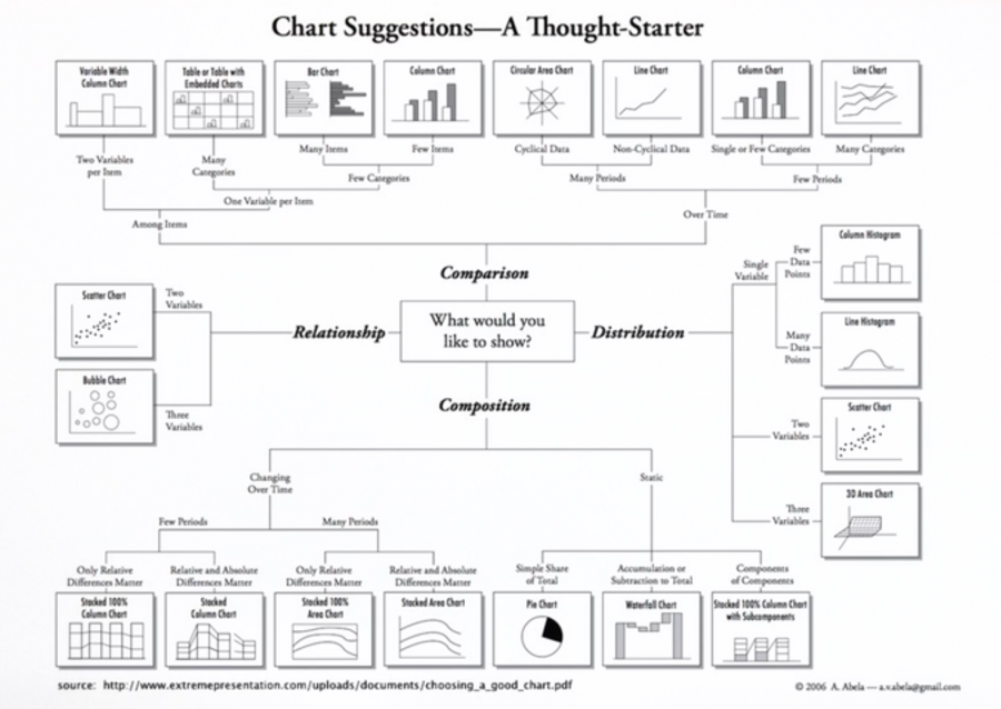
In displaying your data and knowing the most effective in communicating your data, the chart below will surely help you decide:
Recognizing the importance of good data visualization is paramount in effectively communicating insights and facilitating informed decision-making. The examples provided in this article demonstrate the pitfalls of bad data visualization, such as the absence of labels, unclear highlighting of data, and the potential for confusion and misinterpretation.
However, there is a solution on the horizon.
No-code AI programs offer a promising avenue for individuals without coding expertise to create visually compelling and accurate data visualizations. By leveraging these tools, we can mitigate the risks of bad data visualization and empower more people to present data effectively, enhancing understanding and driving impactful outcomes. Check out the program today!
A. An example of bad data visualization is a cluttered and confusing chart with excessive data points, complex visuals, and unclear labeling, making it difficult to interpret and extract meaningful insights.
A. An example of misleading data is when selective or biased data is presented to manipulate the interpretation or perception of a situation, leading to false or incomplete conclusions.
A. A misleading data visualization occurs when a chart or graph is designed in a way that distorts or misrepresents the data, such as using inappropriate scales, omitting relevant information, or manipulating axes to exaggerate or downplay certain aspects.
A. Examples of misleading graphs or charts include truncated axes, improper scaling, cherry-picked data points, distorted aspect ratios, and inappropriate data representation, all of which can lead to misinterpretation or skewed understanding of the underlying information.
The media shown in this article are not owned by Analytics Vidhya and is used at the Author’s discretion.
Lorem ipsum dolor sit amet, consectetur adipiscing elit,


