Introduction to Matplotlib using Python for Beginners
Introduction
Data visualization serves as a gateway to understanding and interpreting complex datasets. Matplotlib tutorial, the cornerstone of plotting libraries in Python, empowers beginners to dive into the world of data visualization.
From installing Matplotlib to crafting your first plots, this guide is tailored to beginners, providing step-by-step instructions and insights into the fundamental concepts of creating compelling visualizations. Whether you’re a student venturing into data science or a professional taking the first steps in data analysis, this article aims to demystify Matplotlib’s functionalities, offering a solid foundation to harness its capabilities.
Join us as we navigate through the essential functionalities of Matplotlib, unraveling the art of line plots, histograms, bar charts, scatter plots, and more.
This article was published as a part of the Data Science Blogathon.
Table of contents
What is Matplotlib?
Matplotlib is a popular plotting library in Python used for creating high-quality visualizations and graphs. It offers various tools to generate diverse plots, facilitating data analysis, exploration, and presentation. Matplotlib is flexible, supporting multiple plot types and customization options, making it valuable for scientific research, data analysis, and visual communication. It can create different types of visualization reports like line plots, scatter plots, histograms, bar charts, pie charts, box plots, and many more different plots. This library also supports 3-dimensional plotting.
Installation of Matplotlib
Let’s check how to set up the Matplotlib in Google Colab. Colab Notebooks are similar to Jupyter Notebooks except for running on the cloud. It is also connected to our Google Drive, making it much easier to access our Colab notebooks anytime, anywhere, and on any system. You can install Matplotlib by using the PIP command.
!pip install matplotlib
To verify the installation, you would have to write the following code chunk:
import matplotlib
print(matplotlib.__version__)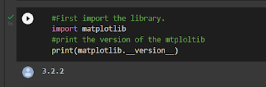
Also Read: A Complete Python Tutorial to Learn Data Science
Types of Plots in Matplotlib
Now that you know what Matplotlib function is and how you can install it in your system, let’s discuss different kinds of plots that you can draw to analyze your data or present your findings. Also, you can go to the article to master in matplotlib
Sub Plots
Subplots() is a Matplotlib function that displays multiple plots in one figure. It takes various arguments such as many rows, columns, or sharex, sharey axis.
Code:
# First create a grid of plots
fig, ax = plt.subplots(2,2,figsize=(10,6)) #this will create the subplots with 2 rows and 2 columns
#and the second argument is size of the plot
# Lets plot all the figures
ax[0][0].plot(x1, np.sin(x1), 'g') #row=0,col=0
ax[0][1].plot(x1, np.cos(x1), 'y') #row=0,col=1

ax[1][0].plot(x1, np.sin(x1), 'b') #row=1,col=0
ax[1][1].plot(x1, np.cos(x1), 'red') #row=1,col=1
plt.tight_layout()
#show the plots
plt.show()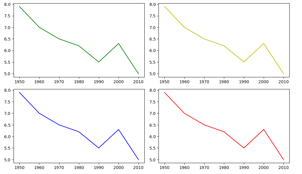
Now, let’s check the different categories of plots that Matplotlib provides.
- Line plot
- Histogram
- Bar Chart
- Scatter plot
- Pie charts
- Boxplot
Most of the time, we have to work with Pyplot as an interface for Matplotlib. So, we import Pyplot like this:
import matplotlib.pyplotTo make things easier, we can import it like this: import matplotlib. pyplot as plt
Line Plots
A line plot shows the relationship between the x and y-axis.
The plot() function in the Matplotlib library’s Pyplot module creates a 2D hexagonal plot of x and y coordinates. plot() will take various arguments like plot(x, y, scalex, scaley, data, **kwargs).
x, y are the horizontal and vertical axis coordinates where x values are optional, and its default value is range(len(y)).
scalex, scaley parameters are used to autoscale the x-axis or y-axis, and its default value is actual.
**kwargs specify the property like line label, linewidth, marker, color, etc.
Code:
this line will create array of numbers between 1 to 10 of length 100

np.linspace(satrt,stop,num)

x1 = np.linspace(0, 10, 100) #line plot
plt.plot(x1, np.sin(x1), '-',color='orange')
plt.plot(x1, np.cos(x1), '--',color='b')

give the name of the x and y axis

plt.xlabel('x label')
plt.ylabel('y label')

also give the title of the plot

plt.title("Title")
plt.show()
Also Read: 90+ Python Interview Questions to Ace Your Next Job Interview
Histogram
The most common graph for displaying frequency distributions is a histogram. To create a histogram, the first step is to create a bin of ranges, then distribute the whole range of values into a series of intervals and count the value that will fall in the given interval. We can use plt.Hist () function plots the histograms, taking various arguments like data, bins, color, etc.
x: x-coordinate or sequence of the array
bins: integer value for the number of bins wanted in the graph
range: the lower and upper range of bins
density: optional parameter that contains boolean values
histtype: optional parameter used to create different types of histograms like:-bar bar stacked, step, step filled, and the default is a bar
Code:
#draw random samples from random distributions.
x = np.random.normal(170, 10, 250)
#plot histograms
plt.hist(x) plt.show()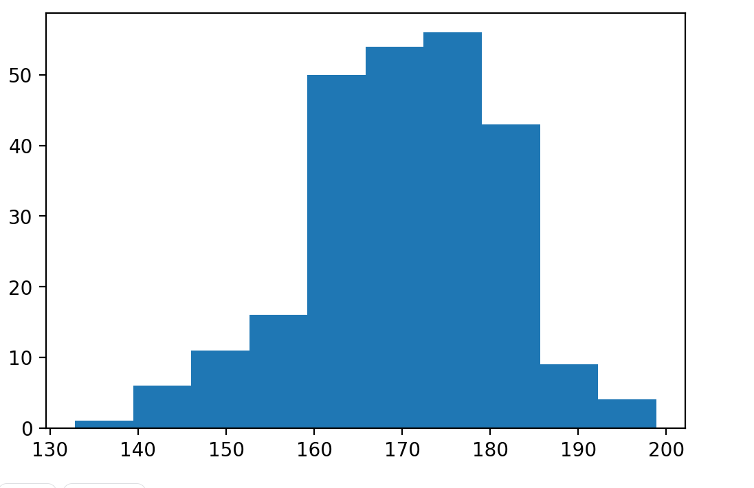
Bar Plot
Mainly, the barplot shows the relationship between the numeric and categoric values. In a bar chart, we have one axis representing a particular category of the columns and another axis representing the values or counts of the specific category. Barcharts are plotted both vertically and horizontally and are plotted using the following line of code:
plt.bar(x,height,width,bottom,align)
x: representing the coordinates of the x-axis
height: the height of the bars
, width: width of the bars. Its default value is 0.8
bottom: It’s optional. It is a y-coordinate of the bar. Its default value is None
align: center, edge its default value is center
Code:
#define array
data= [5. , 25. , 50. , 20.]
plt.bar(range(len(data)), data,color='c')
plt.show()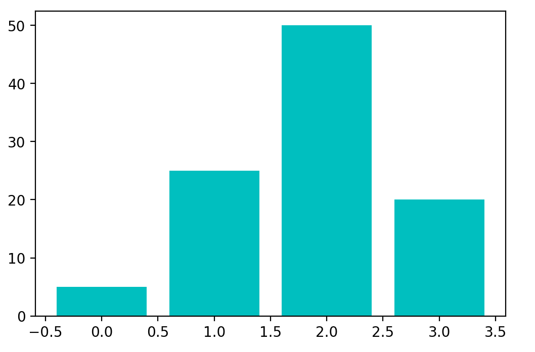
Scatter Plot
Scatter plots are used to show the relationships between the variables and use the dots for the plotting or to show the relationship between two numeric variables.
The scatter() method in the Matplotlib library is used for plotting.
Code:
#create the x and y axis coordinates
x = np.array([5,7,8,7,2,17,2,9,4,11,12,9,6])
y = np.array([99,86,87,88,111,86,103,87,94,78,77,85,86])
plt.scatter(x, y)
plt.legend()
plt.show()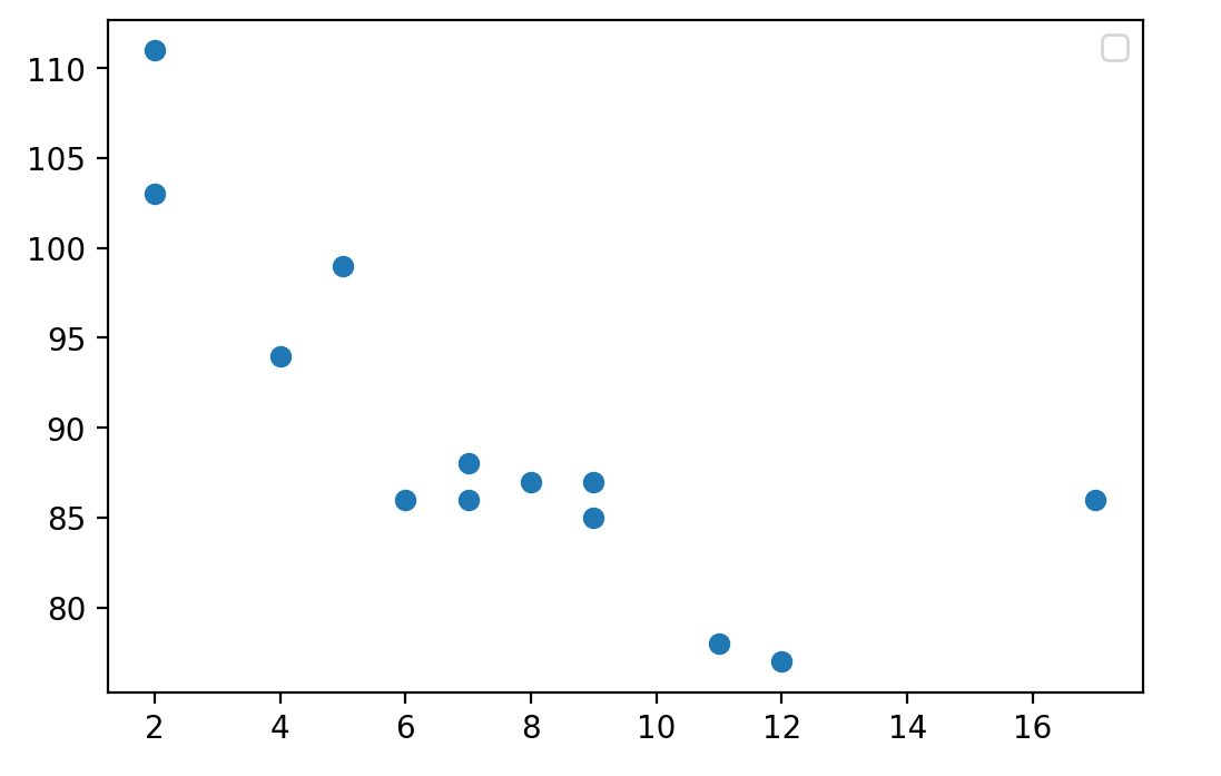
Pie Chart
A pie chart (or circular chart ) is used to show the percentage of the whole. Hence, it is used to compare the individual categories with the whole. Pie() will take the different parameters such as:
x: Sequence of an array
labels: List of strings which will be the name of each slice in the pie chart
Autopct: It is used to label the wedges with numeric values. The labels will be placed inside the wedges. Its format is %1.2f%
Code:
#define the figure size
plt.figure(figsize=(7,7))
x = [25,30,45,10]
#labels of the pie chart
labels = ['A','B','C','D']
plt.pie(x, labels=labels)
plt.show()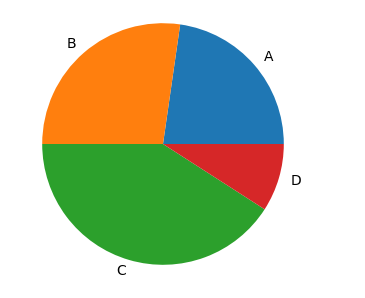
Box Plot
A Box plot in Python Matplotlib showcases the dataset’s summary, encompassing all numeric values. It highlights the minimum, first quartile, median, third quartile, and maximum. The median lies between the first and third quartiles. On the x-axis, you’ll find the data values, while the y-coordinates represent the frequency distribution.
Parameters used in box plots are as follows:
data: NumPy array
vert: It will take boolean values, i.e., true or false, for the vertical and horizontal plot. The default is True
width: This will take an array and sets of the width of boxes. Optional parameters
Patch_artist: It is used to fill the boxes with color, and its default value is false
labels: Array of strings which is used to set the labels of the dataset
Code:
#create the random values by using numpy
values= np.random.normal(100, 20, 300)
#creating the plot by boxplot() function which is avilable in matplotlib
plt.boxplot(values,patch_artist=True,vert=True)
plt.show()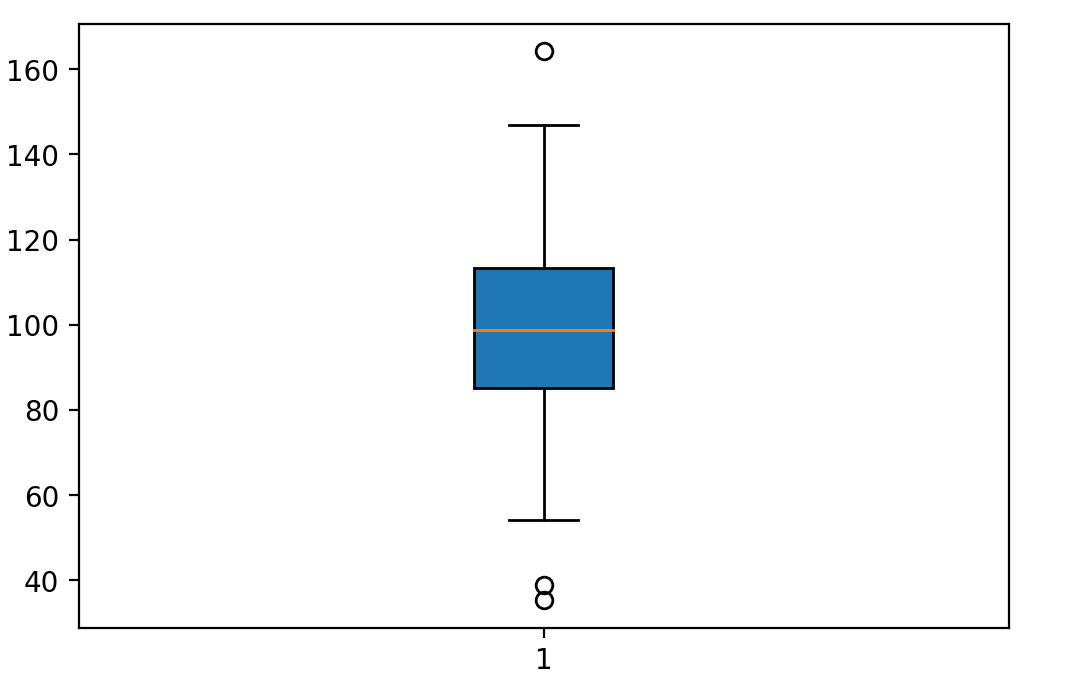
Area Chart
An area chart or plot is used to visualize the quantitative data graphically based on the line plot. fill_between() function is used to plot the area chart.
Parameter:
x,y represent the x and y coordinates of the plot. This will take an array of length n.
Interpolate is a boolean value and is optional. If true, interpolate between the two lines to find the precise point of intersection.
**kwargs: alpha, color, face color, edge color, linewidth.
Code:
import numpy as np
import pandas as pd
import matplotlib.pyplot as plt
y = [2, 7, 14, 17, 20, 27, 30, 38, 25, 18, 6, 1]
#plot the line of the given data
plt.plot(np.arange(12),y, color="blue", alpha=0.6, linewidth=2)
#decorate thw plot by giving the labels
plt.xlabel('Month', size=12)
plt.ylabel('Turnover(Cr.)', size=12) #set y axis start with zero
plt.ylim(bottom=0)
plt.show()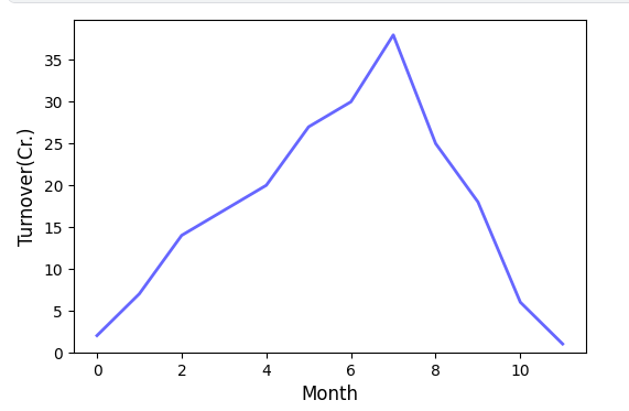
Fill the area in a line plot using fill_between() for the area chart.
plt.fill_between(np.arange(12), turnover, color="teal", alpha=0.4)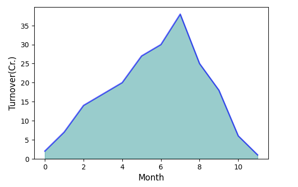
Word Cloud
Wordcloud is the visual representation of the text data. Words are usually single, and the font size or color shows the importance of each word. The word cloud () function is used to create a word cloud in Python.
The word cloud() will take various arguments like:
width: set the width of the canvas .default 400
height: set the height of the canvas .default 400
max_words: number of words allowed. Its default value is 200.
background_color: background color for the word-cloud image. The default color is black.
Once the word cloud object is created, you can call the generate function to generate the word cloud and pass the text data.
Code:
#import the libraries
from wordcloud import WordCloud
import matplotlib.pyplot as plt
from PIL import Image
import numpy as np
#set the figure size .
plt.figure(figsize=(10,15))
#dummy text.
text = '''Nulla laoreet bibendum purus, vitae sollicitudin sapien facilisis at.
Donec erat diam, faucibus pulvinar eleifend vitae, vulputate quis ipsum.
Maecenas luctus odio turpis, nec dignissim dolor aliquet id.
Mauris eu semper risus, ut volutpat mi. Vivamus ut pellentesque sapien.
Etiam fringilla tincidunt lectus sed interdum. Etiam vel dignissim erat.
Curabitur placerat massa nisl, quis tristique ante mattis vitae.
Ut volutpat augue non semper finibus. Nullam commodo dolor sit amet purus auctor mattis.
Ut id nulla quis purus tempus porttitor. Ut venenatis sollicitudin est eget gravida.
Duis imperdiet ut nisl cursus ultrices. Maecenas dapibus eu odio id hendrerit.
Quisque eu velit hendrerit, commodo magna euismod, luctus nunc.
Proin vel augue cursus, placerat urna aliquet, consequat nisl.
Duis vulputate turpis a faucibus porta. Etiam blandit tortor vitae dui vestibulum viverra.
Phasellus at porta elit. Duis vel ligula consectetur, pulvinar nisl vel, lobortis ex.'''
wordcloud = WordCloud( margin=0,colormap='BuPu').generate(text)
#imshow() function in pyplot module of matplotlib library is used to display data as an image.
plt.imshow(wordcloud, interpolation='bilinear')
plt.axis('off')
plt.margins(x=0, y=0)
plt.show()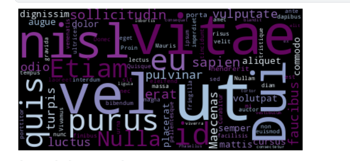
3-D Graphs
Now that you have seen some simple graphs, it’s time to check some complex ones, i.e., 3-D graphs. Initially, Matplotlib was built for 2-dimensional graphs, but later, 3-D graphs were added. Let’s check how you can plot a 3-D graph in Matplotlib.
Code:
from mpl_toolkits import mplot3d%matplotlib inline
import numpy as np
import matplotlib.pyplot as pltfig = plt.figure()
ax = plt.axes(projection='3d')
The above code is used to create the 3-dimensional axes.
Each and every plot that we have seen in 2-D plotting through Matplotlib can also be drawn as 3-D graphs. For instance, let’s check a line plot in a 3-D plane.
ax = plt.axes(projection='3d')
# Data for a three-dimensional line
zline = np.linspace(0, 15, 1000)
xline = np.sin(zline)
yline = np.cos(zline)
ax.plot3D(xline, yline, zline, 'gray')
# Data for three-dimensional scattered points
zdata = 15 * np.random.random(100)
xdata = np.sin(zdata) + 0.1 * np.random.randn(100)
ydata = np.cos(zdata) + 0.1 * np.random.randn(100)
ax.scatter3D(xdata, ydata, zdata, c=zdata, cmap='Greens');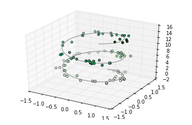
all other types of graphs can be drawn in the same way. One particular graph that Matplotlib 3-D provides is the Contour Plot. You can draw a contour plot using the following link:
fig = plt.figure()
ax = plt.axes(projection='3d')
ax.plot_wireframe(X, Y, Z, color='black')
ax.set_title('wireframe');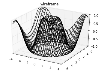
To understand all the mentioned plot types, you can refer her
Conclusion
In this article, we discussed Matplotlib, i.e., the basic plotting library in Python, and the basic information about the charts commonly used for statistical analysis. Also, we have discussed how to draw multiple plots in one figure using the subplot function.
As we explore Python Matplotlib, we’ve covered customizing figures and resizing plots with various arguments. Now, equipped with fundamental plotting skills, feel free to experiment with diverse datasets and mathematical functions.
As Data Professionals (including Data Analysts, Data Scientists, ML Engineers, and DL Engineers), at some point, all of them need to visualize data and present findings, so what would be a better option than this? You would be a bit confident in the industry now that you know this tech.
The media shown in this article are not owned by Analytics Vidhya and are used at the Author’s discretion.
Frequently Asked Questions?
A. Matplotlib is a Python library used for creating static, interactive, and animated visualizations in Python. It provides a wide range of plotting functions to create various types of graphs, charts, histograms, scatter plots, etc.
A. No, matplotlib and NumPy are not the same. NumPy is a fundamental package for scientific computing in Python, providing support for multidimensional arrays and matrices, along with a variety of mathematical functions to operate on these arrays. Matplotlib, on the other hand, is specifically focused on data visualization and provides tools to create plots and graphs from data stored in NumPy arrays or other data structures.
A. Matplotlib simplifies data visualization, making it easy to represent complex data in understandable graphical formats, facilitating better analysis and comprehension.
A. In Python, “plt” is commonly used as an alias for the matplotlib.pyplot module. When you see code referencing “plt”, it’s typically referring to functions and classes from matplotlib’s pyplot module, which is often imported using the alias “plt” for brevity and convenience.


