This article was published as a part of the Data Science Blogathon.
‘The greatest value of a picture is when it forces us to notice what we never expected to see‘ -John W. Tukey
Introduction
As a Data scientist, data is our biggest asset. Using data we assist in the process of decision making which could benefit the business. But data always comes in huge quantities and looking at raw data becomes hard for even a veteran Data scientist to draw meaningful inferences let alone a nontechnical person. For this, we often resort to visualizing data by using various plots which can explain the data. There often comes a situation where
– Multiple types of the plot seem right for the task
– None of the plots seem right for the task
If you ever faced such a dilemma and want to find out when to use what kind of plot then you have come to the right place.
In this article, we will go through a series of plots. Briefly, I will describe each plot and when that plot should be used.
1) Data: Univariate,Continuous
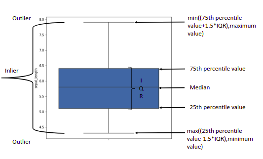
Box and Whisker plot: Used to determine the variation in your continuous data
To identify any outliers in your data.
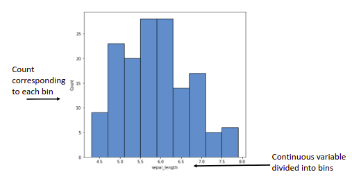
Histograms: Used to visualize the frequency of our continuous variable within each predefined bucket.
– Can also be used to detect outliers.
– To visualize the type of distribution data is coming from e.g.(Gaussian, Lognormal, etc..)
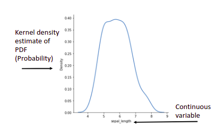
Density plots: A version of histogram smoothened by Kernel density estimation.
– To be used if you want to visualize the type of distribution.
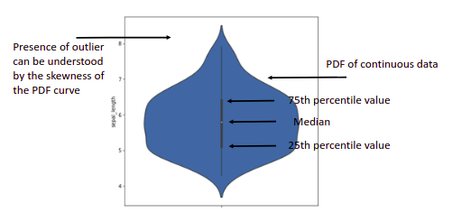
Violin plot: If you want to have the benefits of a box and whisker plot and a density plot, you can use a violin plot.
-This helps to visualize the type of distribution as well as outliers (if any) in your data.
2) Data: Univariate, Categorical
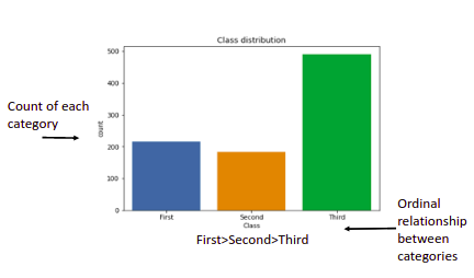
Barplots (Horizontal): You can call these histograms for categorical data where binning is done based on each category.
-Used for visualizing the count of values of each category.
-If our categories have an ordinal relationship we can use a Horizontal Bar plot.
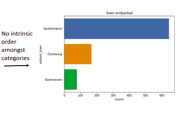
Barplots(Vertical): Similar to Horizontal Barplot but these should be used when our categories have a nominal relationship.
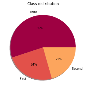
Pie-charts: If you want to represent your categorical data as a part of the whole then we should use a piechart. Each slice of the pie represents the percentage that the given category occupies out of the whole. Note that if you are using a pie chart, the slices should be represented in percentages and these percentages should sum up to be 100.
-To be used if a number of categories are less i.e. <5.
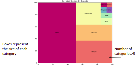
Treemaps: It is similar to a piechart. A treemap arranges categories of a feature in rectangular bounding boxes representing the tree structure. The rectangles of a treemap are called cells.
-If the number of categories increases you should be tempted to use a treemap.
3) Data: Bivariate,(Categorical,Continuous)
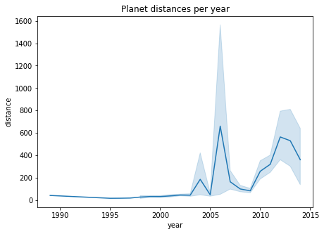
Line plots: If you want to represent your continuous data over a time span you should use a line plot. On the x-axis, we plot the time and on the y-axis, we plot the continuous variable
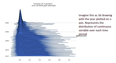
Ridgeline plot: If you want to plot the distribution of continuous variables over a period of time then a ridgeline plot should be used.
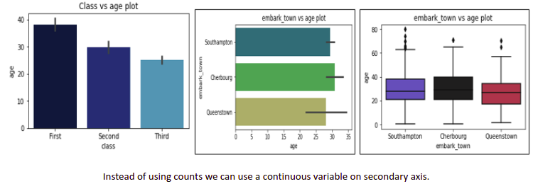
Barchart(Both), Boxplot, Violinplot: We can use these plots for bivariate data too. We can plot categorical data on the x-axis and continuous data on the y-axis.
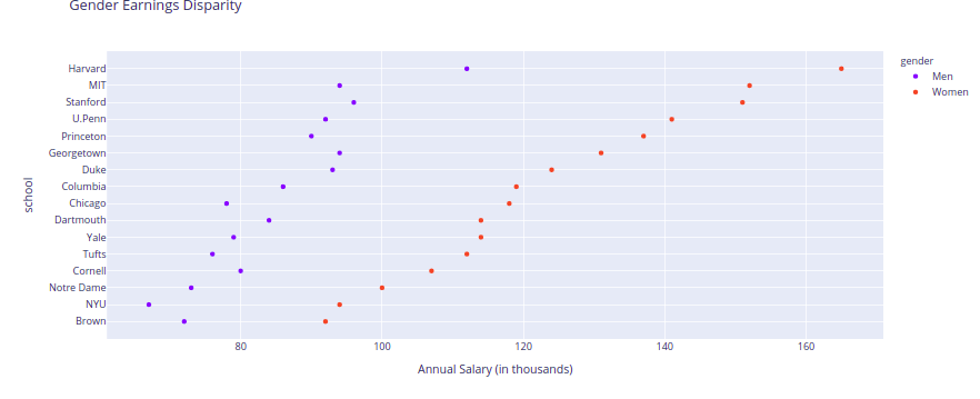
Cleveland dot charts: These are very similar to vertical bar charts with the only difference that the labels are prominently visible. This plot can be used as an alternate vertical barplot.
4) Data: Bivariate,(Continuous,Continuous)
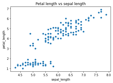
Scatterplot: If you want to understand the relationship between two continuous variables a scatterplot can be used.
-It also helps to get an idea of the degree of correlation of one variable with the other.
5) Data: Bivariate,Categorical,Categorical)
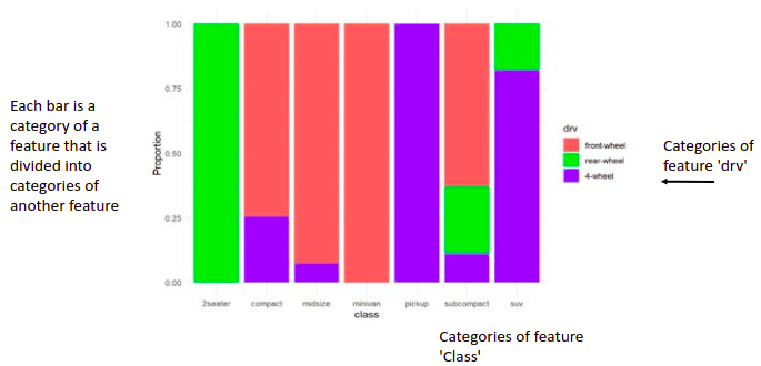
Stacked barplot: A standard barplot is used to compare the counts of each category. A stacked barplot takes it one step further and breaks the bar graph into segments in order to introduce another categorical variable for comparison.
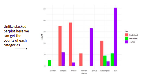
Grouped bar plots: Grouped barplot places the second categorical variable side by side. Grouped bar charts are good for comparing between each element in the categories, and comparing elements across categories.
-If we want to know the count of each category grouped bar plots should be used.
6) Data:Multi-variate
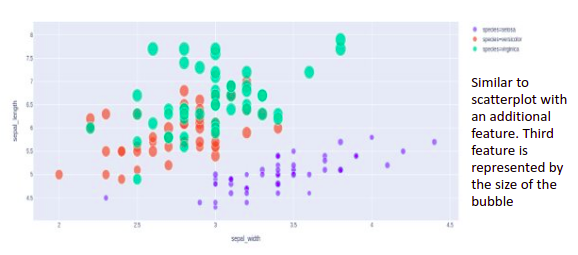
Grouping: We can convert a bivariate plot we learned above for a higher number of variables by using visual characteristics such as color, shape, size, line type, etc. For example, we can convert a scatter plot into a bubble chart by introducing a third variable determined by the size of the bubble.
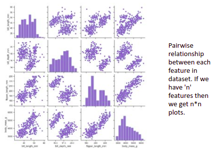
Faceting: Grouping allows us to plot multiple features in a single graph but faceting helps us plotting multiple subplots each representing a level of the third variable. An example of faceting is pair plots.
-To be used if a number of variables(features) <10 else it becomes hard to read.
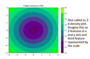
Contour plots: Contour plots are often used to plot the relationship of how changing the values of two independent variables in the x and y-axis affects the dependent variable on the z-axis.
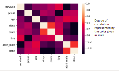
Heatmaps: If you want to display the correlation between each variable a correlation heatmap can be used.
-If the number of variables becomes>10.
End Notes
With this, we have reached the end of this article. For the sake of keeping it concise, I have stuck with some of the basic plots. Let me know in the comments section what plots you want me to cover in one of my future posts.
The media shown in this article are not owned by Analytics Vidhya and is used at the Author’s discretion.


