A quick and step-by-step beginners project to create an animated bar graph for an amazing Covid dataset.

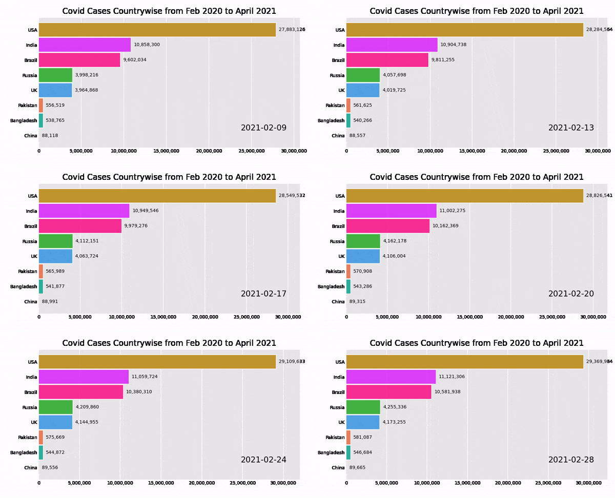
Our task is to create an animated bar chart race(bcr) for the number of country-wise covid-19 cases between the time period of Feb 2020 to April 2021.
Unlike other tutorials that allow you to use a pre-loaded bcr dataset, we will create, process, and clean our own dataset for the race chart bar
About the problem
Our Problem statement would be Covid-19 case records around the world.
“Hope is being able to see that there is light despite all of the darkness.” — Desmond Tutu
About Dataset
You can find the raw data here: https://github.com/shelvi31/Animated-Bar-Graph/blob/main/worldometer_coronavirus_daily_data.csv
If you want to skip data processing and cleaning steps to directly go to graph making. Here is my modified dataset: https://github.com/shelvi31/Animated-Bar-Graph/blob/main/corona_dataset
This data was scraped from woldometers.info on 2021–04–24 by Joseph Assaker.218 countries are represented in this data.
All the countries have records dating from 2020–2–15 until 2021–04–24 (435 days per country). That’s with the exception of China, which has records dating from 2020–1–22 until 2021–04–24 (459 days per country).
Summary of Data Columns:
- country: designates the Country in which the row’s data was observed.
- continent: designates the Continent of the observed country.
- total_confirmed: designates the total number of confirmed cases in the observed country.
- total_deaths: designates the total number of confirmed deaths in the observed country.
- total_recovered: designates the total number of confirmed recoveries in the observed country.
- active_cases: designates the number of active cases in the observed country.
- serious_or_critical: designates the estimated number of cases in serious or critical conditions in the observed country.
- total_cases_per_1m_population: designates the number of total cases per 1 million population in the observed country.
- total_deaths_per_1m_population: designates the number of total deaths per 1 million population in the observed country.
- total_tests: designates the number of total tests done in the observed country.
- total_tests_per_1m_population: designates the number of total tests done per 1 million population in the observed country.
- population: designates the population count in the observed country.
Acknowledgments for Dataset
All the data present in this dataset is scraped from worldometers.info.
You can find the complete clean code on my Jupyter-notebook: https://github.com/shelvi31/Animated-Bar-Graph/blob/main/Animated%20Bar%20Graph.ipynb
Load Libraries
import pandas as pd
import os
Load Dataset
df = pd.read_csv("worldometer_coronavirus_daily_data.csv")
Processing the Dataset: Let’s get to know the data
df.head()
df.shape(95289, 7)df.tail()
As there are many countries’ data, we need to Select some Particular Countries Data which we want to analyze.
df.loc[df["country"] == "Zimbabwe"].shape
Output:
(435, 7)
Thus, we have values for around 450 days for each country.
df.isnull().sum()Output:
date                           0
country                        0
cumulative_total_cases         0
daily_new_cases             6469
active_cases                   0
cumulative_total_deaths     6090
daily_new_deaths           19190
dtype: int64
Selecting countries for Bar Plot
Picking up the cumulative_total_cases column as series and group them with countries name. I will pick up 8 countries, the most populous and our neighbors for evaluation
We have data for only 435 rows for all the countries. Hence let’s take data for 435 rows for china too.
Processing Data For China
CHINA=[]
for i in range(0,435):
    CHINA.append(china[i])
Converting to series
china = pd.Series(CHINA)china.shapeOutput:(435,)
Great! Now the length of all our columns is in the sink! i.e 435 days data.
We also need to pick up the column of date. To retrieve only the first 459 values, as the dates are repetitive with countries, the max days’ data we have is for 435 days for all the countries.
Processing Date Column:
date=[]
for i in range(0,435):
    date.append(df.date[i])
Converting a list to series:
DATE = pd.Series(date)
Concatenating series to create a new database
As we now have different series let’s give a name to these series that would later be converted to Dataframe Columns
data = {"UK": uk,
        "Russia": russia,
        "India" : india,
        "USA": usa,
        "Pakistan" : pakistan,
        "Bangladesh" : bangladesh,
        "Brazil":brazil,
        "China": china,
        "Date" : DATE
       }corona = pd.concat(data,axis = 1)corona.set_index("Date", inplace = True)corona.head()
corona.shapeOutput:(435, 8)
Checking for null values if any
corona.isnull().sum()Output:
UK            0
Russia        0
India         0
USA           0
Pakistan      0
Bangladesh    0
Brazil        0
China         0
dtype: int64
Converting date to Date time format
corona.index = pd.to_datetime(corona.index)
Finally ! We got the required format and countries!
We also need to pick up the date column
corona
corona.to_csv("corona_dataset",header=False,index=False)
GREAT! Our data frame looks great and ready to go ahead!
Let’s get started with aminated bar chart coding now!
Installing Bar Chart Race
pip install bar_chart_race
Point To Note: The graph takes time to load, so be patient. Unlike me, don’t rush to find out unnecessary errors or self-doubts if the results do not show up in minutes.
P.s : Yes, I did waste a lot of time , thinking there is an error while there was none and graph was just taking time to load !!! :p
import bar_chart_race as bcr

bcr.bar_chart_race(df=corona,filename=None,title= "Covid Cases Countrywise from Feb 2020 to April 2021")
It’s very sad to notice how the cases have increased exponentially in India with the coming of April, all that is leading to such panic and havoc and loss of lives at the time I write this blog.

.png)
Note:If you get any FFmpeg related error: here is the step-by-step link to solve it for your system: https://www.wikihow.com/Install-FFmpeg-on-Windows
Saving Race Bar Plot
You can save the bar graph by downloading from the download option at the bottom of the image. Hope you have enjoyed this fun tutorial. Enjoy and Keep Learning 🙂
The media shown in this article are not owned by Analytics Vidhya and is used at the Author’s discretion.


%202.jpg)