This article was published as a part of the Data Science Blogathon.
Introduction
Visual analytics can tell the users the story of data and it aids in revealing various relationships that are not easily identified in conventional reports.
In this article, I am telling about the way I made a simple dashboard in Tableau for revealing the insights given by the source data I collected from a humanitarian information service, ReliefWeb, which is backed by the United Nations Office for the Coordination of Humanitarian Affairs (OCHA).
I downloaded the pdf file regarding the report — “UNICEF Refugee and Migrant Response in Europe: Humanitarian Situation Report #39 (1 January to 31 March 2021)”.
In this article, I am explaining some common steps you may have to be performed while preparing for analysis such as calculating new fields and highlighting various actions for enhancing the visualizations and unveiling the insights that are hidden.
So now we have the data and the next step is to generate insights from this. Let’s get started!
How to prepare the data?
First things first, we have to ensure that all of the data placed properly in the dimensions and measures section and we need to clean up the Data pane.
We can say that in the data analytics workflow, data preparation is a critical stage. While doing more refinement to the data, we may need only some selected fields from the source file for our analysis. Also sometimes we need to calculate fields from existing fields to describe the story of our data clearly.
Dimensions and Measures:
Tableau categorizes data into two (you can see the division in the Data pane): Dimensions and Measures, where the former denotes qualitative data (blue colour) and the latter denotes quantitative data (green colour). However, the record id or serial number is numeric and there is no need to be aggregated (sum or average), then it is grouped in the Dimensions section.

Some common methods you may apply in your data preparation:
Tableau has a lot of advantageous built-in functions that can transform cumbersome calculations into simple ones.
You can select the appropriate field from the left panel and calculate the new measures from it. If you want to create a new measure, in the top menu, under “Analysis”, select “Create Calculated Field” and type the formula for creating the new measure. Example: DATEDIFF(‘minute’, [Starting Time], [Finishing Time]), this formula returns a difference of Starting Time and Finishing Time using ‘minute’ as the unit and can be used for trend analysis.
An example for calculating dimension is weekends and weekday calculation:
IF DATEPART(‘day’, [StartingTime]) = 1
OR
DATEPART(‘day’, [Starting Time]) = 7
THEN
‘Weekend’
ELSE
‘Weekday’
END
Moreover, to break down information into tiny parts with various perspectives, we may need to apply slice and dice often in data preparation. For example, if you want to extend the data by defining time blocks. This can be made up of four six-hour periods: Night (12 am-6 am). Morning (6am-12pm), Afternoon (12pm-6pm), and Evening (6pm-12am). Then formula can be written as follows:
IF
DATEPART('hour', [Starting Time])>=0
AND
DATEPART('hour', [Starting Time]) < 6
THEN 'Night'
ELSEIF
DATEPART('hour', [Starting Time])>=6
AND
DATEPART('hour', [Starting Time]) < 12
THEN 'Morning'
ELSEIF DATEPART('hour', [Starting Time])>=12
AND
DATEPART('hour', [Starting Time]) < 18
THEN 'Afternoon'
ELSE 'Evening'
END
Highlighter — It is a handy tool for finding patterns and it identifies and highlights data while keeping the context of the whole data in the view. Example: From the top menu, select “Analysis” > “Highlighters” > “Field Name”.
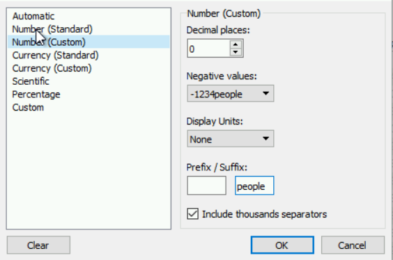
To modify the default properties, Right-click on the field name in the Data pane. Under “Default Properties” > “Number Format”, select “Number (Custom)” and can specify the details in the opened window as in the screenshot given below.
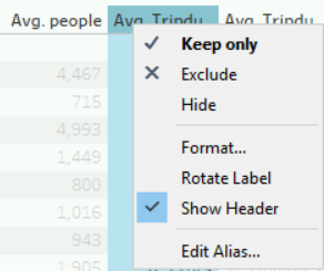
To show the filter window with the apply button, Right-click on your field to filter and click “Show Filter”. A small box will be displayed in the legend to filter on the selected field. Then click on the top right dropdown icon and under “Customize”, select “Show Apply Button”.
During the preparation process, you may need to clean up the table a lot and sometimes combine sorting and filtering.
Exploratory analysis of trends using visualizations:
We can find the trends in the data using a date and time field, such as examining various patterns from the seconds, hour, year, etc.
Discrete and continuous-time analysis:
Tableau is very good at showing the time as either Discrete or Continuous when applying them into a visualization. When you drag a date field into the canvas, you will have to decide whether you want it continuous or discrete and at which level you want it presented (example: the day, hour, minute value).
You can alter the visualization type to “Line”, “Area”, “Bar” etc in the Marks card. To change the Title in the dialog box, you may double click on the x-axis or y-axis. To change the format of the x-axis labels, you can right-click on an x-axis label and can perform“Format”. To turn on the mark labels, In the Marks card, select the T icon for “Label” and then check off “Show label marks”. Moreover, using “Quick Table Calculation”, you can make calculated measures so easy and fast too.
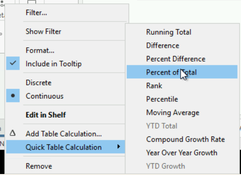
You can see the difference between computing across versus down the table. If we did compute across, then we would get the distribution of values across the table. One isn’t necessarily better than the other, it just depends on what you’re looking for! It’s often worth exploring both.
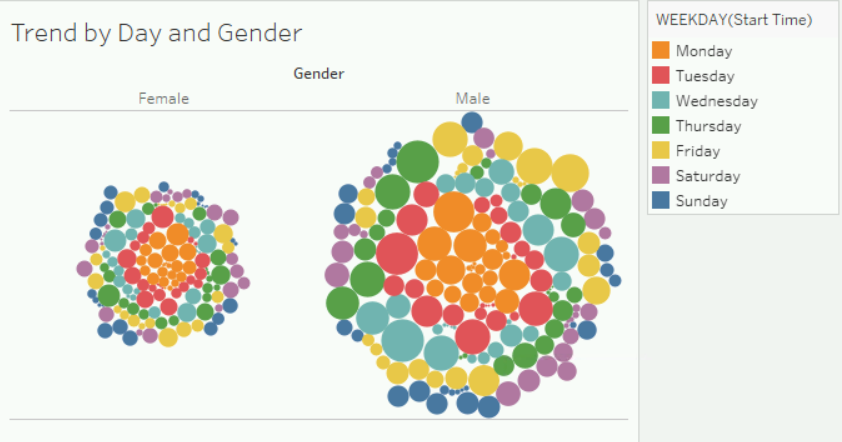
Moreover, Tableau allows us to quickly create creative visualizations such as Bubble chart. By looking at all the bubbles together we can analyze the general trends of our analysis by the area of the colours and the other field too by the size of all the bubbles in that field.
That’s all enough as preparation for analysis. There are several ways to get to an answer to your question by separately analyzing the problem. The very best solution would be a dashboard that lets you interactively filter! In the next part, we will put data together in an interactive dashboard to make solving our questions very simple.
The media shown in this article are not owned by Analytics Vidhya and is used at the Author’s discretion.
Using Data 4 Good | Data Tinkerer - Empowering Impact through Data. A passionate advocate for leveraging the power of data to drive positive change and create meaningful impact. With a deep understanding of data analysis and a strong belief in its potential for social good, I strive to uncover valuable insights that can inform decision-making and drive transformative outcomes.
As a data enthusiast, I am dedicated to exploring and harnessing the power of data to address pressing social, environmental and public health challenges. By employing advanced analytics techniques and applying data-driven strategies, I aim to provide evidence-based solutions that have a lasting and sustainable impact.


