This article was published as a part of the Data Science Blogathon.
Introduction
Hello Readers!!
Data visualization is a process to represent data using plots and graphs. It is a great way to find insights from data and make reports. You must have read about visualizations libraries in python like seaborn, matplotlib, plotly, and many more. For more information on python libraries for machine learning click here.
But in this blog, we are going to explore a new programming language for machine learning Julia, and its visualization library Plots.jl. I hope this article provides you with an in-depth knowledge of Julia’s data visualization library. Sol let’s get started!!
Table Of Contents
- Plots.jl
- Backends
- Installation
- Initialize Packages
- Line Plot
- Plot Attributes
- Plotting Backends
- Scatter Plot
- Combining Multiple Plots as Subplots
- Distribution Plot
- Violin Plot
- 3-D Plots
Plots.jl
It is an open-source Julia package that is used to visualize data. It is a plotting meta-package that is used for plotting. However, it isn’t a plotting package.
This package uses some other plotting libraries called backends like PyPlot, GR, PGFPlotsX, Plotly, and few others. This package understands the commands that have been given to it and it used other libraries for plotting.
Some of the main advantages of this package are shown below:
- Intuitive
- Flexible
- Lightweight
- Powerful
- Smart
- Consistent
- Concise
Backends
Plots.jl is a non-conventional plotting library. It doesn’t execute a “plotting backend” itself, it’s a plotting API. The API is effectively extendable through recipes.
It is a meta-package that is used for plotting. It understands the commands that are given to it and it uses some other libraries called backends. Plots.jl uses other plotting libraries for visualizations as backends. These are called the lifeblood of Plots.
Following are the backend libraries that are present in Julia:
- PyPlot
- Plotly/PlotlyJS
- GR
- PGFPlotsX
- InspectDR
- UnicodePlots
- HDF5
Complete Detail of Backends are shown below:
|
If you require… |
… then use… |
|
features |
PyPlot, Plotly(JS), GR |
|
speed |
GR, InspectDR |
|
interactivity |
Plotly(JS), PyPlot, InspectDR |
|
beauty |
Plotly(JS), PGFPlots/ PGFPlotsX |
|
REPL Plotting |
UnicodePlots |
|
3D plots |
PyPlot, GR, Plotly(JS) |
|
a GUI Window |
GR, PyPlot, PlotlyJS, InspectDR |
|
a small footprint |
UnicodePlots, Plotly |
|
plot+data -> .hdf5 file |
HDF5 |
Installation
First, we will install the Plots.jl package. Open Julia terminal and type the below command:
import Pkg
Pkg.add("Plots")
# To get the latest features update, type this command
Pkg.pkg"add Plots#master"
After this, you need to install at least one plotting packages (install at least one backend ).
Check the below command to install respective backend libraries (you can install any number of backend)
Pkg.add("GR")
Pkg.add("PGFPlotsX")
Pkg.add("PyPlot")
Pkg.add("UnicodePlots")
Pkg.add("InspectDR")
For complete information about backends click here
If you want to add some more extensions from the Plots ecosystem, then type the below commands (It is optional)
Pkg.add("StatsPlots")
Pkg.add("GraphRecipes")
Initialize Packages
After installation of required libraries, next is usage. Check the below command to initialize Plots
using Plots
Choose a backend using the below command:
pgfplotsx()
pyplot()        # backends are selected with lowercase names!
Line Plot
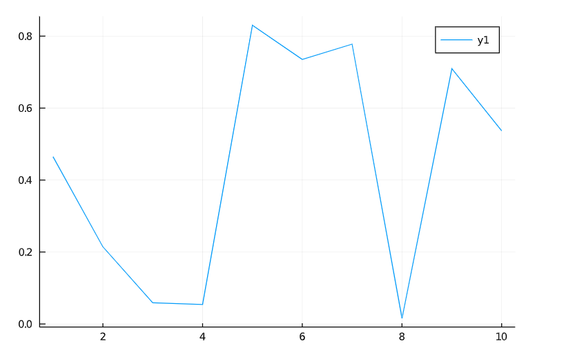
Line Plots are one of the most common and basic plots. Single dimensional vectors are visualized using line plots. It needs two axes ( x and y).
For example, suppose we have a one-dimensional vector x, values range from 1 to 10. We are creating y, again a single-dimensional vector using the rand() function, which helps to generate random values.
So using Plots, we can call a plot() function to draw a line plot between x and y. For example,
using Plots
x = 1:10;           # x : Plotting data on x-axis
y = rand(10);       # y : Plotting data on y-axis
plot(x, y)          # To draw lie plot
The final visual depends on the backend use. We will see later how these backends change our final plots.
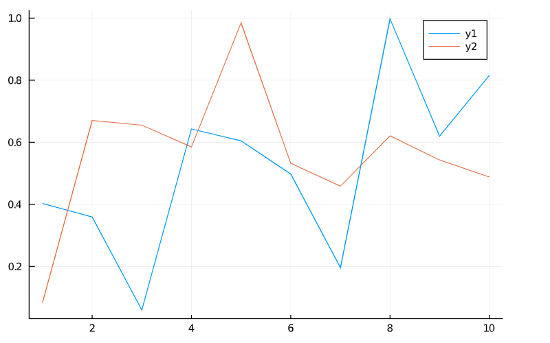
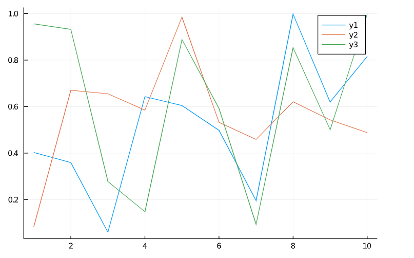
In Plots.jl, every column is considered a series. So we can plot multiple lines by just representing the values in the form of a matrix and each column of the matrix is a separate line that is shown in the final plot.
Check the below code for 2 columns ie, two lines. We are passing one more value in the rand() function so that we will get two sets of random values.
x = 1:10;
y = rand(10, 2)       # 2 columns means two lines in the final plot
plot(x, y)
We can create multiple lines by mutating the plot object by using the plot! Command. Check the below code:
k = rand(10)
plot! (x, k)
Plot Attributes
In the previous section, we have studied line plots, so we’re done? No! We should style our plots for a better look. So the plots can be stylized using modifiers called attributes. For more details on attributes, check attributes.
According to the Plots.jl, positional arguments considered input data and keyword arguments as attributes.
So in this section, we will see some plot attributes in detail.
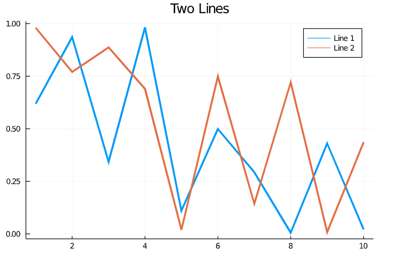
Example: We can increase the linewidth (lw), add the title (title), and can change the legend’s name(label). Check the below code to apply all the above-discussed changes:
x = 1:10;
y = rand(10, 2)       # 2 columns means two lines in final plot
plot(x, y, title = "Two Lines", label = ["Line 1" "Line 2"], lw = 4)
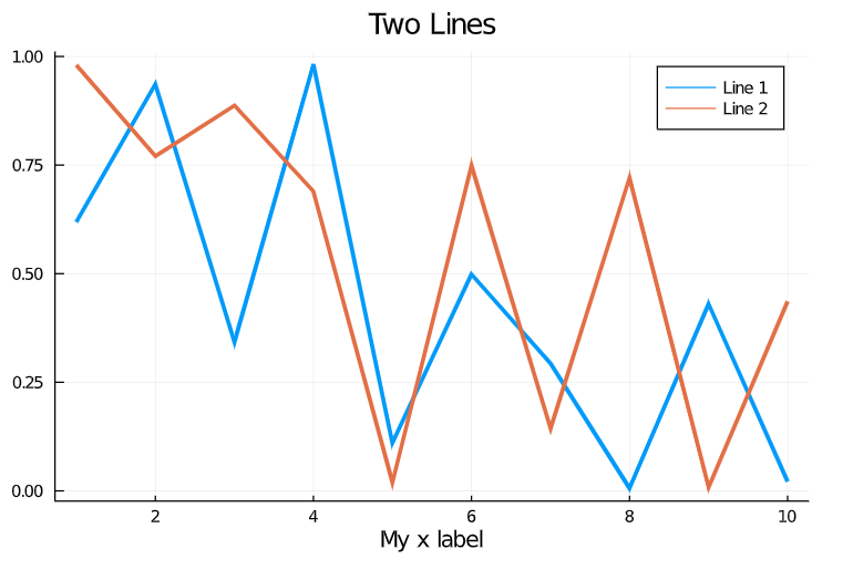
We can also apply any attribute with the help of the modifier function. For example, to add the label for the x-axis, we can use xlabel!. Check the below code:
xlabel!("My x label")
For more information, check this Link
Plotting Backends
So as we discussed earlier, Plots.jl uses a lot of different plotting libraries called backends for plotting. Each backend has its unique features as I have shown all these details in the Backends section.
At the point when we began plotting, our plot utilized the default backend. The default backend relies upon what plotting library you’ve installed in Julia.
If you’ve not installed any backend yet, this will plot to the browser utilizing Plotly, or into the REPL utilizing UnicodePlots.jl. Be that as it may, suppose we need a standard plotting backend that will plot into a pleasant GUI or the plot sheet of Juno.
To do this, we’ll need a backend that is viable with these highlights. Some normal backends for this are PyPlot and GR. To introduce these backends, we need to install them using (Pkg. add(“BackendPackage”)). We can explicitly pick the backend we are plotting into by utilizing the name of the backend in all lower cases.
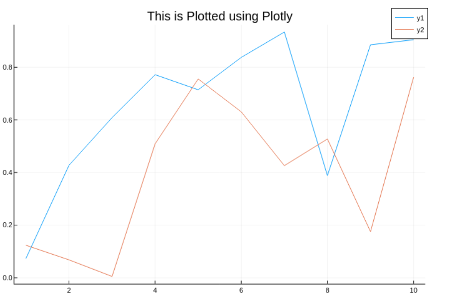
Let’s see an example using two different backends,i.e Plotly and GR.
Using Plotly Backend:
x = 1:10;
y = rand(10, 2)         # 2 columns means two lines in final plot
plotly()                # Here we are using Plotly backend
plot(x, y)
Using GR Backend:
x = 1:10;
y = rand(10, 2)         # 2 columns means two lines in final plot
gr()                    # Here we are using GR backend
plot(x, y)
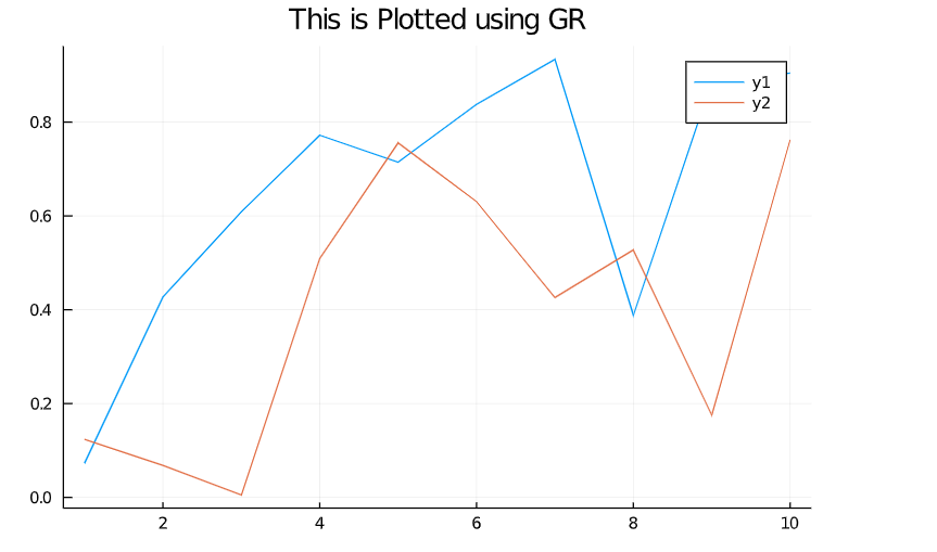
Each backend has its feel and advantages. Some are faster, some provide interactivity and some are full-fledged to deal with large datasets. Saving Plots formats also depend on the backend. For example, Plotly only saves to .pngs and GR saves plots to PDFs and vector graphics.
Saving Plots using savefig command:
savefig("Example_plot.png")                  # Saves the plot as a .png
savefig(k, "Eample_plot.pdf")                # Saves the plot from k as a .pdf vector graphic
For more information, check the backend page.
Scatter Plot
So as of now, we had a detailed discussion of line plots. But there are many others ways to represent our dataset.
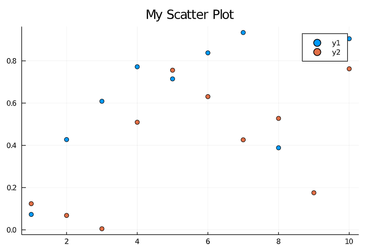
In Plots.jl, the way we draw these other types of plots is called a series type. For example, a line is a one series type, a scatter plot is another series type, and so on. Scatter plots help to find the patterns between different features of the dataset.
We can change the series type in the plot() function using an attribute seriestype.
Let’s see an example of a scatter plot.
gr()                               # We are using the  GR backend
plot(x, y, seriestype = :scatter)  # check the seriestype attribute value

Note: We can also use an alternative method to draw a scatter plot. Check the below code:
scatter(x, y)
For more information on attributes, check the attributes page.
Combining Multiple Plots as Subplots
We can combine multiple plots as subplots using layouts. There are numerous techniques for doing this, and we will show two basic strategies for producing straightforward layouts. For more information on layouts, check this Link
Method-1
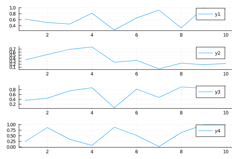
Split Series using Layouts
y = rand(10, 4)                # 4 series of data
plot(x, y, layout = (4, 1))    #4 rows of plots having 1 series in each row
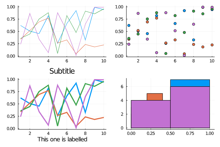
Method-2
The layout on plots of plot objects
p1 = plot(x, y)             # Code for Line plot
p2 = scatter(x, y)          # Code for a scatter plot
p3 = plot(x, y, lw=3)
p4 = histogram(x, y)        # Four histograms
plot(p1, p2, p3, p4, layout = (2, 2))
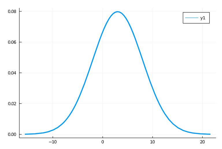
Distribution Plot
We can also draw the distribution curve using Distribution.jl. Check the below command to draw the distribution curve:
using Distributions
plot(Normal(3, 5), lw = 4)
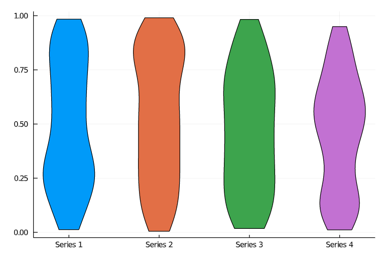
Violin Plot
It also offers violin plots. Check the below code to draw violin plots:
y = rand(100, 4)
violin(y)
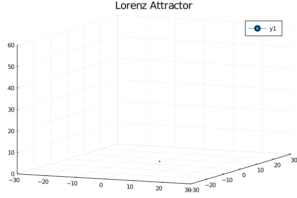
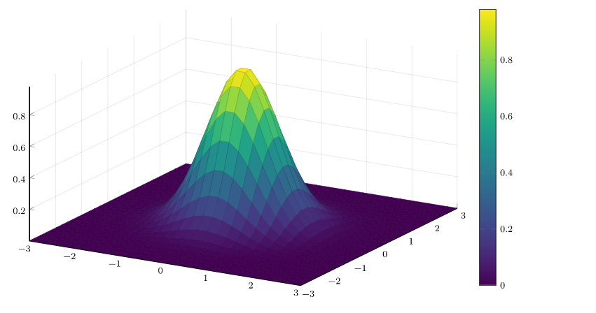
3-D Plots
As of now, we have discussed 2D plots. But now onwards we will some example of 3-D plots. It offers some 3-D plots as Moving waves, 3-D surfaces and many more. Check the below examples for more detail:
Lorenz Attractor
Waves
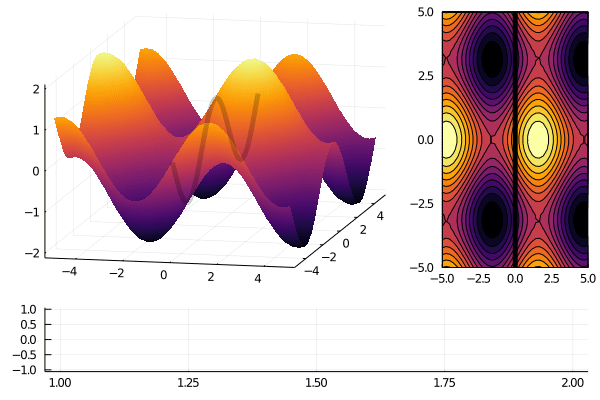
Surfaces
For more information, check the official documentation Plots
Conclusion
So in this article, we had a great detailed discussion on Plots.jl, a visualization package in Julia. Hope you learn something from this blog and it will turn out best for your project. Thanks for reading and your patience. Good luck!
You can check my articles here: Articles
Email id: [email protected]
Connect with me on LinkedIn: LinkedIn
The media shown in this article on Data Visualizations in Julia are not owned by Analytics Vidhya and is used at the Author’s discretion.


