This article was published as a part of the Data Science Blogathon
Overview
- Understanding anomalies via exploratory anomalies detection analysis a
- Setting up PyCaret Environment and experimenting with a variety of data preparing a task
- Comparing the performance and visualizing different anomalies detection algorithm
Introduction
Anomaly detection paths the way to finding patterns, deviations, and exceptions in data that don’t confine to a model’s standard behavior. Anomaly detection aims at determining cases that are unusual within data. These anomalies are also known as outliers in terms of a dataset.
With the exponential rise of data, it has become a common trend to analyze data and derives insights that form the basis for important business decisions. Not only do we need to analyze the data but also interpret it accurately. Figuring out the anomalies and determining outlier behaviors leads us to the optimal solution.
Anomalies detection can be applied in various domains. Some of them are listed below.
- Network security — monitor network traffic and determine outliers that are alarming
- Fraud detection — credit card frauds can be identified
- IT sector — detect and act on unexpected risks
- Banking — determining abnormal transactions behavior
A number of machine learning algorithms can be used for anomaly detection, it plays a crucial role in detecting and classifying outliers in complex data sets.
Why PyCaret?
PyCaret is an open-source, low-code machine learning library in Python that supports multiple features such as data preparation to model deployment within a few lines of code.
Some stunning features offered by PyCaret include-
- It is a flexible and low-code library that enhances productivity thus saving time and effort.
- PyCaret is a simple and easy-to-use machine learning library that enables us to perform ML tasks within minutes.
- PyCaret library allows automating the machine learning steps such as data transformation, preparation, hyper-parameter tuning, and standard model comparisons.
Learning Objectives
- Perform Exploratory anomalies detection analysis
- Introduction to PyCaret environment
- Create and select optimum model
- Compare anomalies in models
- Visualize and Interpret the model
PyCaret Installation
Install the latest version of Pycaret in your jupyter notebook and get started!
pip3 install pycaret
Data Importing
Let’s get started with our hands-on project by importing a common anomaly detection dataset from pre-configured datasets in PyCaret.
Import necessary libraries
Firstly, import the necessary libraries required throughout the project.
import matplotlib.pyplot as plt
import seaborn as sns
import pandas as pd
import numpy as np
Import the dataset
from pycaret.datasets import get_data
all_datasets = get_data(‘index’)
Now we can see all the listed datasets with the default machine learning tasks.
We only need to access the anomaly data which we can get by using the get_data() function.
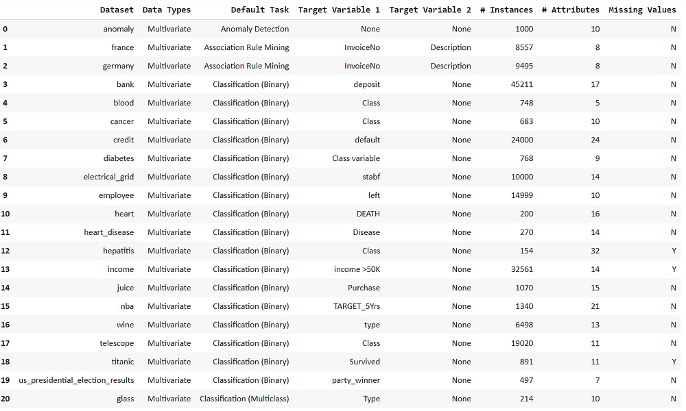
df = get_data(‘anomaly’)
df.head()
Explore and describe this dataset to find missing values and get the statistical distribution.
df.describe()
df.info()
We can notice that the dataset is devoid of any missing values.
Exploratory anomalies detection analysis
Now we can use various means of visualizations for interpreting outliers and anomalies in the dataset.
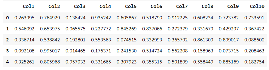
We can start with the Swarm plot
Swarm Plot
Get the swarm plot for the dataset by using melt() function.
plt.rcParams["figure.figsize"] = (10,8)
sns.swarmplot(x="variable", y="value", data=pd.melt(df))
plt.show()
Here is our swarm plot for all the columns
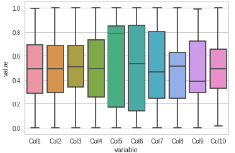
Box Plot
Visualize the dataset by Box plot, this gives us a clear understanding of where most of our data lie.
sns.boxplot(x="variable", y="value", data=pd.melt(df))
plt.show()
These plots would help us in sensing whether our model will able to track them or not.
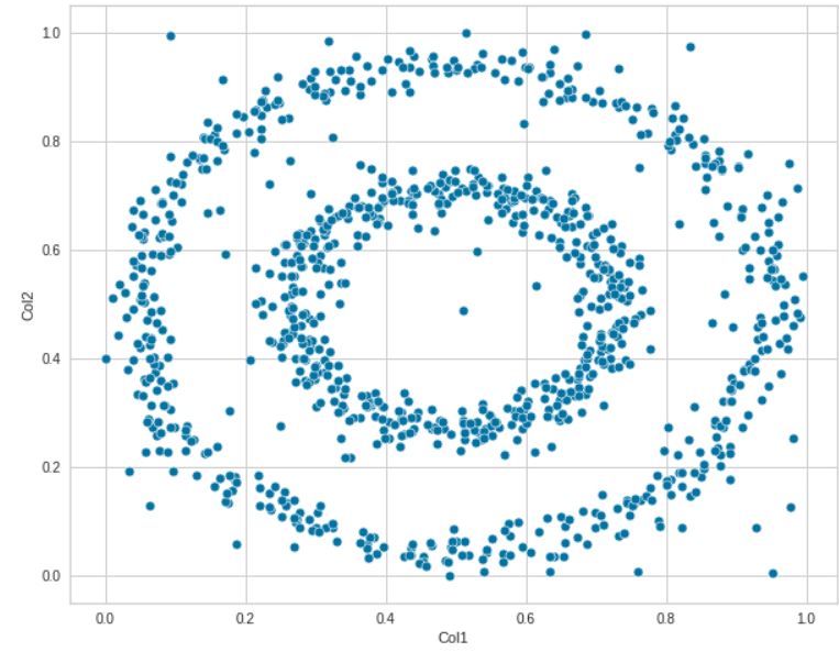
Scatter Plot
We can determine linear relationships between two features via a scatter plot. The relationship between Col1 and Col2 is clearly defined here.
sns.scatterplot(data=df, x="Col1", y='Col2')
We can experiment with different features as well. Explore how various features are related to each other.
sns.scatterplot(data=df, x="Col3", y='Col4')
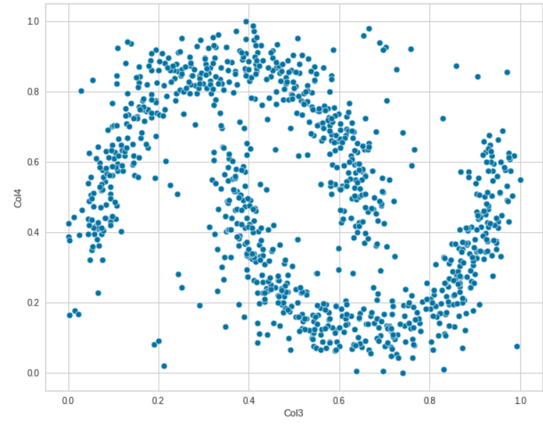
These plots indicate that there is no linear relationship between the data. Let us now analyze the relationship between all the features pairwise by using Seaborn.
sns.pairplot(df)

This pairwise plot determines relationships between different columns and how they are differentiating the values in multiple ways alongside the histograms.
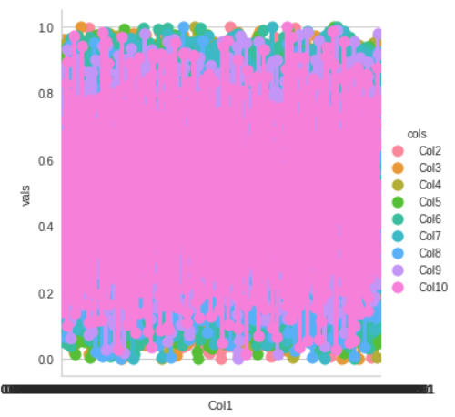
In this manner, we can interpret the boundaries in multiple dimensions for our models.
df1 = df.melt(‘Col1’, var_name=’cols’, value_name=’vals’)
g = sns.factorplot(x=”Col1", y=”vals”, hue=’cols’, data=df1)
Anomaly detection
Set up the PyCaret environment for anomaly detection. For this, we can use Pycaret’s anomaly detection module which is an unsupervised machine-learning module used for identifying outliers in the data that can result in abnormal conditions.
from pycaret.anomaly import *
setup = setup(df, session_id = 123)

Specify the session id, this results in processing after execution. It interprets numerous types of variables automatically and allows us to confirm by pressing ENTER to continue.
Observe that our dataset consists of 10 features, 1000 rows each. We can perform various imputations- numeric and categorical or normalize the data. But we don’t require such transformations in our dataset so let us continue!
Performing all these computations with a few lines of code presents the beauty of the PyCaret library.
Model Creation
Choose the optimal model from the model library and create models for anomaly detection. We can display the list of models by using the model() function.
models()
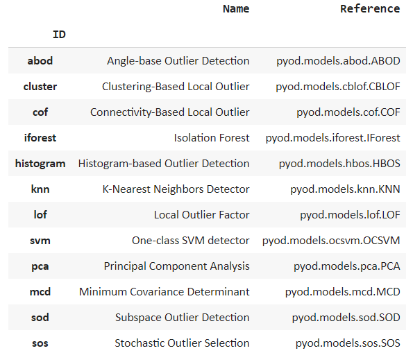
We can see many popular algorithms being listed such as isolation forest and k nearest neighbor.
Isolation Forest
Create the isolation Forest model by using the create_model() function. The isolation Forest algorithm differentiates observations by randomly selecting a feature and then randomly selecting split values between the maximum and minimum values.
iforest = create_model('iforest')
print(iforest)
Thus an anomaly score is determined as the number of conditions required to separate given observations.
Local Outlier Factor
It is an algorithm of the unsupervised anomaly detection method and computes the local density deviation of a data point with respect to its neighbors.
lof = create_model('lof')
print(lof)
K Nearest Neighbors
KNN is a non-parametric lazy learning algorithm used to classify data based on similarities and various distance metrics. It provides a simple yet firm approach to detecting anomalies.
knn = create_model('knn')
print(knn)neighbours
Comparing anomalies in models
Moving on with our task we can now observe the anomalies determined by the models. Traditionally, we have to manually set up different parameters.
But with the use of PyCaret, we can just assign results via the assigned model function. We’ll start with the isolation forest model.
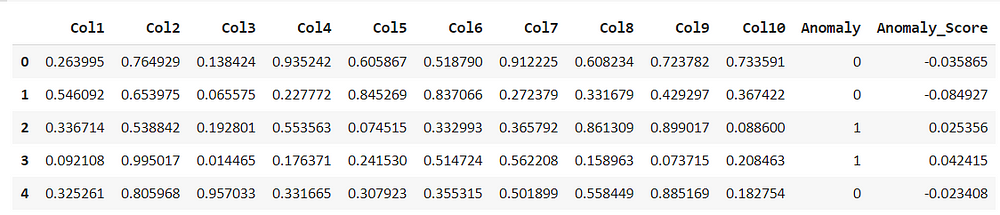
iforest_results = assign_model(iforest)
iforest_results.head()
assign_model() function returns a data frame with detection of anomalies, the presence of outliers are marked as 1 and non-outliers as 0, along with anomaly scores.
Similarly, we can assign other models as well. So comparisons can be made.
lof_results = assign_model(lof)
lof_results.head()
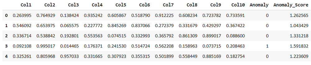
Comparing the above models we can see that the isolation forest had considered the second row as an anomaly but the local outlier factor, doesn’t consider this as an anomaly. But anomaly score is different with respect to the algorithms
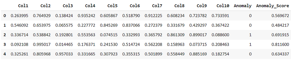
For the k nearest neighbor the predicted score is very similar to that of isolation forest.
knn_results = assign_model(knn)
knn_results.head()
Filter the anomalies by each model, this shows that there are 50 rows out of 1000 considered as anomalies by iforest model.
iforest_anomaly=iforest_results[iforest_results['Anomaly']==1]
iforest_anomaly.shape
Similarly, check for LOF and KNN, we can see that both of them have considered 50 anomalies. Different methods of calculations must have been used for finding the outliers.
lof_anomaly=lof_results[lof_results['Anomaly']==1]
lof_anomaly.shape
knn_anomaly=knn_results[knn_results['Anomaly']==1]
knn_anomaly.shape
From the above results, we can conclude that there would be most likely 50 anomalies out of 1000.
One way to validate can be to analyze which one of them would be a better fit to perform analysis on the data marked as outliers by the models and compare their effect on test data or perform analysis to see if they lie within their decision boundary.
Interpretation and visualization
Visualization is the most convenient way to interpret the information at hand in a creative and independent manner.
Let us start by creating visuals from outside the PyCaret library which will highlight the benefits of the PyCaret library and enable us to understand how the plot_model function is much more interactive.
from yellowbrick.features import Manifold
dfr = iforest_results['Anomaly']
viz = Manifold(manifold="tsne")
viz.fit_transform(df, dfr)
viz.show()
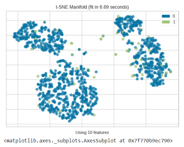
As we can see most of the anomalies determined by the isolation forest in multiple dimensions are usually out of different clusters.
Now use the plot_model() function for KNN within PyCaret that will create a 3D plot for outliers, in which we can see why certain features are considered as an anomaly.
plot_model(knn)
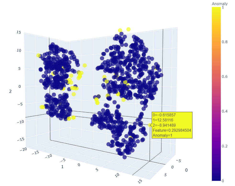
We can move it in any dimension to see and point out the anomalies. This 3D plot helps us to view it better. The KNN plot shows that most of the outliers are those which were not part of any clusters. So that’s good to go!
The same can be done for the other two models.
plot_model(iforest)
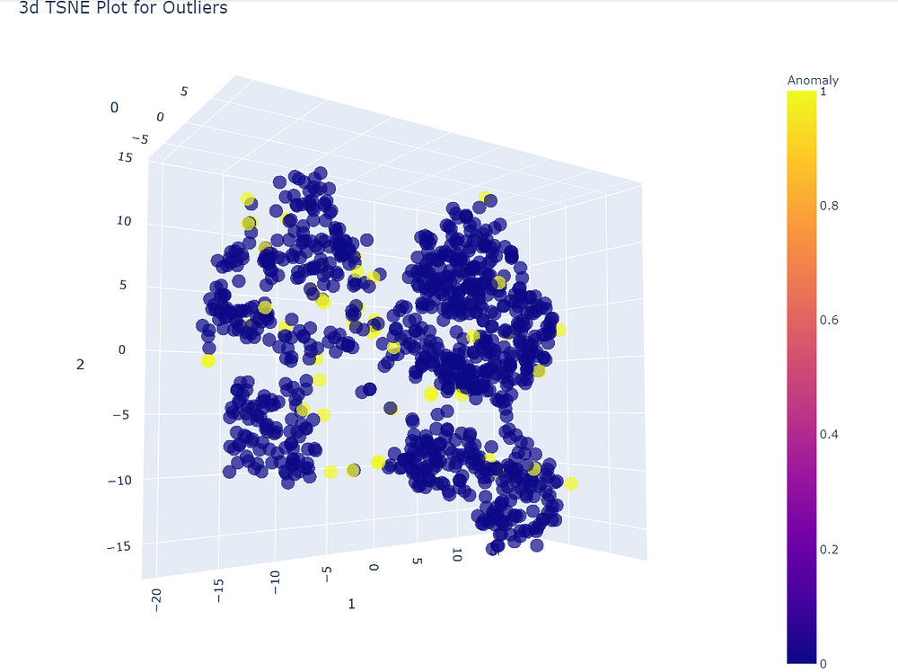
It is clearly visible that the data set is divided into four different clusters, So anything out of these groups will surely be an anomaly.
Anomalies are not always a bad sign! Sometimes they can be very useful in interpreting results or data analysis. These can be used to solve distinct data science usecases.
Moving on to the third model ie. linear outlier factor we can experiment with a different plot that creates a 2D plot.
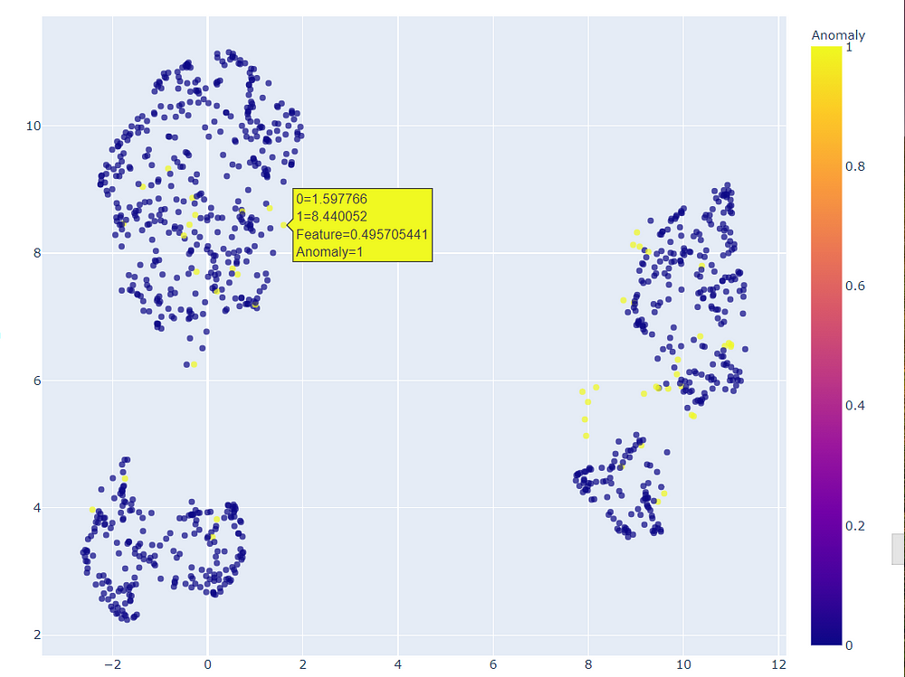
We can zoom this 2D plot to view which points were considered as outliers.
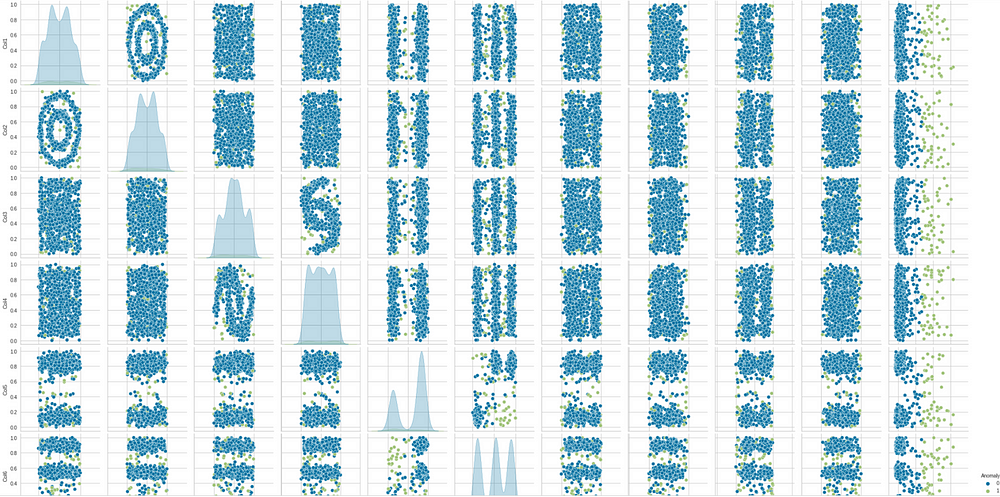
Another visual can be created for pair plot again, now with the anomalies
to see which points will count as anomalies.
sns.pairplot(lof_results, hue = "Anomaly")
Finally, we can save the models. Any suitable model can be saved. Here we are saving the iforest model.
save_model(iforest,'IForest_Model')
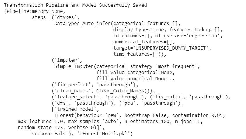
The model is successfully saved along with the sample data and logs.
End Notes
This marks the end of our hands-on project on anomaly detection. We have discussed the use cases and implementation of the PyCaret library and how it can be used for anomaly detection. PyCaret is a fast and reliable machine learning library commonly used by data scientists for solving complex business problems. This project can be extended for further experimentation and exploration while creating deployable models.
The media shown in this article on PyCaret for anomaly detection are not owned by Analytics Vidhya and is used at the Author’s discretion.


