Introduction
Getting Started with Power BI- “Visualization is the human being’s vehicle to the future – good, bad, or indifferent. It’s strictly in our control.” Earl Nightingale
We all are aware of the power of visualization in our lives. You might be thinking about why a motivational blog is being posted on Analytics Vidhya. Don’t worry this is not a motivational or spiritual blog but a blog discussing the power of visualization in data analysis. We will also look into basic Power BI operations which will help you in setting up our data visualization journey.
This article was published as a part of the Data Science Blogathon.
Table of contents
Data Visualization

Data visualization is the graphical representation of data. We use charts, graphs, and maps to see and understand trends, outliers, and patterns.
We all know the importance of data analysis,” If you cannot measure it you cannot improve it.” In order to analyze well gathering and managing data becomes imperative. In the world of Industry 4.0, Business Intelligence tools are essential to analyze massive amounts of information to make data-driven decisions.
A picture speaks a thousand words.
We are living in the world of reels and in shorts. Nobody wants to read long paragraphs or watch long videos. This does not make videos or detailed reports obsolete. At the time of detailed analysis, they are required but the real power of visualization is in telling a lot in less.
Today we are generating tons and tons of data in real-time therefore if we do not have an automated system that cleans, preprocesses, and also presents data in an easy manner, our life would be in trouble. Data Visualization is important in all the career. This tool is not limited to data scientists.
Excels are outdated
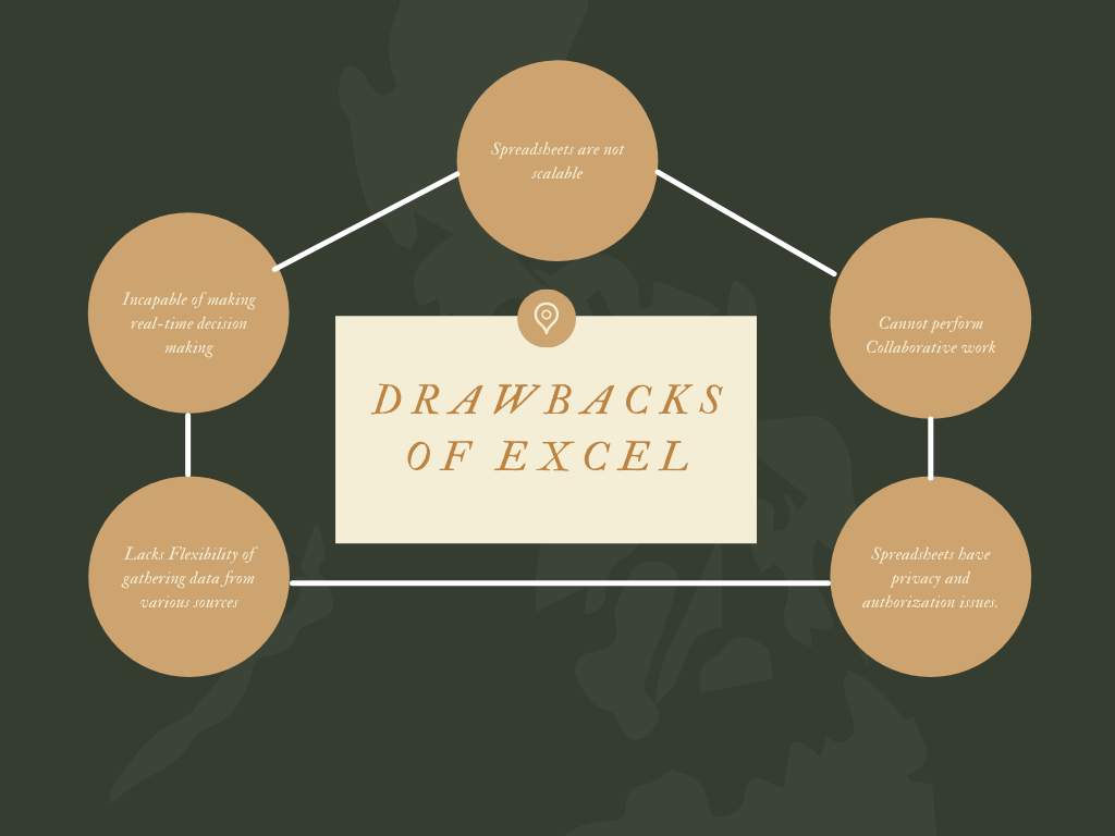
You might be thinking that we already have a powerful tool like excel that is irreplaceable and has the ability to perform all such tasks. But there are some drawbacks in using excel for data visualization.
You cannot work in collaboration with Excel. We all have faced this issue where we cannot edit an excel file if it is open on some other desktop. Only one person at a time can edit which makes it time-consuming.
Excel Sheets are not scalable with the current technology. Many IoT devices and mobile devices generate tons of data. Excel is incapable of processing such data streams.
Sharing Excel Sheets has privacy and authorization issues. You cannot consolidate data in a single place and share it with security.
Excel sheets are incapable of supporting decision-making in real-time due to the data being outdated and inaccurate.
Excel sheets lack flexibility as it is incapable of accumulating data from different sources and formatting data according to personal preference.
This doesn’t mean people will stop using excel. Excel is a great tool and it is like a grandfather for all the newcomer BI software.
Advantages Business Intelligence Software
Business Intelligence Software is used to visualize, process, and analyze a large amount of data to generate reports and business insights. Business Intelligence tools make decision-making simple and easier. You will find solutions for all the loopholes we found in excel.
Advantages of BI Tools:
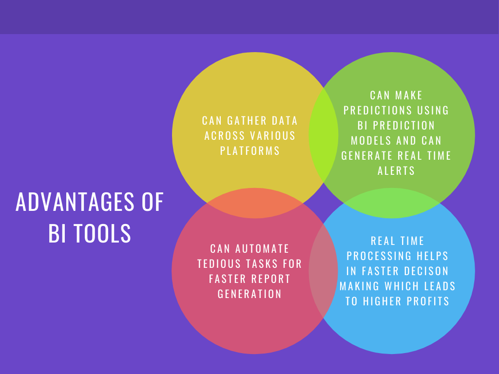
They bring together all relevant data: In any industry, we collect data from various sources like Spreadsheets, ERP, CRM, files, APIs, etc. BI tools work as data connectors and help us in centralizing data for viewing.
We can use forecast engines/ prediction models available in BI tools for predictive analysis. We can also create intelligent data alerts for anomaly detection that will enable us to react immediately.
Manual tasks are reduced greatly. We can automate regular tasks of report generation. There are drag and drop options available through which you don’t have to learn coding and syntax.
BI tools offer Real-time process monitoring enabling faster planning, analysis, and report processing. This has led to a reduction in business costs and an increase in profits.
Today in the market you will find many BI software available in the market. Some of the popular ones are PowerBI, Tableau, QlikView, ZOHO Analytics.
POWER BI
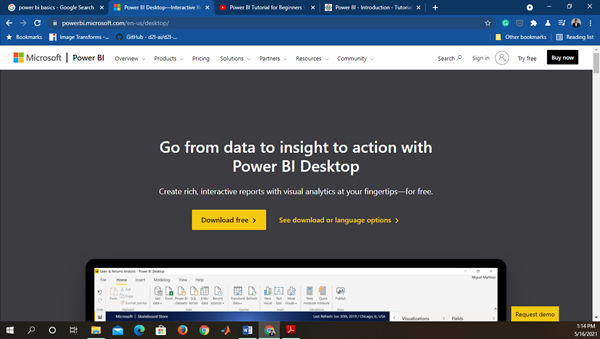
Microsoft’s Power BI is a Business Intelligence tool that brings data from different data sources for building interactive dashboards and reports. You can download Power BI from the Internet and Install it using its wizard.
Power BI provides three versions for different utility.
Power BI Desktop-
It provides data connectivity with multiple software, connectors, and services. You can download its latest version based on your OS Type and Version.
Power BI Services (Software as a Service – SaaS)
It is used to publish the reports. We can edit the dashboard directly on a web server using SaaS. PBi Services is also important for setting permissions and access rights.
Power BI Mobile App-
It is used to view the report and dashboard. Mobile View Editor is found in Power BI desktop, so we can customize mobile dashboards differently from the web dashboard.
Installing and getting started with PowerBI Visualization
Find the suitable version of Power BI Software. After Downloading and Installing you will see this screen on startup.
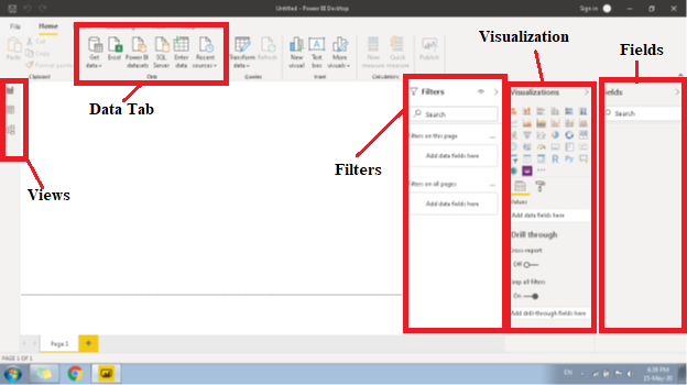
Let us briefly understand a few important buttons and columns in the Desktop Software.
Firstly, PBi has three views:
- Report view – In Report View, We Build our Dashboard. This is responsible for the frontend view of our Dashboard.
- Data View– In Data View, we play with data. We create additional rows and columns using Query, Measure, or Columns for arranging our data.
- Model View– In Model View, we describe a relationship of various tables available. We can create one-to-one, one-to-many, and many-to-many relationships.
You can switch between different views from the buttons available on the left side of the bar.
Next, we will import datasets for creating dashboards. In Data Tab Select Get Data à More. In this, you will find numerous ways through which we can get our data.
Visualization
In the Visualization column, you will find many different types of visual graphs, tables, trees, slicers, and cards. Select any visual, drag the table column in the Values, and “TADA” you have your graph ready. Next to the value tab, you will find the format tab. All types of formatting like font size, color, background, etc. will be available in the format tab.
Fields
Just next to the visualization you will find Fields columns. Here you will find all the columns and measure once you load and transform the data.
How to load the data and create visuals
Go to Get Data
Excel and select the dataset.
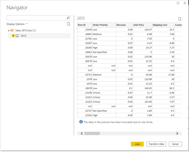
Click on Transform Data for preprocessing data.
On Clicking Power Query Editor window will open. All the data cleaning and merging operations are done in the editor. Once you have performed the data cleaning click “close and apply”.
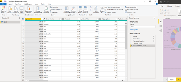
On Clicking “Close and Apply”
You will come back on your main window. Now we will create a column chart from our data.
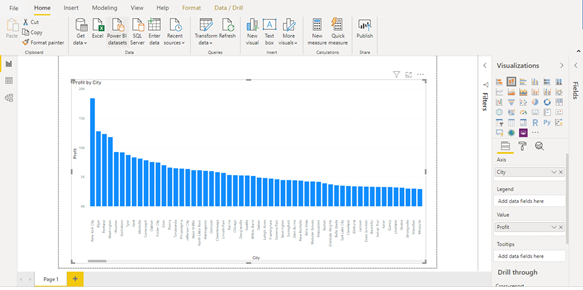
In our dataset, we have two columns city and profits. We will create a column chart describing profits vs city. Select “stacked column chart” from visualization. In Axis drag “City” column and in values drag “Profit” column and your chart is ready.
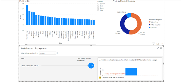
Create different visualizations and charts.
You can also add multiple pages in Power BI. Design your whole dashboard and then publish on Power BI Service. Once you have published your dashboard you can view it from anywhere.
Conclusion
We discussed the importance of visualization and how it can be easily done using BI tools. With new Visualization tools in the market report generation and analysis have become faster and easier. Decision-making has become faster which leads to gaining higher profits. Lastly, we discussed how to start data visualization in Power BI. Power BI is a powerful, popular, and easy to use BI tool by Microsoft. I hope this blog will help you in kick-starting your data visualization journey.
The media shown in this article are not owned by Analytics Vidhya and is used at the Author’s discretion.


