This article was published as a part of the Data Science Blogathon
INTRODUCTION
This blog is aimed to show the Covid cases prevailing in the Indian States. We have been going through this pandemic for over a year now. The numbers of each state are reported every day and we just see the rise in numbers. But what actually do we interpret just by seeing numbers?
For this blog, I have used the Google Collab interface. We have used the libraries like NumPy, pandas, plotly. express and folium for the analysis.
We extract the data from the website https://api.covid19india.org/states_daily.json . We then format the data to the required format and then use it for the analysis. Here in this blog we will be plotting graphs for analysis and also a map to show the numbers.
url=”https://api.covid19india.org/states_daily.json”ur.urlretrieve(url,’data.json’);df = pd.read_json(‘data.json’)with open (‘data.json’) as f:data = json.load(f)df = df[“states_daily”]df = pd.json_normalize(df)
DATA FRAME
We only have the state name abbreviations and the “Confirmed”, “Deceased” and “Recovered” columns at first. We then calculate the death rate and recovery rate of each state by dividing deceased and recovered with total numbers respectively. We then update the data frame with the latitude and longitude to plot the map, which we will see a bit later.
df[‘date’] = pd.to_datetime(df[‘date’])df[‘month’] = df[‘date’].dt.monthdf[[‘an’, ‘ap’, ‘ar’, ‘as’, ‘br’, ‘ch’, ‘ct’, ‘dd’, ‘dl’,‘dn’, ‘ga’, ‘gj’, ‘hp’, ‘hr’, ‘jh’, ‘jk’, ‘ka’, ‘kl’, ‘la’, ‘ld’, ‘mh’,‘ml’, ‘mn’, ‘mp’, ‘mz’, ‘nl’, ‘or’, ‘pb’, ‘py’, ‘rj’, ‘sk’, ‘tg’, ‘tn’, ‘tr’, ‘tt’, ‘un’, ‘up’, ‘ut’, ‘wb’]] = df[[‘an’, ‘ap’, ‘ar’, ‘as’, ‘br’, ‘ch’, ‘ct’, ‘dd’, ‘dl’,‘dn’, ‘ga’, ‘gj’, ‘hp’, ‘hr’, ‘jh’, ‘jk’, ‘ka’, ‘kl’, ‘la’, ‘ld’, ‘mh’,‘ml’, ‘mn’, ‘mp’, ‘mz’, ‘nl’, ‘or’, ‘pb’, ‘py’, ‘rj’, ‘sk’, ‘tg’, ‘tn’, ‘tr’, ‘tt’, ‘un’, ‘up’, ‘ut’, ‘wb’]].astype(str).astype(int)df.drop([‘dateymd’,’tt’],inplace=True,axis=1)df_confirm = df[df[“status”]==”Confirmed”]df_confirm.drop(‘status’,inplace=True,axis=1)df_recovered = df[df[“status”]==”Recovered”]df_recovered.drop(‘status’,inplace=True,axis=1)df_deceased = df[df[“status”]==”Deceased”]df_deceased.drop(‘status’,inplace=True,axis=1)df_c_mth = df_confirm.groupby(‘month’).sum()
df_r_mth = df_recovered.groupby(‘month’).sum()df_d_mth = df_deceased.groupby(‘month’).sum()df4 = df_c_mth.sum()df4 = pd.DataFrame(df4)df4.rename(columns={0:”Confirmed”},inplace=True);df5 = df_d_mth.sum()df5 = pd.DataFrame(df5)df5.rename(columns={0:”Deceased”},inplace=True);df6 = df_r_mth.sum()df6 = pd.DataFrame(df6)df6.rename(columns={0:”Recovered”},inplace=True);Frame = [df4,df5,df6]df_Total = pd.concat(Frame,axis=1)
Now we have created the df_Total data frame. We create the columns “death rate”, “recovery rate” and “state”.
df_Total[“Death Rate”]= df_Total[“Deceased”]/df_Total[“Confirmed”]df_Total[“Recovery Rate”]= df_Total[“Recovered”]/df_Total[“Confirmed”]df_Total.fillna(0,inplace=True);state = [“Andaman and Nicobar”,”Andhra Pradesh”,”Arunachal Pradesh”,”Assam”,”Bihar”,”Chandigarh”,”Chhattisgarh”,”Daman and Diu”,”Delhi”,”Dadra and Nagar Haveli”,”Goa”,”Gujarat”,“Himachal Pradesh”,”Haryana”,”Jharkhand”,”Jammu and Kashmir”,”Karnataka”,”Kerala”,”Ladakh”,”Lakshadweep”,”Maharashtra”,”Meghalaya”,”Manipur”,”Madhya Pradesh”,”Mizoram”,“Nagaland”,”Orissa”,”Punjab”,”Puducherry”,”Rajasthan”,”Sikkim”,”Telangana”,”Tamil Nadu”,”Tripura”,”Uttar Pradesh”,”Uttaranchal”,”West Bengal”]df_Total[“State”] = state
.png)
This data frame has to be updated with the latitude and longitude of the states, such that we would be able to plot the map. The data is available on the Kaggle website. We can download the CSV file and update the data frame.
coordinates = pd.read_csv(‘state wise centroids_2001.csv’)
df_an = {‘State’: ‘Ladakh’, “Latitude”: 34.152588, ‘Longitude’: 77.577049}
coordinates = coordinates.append(df_an, ignore_index = True)
df_an = {‘State’: ‘Telangana’, “Latitude”: 18.1124, ‘Longitude’: 79.0193}
coordinates = coordinates.append(df_an, ignore_index = True)
coordinates.sort_values(by=[‘State’], inplace=True)
df_Total.sort_values(by=[“State”],inplace=True)
Final = pd.merge(df_Total,coordinates,on=”State”, how=”inner”)
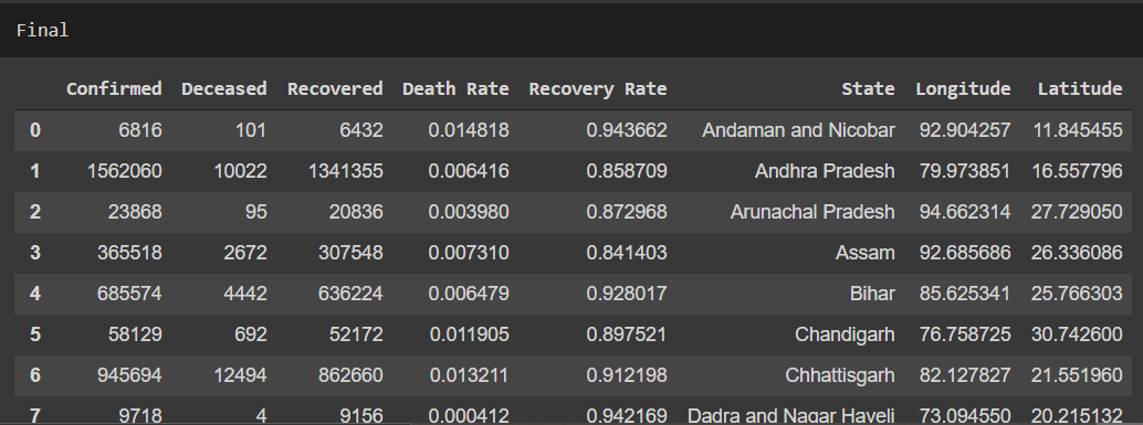
The final dataset that we get after feature engineering is this. Now, this is the completed data frame. We have used libraries like NumPy and pandas to complete the feature engineering. For plotting the graph we will be using plotly.express and for the map folium.
This is the data frame that we will be using to plot the graphs and the map.
PLOTTING GRAPHS AND THEIR INSIGHTS
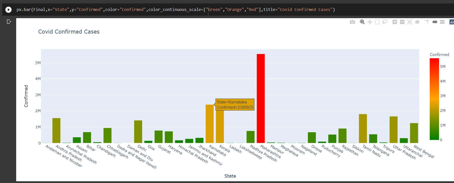
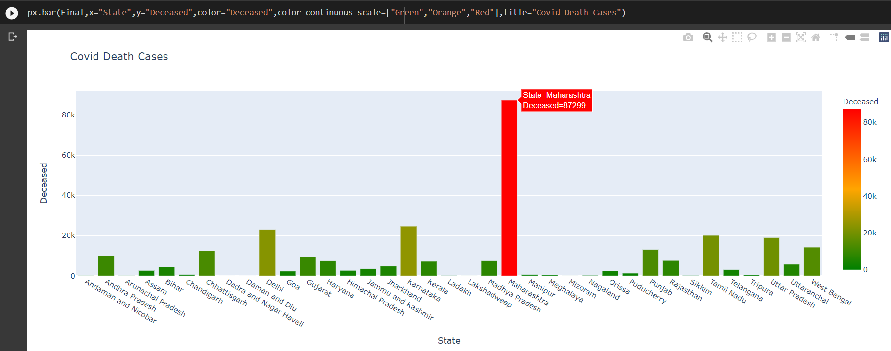
We plot the graphs for the columns, “Confirmed”, “Deceased” and “Recovered”.
px.bar(Final,x=”State”,y=”Confirmed”,color=”Confirmed”,color_continuous_scale=[“Green”,”Orange”,”Red”],title=”Covid Confirmed Cases”)
px.bar(Final,x=”State”,y=”Deceased”,color=”Deceased”,color_continuous_scale=[“Green”,”Orange”,”Red”],title=”Covid Death Cases”)
px.bar(Final,x=”State”,y=”Recovered”,color=”Recovered”,color_continuous_scale=[“Red”,”Orange”,”Green”],title=”Covid Recovered Cases”)
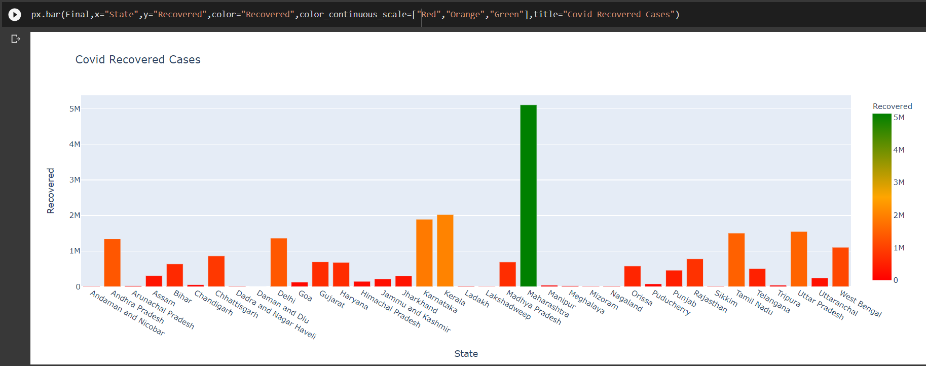
From the above-plotted graphs, we find that Maharastra has the highest number of cases reported and the highest number of death. But from this we cannot conclude that Maharastra is the worst affected since it also has its recovered numbers high. It is important that we look into the next two columns, i.e the recovery rate and the death rate. Those are the numbers that actually show how the state is taking measures for the virus. The more confirmed reveals that more testing has been carried in the state which is a positive note in curbing the virus.
Thus we plot the death rate and recovery rate to know about the numbers.
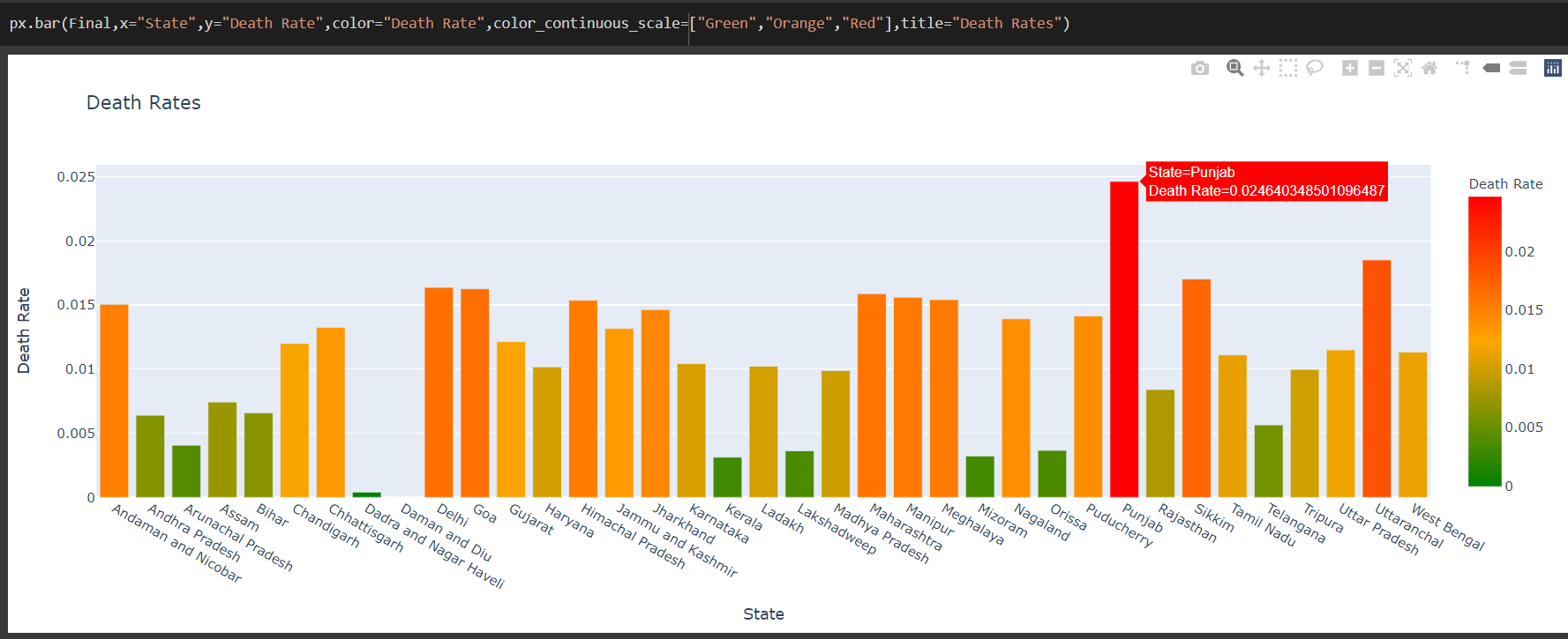
px.bar(Final,x=”State”,y=”Death Rate”,color=”Death Rate”,color_continuous_scale= “Green”,”Orange”,”Red”],title=”Death Rates”)
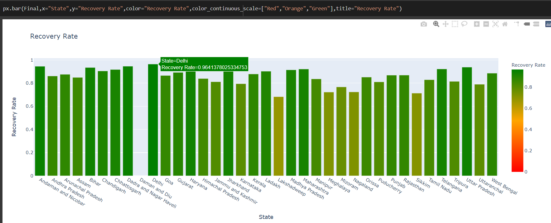
px.bar(Final,x=”State”,y=”Recovery Rate”,color=”Recovery Rate”,color_continuous_scale=[“Red”,”Orange”,”Green”],title=”Recovery Rate”)
From the above graph, we can interpret that the highest death rate is in the state of Punjab. This clearly shows that the state has to take more action.
From the recovery rate graph, it is positive to see that, most of the states have a dark green color which means that they have a high rate of recovery. The ones with the lighter colors, have to work more to increase their recovery rate. The higher the recovery rate and lower the death rate shows that the state is working well against the virus.
PLOTTING MAP
Then we plot an interactive map, such that we would be able to view the numbers state-wise upon hovering in them. For this, we use the folium library.
# retreiving the data from final table and plotting it on the INDIA map# creating the map object zooming on INDIA, location here shows the lat and long of INDIAindia = folium.Map(location = [20.5937,78.9629],zoom_start=4.5)#adding to mapfor state,lat,long,conf,Dec,Recov,drate,rrate in zip(list(Final[‘State’]),list(Final[‘Latitude’]),list(Final[‘Longitude’]),list(Final[‘Confirmed’]),list(Final[‘Deceased’]),list(Final[‘Recovered’]),list(Final[‘Death Rate’]),list(Final[‘Recovery Rate’])):#for creating circle markerfolium.CircleMarker(location = [lat,long],radius = 5,color=’red’,fill = True,fill_color=”red”).add_to(india)#for creating markerfolium.Marker(location = [lat,long],# adding information that need to be displayed on popuppopup=folium.Popup((‘<strong>State : ‘+str(state)+'</strong> <br>’ +‘<strong>Confirmed : ‘+str(conf)+'</strong><br>’ +‘<strong><font color= red>Deceased : </font>’+str(Dec)+'</strong><br>’ +‘<strong><font color=green>Recovered : </font>’+str(Recov)+'</strong><br>’ +‘<strong>Death Rate : ‘+str(drate)+'</strong><br>’ +‘<strong>Recovery Rate : ‘+str(rrate)+'</strong>’ ),max_width=200)).add_to(india)#to show the mapindia
.png)
From this map, we will be able to interpret the data in an interactive way. On clicking each location we get the data for that particular state. Thus this way we can get the data for the state required.
CONCLUSION
Thus, we can conclude that the numbers are just the cases reported while the rates reveal the counter steps taken by the states. It is important that all the states aim to keep the death rates low and recovery rates high.
Author Linkedin: Linkedin
The media shown in this article are not owned by Analytics Vidhya and is used at the Author’s discretion


