Plotly and cufflinks : Advanced Python Data Visualization Libraries
This article was published as a part of the Data Science Blogathon
Introduction
Data Visualization helps to bridge the gap between numbers and words – Brie E. Anderson
In the modern world of data, data is everywhere and it is only useful when we can seek some information from it. Data Visualization is the most beautiful part of data analysis through which we describe the data interactively and visually. It is that magical technique that can convey information to larger masses at a single glance and tell interesting stories from the data.
Data Visualization has a very important role in making critical business decisions where data is present in a very large amount and it becomes harder for businesses to extract decisive information from it.
Data Visualization in Python
In the process of data analysis, after completing data cleaning and data manipulation, the next step is to bring meaningful insights and conclusions from the data which can be achieved through graphs and charts. Python provides several libraries for this purpose. Generally, we are taught about only these two libraries matplotlib and seaborn. These libraries provide features using which we can draw line charts, pie charts, bar plots, box plots, and many more plots. Now, you must have a question if we already have matplotlib and seaborn, then why we need other libraries for data visualization? This is the same question that arrived in my mind when I first heard about plotly and cufflinks. However, when I read about them and used them in my projects then it had completely blown my mind, the power these libraries provide in your hand is amazing.
What is plotlib and why we need it?
Plotly is an open-source and charting library that provides the facility of interactive plotting. The library is available for several programming languages such as Python, R, MATLAB, Arduino, and REST, among others.
Cufflink is also a python library that connects plotly with pandas so that we can create charts directly on data frames. It basically acts as a plugin.
Plotly charts are dynamic in nature, it allows us to hover over the values, zoom in zoom out of graphs, identifies outliers in the dataset. On the other hand, matplotlib and seaborn charts are static, we can’t zoom in or zoom-out, it does not provide detail of every value on the chart. The most important feature of plotly is that it allows us to build dynamic charts for the web directly from python which is not possible in the case of matplotlib. With plotly, we can also create animations and interactive graphs on geographical, scientific, statistical, and financial data.
Authoria Templates
Installing and running plotlib and cufflinks
First, we install these two libraries using the pip command.
pip install plotly
pip install cufflinks
After installing, we import all necessary modules in our python shell or jupyter notebook.
import pandas as pd
import numpy as np
import plotly
import datetime
from datetime import date
import cufflinks as cf
For enabling the offline mode for plotting locally in the jupyter notebook we write the below code.
from plotly import download_plotlyjs, init_notebook_mode, plot, iplot
init_notebook_mode(connected=True)
cf.go_offline()
Dataset
Before going for the implementation of plotly, we first need to understand our dataset and operations that can be applied to do data visualization using various charts.
We have taken the tata motors shares price dataset of 6 years period(2016-2021) from yahoo finance. The dataset has 7 columns that include the date, close price, open price, high, low, adj close, and volume. Then we have added two columns i.e. year and month in the dataset which will help in plotting the charts. The following code is written below:
Python Code:
Now, we will draw several charts on this dataset.
It is not possible to embed the plotly charts on this blog. Therefore, I have added screenshots of charts. However, if you want to play with charts you can run my code in your jupyter notebook.
Basic Charts
Line Chart
import plotly.express as px
fig = px.line(stock_data, x="Date", y="Adj Close",title = 'TATAMOTORS SHARE PRICE (2016-2021)')
fig.show()
OUTPUT
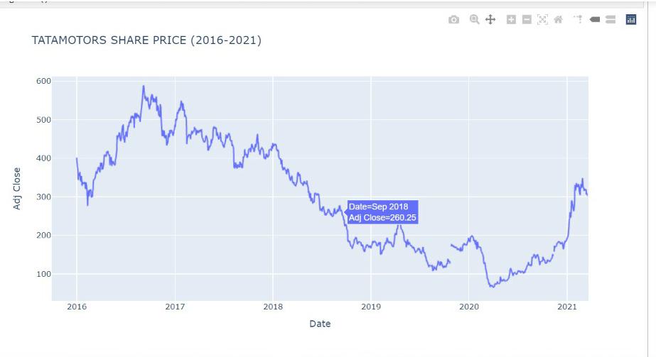
As we can see above, Plotly provides a set of options to play around with the visualization. On the top right corner of the plot, you can see 10 buttons that offer several functionalities. In the order of buttons from going left to right, we have one to download the plot as a png image, toggle buttons to switch between zoom mode and pan mode, a zoom in and zoom out button, and an autoscale button to reset the scale in the plot, a reset axis button, a button to toggle the spike lines in the graph, and pair of toggle button to switch between different mouse hover modes.
This line chart shows the tata motors share price from 2016 to 2021. We can zoom in for a particular year and a month and can see the share price of each day by hovering on it.
Bar Plot
stock=stock_data.groupby('Year')['Adj Close'].mean()
fig = px.bar(stock, x=stock.index, y=stock.values,title = 'TATAMOTORS SHARE PRICE (2016-2021)',labels={'y':'Price'})
fig.show()
OUTPUT
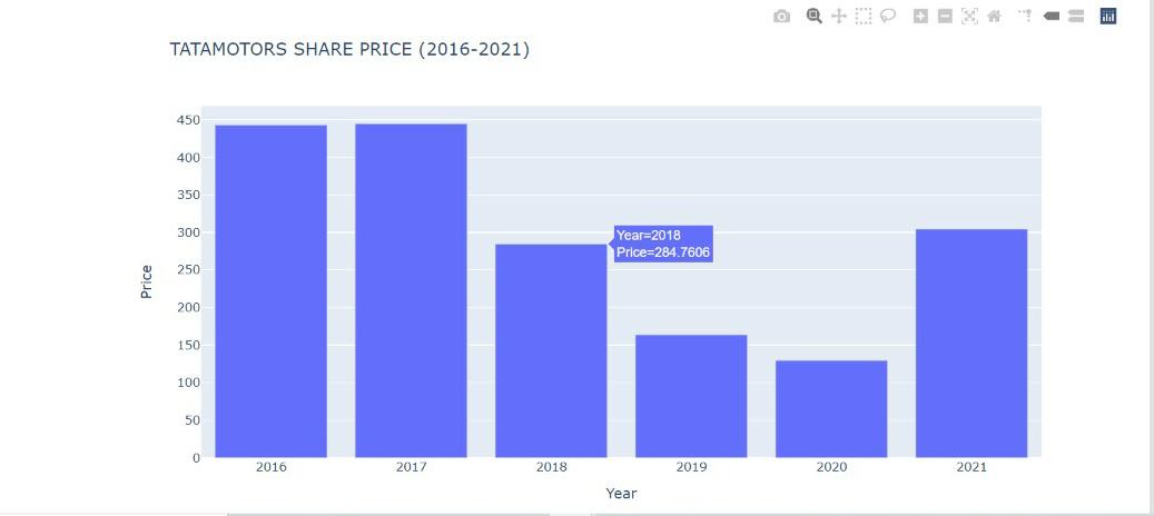
This bar plot shows the mean share price of tata motors in several years.
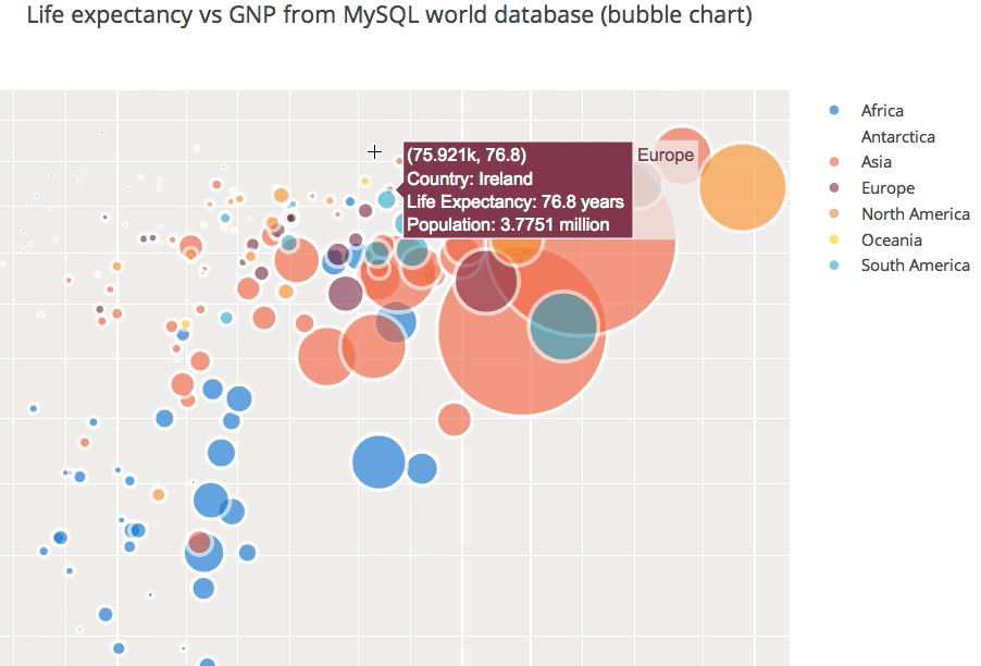
Bubble Chart
df=stock_data.loc[stock_data['Year']==2021,['Date','Adj Close','Volume','Year','Month']]
fig = px.scatter(df, x="Date", y="Adj Close",
         size='Volume',color='Month',title = 'TATAMOTORS SHARE PRICE (2016-2021)')
fig.show()
OUTPUT
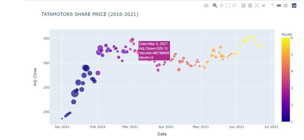
This bubble chart shows the tata motors share price across different months in the year 2021 and the size of the bubble represents the volume of shares traded.
Statistical Charts
Box Plot
fig = px.box(stock_data, x="Year", y="Adj Close",title = 'TATAMOTORS SHARE PRICE (2016-2021)')
fig.show()
OUTPUT
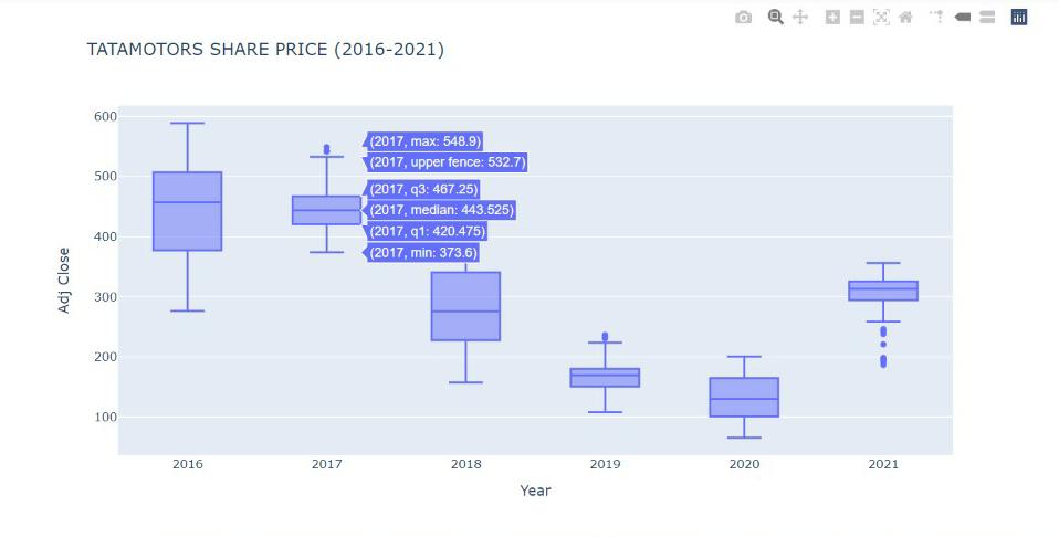
This box plot gives the various descriptive stats of the share price of tata motors for different years. It provides the max, min, median, quantile 1, quantile 3, and max/min values excluding outlier.
Histogram
fig = px.histogram(stock_data, x="Adj Close",title = 'TATAMOTORS SHARE PRICE (2016-2021)')
fig.show()
OUTPUT
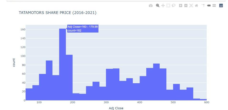
The histogram tells us about the count of the share price of tata motors over 6 years. We can that for most of the period the share price was between Rs 160 and Rs 200.
Heatmap
dff= stock_data[['Adj Close','Year','Month']]
dff=dff.groupby(['Year','Month']).mean()
dff=dff.unstack(level=0)
dff.head()
month=['January','February','March','April','May','June','July','August','September','October','November','December']
year=[2016,2017,2018,2019,2020]
import plotly.graph_objects as go
fig = go.Figure(data=go.Heatmap(
        z=dff,
        x=year,
        y=month,
        colorscale='Viridis'))
fig.update_layout(title="TATAMOTORS SHARE PRICE (2016-2021) -> (Jan to Dec)")
fig.show()
OUTPUT
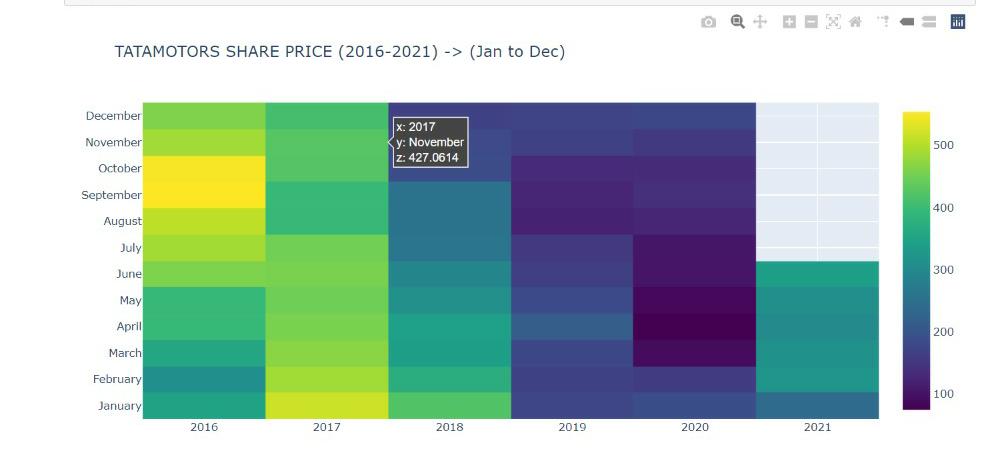
The heatmap shows the share price of tata motors across months and their respective years. By hovering we can get details of each block.
Financial Charts
Candlestick Chart
fig = go.Figure(data=[go.Candlestick(x=stock_data['Date'],
                open=stock_data['Open'],
                high=stock_data['High'],
                low=stock_data['Low'],
                close=stock_data['Adj Close'])])
fig.update_layout(title="TATAMOTORS SHARE PRICE (2016-2021)")
fig.show()
OUTPUT
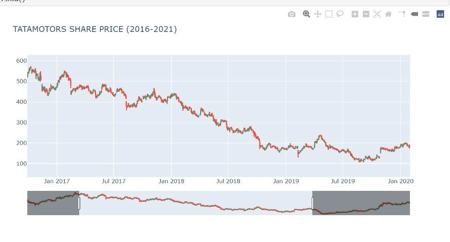
Candlestick chart gives the open, close, high, and low price of each day. There is also a slidebar under the chart that we can use to get the chart for any range in 6 years.
Area Chart
fig = px.area(y=stock_data["Adj Close"],x=stock_data['Date'],title = 'TATAMOTORS SHARE PRICE (2016-2021)',labels={'x':'Year','y':'Price'})
fig.update_layout(showlegend = False)
fig.show()
OUTPUT
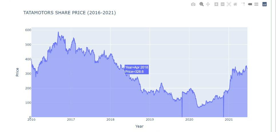
Area Chart gives the area under the stock price. It is useful to see the trend and variation in share price over the years.
Plotly also provides scientific charts, 3-D charts, maps, and animations. You can visit plotly documentation here for more details.
Key Notes
In this blog first, we have seen the importance of data visualization. Then we discussed what’s the need for advanced charting libraries like Plotly and how it provides much more features than matplotlib and seaborn. Lastly, we implemented some interactive Plotly charts on tata motors’ share price data.
References
Featured Image – boostlabs
Google Image – pythonhow
Gif – authoria
plotly documentation – plotly
About Me
Hi! I am Ashish Choudhary. I am pursuing B.Tech from the JC Bose University of Science & Technology. Data Science is my passion and feels proud to write interesting blogs related to it. Feel free to contact me on Linkedin.


Very good explanation