This article was published as a part of the Data Science Blogathon
Introduction
More often than not, while performing an EDA, we are faced with a situation to display information with respect to geographical locations. For example, for a COVID 19 dataset, one may want to show the number of cases in various areas. Here is where the python library GeoPandas comes to our rescue.
This article attempts to give a gentle introduction to the usage of GeoPandas to visualize geospatial data effectively.
Terms Related to GeoSpatial Analysis related to GeoPandas
Geospatial data describe objects, events, or other features with respect to a location (coordinates) of the earth.
Spatial data is represented by the fundamental types of geometric objects (implemented by shapely)
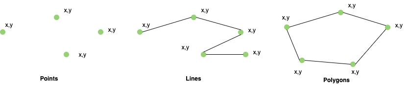
| Geometry | Used to represent | |
| Points | Centre point of plot locations etc. | |
| Lines | Roads, Streams | |
| Polygons | Boundaries of buildings, lakes, states, etc. |
CRS/Coordinate Reference System tells how (using a projection or a mathematical equation) a location (coordinates) on the round earth translates to the same location, on a flattened, 2-dimensional coordinate system (for example, your computer screens or a paper map). The most commonly used CRS is the “EPSG:4326”.
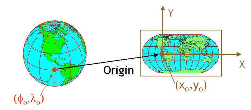
Image 1
Now let’s get to the topic of our interest.
What is GeoPandas?
GeoPandas is based on the pandas. It extends pandas data types to include geometry columns and perform spatial operations. So, anyone familiar with pandas can easily adopt GeoPandas.
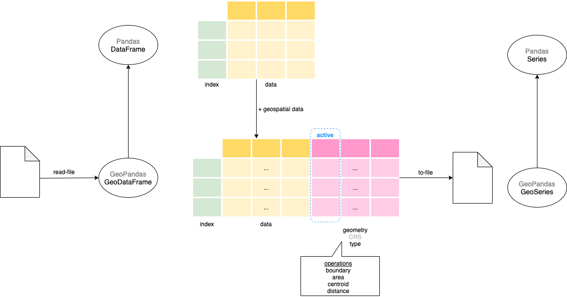
GeoPandas – GeoDataFrame & GeoSeries
The main data structure in GeoPandas is the GeoDataFrame that extends the pandas DataFrame. So all the base DataFrame operations can be performed on the GeoDataFrame. The GeoDataFrame contains one or more GeoSeries (that extends pandas Series) each of which contains geometries in a different projection (GeoSeries.crs). Though GeoDataFrame can have multiple GeoSeries columns, only one of these will be the active geometry i.e. all geometric operations will be on that column.
In the next sections, we will understand how to use some common functions like boundary, centroid, and most importantly plot method. To illustrate the working of geospatial visualizations, let’s will use the Teams data from the Olympics 2021 dataset.
Read the teams dataset before importing GeoPandas
The team’s dataset has the team name, discipline, NOC (country), and event columns. We will be using only the NOC and discipline columns in this exercise.
Python Code:
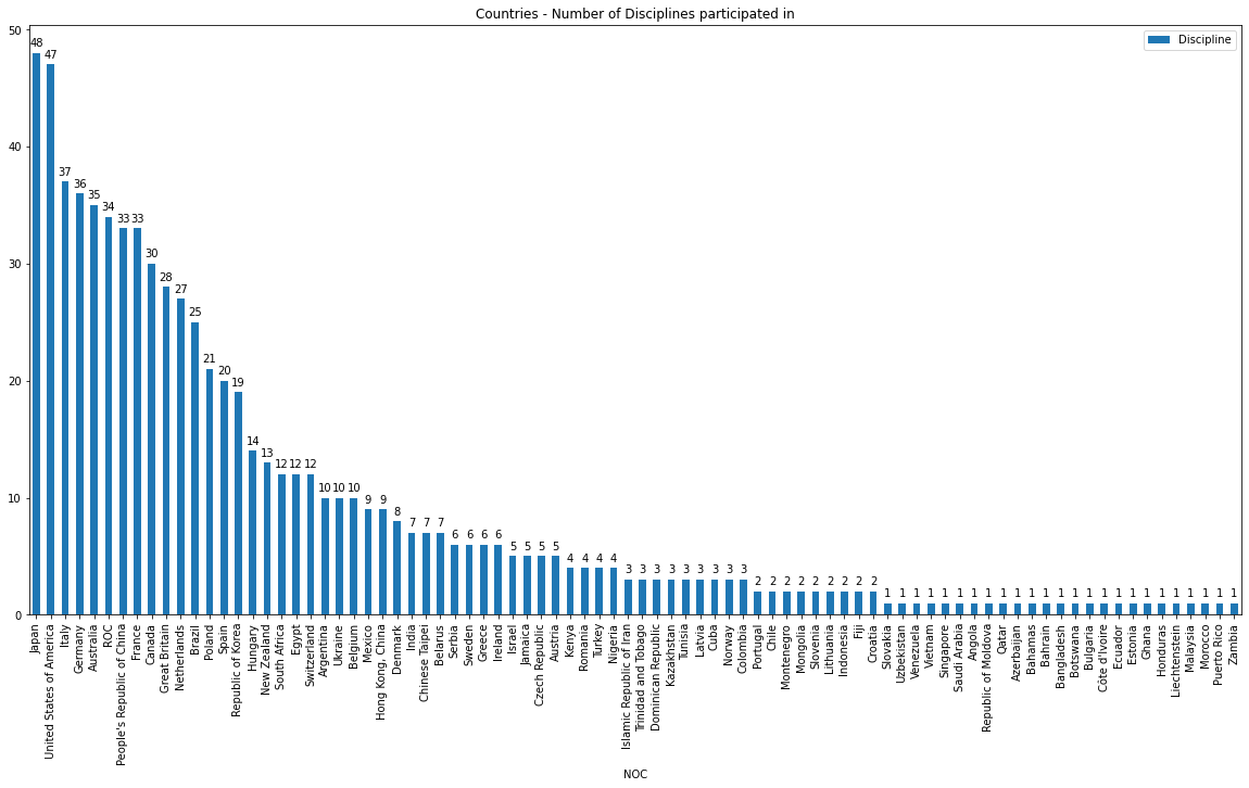
Summarise the disciplines per each country and plot it.
df_teams_countries_disciplines = df_teams.groupby(by="NOC").agg({'Discipline':'count'}).reset_index().sort_values(by='Discipline', ascending=False)
ax = df_teams_countries_disciplines.plot.bar(x='NOC', xlabel = '', figsize=(20,8))
Import GeoPandas and Read the Data
import geopandas as gpd

df_world = gpd.read_file(gpd.datasets.get_path('naturalearth_lowres'))

print(f"{type(df_world)}, {df_world.geometry.name}")

print(df_world.head())

print(df_world.geometry.geom_type.value_counts())
“naturalearth_lowres” is a base map provided with geopandas which we loaded.
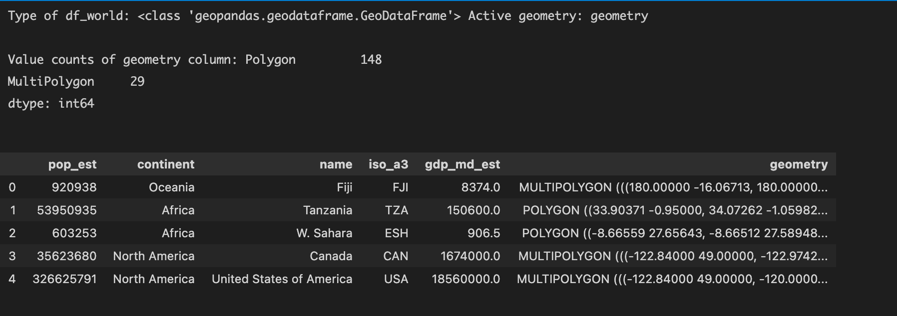
df_world is of type GeoDataFrame with continent, (country) name, and geometry (of country area) columns. geometry is of type GeoSeries and is the active geometry with country area represented in Polygon and MultiPolygon types.
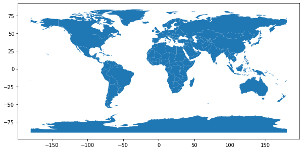
Let’s now plot the world
df_world.plot(figsize=(10,6))
Merge the teams and world dataset
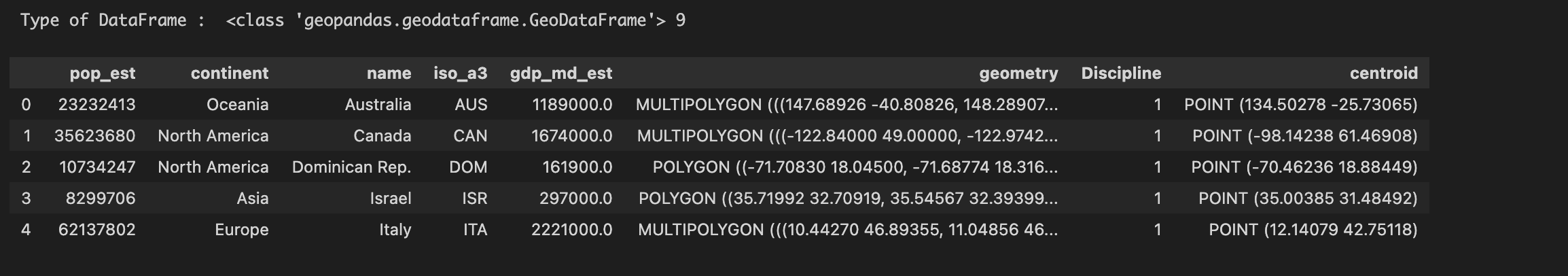
df_world_teams = df_world.merge(df_teams_countries_disciplines, how="left", left_on=['name'], right_on=['NOC'])
print("Type of DataFrame : ", type(df_world_teams), df_world_teams.shape[0])
df_world_teams.head()
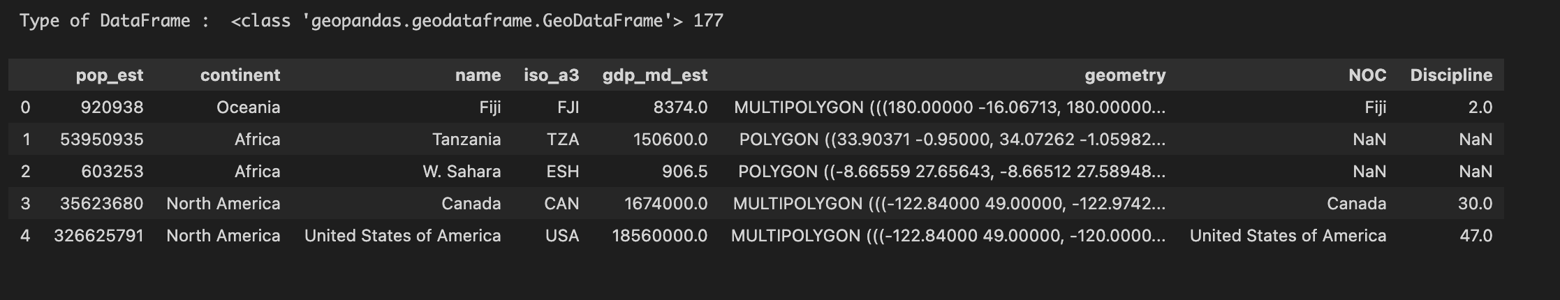
Note:
- df_world_teams will have some entries with NOC and Discipline as NaN. This (merge on left instead of right) has been done intentionally so that we also have the countries that have not participated.
- Few country names were inconsistent between the Olympics and world datasets. So I adjusted the country names (as far as possible). Details are in the source code.
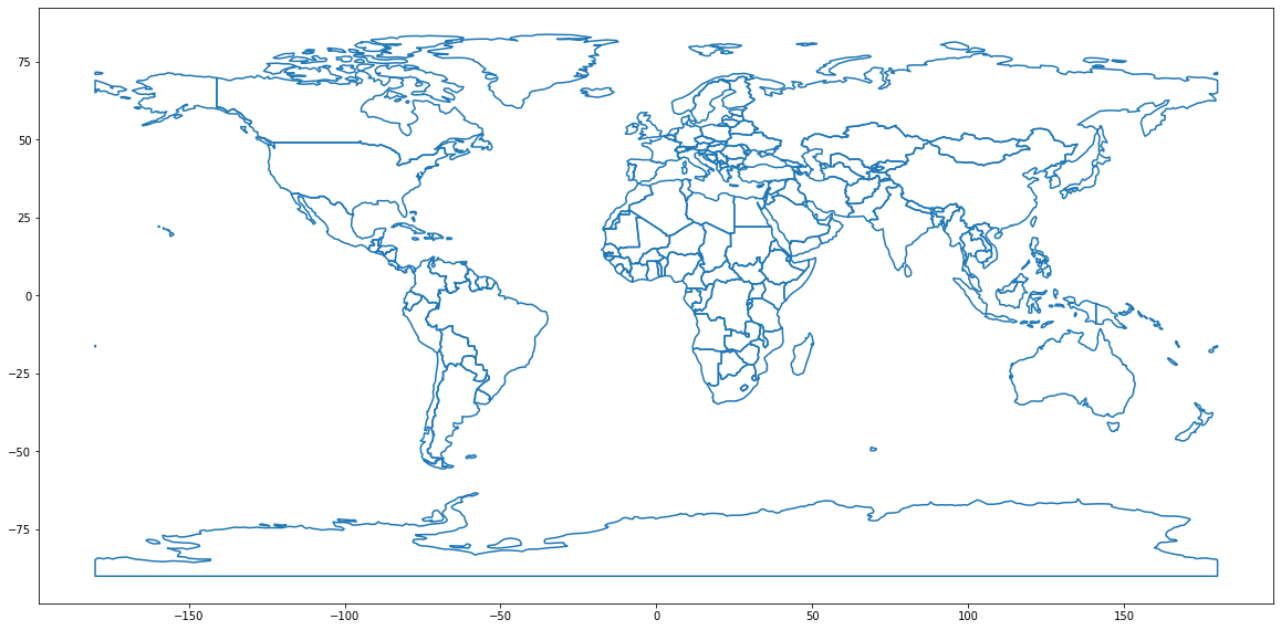
Display a simple world map – plot boundary
As a first step, let’s plot the basic map – world with boundary only. In the next steps, we will colour the countries that we are interested in.
ax = df_world["geometry"].boundary.plot(figsize=(20,16))
Display a Choropleth map – plot area
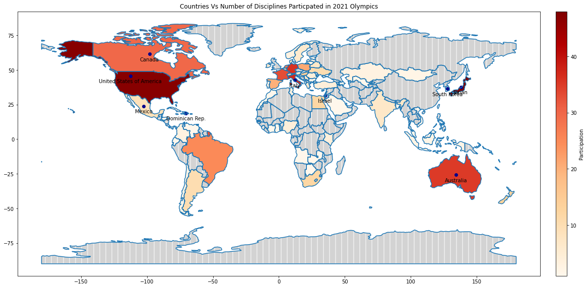
Next, let us colour the countries that have participated in the Olympics with the darkness of the colour based on the number of disciplines the country has participated in. The more disciplines the country participated in, the darker the shade and vice versa. Choropleth maps colour the regions/polygons in relation to a data variable.
df_world_teams.plot( column="Discipline", ax=ax, cmap='OrRd',
                     legend=True, legend_kwds={"label": "Participation", "orientation":"horizontal"})
ax.set_title("Countries Vs Number of Disciplines Particpated in 2021 Olympics")
where
- ax is the axes on which to draw the map
- cmap is the name of the colormap
- legend & legend_kwds control the display of the legend.
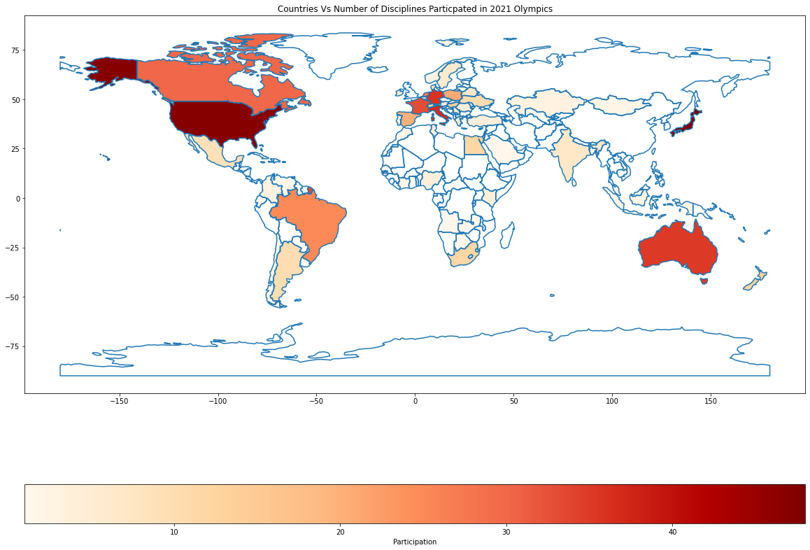
Based on the shading, we can quickly see that Japan, America, Italy, Germany, and Australia are the countries that have participated in most disciplines.
Notice that the legend at the bottom does not look that great. Let’s modify df_world_teams.plot to make the visualization more presentable.
fig, ax = plt.subplots(1, 1, figsize=(20, 16))
divider = make_axes_locatable(ax)
cax = divider.append_axes("right", size="2%", pad="0.5%")
df_world_teams.plot(column="Discipline", ax=ax, cax=cax, cmap='OrRd',

legend=True, legend_kwds={"label": "Participation"})
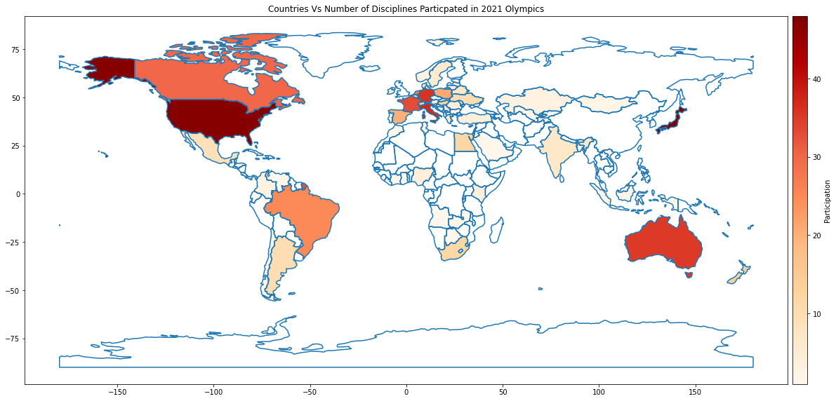
With a neat Colormap
Isn’t this visualization a lot neater?
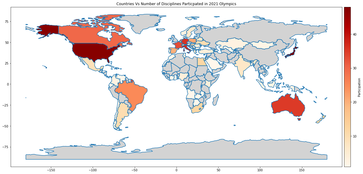
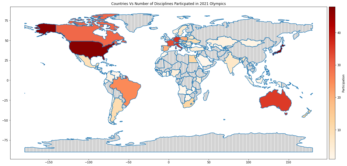
Shading the countries that didn’t participate
plot missing_kwds
Now, what about the countries that didn’t participate? All the countries that are not shaded (i.e. in white colour) are the ones that did not participate. But let’s make that more obvious by shading these countries in grey. We can use missing_kwds with just a plain colour or with colour and pattern for that.
df_world_teams.plot(column="Discipline", ax=ax, cax=cax, cmap='OrRd',

legend=True, legend_kwds={"label": "Participation"},

missing_kwds={'color': 'lightgrey'})
df_world_teams.plot(column= 'Discipline', ax=ax,  cax=cax, cmap='OrRd',
                    legend=True, legend_kwds={"label": "Participation"},
                    missing_kwds={"color": "lightgrey", "edgecolor": "white", "hatch": "|"})
Mark the countries that participated in the least participated discipline – plot points
Which is the discipline where the participation was the least?
df_discipline_countries = df_teams.groupby(by='Discipline').agg({'NOC':'count'}).sort_values(by='NOC', ascending=False)
ax = df_discipline_countries.plot.bar(figsize=(8, 6))
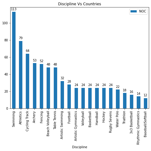
Disciplines Vs Number of Countries
So Baseball/Softball is the discipline in which the least number of countries (12) participated. Now which countries participated in this discipline? Let’s find out.
For this, firstly create a dataset with only the countries that participated in the least participate discipline and then merge this dataset df_teams_least_participated_disciplines and df_world and then calculate the centroids.
# Create a dataset with only the countries participated in the least participate discipline

countries_in_least_participated_disciplines = df_discipline_countries[df_discipline_countries['NOC']<13].index.tolist()

print(least_participated_disciplines)

df_teams_least_participated_disciplines = df_teams[df_teams['Discipline'].isin(countries_in_least_participated_disciplines)].groupby(by=['NOC','Discipline']).agg({'Discipline':'count'})

df_teams_least_participated_disciplines.groupby(by=['NOC']).agg({'Discipline':'count'}).sort_values(by='Discipline', ascending=False)
# Merge

df_teams_least_participated_disciplines with df_world
df_world_teams_least_participated_disciplines = df_world.merge(df_teams_least_participated_disciplines, how="right", left_on=['name'], right_on=['NOC'])
df_world_teams_least_participated_disciplines['centroid'] = df_world_teams_least_participated_disciplines.centroid
print("Type of DataFrame : ", type(df_world_teams_least_disciplines),df_world_teams_least_participated_disciplines.shape[0])
print(df_world_teams_least_participated_disciplines[:5])
So Australia, Canada, Dominican Rep., and others have participated in the least-participated discipline.
Add the following lines to the plotting code we wrote earlier to mark these countries with a dark blue-filled circle.
df_world_teams_least_participated_disciplines["centroid"].plot(ax=ax, color="DarkBlue")
and the below to annotate the countries
df_world_teams_least_participated_disciplines.apply(lambda x: ax.annotate(text=x['name'], xy=(x['centroid'].coords[0][0],x['centroid'].coords[0][1]-5), ha='center'), axis=1)
Now we have the Olympics teams displayed on the world map. We can extend this further to make it richer with information. A word of caution: Do not add too much detail to the map at the cost of clarity.
Summary
In the above sections, we have seen that geopandas.GeoDataFrame can work seamlessly with the base pandas.DataFrame‘s functions – read_file, merge, etc., and with its own functions – boundary, centroid, plot, etc. to generate visualizations in a geographical map that enhances the data storytelling.
References: Source Code | GeoPandas | Spatial data | CRS
Image Sources
Image 1: https://www.earthdatascience.org/courses/earth-analytics/spatial-data-r/intro-to-coordinate-reference-systems/
Sreedevi Gattu
06 Sep, 2022


