This article was published as a part of the Data Science Blogathon
Data Visualization is a revolutionary invention that is widely used today in almost every industry. Data Visualization becomes extremely useful in data storytelling. Charts, plots are visually appealing and one can catch the motive behind the story with a visual. A single chart or plot is enough to represent a thousand words.
One of the visualization techniques we are going to talk about is treemap. Treemaps are easy to visualize and can be understandable by a naive person. Due to its varying sizes of rectangles, one can relate that a larger rectangle means a large amount and a smaller rectangle means a small amount of the whole. In this article, we will learn how to build Treemaps in Python using the library Squarify.
Table of Contents:
- Introduction
- Building Treemap using Squarify
- Using Additional Parameters
- Applications of Treemap
- Conclusion
Introduction
Treemaps are used to visualize hierarchical data using rectangles nested together of varying sizes. The size of each rectangle is in proportion to the amount of data it represents out of the whole. These nested rectangles represent the branches of a tree and thus got their name. Apart from the sizes, each rectangle has unique color representing the unique category. Treemaps are widely used in industries ranging from Financial institutions to Sales organizations.
Treemaps were first invented in the early 1990s by an American Professor, Ben Shneiderman at the University of Maryland Human-Computer Interaction Lab. The idea behind this visualization was to compare the quantities by size in a fixed space. Now, we will look at how to build a word cloud practically.
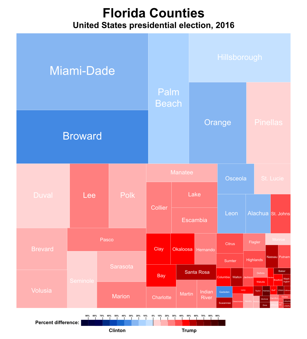
Image by Ali Zifan
Building Treemap using Squarify
Treemap in Python can be built straightforwardly using Squarify. The process of drawing a Treemap in Python is as follows:
1. Installing Necessary Libraries
!pip install squarify
2. Importing Necessary Libraries
import matplotlib.pyplot as plt
import squarify
3. Creating Random Data
Randomly generating a list of values, which will be passed as data into our plot.
data = [500, 250, 60, 120]
4. Plotting the Treemap
Using the .plot() method of squarify, we will build the treemap. Here, we are giving our random data variable data as a parameter to this .plot() method. Also, the plt.axis(‘off’) will remove the axis to get the treemap without the axes.
squarify.plot(data)
plt.axis('off')
plt.show()
5. Putting it All Together
import matplotlib.pyplot as plt
import squarify
data = [500, 250, 60, 120]
squarify.plot(data)
plt.axis('off')
plt.show()
Source – Personal Computer
Each time, on executing this code, it will generate a random set of colours for our nested rectangles.
Using Additional Parameters
More functionalities can be added to our Treemap with the help of parameters of the .plot() method. We can control the colours, labels, and padding of our treemap by explicitly specifying the attributes.
1. Specifying the Colours of Treemap
import matplotlib.pyplot as plt
import squarify
sizes = [500, 250, 120, 60]
color = ['red', 'green', 'blue', 'orange']
squarify.plot(sizes,color=color)
plt.axis('off')
plt.show()
On executing this code, we get:

Source: Personal Computer
2. Adding Labels to Treemap
Labels can be added explicitly by passing a list of values into the label attribute of squarify.plot(). This will overwrite the existing labels or will add labels to our Treemap, if not present. Labels will be added in the same order they are passed as a list.
import matplotlib.pyplot as plt
import squarify
labels = ['A', 'AB', 'ABC', 'ABCD']
sizes = [500, 250, 120, 60]
color = ['red', 'green', 'blue', 'orange']
squarify.plot(sizes,color=color, label = labels)
plt.axis('off')
plt.show()
On executing this code, we get:
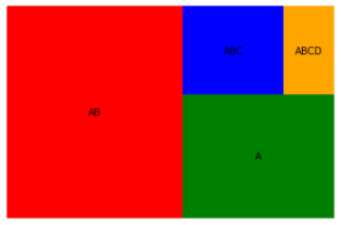
Source – Personal Computer
3. Padding in Treemap
Padding can be added to our treemap which will help to distinguish the rectangles. This is helpful when we have a huge number of categories or rectangles. This can be invoked by setting the pad parameter to True
import matplotlib.pyplot as plt
import squarify
labels = ['AB', 'A', 'ABC', 'ABCD']
sizes = [500, 250, 120, 60]
color = ['red', 'green', 'blue', 'orange']
squarify.plot(sizes,color=color, label = labels, pad = True)
plt.axis('off')
plt.show()
On executing the code, we get:
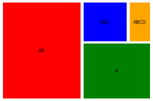
Source – Personal Computer
Applications of Treemaps
Today, Treemaps can be found in every industry from financial institutions to the health industry. Following are the few examples where Treemaps are widely used:
1. Treemap for comparing Literacy Rate in India
A treemap can be built to see the literacy rate in each state of India. The biggest-sized rectangle will represent the state having the highest literacy rate in the country. While the smallest sized rectangle will represent the state with the lowest literacy rate. But one might find this ambiguous when one or more states have almost equal literacy rates. Thus, such states will have almost the same sized rectangles and would be difficult to distinguish if state names are not printed.
2. Treemap for comparing Months in a Year
A treemap can be built to visualize months based on the number of hours spent by an individual studying. Thus, a larger rectangle will represent the most productive month while the smallest rectangle would represent the least productive month of the year.
3. Treemap for Comparing Players of a Team
A treemap can be built to visualize a team’s players based on the number of sixes hit by them. Here, the larger rectangle will represent the player who had scored the most sixes while the smallest rectangle would represent the player who had scored the least sixes throughout the tournament.
4. Treemap for Comparing Audio Tracks of an Artist
A treemap can be built to compare the audio tracks of an album by an artist based on the number of times the audio is streamed. Here, the largest rectangle would represent the track with the most number of streams while the smallest rectangle would represent the track with the least number of streams.
5. Treemap for the Comparing States in India based on Number of Vaccines Administered
A treemap can be built to compare states of India based on the Number of Vaccine Doses 1 administered. Thus, here the largest rectangle would represent the state which had administered the most number of vaccine doses while the smallest rectangle would represent the state which had administered the least number of vaccine doses.
Conclusion
Thus, building a Treemap was a piece of cake. Apart from squarify, Treemaps can be build using several libraries in Python. Numerous BI tools today are available to build Treemaps most simply.
Sometimes, ambiguity may arise in a Treemap. If we have more than one category having the same amount (or rectangle size) and the same shade of colour, this becomes difficult to distinguish between the two for the end-user. Thus, one must always consider the number of categories and the colour map involved. Treemap should always be clutter-free and difficult to understand.
About the Author
Connect with me on LinkedIn Here.
Check out my other Articles Here
You can provide your valuable feedback to me on LinkedIn.
Thanks for giving your time!
The media shown in this article are not owned by Analytics Vidhya and are used at the Author’s discretion.
IT Engineering Graduate currently pursuing Post Graduate Diploma in Data Science.


