Introduction
Understanding project pipelines is paramount for your machine learning career. This pipeline encompasses components like Feature Selection, Exploratory Data Analysis, Feature Engineering, Model Building, Evaluation, and Model Saving. A common question that arises in our minds is – Why do we need end to end machine learning project pipeline? The answer lies in the ability to execute any Machine Learning Project in a structured manner meticulously. This systematic approach not only enhances project clarity but also enables effective communication of results, eliminating the “Black-box” mystique.
This article delves into the comprehensive world of the Machine Learning pipeline. Through the lens of a practical machine learning project, we’ll dissect each step, unraveling the nuances and importance of this end-to-end journey.
This article was published as a part of the Data Science Blogathon
Table of contents
- Pre-Requisites
- Step 1: Import Necessary Dependencies
- Step 2: Study the Data
- Step 3: Read and Load the Dataset
- Step 4: Exploratory Data Analysis(EDA)
- Step 5: Splitting of Data into Training and Testing Data
- Step 6: Training the Model using Linear Regression
- Step 7: Predictions on Test Data
- Step 8: Evaluating the Model
- Step 9: Explore the Residuals
- Step 10: Model Evaluation
- Frequently Asked Questions
Pre-Requisites
Basic understanding of Linear Regression Algorithm. If you have no idea about the algorithm, please refer to the link before going to the later part of the article, so that you have a basic understanding of all the concepts which we will cover.
Step 1: Import Necessary Dependencies
In this step, we will import the necessary libraries such as:
- For Linear Algebra: Numpy
- For Data Preprocessing, and CSV File I/O: Pandas
- For Model Building and Evaluation: Scikit-Learn
- For Data Visualization: Matplotlib, and Seaborn, etc.
import numpy as np
import pandas as pd
import matplotlib.pyplot as plt
import seaborn as sns
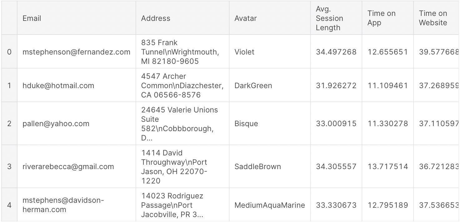
%matplotlib inlineStep 2: Study the Data
Here we will work on the E-commerce Customers dataset (CSV file). It has Customer information, such as Email, Address, and color Avatar. Then it also has numerical value columns:
- Average Session Length: Average session of in-store style advice sessions.
- Time on App: Average time spent by the customer on App in minutes
- Time on Website: Average time spent by the customer on Website in minutes
- Length of Membership: From how many years the customer has been a member.
Also Read: 24 Ultimate Machine Learning Projects to Boost Your Knowledge and Skills (& Can be Accessed Freely)
Step 3: Read and Load the Dataset
In this step, we will read and load the dataset using some basic function of pandas such as
- For Load the CSV file: pd.read_csv( )
- To print some initial rows of the dataset: df.head( )
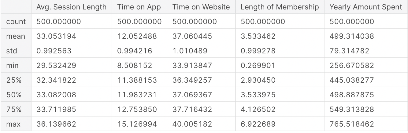
- Statistical Details for Numerical Columns: df.describe( )
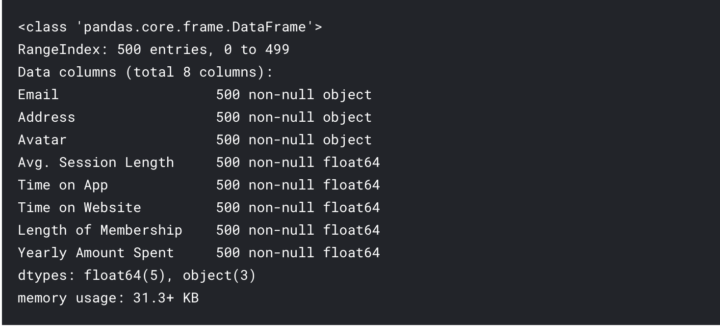
- Basic Information About the dataset: df.info ( )
Load the Dataset
df = pd.read_csv('Ecommerce Customers.csv')Print Some Initial Rows of the Dataset
df.head()Output:
Statistical Details for Numerical Columns
df.describe()
Output:
Basic Information About the Dataset
df.info()Output:
Step 4: Exploratory Data Analysis(EDA)
In this step, we will explore the data and try to find some insights by visualizing the data properly, by using the Seaborn library functions such as
Joint plot:
- Time on Website vs Yearly Amount Spent
- Time on App vs Yearly Amount Spent
- Time on App vs Length of membership
Pair plot: for the complete dataset
Implot: Length of Membership vs Yearly Amount Spent
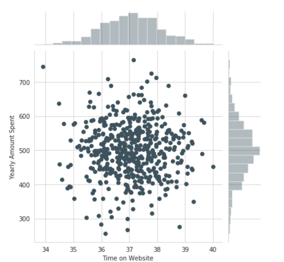
Use seaborn to create a joint plot to compare the Time on Website and Yearly Amount Spent columns.
sns.jointplot(x='Time on Website',y='Yearly Amount Spent',data=df)Output:
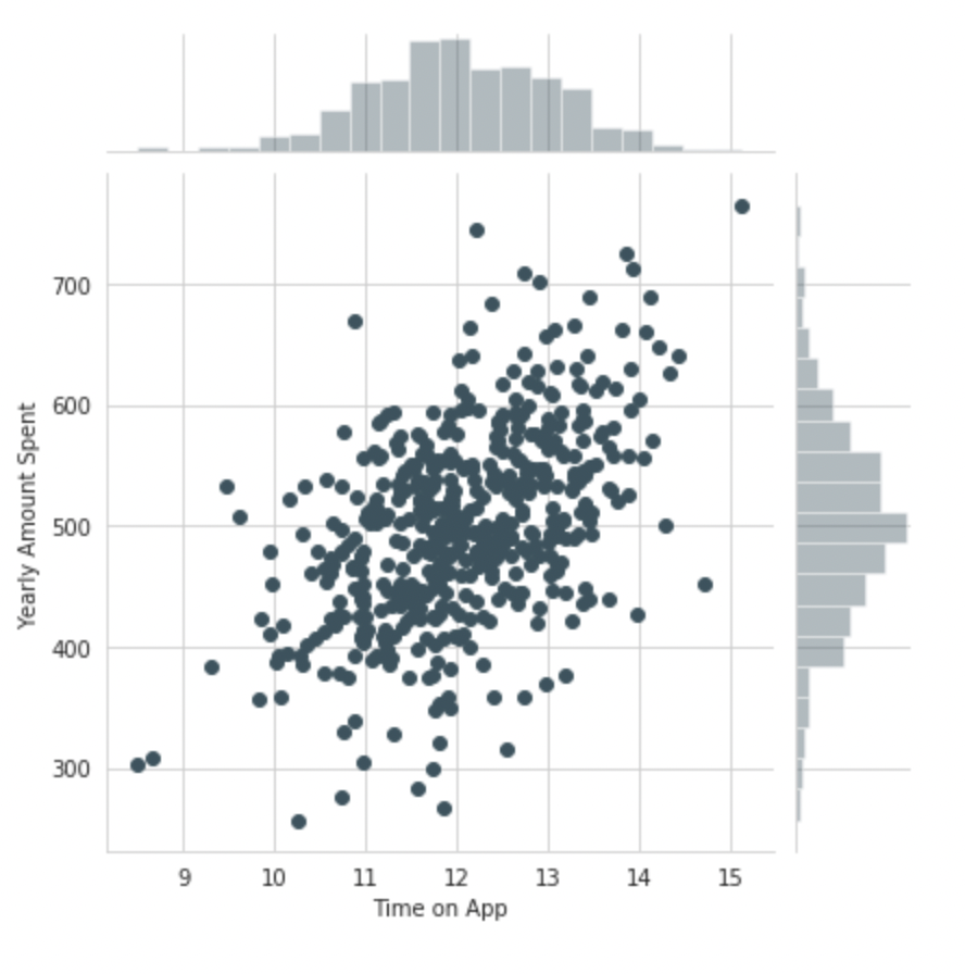
Do the same but with the Time on App column instead
sns.jointplot(x='Time on App',y='Yearly Amount Spent',data=df)
Output:
Use joint plot to create a 2D hex bin plot comparing Time on App and Length of Membership
sns.jointplot(x='Time on App',y='Length of Membership',kind="hex",data=df)Output:

Let’s explore these types of relationships across the entire data set. Use Pair plot to recreate the plot below:
sns.pairplot(df)Based on this plot what looks to be the most correlated feature with the Yearly Amount Spent?
Length of MembershipCreate a linear model plot (using seaborn’s lmplot) of Yearly Amount Spent vs. Length of Membership
sns.lmplot(x='Length of Membership',y='Yearly Amount Spent',data=df)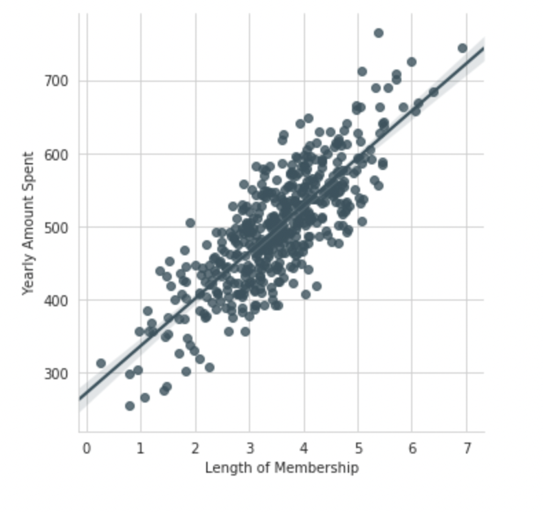
Step 5: Splitting of Data into Training and Testing Data
Now that we have explored the data a bit, it’s time to go ahead and split our initial data into training and testing subsets. Here we set a variable X i.e, independent columns as the numerical features of the customers, and a variable y i.e, dependent column as the “Yearly Amount Spent” column.
Separate Dependent and Independent Variable
X = customers[['Avg. Session Length', 'Time on App', 'Time on Website', 'Length of Membership']]
y = customers['Yearly Amount Spent']
Use model_selection.train_test_split from sklearn to split the data into training and testing sets
Set test_size=0.20 and random_state=105
from sklearn.model_selection import train_test_split
X_train, X_test, y_train, y_test = train_test_split(X, y, test_size=0.20, random_state=105)
Step 6: Training the Model using Linear Regression
Now, at this step we are able to train our model on our training data using Linear Regression.
Import LinearRegression from sklearn.linear_model
from sklearn.linear_model import LinearRegressionCreate an instance of a LinearRegression() model named lm.
lr_model = LinearRegression()Train/fit lm on the training data
lr_model.fit(X_train,y_train)Output:
LinearRegression(copy_X=True, fit_intercept=True, n_jobs=None, normalize=False)Print out the coefficients of the model
lr_model.coef_Output:
array([25.98154972, 38.59015875, 0.19040528, 61.27909654])Step 7: Predictions on Test Data
Now that we have train our model, let’s evaluate its performance by doing the predictions on the unseen data.
Use lr_model.predict() to predict off the X_test set of the data
predictions = lr_model.predict(X_test)Create a scatterplot of the real test values versus the predicted values
plt.scatter(y_test,predictions)
plt.xlabel('Y Test')
plt.ylabel('Predicted Y')Output:

Step 8: Evaluating the Model
To evaluate our model performance, we will be calculating the residual sum of squares and the explained variance score (R2).
Determine the metrics such as Mean Absolute Error, Mean Squared Error, and the Root Mean Squared Error.
from sklearn import metrics
print('MAE :'," ", metrics.mean_absolute_error(y_test,predictions))
print('MSE :'," ", metrics.mean_squared_error(y_test,predictions))
print('RMAE :'," ", np.sqrt(metrics.mean_squared_error(y_test,predictions)))
Output:
MAE :   7.2281486534308295
MSE :   79.8130516509743
RMAE :   8.933815066978626
Step 9: Explore the Residuals
By observed the metrics calculated in the above steps, we should have a very good model with a good fit. Now, let’s quickly explore the residuals to make sure that everything was okay with our dataset and finalize our model.
To see the above thing, try to plot a histogram of the residuals and make sure it looks normally distributed.
Use seaborn distplot, or just plt.hist()
sns.distplot(y_test - predictions,bins=50)Output:

Step 10: Model Evaluation
Now, it’s time to conclude our model i.e, let’s see the interpretation of all the coefficients of the model to get a better idea.
Recreate the dataframe below
coeffecients = pd.DataFrame(lm.coef_,X.columns)
coeffecients.columns = ['Coeffecient']
coeffecients
Output:

How can you interpret these coefficients?
- Keeping all other features constant, a one-unit increase in Avg. Session Length is associated with an increase of 25.98 total dollars spent.
- By Keeping all other features constant, a one-unit increase in Time on App is associated with an increase of 38.59 total dollars spent.
- Keeping all other features constant, a one-unit increase in Time on the Website is associated with an increase of 0.19 total dollars spent.
- Also, Keeping all other features constant, a one-unit increase in Length of Membership is associated with an increase of 61.27 total dollars spent.
Conclusion
Mastering the end-to-end machine learning project pipeline in data science is a transformative skill. It empowers you to navigate the intricate journey from data preprocessing to model deployment confidently and clearly. As you’ve delved into the details of this article, you’ve taken a significant step toward becoming a proficient data scientist.
But remember, learning is an ongoing process. If you want to solidify your expertise and embark on a transformative learning journey, our Blackbelt Program awaits. With over 50 meticulously designed data science projects, it offers a hands-on experience that propels your skills to new heights. Each project is a stepping stone towards becoming a true data science blackbelt. So, don’t miss out on the opportunity to elevate your career and join the ranks of skilled practitioners in the data science landscape. Enroll in our Blackbelt Program today and embark on a journey that will shape your future.
Frequently Asked Questions
Q1. What is an end-to-end machine learning project?
A. An end-to-end machine learning project covers the entire lifecycle, from data collection and preprocessing to model training, evaluation, deployment, and monitoring, resulting in a functional solution.
Q2. How do you make an end-to-end ML project?
A. To create an end-to-end ML project, follow steps like defining objectives, gathering data, preprocessing, selecting models, training, evaluating, optimizing, and finally deploying the model into production.
Q3. What is an end-to-end data science project?
A. An end-to-end data science project encompasses the entire process, from data acquisition, cleaning, and analysis to building models, interpreting results, and delivering actionable insights to stakeholders.
Q4. What is an end-to-end pipeline in ML?
A. An end-to-end pipeline in ML refers to a complete workflow that integrates various stages of a project, from data ingestion and preprocessing to model training, evaluation, and deployment, ensuring a seamless process.
Currently, I am pursuing my Bachelor of Technology (B.Tech) in Electronics and Communication Engineering from Guru Jambheshwar University(GJU), Hisar. I am very enthusiastic about Statistics, Machine Learning and Deep Learning.


Hello #Ashi Goyal this is shadab ahmad here. Love to read your end to end content.. Want to ask that i do some of the project in my jupyter notebook.... So will it be okk to showcase those projects to my resume...... Actually I am not sure about the modular cosing and all..... So will it be okk to shoe those???
Hi Aashi, where do i obtain the csv dataset for this project? Can you please provide the link to download? TQ
Hi Aashi, where do i obtain the csv dataset for this project? Can you please provide the link to download? Thank you :)