This article was published as a part of the Data Science Blogathon
Introduction
Exploratory data analysis is an approach to analyzing data sets to summarize their main characteristics, often using statistical graphics and other data visualization methods.
The main purpose of EDA is to help look at data before making any assumptions. It can help identify obvious errors and better understand patterns within the data, detect outliers or anomalous events, and find interesting relations among the variables.
To understand the flow of EDA, I will be using the NYC Taxi Trip Duration Dataset. This dataset and problem statement is taken from the Applied Machine Learning course by Analytics Vidhya.
Objective:

A typical cab company needs to seamlessly assign a cab to the passenger to have a smooth service. But the major challenge in it is to predict the duration of each trip so that can assign know the availability of that cab to the next ride. This dataset contains different attributes of the trips. Based on individual trip attributes, should predict the duration of each trip in the test set. So the target variable is Trip Duration.
Let us start with the data analysis. Throughout the article, I will be using python.
Importing required libraries:
First, we will import all the necessary libraries needed for analysis and visualization.
import pandas as pd       # data processing
import numpy as np        # Linear algebra
import matplotlib.pyplot as plt    # data visualisation
import seaborn as sns              # data visualisation
from shapely.geometry import Polygon, Point    # geospatial data analysis
import warnings
warnings.filterwarnings(action='ignore')
plt.style.use('fivethirtyeight')
Importing the dataset:
Now we can load the dataset into the pandas Dataframe data.
data = pd.read_csv('nyc_taxi_trip_duration.csv')
We have imported our dataset into a pandas dataframe data.
First look at the data:
Now we will look at the basic aspects of the dataframe which will give the overview of the data: first and last 5 rows of dataframe, shape, columns, info of the data.
data.shape
(729322, 11)
This shows the number of rows(rides) and columns. So there are 729322 rows and 11 columns. There are 10 features and 1 target variable which is trip_duration.
data.info()
<class 'pandas.core.frame.DataFrame'>
RangeIndex: 729322 entries, 0 to 729321
Data columns (total 11 columns):
 #   Column              Non-Null Count   Dtype
---  ------              --------------   -----
 0   id                  729322 non-null  object
 1   vendor_id           729322 non-null  int64
 2   pickup_datetime     729322 non-null  object
 3   dropoff_datetime    729322 non-null  object
 4   passenger_count     729322 non-null  int64
 5   pickup_longitude    729322 non-null  float64
 6   pickup_latitude     729322 non-null  float64
 7   dropoff_longitude   729322 non-null  float64
 8   dropoff_latitude    729322 non-null  float64
 9   store_and_fwd_flag  729322 non-null  object
 10  trip_duration       729322 non-null  int64
dtypes: float64(4), int64(3), object(4)
memory usage: 61.2+ MB
From the above can confirm there are no missing values. Also, Columns like store_and_fwd_flag should be converted to categorical values and pickup, dropoff datetime variables should be in datetime format instead of object data type which gives the advantage of extracting information from that.
data.columns
Index(['id', 'vendor_id', 'pickup_datetime', 'dropoff_datetime',
       'passenger_count', 'pickup_longitude', 'pickup_latitude',
       'dropoff_longitude', 'dropoff_latitude', 'store_and_fwd_flag',
       'trip_duration'],
      dtype='object')
Above are the columns which describe the attributes of each ride. Now let’s see what each column mean.
- id – a unique identifier for each trip.
- vendor_id – a code indicating the provider associated with the trip record.
- pickup_datetime – date and time when the meter was engaged.
- dropoff_datetime – date and time when the meter was disengaged.
- passenger_count – the number of passengers in the vehicle (driver entered value)
- pickup_longitude – the longitude where the meter was engaged.
- pickup_latitude – the latitude where the meter was engaged.
- dropoff_longitude – the longitude where the meter was disengaged.
- dropoff_latitude – the latitude where the meter was disengaged.
- store_and_fwd_flag – This flag indicates whether the trip record was held in vehicle memory before. sending to the vendor because the vehicle did not have a connection to the server (Y=store and forward; N=not a store and forward trip)
- trip_duration – duration of the trip in seconds.
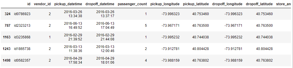
Now let us look at the first and last 5 rows of the data set
data.head()
This gives a glimpse of the dataset.
Before analyzing further, let us convert the necessary column to their respective types.
data['pickup_datetime'] = pd.to_datetime(data.pickup_datetime)
data['dropoff_datetime'] = pd.to_datetime(data.dropoff_datetime)
data['vendor_id'] = data['vendor_id'].astype('category')
data['store_and_fwd_flag'] = data['store_and_fwd_flag'].astype('category')
Now if we check the dtypes attribute, can see datetime64[ns] as the datatype of pickup and dropoff datetime.
Describing the data
Let us look at the statistical summary of the numerical columns.
| passenger_count | pickup_longitude | pickup_latitude | dropoff_longitude | dropoff_latitude | trip_duration | |
|---|---|---|---|---|---|---|
| count | 729322.000000 | 729322.000000 | 729322.000000 | 729322.000000 | 729322.000000 | 7.293220e+05 |
| mean | 1.662055 | -73.973513 | 40.750919 | -73.973422 | 40.751775 | 9.522291e+02 |
| std | 1.312446 | 0.069754 | 0.033594 | 0.069588 | 0.036037 | 3.864626e+03 |
| min | 0.000000 | -121.933342 | 34.712234 | -121.933304 | 32.181141 | 1.000000e+00 |
| 25% | 1.000000 | -73.991859 | 40.737335 | -73.991318 | 40.735931 | 3.970000e+02 |
| 50% | 1.000000 | -73.981758 | 40.754070 | -73.979759 | 40.754509 | 6.630000e+02 |
| 75% | 2.000000 | -73.967361 | 40.768314 | -73.963036 | 40.769741 | 1.075000e+03 |
| max | 9.000000 | -65.897385 | 51.881084 | -65.897385 | 43.921028 | 1.939736e+06 |
From the above table, can summarise the data as
- vendor_id – vendor_id is a categorical variable with only 2 values (0 and 1).
- passenger_count – Its range is from 0 to 9. The minimum value looks fishy. It can be an outlier and need to handle it.
- pickup_longitude and dropoff_longitude – City’s border limit is between
-74.03 and -73.75. - pickup_latitude and dropoff_latitude – City’s border limit is between
40.63 and 40.85. So need to handle it too. - trip_duration – Minimum trip duration is 1
second, those trips are going nowhere and the maximum is 1939736 seconds.
That’s a total of 538.8 hours. Nobody travels that long in a taxi that too within New York. So need to remove those outliers.
Feature Creation
Before proceeding further, can create some useful features with the existing variables for gaining insights on the data.
Previously we have converted the pickup and dropoff datetime column to datetime datatype to extract additional info. Now can leverage that to get more insights.
data.loc[:, 'hour'] = data['pickup_datetime'].dt.hour
data.loc[:, 'day_of_week'] = data['pickup_datetime'].dt.dayofweek
data['day_type'] = 'weekends'
data['day_type'][data['pickup_datetime'].dt.day_of_week<5] = 'weekdays'
data['day_type'] = data['day_type'].astype('category')
data['day_of_week'] = data['day_of_week'].astype('category')
From the datetime columns, we have extracted the hour of pickup, day of the week(which returns numbers from 0 to 6 where 0 is Monday and 6 is Sunday), day type(weekday or weekend).
Let’s convert the day_type and day_of_week to category.
Next can split the rides based on each part of the day. For this, I have created 4 time ranges for 4 parts.
|
|
|
|
|
|
|
|
hour_bins = [0, 6, 12, 16, 23, 24]
labels = ['Night', 'Morning', 'Afternoon', 'Evening', 'Night']
data['Session'] = pd.cut(data.hour,bins=hour_bins, right=False, labels=labels, ordered=False)
Now have created a new column Session for each ride.
Still, we didn’t use the latitude and longitude to derive any useful insights. One of the basic pieces of information which we can get from the coordinates is the distance between them.
There are many ways to calculate the distance like Haversine, Manhattan, etc. But the Manhattan distance doesn’t give the exact distance. Also, note that Haversine doesn’t give the exact distance between the places but provides the distance between 2 points in the surface of the sphere.
def haversine(lat1, lng1, lat2, lng2):
    """function to calculate haversine distance between two co-ordinates"""
    lat1, lng1, lat2, lng2 = map(np.radians, (lat1, lng1, lat2, lng2))
    AVG_EARTH_RADIUS = 6371  # in km
    lat = lat2 - lat1
    lng = lng2 - lng1
    d = np.sin(lat * 0.5) ** 2 + np.cos(lat1) * np.cos(lat2) * np.sin(lng * 0.5) ** 2
    h = 2 * AVG_EARTH_RADIUS * np.arcsin(np.sqrt(d))
    return(h)
data.loc[:, 'distance'] = haversine(data['pickup_latitude'], data['pickup_longitude'], data['dropoff_latitude'], data['dropoff_longitude'])
I have taken the above code from here
Thus, we successfully created some new features which we will analyze in univariate and bivariate analysis.
Analyzing the variables – Univariate analysis:
Numerical variables:
Trip duration:
It will be better to have durations in terms of minutes rather than in seconds since it gives a better interpretation
data['trip_duration(min)'] = data['trip_duration']/60.0
data['trip_duration(min)'].describe()
count    729322.000000
mean         15.870486
std          64.410437
min           0.016667
25%           6.616667
50%          11.050000
75%          17.916667
max       32328.933333
Name: trip_duration(min), dtype: float64
From above can see that till the 3rd quartile durations are in the acceptable range.
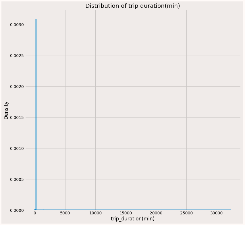
On visualizing the plot on the standard scale, we don’t clearly see the less dense trips, and also our trip_duration is right-skewed, so can apply log transformation and check if the distribution is normal.
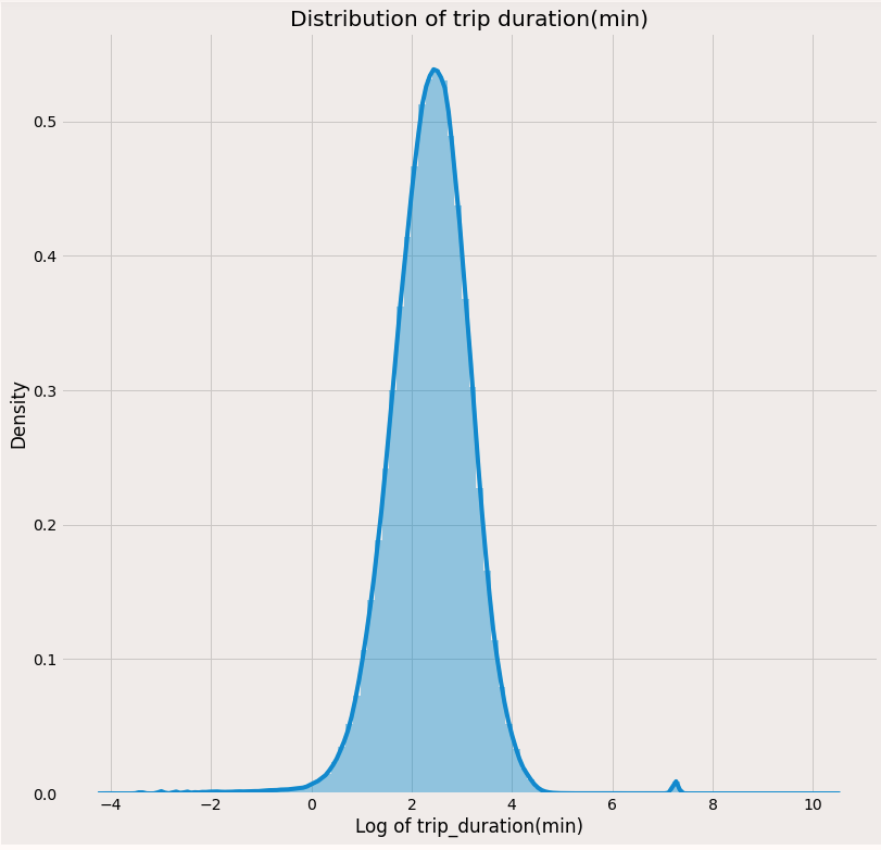
After applying log transformation, can see the plot is an almost normal curve with a small bump at the right side which is a very large duration like 32538 mins.
Latitudes and Longitudes
As seen earlier, there are some outliers with pickup and dropoff longitudes and latitudes i.e some coordinates are outside the New York border. Let’s remove them before analyzing.
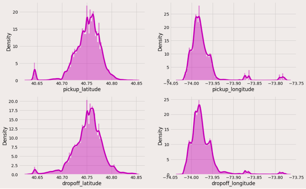
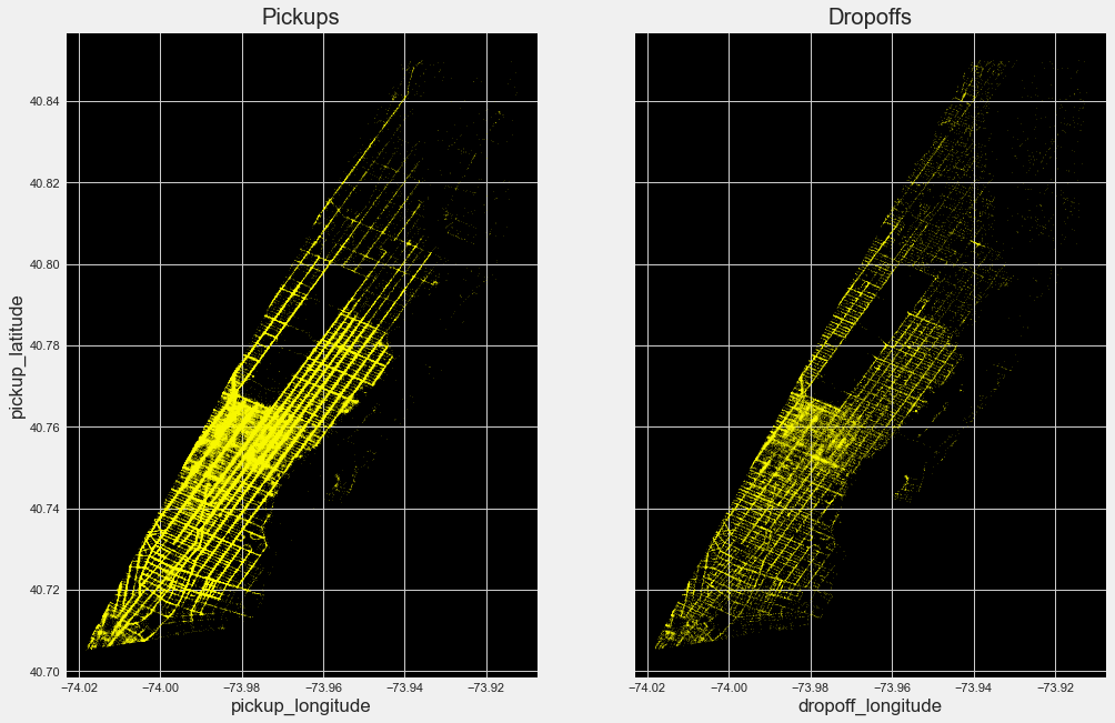
Now we can see that most of the trips are getting concentrated between these lat-long only. Let’s plot them in an empty image and check what kind of city map we are getting.
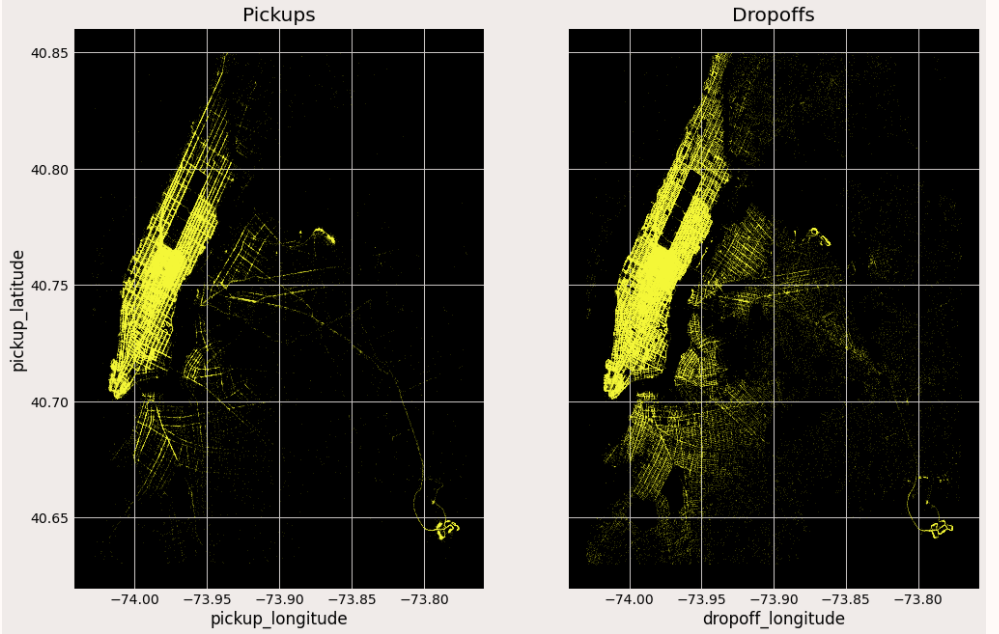
By plotting the pickup and dropoff coordinates can see the map of New York. It is evident from the above plot that
- Most of the journeys start and end at more bright Manhattan.
- Drop off are comparatively spread across all over the city. Might be people taking cabs to their homes.
- Both the airports seem to have more pickup and dropoff rides.
Categorical features:
Vendor id:
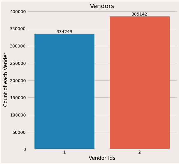
Only 2 vendors are there and out of them, vendor 2 gets more rides.
Store and forward flag:
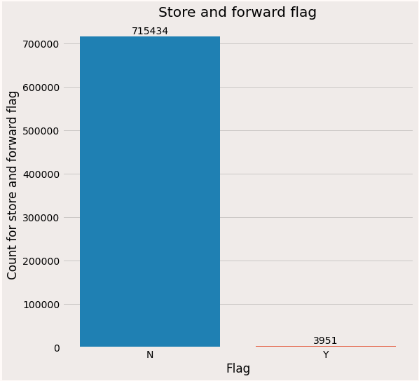
Almost all the rides are forwarded immediately to the vendors and only a few rides are stored and sent to vendors which can be due to bad weather.
Passenger count:
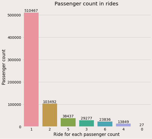
From the above plot can infer that
- Most rides are single travel.
- 27 trips are without any passengers which should be an outlier.
Datetime features:
Day_type:
Now let’s analyze the total rides on weekdays and weekends.
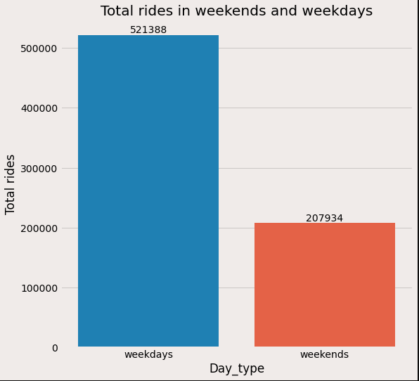
As expected number of rides on weekdays is more than on weekends which can be due to the working population.
Day_of_week:
Now let’s visualize the distribution of rides on each day.
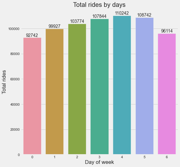
From the above plot, can confirm that Fridays are the busiest days.
Hour of the day:
Now let’s see the distribution for each hour of the day.
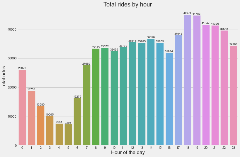
From the above plot, can infer that,
- Rides are more from 8 am to 11 pm.
- Maximum rides are at 6 pm and 7 pm which can be due to most returning home.
- The number of rides are minimum at midnight
Part of the day:
Let’s now see which part of the day is busiest.
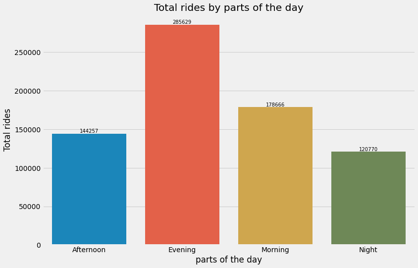
From the above plot can confirm that evening is the busiest.
Analyzing the variables – Multivariate analysis
Trip duration vs trip distance:
Since there are more outliers in Trip duration, visualizing it directly doesn’t give the whole picture of the relationship.
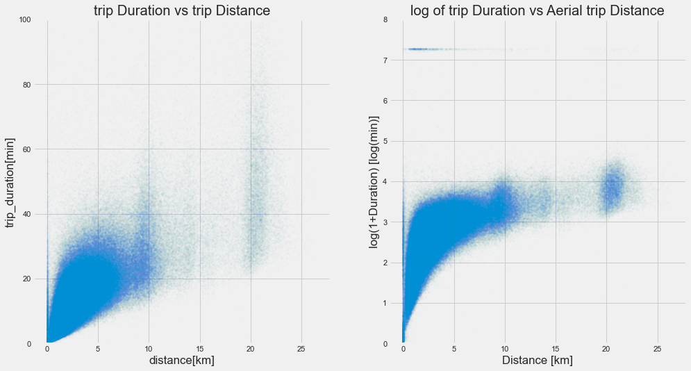
From the plot on the left side, can infer that as the distance increases, the duration of the trip also increases. We can see this relation after restricting the ylimit to 100.
Also, our trip is right-skewed distribution, so on checking with log-transformed values, able to visualise the whole picture of the relationship from the right side plot.
But we have some 0 distance trips with high trip duration. Let’s analyse some of those rides now.
By looking at the ride details, can see that for all the 0 distance ride, dropoff time is more than pickup time. It can be due to 3 reasons.
- Dropoff time is not recorded correctly.
- Taxi might have stuck in the traffic jam and the customer would have canceled the
ride. - Manual error.
- GPS equipment would have stopped recording.
Vendor based trips to and from the airport:
Since the airport is one of the important places in the city, will analyze the rides to and from it. First will filter all the rides to and from both the airports based on their coordinates.
LaGuardia = {"maxLat": 40.76716, "minLong": -73.88695, "minLat": 40.764045, "maxLong": -73.86129}
JFK = {"minLat": 40.64477, "minLong": -73.79408, "maxLat": 40.64961, "maxLong": -73.78576}
# Filtering trips picked and dropped near the La Guardia airport
LAG_data1 = data[((data['pickup_longitude']>=LaGuardia['minLong']) & (data['pickup_longitude']<=LaGuardia['maxLong'])) & ((data['pickup_latitude']>=LaGuardia['minLat']) & (data['pickup_latitude']<=LaGuardia['maxLat']))]
LAG_data2 = data[((data['dropoff_longitude']>=LaGuardia['minLong']) & (data['dropoff_longitude']<=LaGuardia['maxLong']))&((data['dropoff_latitude']>=LaGuardia['minLat']) & (data['dropoff_latitude']<=LaGuardia['maxLat']))]
LAG_data = LAG_data1.merge(LAG_data2, how='outer')
# Filtering trips picked and dropped near the JF Kennedy airport
JFK_data1 = data[((data['pickup_longitude']>=JFK['minLong']) & (data['pickup_longitude']<=JFK['maxLong'])) & ((data['pickup_latitude']>=JFK['minLat']) & (data['pickup_latitude']<=JFK['maxLat']))]
JFK_data2 = data[((data['dropoff_longitude']>=JFK['minLong']) & (data['dropoff_longitude']<=JFK['maxLong']))&((data['dropoff_latitude']>=JFK['minLat']) & (data['dropoff_latitude']<=JFK['maxLat']))]
JFK_data = JFK_data1.merge(JFK_data2, how='outer')
print(f"Totally {LAG_data.shape[0]} and {JFK_data.shape[0]} rides are picked and dropped from La Guardia airport adn JF Kennedy airport")
In the above code, we have filtered rides to and from airports separately in the dataframes LAG_data, JFK_data.
Now can see the hourly ride density taken to and from both the airports based on vendor.
Hourly trip distribution to and from the airport:
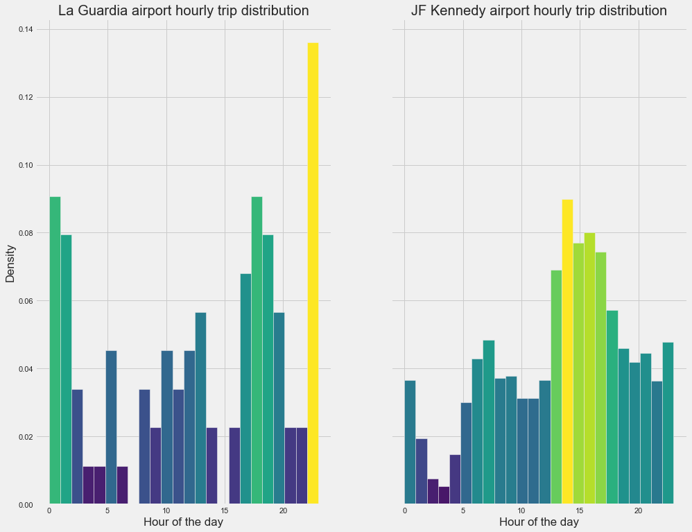
Yellow and light green shades show the high density of rides on an hourly basis. In La Guardia airport, can see from 5 pm to 2 am more rides are taken. In JF Kennedy airport, from 1 pm to 7 pm more rides are taken.
Trips to and from Manhattan
Manhattan has the most number of rides which can be visualised from the heatmap shown above. Now will filter the trips started and ended from manhattan and analyse them.
def within_manhattan(row, polygon):
    if Polygon(polygon).contains(Point(row["pickup_latitude"], row["pickup_longitude"])):
        return 'picked'
    elif Polygon(polygon).contains(Point(row["dropoff_latitude"], row["dropoff_longitude"])):
        return 'dropped'
    return 'NA'
#filtering trips started and ended within Manhattan
polygon = [(40.876939938199065, -73.92630288034404), (40.86913757064833, -73.90996543261298), (40.79345029326196, -73.91569787041335), (40.71137636877774, -73.97904130850333), (40.70529278904752, -74.01888175121593)]
data["within_manhattan"] = data.apply(lambda row: within_manhattan(row, polygon), axis = 1)
manhattan_trips = data[(data['within_manhattan']=='picked')|(data['within_manhattan']=='dropped')]
pickups = manhattan_trips[manhattan_trips['within_manhattan']=='picked']
dropoffs = manhattan_trips[manhattan_trips['within_manhattan']=='dropped']
Tuples inside the list polygon are the boundary coordinates of Manhattan. We have filtered all the rides started and ended there to the new dataframe manhattan_trips.
From the above plots can see that number of pickups is more than dropoffs in manhattan.
Hourly pickup and dropoff density in manhattan:
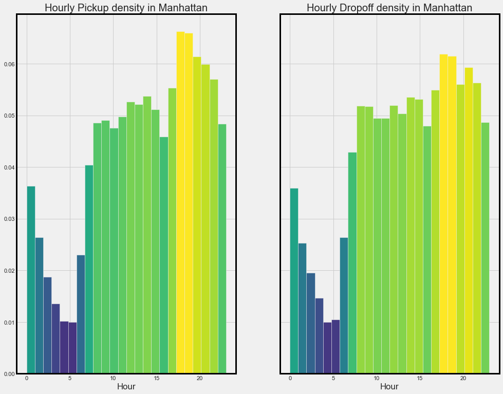
From the above plot can infer that pick and dropoff are more from 7 am to 11 pm. This is because Manhattan is a busy business center.
Trip duration vs Days based on vendors
Since there are some outliers, can visualize the trip duration column till the 95th percentile to get a better idea about the distribution.
Now let’s try to visualize the distribution of trip duration on each day of the week based on vendor.
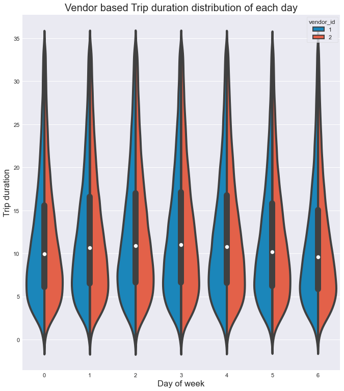
From the above figure can infer that,
- Both the vendors have almost similar duration distribution in each day.
- Also for each day, the most number of rides have 5 to 10 mins duration with each vendor.
- The mediantrip duration(white dot) is between 10 mins to 11 mins for each day.
- Based on the distribution, most of the rides are short duration and very few
rides are more than 25 mins on each day for both vendors
Vendor based hourly distribution of trips of each day
Let’s visualize the distribution of trips in each hour of the day.
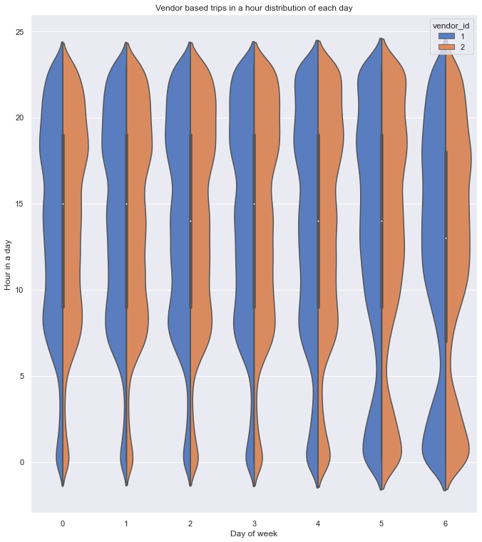
From the plot, can confirm that,
- Here also both the vendors have almost a similar distribution of rides.
- The number of rides started to increase after 5 am and attained a maximum at around 8 am on all weekdays
- On Saturday and Sunday can see the increase in rides early in the morning which can be due to the late-night parties.
- Also can see a steady increase in rides and attained maximum at around 11 on weekends i.e day has started slow for many due to late-night parties.
- On all the weekdays and Saturdays, maximum rides are from 6 pm to 10 pm.
- On Sunday, maximum rides are from 11 am to 7 pm.
Vendor based trip duration vs passenger_count
Let’s now look at the distribution of trip duration of rides with respective passenger count.
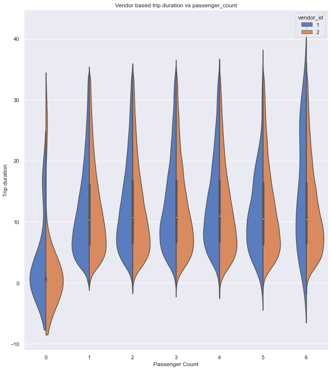
From the above plot, can infer that,
- Both vendors have almost similar distribution but vendor 2 has the larger trip duration(outliers) for 0
passenger count rides which can be due to error while recording the values. - Also for zero passenger count rides, the median trip duration is very small from which we can suspect that it can be canceled rides before cab picking up the customer.
- Both the vendors have zero trip duration rides and zero passenger count rides.
- For rides with 6 passengers, vendor 1 has an almost similar distribution for all trip duration but vendor 2 has a high density of rides for smaller trip durations.
Note:
Negative values in the plot are due to the way KDE works. It means our data is close to 0 and not negative. For more details see here and here.
Hourly trip durations for each day
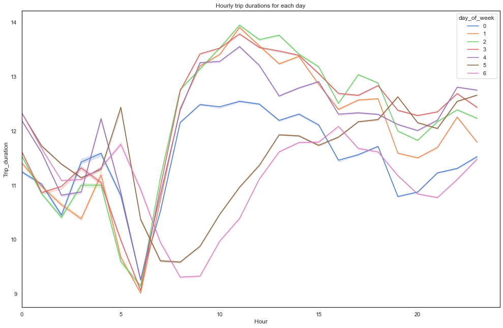
From the above plot, can infer that,
- Trip duration started to increase steeply after 6 am on weekdays and at weekends it started to raise
gradually after 9 am. - On weekdays, duration started to decrease at midnight but there is a peak during weekends which can be due to the late-night parties.
- Also, On weekdays after 10 am, the trip duration is almost the same for all days.
- On Friday and Saturday nights can see duration getting increased after 8 pm.
Weekend vs Weekday pick and drop locations
Now let’s try to visualize the pickup and dropoff location densities on weekdays vs weekends
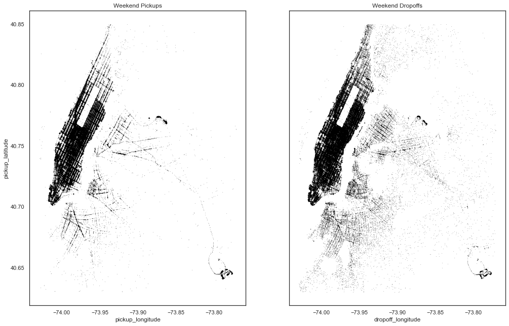
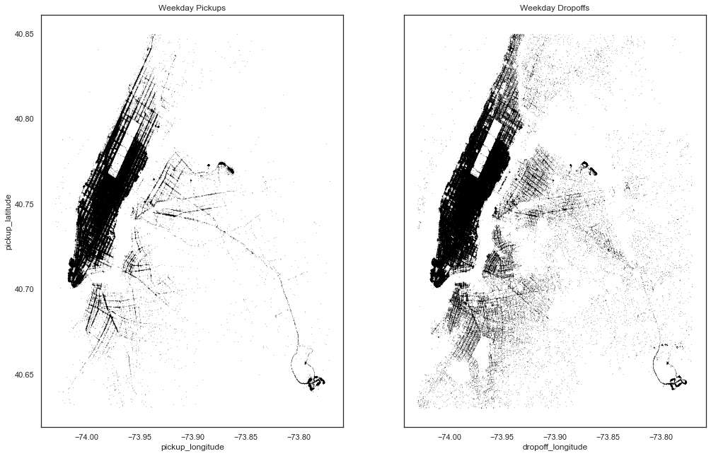
From the above plots, can see that
- Pickup and drop-off density is almost similar for both weekdays and weekends.
- Density during weekdays is more than weekends which can be due to office going
peoples. - Dropoffs are spread across the city which can be due to people returning to homes
Pickup and dropoff locations on different parts of the day:
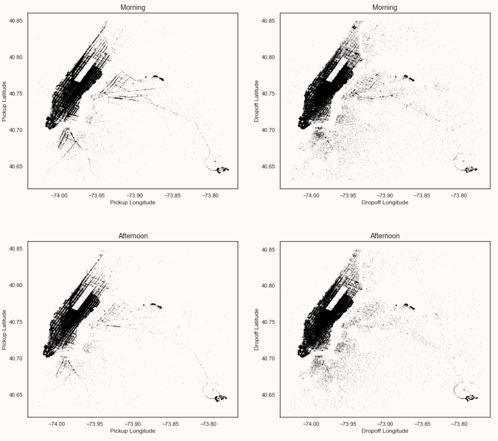
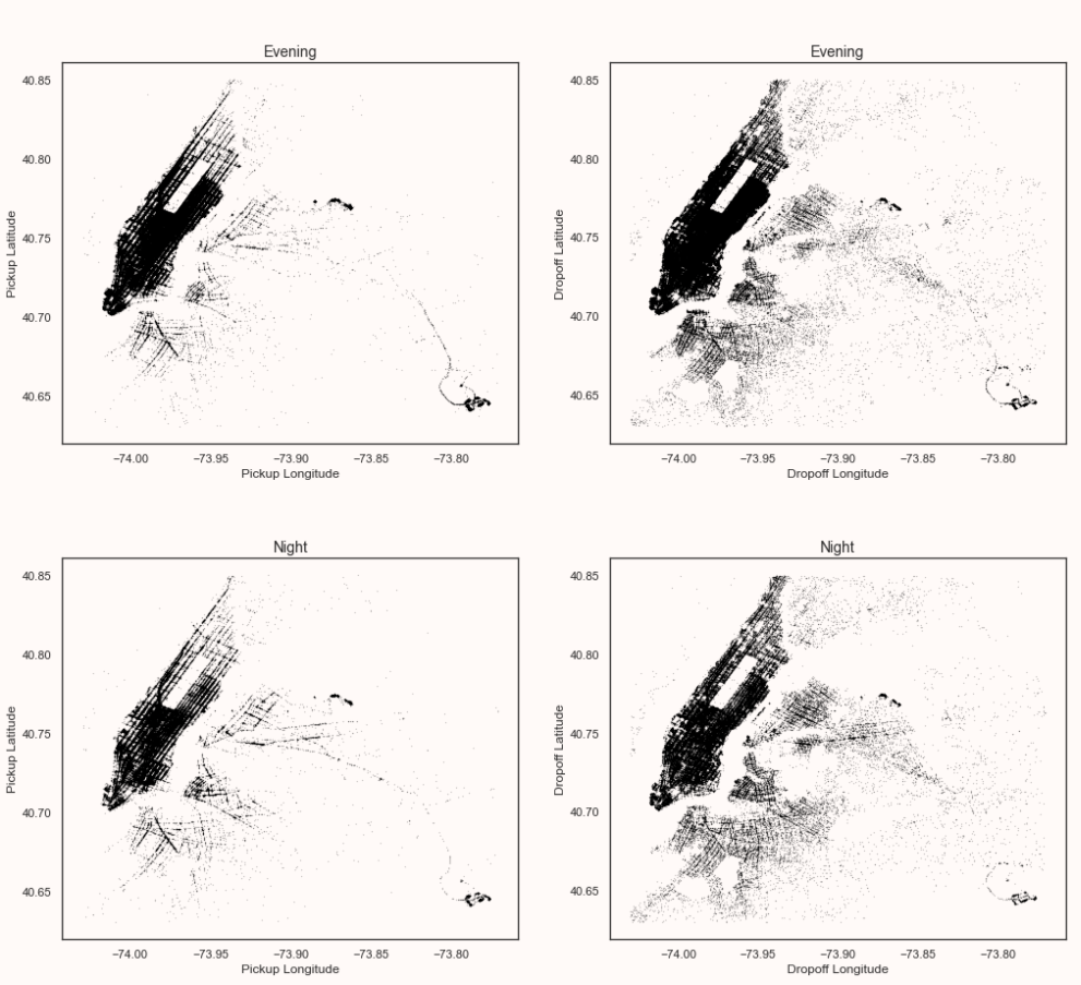
From the above plots, can confirm that
- Dropoff density is more in the Manhattan area in the daytime than at night.
- Pickup density is more in manhattan during the evening.
- The dropoff density is spread across the city more during evening and night time which can be due to people returning home.
- Pickup and dropoff look constant in both the airports in all the plots.
Conclusion
In this article, we understood the flow to perform data analysis starting from importing the necessary libraries, datasets, performing descriptive statistics, univariate and bivariate analysis. On doing these steps, the following are summary:
- Trips to and from Manhattan and airports are more in number.
- Trip duration varies from 0 to 538 hours.
- Most of the rides are with a single passenger.
- Further, Most of the rides are on weekdays and Friday has more trips.
- Most rides are taken in the evening time.
Full code can be found here
Thanks for reading if you reached here 🙂
Let’s connect on LinkedIn.
The media shown in this article on Sign Language Recognition are not owned by Analytics Vidhya and are used at the Author’s discretion.


Hello, Thanks for the sharing this blog, this is very helpful for me , if you want any help regarding Lifestyle Management then contact with Q-Concierge.