This article was published as a part of the Data Science Blogathon
Introduction
Many engineers have never worked in statistics or data science. However, many nuances and misunderstandings arise from the engineering side when building data science pipelines or rewriting produced code by data scientists to an adequate, easily maintained code. This post is for Data/ML engineers and new data scientists. I will try to explain some basic approaches in a simple manner and, from there, some fundamental Data Science concepts.
In their rush to impress those interested in business, data scientists often overlook the process of getting to know the data. It is a serious and, sadly, a repeated error that can lead to the following issues:
- lost insights and, as a result, unfavorable outcomes of the project.
- the development of inaccurate models as a result of unclear data structure, outliers in data, and skew in data;
- constructing accurate models from erroneous data;
- selecting the incorrect model attributes;
- inefficient utilization of resources.
Exploratory Data Analysis
The goal of exploratory data analysis is to become acquainted with the data: to understand the data structure, to check for missing values, to look for anomalies in the data, to form hypotheses about the population, to define and make clear the variable characteristics that help in machine learning, and so on.
You would be surprised (sarcasm), but machine learning is not always necessary, and a simple heuristic can easily outperform all models. You must also be familiar with the data to find that heuristic.
The data analysis is beneficial because it increases your confidence that future results will be reliable, correctly interpreted, and implemented in the desired business context.
The majority of EDA methods are graphical. The motto for the heavy reliance on graphics is that EDA’s primary role is in research, and visuals, associated with the natural pattern recognition capability that we all have, give analysts enormous power to understand the data.
There’s an infinite number of possible charts and graphs, but you only need a few of them to understand the data well enough to work with it.
Let us know about Billionaires!
We try to demonstrate EDA methods using the billionaires’ dataset. Isn’t it always fascinating to count other people’s money?
We use the following tools together with python:
- Jupyter Notebook, Numpy, Pandas, Matplotlib, Seaborn, Plotly.
Begin with the fundamentals.
Start by answering the following basic questions:
- The number of entries does we have on the dataset?
- Columns/features do we have?
-
What kinds of data do our features contain?
-
Is there a target variable?
-
Do all of the dataset’s columns make sense?
data = pd.read_csv("downloads/billionaires.csv")
data.head()
data.shape
data.shape
The intention of displaying data set examples is not to conduct a thorough analysis. Its purpose is to obtain a qualitative “sense” of the data we have.
Descriptive Statistics
The goal of descriptive statistics is to provide you with a generalized view of your data so that you can start querying and visualizing it in new ways.
The pandas function describe() is very useful for obtaining various summary statistics; it returns the amount, average, standard deviation, minimum and maximum values, and data quantiles.
data.describe().T
- There is a significant difference between the 75th percentile tile and the maximum wealth values.
- We can immediately see that we have data from 1996 to 2014, and 2014 is also the median, implying that we have a lot of data for 2014.
- The year of birth of a millionaire has some unusual values, such as -47 years.
At this point, you should begin making notes about potential fixes you want to make. If something appears to be out of place, such as the main deviation in one of your features, now is the time to ask the client/key stakeholder or dig a little deeper.
Now, we have a basic idea of data. Let’s look at the data by plotting it.
Quantitative Data Plot
Often, a simple histogram is all that is required to understand the data.
Let us begin with the most interesting question: how much money does anyone have.
plt.figure(figsize=(12,8))
sns.distplot(data['wealth.worth in billions'])
plt.xscale('log')
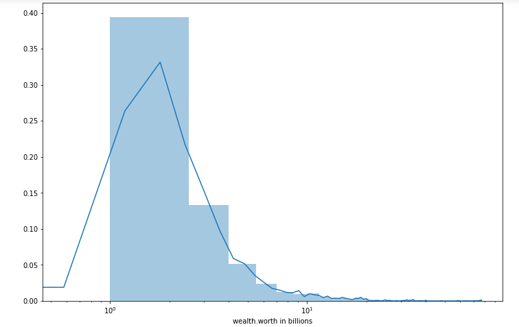
To at least show some distribution, I used a logarithmic scale. There are many more people who do not have a lot of money, but there is also a long tail of people who have a lot of money.
Next topic. What is the average age of our billionaires?
We recall that there are outliers in this column; let us clean them up so that we can see the correct picture.
data = data[data['demographics.age'] > 0]  # drop the records with incorrect age
plt.figure(figsize=(12,8))
sns.distplot(data['demographics.age'], bins=15)
plt.show()
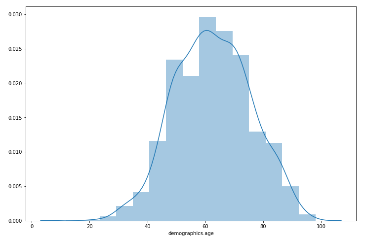
Image by Author
The distribution resembles that of a normal, with a slightly wider tail on the left.
Now perform the same with splitting by industry.
plt.figure(figsize=(15,10))
g = sns.FacetGrid(data=data, hue='wealth.how.industry', aspect=3, height=4)
g.map(sns.kdeplot, 'demographics.age', shade=True)
g.add_legend(title='wealth.how.industry')
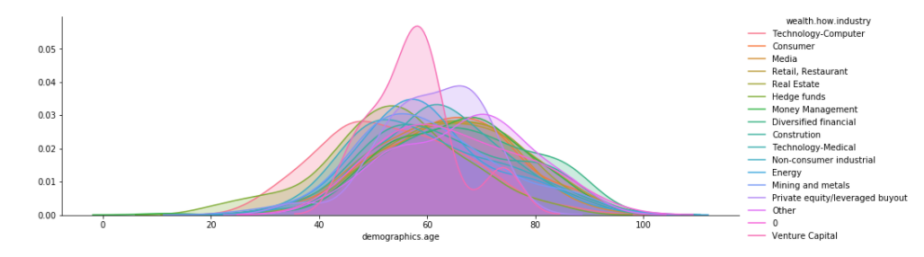
Image by Author
industries = ['Hedge funds', 'Consumer', 'Technology-Computer']
plt.figure(figsize=(15,10))
g = sns.FacetGrid(
    data=data[(data['wealth.how.industry'] != '0') & (data['wealth.how.industry'].isin(industries))],
    hue='wealth.how.industry',
    aspect=3,
    height=4)
g.map(sns.kdeplot, 'demographics.age', shade=True)
g.add_legend(title='wealth.how.industry')
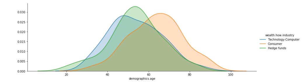
On the dataset, you can see the money going to the older part. Furthermore, we can say that the tech industry is more skewed toward the young, whereas the consumer industry skewed toward the elderly. There is also an industry where, for some reason, one can become wealthy before the age of 20.
Qualitative Data Plot
Histograms cannot depict categorical characteristics. You can also use bar plots instead.
Let’s address the topic: what industry do the wealthier billionaires work in?
city = data['wealth.how.industry'].value_counts(ascending=False)
data_city = data.filter(['wealth.how.industry'], axis=1)
data_city['count'] = 1
grouped_city = data_city.groupby('wealth.how.industry', as_index=False,sort=False).sum()
grouped_city.sort_index(ascending=False)
grouped_city = grouped_city.sort_values('count', ascending=False)
plt.figure(figsize=(14,8))
sns.barplot(data=grouped_city, x='count', y='wealth.how.industry')
plt.title('Industries of billioners', fontsize=17)
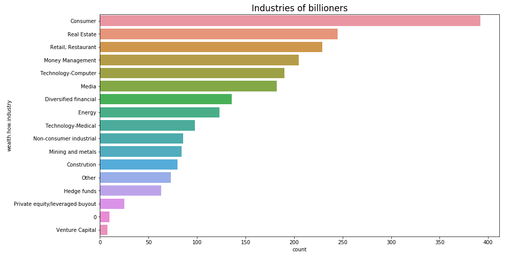
Image by Author
According to the plot at the top, industries represent the target consumers. Here it is tough to draw any conclusions as to why –but this insight can be shared with the company. Furthermore, there is some industry “0” — we can assume that these are people who either do not have industry or have joined other industry.
Who is more likely to be a man or a woman among the billionaires?
plt.figure(figsize=(7,5))
sns.countplot(data=data, x='demographics.gender')
plt.title('Gender', fontsize=17)
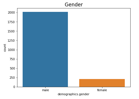
We can see that it’s mostly men.
Now we look at Billionaire countries.
column = 'location.citizenship'
fig  = go.Figure(data = [
    go.Pie(values = data[column].value_counts().values.tolist(),
           labels = data[column].value_counts().keys().tolist(),
           name = column,
           marker = dict(line = dict(width = 2, color = 'rgb(243,243,243)')),
           hole = .3)],layout=dict(title = dict(text="Billionaire countries")))
fig.update_traces(textposition='inside', textinfo='percent+label')
fig.show()
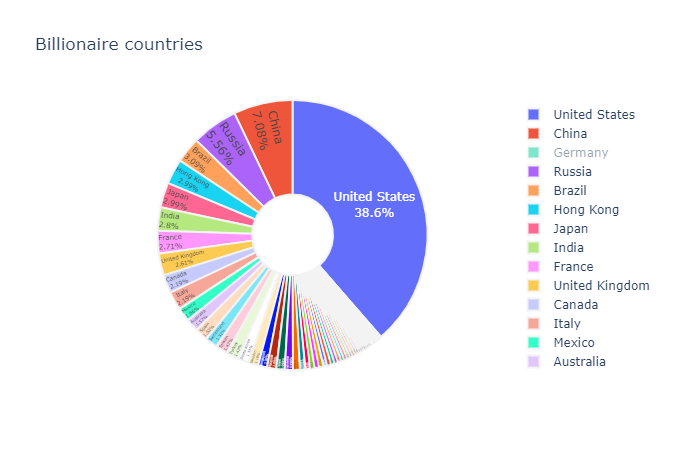
Image by Author
The United States is home to more than one-third of all billionaires.
As you can see, some industries, as well as gender, have a scarcity of data. These are uncommon classes. When it comes to building models, they are usually a source of contention. They can either result in class imbalance (depending on the target) and thus an overfit model.
Boxplots
The box plot (also known as the box and whisker diagram) is a standardized method of displaying data distribution based on the five-number summary:
- Minimum
- Maximum
- First quartile
- Median
- Third quartile
The information on the boxplot mentioned above could be almost as simple to evaluate if presented in a non-graphic format. A boxplot is useful because it allows you to see all of the above and much more at a glance.
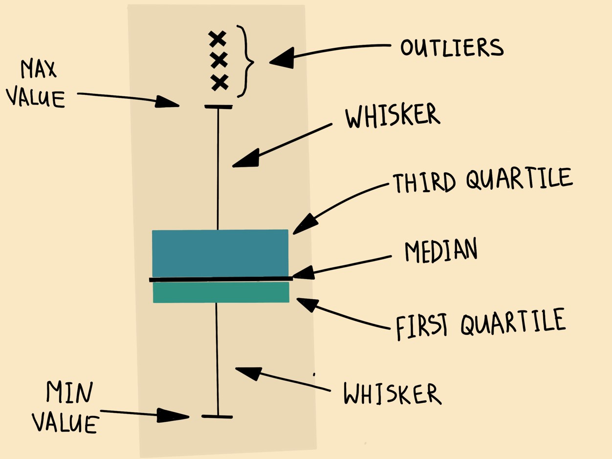
The symmetry of the distribution and possible signs of “fat tails” can be seen. You can estimate the symmetry by observing whether the median is in the center of the box and whether the whisker lengths are equal. The median pushed in the direction of the shorter whiskers in the skewed distribution. Box plots also aid in identifying outliers in data — data that stands out the most from the rest.
Let’s go over all of the quantitative data and create their box plots.
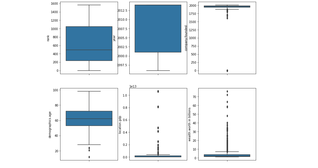
rank: – it visualizes the human rank of overall data.
year: -We can see the period over which the billionaires collected. You can see that year has been quite skewed to recent times, which seems logical — if you could earn the first billion a long while ago, you should probably stack more, and you’re unlikely to leave this list in the future.company.founded: Similarly, you can see that some values are likely to be missing. Handle it properly.
demographics.age: There are many outliers, such as people with zero or negative ages, which is incorrect. If such outliers removed, you may suspect that this variable distribution contains something close to normal. For this variable, we should create a distplot.
location.gdp: It is tough to say anything about this graph — it appears that the majority of billionaire countries are not very wealthy, but it is difficult to judge what this column means precisely.
wealth.worth in billions: A large number of outliers, however by quarters we can say that most have close to zero billion, as seen in the initial plots.
The central rectangle in the simplest box plot spans the first to third quartiles (the interquartile range or IQR). Outliers are typically 3×IQR below the third quartile or 3×IQR above the first quartile. However, the definition of an outlier will differ depending on the data set.
Although boxplots are very good at presenting information about central tendency, symmetry, and variance, they can mislead about aspects such as multimodality. One of the most effective uses of boxplot is in the form of a side-by-side boxplot (see multivariate graphical analysis below).
Correlation analysis
We have already discussed what correlation is and why it is important. Correlations, in short, allow you to examine the relationship between numerical characteristics and other numerical characteristics. To summarise, the correlation ranges from -1 to 1. A negative correlation means that as one feature improves, the other deteriorate; a positive correlation means that as one feature improves, the other improves. There is no relationship.
Correlation research is helpful when looking at data because it shows how the columns relate to one another.
Correlation heatmaps help in analyzing this data.
cols = ['rank', 'year', 'company.founded', 'demographics.age', 'location.gdp']
sns.set(font_scale = 1.25)
sns.heatmap(
    data[cols].corr(),
    annot = True,
    fmt = '.1f'
)
plt.show()
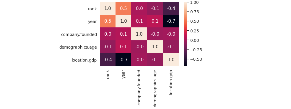
In general, keep an eye out for:
- Which characteristics are highly correlated with the target variable?
- Are there any interesting or surprising strong correlations between other features?
With my data, I don’t see any interesting insights.
Don’t be afraid to try new things
The simple visualizations described here cannot always describe and show all aspects of the data, nor can they always answer all questions. So, don’t be afraid to experiment with new ideas.
Conclusion
Once you have done with Exploratory Data Analysis, you will have a better understanding of data, notes of data cleaning, and a few ideas of feature engineering.
I hope you have found this article useful and have a great day.
The media shown in this article are not owned by Analytics Vidhya and are used at the Author’s discretion.
Embarking on a transformative odyssey through the realms of AI, ML, and NLP, I've woven a tapestry of experience over three dynamic years. Amidst the digital symphony, I now find myself enraptured by the artistry of Generative AI, sculpting the future of innovation. As I dance with colossal language models, each keystroke becomes a brushstroke, painting the canvas of possibility in this ever-evolving technological landscape.


