This article was published as a part of the Data Science Blogathon
https://unsplash.com/photos/oyXis2kALVg
https://unsplash.com/photos/oyXis2kALV
g
Introduction
Machine Learning is a hot topic nowadays. As technology is evolving data visualization fields has grown a lot, different types of visual and charts are there now.
Okay, let’s face the hard reality how do you interpret the data a data analyst is able to understand the data from the statistics but do you think a normal person can understand data just by looking.
Let me, answerer, that for you. The answer is NO we need a graph to visualize the data.
One of the common charts is Racing bar charts. As the animation plays an important role while presenting the charts. The best uses we have seen is in covid the racing bar charts will tell us the which country has the highest number of covid patients over the time period.
Table of Content
- Racing Bar charts with Plotly
- Racing Bar charts with raceplotly
- Normal Bar chart
- Stacked Bar chart
- Group Bar chart
- Customized Bar chart
“Visualization gives you answers to questions you didn’t know you had.” – Ben Schneiderman
Racing Bar chart
Bar charts are known as go-to the chart they are most popular charts due to their simplicity and people can easily interpret them.
Image Source: https://unsplash.com/photos/qWlkCwBnwOE
Let’s start the fun!
Importing library for visualizing and reading the dataset
import plotly.express as px
import pandas as pd
Data
df = px.data.gapminder()
df.head()
Data Description
The Data which we took have 8 columns and 1704 rows. There are 3 categorical columns (Country, Continent, iso_alpha), 5 numerical columns (year, lifeExp, pop, gdppercap, iso_num).
- Country: Country columns have names of different countries
- Continent: Continent columns has names of a different continent
- Year: Year columns have values from 1952 – 2007
- LifeExp: LifeExp column tells the life expectancy of a person
- Pop: Pop column tells the population
- gdpPercap: Gdp per capita
Data Cleaning
checking if any column has null values in them
df.isnull().sum()
How many unique values do every column contain
df.nunique()
Racing Bar Chart
Code:
fig_bar = px.histogram(df, x="continent", y="pop", color="continent",
                 animation_frame="year", animation_group="country",
                 range_y=[0,4000000000],
                 color_discrete_sequence=px.colors.qualitative.T10)
fig_bar.update_yaxes(showgrid=False),
fig_bar.update_xaxes(categoryorder='total descending')
fig_bar.update_traces(hovertemplate=None)
fig_bar.update_layout(margin=dict(t=70, b=0, l=70, r=40),
                        hovermode="x unified",
                        xaxis_tickangle=360,
                        xaxis_title=' ', yaxis_title=" ",
                        plot_bgcolor='#2d3035', paper_bgcolor='#2d3035',
                        title_font=dict(size=25, color='#a5a7ab', family="Lato, sans-serif"),
                        font=dict(color='#8a8d93'),
                        legend=dict(orientation="h", yanchor="bottom", y=1.02, xanchor="right", x=1)
                          )
fig_bar.show()
Interpret the chart:
Here we can see which continent has the highest population in the different years with the play and pause buttons. we can also use a slider and select the year and can see which continent has the highest population.
Necessary Parameters for Plotly animation chart:
- x, y: values for x-axis & y-axis
- animation_frame: values for each animation frame
- animation_group: values for grouping data – (if available)
- range_x, range_y: range of x-axis & y-axis
Note:
you should always fix the x_range and y_range to ensure that your data remains visible throughout the animation of the bar chart.
Parameters used here to enhance the charts
Setting the x-axis and y-axis
- We can set it in 2 ways one is
- Ascending order and another one is Descending order.
To specify the margin
- Here we can adjust the look of the graph by trying different values of margin
By default, legends will come on the right side but if you want them horizontal or vertical it’s up to you.
To enhance the graph you can add different colors to the bar and can also add background color as you like. How to use Plotly and what are the different advanced graphs other than the bar are explained here.
Another way of making a Racing Bar chart
Other than Plotly animation we can also make a racing chart with the help of raceplotly you can find the documentation here
Importing library for race bar plot
!pip install raceplotly
from raceplotly.plots import barplot
Code:
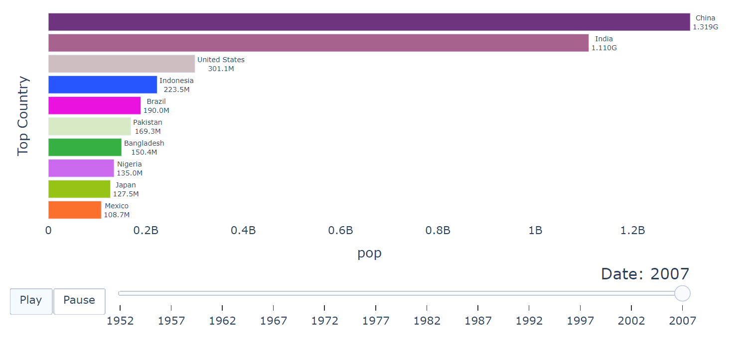
Here Racing bar chart is made without prior specifying colors.
my_raceplot = barplot(df,  item_column='country', value_column='pop', time_column='year')
my_raceplot.plot(item_label = 'Top Country', value_label = 'pop', frame_duration = 600)

parameters are explained below
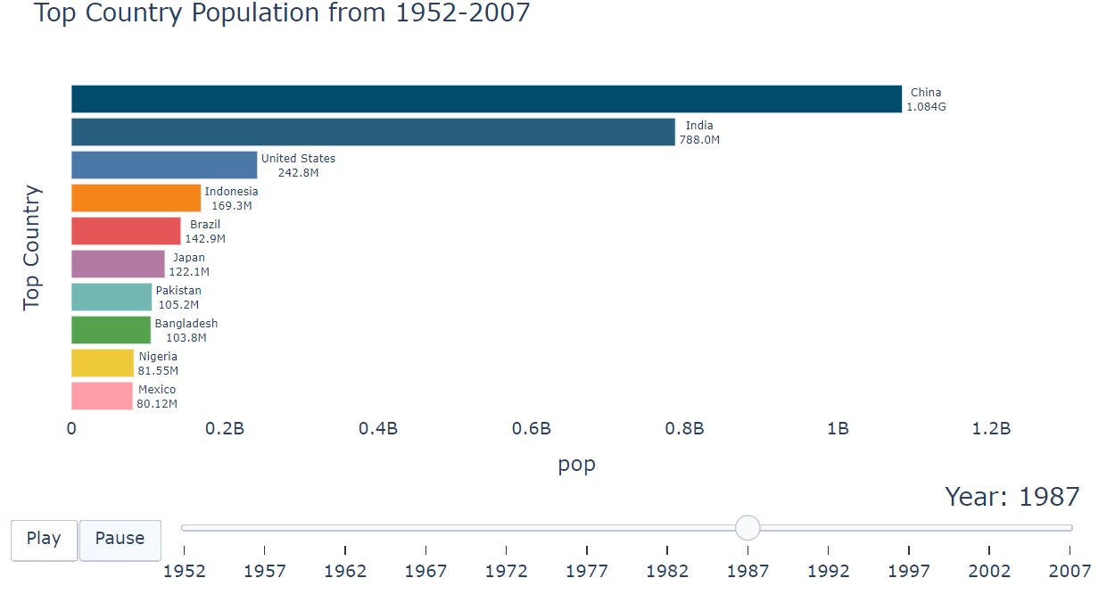
Here Racing bar chart is made by mapping different colors.
Code:
# Assigning colors to the categories.
colors = {'China': 'rgba(0, 76, 109, 1)',
          'India': 'rgba(40, 95, 127, 1)',
          'United States': '#4c78a8',
          'Indonesia': '#f58518',
          'Brazil': '#e45756',
          'Pakistan':'#72b7b2',
          'Bangladesh':'#54a24b',
          'Nigeria':'#eeca3b',
          'Japan': '#b279a2',
          'Mexico': '#ff9da6'
          }
# Mapping the items with the color for the whole dataset.
df['color'] = df['country'].map(colors)
my_raceplot = barplot(df,  item_column='country', value_column='pop', time_column='year', item_color='color')
my_raceplot.plot(title='Top Country Population from 1952-2007', item_label = 'Top Country', value_label = 'pop',
                 time_label = 'Year: ', frame_duration = 600)

Parameters:
- title: Giving a title to the charts (Main title)
- item_column: Name of the col which describes the items to be ranked (e.g.: Country, Continent)
- value_column: Name of the col which describes the value of the item to be ranked
- time_color: Mapping different colors to item column
- item, value, time label: Giving a title to specifies the axis
- frame_duration: Setting the duration of the frame. By default, the frame duration is set to 500 milliseconds.
Note:
- To add a specific color to the categories, a new dictionary with RGB values for each category has to be created.
- The default color for the category will be assigned randomly if not specified explicitly
Bar Chart
Normal bar chart
Here we are going to make a simple bar chart with text on primary bars. The charts show what is the life expectancy of Canada over the year. We saw that country has 142 unique values one is Canada.
Code:
data_canada = px.data.gapminder().query("country == 'Canada'")
fig = px.bar(data_canada, x='year', y='lifeExp', text='lifeExp', color_discrete_sequence=['#b279a2'],
             title='Canada Life Expectation over the Year', height=300)
fig.update_yaxes(showgrid=False),
fig.update_xaxes(categoryorder='total descending')
fig.update_traces(hovertemplate=None,)
fig.update_layout(margin=dict(t=70, b=0, l=70, r=40),
                        hovermode="x unified",
                        xaxis_tickangle=360,
                        xaxis_title=' ', yaxis_title=" ",
                        plot_bgcolor='#2d3035', paper_bgcolor='#2d3035',
                        title_font=dict(size=25, color='#a5a7ab', family="Lato, sans-serif"),
                        font=dict(color='#8a8d93'),
                          )
fig.show()
Parameter:
text: Text will show the numerical value on the primary bars.
Stacked bar chart
The stacked bar chart shows the quantitative relationship that exists between a categorical variable and its subcategorical variable. They show how the subcategories change over the time period.
Stacked bar charts are mostly used for comparison between the variables. They are two-dimensional with 2 axes: one axis will represent a categorical variable and the other will represent the numerical value. we can show stacked bar charts in 2 ways one is vertical and another one is horizontal.
Note:
- You should specify the color of the subcategory because if you have different color then the audience will not be able to interpret the graph.
- There should be equal space between principal bars for a clear and concise view.
Here we are going to see how Canada, India, and US life expectancy has an impact over the years.
Code:
dff = px.data.gapminder().query("country == 'India' | country == 'Canada'| country == 'United States'")
fig_stack = px.bar(dff, x='year', y='lifeExp', color='country', color_discrete_sequence=['#72b7b2','#4c78a8','#b279a2'],
             title='Canada|India|US Life Expectation over the Year', height=300)
fig_stack.update_yaxes(showgrid=False),
fig_stack.update_traces(hovertemplate=None,)
fig_stack.update_layout(margin=dict(t=70, b=0, l=70, r=40),
                        hovermode="x unified",
                        xaxis_tickangle=360,
                        xaxis_title=' ', yaxis_title=" ",
                        plot_bgcolor='#2d3035', paper_bgcolor='#2d3035',
                        title_font=dict(size=25, color='#a5a7ab', family="Lato, sans-serif"),
                        font=dict(color='#8a8d93'),
                          )
fig_stack.show()
we can see the bar chart in different ways the above one we saw is a stacked bar chart now which we are going to see is a bar group chart.
Code:
dff = px.data.gapminder().query("country == 'India' | country == 'United States'")
fig2 = px.bar(dff, x='year', y='lifeExp', color='country', color_discrete_sequence=['#72b7b2','#b279a2'],
             title='India|US Life Expectation over the Year', height=300,
             barmode='group')
fig2.update_yaxes(showgrid=False),
fig2.update_traces(hovertemplate=None,)
fig2.update_layout(margin=dict(t=70, b=0, l=70, r=40),
                        hovermode="x unified",
                        xaxis_tickangle=360,
                        xaxis_title=' ', yaxis_title=" ",
                        plot_bgcolor='#2d3035', paper_bgcolor='#2d3035',
                        title_font=dict(size=25, color='#a5a7ab', family="Lato, sans-serif"),
                        font=dict(color='#8a8d93'),
                          )
fig2.show()
Customize Bar charts
We can customize bar charts by using keyword arguments here we have used ‘lifeExp’. It is easy to interpret the chart by using keyword arguments as every bar has a different color. The chart displays the life expectancy of Canada over the years in ascending order with different bar colors.
Code:
data_canada = df[df.country == 'Canada']
fig1 = px.bar(data_canada, x='year', y='pop', height=400,
              hover_data=['lifeExp', 'gdpPercap'], color='lifeExp')
fig1.update_yaxes(showgrid=False),
fig1.update_layout(margin=dict(t=70, b=0, l=70, r=40),
                        hovermode="x unified",
                        xaxis_tickangle=360,
                        xaxis_title=' ', yaxis_title=" ",
                        plot_bgcolor='#2d3035', paper_bgcolor='#2d3035',
                        title_font=dict(size=25, color='#a5a7ab', family="Lato, sans-serif"),
                        font=dict(color='#8a8d93'),
                          )
fig1.show()
Conclusion:
We saw how to work with a Plotly animation chart and raceplotly for bar charts with their different parameters. We also show a stacked bar chart, grouped bar chart, and customized bar chart
About Author:
you can connect with me through
The media shown in this article are not owned by Analytics Vidhya and are used at the Author’s discretion.


