This article was published as a part of the Data Science Blogathon
Objective
The objective or goal of this article is to know what is time series, how to import time series data in the programming language Python, and to know how we can predict the future from the data available after a particular period.
What is the Time Series?
Time arrangement is a grouping of perceptions recorded at standard periods.
Contingent upon the recurrence of perceptions, a period of data may ordinarily be hourly, every day, week by week, month to month, quarterly and yearly.
Why is time-series data so significant and holds importance for a Businessperson?
The main reason behind this is that the prediction and demands of sales are highly beneficial for any particular type of business.
Time series investigation includes understanding different angles about the characteristic idea of the arrangement so that a business person is much educated to make significant and precise figures.
Some of the points we will discuss here are as follows:
- How to import time series data?
- Prediction of future based on data
How to Import time-series data?
The data for a time series ends in .csv files or other spreadsheet formats like that of excel.
It contains at least two columns: the date and the measured value.
The most Packages or libraries utilized are matplotlib, NumPy, seaborn, and pandas.
Matplotlib –
It is an open-source and freely available python library or package that goes for plotting a graph.
NumPy –
Numpy, also known as numerical Python, is a free python library that is used to work with arrays and matrices.
Key NumPy information types:
The NumPy Array object has a few valuable implicit techniques, including shape, max/min, argmax/argmin, whole, cumsum, mean, var, etc.
datetime64: is NumPy’s DateTime design, where each worth is a timestamp. It was made to enhance Python’s DateTime arrangement, and store timestamps as 64-digit numbers. These timestamps frequently default to nanosecond exactness (datetime64[ns]), in any event, when working with every day or hourly information, albeit this can be changed.
timedelta64: is NumPy’s period design, which can be considered as a timeframe between two datetime64 qualities and utilizes similar units as datetime64. The most well-known unit esteems are Y__: year, __M: month, W__: week, __D: day, h__: hour, __m: minute, s__: second, __ns: nanosecond (default).
Seaborn –
Seaborn gives a basic default technique to making pair plots that can be modified and stretched out through the Pair Grid class.
Pandas-
Pandas Dataframe is a data science structure that consists of two dimensions that are rows and columns. The code DataFrame.head(5); returns the first five rows. It enables the person to check whether the data is correct or not.
Here we investigate techniques for plotting Time Series Data. The most useful part of these bundles utilizes Matplotlib’s pyplot library, even though it may not be called straightforwardly. This implies it is feasible to change plot highlights, similar to the title, utilizing pyplot orders.
Code-
We make use of a few python libraries such as NumPy, pandas, matplotlib, and seaborn by importing them.
#Importing of libraries and reading the data
import numpy as np
import pandas as pd
import matplotlib.pyplot as plt
import seaborn as sns
data = pd.read_csv("Superstore1.csv")
print(data.head())
Pivoting Data-
One of the most popular libraries of python used for data analysis by using Pandas that enables us to view or see our data in a structured format similar to a spreadsheet.
Since there are numerous classifications, we have various Time Series to examine. Therefore, our
Date-time Index doesn’t exceptionally recognize a perception. To particularly recognize perceptions, we can either add all out factors to the Index or set a Pandas Date Time Index with discrete segments for every arrangement. There are a few different ways to achieve this. The first approach utilizes Pandas’ underlying turn strategy:
Identifying observations uniquely, we can either add categorical variables to the Index or set a Pandas Date-Time Index with separate columns for each series, to achieve these we are using the pivot method.
#Pivot method
sales = data2.pivot_table(index='Order Date', columns='Category', values='Sales')
sales.head()
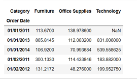
Fig 2 Note that missing qualities (NaN) are frequently presented here, and can be set to 0 effectively utilizing the fillna(0) strategy.
Unstacking and Stacking:
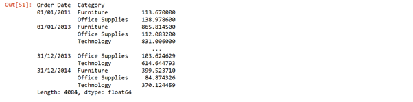
To accomplish a similar outcome in Pandas, it is frequently simpler to utilize the Index and unstack/(stack) techniques. The unstack strategy changes long information into wide information by making sections by classification for levels of the record, while the stack does the converse.
sales_n = sales.stack()
sales_n
unstack=sales_n.unstack().fillna(0)
unstack
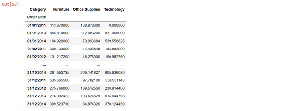
Here, we can reveal to Pandas that the Date and Category esteems are essential for the Index and utilize the unstack capacity to create separate sections.
Fig 3 The stack and unstack function enable the reshaping of the data. Stack() function changes data into a stacked format, and unstack() functions are reversible of stack function.
A Pair-plot or a scatter-matrix plot is widely used in python to show the distribution of both single variables and the relationship between both variables by scatter-matrix and bar graph.
Pair plots are an amazing asset to rapidly investigate circulations and connections in a dataset.
# Seaborn visualization library
import seaborn as sns
# Create the default pairplot
sns.pairplot(data)
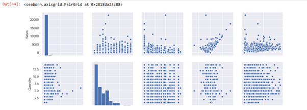
Fig 4: A pair plot permits us to see both circulations of single factors and connections between two factors or variables.
In this graph, the pair plot has given us two figures histogram and scatter plot. The histogram shows us the distribution of a single variable, and that A scatter matrix shows us the relationship between two variables. The left second-row plot shows a scatter plot of profit/sales according to the category Furniture. We can see here that sales and shipping are correlated positively to each other.
The lag plot is often used in data visualization to check whether the given data is random or follows any pattern.
from pandas.plotting
import lag_plot
from pandas.plotting
import lag_plotplt.rcParams.update({'ytick.left': False, 'axes.titlepad':10})
# Plot
fig, axes = plt.subplots(1, 4, figsize=(10,3), sharex=True, sharey=True, dpi=100)
for i, ax in enumerate(axes.flatten()[:4]):
lag_plot(df.Sales, lag=i+1, ax=ax, c='firebrick')
ax.set_title('Lag ' + str(i+1))
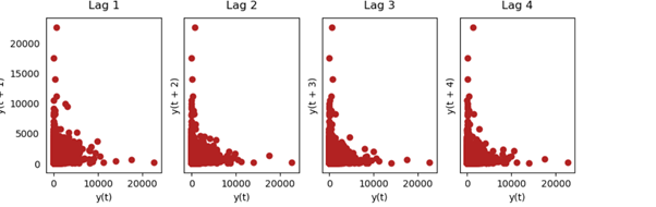
Fig 5 Lag plot is basically used to check whether the given data set is random or not random and the above graph shows that the uni-variate data is not random.
A Data visualization tool that is nothing but an analysis software that uses color to represent the data like a bar graph.
#Heat Map
heatmap_a=pd.pivot_table(data, values=["Sales"],columns=['Category'] )
sns.heatmap(heatmap_a,cmap='PRGn_r' )
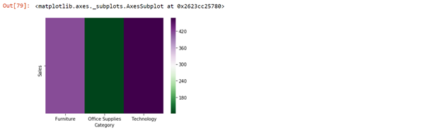
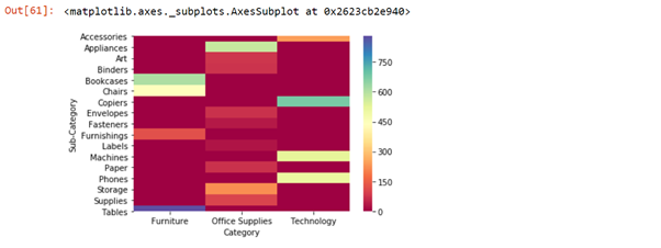
Fig 6 Technology has more sales as compared to Furniture and Office Supplies.
Time Series Visualizations
There are various bundles to help examine Time Series information and make important plots. One model is statsmodels, which incorporates various strategies for plotting Time Series-explicit perceptions:
plot_acf: Plot of the Autocorrelation Function
plot_pacf: Plot of the Partial Autocorrelation Function
month_plot: Seasonal Plot for Monthly Data
What is auto-correlation?
Autocorrelation is a trait of information that shows the level of similitude between the upsides of similar factors throughout progressive time stretches. This post clarifies what auto-correlation is, kinds of auto-correlation – positive and negative auto-correlation, just as how to analyze and test for an auto relationship.
ACF and PACF Plots
plot_acf (Auto-correlation plot): It is a bar chart graph that simply states how the present value is correlated with #the past values. It creates a 2D plot that shows lag values at the x-axis and correlated values at the y-axis.
In other words, Auto-correlation refers to know or predict how closely a time series is correlated with its past values whereas the ACF is the plot that is used to see the correlation between the points, up to and including the lag unit.
Pacf_(Partial auto-correlation plot): Here the plot shows a chart of partial correlation. It differs from the acf_plot as instead of the present value it compares with residual i.e remains left with the present value of lag. In other words, partial auto-correlation is an outline of the connection between the perception in a period series with perceptions at earlier time ventures with the connections of interceding perceptions eliminated.
And the ARIMA model mostly AR and MA terms are used, where AR terms mean autoregressive and moving average and in the case of ACF plot, if the positive correlation is at lag 1 AR is used otherwise MA is used for -ve correlation.
In the case of the PACF plot, if the lag is down AR model is used otherwise MA model is used.
Code-
#Importing plot_acf and plot_pacf
from statsmodels.graphics.tsaplots import plot_acf, plot_pacf, month_plot, quarter_plot
print('Daily data Autocorrelation Plots')
# Autocorrelation and Partial Autocorrelation Functions for Daily Data
#Here, plot_acf is a bar chart graph which simply states how the present value is correlated with #the past values. It creates a 2D plot which shows lag values at x-axis and correlated values at y-axis.
#plot_acf(sales_new['Sales']['Furniture'])
acf_plot = plot_acf(data2['Sales'], lags=30, title='Autocorrelation in Furniture Daily Sales Data')
#plot_acf(sales_new['Sales']['Furniture'])
 #Pacf_plot shows a chart of partial correlation. It differs from the acf_plot as instead of present      value it compares with residual i.e remains left with present value of lag.
pacf_plot = plot_pacf(data2['Sales'], lags=30, title='Partial Autocorrelation in Furniture Daily Sales Data')
#plot_acf(sales_new['Sales']['Furniture'])
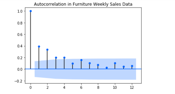
Fig 7 shows at lag 1 there is a significant correlation followed by an insignificant correlation.
Time-series Forecasting
ARIMA Model Prediction
An ARIMA model is a class of measurable models for dissecting and determining time arrangement information.
ARIMA is an abbreviation that represents Auto-Regressive Integrated Moving Average. It is a speculation of the more straightforward Auto-Regressive Moving Average and adds the idea of combination.
ARIMA model is actually a combination of models autoregressive model and moving average model, which is dependent on time series and its own previous values. AR model is similar to linear regression. AR term in the model is used when the ACF plots show auto-correlation rotting towards zero and the PACF plot cuts off rapidly towards zero.
This abbreviation is graphic, catching the vital parts of the actual model.
Code-
#Forecasting by ARIMA model
Maximum Likelihood Estimation (MLE) is utilized to assess the ARIMA model. The model takes up three significant boundaries: p,d,q respectively. MLE assists with expanding the likelihood for these boundaries while computing boundary gauges.
Here
p is addressed as the order of the AR model
q is addressed as the order of the MA model
d is the number of differences required to make the time series stationary.
returns= pd.DataFrame(np.diff(np.log(df['Sales'].values)))
arm_model = pf.ARIMA(data=returns, ar=4, ma=4, target='Returns', family = pf.Normal())
arm = arm_model.fit("MLE")
arm_model.plot_predict(h=20,past_values=50,figsize=(15,5))
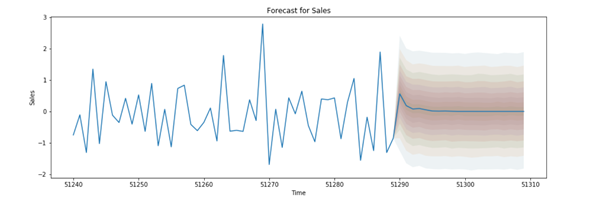
Fig 8 ARIMA model used for future prediction here predicts that sales in future is constant, neither is more nor less.
Conclusion
In this article, I have tried to cover data visualization, its future prediction by using the Arima model. Lag plots, a heat map, and various other concepts. With the help of the Arima model we came to know the future sale is constant, the heat map showed max. sale of Technology in previous years.
I, Sonia Singla has done MSc in Bioinformatics from the University of Leicester, U.K and is currently an advisory editorial board member at IJPBS.
Linkedin – Sonia Singla | LinkedIn
The media shown in this article are not owned by Analytics Vidhya and are used at the Author’s discretion.
I have done my Master Of Science in Biotechnology and Master of Science in Bioinformatics from reputed Universities. I have written a few research papers, reviewed them, and am currently an Advisory Editorial Board Member at IJPBS.
I Look forward to the opportunities in IT to utilize my skills gained during work and Internship.
https://aster28.github.io/SoniaSinglaBio/site/


The constant values doesn't look good as predictions, I would recommend applying pmdArima (AutoArima) method to determine best p, d, q values also HPT will help to predict correct values.