This article was published as a part of the Data Science Blogathon.

Introduction
We can say that data visualization is basically a graphical representation of data and information. It is mainly used for data cleaning, exploratory data analysis, and proper effective communication with business stakeholders. Right now the demand for data scientists is on the rise. Day by day we are shifting towards a data-driven world. It is highly beneficial to be able to make decisions from data and use the skill of visualization to tell stories about what, when, where, and how data might lead us to a fruitful outcome.
Data visualization is going to change the way our analysts work with data. They’re going to be expected to respond to issues more rapidly. And they’ll need to be able to dig for more insights – look at data differently, more imaginatively. Data visualization will promote that creative data exploration. -Simon Samuel
Table of contents
- Why do we need Data Visualization?
- Types of Data Visualization.
- Brief about tools we will be using
- Data pre-processing
- Data Visualization
- Keep in mind
- Conclusion
Why do we need good Data Visualizations?
Our eyes are drawn to colours and patterns. We can quickly recognize blue from yellow, circle from a square. Data visualization is a form of visual art that not only grabs our interests but also keeps our eyes on the message. We can literally narrate our entire numerical data to the stakeholders in a form of captivating graphs with the help of data visualization.
Right now we are living in “an age of Big data” trillions of rows of data are being generated every day. Data visualization helps us in curating data into a form that is easily understandable and also helps in highlighting a specific portion. Plain graphs are too boring for anyone to notice and even fail to keep the reader engaged. Hence, today we will be seeing how to create some mind-blowing visualization using matplotlib and seaborn.
Types of Data visualization
In this article we will be creating two types of Data visualization:
1. Bar Plot( Horizontal ):
It is a graph that represents a specific category of data with rectangular bars with length and height proportional to the values they represent.
Syntax: matplotlib.pyplot.barh(y,width,height)
Parameters:
-
- Y: Co-ordinates of the Y bar.
- Width: Width of the bar.
- Height: Height of the bar.
2. Timeline (Customized Horizontal line):
Syntax: axhline(y=0, xmin=0, xmax=1, c, zorder )
Parameters:
-
- Y: Co-ordinates of Y in a horizontal line with a default value of 0.
- xmin: This parameter should be between 0 and 1. 0 means the extreme left of the plot and 1 means the extreme right of the plot with 0 being the default value.
- xmax: This parameter should be between 0 and 1. 0 means the extreme left of the plot and 1 means the extreme right of the plot with 1 being the default value.
Before we get started, I want you to know that we won’t be using any python library other than Matplotlib, seaborn and we will be using Netflix’s dataset for the explanation.
By the end of this article, you will be able to create some awesome data visualization using matplotlib and seaborn. So without further ado, let’s get started.
Brief about Data Visualization libraries we will be using
*Feel free to skip this part if you are already aware of these libraries…
Matplotlib: It is a plotting library for the Python programming language and it has numerical mathematics extension Numpy. It provides an object-oriented API for embedding plots into applications using general-purpose GUI toolkits like Tkinter, QT, WxPython, or GTX. (Source)
Seaborn: It is an amazing visualization library for statistical graphics plotting in python. It provides beautiful default styles and color palettes to make statistical plots more attractive. It is built on top of matplotlib library and is also closely integrated into the data structures from pandas. The aim of seaborn is to make visualization the central part of exploring and understanding data. It also provides dataset-oriented APIs so that we can switch between different visual representations for the same variables for a better understanding of the dataset. (Source)
Numpy: It is a library for python that supports multi-dimensional arrays and matrices with many high-level mathematical operations to perform on these arrays and matrices.
Pandas: It is a powerful, flexible, and easy-to-use data manipulation tool for the python programming language.
Best time to grab a Coffee !!
Data pre-processing
Importing all the necessary libraries
import pandas as pd
import numpy as np
import matplotlib.pyplot as plt
%matplotlib inline
import seaborn as sns
Pre-processing the data
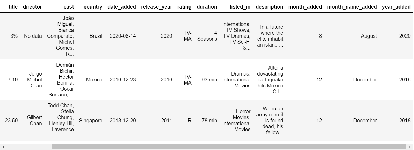
import pandas as pd
df = pd.read_csv('netflix_titles.csv')
print(df.head())
Calculating the missing data
for i in df.columns:
    null_rate = df[i].isna().sum()/len(df) * 100
    if null_rate > 0 :
        print("{} null rate: {}%".format(i,round(null_rate,2)))
director missing percentage: 30.68%
cast missing percentage: 9.22%
country missing percentage: 6.51%
date_added missing percentage: 0.13%
rating missing percentage: 0.09%
Dealing with the missing data
Here we will be replacing the missing country with the most country (mode), cast, and director with no data.
df['country'] = df['country'].fillna(df['country'].mode()[0])
df['cast'].replace(np.nan,'No data',inplace=True)
df['director'].replace(np.nan,'No data',inplace=True)
df.dropna(inplace=True)
df.drop_duplicates(inplace=True)
Now we are done with missing values, but the dates are still not quite right…
df['date_added'] = pd.to_datetime(df['date_added'])
df['month_added'] = df['date_added'].dt.month
df['month_name_added'] = df['date_added'].dt.month_name()
df['year_added'] = df['date_added'].dt.year
Okay, let’s visualize now!!!
Netflix’s Brand Palette
Always use a color palette, it is a great way in achieving good integrity and helps us to give a professional look keeping all the readers engaged.
sns.palplot(['#221f1f', '#b20710', '#e50914','#f5f5f1'])
plt.title("Netflix brand palette",loc='left',fontfamily='serif',fontsize=15,y=1.2)
plt.show()
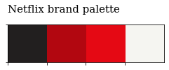
We will use Netflix brand colors wherever we can…
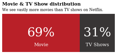
Let’s visualize the ratio between Netflix’s TV shows and Movies

Awesome !! Isn’t it?
Steps:
1. Calculating the ratio
x = df.groupby(['type'])['type'].count()
y = len(df)
r=((x/y)).round(2)
mf_ratio = pd.DataFrame(r).T
Drawing the figure:
fig, ax = plt.subplots(1,1,figsize=(6.5,2.5))
ax.barh(mf_ratio.index, mf_ratio['Movie'],
        color='#b20710', alpha=0.9, label='Male')
ax.barh(mf_ratio.index, mf_ratio['TV Show'], left=mf_ratio['Movie'],
        color='#221f1f', alpha=0.9, label='Female')
ax.set_xlim(0, 1)
ax.set_xticks([])
ax.set_yticks([])
plt.show()

2. Annotating the figure:
fig, ax = plt.subplots(1,1,figsize=(6.5,2.5))
ax.barh(mf_ratio.index, mf_ratio['Movie'],
        color='#b20710', alpha=0.9, label='Male')
ax.barh(mf_ratio.index, mf_ratio['TV Show'], left=mf_ratio['Movie'],
        color='#221f1f', alpha=0.9, label='Female')
ax.set_xlim(0, 1)
ax.set_xticks([])
ax.set_yticks([])
//annotating code starts here
for i in mf_ratio.index:
    ax.annotate(f"{int(mf_ratio['Movie'][i]*100)}%",
                   xy=(mf_ratio['Movie'][i]/2, i),
                   va = 'center', ha='center',fontsize=40, fontweight='light', fontfamily='serif',
                   color='white')
    ax.annotate("Movie",
                   xy=(mf_ratio['Movie'][i]/2, -0.25),
                   va = 'center', ha='center',fontsize=15, fontweight='light', fontfamily='serif',
                   color='white')
for i in mf_ratio.index:
    ax.annotate(f"{int(mf_ratio['TV Show'][i]*100)}%",
                xy=(mf_ratio['Movie'][i]+mf_ratio['TV Show'][i]/2,i),
                va = 'center', ha='center',fontsize=40, fontweight='light', fontfamily='serif',
                color='white')
    ax.annotate("TV Shows",
                   xy=(mf_ratio['Movie'][i]+mf_ratio['TV Show'][i]/2, -0.25),
                   va = 'center', ha='center',fontsize=15, fontweight='light', fontfamily='serif',
                   color='white')
plt.show()
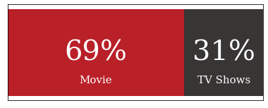
3. Adding text and removing legend & spines:
fig, ax = plt.subplots(1,1,figsize=(6.5,2.5))
ax.barh(mf_ratio.index, mf_ratio['Movie'],
        color='#b20710', alpha=0.9, label='Male')
ax.barh(mf_ratio.index, mf_ratio['TV Show'], left=mf_ratio['Movie'],
        color='#221f1f', alpha=0.9, label='Female')
ax.set_xlim(0, 1)
ax.set_xticks([])
ax.set_yticks([])
//Annontate code
for i in mf_ratio.index:
    ax.annotate(f"{int(mf_ratio['Movie'][i]*100)}%",
                   xy=(mf_ratio['Movie'][i]/2, i),
                   va = 'center', ha='center',fontsize=40, fontweight='light', fontfamily='serif',
                   color='white')
    ax.annotate("Movie",
                   xy=(mf_ratio['Movie'][i]/2, -0.25),
                   va = 'center', ha='center',fontsize=15, fontweight='light', fontfamily='serif',
                   color='white')
for i in mf_ratio.index:
    ax.annotate(f"{int(mf_ratio['TV Show'][i]*100)}%",
                xy=(mf_ratio['Movie'][i]+mf_ratio['TV Show'][i]/2,i),
                va = 'center', ha='center',fontsize=40, fontweight='light', fontfamily='serif',
                color='white')
    ax.annotate("TV Shows",
                   xy=(mf_ratio['Movie'][i]+mf_ratio['TV Show'][i]/2, -0.25),
                   va = 'center', ha='center',fontsize=15, fontweight='light', fontfamily='serif',
                   color='white')
//Adding text and removing spines and legend
fig.text(0.125,1.0,'Movie & TV Show distribution',fontfamily='serif',fontsize=15,fontweight='bold')
fig.text(0.125,0.90,'We see vastly more movies than TV shows on Netflix.',fontfamily='serif',fontsize=12,fontweight='light')
for s in ['top','left','right','bottom']:
    ax.spines[s].set_visible(False)
ax.legend().set_visible(False)
plt.show()
Boom!!
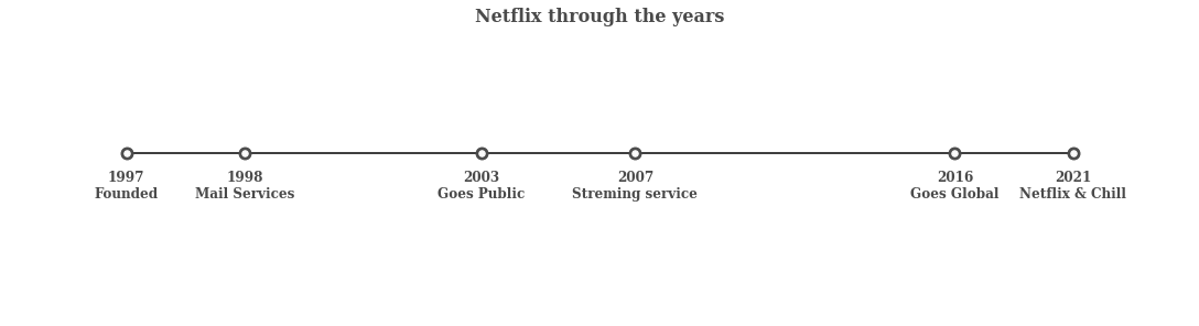
Now let’s visualize Netflix’s Timeline
Steps:
1. Initializing the timeline list:
from datetime import datetime
tl_dates = [
    "1997nFounded",
    "1998nMail Services",
    "2003nGoes Public",
    "2007nStreming service",
    "2016nGoes Global",
    "2021nNetflix & Chill"
]
tl_x = [1,2,4,5.3,8,9]
2. Drawing the figure :
fig,ax = plt.subplots(figsize=(15,4),constrained_layout=True)
ax.set_ylim(-2,1.5)
ax.set_xlim(0,10)
ax.axhline(0, xmin=0.1, xmax=0.9,c="#000000",zorder=1)
ax.scatter(tl_x,np.zeros(len(tl_x)),s=120,c="#4a4a4a",zorder=2)
ax.scatter(tl_x, np.zeros(len(tl_x)), s=30, c='#fafafa', zorder=3)
for x, date in zip(tl_x, tl_dates):
    ax.text(x, -0.55, date, ha='center',
            fontfamily='serif', fontweight='bold',
            color='#4a4a4a',fontsize=12)
for spine in ["left", "top", "right", "bottom"]:
    ax.spines[spine].set_visible(False)
ax.set_xticks([])
ax.set_yticks([])
ax.set_title("Netflix through the years", fontweight="bold", fontfamily='serif', fontsize=16, color='#4a4a4a')
plt.show()
Boom!!
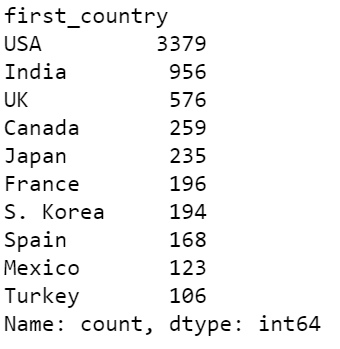
Now let’s visualize histogram displaying countries
For that, we need to pre-process the data a little bit more:
Firstly, let’s print the country columns see what we get…
df['country']
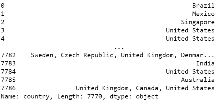
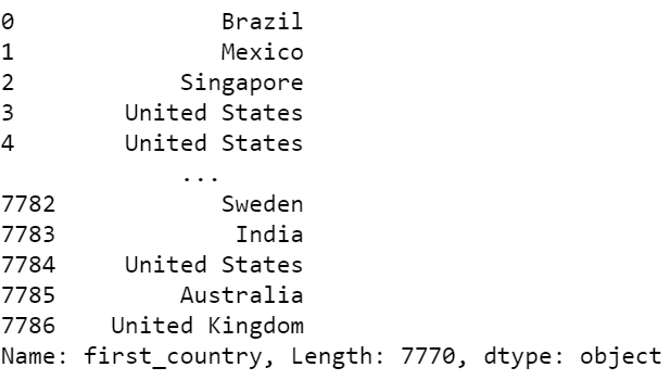
As can we see that in 7782 and 7786 there are multi countries in a single column so what we will do is we will create another column that will store only the first country.
df['first_country'] = df['country'].apply(lambda x: x.split(",")[0])
df['first_country']
Now we will replace some of the country names with their short form.
df['first_country'].replace('United States', 'USA', inplace=True)
df['first_country'].replace('United Kingdom', 'UK',inplace=True)
df['first_country'].replace('South Korea', 'S. Korea',inplace=True)
After that, we calculate the total occurrence of each country.
df['count']=1 #helper column
data = df.groupby('first_country')['count'].sum().sort_values(ascending=False)[:10]
output:
Now let’s get started with the visualization:
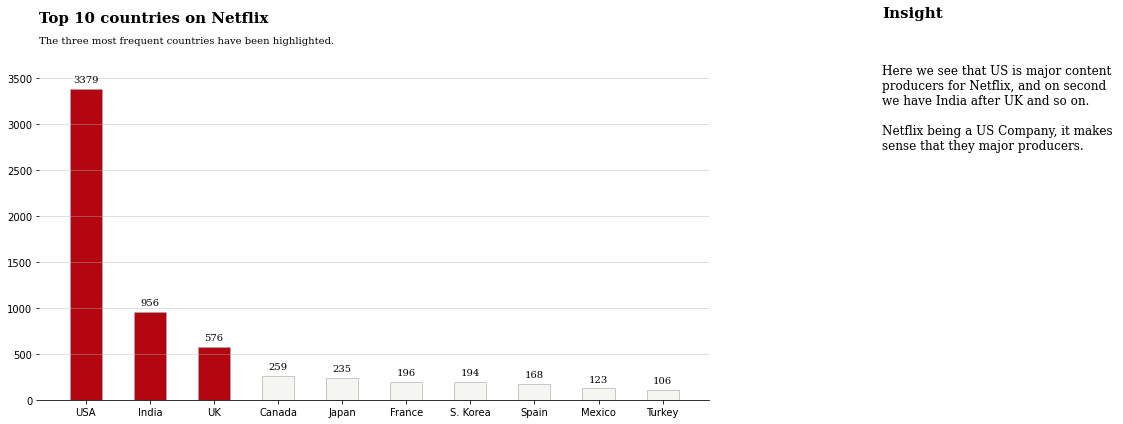
#Drawing the figure
color_map = ['#f5f5f1' for _ in range(10)]
color_map[0] = color_map[1]= color_map[2] = '#b20710'
fig,ax = plt.subplots(1,1,figsize=(12,6))
#Annotating the figure
ax.bar(data.index,data,width=0.5,edgecolor='darkgray',linewidth=0.6,color=color_map)
for i in data.index:
    ax.annotate(f"{data[i]}",xy=(i,data[i]+100),va='center',ha='center',fontweight='light',fontfamily='serif')
for s in ['top','left','right']:
    ax.spines[s].set_visible(False)
#Adding text
fig.text(0.125,1,'Top 10 countries on Netflix',fontsize=15,fontweight='bold',fontfamily='serif')
fig.text(0.125,0.95,'The three most frequent countries have been highlighted.',fontsize=10,fontweight='light',fontfamily='serif')
fig.text(1.1, 1.01, 'Insight', fontsize=15, fontweight='bold', fontfamily='serif')
fig.text(1.1, 0.67, '''
Here we see that US is major content
producers for Netflix, and on second
we have India after UK and so on.
Netflix being a US Company, it makes
sense that they major producers.
'''
         , fontsize=12, fontweight='light', fontfamily='serif')
ax.grid(axis='y', linestyle='-', alpha=0.5)
At last, we will create a word cloud:

To create a word cloud you will be needing a mask(Structure of our word cloud) in this example mask image is given below, feel free to create any shape you want.

Importing necessary libraries:
from wordcloud import WordCloud
import random
from PIL import Image
import matplotlib
Creating a word cloud and displaying it:
paintcmap = matplotlib.colors.LinearSegmentedColormap.from_list("", ['#221f1f', '#b20710'])
text = str(list(df['title'])).replace(',', '').replace('[', '').replace("'", '').replace(']', '').replace('.', '')
mask = np.array(Image.open('mask.png'))
wordcloud = WordCloud(background_color = 'white', width = 500,  height = 200,colormap=cmap, max_words = 150, mask = mask).generate(text)
plt.figure( figsize=(5,5))
plt.imshow(wordcloud, interpolation = 'bilinear')
plt.axis('off')
plt.tight_layout(pad=0)
plt.show()
Keep in Mind
- Always make sure that you keep your data visualizations organized and Coherent.
- Make sure to use proper colours to represent and differentiate information. Colours can be a key factor in a reader’s decisions.
- Use high contrast colours and annotate the elements of your data visualization properly.
- Never distort the data, data visualization is said to be great when it tells the story clearly without distortions.
- Never use a graphical representation that does not represent the data set accurately(For eg: 3D pie charts).
- Your Data visualization should be easy to comprehend at a glance.
- Never forget that our agenda of data visualization is to enhance the data with the help of design, not just draw attention to the design itself.
Conclusion
So, we wrap up our first tutorial on Netflix Data visualization – Part 1 here. There is still a problem with this visualization i.e. these are not interactive, the ones we can build with plotly and cufflinks.
Sometimes data visualization should be captivating and attention-grabbing which I think we have achieved here even if it isn’t precise. So by customizing our visualization like what we did here reader’s eye is drawn exactly where we want.
I hope enjoyed reading the article. If you found it useful, please share it among your friends on social media too. For any queries and suggestions feel free to ping me here in the comments or you can directly reach me through email.
Connect me on LinkedIn
Email: [email protected]
Thank You !!


