This article was published as a part of the Data Science Blogathon
Introduction
Human beings are amongst the most creative species on this planet. From time immemorable art has taken diverse forms, beginning from palaeolithic cave paintings to modern art. For instance, Bhimbetka cave paintings gave so many insights into the life of people back then. The genesis of visual art lies back in the stone age.
Now being a part of the fourth revolution generation, who has witness art and creativity in diverse fields and forms, here comes various tools and programming languages to our rescue to solve complex business problems using the art of visualization.
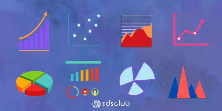
Modern-day business uses various visualization techniques to understand data and get insights from it to make data-driven business decisions. Nowadays there are a lot of visualization tools available like Tableau, Power BI, Looker, Qlik sense and a lot more. In this topic, we will be covering various types of charts using Python.
The Necessity of Data Visualization
Data makes more sense and is easy to understand when it is presented in a simple and visualized format, as it is difficult for the human eye to decipher the pattern, trend and seasonality from the raw data. Hence data is visualized to understand how different parameters are behaving.
Various types of charts and their uses
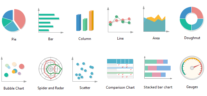
1. Bar and Column Charts
It’s one of the simplest graphs to understand how our quantitative field is performing across various categories. It is used for comparison.
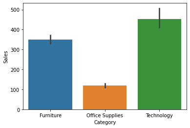
From the above column chart, we can see that sales of technology are higher and office supplies are the least.
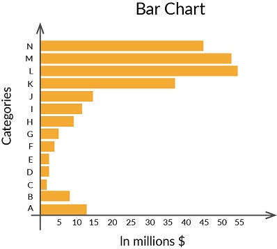
The above-shown graph is a bar chart that shows that L categories perform better.
2. Scatter Plot and Bubble Chart
Scatter and bubble plots help us to understand how variables are spread across the range considered. It can be used to identify the patterns, the presence of outliers and the relationship between the two variables.
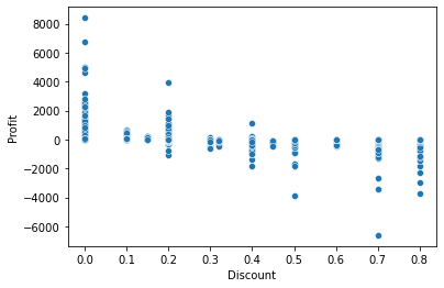
We can see that with the increase in discount profits are decreasing.
.png)
The above-shown graph is a bubble graph.
3. Line Graph
It is preferred when time-dependent data has to be presented. It is best suited to analyse the trend.
.png)
From the above graph, we can see that sales are increasing over the months but there is a sudden dip in the month of July and sales are highest in November.
4. Histogram
A histogram is a frequency chart that records the number of occurrences of an entry in a data set. It is useful when you want to understand the distribution of a series.
.png)
5. Box Plot
Box plots are effective in summarizing the spread of large data. They use percentile to divide the data range. This helps us to understand data point which falls below or above a chosen data point. It helps us to identify outliers in the data.
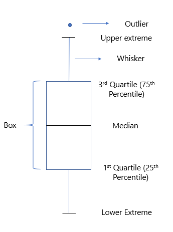
Box plot divides entire data into three categories
* Median value-it divides the data into two equal halves
* IQR – It ranges between 25th and 75th percentile values.
* Outliers – This data differ significantly and lie outside the whiskers.
.png)
The circles in the above plot show the presence of outliers.
6. Subplots
Sometimes it’s better to plot different plots in the same grid to understand and compare the data better.
.png)
Here you can see that in the single graph we were able to understand sales over a period of time in different regions.
7. Donut, Pie charts and stacked column charts
When we want to find the composition of data above-mentioned charts is the best.
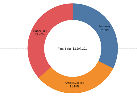
The above doughnut chart shows the sales composition of different product categories.
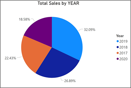
The above pie chart shows the percentage of sales in different years.
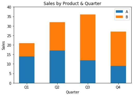
The above-stacked column chart shows the sale of two products over different quarters.
8. Heatmaps
It is the most preferred chart when we want to check if any correlation between variables.
.png)
Here the positive value shows a positive correlation and the negative value shows a negative correlation. The colour indicates the intensity of correlation, the darker the colour higher the positive correlation and the lighter the colour higher the negative correlation.
Understanding visualization with Python
Python offers various libraries to understand the data graphically like Matplotlib and Seaborn etc. Let’s begin our journey into the world of visualisation.
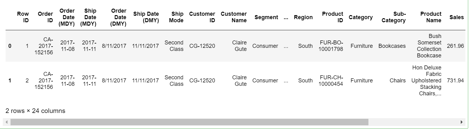
Anubhav is a product based company selling different kinds of products. Let’s explore the data to find its sales over a period, which product category/sub-category makes the highest sales, the relation of profit with an increase in discount.
1. Let’s import the relevant libraries first.
import numpy as np
import pandas as pd
import matplotlib.pyplot as plt
import seaborn as sns
import warnings
warnings.filterwarnings (‘ignore’)
2. Next step would be to load the data set
sales=pd.read_excel('Maven Supplies Raw.xlsx',skiprows=3)
sales.head(2)
3. Having the dataset with us, let us explore the data
# Check the number of rows and columns in the dataframe
sales.shape
(9994, 24)
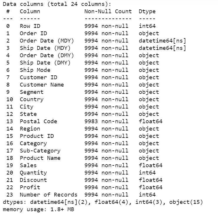
# Check the column-wise info of the dataframe
sales.info()
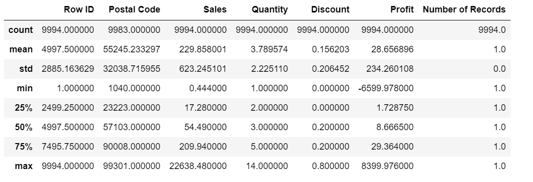
# Check the summary for the numeric columns
sales.describe()
sales.columns
4. Now that we have a better understanding of the data available let’s visualize it to get a better understanding.
– First, explore the composition of categories with sales%.
sales.groupby(['Category'])['Sales'].sum().plot(kind='pie',autopct='%1.2f%%')
plt.title("Sales% of different category")
plt.ylabel(" ")
plt.show();
.png)
We can see that technology is performing better when compared to other categories.
– There is a lot of sub-category within the data lets see how different sub-category is performing.
plt.figure(figsize=(10,3))
sales.groupby(['Sub-Category'])['Sales'].sum().sort_values(ascending=False).plot(kind='bar',color='seagreen')
plt.show();
.png)
We can see that sales of the phone are the highest followed by chairs and so on.
– Sales in different regions will be different. Let’s see
sales.groupby(['Region'])['Sales'].sum().sort_values(ascending=False).plot(kind='bar',color='seagreen')
plt.show();
.png)
Sales in the West region is high and the south region is the least.
– Now let’s see how regions are performing in terms of profit
sales.groupby(['Region'])['Profit'].sum().sort_values(ascending=False).plot(kind='bar',color='seagreen')
plt.show();
.png)
The South region which was performing worst in terms of sales is performing better when compared to the central region.
– Heatmaps give us a better understanding of how different variables are correlated with each other.
plt.figure(figsize = (10, 5))
sns.heatmap(sales.corr(),annot=True,cmap="summer")
plt.show()
.png)
It’s evident that discounts are having a negative correlation with profit.
– Let’s decipher how profit is affected by an increase in discounts.
sns.scatterplot(x = 'Discount', y='Profit', data = sales ,color='seagreen')
plt.show;
.png)
We can see that with the increase in discount the profits are also decreasing.
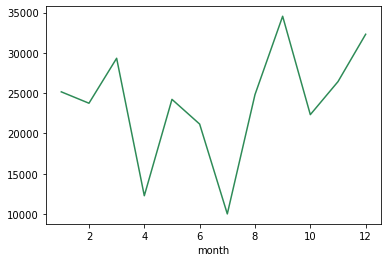
– Sales are not constant, it either increases or decreases depending on various factors. Let’s see how sales are performing over different months.
sales.groupby(['month'])['Sales'].sum().plot(kind='line',color='seagreen')
.png)
Like mentioned before its showing a pattern with the highest sales in the month of November and the lowest sales in the month of February.
– It’s not necessary that even if the sales are high profits will show a similar pattern. Let’s see how profits are changing over the period of time. This might be due to the sale of products with discounts as seen in the scatter plot.
sales.groupby(['month'])['Profit'].sum().plot(kind='line',color='seagreen')
we can see that profits are high during the month of September and lowest during the month of July.
– Sales might show an increasing or decreasing pattern with year
sales.groupby(['year'])['Sales'].sum().plot(kind='line',color='seagreen')
plt.xticks([2015,2016,2017,2018])
plt.show()
.png)
We can see that sales show a declining trend in the year 2016 while it’s growing in all the years.
From a dataset, we were able to understand phones made the major portion of sales and the highest sales and profits were contributed by the west region. Over a period of time sales increased but with the increase in discount, profits showed a declining trend. We saw that there were particular months which witnessed highest sales and profit.
Thus we can say that visualization speaks a lot, it will always have some story to tell which helps businesses to make data-driven decisions.
Conclusion
In this article, we talked about various kinds of graphs and their uses. We dealt with a data set to understand how to use Python libraries to visualize the data and make sense out of it. Thus we can say that through visualization, it’s easy to decipher a hidden pattern or a trend in data. With few examples, we saw that graphs help in comparison and most importantly it’s easy to understand.
Endnotes
Thanks for reading!!!
I hope you enjoyed reading the article and increased your knowledge about various types of graphs and their usage.
If I have not mentioned anything or if you want to share your thoughts, feel free to comment below in the comment section.
About the author
Sruthi E R
I’m a Data Science enthusiast with an interest in data analysis and visualization, currently pursuing Post Graduation Certification in Data Science from IIIT-Bangalore. I come from a Civil Engineering background with 4 years of experience in the construction industry.
Feel free to contact me on Linkedin
The media shown in this article are not owned by Analytics Vidhya and are used at the Author’s discretion.


Nice and useful info.!
Great Read. Well written and easily understandable. Kudos
Thank you so much for sharing. Kindly share the URL to the dataset use in this tutorial. Thanks a million !