This article was published as a part of the Data Science Blogathon

Introduction
n this article, I would like to introduce a cool python hand-painted styles visualization package; cute charts. Cutecharts are perfect to give a more personal touch to charts. If you want to make charts less intimidating then add a spoonful of sweetness then cute charts are the best option.
It’s totally different from the regular Matplotlib and Seaborn library, it has a lookout of handmade charts and while hovering on the charts it shows us the values. The hovering effect is not there in the Matplotlib chart which is an advantage of cute charts. Creating charts in cute charts is a little bit longer compared to seaborn, but a still lesser number of codes than the standard matplotlib library.
This package can be used to generate the following kinds of charts. For now, this library support five different charts- Bar, Pie, Radar, Scatter, and Line.
Install cutecharts
To create this chart, you will need to install a cute chart library.
!pip install cutecharts
Importing the library
import cutecharts.charts as ctc

import pandas as pd
Dataset
Let’s see how TMBD data looks like. The data has 21 columns.
Python Code:
import pandas as pd
import cutecharts.charts as ctc

df = pd.read_csv(r'tmdb-movies.csv')
print(df.head(2))
Data Explanation
The data of TMBD is taken from kaggle and if you want to check EDA is plotly do have a look here – https://www.kaggle.com/kashishrastogi/eda-of-tmbd-dataset
- Popularity: A numeric quantity specifying the movie popularity
- Budget: The budget in which the movie was made.
- Revenue: The worldwide revenue generated by the movie.
- Original Title: The title of the movie before translation or adaptation.
- Cast: The actor name who played a role in the movie
- Homepage: A link to the homepage of the movie.
- Director: The director name who directed the movie
- Title: Title of the movie.
- Keywords: The keywords or tags related to the movie.
- Overview: A brief description of the movie.
- Runtime: The running time of the movie in minutes.
- Genres: The genre of the movie Drama, Action, Comedy, Thriller, etc.
- Production Company: The production house of the movie.
- Vote Count: The count of votes received.
- Vote Average: Average ratings the movie received.
Date Time
- Release Date: The date on which the movie was released.
- Release Year: The year in which the movie was released.
Data Cleaning
Let’s first clean the data then we will see cute charts.
Changing the feature into the proper date-time format and rounding the popularity features up to 2 decimal for more insights.
df['release_date'] = pd.to_datetime(df['release_date'])
df['popularity'] = round(df['popularity'], 2)
Removing features that are not that much necessary
df.drop(['imdb_id', 'homepage', 'budget_adj','revenue_adj'], axis=1, inplace=True)
Replacing features nan values with missing value
df['tagline'].fillna('missing',inplace=True)
df['keywords'].fillna('missing',inplace=True)
df['production_companies'].fillna('missing',inplace=True)
df['cast'].fillna('missing',inplace=True)
df['director'].fillna('missing',inplace=True)
df['genres'].fillna('missing',inplace=True)
df['overview'].fillna('missing',inplace=True)
Droping 0 values from budget & Revenue
df.drop(df[(df['budget']==0) & (df['revenue']==0)].index, inplace=True)
Now, data is clean we can now move further to create some cute charts.
Parameters used in cutecharts
Assigning the chart name you want, for example, you want a pie chart then run the below code
chart = ctc.Pie()
Setting the title, width, and height of the chart we need to add the width, height in the parameters, an example is given below.
chart = ctc.Pie('Title', width='600px', height='300px')
Setting the chart option we will use set_options() function, an example is given below.
chart.set_options()
Setting the x and y labels title we will use x_label, and y_label passing in set_options() function example is given below.
chart.set_options(x_label='X Labels',
                  y_label='Y Labels' ,
 )
Finally, we will use a function to display the charts render_notebook() an example is given below.
chart.render_notebook()
Let’s explore the charts one by one.
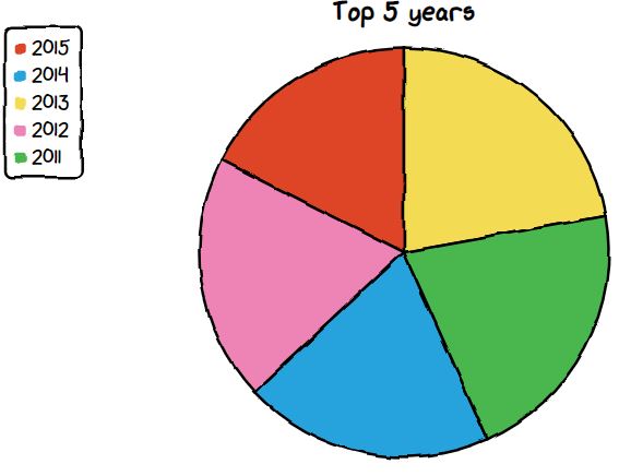
Pie chart using cutecharts
The chart which we are going to make is of Donut chart. We will see the top 5 years when the highest movies were released.
df_year = df['release_year'].value_counts().reset_index().sort_values(by='index', ascending=False)[:5].rename(columns={'index':'release_year','release_year':'Count'})
chart = ctc.Pie('Top 5 years', width='600px', height='300px')
chart.set_options(labels=list(df_year['release_year']), inner_radius=0)
chart.add_series(list(df_year['Count']))
chart.render_notebook()
Donut Chart using cutecharts
The chart which we are going to make is of Donut chart. We will see the top 5 years when the highest movies were released.
df_year = df['release_year'].value_counts().reset_index().sort_values(by='index', ascending=False)[:5].rename(columns={'index':'release_year','release_year':'Count'})
chart = ctc.Pie('Top 5 years', width='600px', height='300px')
chart.set_options(labels=list(df_year['release_year']), inner_radius=0.8)
chart.add_series(list(df_year['Count']))
chart.render_notebook()
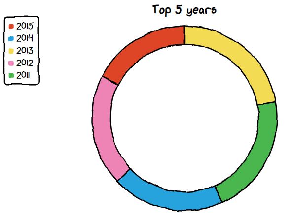
All the features are the same which we used in the pie chart just one more additional parameter is used by inner_radius; we can give any value between 0 to 1 for the inner radius of the donut chart. If you see by default the legend will be on the up left corner you can specify the legend values like upLeft, upRight, downLeft, downRight to.
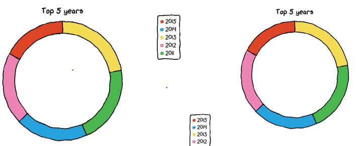
The below chart shows the legend on the upRight and downLeft.
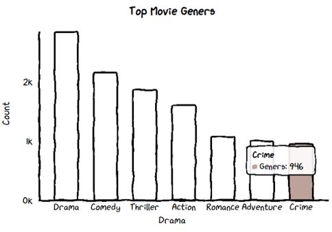
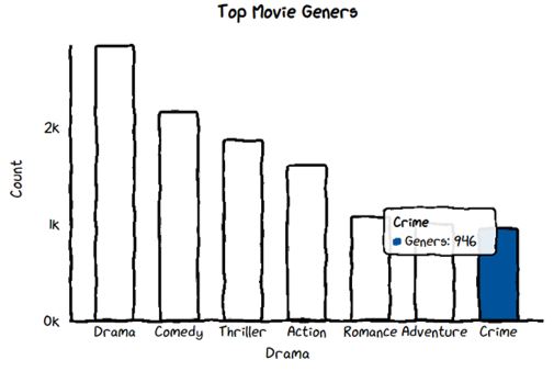
Bar chart using cutecharts
Let’s see the top movie genres.
The function will split the string and return the count of each genre.
def count_genre(x):
data_plot = df[x].str.cat(sep = '|')
    data = pd.Series(data_plot.split('|'))
    info = data.value_counts(ascending=False)
    return info
Call the function for counting the movies of each genre.
df_genre_movies = count_genre('genres')
df_genre_movies = pd.DataFrame(df_genre_movies).reset_index().rename(columns={'index':'Drama', 0:'Count'})
Code for bar chart
Here we have use colors for the different bars by importing the faker library.
from cutecharts.faker import Faker

chart = ctc.Bar('Top Movie Geners', width='600px', height='200px')

chart.set_options(labels=list(df_genre_movies['Drama'][:7]),

x_label='Drama',

y_label='Count',

colors=Faker.colors

)

chart.add_series('Geners',list(df_genre_movies['Count'][:7]))

chart.render_notebook()
Here we have added one more parameter color in the set_options() where we can set different colors for the bars explicitly.
chart = ctc.Bar('Top Movie Geners', width='600px', height='200px')

chart.set_options(labels=list(df_genre_movies['Drama'][:7]),

x_label='Drama',

y_label='Count',

colors=['#FFF1C9', '#F7B7A3', '#EA5F89', '#9B3192', '#57167E', '#47B39C','#00529B']

)

chart.add_series('Geners',list(df_genre_movies['Count'][:7]))

chart.render_notebook()
Line Chart using cutecharts
We will calculate the number of movies released over the years and only plot those movies which are in 20’s.
data = df.groupby('release_year').count()['id'].reset_index().tail(16)
Making a line chart for finding the impact of movies over the years which are in 20’s.
chart = ctc.Line("Impact of Movie over the years of 20's", width='700px', height='200px')
chart.set_options(labels=list(data['release_year']),
                  x_label='Years',
                  y_label='Count',
 )
chart.add_series('Years',list(data['id']))
chart.render_notebook()
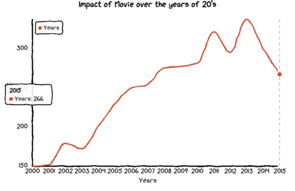
There is an exponential growth in the release of movies over the years.
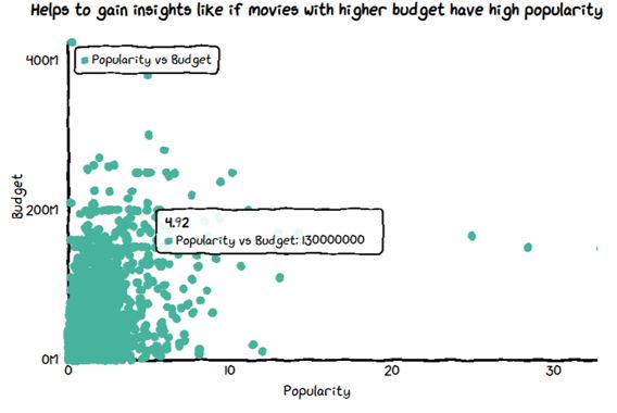
Scatter Chart using cutecharts
Let’s see how popularity vs budget is, and find out if budget is more than the popularity of the movie is more or not.
chart = ctc.Scatter("Helps to gain insights like if movies with higher budget have high popularity", width='700px', height='200px')
chart.set_options(x_label='Popularity',
                  y_label='Budget',
                  dot_size=1,
                  colors=['#47B39C']
 )
chart.add_series('Popularity vs Budget', [(z[0], z[1]) for z in list(zip(df['popularity'],df['budget']))])
chart.render_notebook()
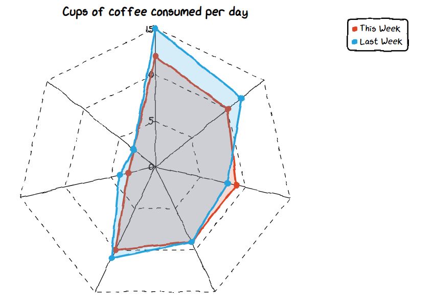
Radar chart using cutecharts
A radar chart is also known as a spider chart mostly used to display Multivariate values. For the Radar chart, we will take dummy data of coffee consumption where features are Day, This week, and last week.
data = {'Day': ['Mon', 'Tue', 'Wed', 'Thu', 'Fri', 'Sat', 'Sun'],
        'This week': [12, 10, 9, 9, 10, 3, 3],
        'Last week': [15, 12, 8, 9, 11, 4, 3]
       }
df_coffee = pd.DataFrame(data, columns = ['Day', 'This week', 'Last week'])
Let’s see the radar chart for coffee consumption per day for this and last week.
chart = ctc.Radar('Cups of coffee consumed per day')
chart.set_options(
    labels=list(df_coffee['Day']),
    is_show_legend=True,
    legend_pos='upRight'
    )
chart.add_series('This Week', list(df_coffee['This week']))
chart.add_series('Last Week', list(df_coffee['Last week']))
chart.render_notebook()
EndNote
We saw amazing handwritten cute charts made in python. The limit of this package is it’s only providing 5 charts.
Image Sources
- Image1: https://unsplash.com/photos/jrh5lAq-mIs
The media shown in this article are not owned by Analytics Vidhya and are used at the Author’s discretion.
A student who is learning and sharing with a storyteller to make your life easy.


