This article was published as a part of the Data Science Blogathon.
Overview of Parallel Coordinates Plot
While using visualizations, one compact visualization showing the relation between multiple variables has an upper hand over multiple visualizations – one for each variable. When you are trying to visualize high dimensional numerical data instead of multiple bar/line charts (one for each numerical variable), a single Parallel Coordinates plot could be more useful.
A Parallel coordinates plot is used to analyze multivariate numerical data. It allows a comparison of the samples or observations across multiple numerical variables.
- Each feature/variable is represented by a separate axis. All the axes are equally spaced and parallel to each other. Each axis can have a different scale and unit of measurement.
- Each sample/observation is plotted horizontally.
See the below Parallel Coordinates plot of the iris dataset, where each sample is plotted starting from the left-most axis to the right-most axis. We can see how a sample behaves for each of the various features.
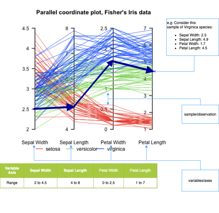
Parallel Coordinates for iris dataset
Image source: https://upload.wikimedia.org/wikipedia/en/4/4a/ParCorFisherIris.png
From the above example, we can see that there are 4 variables/features – Sepal Width, Sepal Length, Petal Width, Petal Length. Each of the variables is represented by an axis. Each axis has different min-max values
In the plot, you can see a clear pattern emerging
- Flowers belonging to setosa species have large Sepal Widths but low Sepal Length, Petal Width, and Length
- Flowers belonging to versicolor species have low Sepal Widths and medium Sepal Length, Petal Width and Length
- Flowers belonging to viriginica species have low to medium Sepal Widths, medium to large Sepal Length and large Petal Width and Length
The following can be adjusted
- Scale: All the axes can be normalized to keep all the scales uniform.
- Order: The features can be ordered so that there are not too many lines intersecting resulting in an unreadable chart
- By highlighting one or more lines, you can focus on a part of the plot that you are interested in
How to make a Parallel Coordinates plot using python?
Let’s use the Olympics 2021 dataset to illustrate the use of a parallel coordinates plot. This dataset has details about the
- teams that have participated – country, disciplines
- athletes who have participated – country, athletes
- final medals tally – country, rank, total medals, and the split across gold, silver, bronze medals
Let us try and get a summary of the country, the number of athletes, disciplines participated in, rank and medal count, and try and find answers to some questions
- Typically how many athletes did a country field? How many disciplines did it participate in? How many medals did a country win?
- Did countries with more athletes win more medals?
- Did countries that participated in more disciplines win more medals?
Read and prepare the data
df_teams = pd.read_excel("data/Teams.xlsx")
df_atheletes = pd.read_excel("data/Athletes.xlsx")
df_medals = pd.read_excel("data/Medals.xlsx")
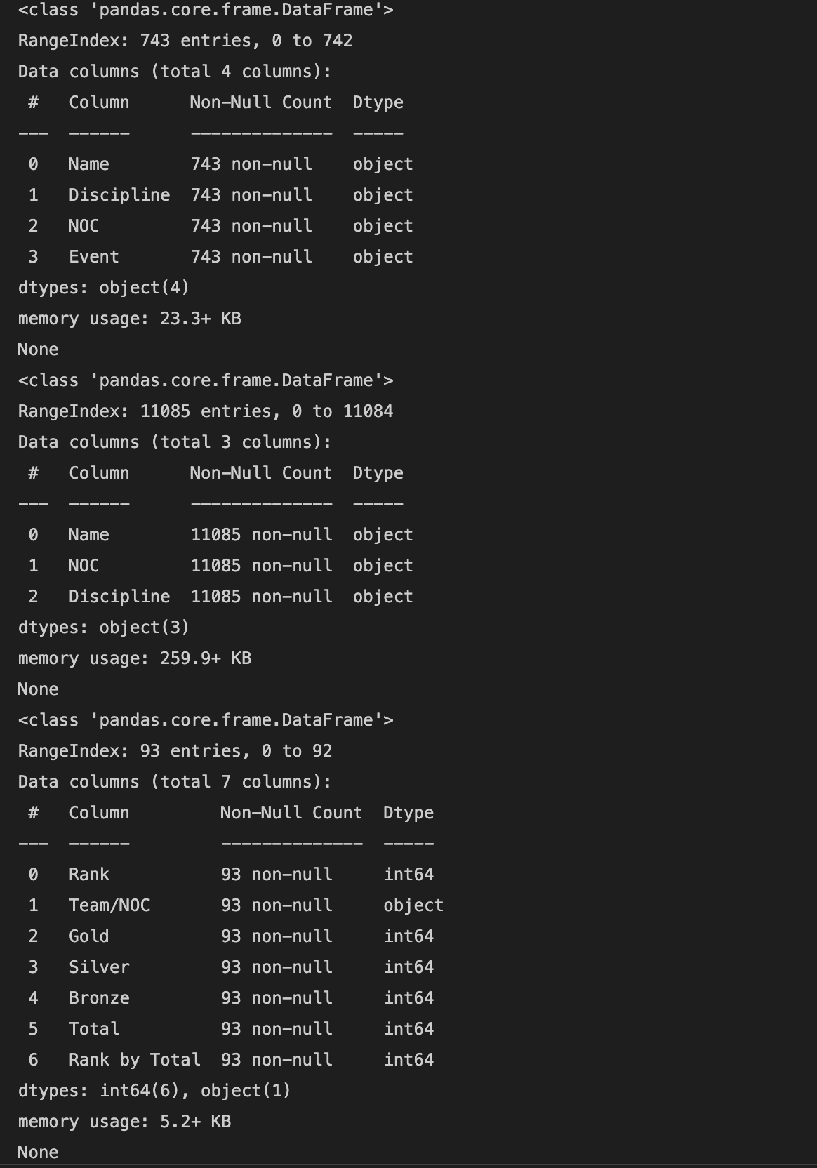
print(df_teams.info())
print(df_atheletes.info())
print(df_medals.info())
There is no missing data, so no specific missing data handling is needed.
Let’s find the number of disciplines each country has participated in and the number of athletes from each country who participated and merge this data into a single data frame.
df_medals.rename(columns={'Team/NOC':'NOC', 'Total': 'Total Medals', 'Gold':'Gold Medals', 'Silver': 'Silver Medals', 'Bronze': 'Bronze Medals'}, inplace=True)
df_disciplines_per_country = df_teams.groupby(by='NOC').agg({'Discipline':'nunique'})
df_atheletes_per_country = df_atheletes.groupby(by='NOC').agg({'Name':'nunique'}).rename(columns={'Name':'Athletes'})
df = pd.merge(left=df_disciplines_per_country, right=df_medals, how='inner',on='NOC')
df = pd.merge(left=df, right=df_atheletes_per_country, how='inner',on='NOC')
df.rename(columns={'NOC':'Country'}, inplace=True)
df = df[['Country', 'Rank', 'Total Medals', 'Gold Medals', 'Silver Medals', 'Bronze Medals', 'Athletes', 'Discipline' ]]
df.sort_values(by='Rank', inplace=True)
df.reset_index(inplace=True)
df.drop(columns=['index'], inplace=True)
df.head(10)
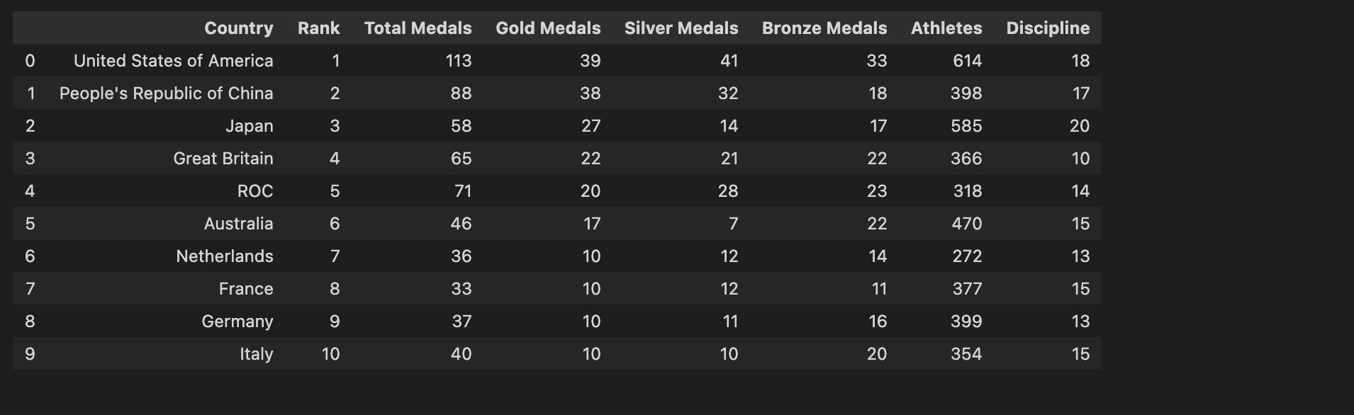
Final dataset after merging all the different datasets
Plot using Bar Charts
At first, let’s use bar charts to plot the Athletes, disciplines, rank and medals data for each country. For better readability, using only the top 20 entries
plt.figure(figsize=(20, 5))
ax = plt.subplot(1,2,1)
ax = df[['Country','Athletes']][:40].plot.bar(x='Country', xlabel = '', ax=ax)
ax = plt.subplot(1,2,2)
df[['Country','Discipline']][:40].plot.bar(x='Country', xlabel = '', ax=ax)
plt.figure(figsize=(20, 5))
ax = plt.subplot(1,2,1)
df[['Country','Rank']][:40].plot.bar(x='Country', xlabel = '', ax=ax)
ax = plt.subplot(1,2,2)
df[['Country','Gold Medals', 'Silver Medals','Bronze Medals',]][:40].plot.bar(stacked=True, x='Country', xlabel = '', ax=ax)
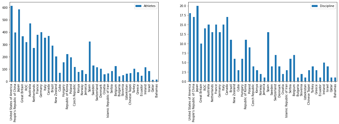
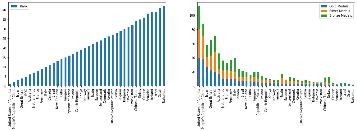
After looking at these 4 separate charts, some of the insights that we can draw are
- The Top 5 countries have 300+ athletes who participated in 10+ disciplines won 50+ Medals out of which 20+ are Gold medals
- While most countries have < 200 athletes participated in <7 disciplines won <20 Medals out of which <5 are Gold medals
- Japan though fielded 570+ athletes in 20 (most disciplines than all the countries) is at 3rd position with 60 total medals and 27 Golds
- While China fielded 400 athletes in 15 disciplines is at 2nd position with 88 medals and 37 Golds
This is good. But what if we can draw similar insights using a single and more compact visualization
Plot Parallel Coordinates using pandas
Let’s plot using pandas interface for 20 countries
df_20 = df.head(20).copy()
df_20 = df_20[['Country', 'Athletes', 'Discipline', 'Rank', 'Total Medals', 'Gold Medals', 'Silver Medals', 'Bronze Medals']]
plt.figure(figsize=(16,8))
pd.plotting.parallel_coordinates(df_20, 'Country', color=('#556270', '#4ECDC4', '#C7F464'))
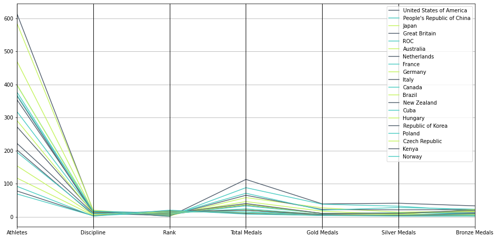
Parallel Coordinates Plot using Pandas
With the pandas interface, we have 2 issues
1. We cannot control the scale of individual axes
2. We cannot label the (poly-)lines inline
We could use Plotly for better control of the various parameters.
Plot Parallel Coordinates using Plotly
Before we dive deep, a little about Plotly. Plotly is a Python graphing library that makes interactive, publication-quality graphs online. It provides 2 interfaces
- Plotly Express, a simple interface, which produces easy-to-style figures. It uses graph objects internally.
- Plotly Graph Objects, a low-level interface that could be used for better control. What can be created by a single function call using Plotly Express would need a lot more code.
To create and render graphical figures (i.e. charts, plots, maps and diagrams) in Plotly , one would have to
- create figures that can be represented either as dicts or as instances of the Plotly .graph_objects
- manipulate if required
- render that uses the Plotly.js JavaScript library under the hood
Parallel coordinates are richly interactive by default. One could drag the lines along the axes to filter regions and drag the axis names across the plot to rearrange variables.
Use plotly express interface
In a parallel coordinates plot with px.parallel_coordinates, each row (or sample) of the DataFrame is represented by a polyline mark which traverses a set of parallel axes, one for each of the dimensions.
import plotly.express as px
df_ = df.copy()
# color     : Values from this column are used to assign color to the poly lines.
# dimensions: Values from these columns form the axes in the plot.
fig = px.parallel_coordinates(df_, color="Rank", dimensions=['Rank', 'Athletes', 'Discipline','Total Medals'],
                              color_continuous_scale=px.colors.diverging.Tealrose,
                              color_continuous_midpoint=2)
fig.show()
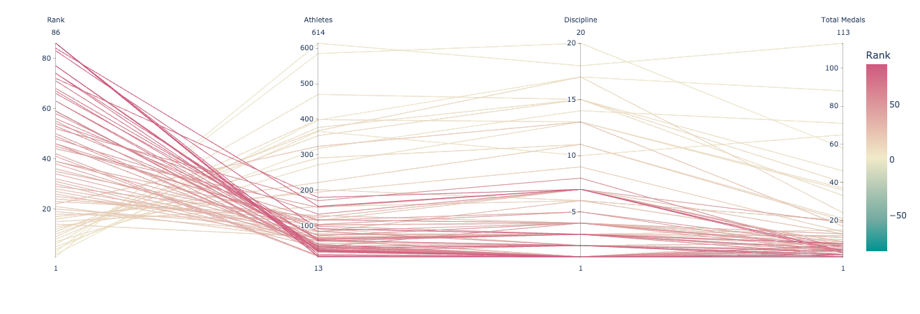
Parallel Coordinates Plot using Plotly express
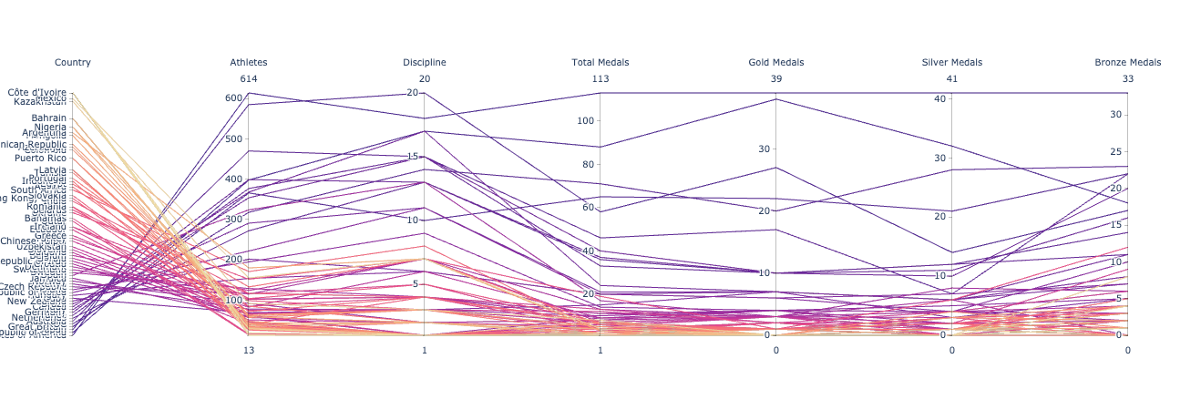
Use Plotly’s graph_objects interface
plotly.graph_objects.Parcoords allow control to a granular level – range of each axis, tick values, the label of the axis, etc.
- First, define the list of variables/axes that should be plotted. For each dimension, specify the
- range: start and end values specified as a list or tuple
- tickvals: values where the ticks should be displayed on this axis
- ticktext: text that should be displayed at the ticks
- label: name of the axis
- values: values that should be plotted on that axis
- Then, create a Parcoords which is a list of attributes for the figure.
- Next, create a figure with the above-defined Parcoords
- Lastly, render the figure using show
import plotly.graph_objects as go
df_ = df.copy()
dimensions = list([ dict(range=(df_['Rank']There is still one issue. USA won the most medals but is displayed at the bottom. Due to this there are unnecessary criss-crossed lines. This is no very intuitive. We would like to see countries in descending order.min(), df_['Rank'].max()),tickvals = df_['Rank'], ticktext = df_['Country'],label='Country', values=df_['Rank']),
dict(range=(df_['Athletes'].min(),df_['Athletes'].max()),label='Athletes', values=df_['Athletes']),
dict(range=(df_['Discipline'].min(),df_['Discipline'].max()),label='Discipline', values=df_['Discipline']),
dict(range=(df_['Total Medals'].min(), df_['Total Medals'].max()),label='Total Medals', values=df_['Total Medals']),
dict(range=(df_['Gold Medals'].min(), df_['Gold Medals'].max()),label='Gold Medals', values=df_['Gold Medals']),
dict(range=(df_['Silver Medals'].min(), df_['Silver Medals'].max()),label='Silver Medals', values=df_['Silver Medals']),
dict(range=(df_['Bronze Medals'].min(), df_['Bronze Medals'].max()),label='Bronze Medals', values=df_['Bronze Medals']),
])
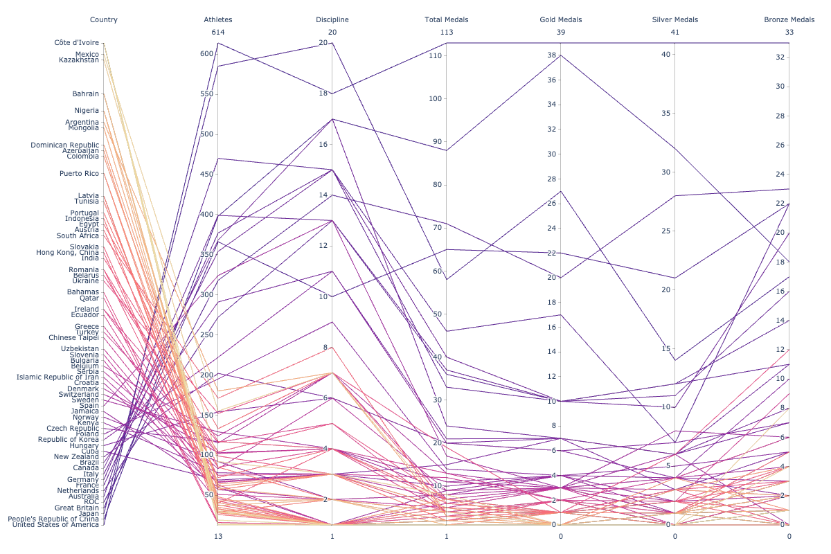
fig = go.Figure(data= go.Parcoords(line = dict(color = df_['Rank'], colorscale = 'agsunset'), dimensions = dimensions))
fig.show()
Parallel Coordinates Plot using Plotly graph objects
This is definitely a better plot than what pandas gave us. But the figure size is bad – labels are cut off. Let us adjust the size using update_layout
# Adjust the size to fit all the labels
fig.update_layout(width=1200, height=800,margin=dict(l=150, r=60, t=60, b=40))
fig.show()
There is still one issue. The USA won the most medals but is displayed at the bottom. Due to this, there are unnecessary crisscrossed lines. This is not very intuitive. We would like to see countries in descending order
# Let's reverse the min and max values for the Rank, so that the country with top rank comes on the top.
dimensions = list([ dict(range=(df_['Rank'].max(), df_['Rank'].min()), tickvals = df_['Rank'], ticktext = df_['Country'],label='Country', values=df_['Rank']),
                    dict(range=(df_['Athletes'].min(),df_['Athletes'].max()),label='Athletes', values=df_['Athletes']),
                    dict(range=(df_['Discipline'].min(),df_['Discipline'].max()),label='Discipline', values=df_['Discipline']),
                    dict(range=(df_['Total Medals'].min(), df_['Total Medals'].max()),label='Total Medals', values=df_['Total Medals']),
                    dict(range=(df_['Gold Medals'].min(), df_['Gold Medals'].max()), label='Gold Medals', values=df_['Gold Medals']),
                    dict(range=(df_['Silver Medals'].min(), df_['Silver Medals'].max()),label='Silver Medals', values=df_['Silver Medals']),
                    dict(range=(df_['Bronze Medals'].min(), df_['Bronze Medals'].max()),label='Bronze Medals', values=df_['Bronze Medals']),
                  ])
fig = go.Figure(data= go.Parcoords(line = dict(color = df_['Rank'], colorscale = 'agsunset'), dimensions = dimensions))
fig.update_layout(width=1200, height=800,margin=dict(l=150, r=60, t=60, b=40))
fig.show()
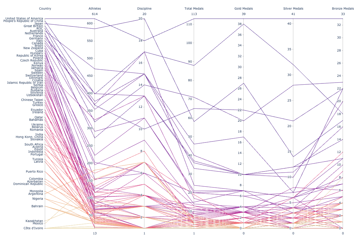
Parallel Coordinates Plot using plotly graph objects
Now the plot looks much better. Don’t you agree? If you follow the line corresponding to the United States of America ranked first on the top of the table, you can see that 614 athletes have participated in 18 disciplines and won a total of 113 medals out of which 39 are Gold. While China who fielded 400 athletes in 15 disciplines is at the 2nd position with 88 medals and 37 Golds.
From this one chart, we can draw the following insights that are basically the same as earlier. Only in this case, there is one single summary view.
What are the insights?
- The Top 5 countries have 400+ athletes who participated in 15+ disciplines won 50+ Medals out of which 20+ are Gold medals
- While most countries have < 200 athletes participated in <7 disciplines won <20 Medals out of which <5 are Gold medals
- Japan though fielded 570+ athletes in 20 (most disciplines than all the countries) is at the 3rd position with 60 total medals and 27 Golds
- While China fielded 400 athletes in 15 disciplines is at the 2nd position with 88 medals and 37 Golds
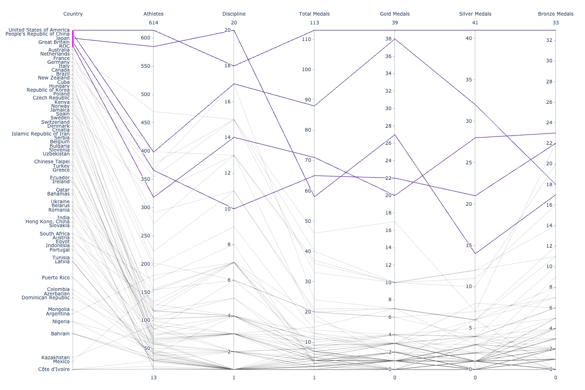
Interactivity
For large-sized datasets, Parallel Coordinates Plots tend to get cluttered. In such cases, interactivity comes to our rescue. Using interactivity, it is possible to filter out or highlight certain sections of data. The order of the axes can also be adjusted in an optimum way so that patterns or correlations across variables emerge.
The Plotly parallel coordinates plots support interactivity. One could
- Drag the lines along the axes to filter regions
- Drag the axis names across the plot to rearrange variables.
Summary
We saw how Parallel Coordinates plots – compact visualizations – can be used for high dimensional multivariate numerical data to bring out meaningful insights. To generate Parallel Coordinates plots we used the Plotly Python library that provides a lot of convenient functions.
About the author
A technical architect who also loves to break complex concepts into easily digestible capsules! Currently, finding my way around the fascinating world of data visualizations and data storytelling!!
The media shown in this article is not owned by Analytics Vidhya and are used at the Author’s discretion


