Businesses and Companies have a lot of customers these days. The number of customers widely vary. It might be in hundreds for a local grocery store, and it may be in millions for a national bank or an insurance company. Companies like Google and Facebook have users in the numbers of Billions. Knowing about these customers is important for any company. Knowing your customers well and understanding their interests, likes and dislikes can help any business maximise its profits and improve customer retention.

This article was published as a part of the Data Science Blogathon
Table of contents
- What is Customer Analytics?
- Data Generated by customers
- What is the importance of customer analytics?
- What to do with Customer Analytics:
- An example with Python code:
- Transaction Volume over the dates
- Transaction Volume By Gender
- Mean Transaction by Gender
- Transaction Volume by merchant state
- Account Balance (mean of all customers) over the dates
- Account Balance (mean of all customers) for various states (all days average)
- Total Transaction by Age
- Mean Transaction by Age
- Debit-Credit Transaction Mean analysis By Gender
- Debit-Credit Transaction Sum analysis By Age
- Debit-Credit Transaction Mean analysis By Age
- Taking out the map coordinates
- Grouping customers by their Mean Balance and Transaction Amount
- Customer Segmentation- 2D
- Conclusion
What is Customer Analytics?
Customer Analytics is a process of collecting, gathering and analyzing customer data across a wide range of channels, interactions, funnels and help businesses make better business decisions. Customer analytics help businesses make better strategies, build better products, and provide better services to the customers. Important steps in the customer analytics process are data collection, data segmentation, visualization, modelling etc. Companies can use customer analytics for Direct marketing, better brand positioning and better customer relationship management. With proper analysis, one can provide a better experience to the customers, and make them stick to the brand. The likes and dislikes of the majority of customers can make or break a brand/ product. So, knowing customer habits are important and a well-implemented Customer Analytics strategy helps in predicting customer behaviour.
Data Generated by customers
Customers of a company/business generate a variety of data, but it can be grouped majorly into 4 types of data. They are:
Web Behaviour Data
People using a website generate a lot of data. Analysis of how people use a website, navigate and spend time on a particular page can help in a lot of ways to understand customer nature.
Transaction Data
Customer payments, transactions, purchases, etc have the most amount of data. This data will contain the customer ID, date, time, amount, product purchased, etc and so on. This data is the most sought-after as it provides great insights.
Product/ Service usage data
Customers using a certain product, service by a company, also generate data. Let us say, the product is a fitness app, the app developer will get a lot of data which will include a mobile app on-screen time, data about usage of app features, in-app spends and so on. This will vary according to the product or service, but it can show valuable insights. If a certain product is being used a lot, it means it is popular and developers should make that feature better. Similarly, if something is not being used, it means it is not that popular. Such features might need to be removed or improved.
Customer created text data
Customers generate a lot of text data, it can be reviews, comments or other things. This type of data can help in understanding customer sentiments. Customers’ attitudes towards the company can be understood.
What is the importance of customer analytics?
Customer analytics can help in numerous ways. An overview of customer habits can help in many ways. A well-defined strategy will help in customer acquisition, retention and active engagement with customers.
Customer Acquisition
Gaining new customers is a vital part of any business, without customers there will be no business. Effective marketing and sales strategies can help in gaining new customers. Creating personalized and viral marketing campaigns are easy with the correct data and insights.
Customer Satisfaction and Retention
Retaining customers is very important. By studying and understanding customer behaviour, we can perform predictive customer analytics. Techniques can be developed to engage with the retained customers and improve their satisfaction.
Lower costs and Improve Revenue
Better customer analytics can help lower acquisition costs and operating costs. Increased sales can also help in increased revenues. Consumers nowadays are very much price-conscious, informed, and selective. So brands and companies need to focus on selective targeting.
What to do with Customer Analytics:
Once we start tracking and collecting customer data, the data can be used to answer questions and deal with challenges. Better business decisions can be made. Using data, we can personalize content for users, focus on the promotion of campaigns to the right audience, and improve product development, sales, and marketing as a whole.
Analysis of all types of customer channels should be performed, and we should understand how our service or product is helping/ serving customers of different demographics. Customer Analytics can help to promote the brand in a better way by understanding customer-generated data like ratings, reviews, and feedback.
While analysing customer data, customers which are at risk of being lost should be targeted to be retained to improve customer lifetime value. Customer segmentation can be implemented to better target customers across all channels and groups.
An example with Python code:
We will be working on a sample customer analytics project. The first part is Data collection and management. Our data taken is transactional data, where the transactions are bank transactions. One important part of data processing in such transactional data is the consolidation of customer profiles. This can be done by grouping together customer profiles by customer ID.
Let us get started with the code, first we import the necessary libraries.
import numpy as np
import pandas as pd
import matplotlib.pyplot as plt
%matplotlib inline
import seaborn as sns
from wordcloud import WordCloud
import matplotlib.ticker as ticker
from shapely.geometry import Point
import geopandas as gpd
from geopandas import GeoDataFrame
Now, the necessary libraries are imported.
Now, we read the data.
#Reading the data
data = pd.read_csv("/kaggle/input/anz-banking-data/ANZ.csv")
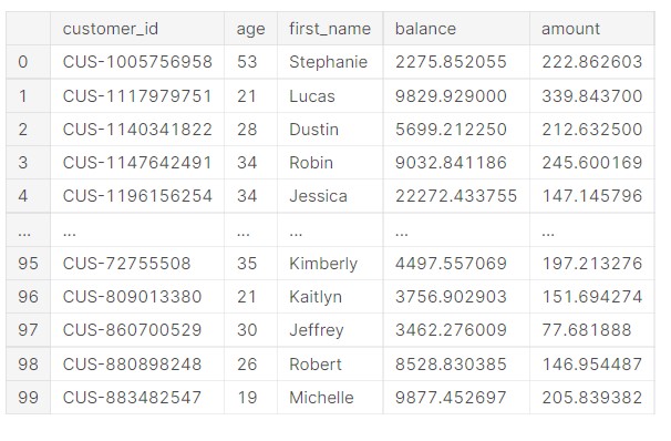
Let us now have a look at the data.
data.head()
Output
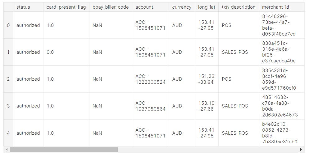
The data has many features.
Now, let us check the number of unique accounts in this data.
#Checking the number of unique values
data["account"].nunique()
Output:
100
Now, we check the value count of the dates.
#number of date values
data["date"].value_counts()
Output
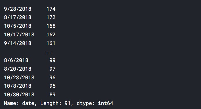
So, the date which had the most number of transactions is 28/09/2018.
Now, we check it for customer IDs.
#the number of values for customer id
data["customer_id"].value_counts()
Output
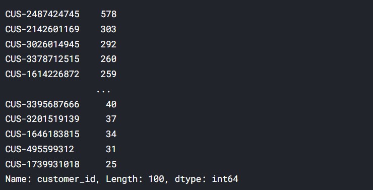
From here, we can understand which customers had the most transactions and purchases.
Such data can be used to profile and segment customers.
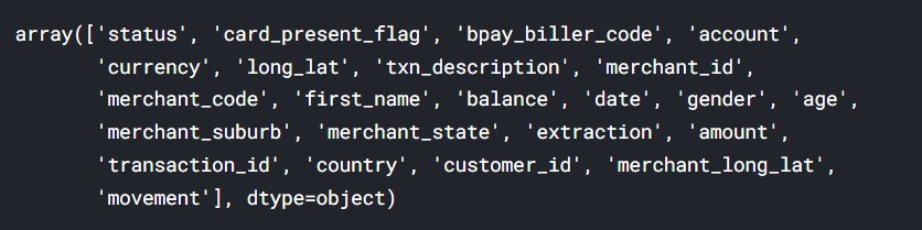
Now, we check the column names.
#Values of the columns
data.columns.values
Output
The dataset contains 12043 transactions for 100 customers who have one bank account each. The transactional period is from 01/08/2018 – 31/10/2018 (92 days duration). The data entries are unique and have consistent formats for analysis. For each record/row, information is complete for the majority of columns. Some columns contain missing data (blank or NA cells), which is likely due to the nature of the transaction. (i.e. merchants are not involved in InterBank transfers or Salary payments) It is also noticed that there are only 91 unique dates in the dataset, suggesting the transaction records for one day are missing (turned out to be 2018-08-16).
Let us now analyze the data.
Transaction Volume over the dates
Now, we check the transaction volume over the dates.
#Taking the sum of all transactions over the dates
date_group = data.groupby('date')["amount"].sum().reset_index()
#Lineplot of the entire data
plt.figure(figsize=(16, 6))
ax=sns.lineplot(y="amount",x="date",data=date_group)
ax.xaxis.set_major_locator(ticker.LinearLocator(10))
Output
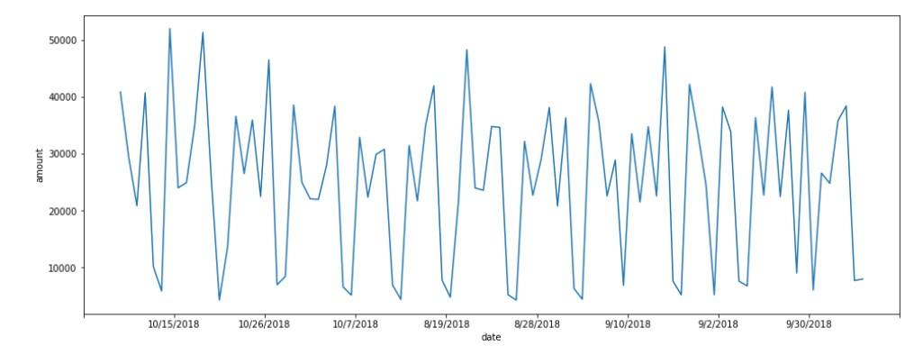
The number of transactions seems to vary on a weekly basis.
Transaction Volume By Gender
Now, let us see how it has varied for each gender.
#Transaction volume over the dates by gender
gender_vol = data[["date","amount","gender"]]
gender_data = gender_vol.groupby(['date',"gender"])["amount"].sum().reset_index()
#Lineplot
plt.figure(figsize=(16, 6))
ax=sns.lineplot(y="amount",x="date",hue="gender",data=gender_data)
ax.xaxis.set_major_locator(ticker.LinearLocator(10))
Output
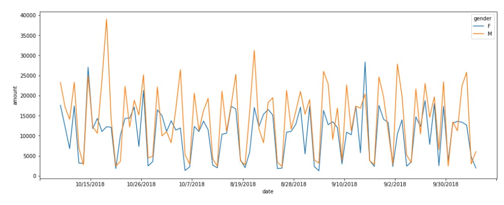
We can see the generally male customers had more amount of transactions. This shows that male customers are more likely to spend more.
Mean Transaction by Gender
Let us check the mean transaction by gender.
#Mean transaction over the dates by Gender
gender_mean = data.groupby(["date","gender"])["amount"].mean().reset_index()
#Lineplot for the data
plt.figure(figsize=(16, 6))
ax=sns.lineplot(y="amount",x="date",hue="gender", data=gender_mean)
ax.xaxis.set_major_locator(ticker.LinearLocator(10))
Output
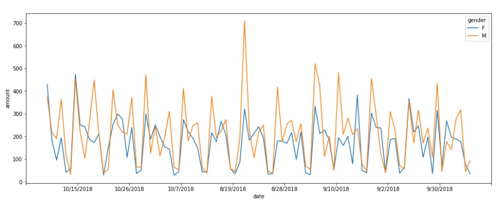
The data here also clearly shows, male customers have more value in transactions.
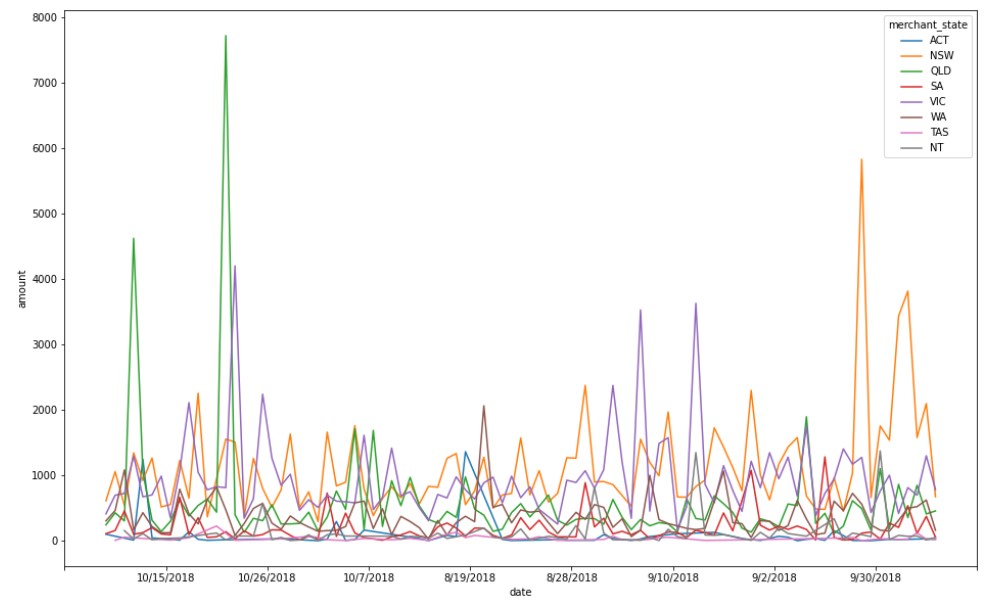
Transaction Volume by merchant state
Now, we check the transaction volume by merchant state.
#Transaction volume sorted by states
merchant_state = data.groupby(["date","merchant_state"])["amount"].sum().reset_index()
#Lineplot for the data
plt.figure(figsize=(16, 10))
ax=sns.lineplot(y="amount",x="date",hue="merchant_state", data=merchant_state)
ax.xaxis.set_major_locator(ticker.LinearLocator(10))
Output
Account Balance (mean of all customers) over the dates
#mean account balance of all customers
acc_bal_mean= data.groupby(["date",'gender'])["balance"].mean().reset_index()
plt.figure(figsize=(16, 6))
ax=sns.lineplot(y="balance",x="date",data=acc_bal_mean)
ax.xaxis.set_major_locator(ticker.LinearLocator(10))
Output
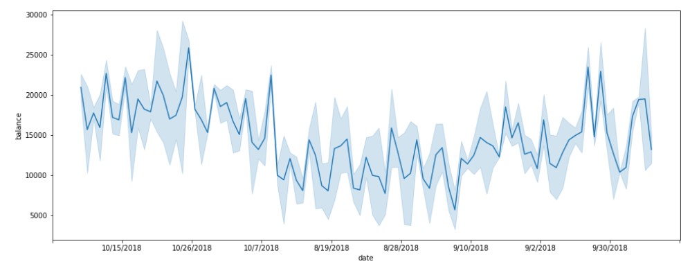
Account balances are reducing in the month of August.
plt.figure(figsize=(16, 6))
ax=sns.lineplot(y="balance",x="date",hue="gender",data=acc_bal_mean)
plt.ylabel("Balance [By gender]")
ax.xaxis.set_major_locator(ticker.LinearLocator(10))
Output
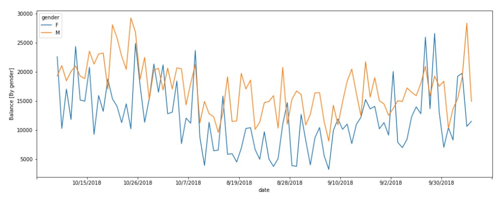
Male customers have more account balances.
Account Balance (mean of all customers) for various states (all days average)
#Mean account balance over the states
acc_bal_state= data.groupby(['merchant_state',"gender"])["balance"].mean().reset_index()
#Barplot for the data
plt.figure(figsize=(16, 6))
sns.barplot(x="balance", y="merchant_state",  data=acc_bal_state)
Output
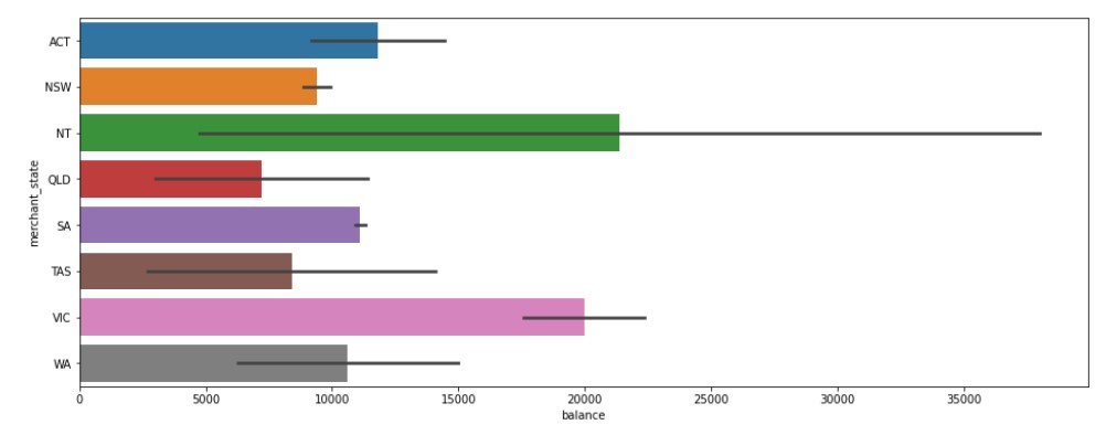
Northern Territory has the highest value and also the widest range of distribution.
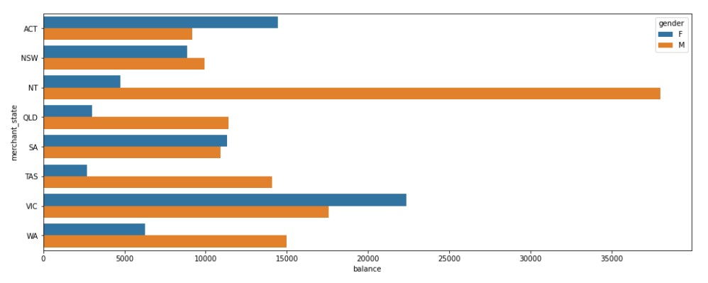
Barplot divided by gender.
#Barplot sorted by gender
plt.figure(figsize=(16, 6))
sns.barplot(x="balance", y="merchant_state",hue="gender",  data=acc_bal_state)
Output
Total Transaction by Age
age_amount_sum= data.groupby(['age',"gender"])["amount"].sum().reset_index()
#Barplot for the data
plt.figure(figsize=(16, 6))
sns.barplot(y="amount", x="age",  data=age_amount_sum)
Output
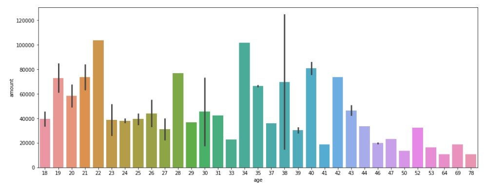
So, larger transactions are done by people in their youth and people in their middle ages, or is it actually the case?
Let us split the data for males and females.
#Barplot with hue parameter for gender
plt.figure(figsize=(16, 6))
sns.barplot(y="amount", x="age", hue="gender" ,data=age_amount_sum)
Output
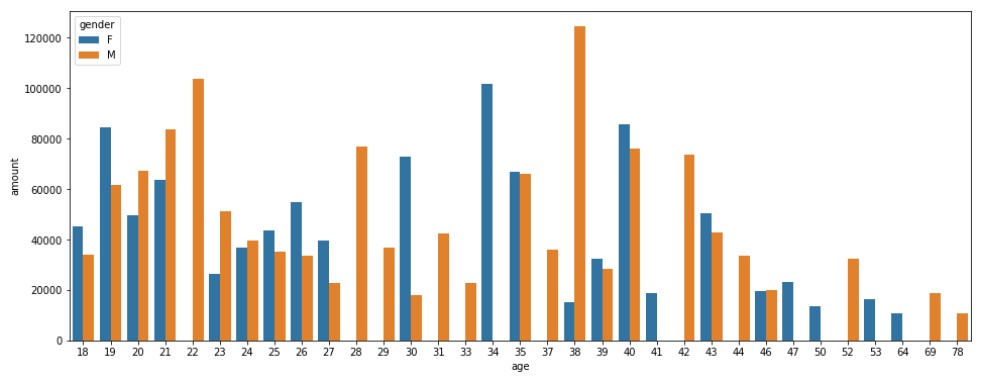
Males have had higher values.
Mean Transaction by Age
Mean transaction by age will show the actual overview of whether spending is more for some age group or simply those age groups have more population.
#Mean of transaction values by age
age_amount_mean= data.groupby(['age',"gender"])["amount"].mean().reset_index()
#Barplot for that data
plt.figure(figsize=(16, 6))
sns.barplot(y="amount", x="age",  data=age_amount_mean)
Output
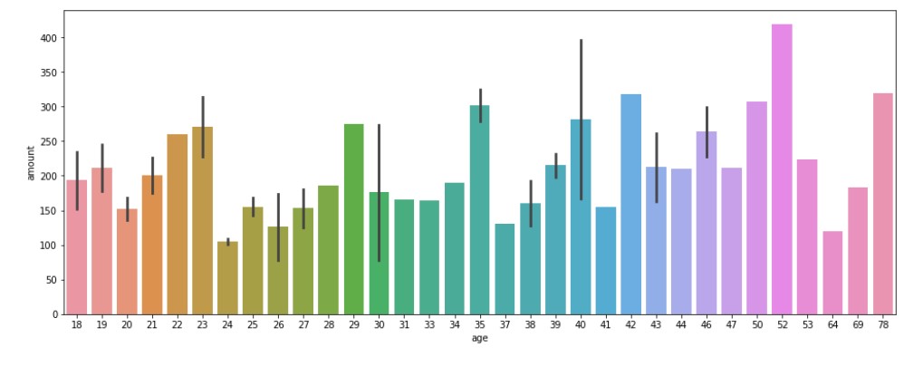
So, the value of transactions is fairly the same across all age groups.
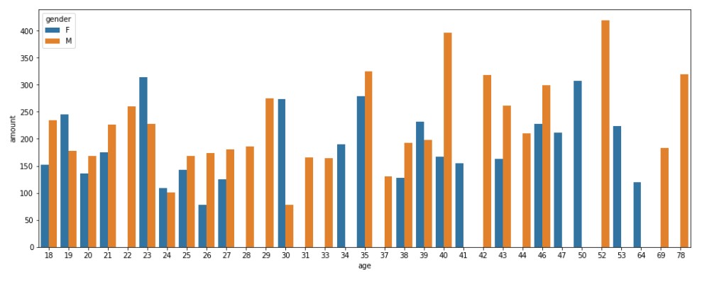
Let us split it by gender.
#Barplot with Gender as a Hue
plt.figure(figsize=(16, 6))
sns.barplot(y="amount", x="age", hue="gender", data=age_amount_mean)
Output
Debit-Credit Transaction Mean analysis By Gender
#Analysis of debit/credit
debit_credit= data.groupby(["movement","gender"])["amount"].mean().reset_index()
plt.figure(figsize=(8, 6))
sns.barplot(y="amount", x="movement", hue="gender", data=debit_credit)
Output
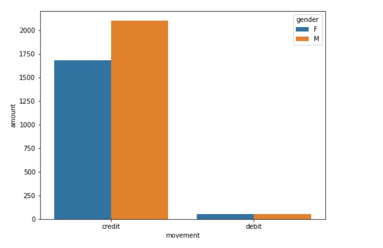
It is clear that people do credit transactions. Credit transactions are more popular in countries like the USA, Australia, etc.
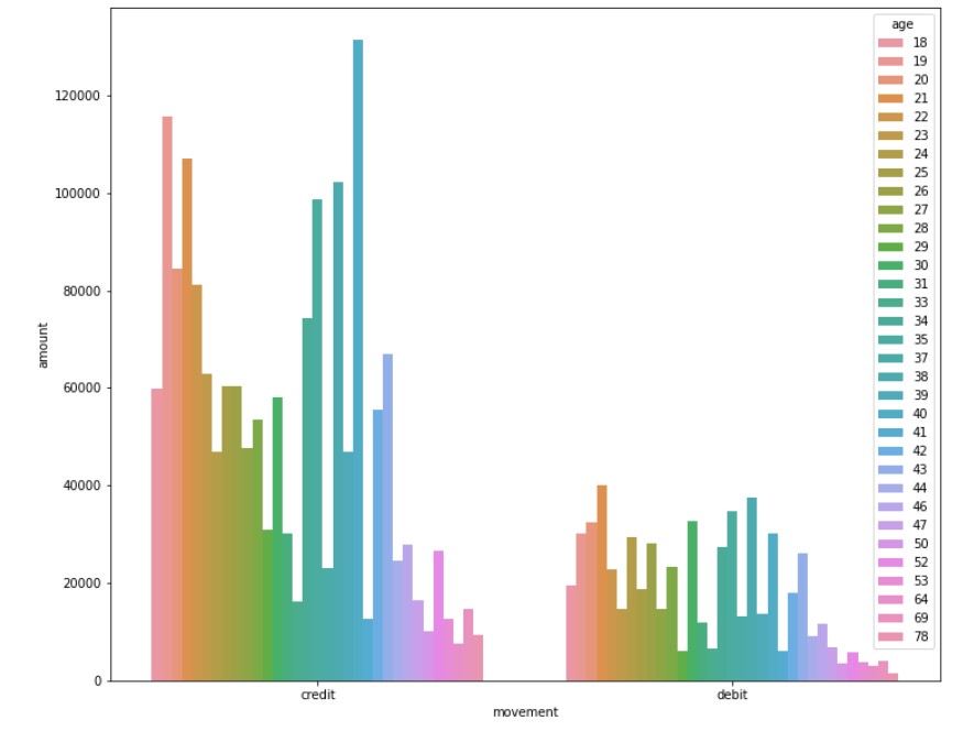
Debit-Credit Transaction Sum analysis By Age
#By age
dc_age_total= data.groupby(["movement","age"])["amount"].sum().reset_index()
#Barplot according to age
plt.figure(figsize=(12, 10))
sns.barplot(y="amount", x="movement", hue="age", data=dc_age_total)
Output
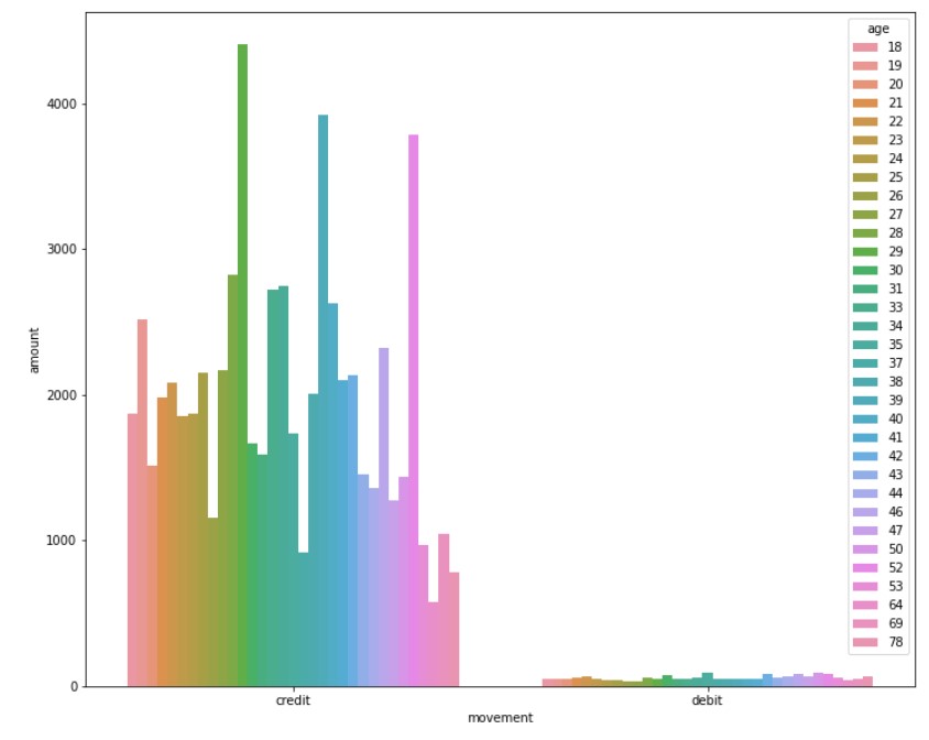
Debit-Credit Transaction Mean analysis By Age
#Mean transaction analysis by age
dc_age_mean= data.groupby(["movement","age"])["amount"].mean().reset_index()
plt.figure(figsize=(12, 10))
sns.barplot(y="amount", x="movement", hue="age", data=dc_age_mean)
Output
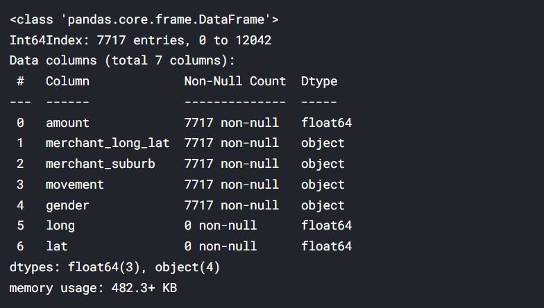
Taking out the map coordinates
Now, we will do some geospatial analysis by plotting the bank transaction points, on a map.
#taking relevant data
df=data[["amount",'merchant_long_lat',"merchant_suburb","movement","gender"]]
df=df.dropna()
df = df.reindex(columns = df.columns.tolist() + ['long','lat'])
df.info()
Output
#Extracting the latitude and longitude data
longitude=[]
latitude=[]
for row in df['merchant_long_lat']:
    longitude.append(row.split(' ')[0])
    latitude.append(row.split(' ')[1])
df["long"]=longitude
df["lat"]=latitude
#Making the values numeric
df[["long", "lat"]] = df[["long", "lat"]].apply(pd.to_numeric)
#The maximum ranges in longitude and latitude
ranges = ((df.long.min(),   df.long.max(),
         df.lat.min(), df.lat.max()))
print(ranges)
Output

#Plotting the transactions over the map of australia
geometry = [Point(xy) for xy in zip(df['long'], df['lat'])]
gdf = GeoDataFrame(df, geometry=geometry)
#selecting australia
world = gpd.read_file(gpd.datasets.get_path('naturalearth_lowres'))
aus =  world[world.name == "Australia"]
gdf.plot(ax=aus.plot(figsize=(12, 12)), marker='o', color='black', markersize=20)
Output
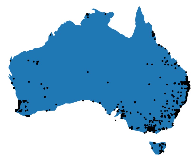
So the majority of transactions are in the southeast part of Australia, which has the maximum population and the biggest cities. This is clear, as it suggests that transactions will be in places where people live.
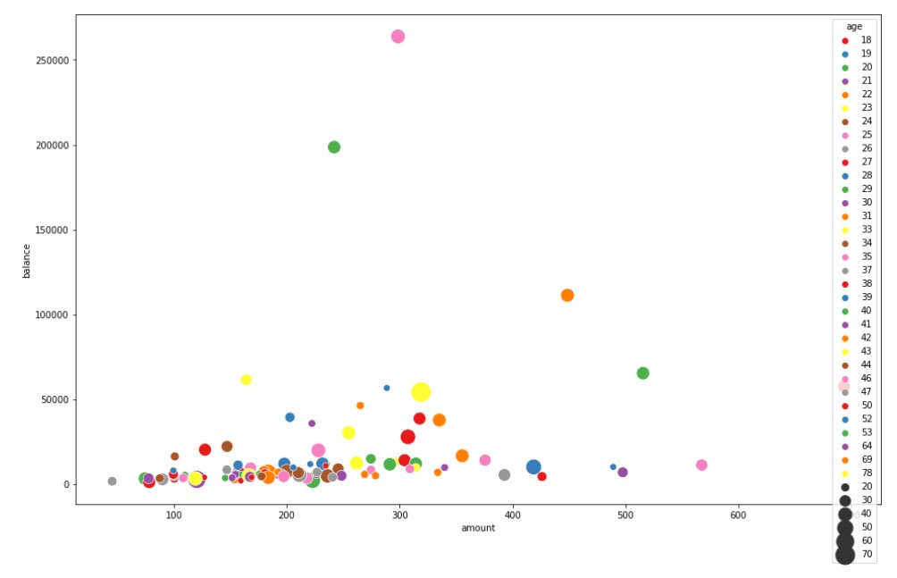
Grouping customers by their Mean Balance and Transaction Amount
An important part of customer analytics is customer segmentation. Customers can be segmented and grouped on the basis of a variety of data. The data can be geographic, like latitude and longitude, or it can be demographically based. Demographic data can be age, gender, income, marital status, etc. Customers can be segmented on the basis of behaviours and habits, for example, spending patterns, account balance, things purchased, and so on. Such things help in understanding your customers.
data_cust=data[["customer_id","first_name","age","balance",'amount']]
customer=data_cust.groupby(["customer_id","age","first_name"])["balance","amount"].mean().reset_index()
customer
Output
The data has now been modelled into a table that contains customer data. The data has the customer id, the customer’s first name, the customer’s age, customer balance, and amount.
We shall be using K-Means clustering to group the customers.
plt.figure(figsize=(16, 10))
sns.scatterplot(y="balance", x="amount",hue="age", palette="Set1", size="age",sizes=(50,500), data=customer)
Output
Customer Segmentation- 2D
Now, let us proceed with the segmentation.
#KMeans clustering
from sklearn.cluster import KMeans
X=customer[["balance","amount"]].values
wcss=[]
for i in range(1,11):
    km=KMeans(n_clusters=i)
    km.fit(X)
    wcss.append(km.inertia_)
Now, we will use the elbow method to find the optimal number of clusters.
plt.figure(figsize=(12,6))
plt.plot(range(1,11),wcss)
plt.grid()
plt.plot(range(1,11),wcss, linewidth=2, color="red", marker ="8")
plt.xlabel("K Value")
plt.xticks(np.arange(1,11,1))
plt.ylabel("WCSS")
plt.show()
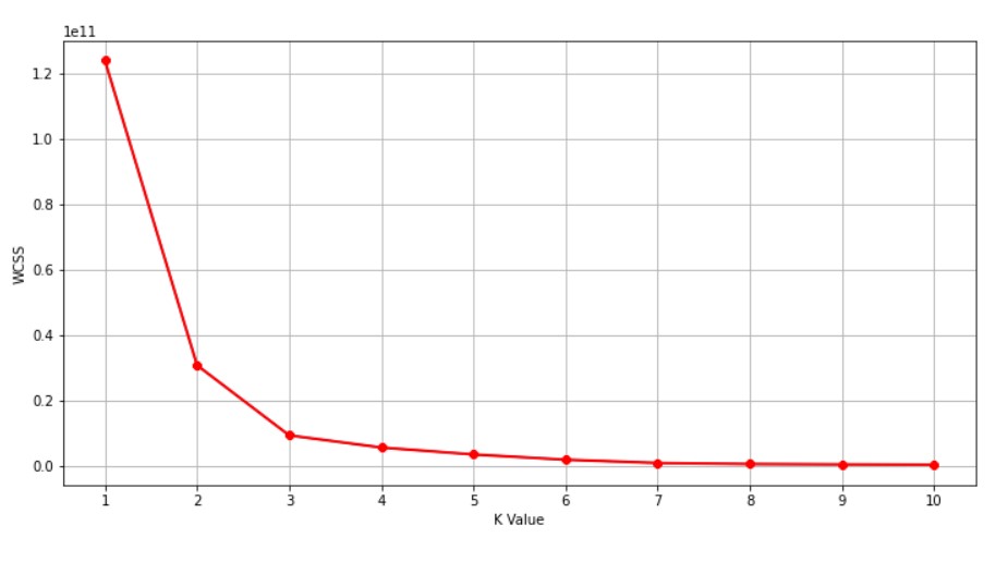
Here the X-Axis is the number of groups/clusters. We will take that many numbers of clusters where the graph is making a turn. So, judging by this graph, we should take the number of clusters= 3.
km1=KMeans(n_clusters=3)
km1.fit(X)
y=km1.predict(X)
plt.figure(figsize=(16, 5))
plt.scatter(X[y==0,1],X[y==0,0],color='red')
plt.scatter(X[y==1,1],X[y==1,0],color='green')
plt.scatter(X[y==2,1],X[y==2,0],color='blue')
Output
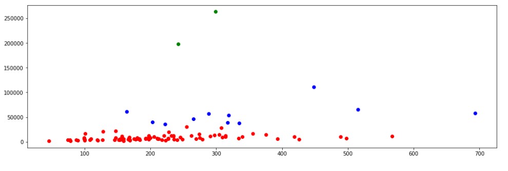
There seem to be 3 clusters, the large cluster of maximum people with normal financial resources. The next cluster with better financial resources. The top cluster has only 2 customers with the highest financial resources.
Here, in this dataset, we were able to analyse the customers of this bank in many ways and understand a lot of things, how to analyse data for customer analytics, what is customer analytics and how to proceed with it. Check the code in the link below.
Code: Here
Conclusion
Customer Analytics is very important in today’s digital world. Properly implemented analytics helps to predict customers’ reactions to marketing and AD campaigns, their brand adaptation, and their understanding of the customer experience. Other parameters which can be judged are customer satisfaction, customer experiences, marketing campaign success, etc.
So, overall speaking, customer segmentation is a very promising sector and has room for growth and improvement.
Thank You.
The media shown in this article is not owned by Analytics Vidhya and are used at the Author’s discretion.
Prateek is a dynamic professional with a strong foundation in Artificial Intelligence and Data Science, currently pursuing his PGP at Jio Institute. He holds a Bachelor's degree in Electrical Engineering and has hands-on experience as a System Engineer at TCS Digital, where he excelled in API management and data integration. Prateek also has a background in product marketing and analytics from his time with start-ups like AppleX and Milkie Way, Inc., where he was involved in growth campaigns and technical blog management. Recognized for his structured thinking and problem-solving abilities, he has received accolades like the Dr. Sudarshan Chakraborty Award for Best Student Performance. Fluent in multiple languages and passionate about technology, Prateek continues to expand his expertise in the rapidly evolving AI and tech landscape.


I enjoyed reading your article. It really explains every detail so well. Thank you.
You article is very valuable for me. Hoping to read more. Thank you.