This article was published as a part of the Data Science Blogathon.
Introduction
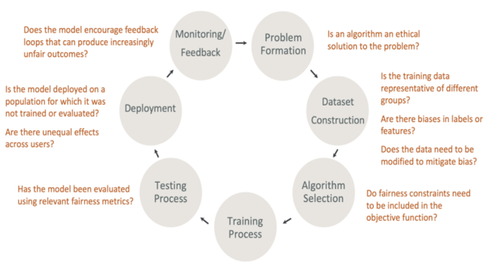
Ref: https://docs.aws.amazon.com/sagemaker/latest/dg/clarify-fairness-and-explainability.html
AI-based systems are disrupting almost every industry and helping us to make crucial decisions that are impacting millions of lives. Hence it is extremely important to understand how these decisions are made by the AI system. AI researchers, professionals must be able to explain the behavior of the model so the consumers understand why certain predictions are made by the AI Model.
This broad area of research is commonly referred to as trustworthy ML. When we use the terms Explainable AI and Responsible AI interchangeably most of the time, they are different concepts.
Define Responsible AI & Explainable AI
Responsible AI is a broader field of study with encapsulates other principles along with explainable AI.
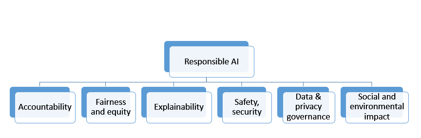
Responsible AI is a Practice of ensuring that AI benefits society and does not reinforce unfair bias. When the principles need a wider association with the government, legal, professionals from various industries, and socio-economic framework to be established, we can focus on two important topics of Fairness & Explainability with the help of technology and bring some amount of trust in the model development lifecycle.
Fairness – The process to understand how fairly the prediction of the ML system is serving all the user or user groups in a bias-free system.
Explainability – The process of understanding how an ML system is making some prediction or recommending some actions. How can we explain the model behavior with the importance of various features which determine the target prediction?
It can also be used outside the context of fairness to do something like, explain why a model is predicting a transaction fraud vs not fraud in a business application.
In this article, I am focusing on how to build an Explainable Model using one famous algorithm Shapley (SHAP). The demo will use Lending Club dataset which can be downloaded from https://github.com/sarbaniAi/LendingClubDataset
Problem Statement
The lending club connects borrowers & lenders. In Lending Club, Borrowers apply through an online platform where they are assigned an internal score. Lenders decide 1) whether to lend and 2) the terms of the loan such as interest rate, monthly instalment, tenure, etc. In this process, the lending club puts a lot of money at risk where borrowers do not pay back the loan (basically they default). On the other hand, lenders can earn a lot of money from good investments with the calculated risk associated with the borrowers (where they pay back the loan).
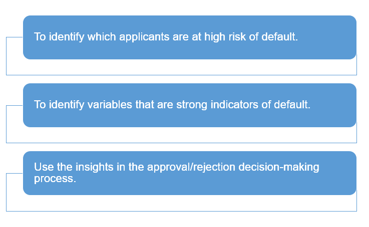
Business Objective
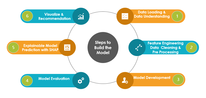
Steps to Build the Model
Approach
The demo aims to build an Explaianable Model and hence we will use basic feature engineering techniques and build a simple model using Logistic Regression, KNN, SVC, DecisonTree, and XGBosst classifiers. The best fit model will be used to predict the default loan. Our focus will be to explain the prediction and determine the important input features(independent predictors) which are influencing the risk of default of the applicant.
In this process, we will handle an imbalance in the dataset and apply hyperparameter optimization techniques to achieve decent evaluation metrics. However, the model performance can be improved by applying various other techniques that are not in the scope of this article.
Import Libraries
#Please install shap module if it is not installed in the runtime environement
#!pip install shap
# import Classifier Libraries
from sklearn.linear_model import LogisticRegression
from sklearn.svm import SVC
from sklearn.neighbors import KNeighborsClassifier
from sklearn.tree import DecisionTreeClassifier
from sklearn.ensemble import RandomForestClassifier
import xgboost
import collections
# Import Other Libraries
from sklearn.model_selection import train_test_split
from sklearn.pipeline import make_pipeline
from imblearn.pipeline import make_pipeline as imbalanced_make_pipeline
from imblearn.over_sampling import SMOTE
from imblearn.under_sampling import NearMiss
from imblearn.metrics import classification_report_imbalanced
from sklearn.metrics import precision_score, recall_score, f1_score, roc_auc_score, precision_recall_curve, accuracy_score, classification_report, confusion_matrix
from collections import Counter
from sklearn.model_selection import KFold, StratifiedKFold
from sklearn.model_selection import GridSearchCV,KFold
from sklearn.model_selection import cross_val_score
#Import ExplainableAI Module Shapeley
import shap
import time
import random
from six import StringIO
from IPython.display import Image
import numpy as np
import pandas as pd
import matplotlib.pyplot as plt
import seaborn as sns
Data Loading & Data Understanding
pd.set_option('display.max_columns', None)
pd.set_option('display.max_rows', None)
#Loading the loan data
loan = pd.read_csv("loan.csv", sep=",")
print(“dataframe shap:”,loan.shape)
print(“loan describe”, loan.describe())
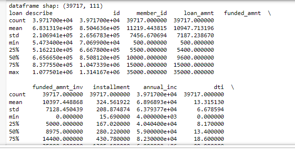
The partial output is shown above as it describes all the numeric features.
# let's look at the first few rows of the df
loan.head(3)
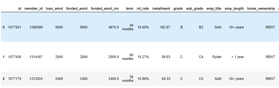
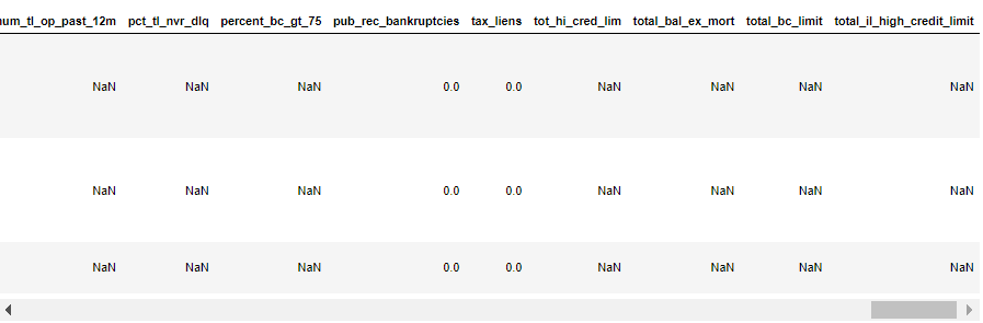
The first few columns and last few columns of three samples are shown above. We can see many columns are having many NaN values.
Feature Engineering
Handle Missing Values
Let’s drop the columns with missing values > 50%, the total number of columns are 111 and hence it should be ok to drop these columns to build a simple model.
# removing the columns having more than 50% missing values
missing_columns = loan.columns[100*(loan.isnull().sum()/len(loan.index)) > 0.5]
loan = loan.drop(missing_columns, axis=1)
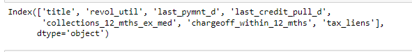
# Let's check how many columns are still having missing values
missing_columns = loan.columns[100*(loan.isnull().sum()/len(loan.index)) > 0]
print(missing_columns)
# They are not many and can be dropped as not important for the loan default indicator.
loan = loan.drop(missing_columns, axis=1)
# Final check for missing values
missing_columns = loan.columns[100*(loan.isnull().sum()/len(loan.index)) > 0]
missing_columns
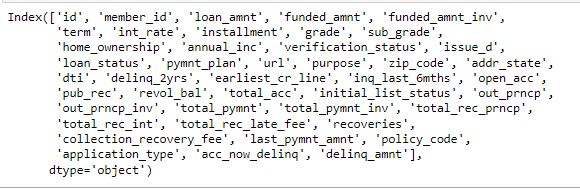
loan.columns
# The column int_rate is character type, let's convert it to float
loan['int_rate'] = loan['int_rate'].apply(lambda x: pd.to_numeric(x.split("%")[0]))
The objective is to identify predictors of default so that at the time of loan application, we can use those variables for approval/rejection of the loan. Now, there are broadly three types of variables – 1. those which are related to the applicant (demographic variables such as age, occupation, employment details etc.), 2. loan characteristics (amount of loan, interest rate, purpose of loan etc.) and 3. Customer behavior variables (those which are generated after the loan is approved such as delinquent 2 years, revolving balance, next payment date etc.).
Now, the customer behavior variables are not available at the time of loan application, and thus they cannot be used as predictors for credit approval.
Thus, going forward, we will use only the other two types of variables.
behaviour_var =  [
  "delinq_2yrs",
  "earliest_cr_line",
  "inq_last_6mths",
  "open_acc",
  "pub_rec",
  "revol_bal",
  "total_acc",
  "out_prncp",
  "out_prncp_inv",
  "total_pymnt",
  "total_pymnt_inv",
  "total_rec_prncp",
  "total_rec_int",
  "total_rec_late_fee",
  "recoveries",
  "collection_recovery_fee",
  "last_pymnt_amnt",
  "application_type"]
behaviour_var
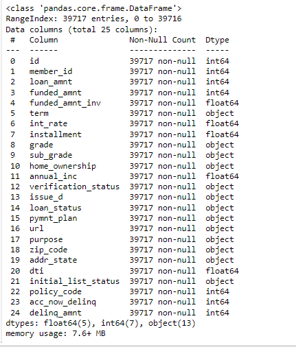
# let's now remove the behaviour variables from analysis
df = loan.drop(behaviour_var, axis=1)
df.info()
#also, we will not be able to use the variables zip code, address, state etc.
# the variable 'title' is derived from the variable 'purpose'
# thus let get rid of all these variables as well
df = df.drop(['id', 'url', 'zip_code', 'addr_state'], axis=1)
df[‘loan_status’] = df[‘loan_status’].astype(‘category’)
df['loan_status'].value_counts()
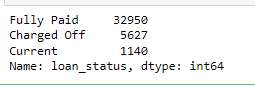
# filtering only fully paid or charged-off
df = df[df['loan_status'] != 'Current']
df['loan_status'] = df['loan_status'].apply(lambda x: 0 if x=='Fully Paid' else 1)
# converting loan_status to integer type
df['loan_status'] = df['loan_status'].apply(lambda x: pd.to_numeric(x))
# summarising the values
df['loan_status'].value_counts()
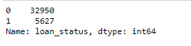
round(np.mean(df[‘loan_status’]), 2)
# let’s also observe the distribution of loans across years
# first lets convert the year column into datetime and then extract year and month from it
df['issue_d'].head()
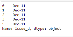
from datetime import datetime
df['issue_d'] = df['issue_d'].apply(lambda x: datetime.strptime(x, '%b-%y'))
# extracting month and year from issue_date
df['month'] = df['issue_d'].apply(lambda x: x.month)
df['year'] = df['issue_d'].apply(lambda x: x.year)
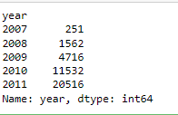
# let's first observe the number of loans granted across years
df.groupby('year').year.count()
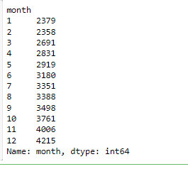
# number of loans across months
df.groupby('month').month.count()
# debt to income ratio
def dti(n):
    if n <= 10:
        return 'low'
    elif n > 10 and n <=20:
        return 'medium'
    else:
        return 'high'
df['dti'] = df['dti'].apply(lambda x: dti(x))
# funded amount
def funded_amount(n):
    if n <= 5000:
        return 'low'
    elif n > 5000 and n <=15000:
        return 'medium'
    else:
        return 'high'
df['funded_amnt'] = df['funded_amnt'].apply(lambda x: funded_amount(x))
# filtering all the object type variables
df_categorical = df.loc[:, df.dtypes == object]
df_categorical['loan_status'] = df['loan_status']
# Now, for each variable, we can compute the incremental diff in default rates
print([i for i in df.columns])
# store columns with specific data type
numeric_columns = df.select_dtypes(include=['integer', 'float64', 'uint8']).columns
categorical_columns = df.select_dtypes(include=['object']).columns
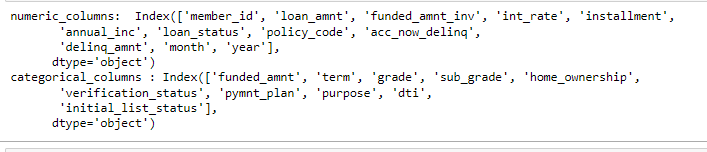
print("numeric_columns: ", numeric_columns)
print("categorical_columns :", categorical_columns)
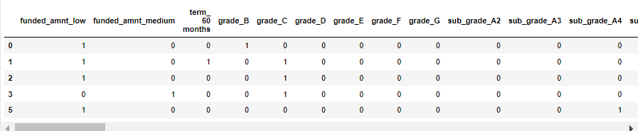
# convert categorical variables into dummies - one hot encoding
df_dummy = pd.get_dummies(df[categorical_columns ], drop_first=True)
df_dummy.head()
# drop categorical variables from numeric dataset
df_tmp = df.drop(categorical_columns, axis=1)
# concat dummy variables with categorical dataset
df_train = pd.concat([df_tmp, df_dummy], axis=1)
# store columns with specific data type
numeric_columns = df_train.select_dtypes(include=['integer', 'float64', 'uint8']).columns
categorical_columns = df_train.select_dtypes(include=['object']).columns
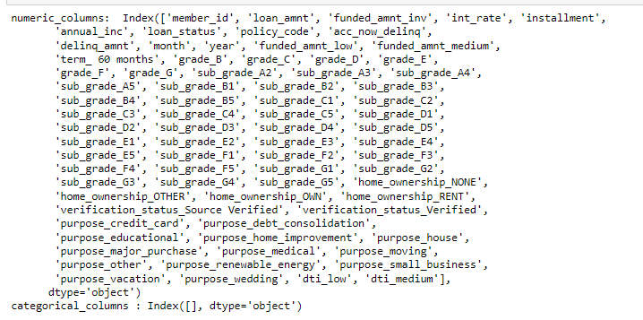
print("numeric_columns: ", numeric_columns)
print("categorical_columns :", categorical_columns)
df_train.drop(['issue_d'], axis =1, inplace=True)
Handling Imbalance Data
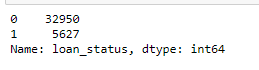
df_train['loan_status'].value_counts()
print(“The % of Non Fraud datset is “, round((df_train[‘loan_status’].value_counts()[0]/len(df_train))*100,2))
print("The % of Fraud datset is ", round((df_train['loan_status'].value_counts()[1]/len(df_train))*100,2))
df_train=df_train.set_index(‘member_id’)

The data is highly imbalanced. I am using SMOTE technique to oversample the minority class which is Target Label =1 in this case.
SMOTE is performed during cross-validation. The train-test split will be done before applying the SMOTE techniques to avoid data leakage. The test dataset will be untouched and will not be used in any feature engineering.
Model Building
 #Preparing X dataset for training
X = df_train.drop(['loan_status'],axis=1)
#Putting response variable to y
y = df_train['loan_status']
# Splitting the data into train and test
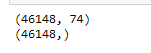
X_train, X_test, y_train, y_test = train_test_split(X,y, train_size=0.7,test_size=0.3,random_state=100)
print(X_train.shape)
print(y_train.shape)
(27003, 74)
(27003,)
classifiers = {
    "LogisiticRegression": LogisticRegression(),
    "KNearest": KNeighborsClassifier(),
    "Support Vector Classifier": SVC(),
    "DecisionTreeClassifier": DecisionTreeClassifier(),
    "XGBoostClassifier": xgboost.XGBClassifier(objective="binary:logistic", eval_metric="auc", use_label_encoder=False, n_estimators=100, max_depth=2)
}
for key, classifier in classifiers.items():
    classifier.fit(X_train, y_train)
    training_score = cross_val_score(classifier, X_train, y_train, cv=5)
    print("Classifiers: ", classifier.__class__.__name__, "Has a training score of", round(training_score.mean(), 2) * 100, "% accuracy score")
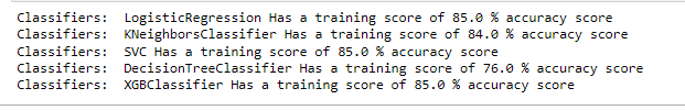
Model Selection
XGBOOST is selected as the final model as it is showing good accuracy.
X_train_smote, y_train_smote = SMOTE(random_state=1234).fit_resample(X_train, y_train)
smote_value_counts = y_train_smote.value_counts()
print("Loan Status with default are %.2f%% of the test set." % (smote_value_counts[0] * 100 / len(y_train_smote)))

print(X_train_smote.shape)
print(y_train_smote.shape)
def xgboost_search(X, y, search_verbose=1):
    params = {
        "gamma":[0.5, 1, 1.5, 2, 5],
        "max_depth":[3,4,5,6],
        "min_child_weight": [100],
        "subsample": [0.6, 0.8, 1.0],
        "colsample_bytree": [0.6, 0.8, 1.0],
        "learning_rate": [0.1, 0.01, 0.001]
    }
    xgb = xgboost.XGBClassifier(objective="binary:logistic", eval_metric="auc", use_label_encoder=False)
    skf = StratifiedKFold(n_splits=3, shuffle=True, random_state=1234)
    grid_search = GridSearchCV(estimator=xgb, param_grid=params, scoring="roc_auc", n_jobs=1, cv=skf.split(X,y), verbose=search_verbose)
    grid_search.fit(X, y)
    print("Best estimator: ")
    print(grid_search.best_estimator_)
    print("Parameters: ", grid_search.best_params_)
    print("Highest AUC: %.2f" % grid_search.best_score_)
    return grid_search.best_params_
Train Model
# The model evaluation with various hyper parameters will take ~20 mins to run
rows = random.sample(np.arange(0,len(X_train_smote.index)).tolist(), 5000)
model_params = xgboost_search(X_train_smote.iloc[rows,], y_train_smote.iloc[rows,])
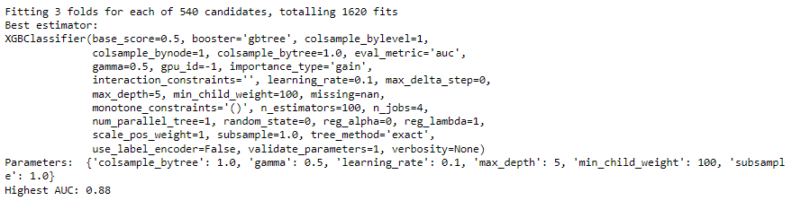
The output shows the number of executions and the best parameters selected by the xgboost_search function built above.
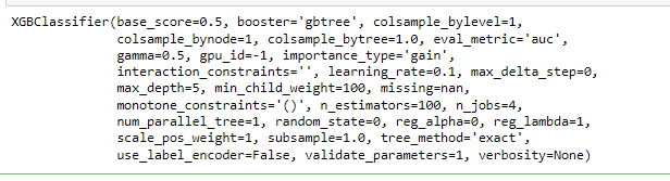
model = xgboost.XGBClassifier(objective=”binary:logistic”, eval_metric=”auc”, use_label_encoder=False)
model.set_params(**model_params)
model.fit(X_train_smote, y_train_smote)
Explainable AI Model Performance
# Get the predictions
xgb_predictions = model.predict(X_test)
print(accuracy_score(y_test, xgb_predictions))
print(classification_report(y_test, xgb_predictions))
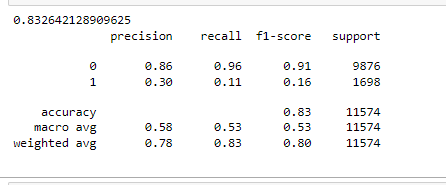
The accuracy of the model is > 80% but accuracy is not the correct measurement of model performance. Precision & Recall of minority class (default where target =1) is significantly low even after handling imbalance with SMOTE (oversampling technique).
This demands a detailed inspection of the model to verify if the model is explainable in terms of features’ importance. This
Explain the Model Prediction
Detecting model bias
Explain how feature values contribute to the predicted outcome, both for the model overall and for individual predictions.
import matplotlib.pylab as pl
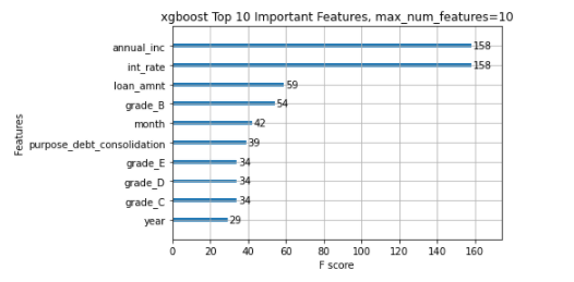
xgboost.plot_importance(model, max_num_features=10)
pl.title("xgboost Top 10 Important Features, max_num_features=10")
pl.show()
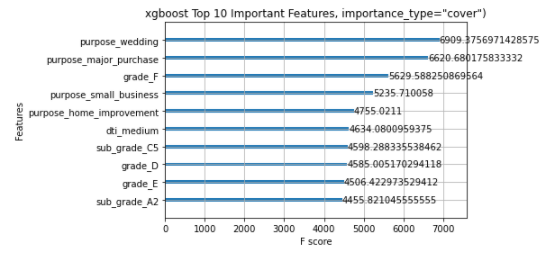
xgboost.plot_importance(model, max_num_features=10, importance_type="cover")
pl.title('xgboost Top 10 Important Features, importance_type="cover")')
pl.show()
xgboost.plot_importance(model, max_num_features=10, importance_type="gain")
pl.title('xgboost Top 10 Important Features, importance_type="gain")')
pl.show()
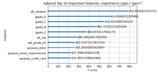
The different importance types parameters are showing different features in the top feature list. The above XGBOOST feature importance function is not able to achieve consistent results and hence fails to gain the trust of the people.
Next, I will demonstrate how the SHAP value technique can help to explain the model prediction in a trustworthy manner.
Explainable AI SHAP Algorithm
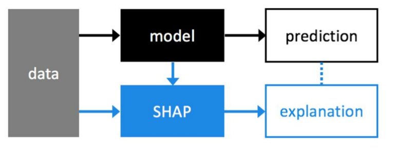
The above diagram is showing the prediction explanation method with SHAP.
SHAP stands for SHapley Additive exPlanations. ‘Shapley’ is based on a game theory which gives a realistic ground for this algorithm.
• Sapley values are used for calculating the feature importance which builds the explanations.
• A Shapley value calculates the marginal contribution of each ‘player’ and calculates all possible ‘coalitions’.
• Let’s use this in a machine learning context, the marginal contribution of each player is compared with the feature contribution.
• SHAP theory explains the model prediction with a baseline prediction. Given a set of features, Shapley Values are calculated for each feature, Then SHAP values are added together to give the overall model prediction which is referred to as “Base Value”. This explains the ‘Additive’ nature of this theory.
The model output contains all the input features however, it is difficult to explain the importance of the features in a consistent manner. The xgboost feature importance method is showing different features in the top ten important feature lists for different importance types.
The SHAP value algorithm provides a number of visualizations that clearly show which features are influencing the prediction.
Importantly SHAP has the
capability to explain both overall model prediction (Global Feature Importance)
and specific prediction (Local Feature Importance). SHAP is model agnostic ie.
works for regression, tree-based, and boosting algorithms.
Next sections, I will demonstrate how to use SHAP values to understand XGBoost model predictions and how to interpret the visualization to explain the feature importance without technical jargon.
Global Feature Importance of Explainable AI
Global feature importance Bar plot
This is created by passing a matrix of SHAP values to the bar plot function. In this case, the mean absolute SHAP value is considered for each feature over all the given samples.
The plot only shows a maximum of ten bars by default, but we can use the max_display parameter to control the numbers.
The below codes and plots are showing the various interpretations of the Model explainability using SHAP values:
shap.plots.bar(shap_values)
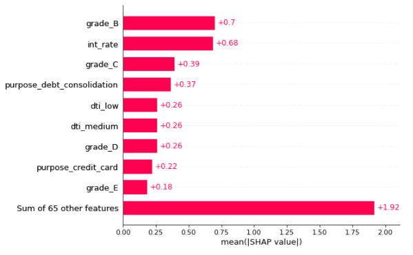
In the above plot, The X-axis is showing the absolute mean of SHAP values. Features are plotted on the y axis in ascending order of their feature importance.
The number written on the right side of each bar plot is the respective mean shap values of the feature which is the effect of that feature on the loan default prediction.
Top three global features with highest importance are Grade_B (dummy Grade=B), int_rate & Grade_C (dummy Grade =C).
Note: In the rest of the plots shown below, the Red colour indicates the high value of the feature and the Blue colour indicates the low value of the feature.
The right side of the zero or base value on the X-axis will indicate the increase in the probability of the Target value =1 (in our case it will increase the risk of default loan).
The left side of the zero or base value on the X-axis will indicate the decrease in the probability of the Target value =1 (in our case it will decrease the risk of default loan).
Explainable AI SHAP Summary plot
shap.plots.beeswarm(shap_values)
In the above SHAP summary plot, we see how the value of a feature impacts the prediction. Here we can see the low value of int_rate will decrease the risk of default loan. Also, grade_B & grade_C -> two categorical features when become True, will decrease the risk of default loan
SHAP Summary plot with the absolute mean value
The below plot is showing the absolute mean value of shap values to present simple visualization of the global top feature importance.
shap.plots.beeswarm(shap_values.abs, color="shap_red")
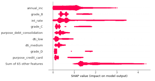
Here we can see tope features that are impacting the prediction are annual_income, int_rate, grade_b, & grade_C.
Explainable AI SHAP Interaction Plot
Another way to visualize the interaction of one or two features on the predicted outcome is SHAP Interaction plots (scatter plots). The function automatically includes another variable that the selected feature interacts most with.
shap.plots.scatter(shap_values[:,"int_rate"], color=shap_values)
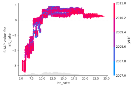
The above interaction plot is showing how the change of int_rate (along the X-axis) is affecting the prediction (SHAP value of the int_rate along the Y-axis). When the int_rate is low, a slight change in int_rate is increasing the prediction = 1 ie loan default risk a lot. At int_rate ~12.5 or greater the change of this feature is not affecting the prediction of default loans as such.
Also notice, the Interest rate is also interacting with the “year” value most frequently.
Let’s visualize another feature annual income (annual-inc) in the next plot –
shap.plots.scatter(shap_values[:,"annual_inc"], color=shap_values)
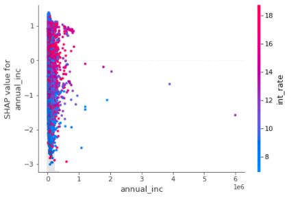
The above interaction plot is showing how the change of annual_inc(along the X-axis) is affecting the prediction (SHAP value of the annual_inc along Y-axis). When the annual_inc is low, a slight change in annual_inc shows a sharp rise in prediction = 1 ie loan default risk. This is showing the real-life situation when low income will increase the risk of default loan.
Let’s check a few categorical variables in the next two plots.
shap.plots.scatter(shap_values[:,"grade_B"], color=shap_values)
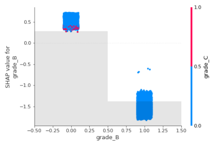
grade_B is a dummy variable and has two values “zero” or “one”, When the grade_B is false ie. The grade is other than B, then the effect on prediction is high and hence increases the risk of default.
When the Grade is B (grade_B =1) then the effect on the prediction of default is low. Clearly, this is interacting with Grade_C most frequently.
The same explanation is applicable for the other categorical feature Grade_C as shown below.
shap.plots.scatter(shap_values[:,"grade_C"], color=shap_values)
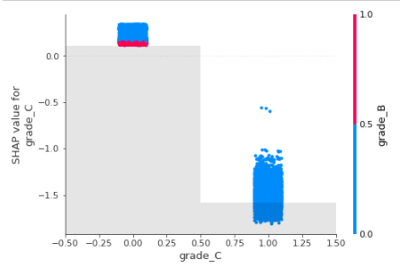
grade_C is a dummy variable and has two values “zero” or “one”, When the grade_C is false ie. The grade is other than C, then the effect on prediction is high and hence increases the risk of default.
When the Grade is C (grade_C =1) then the effect on the prediction of default is low. Clearly, this is interacting with Grade_B most frequently.
Local Feature Importance
Local feature importance explains the prediction of a specific sample. The SHAP values are calculated for the features in terms of their importance to influence the model to predict the target value of that sample.
SHAP Waterfall plot
A waterfall chart is used to visualize the cumulative effect of each feature. The plot starts from the bottom of the chart with the baseline probability for loan defaults. The plot shows how the addition of each feature shifts the default probability either towards 1 or 0. At last, all features are considered, the final prediction is achieved in terms of loan default risk (shown at the top of the chart).
The plot shows the features that push the model output from the base value to the model output.
The interpretation of the waterfall plot is that the features push the model output from the base value to the model output.
Base value -> The average model value over the entire training dataset
• Features in Red are pushing the prediction probability higher than the base value ie. it increases the probability of a “default” loan.
• Features in Blue are bringing down the prediction lower than the base value ie. it decreases the probability of a “default” loan.
# Explain the specific Sample
sample_ind = 2
shap.plots.waterfall(shap_values[sample_ind], max_display=14)
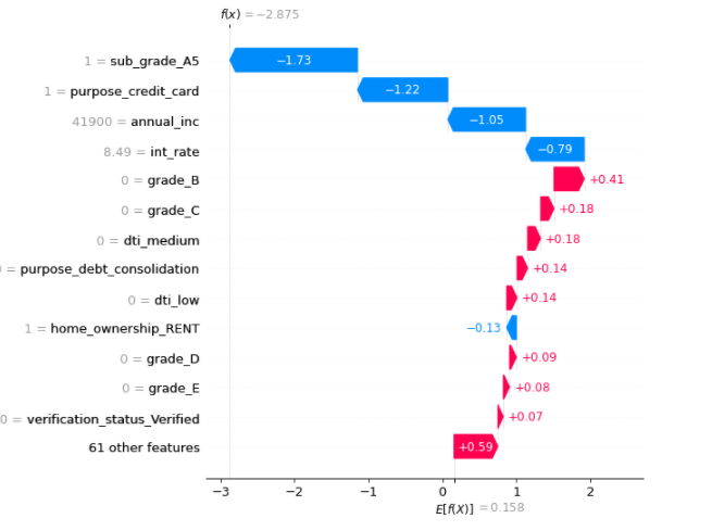
The above visualization explains the prediction of the second sample. The most important feature is sub_grade with value A5 for this sample. The low value of sub_grade is zero means sub_grade has values other than “A5” and those values will decrease the probability of loan default.
The second important feature “purpose” has value “credit card” for this sample and if it has value other than “credit card” the default risk will go down.
Annual Income is the numeric feature and has a low value. It is bringing down the default risk below the base value and hence lowering the risk of default for this sample.
Let’s check another sample, 1000 th sample below
# Explain the specific  Sample "sample_ind"
sample_ind = 1000
shap.plots.waterfall(shap_values[sample_ind], max_display=14)
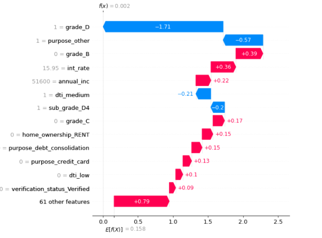
In the above sample, the annual income is having a high value and hence increasing the risk of default in loans. Interest Rate (int_rate) is also an important feature and increases the risk of default.
SHAP local feature importance with a bar plot
The Red colour means the high value of the feature. If the RED color increases the SHAP values it will increase the probability of Label=1 which is the default loan in this case.
The Blue color represents the low value of the features. If the Blue color bar shows the decrease in SHAP values, it will decrease the probability of Label=1 which is the default loan in this case.
Below is the feature importance shown for the sample = 3000
# Explain the 1000th Sample with other plots
shap.plots.bar(shap_values[3000])
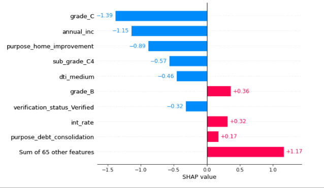
Here the features with blue color are decreasing the default probability. Red features are increasing the default probability.
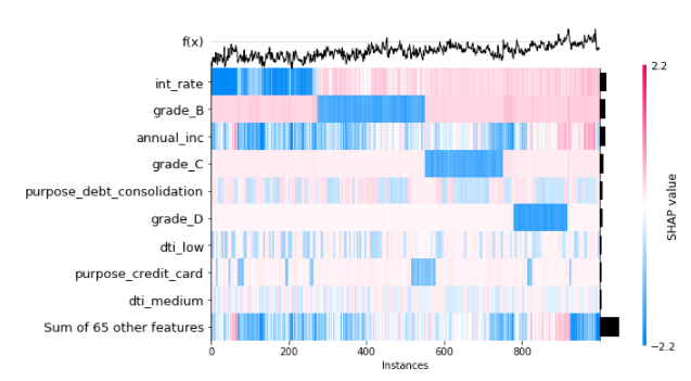
SHAP Local feature importance with heatmap
# Explain the 1000th Sample with other plots - Heatmap
shap.plots.heatmap(shap_values[:1000])
SHAP Local feature importance: Visualize the specific prediction’s explanation with a forced plot
• Base value is the threshold. Anything which is above base value is denoting the label 1 (one – default loan
• Below base value it is denoting the label 0 (Zero – not default)
• Direction is showing the Importance of every feature that is driving it above or below the base value.
• Red features are trying to push the prediction values above the base value indicating high risk of default loan
• Blue features are trying to push the prediction below the base value indicating low risk of default loan
# visualize the first prediction's explanation with a force plot.
#This plot is mot visible in github. run this code in notebook to generate the plots
shap.initjs()
shap.plots.force(shap_values[0])
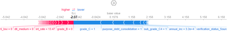
# visualize another prediction with a forced plot
shap.initjs()
shap.plots.force(shap_values[2000])
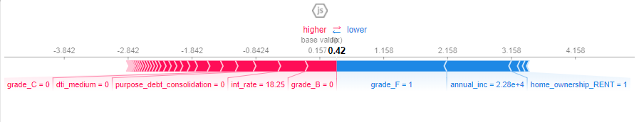
The above force plots are showing that the blue features are having low values in the respective sample and hence bringing down the default risk. the red features are increasing the default risk.
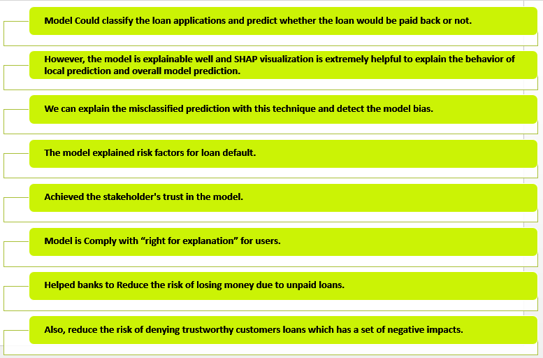
Conclusion
Want to read more on AI? Click here.
References
https://shap.readthedocs.io/en/latest/example_notebooks/overviews/An%20introduction%20to%20explainable%20AI%20with%20Shapley%20values.html?highlight=logistic#
https://docs.aws.amazon.com/sagemaker/latest/dg/clarify-fairness-and-explainability.html
https://developers.google.com/machine-learning/crash-course/fairness/identifying-bias
Sarbani Maiti,
Vice President, Data and AI Practice at Veersa Technology.
She is having 20 + yrs of experience in various technologies including cloud, AI/Ml, and data analytics. In her current role, she focuses on developing data-driven solutions for healthcare, finance, and other industries.
As an AWS Community Builder, speaker, and tech blog writer, Sarbani is dedicated to sharing her knowledge and experience with others.


Hi, I got invalid syntax at "XGBoostClassifier": xgboost.XGBClassifier(objective="binary:logistic", eval_metric="auc", use_label_encoder=False, n_estimators=100, max_depth=2) when I run the codes. May I know what is the proble with that line? Thank you.
Hi, Thanks for reading my article. I will check and get back to you. Thanks Sarbani