Introduction
In data-driven decision-making, Microsoft Excel is a versatile and accessible tool for data analysis. From professionals to enthusiasts, it’s familiarity and user-friendly interface have made it a go-to choice for interpreting and extracting valuable insights from datasets of all sizes. In this article, we delve into the diverse functionalities of Microsoft Excel that enable data analysts to clean, transform, and visualize data, empowering them to make informed decisions and unravel hidden patterns. Whether you’re a beginner or a seasoned analyst, join us on this journey as we unlock the potential of Microsoft Excel for data analysis and harness its capabilities to derive meaningful conclusions from the vast sea of data.
This article was published as a part of the Data Science Blogathon.
Table of contents
Benefits of Microsoft Excel for Data Analysis
- Ease of Use: Microsoft Excel’s user-friendly interface and familiar spreadsheet layout make it accessible even to non-technical users, enabling them to perform data analysis without extensive coding knowledge.
- Data Manipulation: Excel offers a wide range of functions and tools to manipulate and clean data, such as sorting, filtering, and conditional formatting, facilitating data preparation for analysis.
- Formula and Function Library: Excel’s extensive library of built-in formulas and functions enables users to perform complex calculations and data transformations efficiently.
- Data Visualization: Excel provides various charting and graphing options to visualize data, making it easier to identify trends, patterns, and outliers within the dataset.
- PivotTables and PivotCharts: PivotTables and PivotCharts simplify data summarization and analysis, allowing users to create dynamic reports and gain valuable insights.
- Scenario Manager: Excel’s Scenario Manager helps analyze different scenarios by changing input values, making it useful for sensitivity analysis and decision-making.
- Statistical Analysis: Excel’s built-in statistical functions, such as regression, correlation, and t-tests, support basic statistical analysis without the need for specialized software.
- Integration with External Data: Excel can connect to various external data sources, such as databases and web services, enabling seamless data import and analysis.
- Data Validation: Excel allows users to set data validation rules to ensure data accuracy and consistency, reducing errors during analysis.
- Automated Tasks: Excel’s Visual Basic for Applications (VBA) enables users to automate repetitive tasks and create custom macros, saving time and effort in data analysis workflows.
- Collaboration: Excel’s compatibility and wide usage facilitate easy sharing and collaboration among team members for collective data analysis efforts.
- Cost-Effective Solution: Excel comes bundled with Microsoft Office suites, making it a cost-effective option for data analysis compared to specialized data analysis software.
Example – Microsoft Excel for Data Analysis
The data is publicly available on Kaggle. It includes fitness information collected by the contributor on Kaggle on their Redmi fit and synthetically generated data. The data columns are the following.
Day, Workout Type, Distance Covered (in km), Duration of the workout (in minutes), Total number of active calories burned (kcal), Steps count per day, Average speed (km/hour), Average Stride Rate, Maximum number of steps taken per minute in the entire workout, Average time is taken to cover a kilometer, Maximum time taken to cover a kilometer, Minimum time taken to cover a kilometer, Maximum BPM during the workout, Minimum BPM during the workout, Maximum volume of oxygen used by the body while exercising, Anaerobic, Aerobic, Intensity, Light.
After downloading the CSV file from Kaggle I opened it in Excel and converted the available sheet into a table; a shortcut to do the same is, pressing Ctrl + t.
Converting it to a table provides ease in calculations and referring to the information in different sheets of the same Excel workbook.
As we do describe() in python to get an overview of the maximum, minimum, different quartile ranges, the same can be done in Excel with the use of some simple formulas.
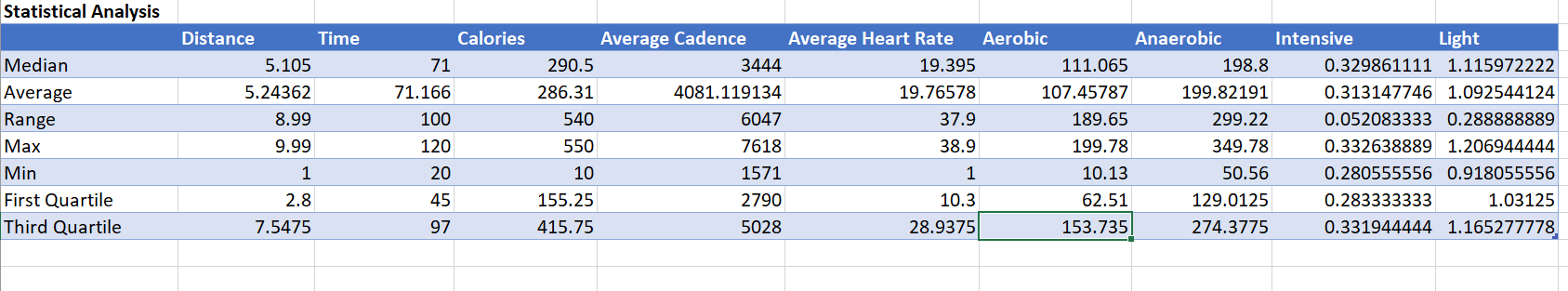
I have used inbuilt excel functions to create the statistical summary, the attached video will provide you with the functions I used to generate the summary.
Solving the Problem Using MS Excel
Data analysis is asking questions about the data that would help in making better our understanding of it. As part of this article, we would ask questions about the data and visualize its results in Excel.
Which Workout Burns the Most Calories Given the Time Spent and Distance Covered for Each?
We have created a pivot table keeping the workout type as a column and calories, time, and distance as values.
We have kept the workout type to be a column, all the other features in the pivot table would be grouped by it.
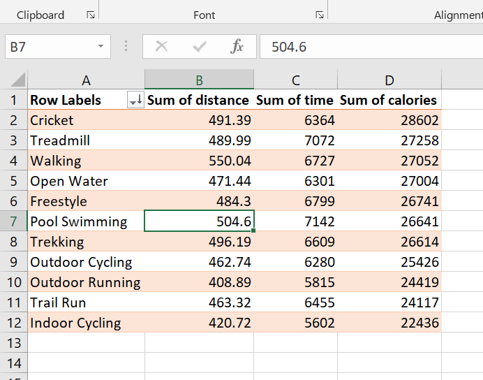
Cricket burns the most calories even when the time spent on it is lesser than the time spent on the treadmill or pool swimming.
We can visualize the same using a bar graph.
Go to Insert –> Select a bar graph,
After selecting the type of bar graph we get the next visualization.
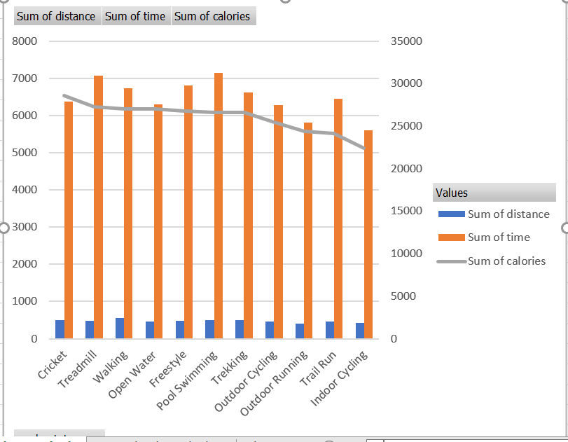
When you have a non-technical audience, this graph could have a better impact than looking at numbers in a pivot table.
Calories burning do not seem to affect by the time and distance spent. We have workouts that like outdoor cycling take almost the same amount of time but the calories spent are lesser.
Let us further ask some other questions.
Month-wise Calories Spent
We have data for all of January and the first 15 days of February. We know that the calories spent in January would be higher, let us see if the reasoning is right?
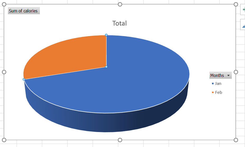
We see a split of 70-30, 70% of calories spent are in January whereas 30% in February.
Does Heart Rate get Affected by Aerobic or Anaerobic Exercises?
We know that anaerobic exercises are performed best in smaller time bursts and they need your body to use a lot of energy, aerobic exercises, on the other hand, include walking or cycling which can be done over longer periods of time.
We have grouped by the information on workout type column using Excel’s pivot table, post that we draw a 2d line graph.
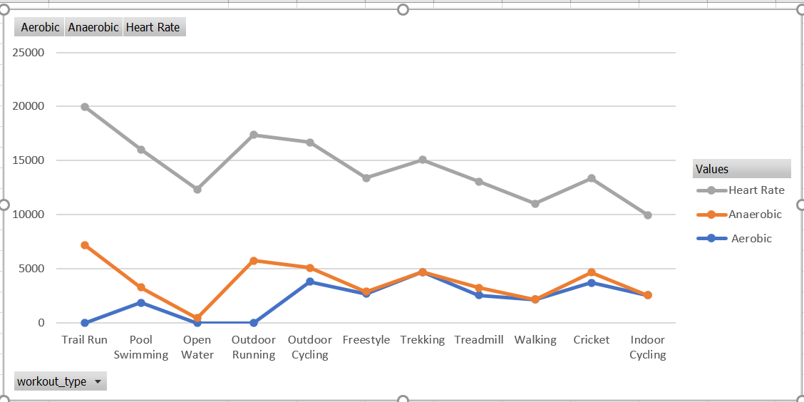
We see a pattern here the heart rate line graph follows a similar trajectory as the anaerobic line graph. The heart rate seems to be affected by how anaerobic the exercise is.
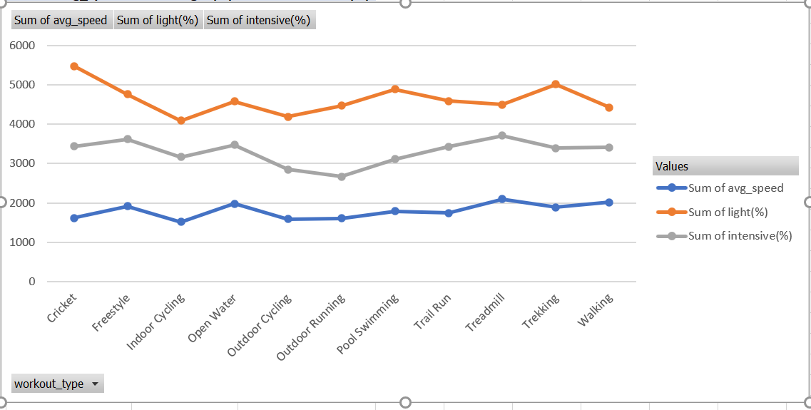
Can the Average Speed at Which the Workout is Performed Determine its Intensity?
We plot a stacked chart in Excel to understand if the magnitude of a workout can be determined by the speed of the workout.
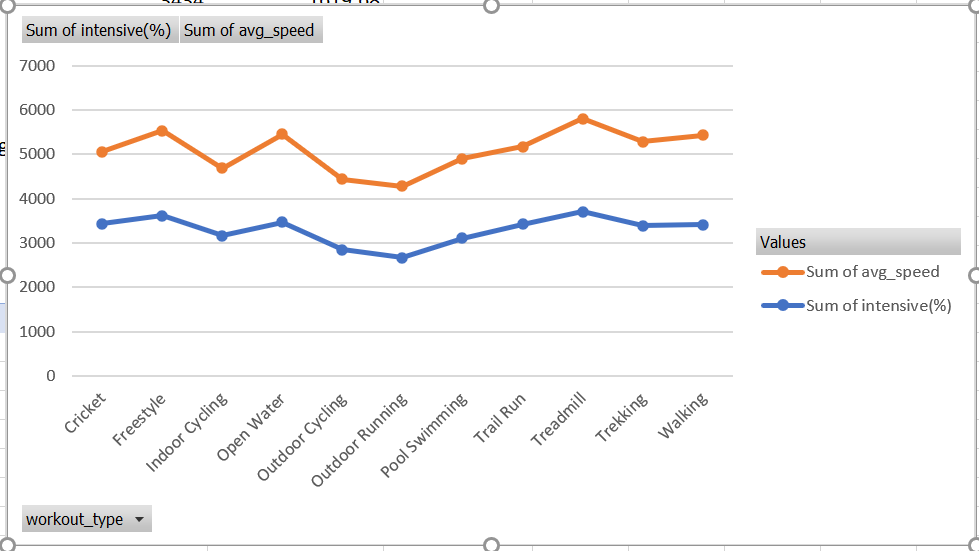
The pattern is clearly visible, the speed of the workout does determine its magnitude per our data.
The lower the speed at which the workout is performed, the higher is the lightness feature.
Count of Workouts Performed Each Day
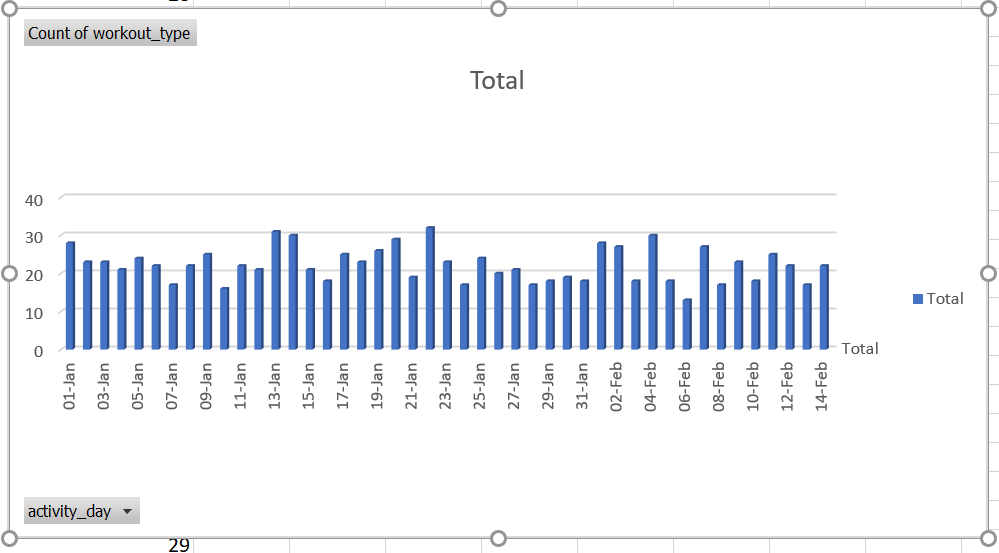
We had already discussed that some of the data is generated artificially, which looks right, it seems to be difficult to complete daily more than 20 workout exercises.
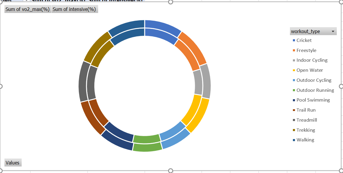
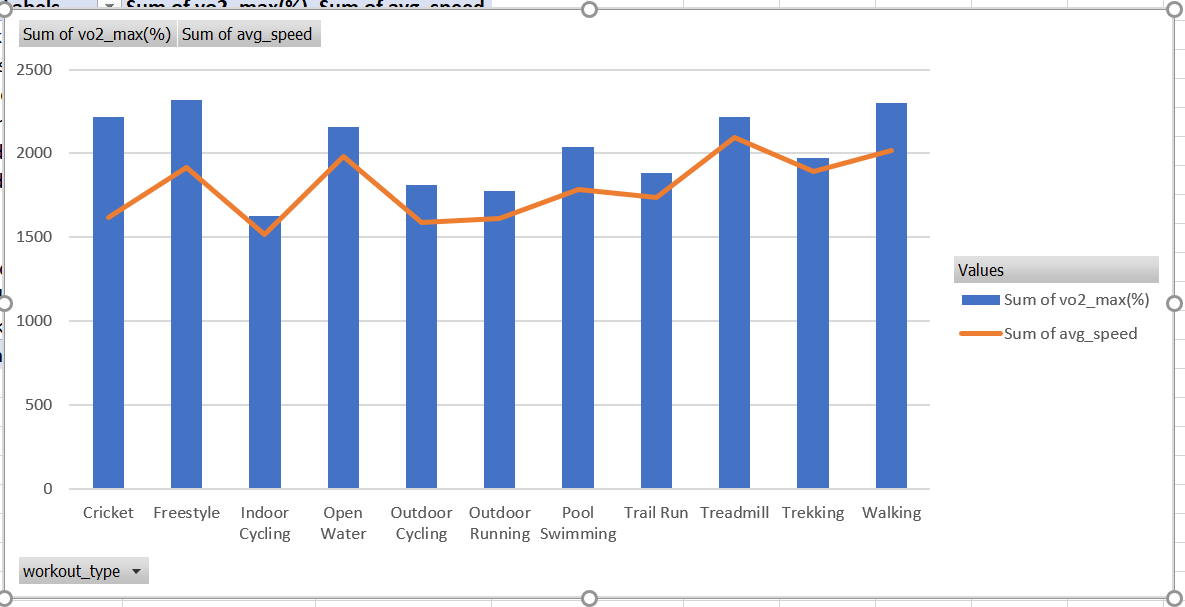
Is the Amount of Oxygen Related to any Other Features in the Table?
The amount of oxygen used in a workout seems to be reflective of the intensity of the workout, the doughnut chart shows the same visually.
The speed at which the workout is done is linearly related to the amount of oxygen that is spent during it, a graphical representation is
Conclusion
As we conclude this exploration of Microsoft Excel’s data analysis prowess, it becomes evident that honing your skills in this ubiquitous tool is essential for every data enthusiast and professional. To unlock its potential, immerse yourself in the comprehensive Analytics Vidhya BlackBelt Program. Through expert-led courses and hands-on projects, you’ll master advanced Excel techniques, data visualization, and data manipulation, elevating your proficiency to new heights. Join a vibrant community of learners, access valuable resources, and propel your data analysis career forward. Enroll now!
Frequently Asked Questions
Q1. What is Microsoft Excel data analysis?
A. Microsoft Excel data analysis refers to the process of using Excel’s features and functions to interpret, organize, and visualize data for insights and decision-making.
Q2. How do I get data analysis on Excel?
A. In Excel, go to the “Data” tab, click “Data Analysis,” and choose the desired analysis tool from the list. If it’s not available, install the Analysis ToolPak add-in.
Q3. How is Excel used by data analysts?
A. Data analysts leverage Excel’s capabilities to clean and manipulate data, perform calculations, create charts, and apply various analytical functions for exploratory data analysis and reporting.
Q4. Which tool is used for data analysis in Excel?
A. The “Data Analysis” tool, along with features like pivot tables, functions (e.g., SUM, AVERAGE), and charting, facilitate data analysis within Microsoft Excel.
The media shown in this article is not owned by Analytics Vidhya and are used at the Author’s discretion.


