Exploratory Data Analysis (EDA) is crucial for identifying outliers, understanding relationships between variables, and analyzing the structure of the data. It helps frame relevant questions, visualize results, and select the most suitable machine learning algorithm for the problem at hand. The goal is not to create fancy graphs but to derive meaningful insights.
In this article, you will explore the significance of Exploratory Data Analysis (EDA) through various exploratory data analysis examples. We will discuss practical EDA examples that illustrate how to analyze datasets effectively. One compelling exploratory data analysis example involves visualizing data relationships to uncover hidden insights. By the end, you will understand the importance of exploratory data analysis in enhancing your data-driven decision-making.
The dataset includes:
- Age of the patient at the time of surgery (numerical)
- Year of operation (numerical)
- Number of positive axillary nodes detected (numerical)
- Survival status (1 = survived 5+ years, 2 = died within 5 years)
We begin by loading the data into a dataframe.
df = pd.read_csv("/kaggle/input/habermans-survival-data-set/haberman.csv")
df.shape
df.info()
The data has 305 rows and 4 columns with no NULL values. The columns do not have a heading/title, hence we provide a meaningful title to the columns in our dataset.
df.columns = ["age",'year','nodes','status']df.describe()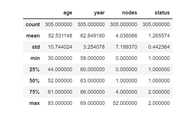
This article was published as a part of the Data Science Blogathon.
Let’s Look at the Data!
A quick look at the count of records for the attributes “age” and “year”(when the operation was performed) gives us the following insights.
- We have more patients with a survival status of 1(those who survived for more than 5 years or longer) than patients with a survival status of 2(those who died within 5 years)
- As the number of records existing for both survival rates has a major difference, our data is imbalanced.
- In the year 1958, most of the operations were performed and the least operations were performed in 1969
print(df["status"].value_counts())
print(df["year"].value_counts())
Univariate Analysis
It is the simplest form of analyzing data, it uses only one variable hence the name, Univariate.
We would use Probability Density Function, Cumulative Distribution Function, Box Plots, and Violin Plots for our analysis
Probability Density Function
The probability density function(PDF) provides the probability of a random variable falling in the range of values.
We have plotted below the PDF of the age

Observations
- Patients between the ages of 30–34 have survived for 5 years or longer.
- Patients whose age is more than 75 died within 5 years of the operation.
- The number of patients between the age of 40–50 is more for status 2(i.e those who died within 5 years)
- The number of patients between the age of 35–40 is more for status 1(i.e who have survived for 5 years or more), patients within this age group have a good chance of survival post the operation.
PDF of Number of Nodes

Observations
We see that the data is overlapping but we can note that the survival rate is better in patients who have 0–2 nodes and the survival rate decreases as there is an increase in the number of nodes.
PDF of the year of operation
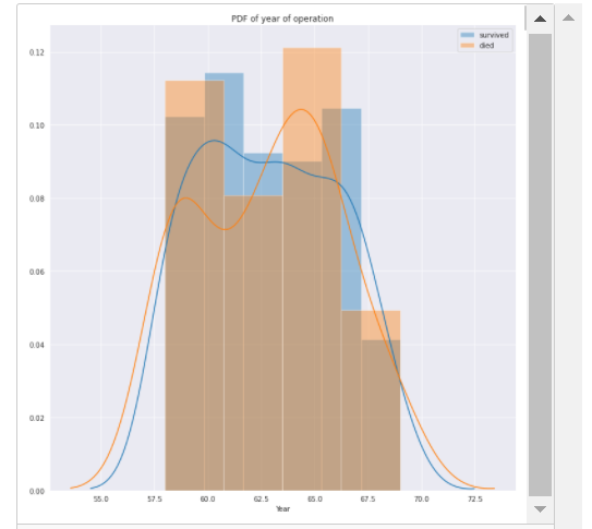
Observations
The data is overlapping but we can see that between 1963 and 1966 we have more survival data and between 1958–1961 we have more data on patients who died within 5 years of the operation.
Cumulative Distribution Function
It describes the probability that a random variable will be found at a value less than or equal to the point at which the CDF is calculated.
CDF of number of nodes

Observations
- 80% of the patients who survived had nodes less than 5.
- Whereas 80% of the patients who could not survive had greater than 10 nodes.
CDF of Age

Observations
- The CDF curve is highly overlapping but we can observe that 20% of surviving patients had an approximate age of 38, while 20% of patients who could not survive have an approximate age of 45
Box Plots
Help us in visualizing the distribution of data based on the quartiles and provide some indication of the data’s symmetry and skewness. Unlike many other methods of data display, boxplots show outliers.
Boxplot on Age

Observations
- The 25th percentile of patients who have survived are of age approximate 42 years
- The 25th percentile of patients who died are of age approximate 46 years
- The 50th percentile of patients who have survived are of age approximate 52 years
- The 50th percentile of patients who died are of age approximate 55 years
- 75th percentile of patients who have survived are of age approximate 60 years
- 75th percentile of patients who died are of age approximate 61 years
As we have noted before the data is overlapping to a great extent and hence we would not be able to draw an accurate conclusion on the basis of just the age of the patient.
Boxplot on Nodes

Observations
We can see that for the nodes attribute we have some outlier points.
- 75 percentile of patients who survived have less than 4 nodes whereas 50 percentile of patients who could not survive have 5 nodes
- Having a low count of active nodes is definitely a contributing factor to the survival of a patient.
Bivariate Analysis
The aim is to find patterns/relationships within the dataset using two attributes. It is useful in testing simple associations.
One plot which can be used for the analysis is the pair plot.
Pair plots are an easy way to visualize relationships within your data. A matrix of each variable associated with another variable is produced for our analysis.
Example of Pair Plots

Observations
Plot 2:- attributes:- age and year
The points are overlapping, due to which all points are not clearly visible on the plot, which makes it difficult to conclude.
Plot 3:- attributes:- age and nodes
The points are overlapping, due to which all points are not clearly visible on the plot, which makes it difficult to conclude. We can however see that patients with more number of nodes and high age are generally of status 2(who could not survive)
Plot 6:- attributes:- year and nodes
The points are overlapping, due to which all points are not clearly visible on the plot, which makes it difficult to conclude.
Multivariate Analysis
Contour plots can be used for multivariate analysis. They are used to represent a three-dimensional surface on a two-dimensional plane. One variable is represented on the horizontal axis and a second variable is represented on the vertical axis. The third variable is represented by a colour gradient.
A contour plot on attributes, age on the Y axis, year on the X-axis, and the third variable is status = 1(successful survival post 5 years of operation)

Observations
The patients who survived are mostly in the approximate age group of 45–55 within the years 1962–1964
A contour plot on attributes, age on the Y axis, year on the X-axis, and the third variable is status = 2(could not survive)

Observations
The patients who could not survive were in the approximate age group of 45–50 between the years 1962 and 1965
Conclusion
- The dataset is imbalanced.
- The data is highly overlapping for both the status which makes it difficult to implement a simple decision-making algorithm.
- Less number of nodes is a contributing factor to the survival status of a patient.
- Through our exploratory data analysis, we can deduce that since our dataset has highly overlapping attributes we would need to use a powerful machine learning algorithm for our objective of predicting the survival rates.
Hope you like the article! Exploratory Data Analysis (EDA) is essential in data science, providing numerous exploratory data analysis examples. For instance, analyzing a dataset can reveal trends and anomalies, showcasing various EDA examples. A practical exploratory data analysis example involves visualizing relationships between variables to uncover insights. Overall, understanding exploratory data analysis enhances decision-making in projects.
Hope you liked reading my article on Exploratory Data Analysis. Read the latest articles on our blog!