This article was published as a part of the Data Science Blogathon.
In Machine Learning problems, teams deal with a lot of data. Not all data is useful and can be utilized. Usually, some data has to be left out of the training process so that only the most relevant data and features are used. This is important so that only the most critical case features are used in the Machine Learning model. Let us look at using the most valuable features in the data.
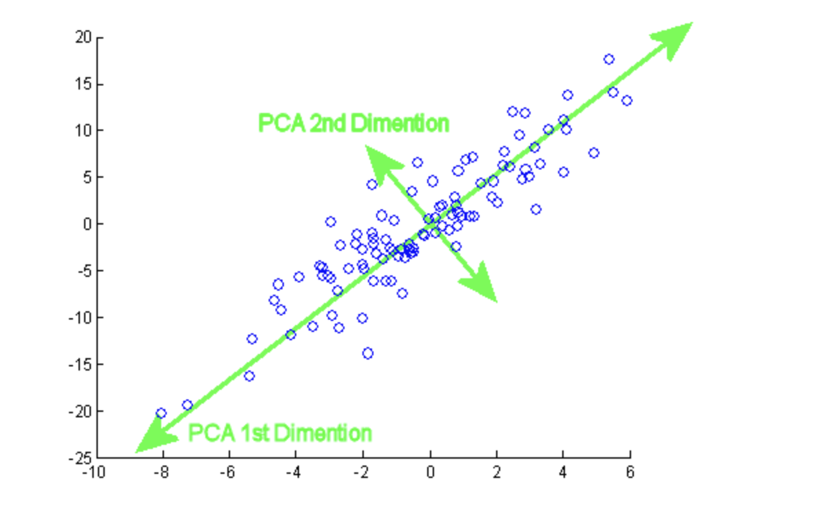
Principal component analysis (PCA) is the process of computing and analyzing the essential features of data and utilizing them to modify the foundation of the data, often just using the first few critical features and not using the rest.
In the modern machine learning processes, PCA is one of the most widely used multivariate statistical approaches. It is a statistical approach with the broader field of feature analysis that has been commonly employed in pattern recognition and signal processing.
( Image: https://programmathically.com/principal-components-analysis-explained-for-dummies/)
Machine learning and deep learning models can now tackle almost all types of problems, be it traditional Machine Learning and other related issues, because of high-performance CPUs and GPUs. While developing such models, several issues still cause performance bottlenecks. One of the parameters affecting the training time and the accuracy of machine learning models is the number of features in the dataset. When dealing with a dataset with many characteristics, one has several possibilities.
Relevance of PCA
PCA is a dimensionality reduction approach that converts a dataset’s columns into a new group of characteristics called Principal Components (PCs). The variance in a column is the information contained in it. The main aim of Principal Components is to express data in the smallest number of columns possible.
PCA is a process for reducing the complexity of high-dimensional data while preserving trends and patterns. It accomplishes this by condensing the data into fewer components, which can be assumed as feature summaries.
Components are unrelated features that are composites of the original features. They are also assigned so that the first has the most variance in the data, the second for the second most variance, and so on.
PCA is highly beneficial when working with large data sets with many characteristics. Image processing and genomic research are two examples of typical applications that deal with hundreds, if not tens of thousands, of columns.
We will use Python’s Scikit-Learn package to implement PCA. We will use the traditional machine learning pipeline, first importing libraries and datasets, then performing exploratory data analysis and preprocessing, and train our models, making predictions and evaluating accuracy. The only other step will be to use PCA to determine the appropriate amount of features before introducing our models.
Implementation on the Star Type Classification
First, we import the necessary libraries.
import numpy as np # linear algebra
import pandas as pd # data processing, CSV file I/O (e.g. pd.read_csv)
import seaborn as sns
import matplotlib.pyplot as plt
%matplotlib inline
sns.set_theme(style = "darkgrid")
Now, we read the data and check out how the data looks.
data = pd.read_csv('/kaggle/input/star-type-classification/Stars.csv')
data.head()
Output:
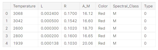
So, we can see the data. Let us get some idea about the problem at hand.
There are many types of stars in the Universe, ranging from Protostars to Red Supergiants. They are classified based on their mass and temperature. The spectra of stars can also organize them (the elements they absorb). A star’s spectral class and its brightness (apparent magnitude) may reveal a lot about it to astronomers.
The data features are as follows:
- Temperature — K
- L — L/Lo
- R — R/Ro
- AM — Mv
- Colour — General Color of Spectrum
- Spectral_Class — O,B,A,F,G,K,M
- Type — Red Dwarf, Brown Dwarf, White Dwarf, Main Sequence, Super Giants, Hyper Giants
Target features are as follows:
From 0 to 5
- Red Dwarf – 0
- Brown Dwarf – 1
- White Dwarf – 2
- Main Sequence – 3
- Super Giants – 4
- Hyper Giants – 5
Lo = 3.828 x 10^26 Watts
(Avg Luminosity of Sun)
Ro = 6.9551 x 10^8 m
(Avg Radius of Sun)
Temperature:
Because stars do not all have the same temperature, they are not the same hue. Astronomers have created quantitative ways to measure a star’s colour and then utilize those colours to estimate stellar temperatures to describe colour accurately.
The hottest stars have temperatures over 40,000 K, while the coldest stars have temperatures in the order of 2000 K. The surface temperature of our Sun is around 6000 K, and its peak wavelength hue is a little greenish-yellow. The Sun would seem white in space, with roughly equal proportions of reddish and bluish wavelengths of light.
L/Lo and R/Ro give a ratio of the Avg Luminosity of the star to that of our Sun and the Avg ratio of the star to our Sun, respectively.
Absolute Magnitude:
The absolute magnitude was developed after apparent magnitude when astronomers required a mechanism to compare celestial objects’ intrinsic or absolute brightness. The absolute magnitude is the magnitude it would have if it were 10 parsecs distant.
Colour of the Star:
A star’s colour measures its intrinsic or absolute surface temperature.
Spectral Class:
The spectra of stars can also classify them (the elements that they absorb). A star’s spectral class and its brightness (apparent magnitude) may reveal a lot about it to astronomers.
There are seven different kinds of stars. O, B, A, F, G, K, and M, in decreasing temperature order. O and B are unusual, very hot, and dazzling, and M stars are more frequent, colder, and less bright.
Now, let us check the shape of the dataset. Before proceeding with the problem statement, understanding the dataset is very important.
print(data.shape)
Output:

So, the data has 240 data units and 7 features.
Let us check the attributes of the data.
data.info()
Output:
RangeIndex: 240 entries, 0 to 239
Data columns (total 7 columns):
 #   Column          Non-Null Count  Dtype
---  ------          --------------  -----
 0   Temperature     240 non-null    int64
 1   L               240 non-null    float64
 2   R               240 non-null    float64
 3   A_M             240 non-null    float64
 4   Color           240 non-null    object
 5   Spectral_Class  240 non-null    object
 6   Type            240 non-null    int64
dtypes: float64(3), int64(2), object(2)
memory usage: 13.2+ KB
So, we can see that 5 features are numeric, and two are categorical features.
Now, we check for missing values.
#Missing Value Analysis
data.isnull().sum()
Output:
Temperature       0
L                 0
R                 0
A_M               0
Color             0
Spectral_Class    0
Type              0
dtype: int64
So, there are no missing values.
Let us perform some analysis of the data distribution.
Star Colour Analysis:
a= pd.DataFrame(data['Color'].value_counts())
plt.figure(figsize=(8,6))
sns.barplot(data= a, x='Color',y= a.index, palette= 'Spectral')
plt.title("Star Color Analysis")
Output:
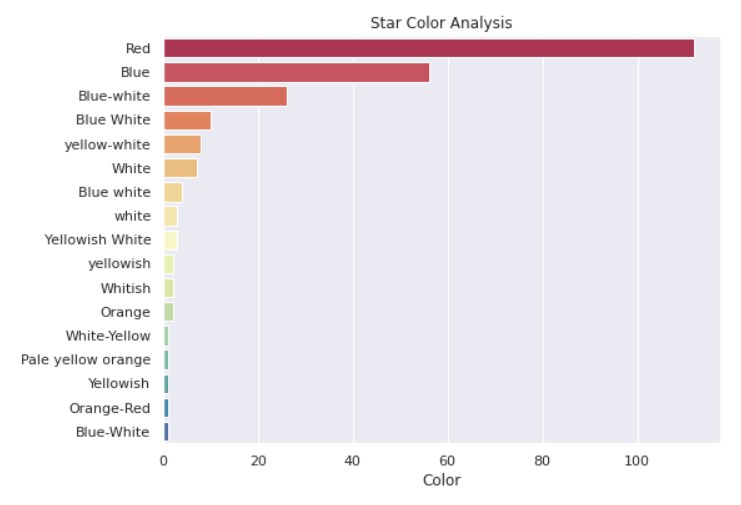
So, we can see that blue and red stars are the most common. Our Sun is a somewhat reddish-yellow star.
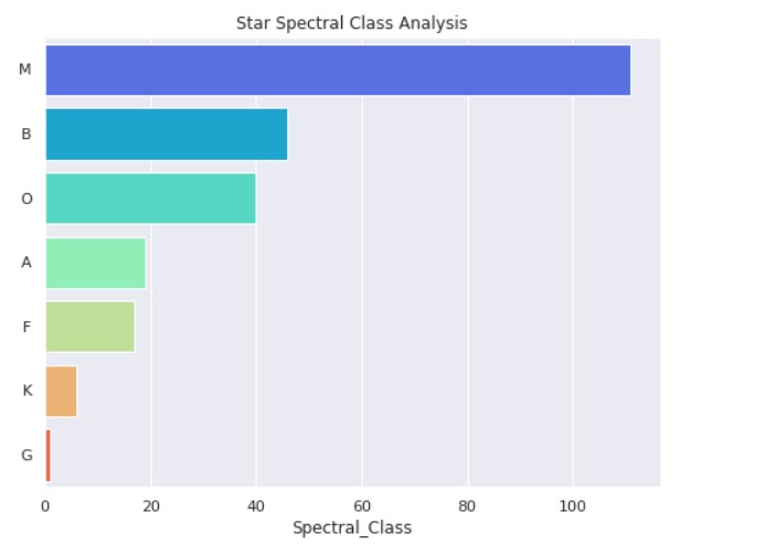
Star Spectral Class Analysis:
a= pd.DataFrame(data['Spectral_Class'].value_counts())
plt.figure(figsize=(8,6))
sns.barplot(data=a, x='Spectral_Class',y= a.index, palette= 'rainbow')
plt.title("Star Spectral Class Analysis")
Output:
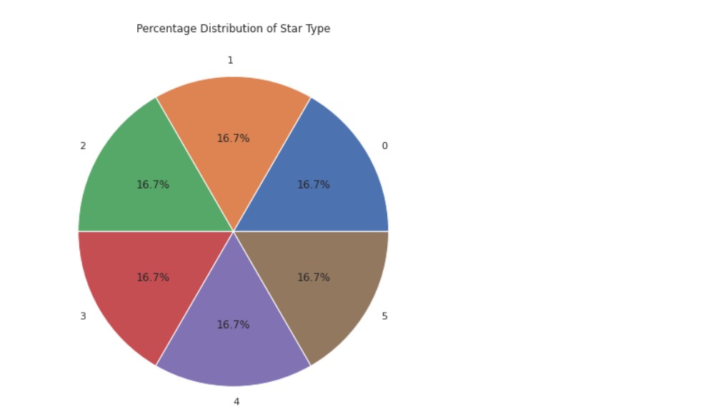
Star Type Analysis:
a =pd.DataFrame(data['Type'].value_counts())
plt.figure(figsize=(10,8))
plt.pie(data=a, x='Type',labels=a.index,autopct='%1.1f%%')
plt.title("Percentage Distribution of Star Type")
Output:
Correlation Analysis:
matrix= data.corr()
mask = np.zeros_like(matrix, dtype=float)
mask[np.triu_indices_from(mask)]= True
plt.figure(figsize=(11,6))
sns.heatmap(matrix,annot=True,cmap='viridis',annot_kws = {'size': 10},mask=mask)
plt.title("Correlation Analysis")
plt.show()
Output:
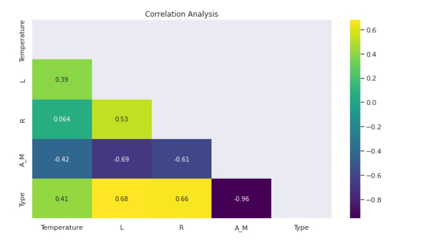
- The Luminosity-Temperature and Star Type-Temperature Correlations are Moderately Positive.
- There is a moderately high positive correlation between Luminosity-Radius, Luminosity-Star Type, and Radius-Star Type.
- Negatively Moderately High Luminosity-Magnitude and Radius-Magnitude correlate.
- Magnitude and Star Type have a strong negative correlation.
Label Encoding
A label is a notation for a feature.
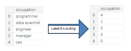
( Image: https://huntdatascience.wordpress.com/2019/07/26/encoding-categorical-variables/)
Label encoding is one of the most common methods for translating labels into numeric values that machines can interpret. For example, suppose we have a level column in a dataset, including class, class B, and class C. It will be turned into 0,1, and 2 correspondingly after applying the label encoder.
Label Encoder converts categorical data labels into a numerical representation.
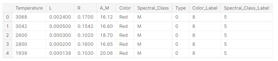
Now, let us implement the label encoding.
from sklearn import preprocessing
# label_encoder
label_encoder = preprocessing.LabelEncoder()
Now, we apply the encoder to the dataset.
data['Color_Label']= label_encoder.fit_transform(data['Color'])
data['Spectral_Class_Label']= label_encoder.fit_transform(data['Spectral_Class'])
Now, let us see what the data looks like.
data.head()
Output:
Now, we check the original labels for the colours and see what labels are assigned.
print("Original Colours:")
print(data['Color'].unique())
print("Labels:")
print(data['Color_Label'].unique())
Output:
Original Colours:
['Red' 'Blue White' 'White' 'Yellowish White' 'Blue white'
 'Pale yellow orange' 'Blue' 'Blue-white' 'Whitish' 'yellow-white'
 'Orange' 'White-Yellow' 'white' 'yellowish' 'Yellowish' 'Orange-Red'
 'Blue-White']
Labels:
[ 8  1  9 13  2  7  0  4 11 15  5 10 14 16 12  6  3]
Now, we check the same for the Spectral class feature.
print("Original Spectral Class:")
print(data['Spectral_Class'].unique())
print("Labels:")
print(data['Spectral_Class_Label'].unique())
Output:
Original Spectral Class:
['M' 'B' 'A' 'F' 'O' 'K' 'G']
Labels:
[5 1 0 2 6 4 3]
Splitting Dataset
Now, we split the dataset into X and y.
y= data["Spectral_Class_Label"].values
X = data.drop(labels=['Spectral_Class_Label','Color','Spectral_Class'], axis=1).values
Standard Scalar Normalization
Now, we shall perform Standard Scalar Normalization. StandardScaler adheres to the Standard Normal Distribution (SND). As a result, it sets the mean to 0 and scales the data to unit variance.
from sklearn.preprocessing import StandardScaler
sc = StandardScaler()
X = sc.fit_transform(X)
PCA
Implementation of PCA:
from sklearn.decomposition import PCA
pca = PCA()
X = pca.fit_transform(X)
The explained variance ratio function in the PCA class returns the variance produced by each principal component.
explained_variance = pca.explained_variance_ratio_
explained_variance
Output:
array([0.58015798, 0.23500814, 0.06856623, 0.0601706 , 0.04920672,
       0.00689033])
We can see that the first two features have the most variance here. Now we train the model.
Training with Two Principal Components
First, we train the Classifier model by taking the two top features. We shall be training a Random Forest Classifier model.
Random forests, also known as random decision forests, are an ensemble learning approach for classification, regression, and other problems that work by training many decision trees. For classification tasks, the random forest’s output is the class chosen by most trees. A random forest comprises Decision Trees, each making its prediction. The values are then averaged (Regression) or max voted (Classification) to arrive at the final result.
The power of this model comes from the ability to create several trees with various sub-features from the features. Because the characteristics chosen for each tree are random, the trees do not grow in-depth and are just focused on the set of features.
from sklearn.decomposition import PCA
pca2 = PCA(n_components=2)
X_2 = pca2.fit_transform(X)
from sklearn.model_selection import train_test_split
X_train, X_test, y_train, y_test = train_test_split(X_2, y, test_size=0.2, random_state=5)
from sklearn.ensemble import RandomForestClassifier
classifier = RandomForestClassifier(max_depth=2, random_state=0)
classifier.fit(X_train, y_train)
# Predicting the Test set results
y_pred = classifier.predict(X_test)
from sklearn.metrics import accuracy_score
print('Accuracy: ' , accuracy_score(y_test, y_pred))
Output:
Accuracy: 0.6875
Training with Three Principal Components
Now, we proceed with the number of principal components=3.
from sklearn.decomposition import PCA
pca3 = PCA(n_components=3)
X_3 = pca3.fit_transform(X)
X_train, X_test, y_train, y_test = train_test_split(X_3, y, test_size=0.2, random_state=5)
classifier = RandomForestClassifier(max_depth=2, random_state=0)
classifier.fit(X_train, y_train)
# Predicting the Test set results
y_pred = classifier.predict(X_test)
print('Accuracy: ' , accuracy_score(y_test, y_pred))
Output:
Accuracy: 0.7083333333333334
Training with Four Principal Components
Now, we take the number of principal components=4.
from sklearn.decomposition import PCA
pca4 = PCA(n_components=4)
X_4 = pca4.fit_transform(X)
X_train, X_test, y_train, y_test = train_test_split(X_4, y, test_size=0.2, random_state=5)
classifier = RandomForestClassifier(max_depth=2, random_state=0)
classifier.fit(X_train, y_train)
# Predicting the Test set results
y_pred = classifier.predict(X_test)
print('Accuracy: ' , accuracy_score(y_test, y_pred))
Output:
Accuracy: 0.7708333333333334
Conclusion
- As we increased the number of features, the model’s accuracy improved.
- PCA can be an excellent way to understand which features are more relevant for a particular machine learning problem.
- PCA is a practical mathematical approach for reducing data complexity. It finds linear combinations of the input fields that best represent the statistical variation in the complete set of areas. The data components are orthogonal to and unrelated to one another.
- We can use PCA to select the most relevant data features.
The media shown in this article is not owned by Analytics Vidhya and is used at the Author’s discretion.
Prateek is a dynamic professional with a strong foundation in Artificial Intelligence and Data Science, currently pursuing his PGP at Jio Institute. He holds a Bachelor's degree in Electrical Engineering and has hands-on experience as a System Engineer at TCS Digital, where he excelled in API management and data integration. Prateek also has a background in product marketing and analytics from his time with start-ups like AppleX and Milkie Way, Inc., where he was involved in growth campaigns and technical blog management. Recognized for his structured thinking and problem-solving abilities, he has received accolades like the Dr. Sudarshan Chakraborty Award for Best Student Performance. Fluent in multiple languages and passionate about technology, Prateek continues to expand his expertise in the rapidly evolving AI and tech landscape.


