
Image source: Lewis Cho
Introduction
Data is the new oil we have heard it so many times. But do we apply the visual techniques to find some amazing insights to boost the business? This is a very crucial stage to bring out the insights and pinpoint from the data so we can change the product in such a way that it becomes user-friendly.
Thousands of visualizations are created every 24 hours. Some charts are really appreciated well by the audience while others are just neglected due to various reasons. Why so? Well, the answer lies in creation. Let’s find out the cause and the problem which the creator does while creating the charts and see how to solve them with the Plotly data visualization library.
“Visualization gives you answers to questions you didn’t know you had.” – Ben Schneiderman
What is the Need for Visualization?
Well we love excel and it helps to solve our problems more efficiently but it is not a great tool to make a decision that affects the business directly. A chart can speak 1000 words that an excel sheet can’t.
Data viz always helps in data analysis, and data exploration and makes the data more understandable to draw insights. Summarizing the complex quantitative information in a small space is what a chart does.
The chart always helps in discovering the latest trends in the finance sector or time series, and hidden patterns in the data. We can easily identify the relationships between 3 variables or the correlations between the variables.
Why do we use Plotly?
Plotly is a hero in the field of data visualization as it gives the user the freedom to make charts. Plotly is an open-source data visualization library that provides an abundance of chart types as well as a Plotly Dash tool for making Dashboard with callbacks. With the plot, we can embed charts on any article or blog. We can also make charts in the chart studio of plotly.
The attractive nature of plotly is that we can interact with the chart which reveals more information about the chart. The tooltip is very attractive in plotly and we can modify them as per our use. Plotly is in great demand rather than other libraries of python like Matplotlib and Seaborn. Plotly provides various charts having animations in 1D, 2D, and 3D dashboard tools, and we can even embed them.
This article is inspired by this notebook on Kaggle.
Different Types of Graphs
The following is taken directly from the documentation:
The goal of plotly.py is to provide a pleasant Python interface for creating figure specifications for display in the Plotly.js JavaScript library. In Plotly.js, a figure is specified by a declarative JSON data structure, and so the ultimate responsibility of plotly.py is to produce Python dictionaries that can be serialized into a JSON data structure that represents a valid figure.
There are various modules that Plotly provides to create visualizations
- express: Most of the time plotly express is used for the visualization and it is one of the fastest modules to make a chart. It is good for visualizations, but there is one condition where data often need to be structured in a proper format otherwise there will be confusion while manipulating in pandas library. There is a plethora of documentation available so you can make charts with the help of documentation.
- graph_objects: A low-level interface to figures, traces, and layout. My go-to module when I need more than one chart side by side for comparison. It is highly customizable with an innumerable ways for graphs.
- figure_factory: Figure Factories are mainly dedicated functions to creating high-level types of visuals.
Let’s add magic to charts. Beautiful Data Visualization Made Easy with Plotly. We can convert normal charts to some mind-blowing charts with editing. Let’s start our journey step by step and make changes to enhance the charts.
Adding Magic to Charts by using Plotly
Importing Library
We can install the libraries with the pip or even can download the package in anaconda.
# pip
 pip install plotly
# anaconda
conda install -c anaconda plotly
Importing Libraries
import pandas as pd
import numpy as np
import plotly.express as px
from plotly.subplots import make_subplots
import plotly.graph_objs as go
For simplicity, I am going to take simple data for understating. So after implementing different charts you can enhance your charts with your use cases and explore the plotly. Python notebook is available here.
Load the data
The dataset consists of Men & Women’s Clothes the link for the Dataset is here on the kaggle.
df = pd.read_csv('myntra_products_catalog.csv')
df[:2]

Image: Fashion clothes (Data)
Cleaning and Pre-Processing Data
Replacing the boys and girls with men and women for sorting the data. Removing the redundancy from the data. Also, replacing the brand’s name so that they can appear in a proper format on the chart.
df = df.replace({'Boys':'Men', 'Girls':'Women'})
df = df.replace({'U.S. Polo Assn. Kids':'US Polo'})
Deleting the Unisex Kids gender from clothing data so we can classify data into 3 genders.
df = df[df['Gender']!='Unisex Kids']
Replacing null values from the data to Missing in the color of the clothing.
df['PrimaryColor'] = df['PrimaryColor'].replace(np.nan,"Missing")
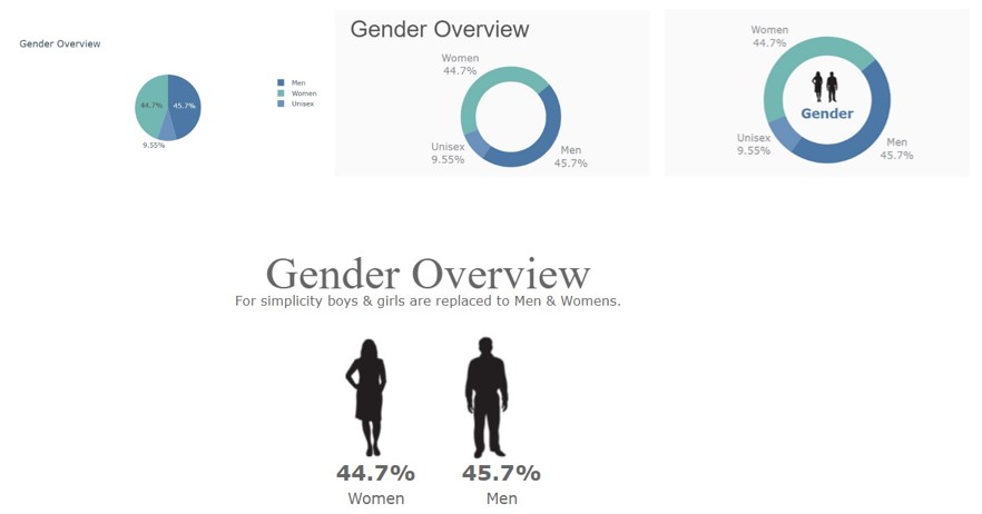
Let’s start making charts. First of all, we will make a pie chart where we see the overall gender distribution in data.
Type of Plotly Chart you want to Make using a Pie Chart
Pie chart 1
Let’s make a simple pie chart with no additional parameters for look and feel.
fig = px.pie(df, names='Gender',
             height=300, width=600,
             title='Gender Overview',
             color_discrete_sequence=['#4c78a8', '#72b7b2', '#6b92bc'])
fig.show()
In the above chart, we can see the overall distribution of gender and their percentage distribution. But something is missing let’s add some proportion of magic (Plotly) in the next charts.
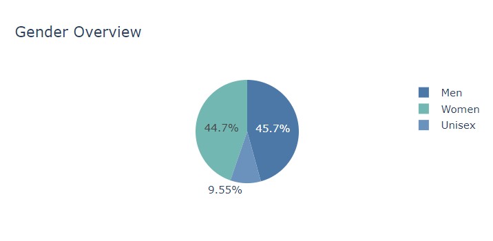
First step to convert the background of the chart. Yes, I do agree white background is nice but we can play with different colors so charts can speak for itself. Now, we will add the background color for the chart, for color changing we need to add the parameter plot_bgcolor and paper_bgcolor
fig = px.pie(df, names='Gender',
             height=300, width=600,
             hole=0.7,
             title='Gender Overview',
             color_discrete_sequence=['#4c78a8', '#72b7b2', '#6b92bc'])
fig.update_layout(plot_bgcolor='#fafafa', paper_bgcolor='#fafafa')
fig.show()
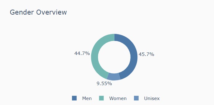
After, adding background color let’s play with the legends to use the space of the chart appropriately. For now, we will use legends and put them in a horizontal manner from vertical in the below chart.
fig = px.pie(df, names='Gender',
             height=300, width=600,
             hole=0.7,
             title='Gender Overview',
             color_discrete_sequence=['#4c78a8', '#72b7b2', '#6b92bc'])
fig.update_layout(plot_bgcolor='#fafafa', paper_bgcolor='#fafafa',
                  legend=dict(orientation="h", yanchor="bottom", y=-0.5, xanchor="center", x=0.5)
)
fig.show()
Okay… so now the chart does look good but something is missing. If we look closely at the charts there are various things that we can improve and enhance the readability of the chart.
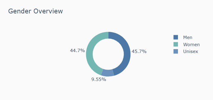
Pie chart 2
Points for changing in the chart:
- First, we will remove the legends
- Second, we will put the legends value and their percentage value both in the same group on the chart.
fig = px.pie(df, names='Gender',

             height=300, width=600,

             hole=0.7,

             title='Gender Overview',

             color_discrete_sequence=['#4c78a8', '#72b7b2', '#6b92bc'])

fig.update_layout(plot_bgcolor='#fafafa', paper_bgcolor='#fafafa')

fig.show()
Let’s understand the code:
We want to have gender names and distribution on the chart beside each other. So we need to add textposition and textinfo in the parameters section for the pie chart.
- textposition: We can select where we want to put the position of the text on the chart. (Inside, Outside)
- textinfo: We can choose what we want to display on the chart (Text, Percentage value, Label)
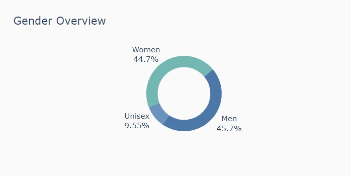
See, after changes the charts looks more readable and attractive compared to the first chart. but let’s increase the font size of the title of the chart and let’s see how it looks.
fig = px.pie(df, names='Gender', height=300, width=600, hole=0.7, title='Gender Overview',
                   color_discrete_sequence=['#4c78a8', '#72b7b2', '#6b92bc'])
fig.update_traces(hovertemplate=None, textposition='outside', textinfo='percent+label', rotation=50)
fig.update_layout(margin=dict(t=100, b=30, l=0, r=0), showlegend=False,
                        plot_bgcolor='#fafafa', paper_bgcolor='#fafafa',
                        title_font=dict(size=39, color='#555', family="Lato, sans-serif"),
                        font=dict(size=17, color='#8a8d93'),
                        hoverlabel=dict(bgcolor="#444", font_size=13, font_family="Lato, sans-serif"))
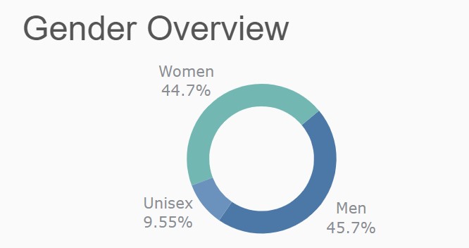
Image: Plotly pie chart
Let’s compared the First and Last charts.
Let’s create the next Interactive Visualizations using Plotly in Python.
Pie Chart 3
We saw the above pie chart. There is a room for change and we can easily modify the pie chart. First, thing we can remove the title of the chart and placed in the between of the pie. For exmaple, here we will place Gender in the center of the pie chart.
fig = px.pie(df, names='Gender', height=300, width=600, hole=0.7,
                   color_discrete_sequence=['#4c78a8', '#72b7b2', '#6b92bc'])
fig.update_traces(hovertemplate=None, textposition='outside',
 textinfo='percent+label', rotation=50)
fig.update_layout(margin=dict(t=50, b=35, l=0, r=0), showlegend=False,
                        plot_bgcolor='#fafafa', paper_bgcolor='#fafafa',
                        font=dict(size=17, color='#8a8d93'),
                        hoverlabel=dict(bgcolor="#444", font_size=13, font_family="Lato, sans-serif"))
fig.add_annotation(dict(x=0.5, y=0.5,  align='center',
                        xref = "paper", yref = "paper",
                        showarrow = False, font_size=22,
                        text="Gender"))
Image: Removing the title from the chart
Let’s understand how to do it:
- We will remove the title from the plotly pie code.
- Now, we will add the annotation and give the x-axis number and y-axis number where we want the text to display.
Pie Chart 4
Let’s add some other things such as image in a pie chart to make it look more expensive.
fig = px.pie(df, names='Gender', height=300, width=600, hole=0.7,
                   color_discrete_sequence=['#4c78a8', '#72b7b2', '#6b92bc'])
fig.update_traces(hovertemplate=None, textposition='outside', textinfo='percent+label', rotation=50)
fig.update_layout(margin=dict(t=50, b=35, l=0, r=0), showlegend=False,
                        plot_bgcolor='#fafafa', paper_bgcolor='#fafafa',
                        font=dict(size=17, color='#8a8d93'),
                        hoverlabel=dict(bgcolor="#444", font_size=13, font_family="Lato, sans-serif"))
fig.add_annotation(dict(x=0.5, y=0.4,  align='center',
                        xref = "paper", yref = "paper",
                        showarrow = False, font_size=22,
                        text="Gender"))
fig.add_layout_image(
    dict(
        source="https://i.imgur.com/3Cab96Z.jpg",
        xref="paper", yref="paper",
        x=0.48, y=0.48,
        sizex=0.3, sizey=0.25,
        xanchor="right", yanchor="bottom", sizing= "contain",
    )
)
fig.add_layout_image(
    dict(
        source="https://i.imgur.com/c6QKoDy.jpg",
        xref="paper", yref="paper",
        x=0.55, y=0.48,
        sizex=0.3, sizey=0.25,
        xanchor="right", yanchor="bottom", sizing= "contain",
    )
)
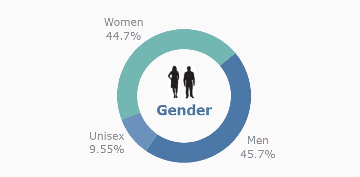
Image: Plotly pie chart with image
Let’s understand how to do it:
- First, we need to add an annotation to the chart so we can have text in the middle of the chart
- Second, we will add images for Men and Women on the top of the gender label.
While adding images we need to look around various things to make the image look good.
- sizex, sizey: This will help us to increase or decrease the size of the image in terms of width and height.
- xanchor, yanchor: This will help us to put the image on right, left, bottom, or top in terms of the x-axis and y-axis respectively
- source: This will help us to know which image to place on the chart.
Pie Chart 5
We have seen multiple images which looks extraordinary with the help of little editing with plotly. We can add images and annotation in charts. So let’s use images and tell them about gender distribution.
fig = px.scatter(x=[1,1.2,1.3], y=[0,0,0],
                 color_discrete_sequence=['#fff'])
# styling
fig.update_xaxes(visible=False)
fig.update_yaxes(visible=False)
fig.update_traces(textposition='top center')
fig.update_layout(height=300, width=500,
                  plot_bgcolor='#fff', paper_bgcolor='#fff',
                  margin=dict(b=0,r=50,l=50,t=110),
                  title={'text': "Gender Overview
For simplicity boys & girls are replaced to Men & Womens.",
                         'y':0.8, 'x':0.5,
                         'xanchor': 'center', 'yanchor': 'top'},
                  font=dict(size=9, color='#666'),
                 )
fig.add_layout_image(
    dict(
        source="https://i.imgur.com/3Cab96Z.jpg",
        xref="paper", yref="paper",
        x=0.4, y=0.38,
        sizex=0.6, sizey=0.635,
        xanchor="right", yanchor="bottom", sizing= "contain",
    )
)
fig.add_layout_image(
    dict(
        source="https://i.imgur.com/c6QKoDy.jpg",
        xref="paper", yref="paper",
        x=0.7, y=0.38,
        sizex=0.6, sizey=0.65,
        xanchor="right", yanchor="bottom", sizing= "contain",
    )
)
fig.add_annotation(dict(x=0.37, y=0.25, ax=0, ay=0,
                    xref = "paper", yref = "paper",
                    text= "44.7%

Women"
                  ))
fig.add_annotation(dict(x=0.68, y=0.25, ax=0, ay=0,
                    xref = "paper", yref = "paper",
                    text= "45.7%

Men"
                  ))
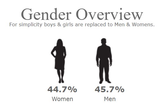
Image: Plotly images with annotation
Let’s understand how to do it:
- First we will make a scatter chart and use the same color of the marker and background which is grey in our case.
- Then we will put the 2 images side by side each other with the help of plotly image annotation
- and then we will write at the below of the image with the help of annotation.
Conclusion
We saw how we can make charts with little to way many modifications with a plotly charting library. Visualization is a basic need just like oxygen to our body for the business to view their reports and draw insights. We saw what is plotly and it’s submodules which help to make mind-blowing articles. We saw how the annotation of text and images works with the help of a fashion clothing dataset.
Below are the Key-takeaways from the article:
- We are able to create tableau type of pie charts in python with the help of plotly library.
- We know the importance of image and pie chart and also get to known when to apply pie chart or image in our dashboard.
The media shown in this article is not owned by Analytics Vidhya and is used at the Author’s discretion.


