Image Courtesy: Bar Chart Animation with Plotly library
Introduction
We all love animation! We can update our photos on Instagram, Facebook, or any other social media platform with just a click. We live in a big data era where everything is a click away. We have seen often that in a meeting we present our findings in a presentation form rather than in a tabular format in excel or sometimes we also illustrate the data in a simple dashboard format for easy understanding. There is an abundance of ways to represent the data but the most effective way is to make it look like a movie or a film where you are depicting a story with a higher engagement ratio.
For example, if a movie is good then it is going to make a significant rise in revenue from it and the shows are going to be booked. Take this example, in our life as we easily get affected by a short film rather than reading a story of hundreds of pages of poetry. Why? The main reason is our mind processes the things which are present to us in a pictorial form faster than in reading format.
Animation Charts
Here, comes the power of visualization which is a great tool to have in our pocket it works the same as harry potter’s magic wand! One can easily use the magic wand to make eye-catching infographics, and charts that will hook up the audience in the first 90 seconds. Visualization is the main powerhouse of exploratory data analysis from where one can understand what is data trying to convey.
There is no pre-defined format of visualization. Also, not all charts are feasible for every use case. Here, in this particular article, we are going to see one of the highly utilized charts “Animation Charts”.
Bar Chart Race Animation
Plotly Python library has an amazing library for making easy, understandable, and lessen effort charts with extraordinary animation charts.
Plotly Benefits for Making Animated Charts
Let’s see how to make animated charts.
Importing library for visualizing and reading the dataset
import plotly.express as px
import pandas as pd
The data looks like this after importing the libraries for animation
Python Code:
import plotly.express as px
import pandas as pd

df = px.data.gapminder()
print(df)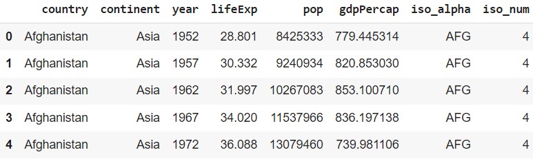
Image Courtesy: The look of the data
Understanding of the data
- country: This feature has various countries’ names
- continet: This feature has various continents names
- year: This feature has year value for each respective country
- lifeExp: This feature tells us about the life expectancy
- pop: This feature tells us about the population of the country
- gdpPercap: This feature tells us about the average GDP value of the country
Let’s make an animated bar chart having a year as the dependent axis. First, we will see what is the population of each continent with respect to the year.
Animated Bar Chart
fig = px.histogram(df, x="continent", y="pop", color="continent",
  animation_frame="year", animation_group="country", range_y=[0,4000000000])
fig.show()
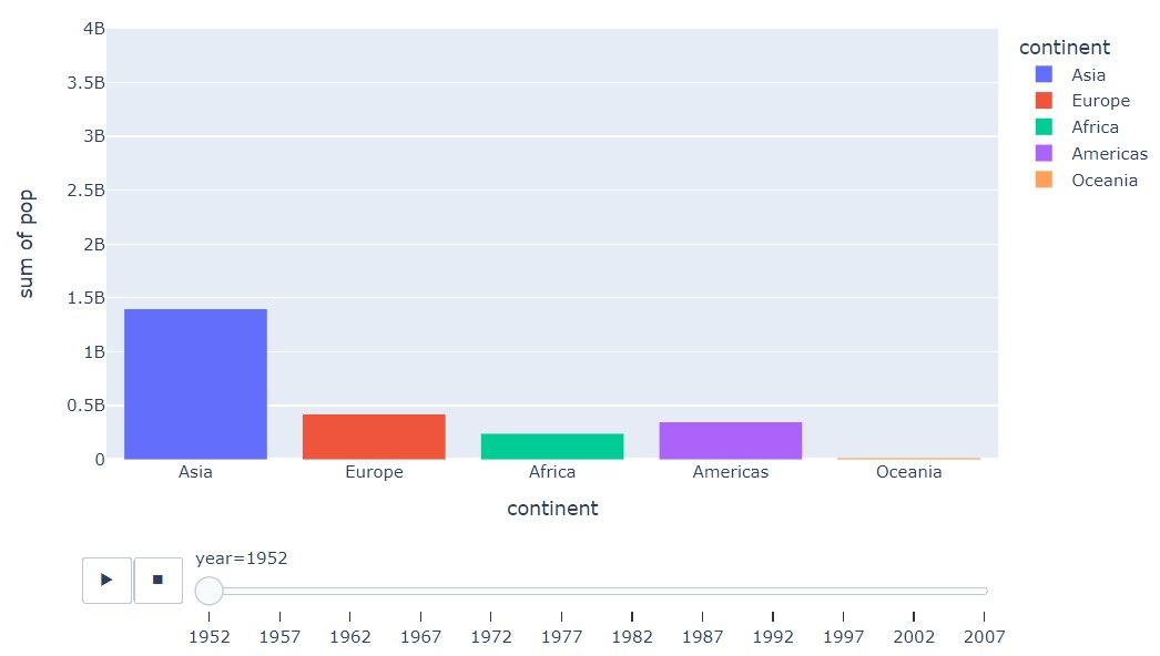
Image Courtesy: Plotly animation bar chart
Understanding the Chart Parameters
Normal chart parameters descriptions
- x: The x parameter takes a value that must be present on the x-axis.
- y: The y parameter takes a value that must be present on the y-axis.
- color: The color parameter takes a value that must be present on the legends. If we are making a simple bar chart then each different category will have different colors displayed in the chart.
Animated chart parameters descriptions
- animation_frame: The animation_frame parameter take a value that will need while using the animation. For example, here we use the year as an animation frame in the chart.
- animation_group: The animation_group parameter take a value that needs to be grouped in the chart while animation.
- range_y: The range_y parameter means the speed where the animation will complete
Advanced Animated Bar Chart Plotly
We can also add other parameters to make it look rich and eye-catching! Let’s see how can we achieve that look.
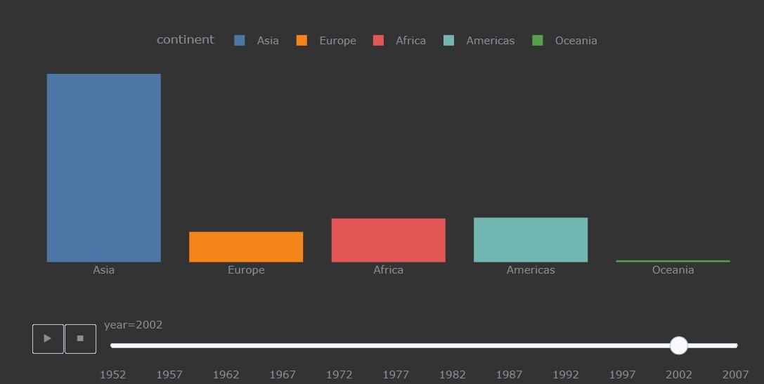
Personally, I love dark shade colors in which black is my favorite color, So, let’s use it in the chart. Most of the colors which are used for the background are black, white, or creme. There is a direct parameter for using white as the background color in the chart.
First and foremost we will keep the same parameters to make animated chart with plotly we will just add some parameters to enhance the chart.
fig = px.histogram(df, x="continent", y="pop", color="continent",
                 animation_frame="year", animation_group="country",
                 range_y=[0,4000000000],
                 color_discrete_sequence=px.colors.qualitative.T10)
fig.update_yaxes(visible=False)
fig.update_layout(margin=dict(t=70, b=0, l=50, r=40), width=900, height=450,
                  xaxis_title=' ',
                  plot_bgcolor='#333', paper_bgcolor='#333',
                  title_font=dict(size=25, color='#a5a7ab', family="Lato, sans-serif"),
                  font=dict(color='#8a8d93'),
                  legend=dict(orientation="h", yanchor="bottom", y=1, xanchor="right", x=0.8)
                    )
fig.show()

Image Courtesy: The final look of animated bar chart plotly
Understanding the Chart’s Advanced Parameters
The color and background parameters descriptions
- color_discrete_sequence: The color_discrete_sequence parameter shows different colors on the color parameter value. There are various ways you can design your chart such as using sequential, divergent, or qualitative. Here, in the 10 ideas that every professional must avoid article, it is explained in the best way when to use which mode of the color scale.
- plot_bgcolor & paper_bgcolor: The plot_bgcolor & paper_bgcolor parameter adjust the background colors of the chart.
Axis + Basic parameters descriptions
- update_yaxes: The update_yaxes parameter where we can change the y-axis. Such as we can hide the axis or even format it.
- update_xaxes: The update_xaxes parameter where we can change the x-axis. Such as we can hide the axis or even format it.
- height: The height parameter take a value that needs to be present on the height.
- width: The width parameter take a value that needs to be present on the width.
- margin: The margin parameter takes a value that will keep adjusting the left, right, top, and bottom of the chart in the container.
The font and title parameters descriptions
- font: The font parameter helps to edit the font properties such as font, color, size, and many more in the chart. Here, while using a dark color background for the chart we can play around with the font color for a blending look of various colors in the chart.
- title_font: The title font parameter helps to edit the font properties such as font, color, size, and many more in the chart. Properly using the title font properties often catch the audience’s attention in the first 20 seconds and hooks them up.
- legend: The legend parameter keeps the formatting of the legends on the chart. Sometimes on the based of the chart, we can also avoid using legends.
Image Courtesy
All the images used while making the animated bar chart with the help of plotly are of the author.
Conclusion
To sum up, we saw how we can make an infographic view animated chart with the help of the plotly library. Also, we saw how we add the parameters to make it more eye-catching charts which we can easily embed in any blog or article to make the analysis pop out for the audience. Some of the key takeaways are:
- After reading the article one can easily make an animated bar chart in Plotly which is user-friendly.
- Moreover, making an eye-catching bar chart that explains the purpose of the use cases with visual appeal is a must and we even learn how to make it in Plotly.
- In addition to this bar chart with a touch of animation makes the user hook up to the report which we saw in the above section of the article.
- Also, we saw how to use a plethora of parameters to enhance the charts and make them look like it is made in Tableau software and looks like an Infographic.
The media shown in this article is not owned by Analytics Vidhya and is used at the Author’s discretion.


